

Die technische Arbeit an einer neuen Schrift durch externe Designer weckt immer die professionelle Neugier. Vor allem, wenn es sich um Schriften für Marken handelt, deren Geschichte weltweit bekannt ist.
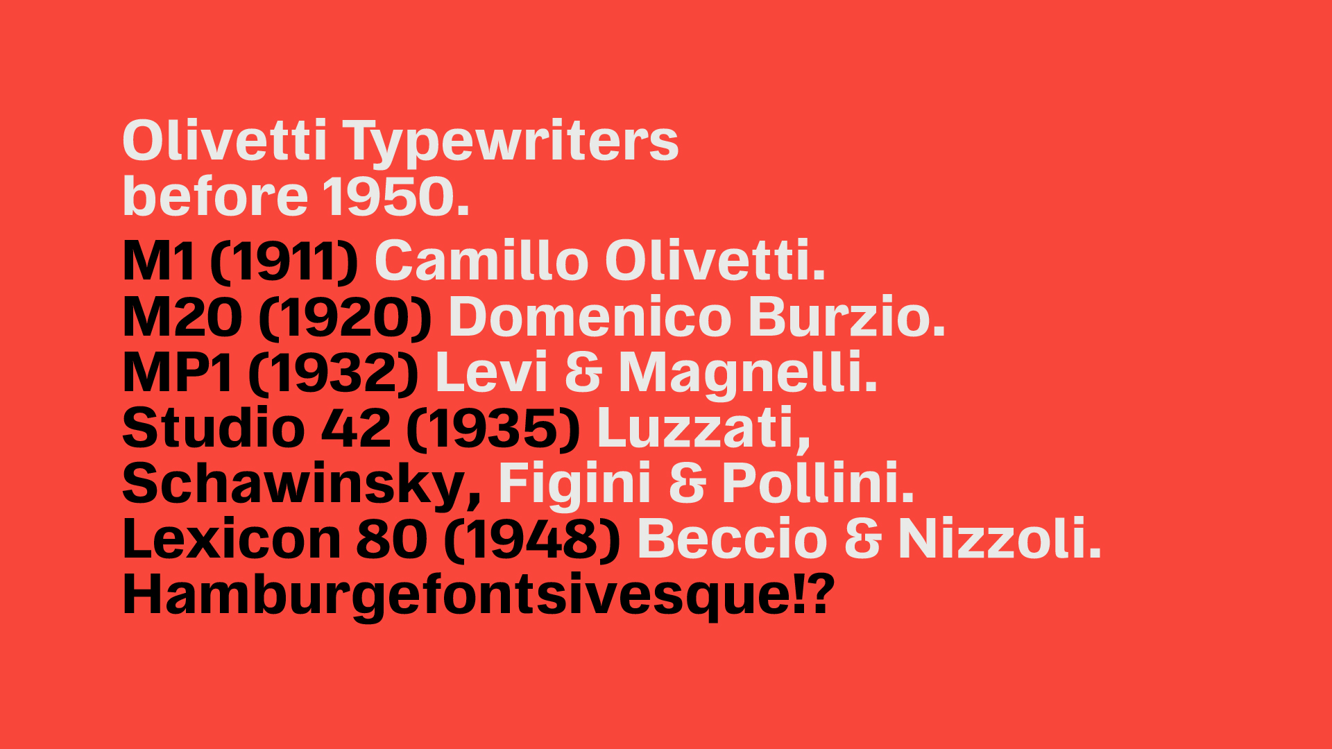
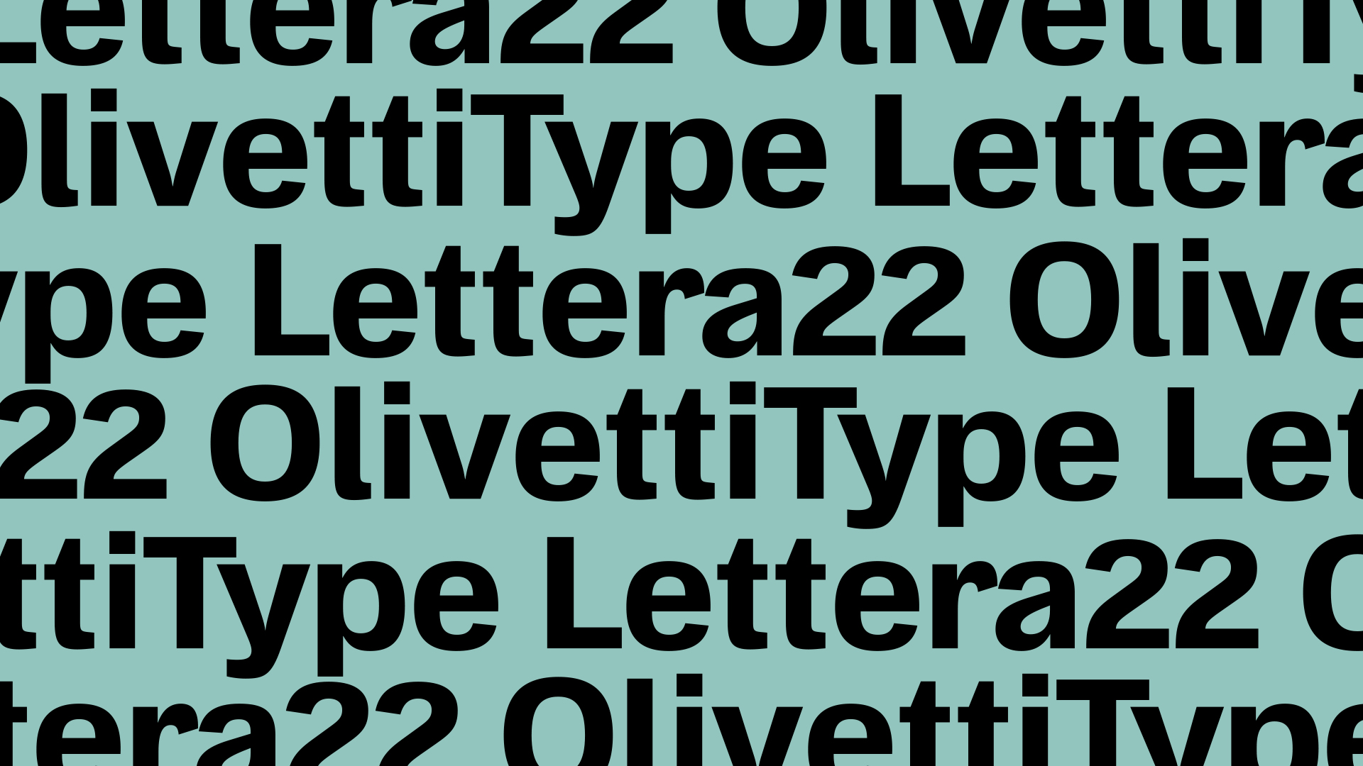
Olivetti ist ein italienisches Unternehmen, dessen Name im 20. Jahrhundert vor allem bei Journalisten und Schriftstellern Bewunderung und Respekt hervorrief. Olivetti stellte einige der populärsten Schreibmaschinen her, und die Lettera 22 ist im Museum of Modern Art in New York und in zahlreichen anderen internationalen Ausstellungen zu sehen.
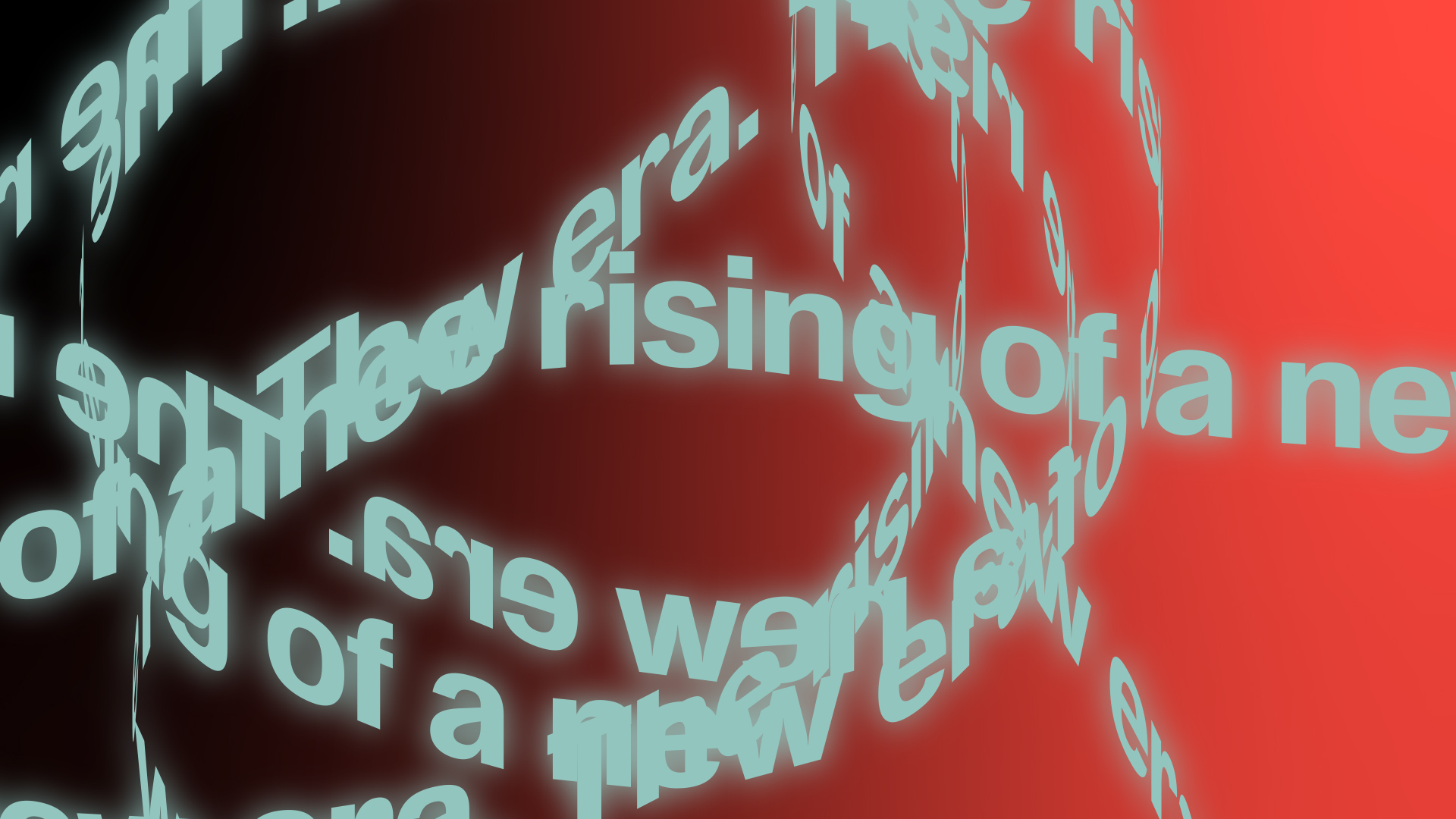
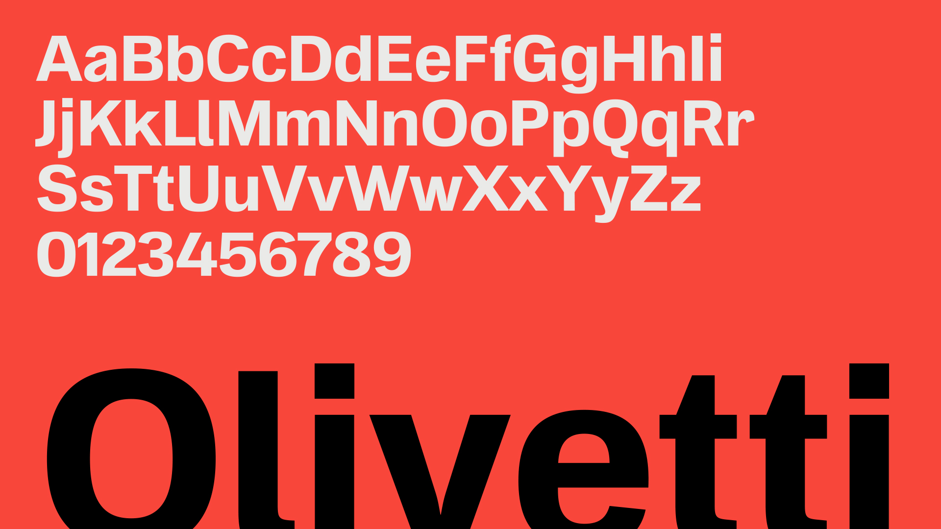
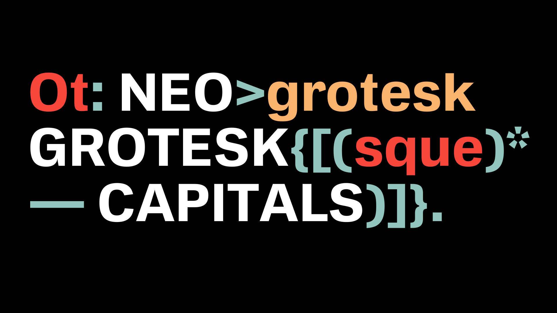
Zum 70. Geburtstag der Lettera 22 beschloss Olivetti, eine moderne Schrift zu entwerfen, die OT L22, inspiriert von der Geschichte der berühmten Schreibmaschine. Mit der Gestaltung wurde die Designagentur Capelli Identity Design beauftragt.
Für Schriftprojekte engagiert Capelli den Designer Antonio Pace, mit dem wir häufig zusammenarbeiten. Wir wurden als technische Spezialisten hinzugezogen und tauchten in die Geschichte von Olivetti ein. Wir wussten zwar, dass dies der größte Schreibmaschinenhersteller war, waren aber überrascht zu erfahren, dass Olivetti seine Produkte sogar in die UdSSR lieferte. Unsere Partner hatten zunächst die Möglichkeit einer ganzen Schriftfamilie erwogen, sich dann aber auf einen Stil festgelegt.
Also begannen wir, daran zu arbeiten. Während der Verhandlungsphase wurde klar, dass wir den gesamten technischen Teil des Masterings übernehmen mussten, mit Ausnahme des visuellen Teils.
TypeType unterteilte das Font-Mastering in 4 große Blöcke:
- Visuell, d.h. das Polieren des Designs einzelner Elemente oder ganzer Zeichen, die Überprüfung, ob die Glyphen den typografischen Regeln entsprechen, die Durchführung von Korrekturen
- technisch, d.h. die Einstellung der technischen Schriftparameter, die Überprüfung der Konturen und diakritischen Zeichen, die Erstellung von Merkmalen
- Kerning, d.h. das erzwungene Ausgleichen der Buchstabenabstände für bestimmte Buchstabenpaare
- Hinting, d.h. die Erstellung von visuellen Markierungen, damit die Schrift in jeder Größe perfekt dargestellt wird
Von Fullest Mastering spricht man, wenn ein Kunde mit einer gezeichneten Schrift zu uns kommt, die wir zunächst einer visuellen und dann einer technischen Prüfung unterziehen. Anschließend arbeiten Spezialisten aus zwei Abteilungen daran, die Schrift zu verbessern und die notwendigen Änderungen vorzunehmen. Für das Projekt OT L22 war ein visuelles Mastering nicht erforderlich. Nachdem wir die endgültige Schriftdatei erhalten hatten, begannen wir mit der Arbeit an Kerning und Spacing, der Erstellung von Font Info, der Überprüfung der Laufrichtung und der Andeutung.
Antonio Pace, Schriftdesigner und unser Partner, ist jemand, der es vorzieht, als Kreativer zu arbeiten und bei jedem Projekt kreativ bis an die Grenzen zu gehen. Unsere Aufgabe ist es, die Schriftdatei technisch zu vervollständigen, die diakritischen Zeichen und Konturen zu überprüfen, die Eigenschaften zu definieren und die Schrift mit den Funktionen auszustatten, die sie zu einem funktionierenden Werkzeug machen. Unser gemeinsames Ziel bei gemeinsamen Projekten ist es, eine Schriftfamilie zu schaffen, die ästhetisch ansprechend und einfach und intuitiv zu bedienen ist.
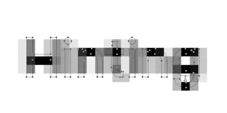
Da es sich bei OT L22 um eine Schrift handelt, war die Arbeitsweise ähnlich wie bei TypeType, wenn es sich um Schriften aus eigener Produktion handelt. Zuerst überprüften wir die Umrisse, um sicherzustellen, dass sie richtig konstruiert waren, und legten dann die richtigen Drehrichtungen fest, damit die Schrift korrekt angezeigt wurde.
Anschließend wurden diakritische Zeichen und das Vorhandensein von Ankern überprüft. Als nächstes wurde die Schrift mit einem speziell vom Studio entwickelten Programm — einem Sprachskript — diagnostiziert, um sicherzustellen, dass alle erforderlichen Glyphen in der Schrift vorhanden sind.
Nach der Überprüfung und den ersten Anpassungen kann die Schrift dem Kerning unterzogen werden — einem erzwungenen Ausgleich der Abstände zwischen den Buchstabenpaaren, wodurch die Schrift optisch harmonisch wird. Unser Studio verfügt über eine bewährte Technik für das Kerning, die unsere technische Abteilung im Laufe der Jahre perfektioniert hat.
Nachdem das Kerning in die Hauptschriftdatei übertragen worden war, nahmen die Spezialisten die Feinabstimmung vor und legten die wichtigsten Merkmale fest. Bevor die Schrift in das Hinting übertragen wurde, überprüfte unser Team die Datei mit einem Validator, um mögliche Fehler auszuschließen. Der Validator ist eine weitere TypeType-Entwicklung, die für die abschließende Validierung einer Datei entwickelt wurde. Am Ende der technischen Arbeit an der OT L22 haben wir das Hinting durchgeführt, d. h. wir haben ein visuelles Layout der Schrift erstellt, um die Lesbarkeit in absolut jeder Bildschirmgröße und -auflösung zu verbessern.
Für die gesamte technische Arbeit benötigte das TypeType-Team zwei Wochen. Der längste Teil der Zusammenarbeit an OT L22 waren die Projektbesprechungen und Verhandlungen, da in dieser Phase eine ganze Reihe von Aufgaben unsererseits geplant wurden, für die die Zeit im Voraus festgelegt wurde.
Die technische Arbeit mit den Schriftsätzen ist eine der häufigsten und gleichzeitig beliebtesten Aufgaben für uns. Das Team hat die Arbeit in jeder Phase perfektioniert, so dass es jetzt möglich ist, den Besonderheiten der Schrift, an der wir arbeiten, mehr Aufmerksamkeit zu schenken. Wir haben die endgültige Datei OT L22 ohne Probleme freigegeben — in der Gewissheit, dass diese Schrift nun mit Freude verwendet werden kann.
An der Arbeit an der Schrift beteiligt:
Kreative Leitung: Emanuele Cappelli
Schriftgestaltung: Antonio Pace, Lorenzo Properzi
Visuelle Gestaltung: Andrea Fiori
Projektleitung: Massimiliano Napoli
Kommunikation & Außenbeziehungen: Fabio ZaninoFont
Mastering: TypeType Team