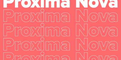
Hausschrift für die Digitalagentur Red Collar
Red Collar ist eine international tätige Digitalagentur, die bereits mehrere Webdesign-Preise gewonnen hat.
Red Collar schreibt über sich selbst: «Weltbeste Agentur laut CSS Design Award in internationalem Webdesign und Entwicklung. Wir schaffen beeindruckende digitale Objekte, die nicht nur die Köpfe, sondern auch die Herzen der Menschen berühren».
Seit ihrer Gründung hat die Agentur eine beeindruckende Entwicklung durchlaufen, sich im Laufe der Zeit verändert und ihre Herangehensweise an das Geschäft und die Kundenbotschaft perfektioniert. Der damalige Firmenstil und die Schriftart spiegelten die Werte der Agentur nicht mehr angemessen wider.
Der Geist, den der Kunde in der Schrift sehen wollte, sollte die Selbstpositionierung der Agentur widerspiegeln: «Sie ist technologisch, aber bezahlbar; sie ist mutig, kühn, aber voll verantwortlich für das Ergebnis».
Die Grundprinzipien, nach denen die Mitarbeiter der Agentur arbeiten, sollten sich in der Schrift widerspiegeln:
1. zurückhaltende Ausdruckskraft
2. Einfachheit, Plastizität, Klarheit
3. Mäßige Einzigartigkeit
Die Schrift soll ein bestimmtes Gefühl vermitteln: Sie sollte sich besonders anfühlen, aber auch verständlich sein.
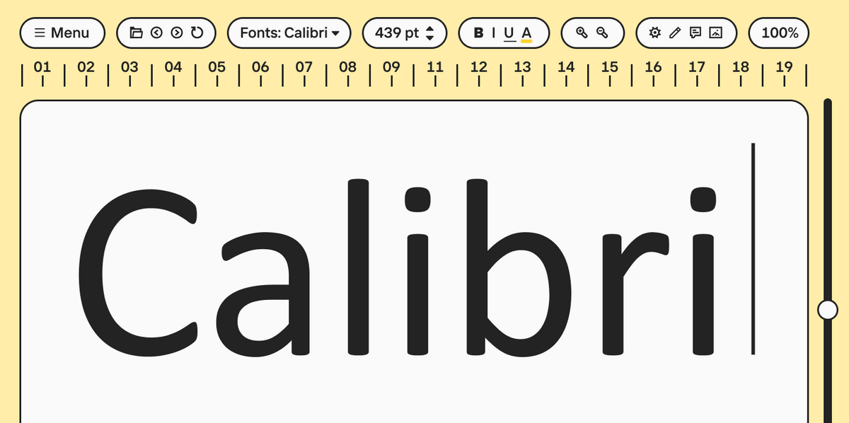
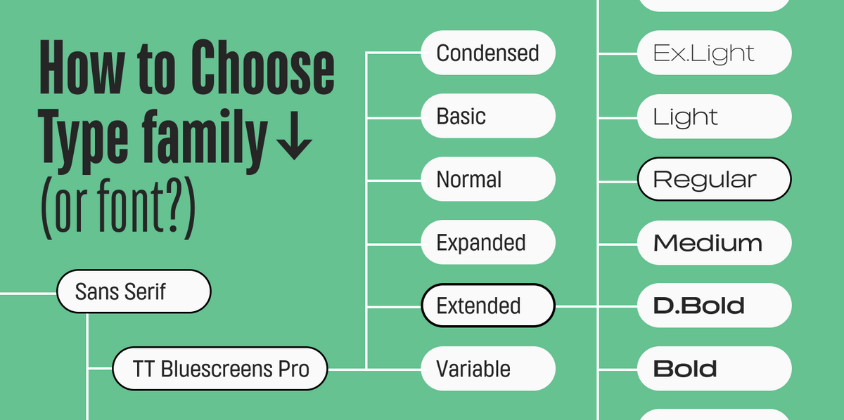
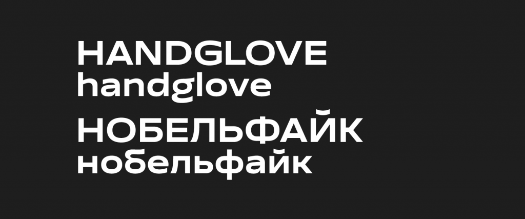
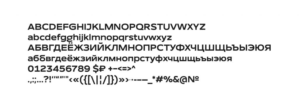
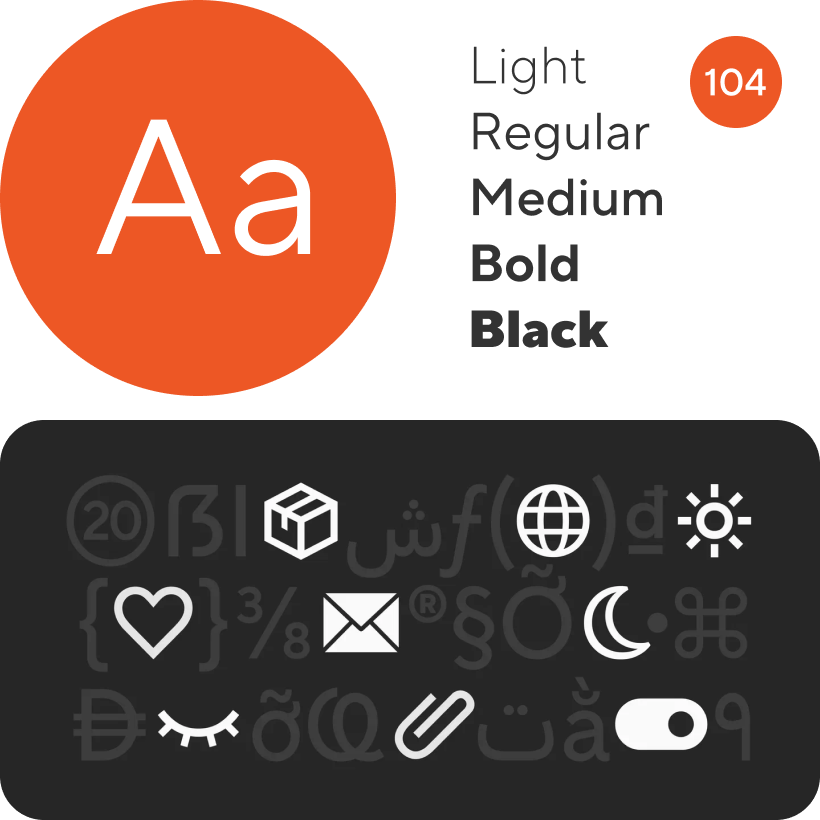
Der Kunde beabsichtigte, die Schrift als Displayschrift zu verwenden, insbesondere in großen Schriftgraden. Die Schrift sollte einen Standardzeichensatz mit englischen und russischen Zeichen, Ziffern, den wichtigsten Satzzeichen und Symbolen haben.
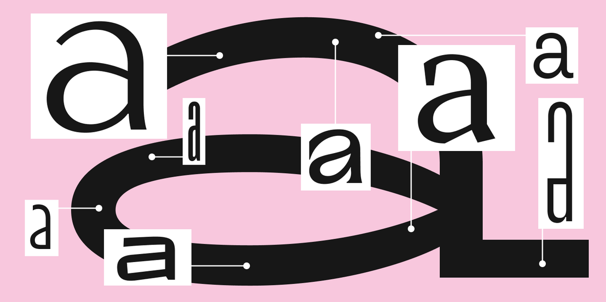
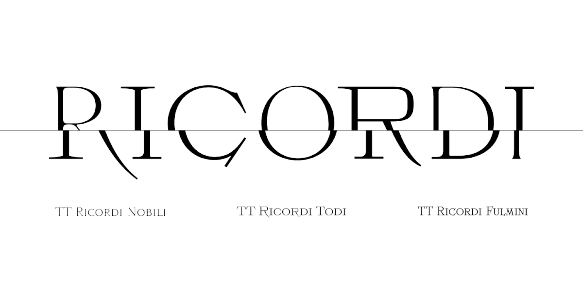
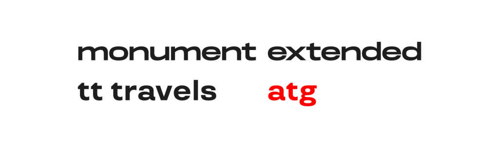
Red Collar wählte die Schrift TT Travels als Hauptreferenz: Sie mochte ihre spezifischen Details, z. B. das Einfließen der Halbkugel des «a» in den Schaft, das Einfließen des Buchstabens «t». Auch die Monument Extended von Pangram Pangram Foundry war eine Referenz wegen ihrer kühnen, breiten Proportionen und dynamischen Buchstaben. Diese beiden Schriften waren für uns der Ausgangspunkt.
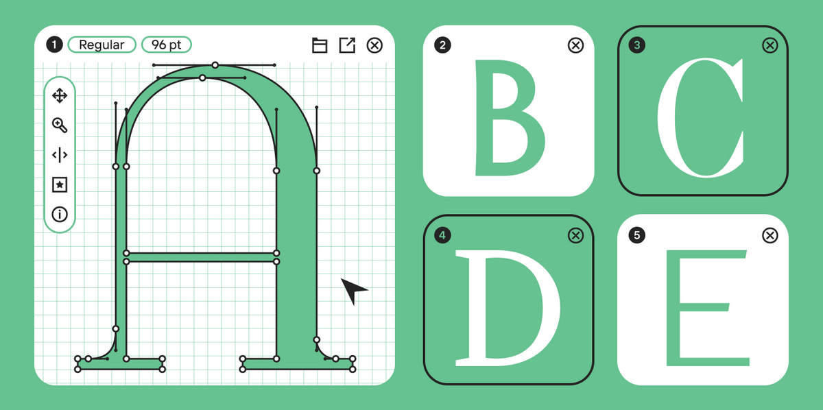
Zunächst entschieden wir uns, mehrere Skizzen anzufertigen, da diese Aufgabenstellung Raum für kreative Erkundungen bot. Um die verschiedenen Interpretationsmöglichkeiten der Aufgabe zu untersuchen, haben wir zwei Designer in den kreativen Prozess einbezogen, die jeweils drei Entwürfe anfertigten. Die Ergebnisse waren sehr unterschiedlich — einer der drei Entwürfe war strenger und orientierte sich an dem Motto «diskrete Ausdruckskraft», während der andere viel näher an den Displayschriften lag.
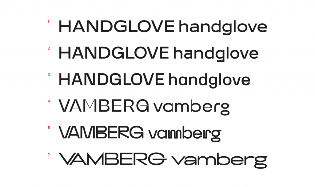
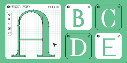
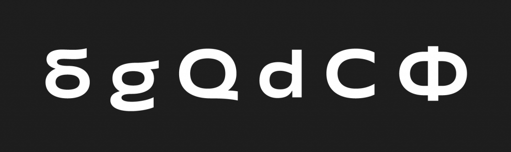
Die erste Version gefiel dem Kunden und wir arbeiteten weiter daran. Die Formen der Buchstaben wurden stark verändert, und die Skizze änderte sich fast vollständig. Wir arbeiteten mit der Plastizität der Schrift, passten die Sättigung an und fügten einige markante Buchstabenkonstruktionen hinzu: Wir sprechen hier von g, б, л, й. Wir mussten der Schrift einen unverwechselbaren Charakter verleihen, ohne sie zu sehr zu einer Displayschrift zu machen.
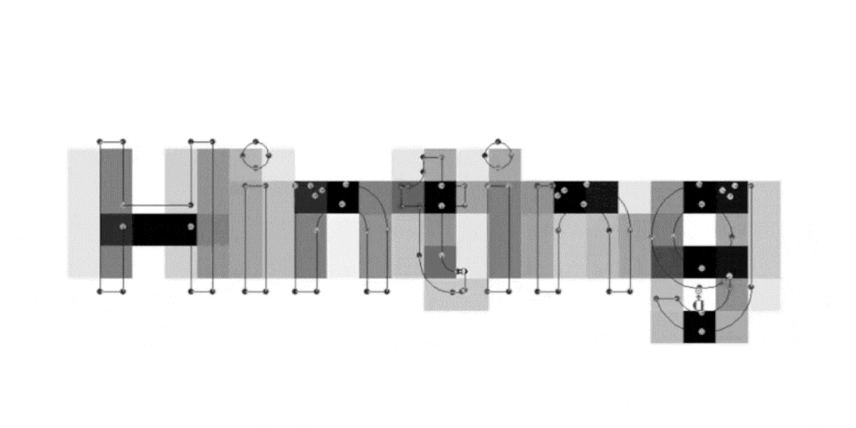
Nachdem die Skizze genehmigt war, begannen wir, die Zeichenzusammensetzung der Schrift zu erweitern. In der Zwischenzeit lösten wir die Probleme, die sich aus den grafischen Besonderheiten der neuen Zeichen ergaben.
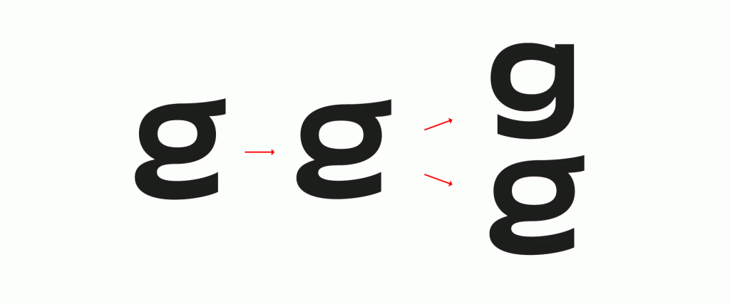
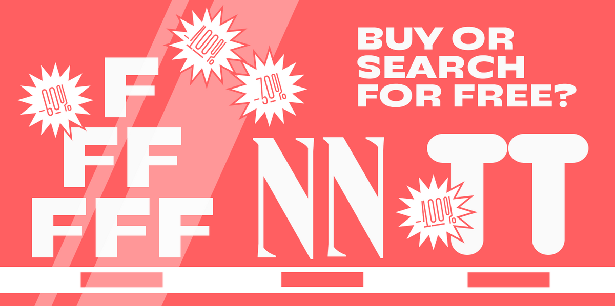
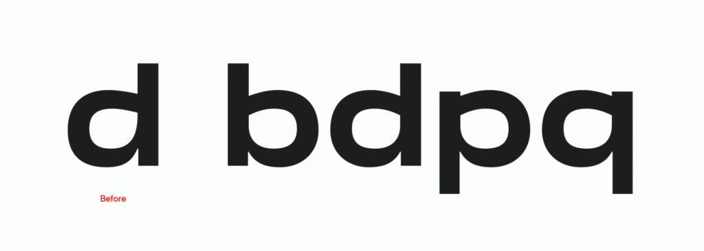
Das Ergebnis war, dass viele Zeichen mehr als einmal verändert wurden. Die ungewöhnlichen Formen von g und б wurden in Stilsätze übertragen, und wir mussten das Л neu zeichnen. Außerdem haben wir lange nach den richtigen Halbschalenformen für d, p, b und q gesucht.
Die ursprüngliche Version der vollständigen Zeichenzusammensetzung der Schrift hat einen langen Weg hinter sich und wurde stark verändert, um sie harmonischer und lesbarer zu machen.

Die Schrift ist modern, frech und dynamisch, genau wie die Agentur selbst. Nachdem alle Grafiken fertiggestellt waren, begann unser technisches Team mit der Einstellung der detaillierten Schriftparameter, der allgemeinen Überprüfung und dem Kerning.
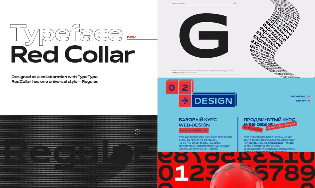
Derzeit verwendet Red Collar die Schrift in der Kommunikation und auf den Webseiten. So hat Red Collar beispielsweise eine eigene Website mit der Schrift font.redcollar.co eingerichtet, die auf www.awwwards.com als Site of the Day ausgezeichnet wurde.
Insgesamt haben wir 11 Monate gebraucht, um das Projekt fertigzustellen. In dieser Zeit haben wir 9 Entwürfe und 3 Versionen der kompletten Schrift erstellt. Die Schrift besteht aus insgesamt 199 Zeichen und es waren 6 Personen an dem Projekt beteiligt.
* Der Artikel enthält Bilder von font.redcollar.co und school.redcollar.ru.