

Eine Schrift ist ein Kunstwerk.
Viele Designer denken so, aber wir sprechen hier nicht über die Branche als Ganzes, sondern über eine bestimmte Schrift, die für Kunstliebhaber interessant ist. Sie hat alles, was es dazu braucht: eine schöne Entstehungsgeschichte, Ästhetik und Linienführung. Der italienische Schriftdesigner Antonio Pace entwarf die Schrift für das Studio Cappelli Identity Design, und TypeType verwandelte seine Kreation in ein funktionales Arbeitswerkzeug.
2020, Insel Lido, 77. Internationale Filmfestspiele von Venedig.
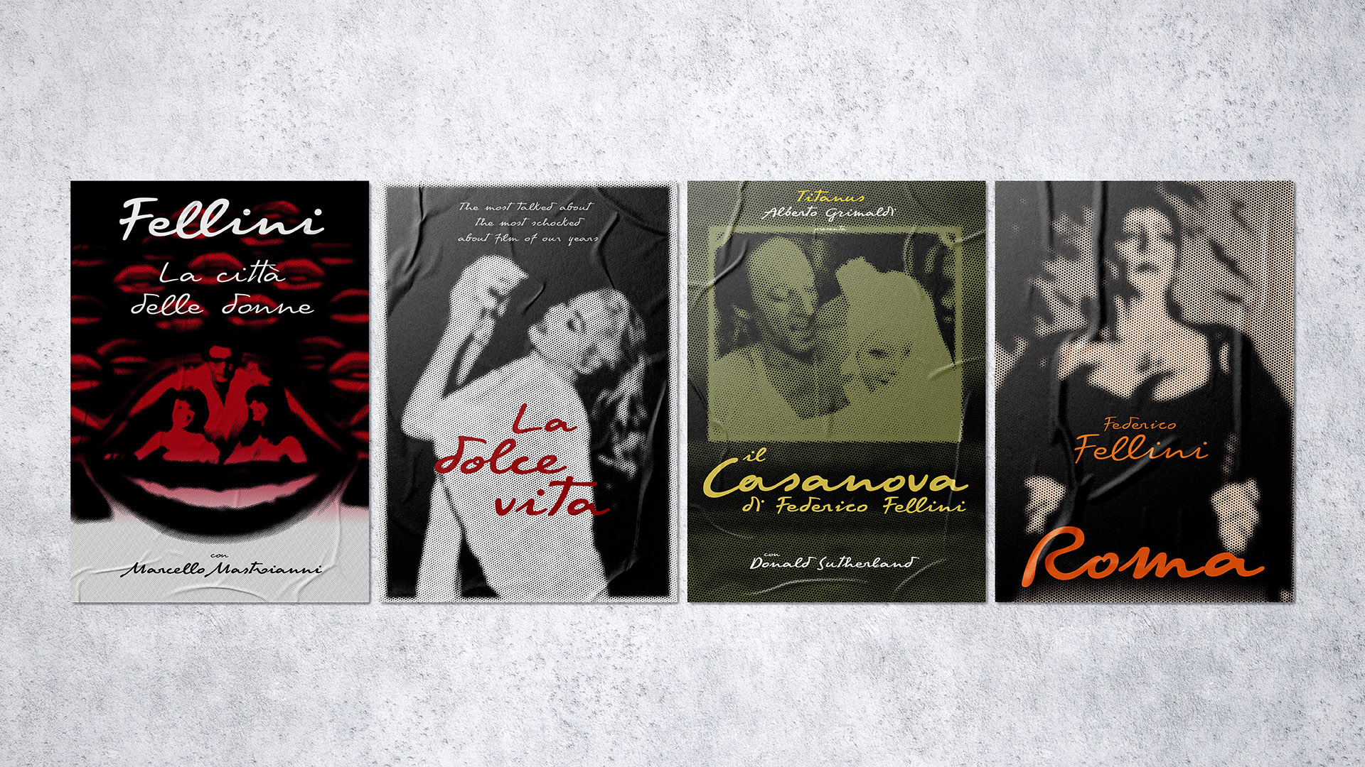
Der italienische Pavillon ist dem Maestro des Kinos, Federico Fellini, gewidmet, einem Regisseur, dessen Beitrag zur Filmindustrie von unschätzbarem Wert ist. Er gilt als Klassiker und Innovator seiner Zeit; mehr als eine Generation von Filmemachern ist mit Fellinis Werken aufgewachsen. Trotz der Tatsache, dass seine Filme im 20. Jahrhundert gedreht wurden, sind ihre Einschaltquoten immer noch hoch.
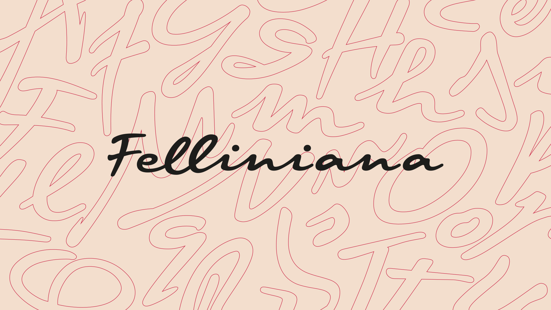
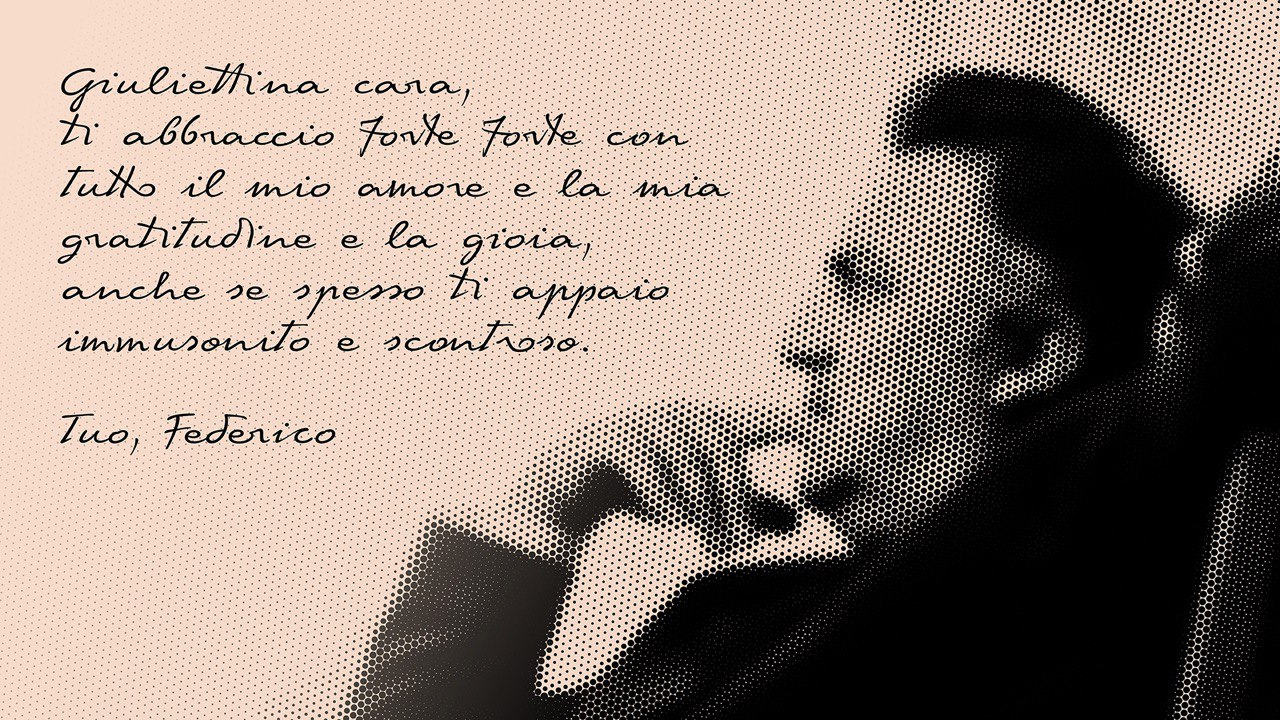
Seien Sie nicht überrascht, wenn Sie Informationen über die Filmfestspiele von Venedig lesen, denn die Schriftart Feliniana wurde eigens für diese Veranstaltung entworfen und war im Design des italienischen Pavillons zu sehen. Das Thema war kein Zufall — 2020 wäre der 100. Geburtstag von Federico Fellini. Felliniana ist eine Kursivschrift, die von Fellinis Handschrift inspiriert wurde. Die Briefe des Regisseurs wurden als Ausgangspunkt genommen und als Referenzmaterial für die zukünftige Schrift sorgfältig gesammelt.
Bereits in dieser Phase wandte sich Antonio an uns als technischen Partner. Sie verfügten über ein System, mit dem sie eine auf der Handschrift basierende Schrift erstellen konnten. Das Konzept und der Umfang der zukünftigen Schriftfamilie waren in den zur Verfügung gestellten Materialien klar definiert. Die Digitalisierung, die Übertragung der Glyphen in einen Schrifteneditor und die Gestaltung der Schrift wurden von unseren Partnern geplant, und TypeType hatte die Aufgabe, ihre Arbeit in eine funktionsfähige Schrift umzuwandeln.
Da das Budget begrenzt war, wurde auch der Umfang der Aufgaben klein geplant. Trotzdem war das Mastering für Felliniana eine wertvolle Erfahrung für uns, da wir an einem Projekt mit Weltruf beteiligt waren.
In der Verhandlungsphase diskutierten wir jede Option und entwarfen einen Plan für die weitere Arbeit. Das handgeschriebene Kunstwerk im Font-Format erreichte TypeType Studio im Oktober, und bereits im Dezember lieferten wir eine funktionierende Schriftfamilie.
Eine Schrift für die Filmfestspiele in Venedig zu entwickeln, schien eine vielversprechende Idee zu sein. Aber wir waren auch daran interessiert, eine handgeschriebene Schrift mit einer so faszinierenden Hintergrundgeschichte für die technische Arbeit zu übernehmen.
Die meisten Projekte des TypeType-Studios haben mit Schreibmaschinenschriften zu tun. Natürlich sind unsere Erfahrungen nicht auf Schreibmaschinenschriften beschränkt, aber die meisten handgeschriebenen Schriften wurden unter unserer experimentellen Marke Piñata veröffentlicht. Bei der Entwicklung dieser Schriften lernten wir die Besonderheiten der technischen Arbeit an solchen Schriften kennen und erkannten den großen Unterschied in der Herangehensweise.
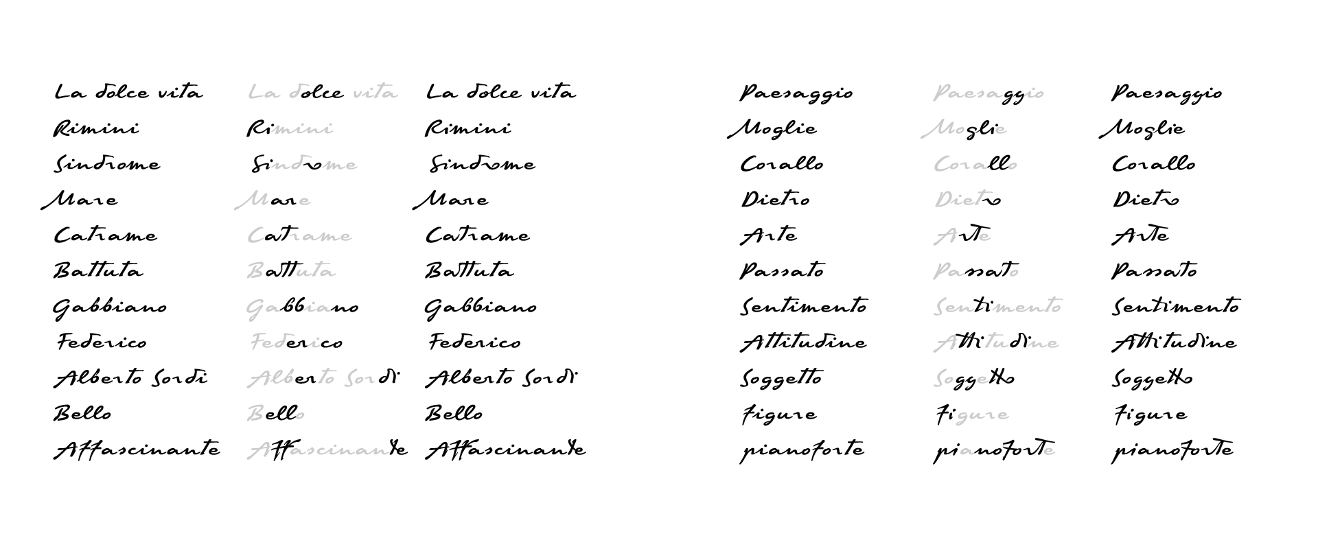
Eine handgeschriebene Schrift ist für einen technischen Spezialisten immer ein lebendiges, sehr dynamissches Material. Dabei spielt es keine Rolle, ob wir gescannte Buchstaben oder eine digitalisierte und im Editor zusammengesetzte Version erhalten. Bei der Arbeit mit solchen Schriften ist es unmöglich und sogar schädlich, alle Regeln anzuwenden, die für maschinengeschriebene Schriften vorgeschrieben sind. Dies gilt für die Abstände, das Kerning und die Form der Glyphen. Viele Aspekte können aus typografischer Sicht nicht ganz korrekt sein, sind es aber aus handgeschriebener Sicht. Zum Beispiel die Form der Buchstaben: Ein und derselbe Mensch schreibt einen Buchstaben nie genau gleich, und es ist wichtig, dass sich dies im Font widerspiegelt, da sonst die Gefahr besteht, dass die Lebendigkeit der Handschrift im fertigen Font verloren geht. Solche Besonderheiten kann es viele geben.
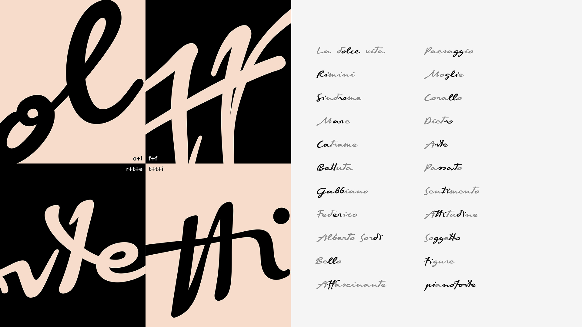
Federico Fellini verband übrigens selten Groß- und Kleinbuchstaben miteinander, so dass zwischen ihnen oft ein freier Raum zu sehen ist. Dies fällt in seinen Briefen auf, die als Referenz für Felliniana dienen, und es war wichtig, dieses Merkmal zu vermitteln. Fellinis Handschrift zeichnet sich außerdem durch glatte Linien und einen starken Ausdruck aus. Antonio Pace, der für Capelli arbeitet, war in der Lage, den Geist der Handschrift in die Schrift zu übertragen. Die Aufgabe von TypeType bestand darin, die Schrift technisch zu verfeinern und ein funktionierendes Werkzeug zu liefern.
Aufgrund des engen Zeitrahmens und des minimalen Budgets wurde auf eine visuelle Bearbeitung verzichtet. Außerdem kam die digitalisierte Nachahmung der Handschrift den Autoren sehr entgegen. Das technische Team von TypeType führte ein Audit der Schriftquelle durch, um Fehler in der Konturausrichtung zu korrigieren, das Vorhandensein oder Fehlen von Ankern in einigen Glyphen zu bestimmen und teilweise die Abstände zu überprüfen. Für einige der Änderungen mussten wir zusätzliche Genehmigungen einholen, z.B. für die Zeichnung einiger Glyphen — einige wurden für kleinere Überarbeitungen zurückgeschickt.
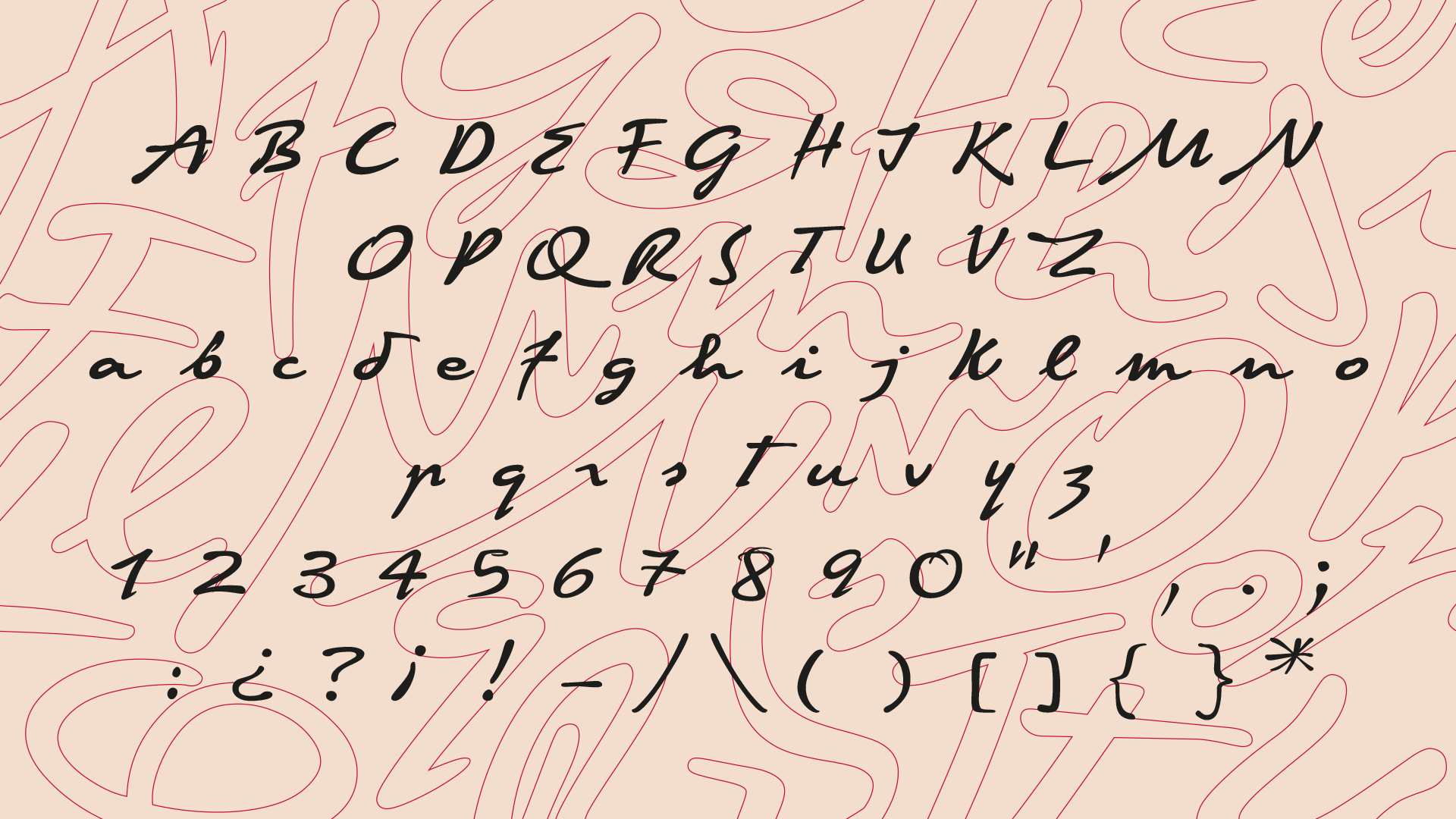
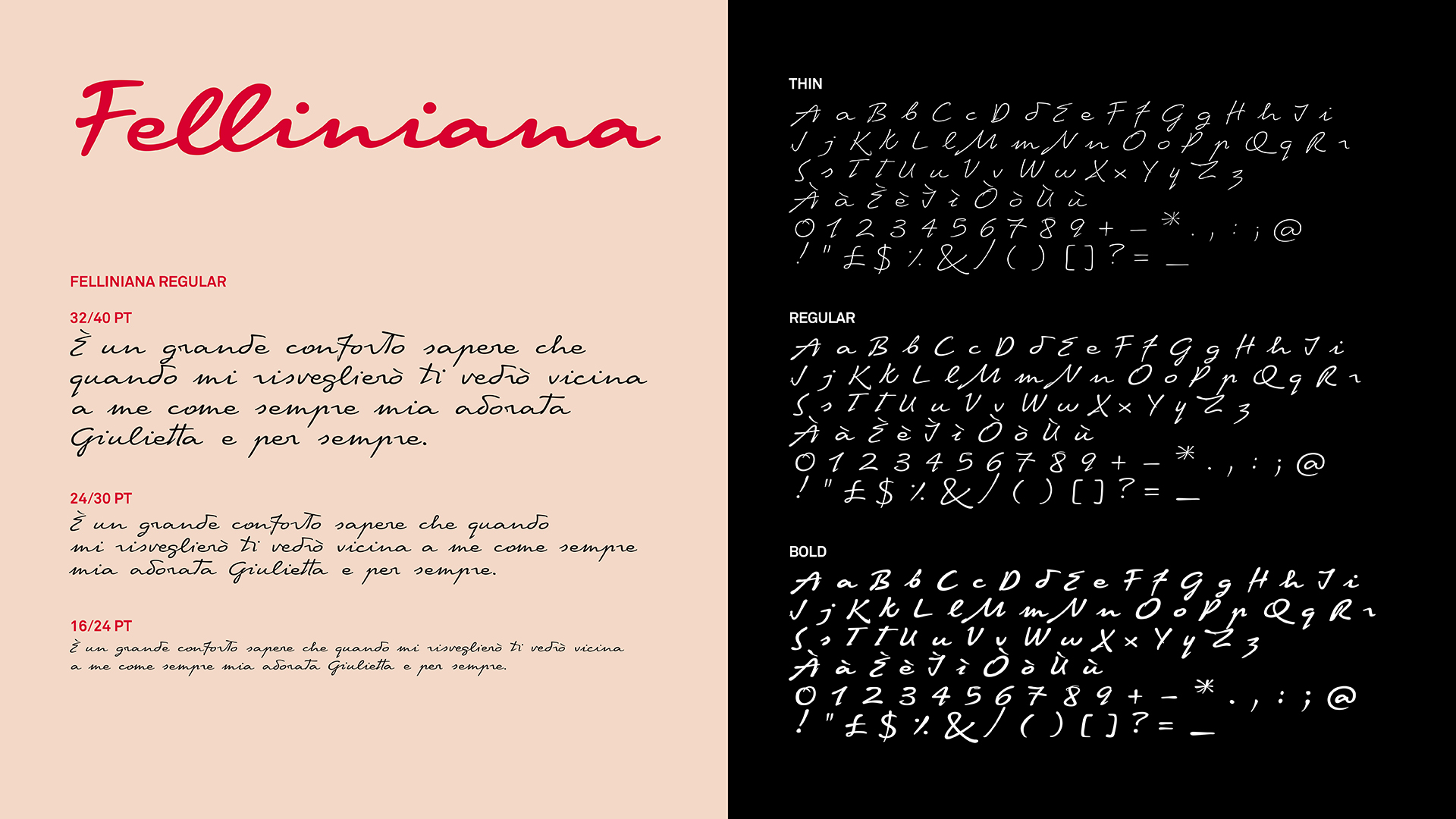
In der korrigierten Datei haben wir OpenType-Features hinzugefügt und Font Info eingerichtet. Nur für die Ligaturen, die aus Fellinis handschriftlichen Texten entlehnt waren, haben wir Features angegeben. Insgesamt verfügte die Schrift über zwei gerenderte Schriftschnitte, einen dünnen und einen fetten, sowie einen interpolierten, d. h. von der Software automatisch erzeugten. Wir haben uns in der technischen Phase mit der Zwischenschrift beschäftigt und auch die Korrektheit der Konstruktion der oberen und unteren diakritischen Zeichen in allen drei Stilen überprüft.
Natürlich wurde auch die Richtung der Konturen überprüft. In der Kursivschrift ist dies besonders wichtig, da sich die Glyphen oft überschneiden, was bedeutet, dass sie die gleiche Richtung haben müssen, damit an den Überschneidungen keine weißen Flecken entstehen.
In nur 10 Arbeitstagen haben wir Felliniana in ein funktionierendes Werkzeug verwandelt. Diese handgeschriebene Schrift wurde später verwendet, um Zitate und Gedanken von Federico Fellini für den italienischen Pavillon bei den 77. Internationalen Filmfestspielen von Venedig zu verzieren.
Das Mastering für die Felliniana ist nicht nur eine stilvolle Linie im Portfolio des TypeType Studios geworden. Dank dieses Projekts konnten wir Erfahrungen mit dem Mastering einer handschriftlichen Schrift sammeln, die von internationalen Experten erstellt wurde. Seien wir ehrlich, die Arbeit an der technischen Seite einer solchen Fremdschrift ist so, als würde man Manuskripte zum Leben erwecken und sie in ein Werkzeug verwandeln.
Die Arbeit an der Felliniana mit unseren Kollegen aus Italien war aufregend und angenehm, vor allem, weil wir gemeinsam eine großartige Schrift für die Filmfestspiele von Venedig geschaffen haben.
An der Schrift beteiligt:
Kreativer Leiter: Emanuele Cappelli
Schriftgestaltung: Antonio Pace, Lorenzo Properzi
Beschriftung: Giovanni Dal Ben
Font Mastering: TypeType Team