
Die Schriftfamilie TT Commons™ Pro muss nicht vorgestellt zu werden. Sie ist seit vielen Jahren der Bestseller von TypeType. Und das sind nicht nur Worte — seit 2018 ist die Schriftfamilie in über 93 % der Zeit, in der sie auf Websites zu sehen ist, ein Bestseller.
Die TT Commons™ hat eine faszinierende Geschichte, denn sie wurde 2016 entwickelt und war ursprünglich gar nicht als kommerzieller Font gedacht. Nichtsdestotrotz wurde die TT Commons™-Familie in ihrer klassischen Version in zwei Versionen veröffentlicht, und 2021 wurde sie einer umfassenden Überarbeitung unterzogen und erhielt den neuen Namen TT Commons™ Pro.
Anlässlich der Veröffentlichung der neuen Unterfamilie TT Commons™ Pro Mono haben wir uns entschlossen, die Designer hinter die Kulissen des Schriftdesigns blicken zu lassen und zu erzählen, wie eine Hausschrift, die ursprünglich für den internen Gebrauch von TypeType entwickelt wurde, zu einer der treibenden Kräfte des Studios wurde.
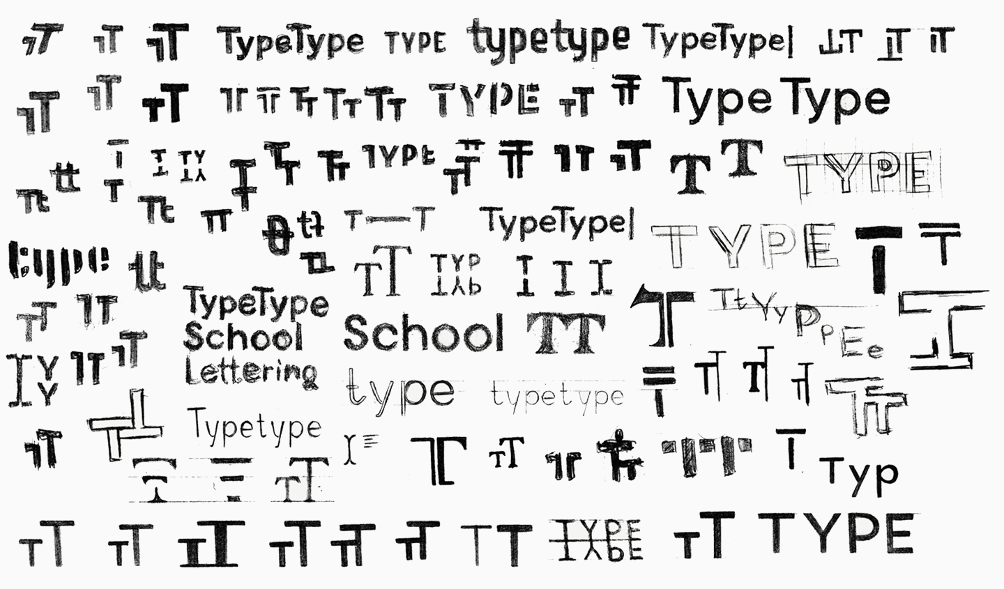
Erste Skizzen und Entwicklung
Ende 2016 hatte Pavel Emelyanov, der Autor von der TT Commons™, die Idee, eine Hausschrift für das TypeType-Studio zu entwerfen. Wir wollten eine interessante und einprägsame Schriftfamilie, die gleichzeitig prägnant und minimalistisch ist. Schließlich hat unsere Corporate Identity einen neutralen Charakter und die Schrift sollte Teil dieses Stils sein. Wir planten, unser Logo, die neue Website, Kundenverträge und interne Dokumente mit der entwickelten Schrift zu gestalten.
Die Schrift sollte ausdrucksstark, aber gleichzeitig neutral und einfach sein. Mit dieser Idee entstanden die ersten Skizzen — Optionen für das Logo und einige Buchstaben.
Dann erweiterten wir die Schriftkomposition und arbeiteten nur noch an einer Schrift, die zwischen Medium und DemiBold lag. In etwa zwei Wochen hatten die Spezialisten des Studios die Schrift fertiggestellt, und sie war bereit für den Einsatz.
Die Schrift erhielt den Namen TT Commons™, wie in «common», also «gemeinsam». Wie geplant, gestalteten wir die gesamte Corporate Identity mit der neuen Schrift. Wir schufen eine ästhetische Schrift, die den Grafikdesignern optisch gefiel und den Kollegen, die mit den Dokumenten arbeiteten, wegen ihrer Einfachheit und Benutzerfreundlichkeit gefiel.
Eine Besonderheit der Schrift war, dass die TT Commons 11 % kleiner war als Standardschriften. Normalerweise beträgt die Höhe von Großbuchstaben 700 Schriftgradeinheiten, und die Größe von Großbuchstaben in der TT Commons™ beträgt 630. Diese Besonderheit ergab sich ganz natürlich, und für den internen Gebrauch behinderten solche Parameter die Arbeit mit der Schrift überhaupt nicht, und wir hatten ursprünglich nicht vor, die TT Commons™ auf Websites zu veröffentlichen.
Entwicklung der kommerziellen Schrift
Unmittelbar nach der Veröffentlichung von der TT Commons™ als Unternehmensschrift erhielten wir viele Anfragen zu der neuen Schrift. Die Benutzer sahen die Schrift, die ihnen gefiel, und sie sahen auch den Namen TT Commons™ im Seitencode. Es gab eine Dissonanz: Es gab eine ästhetische Schrift, die die Leute gerne kaufen wollten, aber die Schrift selbst existierte weder auf den Schrift-Websites noch auf der Unternehmenswebsite.
Als das Interesse an der TT Commons zunahm, wurde uns klar, dass wir mit der Entwicklung einer kompletten Schriftfamilie für den kommerziellen Gebrauch beginnen mussten. Wir erweiterten den Zeichensatz, fügten Sprachunterstützung hinzu und erhöhten die Anzahl der Schriftschnitte. Dabei haben wir weder die Parameter der Schrift noch ihren visuellen Charakter verändert.
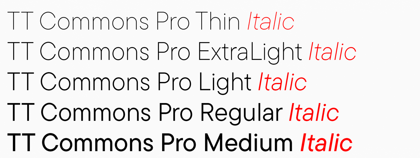
Im Sommer 2017 wurde der Black Font fertiggestellt, später wurde der Thin Font gezeichnet und dann ging es an die Zwischenfonts. Im Herbst waren alle geraden Schriftschnitte fertig: Thin, ExtraLight, Light, Regular, Medium, DemiBold, Bold, ExtraBold, Black. Während die technische Abteilung diese Strichstärken entwarf, arbeiteten die Schriftdesigner an den Kursiven.

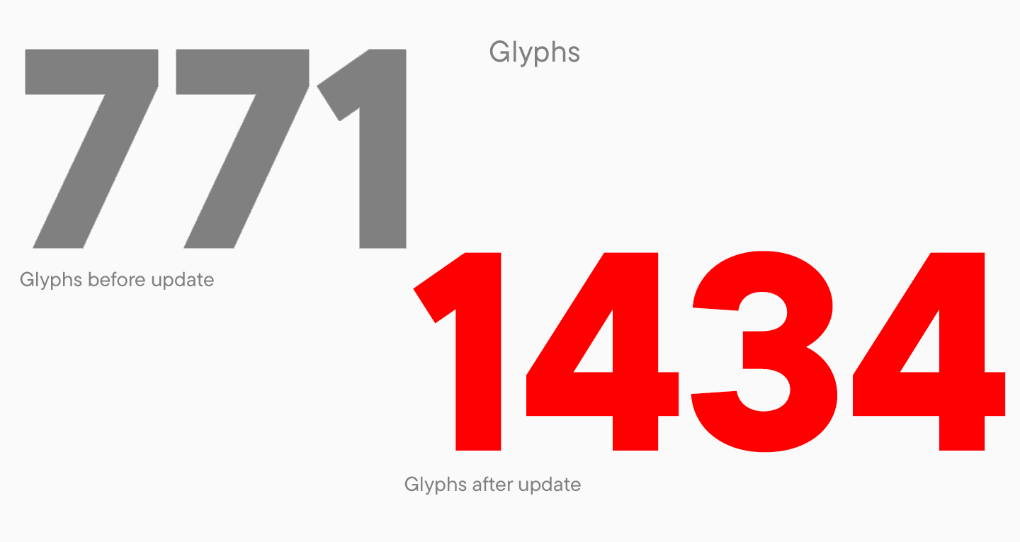
Anfang 2018 wurde die Schrift auf den Markt gebracht. Die erste kommerzielle Version von der TT Commons™ umfasste 18 Schriftschnitte und 771 Glyphen. Die Veröffentlichung erfolgte im März 2018 und die Schrift wurde fast sofort zum Bestseller des Studios.
Der technische Fortschritt des TypeType-Studios und die professionelle Entwicklung der Grafikabteilung hatten einen direkten Einfluss auf die Entwicklung von TT Commons™. Wir wollten die Schriftfamilie verbessern, neue interne Technologien einsetzen und den Zeichensatz erweitern. So entstanden die zusätzlichen Versionen 2, 2.1 und 2.110.
Wir haben die Schrift technisch verbessert, die Kodierung geändert und neue Glyphen hinzugefügt. In der Version 2.0 gab es immer noch 18 Schriftschnitte, aber der Zeichensatz bestand aus 1230 Glyphen. In der Version 2.1 kamen neue Schriftschnitte hinzu, so dass es nun insgesamt 24 waren. Auch der Zeichensatz änderte sich: Statt 1230 gab es nun 1434 Zeichen.
Wir verbesserten die Schrift ständig, und jede Version war ein natürlicher Schritt in der Entwicklung des Projekts. Trotz der großen Veränderungen behielt die Schrift all ihre Eigenschaften, die Designer auf der ganzen Welt so sehr liebten.
Die letzte Version der klassischen TT Commons™ wurde 2019 veröffentlicht, aber nach der Veröffentlichung begannen wir mit den Vorbereitungen für ein neues, globales und bedeutendes Upgrade für das Projekt. Die meistverkaufte Schrift stand kurz vor der Wiedergeburt und einer fast vollständigen Neugestaltung.
Beiträge unserer Kunden zur TT Commons™ und weitere Anpassungen
In unserem Studio gibt es eine unausgesprochene Regel: Höre immer auf die Meinung des Publikums. Die Kommentare der Nutzer zu unseren Schriften helfen uns, unsere Projekte weiterzuentwickeln, zu verbessern und zu verschönern. Natürlich ist das nicht alles: Unser Team ist immer bestrebt, professioneller und besser zu werden. Aber ohne Feedback ist es schwieriger zu verstehen, ob wir in die richtige Richtung gehen oder nicht.
In der Geschichte von der TT Commons™ waren es die Kommentare der Nutzer, die dazu geführt haben, dass die Schrift jetzt für Ihr Projekt zum Kauf angeboten wird. Das Feedback der Öffentlichkeit hat jedoch die Entwicklung von TT Commons während der gesamten Entwicklungszeit beeinflusst.
Seit die Schrift auf den Plattformen veröffentlicht wurde, haben wir viele Kommentare und Fragen dazu erhalten. Dabei handelte es sich hauptsächlich um Projekte zur Anpassung von der TT Commons™, die später die Entwicklung der TT Commons™ Pro beeinflussten.
Die Anpassung von Schriften ist ein üblicher TypeType-Service, bei dem wir eine Schrift für ein bestimmtes Projekt modifizieren, indem wir sie technisch, visuell oder anderweitig verändern. Zu den häufigsten Anfragen gehören das Hinzufügen eines Logos zu den Zeichen eines Fonts, die Reduzierung der Anzahl der Sprachen, um den Font zu vereinfachen, und die Umbenennung des Fonts für den Kunden.
Alle oben genannten Anpassungen wurden auch bei der TT Commons™ vorgenommen, aber einige der Anfragen waren nur für diese Schriftart relevant.
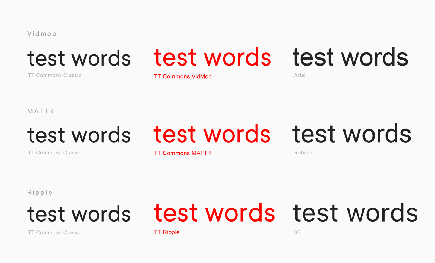
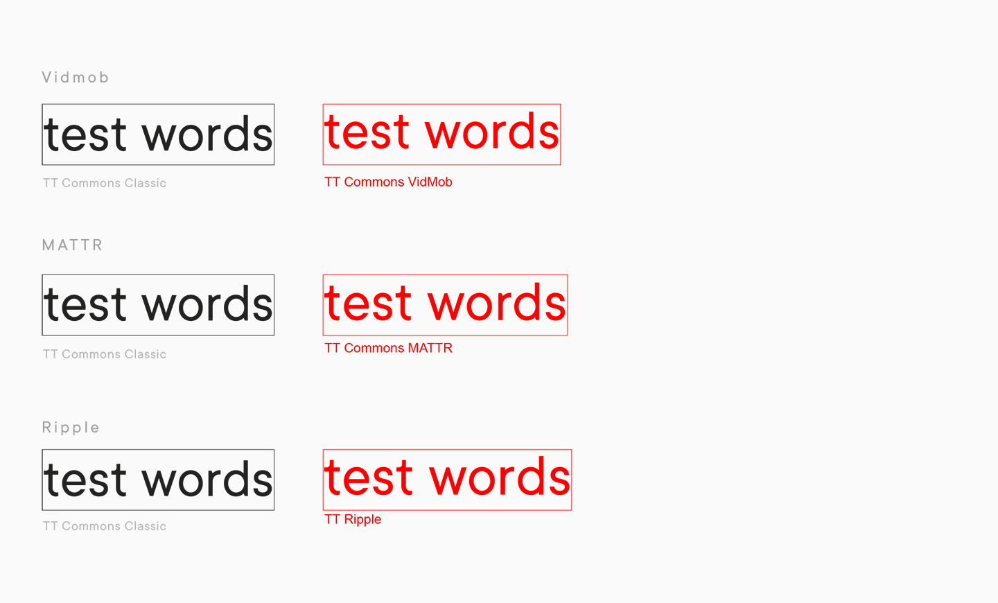
Sie erinnern sich vielleicht, dass die TT Commons™ mit benutzerdefinierten Größen erstellt wurde, die um 11 % verkleinert wurden. Die ursprüngliche Funktion der Schriftart war für viele Kunden nicht sehr praktisch, so dass die häufigste Anfrage zur Anpassung von TT Commons™ darin bestand, die Schriftgrößen auf die Standardgrößen der beliebtesten Schriftarten zu erhöhen.
Eine solche Anpassung wurde beispielsweise von Vidmob, MATTR und Ripple gewünscht.
Im nächsten Kapitel werden wir erläutern, wie solche Anfragen die Entwicklung von TT Commons™ Pro beeinflusst haben, und nun kommen wir zu einer anderen häufigen Art von Anpassung, die für TT Commons™ vorgenommen wurde. Diese Anfragen kamen häufiger von Designern, die mit Interface-Programmen arbeiten. Der Font hat so etwas wie eine Mittellinie, d.h. eine bedingte Linie, an der der Font ausgerichtet wird, z.B. in Schaltflächen. Damit Wörter harmonisch wirken, sollten sie zentriert sein, aber viele Designer hatten Schwierigkeiten mit TT Commons™, weil die Mittellinie leicht verschoben war. Wir haben die Höhe der Mittellinie bei vielen Projekten geändert und achten seitdem bei allen unseren Schriften stärker auf diesen Parameter. Übrigens: Designer, die mit Schnittstellenprogrammen arbeiten, werden mit der TT Commons™ Pro zufrieden sein.
Natürlich gab es noch weitere globale Anpassungen. Dabei handelt es sich zum Beispiel um grafische Änderungen an Glyphen, die von Firmen gewünscht wurden, um die Schrift an die Corporate Identity des Projekts oder an die Wünsche des Kunden anzupassen.
Die umfangreichsten Anpassungen haben wir bei Ripple vorgenommen, wo wir im Laufe der Arbeit die folgenden Änderungen vorgenommen haben.
- Wir haben den ursprünglich schrägen Stamm des Buchstabens a gerade geschnitten.
- Der Sporn im Großbuchstaben G wurde entfernt.
- Die Öffnung im Buchstaben e wurde vergrößert.
- Das S wurde durch ein breiteres ersetzt.
- Die Prozentzeichen und die Ziffern 69 wurden neu gezeichnet.
- Die fertige Schrift erhielt einen neuen Namen und wurde Teil des Projekts.
Natürlich sind einige Anpassungen einzigartig und hängen mit der Vision des Kunden für sein Projekt zusammen. Im Fall von TT Commons™ waren einige Anpassungen jedoch wiederkehrend, und wir konnten die Wünsche der Mehrheit nicht ignorieren.
Es war unmöglich, eine neue Version 3.0 von TT Commons™ zu erstellen, da eine globale Neuinterpretation der Schrift erforderlich war. Und so begannen wir mit der Arbeit.
Die Entwicklung von der TT Commons™ Pro und TT Commons™ Pro Mono
Als wir mit der Arbeit an TT Commons™ Pro begannen, hatten wir uns als Schriftdesign-Studio schon sehr weit entwickelt. Wir hatten bereits unsere eigenen Systeme, um bestimmte Aufgaben zu erledigen, z. B. einen proprietären Ansatz für Kerning und manuelles Hinting. Unser Programmierer hatte nützliche Software für die Arbeit mit Schriften entwickelt, und die Grafikabteilung hatte sich professionell weiterentwickelt.
Ein bereits bekanntes Projekt komplett neu zu gestalten und dabei seine Einzigartigkeit zu bewahren, war eine spannende und zugleich sehr verantwortungsvolle Aufgabe.
Dies gilt umso mehr, wenn man bedenkt, dass wir die Veröffentlichung der neuen Version nicht um viele Jahre verzögern wollten. Aus diesem Grund arbeiteten mehrere Spezialisten parallel an TT Commons™ Pro. Das war eine Herausforderung, denn jeder Designer hatte seine eigene Vision und Arbeitslogik, die unweigerlich zum Ergebnis beitrugen. Wenn verschiedene Spezialisten an der gleichen Aufgabe arbeiten, ist es nicht nur notwendig, ihre Aktionen zu koordinieren, um ein harmonisches Ergebnis zu erzielen, sondern auch, um den Enthusiasmus und die kreative Vision jedes Einzelnen zu erhalten. Wir sind der Meinung, dass uns dies gelungen ist, indem wir die Erfahrungen aus der parallelen Arbeit mehrerer Spezialisten in anderen Großprojekten genutzt haben.
Dies ist nur ein kleiner Teil der gigantischen Arbeit, die wir an TT Commons™ Pro geleistet haben.
Zuerst wollten wir die Schriftgröße in der neuen Schriftart auf die von den Benutzern gewohnte Größe erhöhen, da dies ein häufiger Wunsch der Öffentlichkeit war. Zuvor führten wir eine Untersuchung durch, um die optimalen Werte für die neue Schriftart zu ermitteln, damit TT Commons™ Pro erkennbar, lesbar und neutral bleibt. Die Höhe der Großbuchstaben in der Pro-Version beträgt nun 700 Punkte, die der Kleinbuchstaben 500 Punkte.
Bei unseren Recherchen stießen wir auf eine weitere Besonderheit: Die Standardschrift von TT Commons™ wirkte kräftiger als die Standardschriften anderer Schriften. Deshalb arbeiteten wir bei TT Commons™ Pro mit Standardgewichten, was uns zwang, die Gewichte der gesamten Schriftfamilie zu überdenken. Auf den ersten Blick ist der Unterschied zwischen den Versionen nicht so offensichtlich, aber bei genauerem Hinsehen wird er deutlich.
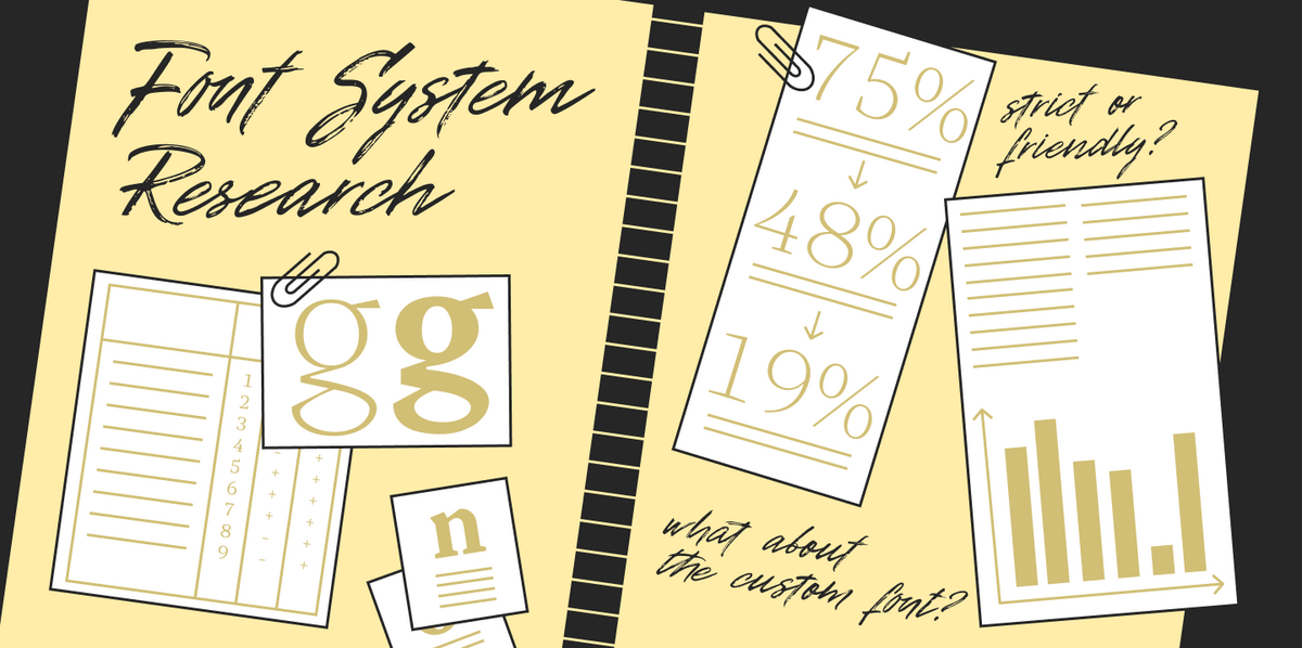
Bei der Arbeit mit TT Commons™ Pro haben wir übrigens mehrere Forschungsprojekte durchgeführt. Eines davon war ein Blindtest, mit dem wir eine der wichtigsten Aufgaben bei der Arbeit an der Schriftfamilie lösen konnten.
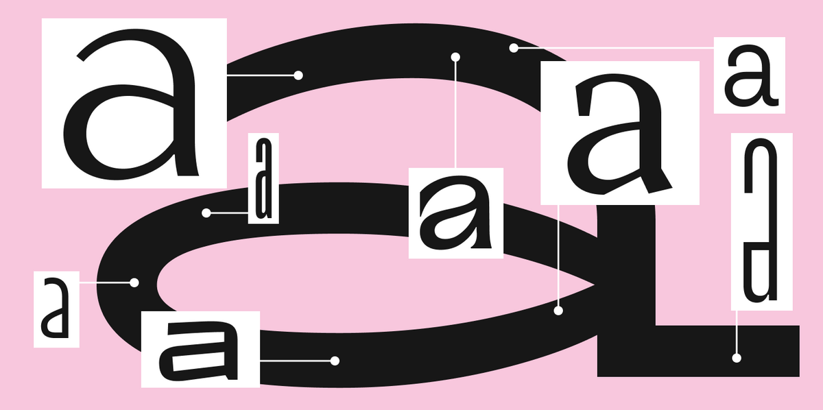
Wir sprachen über die Form der Ovale, die in der klassischen Version von TT Commons™ rautenförmig waren. Wir wollten sie in rundere Formen umwandeln, hatten aber gleichzeitig die Befürchtung, dass dies der legendären Schrift ihren charakteristischen grafischen Charakter nehmen würde.
Wir trauten uns nicht, eine so wichtige Entscheidung allein in der TT Commons™ Pro-Arbeitsgruppe zu treffen. Deshalb haben wir mehrere Varianten der Ovale entworfen und sie in Texten platziert, die in der Schrift gesetzt wurden. In einer Version blieben die Ovale rautenförmig, in anderen bekamen sie rundere Konturen mit unterschiedlichen Rundungsgraden. Wir stellten eine Fokusgruppe aus Kollegen zusammen, die nicht an der Arbeit an TT Commons™ Pro beteiligt waren, und zeigten ihnen Texte, in denen die Versionen mit herkömmlichen Symbolen gekennzeichnet waren.

Zunächst bemerkten die Kollegen nicht, was sich genau geändert hatte, was ein Vorteil war. Wir stellten fest, dass die Schrift ihren Charakter nicht verliert, wenn die Form der Ovale verändert wird. Später beschrieben jedoch alle Mitglieder unserer Fokusgruppe, was genau sich an der Schrift geändert hatte, und die Mehrheit stimmte für die radikalste Version mit den rundesten Ovalen. In TT Commons™ Pro können Sie die neue Form der Ovale sehen, bei der die Rautenform verschwunden ist.
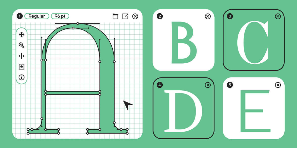
Bei der Arbeit an TT Commons™ Pro haben wir alle Punkte und Konturen sorgfältig überprüft, die Regale, die Stieldicke und die Diagonalen korrigiert und dabei darauf geachtet, dass die Authentizität der klassischen TT Commons™ erhalten bleibt.
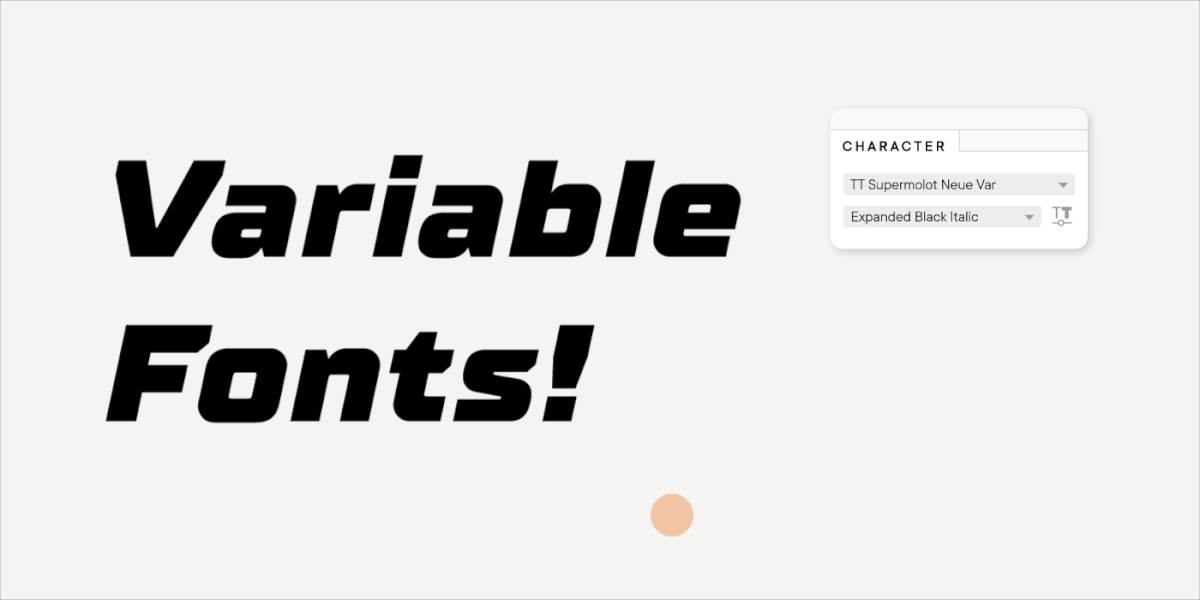
Im Laufe der Arbeit haben wir die Schrift buchstäblich neu gezeichnet und den Bestseller harmonisch in einen neuen Rahmen gesetzt. Gleichzeitig haben wir den Zeichensatz erweitert und neue Sprachen und Stile hinzugefügt. Außerdem haben wir zwei neue Unterfamilien geschaffen: TT Commons™ Pro Condensed und TT Commons™ Pro Expanded. Sie stellen eine schmalere bzw. breitere Version der neuen TT Commons™ Pro dar und wurden zu einem integralen Bestandteil der variablen Schriften, an denen wir gearbeitet haben.
Variable Fonts sind die neuen Klassiker des Studios, und wir erstellen sie jetzt für fast alle neuen Schriften. Technisch gesehen haben wir uns schon lange darauf vorbereitet, vor allem, weil die Nachfrage nach variablen Schriften bei unseren Kunden sehr groß ist. Das ist nicht verwunderlich, denn mit einer solchen Schrift muss ein Designer nicht mehr aus vorhandenen Stilen auswählen, sondern kann eigene Stile mit Parametern erstellen, die ideal zum Projekt passen.

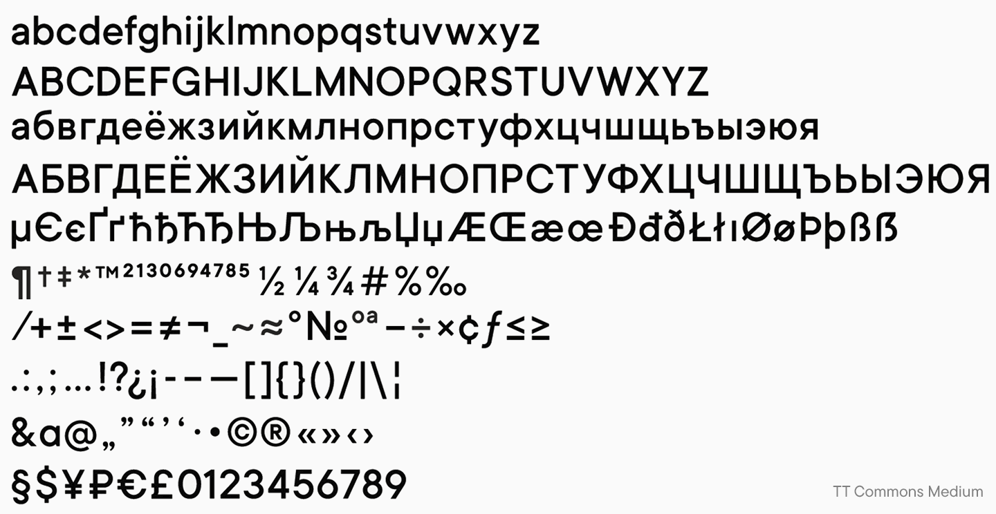
Die endgültige Version der TT Commons™ Pro wurde im Frühjahr 2021 auf Plattformen veröffentlicht. Die Schrift umfasst 62 Schriftschnitte, einschließlich des variablen Schnitts, und der Zeichensatz wurde auf eine Rekordzahl von 1546 Glyphen erweitert. Die Schrift ist handgeschnitten, perfekt gekernt und mit funktionalen Features ausgestattet, mit denen jeder Designer gerne arbeitet.
Wir haben versucht, den Umfang der Schrift zu maximieren. Deshalb begannen wir unmittelbar nach der Veröffentlichung von TT Commons™ Pro mit der Entwicklung einer neuen Monospace-Subfamilie.
Die Idee, unsere Bestseller durch Monospaced-Fonts zu ergänzen, hatten wir schon lange. Monospaced-Schriften wurden ursprünglich in der Programmierung verwendet und haben in den letzten Jahren auch im Design an Popularität gewonnen. Natürlich werden viele Menschen die vertraute TT Commons™ gerne als Monospace-Schrift verwenden, da diese Unterfamilie trotz neuer Formen die wichtigsten visuellen Merkmale der Hauptfamilie beibehalten hat.
Die eigenwillige Monospace-Schrift TT Commons™ Pro Mono, bei der die üblichen Glyphen in einem 600-Punkt-Quadrat angeordnet sind, kann für Designer eine echte Bereicherung sein. Schließlich verfügt die Schrift neben 14 Schriftschnitten auch über eine variable Version, und alle üblichen und funktionalen OpenType-Funktionen bleiben erhalten.
Für das Studio sind die TT Commons™ Pro und TT Commons™ Pro Mono wertvolle Projekte, die unser professionelles Wachstum, die kreative Vision der Schriftdesigner und die Bedürfnisse des Publikums verkörpern.

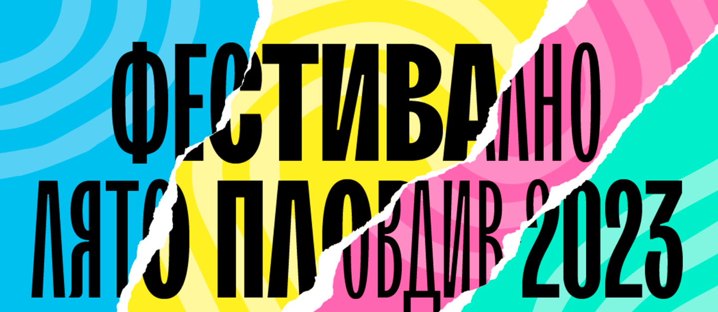
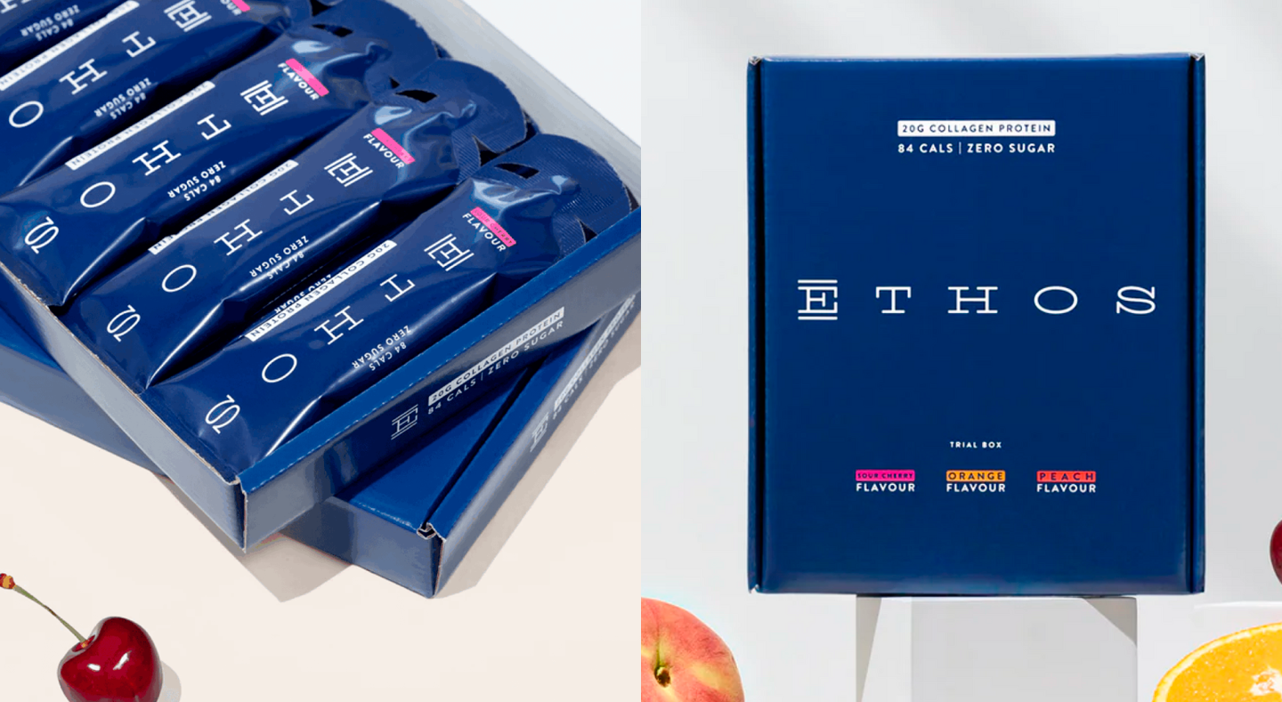
Bonus für Ästheten: TT Commons™ in Projekten
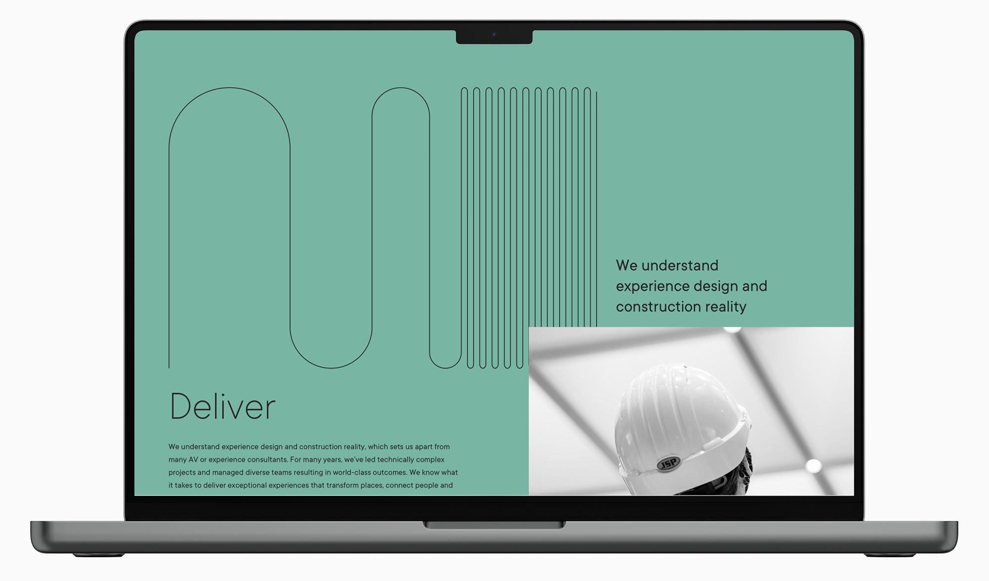
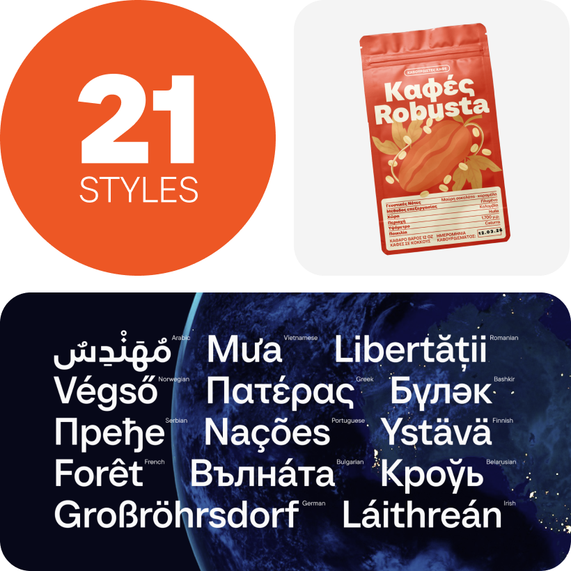
Wir haben Ihnen die Geschichte eines der Top-Bestseller des Studios erzählt, aber Tatsache ist, dass Designer mit ihren Augen lieben. Genug der Worte, denn TT Commons™ und TT Commons™ Pro können auch ohne sie beeindrucken!
Zum Schluss zeigen wir Ihnen Beispiele, wie TT Commons™ und TT Commons™ Pro in realen Projekten eingesetzt werden: Lassen Sie sich zu eigenen Meisterwerken inspirieren.


P.S. Wenn Sie mehr über die Entwicklung von TT Commons™ Pro erfahren möchten, sehen Sie sich unsere Präsentation auf YouTube an.
An der Schrift beteiligt waren:
Pavel Emelyanov
Antonina Zhulkova
Marina Khodak
Ivan Gladkikh
+ TypeType-Team
FAQ
Was ist TT Commons™ und wie wurde die Schrift zum Bestseller?
TT Commons™ ist eine minimalistische und neutrale Sans-Serif-Schrift, die ursprünglich für die interne Identität von TypeType entwickelt wurde. Sie wurde zum Bestseller, nachdem Nutzer sie auf der Website der Foundry bemerkten, fragten, wo man sie kaufen könne, und das Team dazu brachten, die interne Schrift zu einer vollständigen kommerziellen Familie auszubauen. Die erste kommerzielle Version erschien 2018 und wurde fast sofort zu einem der Bestseller der Foundry.
Warum wurde TT Commons™ ursprünglich als Corporate Typeface entwickelt?
TT Commons™ wurde entwickelt, um Teil der eigenen visuellen Identität von TypeType zu werden. Die Foundry brauchte eine prägnante, einfache, neutrale, aber dennoch einprägsame Schrift für Logo, Website, Verträge und interne Dokumente.
Wie entwickelte sich TT Commons™ von einer internen Schrift zu einem kommerziellen Produkt?
Nachdem TT Commons™ in der Corporate Identity von TypeType erschien, begannen Nutzer, nach der Schrift zu fragen, und fanden ihren Namen im Website-Code. Da die Schrift nicht zum Kauf verfügbar war, entschied die Foundry, sie zu einer vollständigen kommerziellen Familie mit mehr Schnitten, breiterer Sprachunterstützung und erweitertem Zeichensatz auszubauen.
Welche Änderungen wurden in verschiedenen Versionen von TT Commons™ vorgenommen?
Die erste kommerzielle Version von TT Commons™ hatte 18 Schnitte und 771 Glyphen. Spätere Versionen verbesserten die technische Qualität, änderten die Kodierung, erweiterten den Zeichensatz und fügten neue Schnitte hinzu: Version 2.0 hatte 1230 Glyphen, während Version 2.1 auf 24 Schnitte und 1434 Glyphen anwuchs.
Wie beeinflussten Nutzerfeedback und Anpassungsanfragen die Entwicklung von TT Commons™?
Nutzerfeedback prägte TT Commons™ direkt. Häufige Anpassungsanfragen betrafen die Vergrößerung der Schrift auf Standardproportionen, die Anpassung der Mittellinie für Interface-Arbeiten und grafische Änderungen für Corporate-Identity-Projekte. Diese wiederkehrenden Anfragen wurden zu einem der Gründe für die Entwicklung von TT Commons™ Pro.
Was sind die wichtigsten Unterschiede zwischen TT Commons™ und TT Commons™ Pro?
TT Commons™ Pro ist eine grundlegende Neuinterpretation der ursprünglichen Familie. Sie besitzt Standardproportionen, überarbeitete Gewichtungen, verbesserte technische Qualität, mehr Glyphen, mehr Schnitte, manuelles Hinting, besseres Kerning, funktionale OpenType-Funktionen und eine variable Schrift.
Warum war für TT Commons™ Pro ein vollständiges Redesign nötig statt eines einfachen Updates?
Eine einfache Version 3.0 reichte nicht aus, weil die wiederkehrenden Anpassungsanfragen tiefere Änderungen erforderten. Die Schrift brauchte eine grundlegende Neuinterpretation: Standardgrößen, angepasste Metriken, überarbeitete Gewichtungen, bessere Nutzbarkeit in Interfaces und ein ausgereifteres technisches System.
Welche technischen Verbesserungen wurden in TT Commons™ Pro eingeführt?
TT Commons™ Pro erhielt manuelles Hinting, verfeinertes Kerning, erweiterte OpenType-Funktionalität, eine variable Schrift, standardisierte Höhen für Groß- und Kleinbuchstaben sowie einen erweiterten Zeichensatz mit 1546 Glyphen. Die finale Pro-Version umfasst 62 Schnitte, einschließlich der variablen Version.
Was ist TT Commons™ Pro Mono und wie unterscheidet sie sich von der Hauptfamilie?
TT Commons™ Pro Mono ist eine monospaced Unterfamilie auf Basis von TT Commons™ Pro. Sie bewahrt den visuellen Grundcharakter der ursprünglichen Familie, platziert die Glyphen jedoch in einem festen Geviert von 600 Punkten. Sie umfasst 14 Schnitte, eine variable Version und die erhaltene OpenType-Funktionalität.
Was macht TT Commons™ zu einer vielseitigen Schrift für Branding- und Designprojekte?
TT Commons™ ist vielseitig, weil sie Neutralität, Einfachheit, Lesbarkeit und einen wiedererkennbaren, aber zurückhaltenden visuellen Charakter verbindet. Sie kann in Corporate Identity, Interfaces, Dokumenten, Websites und Branding-Systemen eingesetzt werden, ohne das Design zu dominieren.