

Sobre el tipo de fuentes tipográficas
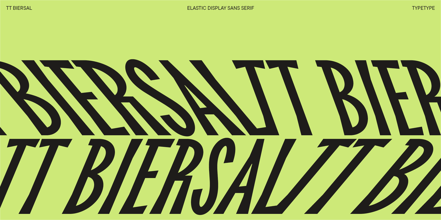
¡Conoce la nueva TT Biersal promocional! Una fuente distintiva y enérgica inspirada en la tipografía de la primera mitad del siglo XX.
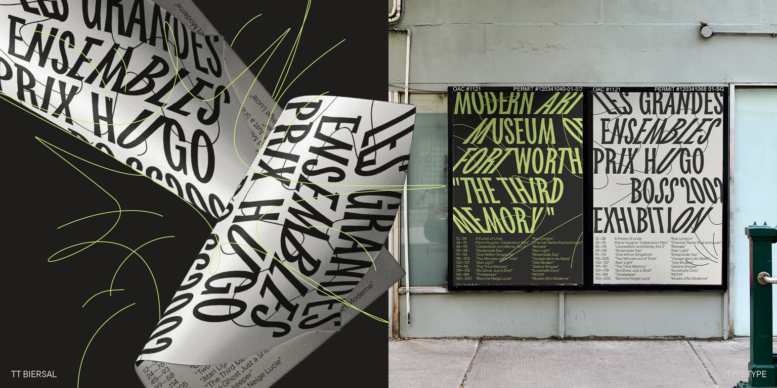
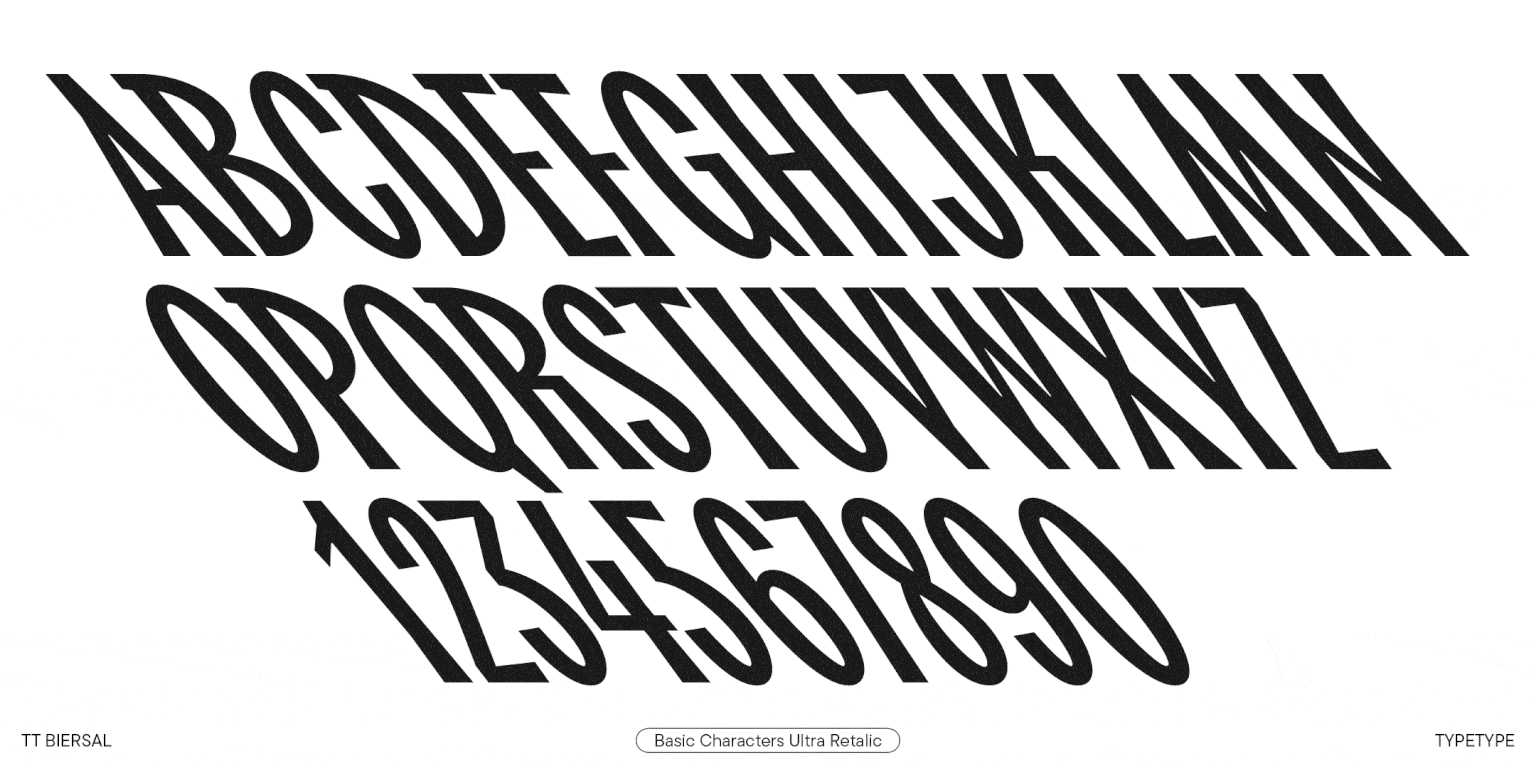
TT Biersal es un espectáculo grotesco con un carácter libre, travieso y aventurero. El punto de partida para su creación fue un cartel alemán de principios de los años 30. Queríamos preservar no sólo las proporciones, sino también la sensación de descuido y vivacidad de las letras de la referencia. El resultado es una fuente rica y densa con proporciones estrechas y formas asimétricas.
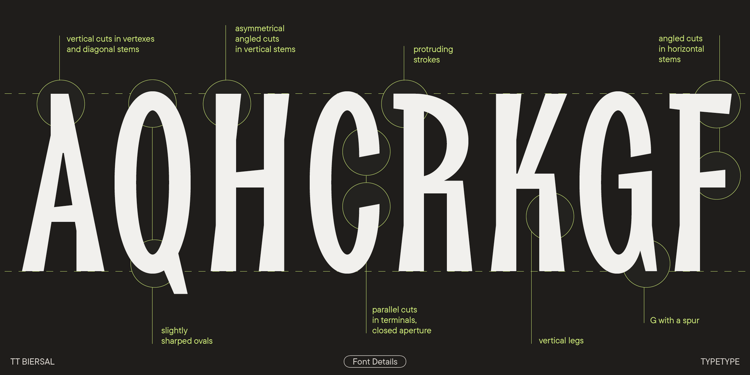
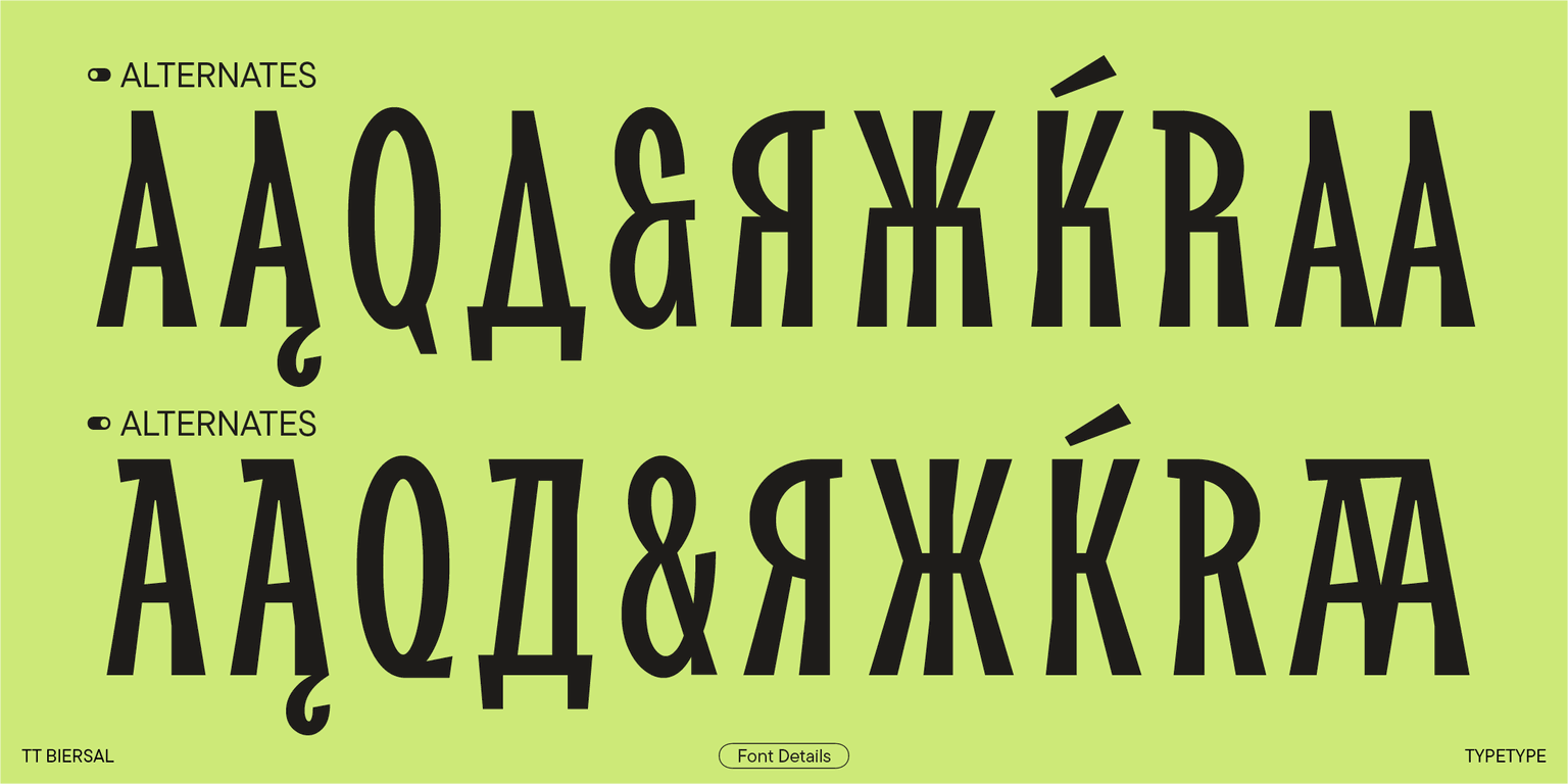
Los detalles característicos de TT Biersal son los cortes asimétricos en ángulo en carteles rectos y triangulares. Le dan a la fuente una sensación de estar hecho a mano: como si alguien recortara pedazos individuales de papel, vidrio o piedra y los ensamblara en un collage modular. Los cortes paralelos no estándar en los terminales de letras redondas dan dinamismo al diseño. En algunas letras, como «E», «P» y «B», se pueden ver pequeñas protuberancias, como si los trazos estuvieran ligeramente fuera de las raíces verticales al escribir con fluidez. Y los óvalos son ligeramente puntiagudos para estar en consonancia con los ángulos agudos de los signos verticales.
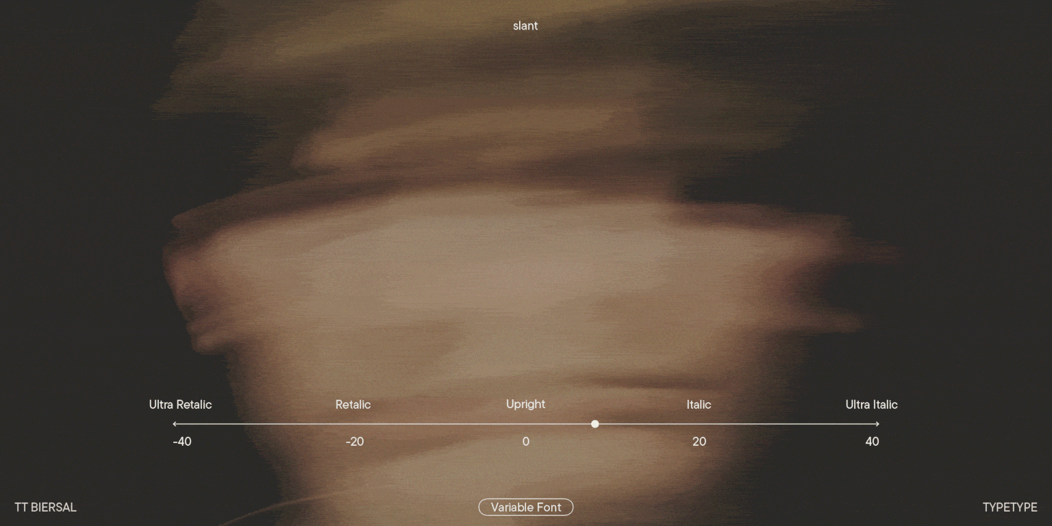
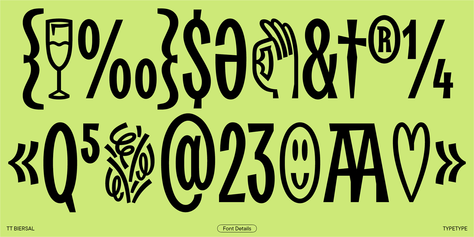
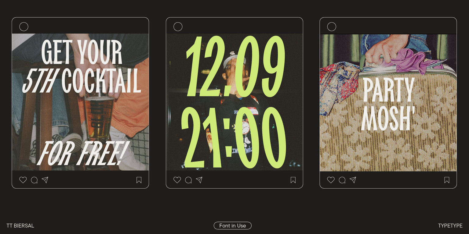
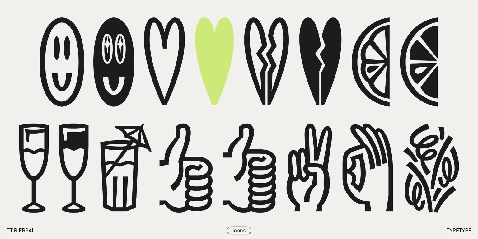
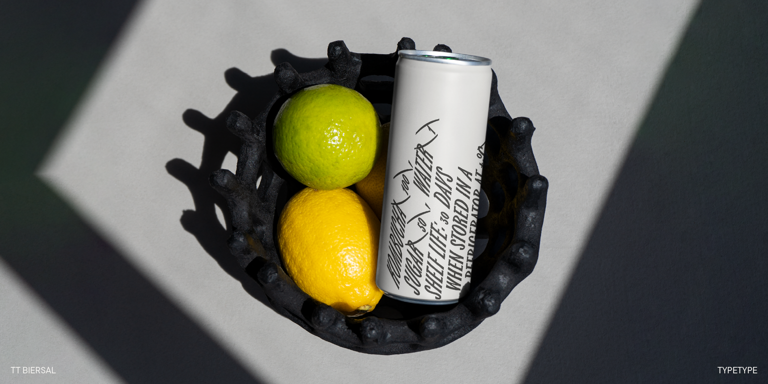
Gracias a los cortes angulares, las diagonales asimétricas y la composición tipográfica densa, el diseño de la fuente se asemeja al entrelazamiento de ramas contra un cielo azul claro. En estilos oblicuos, TT Biersal se vuelve aún más rápido y dinámico. Hemos agregado una inclinación extrema a las retálicas y cursivas: de -40° a +40°. Si combinas bloques de texto con diferentes ángulos, puedes crear el efecto de movimiento o sombra. Un conjunto de íconos con temas de fiestas ayudará a complementar el diseño.
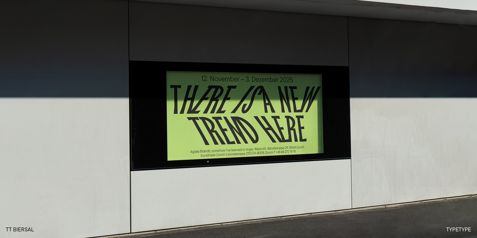
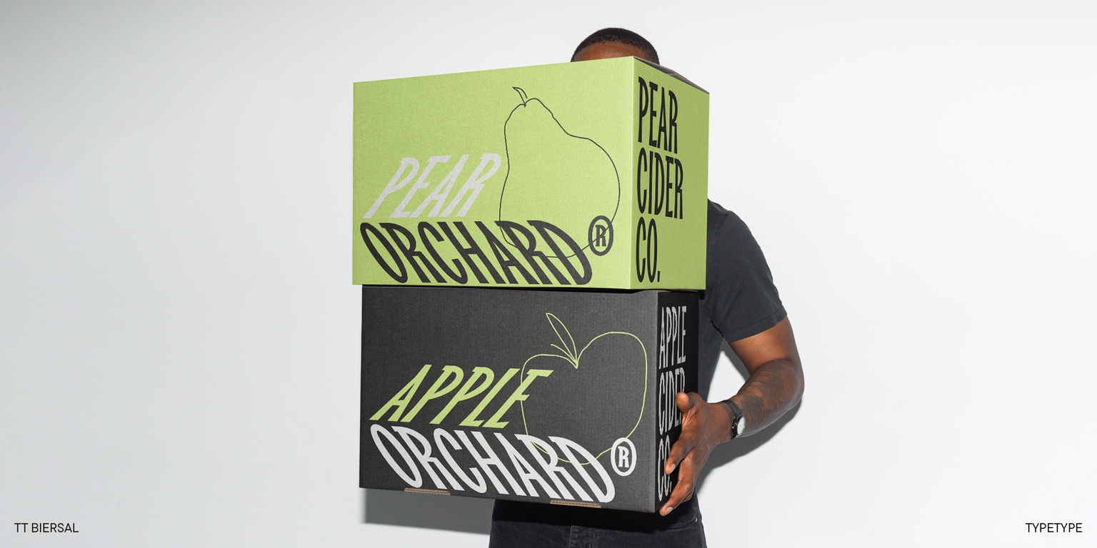
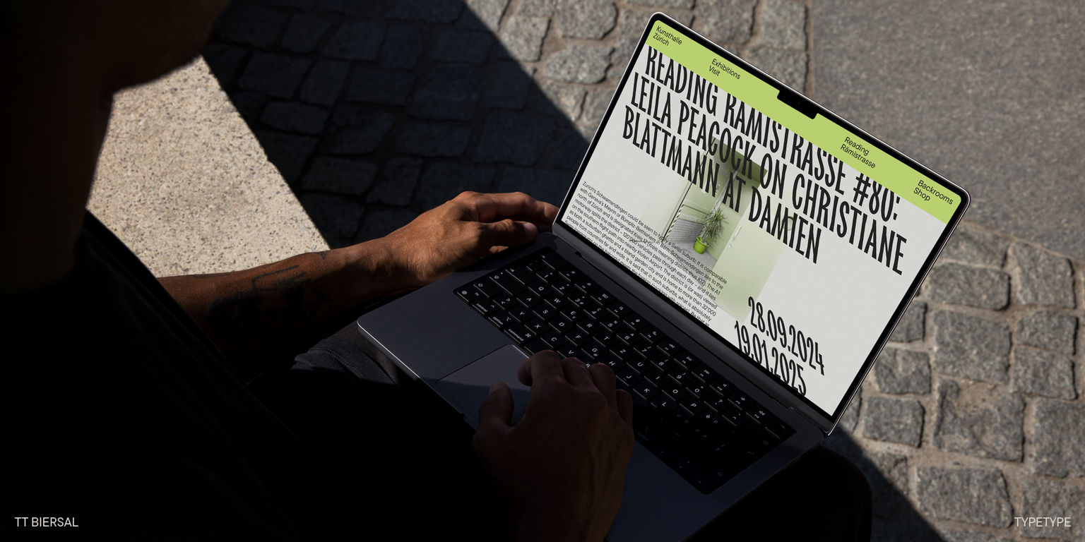
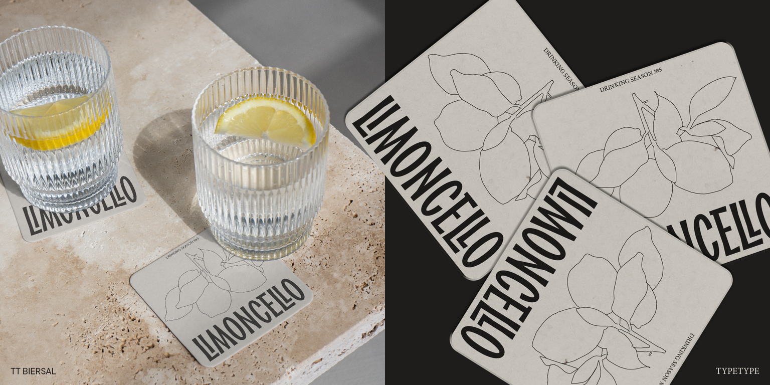
TT Biersal es perfecto para decorar festivales de música, exposiciones y carteles de películas. El espíritu alegre de la fuente agregará audacia a cualquier diseño. Y gracias al principio escrito a mano, complementará bien la identidad de las marcas especializadas en productos artesanales y hechos a mano.
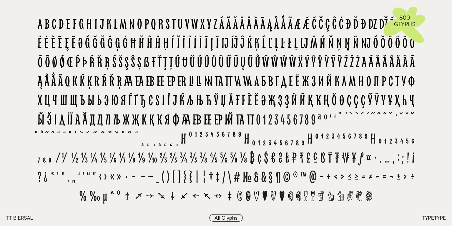
TT Biersal incluye:
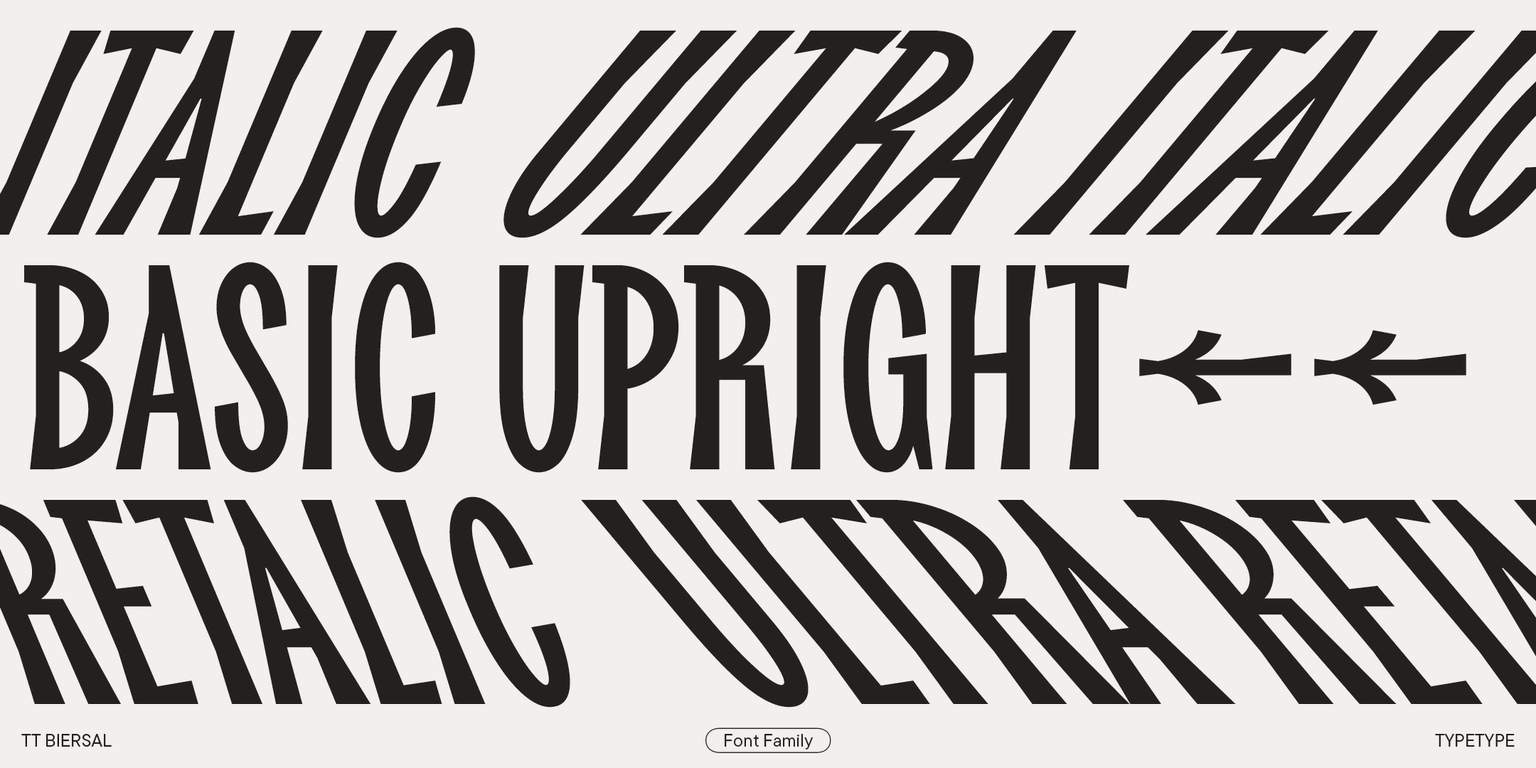
- 6 estilos: 1 recto, 2 cursiva, 2 retalicos y 1 fuente variable, que cambian a lo largo del eje de inclinación;
- 799 caracteres en cada estilo;
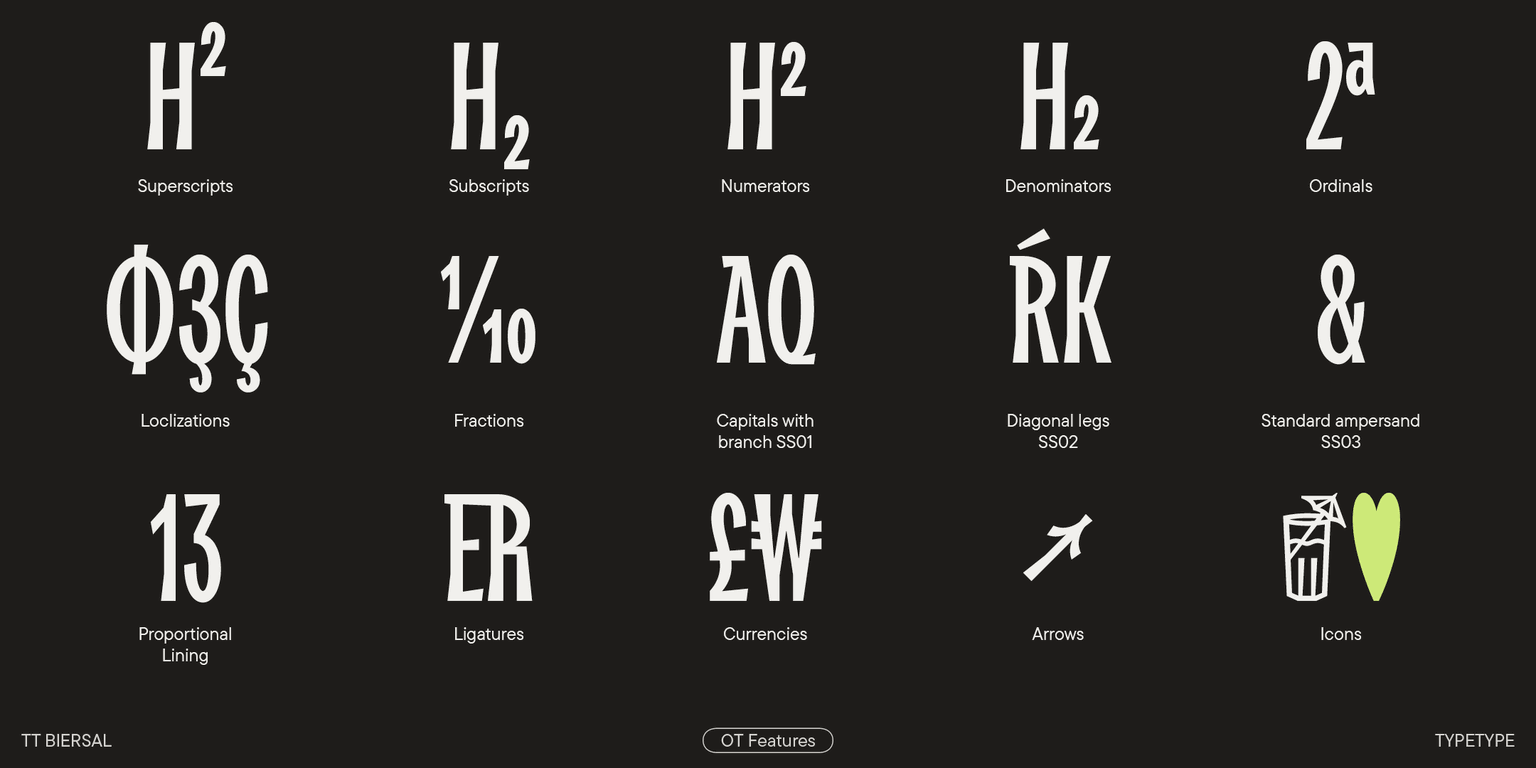
- 22 funciones OpenType;
- Admite más de 230 idiomas.
¡TT Biersal es el rey de las fiestas tipográficas!