The bestseller TT Norms® Pro—a geometric sans serif, trouble-free workhorse
Selección de Polaco+ fuentes
- Fuentes 73
- Sans Serif 47
- Serif 27
- Slab Serif 6
- Decorativas 40
- Script 10
- Variables 45
- Descuentos 16
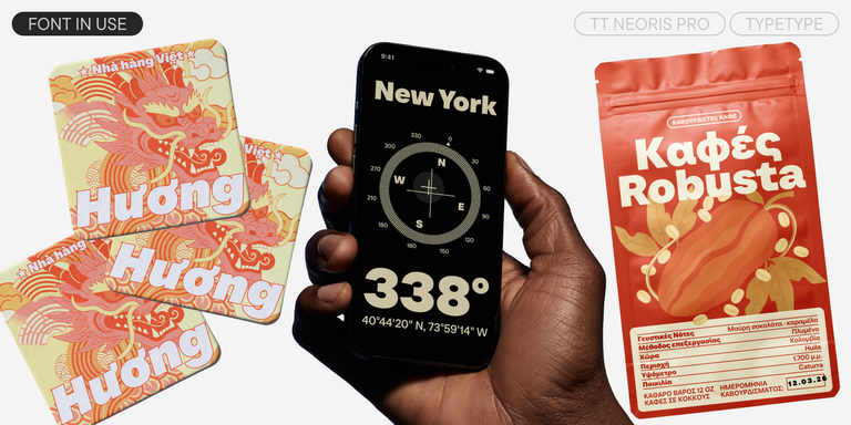
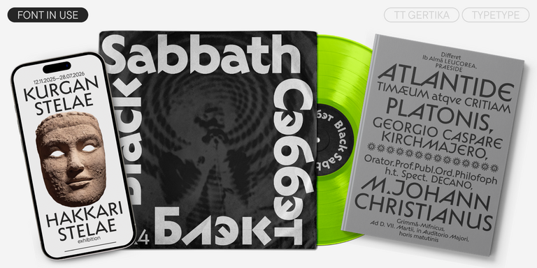
Selecciona una fuente adecuada que admita Polaco+ idiomas. Una enorme colección de familias de fuentes para cualquier propósito y tarea: escribir grandes conjuntos de texto, diseñar títulos para sitios web y publicaciones impresas, imprimir sobre textiles y otros materiales, diseñar letreros y carteles.
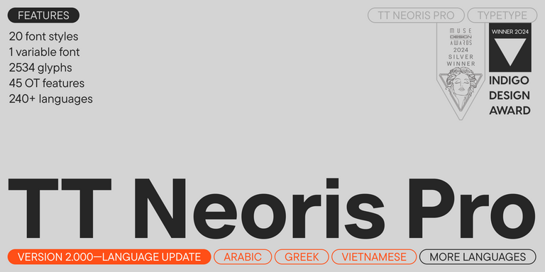
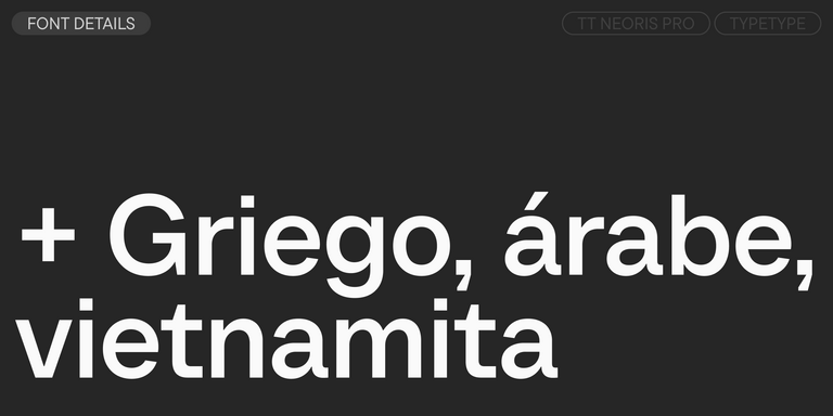
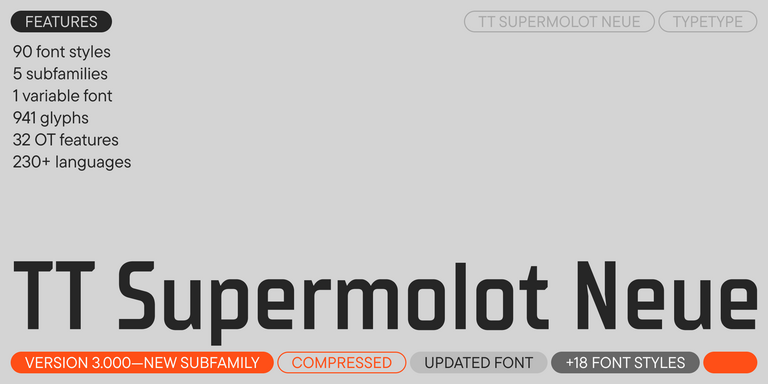
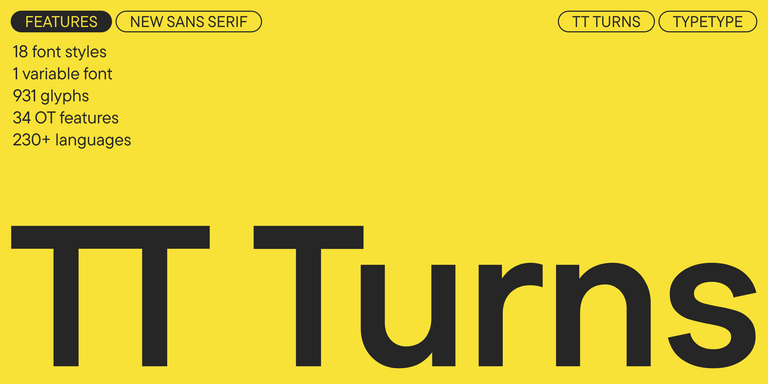
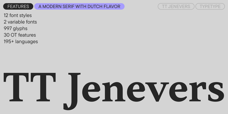
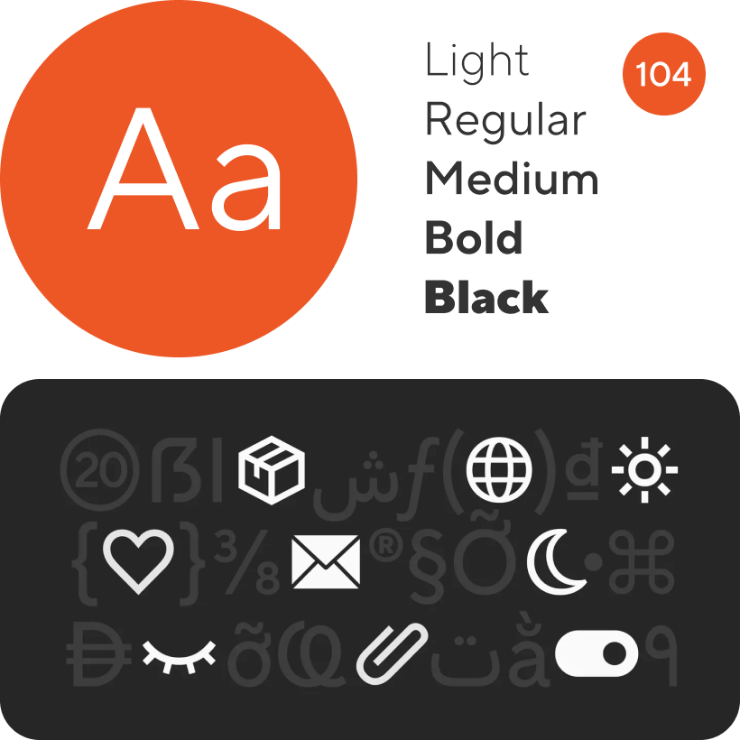
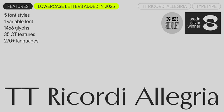
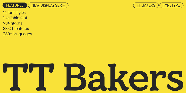
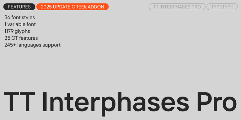
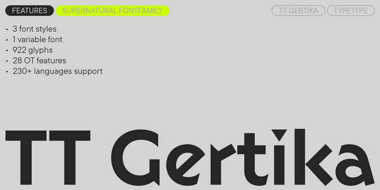
Cada una de las fuentes presentadas contiene el alfabeto Polaco+. Una amplia selección de símbolos, moneda y signos de puntuación, estilos de fuente y funciones OpenType le permitirán utilizar una fuente para diferentes proyectos. Los caracteres latinos extendidos que contienen signos diacríticos ampliarán la usabilidad de la fuente en diferentes países.
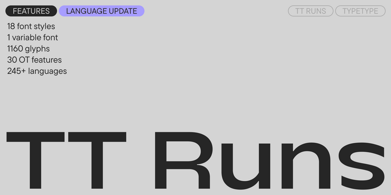
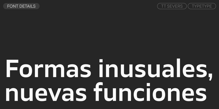
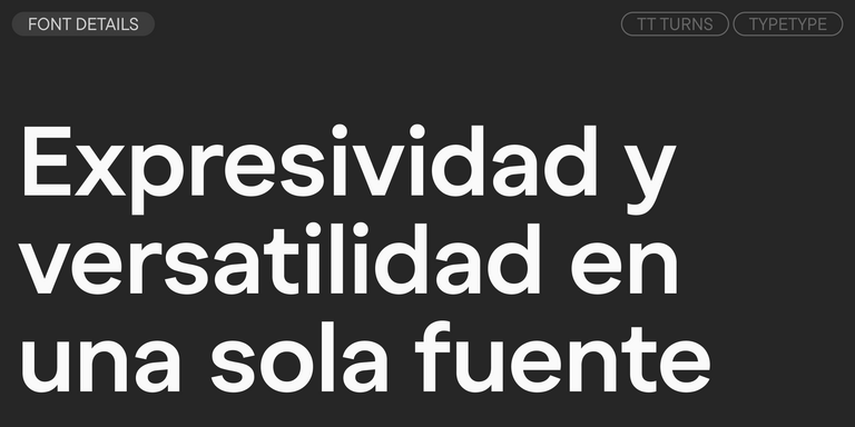
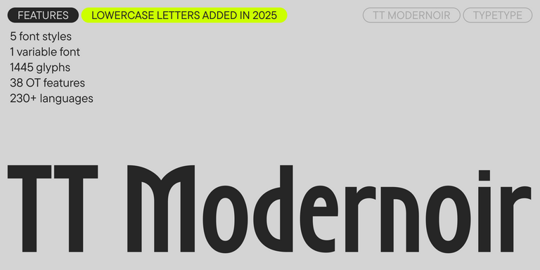
Cada fuente es técnicamente impecable. Muchas fuentes de la colección incluyen un estilo variable, que puede usarse para crear un estilo único para tu proyecto.
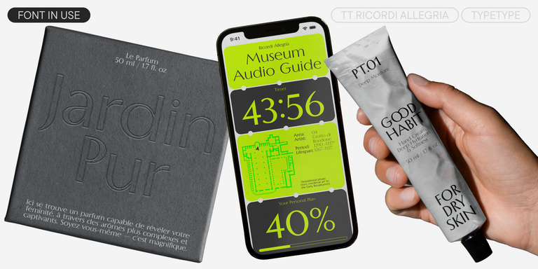
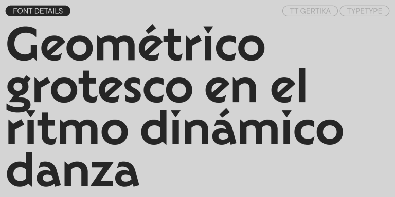
Puedes utilizar etiquetas para seleccionar el estilo de fuente o carácter que necesita: geométrico o dinámico, universal o clásico, dinámico o suave. También será conveniente buscar por finalidad: fuente para revistas o sitios web, para emails o publicidad.
Cualquier fuente de la colección se puede personalizar técnica o gráficamente. Con la personalización, puedes agregar o eliminar una letra, agregar el logotipo de una empresa o reducir la composición del efectivo para aligerar el peso del archivo de fuente.
Hay pruebas gratuitas disponibles para fuentes de estudio utilizando una licencia de prueba. Para recibir una versión de prueba, selecciona el botón "fuente de prueba" y completa el formulario de solicitud. La fuente de prueba es idéntica a la versión comercial en términos de efectivo y composición técnica.
También puedes encargar el desarrollo de una fuente comercial desde cero basándose en una fuente que te guste de la colección o según tus deseos.
- The quick brown fox jumps over a lazy dog.
- Pack my box with five dozen liquor jugs.
- Sphinx of black quartz, judge my vow
- 0123456789 !?.,:;—–()[]{}<> “quotes” ‘apostrophe’ @#%&*_+=/\| № $ € £ ₽ +−×÷=≠≤≥ … % © ® ™
- Aa Bb Cc Dd Ee Ff Gg Hh Ii Jj Kk Ll Mm Nn Oo Pp Qq Rr Ss Tt Uu Vv Ww Xx Yy Zz
TT Commons™ Pro is a completely redesigned version of the well-established classic font family TT Commons.
TT Hoves Pro is a versatile sans-serif with a recognizable geometry
TT Supermolot Neue is a redesigned, extended, and greatly enhanced reincarnation of the popular font family
TT Runs is a very stylish and charismatic display sans serif with irregular proportions of some characters.
TT Bells combines the elegant softness of Antiqua with a complex and daring temper reflected in straight stroke terminals and arrowheaded serifs. The typeface is based on the broad nib, which creates these hallmark terminals and serifs.
TT Severs is a geometric sans serif with emphasized elements of internal brackets. The main visual feature of TT Severs is the unusual form of internal ovals.
TT Turns is a striking geometric sans serif with expressive elements. This versatile font works exceptionally well for running text, while at large point sizes, it takes on a distinct display character.
TT Jenevers is a modern serif with a Dutch flavor. The font family features the characteristic details peculiar to Dutch serifs—these are the asymmetrical shape of serifs and an irregular slant of ovals.
TT Regins is a Scottish modern serif. Striking contrast and sharp triangular serifs give this font a stern and commanding character, while refined forms, enlarged lowercase letters, and slightly condensed, static proportions add grace to its design.
TT Quaris is an exquisite, modern high-contrast sans whose design balances between soft and sharp. The glyph shapes in the font are fluid and tend towards roundness, yet there are also sharp elements.
TT Ricordi Allegria is a sleek and intelligent contemporary Florentine grotesque.
TT Bakers is a fluid serif with a gentle and lively character. This font is like freshly baked goods: it’s warm and soft, especially in its bolder weights.
TT Modernoir is a display sans serif with dynamic proportions. Fluid lines and delicate Art Nouveau forms in this typeface blend seamlessly with the rhythmic flow and improvisational freedom of jazz.
TT Neoris is an elegant Neo-Grotesque with unlimited potential and a font that encompasses all modern requirements and user desires.
TT Ricordi Greto is an experimental project, inspired by a floor plaque dating from 1423 found in the Basilica di Santa Croce, Florence.
TT Firs Neue is a contemporary reincarnation of the good old TT Firs sans serif.
TT Marks ofrece un estilo manuscrito con un ritmo dinámico, un carácter entrañable y un atractivo nostálgico inspirado en el arte clásico de la rotulación a pincel. Este oficio —donde artistas expertos pintaban a mano los letreros de tiendas con pinceles y gran técnica— está viviendo un merecido renacimiento en el mundo del diseño actual.
TT Fors is a modern geometric sans serif with characters and shapes contrasting in width.
TT Fellows is a humanist sans serif with a mechanical touch.
TT Interphases Pro is a neo-grotesque sans serif with equal-width proportions
TT Ramillas is a fully reconsidered high contrast transitional serif, which is perfectly adapted to modern realities and requirements.
TT Drugs is a typeface that doesn’t feature serifs but stands out for its high contrast.
TT Gertika is a geometric sans serif with a dynamic character and a dancing rhythm. This font’s idea originates from the lettering featured on an American poster from the late 1930s.
