Para proyectos que requieren una profundidad estilística especial, fuentes refinadas son la elección ideal. El catálogo de TypeType ofrece familias con aperturas bien pensadas, transiciones suaves en el grosor de los trazos y espaciado equilibrado — soluciones perfectas para branding premium, publicaciones de moda y proyectos artísticos.
¿Buscas dónde comprar las mejores fuentes de tendencia para crear tus propios diseños? El estudio de fuentes TypeType presenta su propia colección de fuentes Sofisticadas es disponibles para uso comercial en sus proyectos. Prueba todas nuestras fuentes populares Sofisticadas es en una sola página: elige entre una docena de familias de fuentes de alta calidad y técnicamente verificadas, una amplia variedad de estilos y escrituras, prueba de forma gratuita y envía una solicitud para comprar el tipo de licencia adecuado. Para cada fuente de esta colección, puedes descargar versiones de prueba gratuitas, así como obtener el asesoramiento necesario de nuestros diseñadores y especialistas del departamento de atención al cliente.
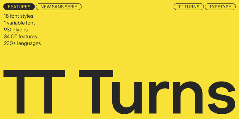
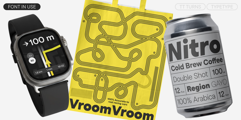
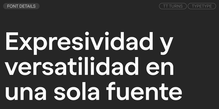
TT Turns es una impactante sans serif geométrica con elementos expresivos. Esta versátil tipografía funciona excepcionalmente bien en textos corridos y, en tamaños grandes, adquiere un marcado carácter display.
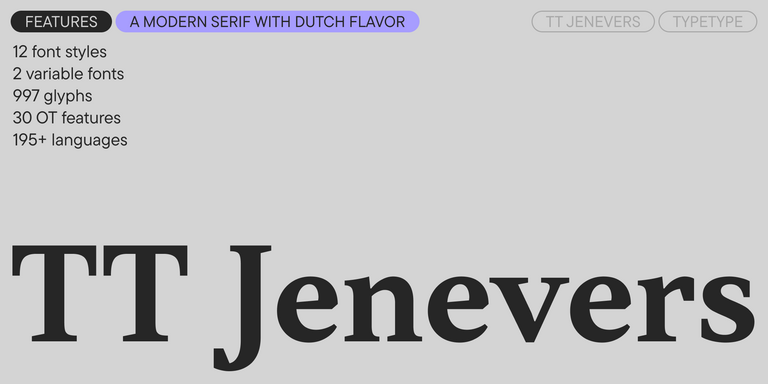
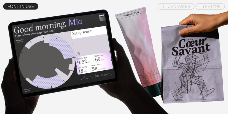
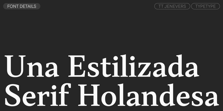
TT Jenevers es una serif moderna con carácter neerlandés. La familia tipográfica presenta detalles característicos de las serifas holandesas, como las serifas asimétricas y la inclinación irregular de los óvalos.
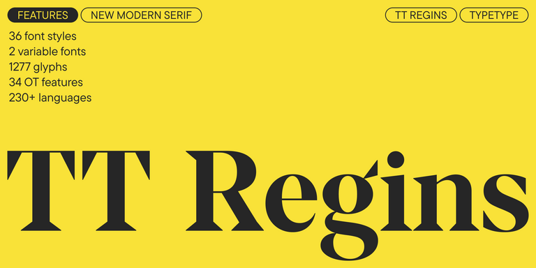
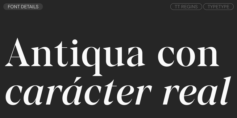
TT Regins es una serif moderna escocesa. Su fuerte contraste y sus afiladas serifas triangulares le otorgan un carácter severo y dominante, mientras que las formas refinadas, las minúsculas ampliadas y las proporciones ligeramente condensadas y estáticas aportan elegancia al diseño.
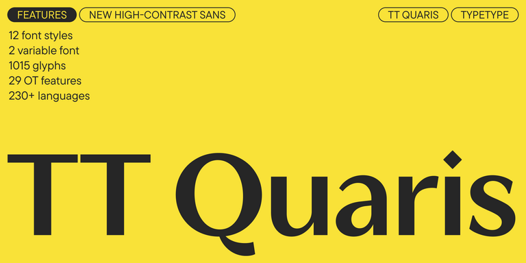
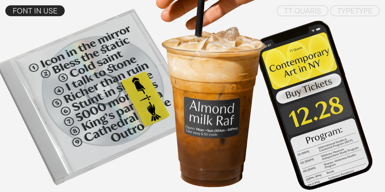
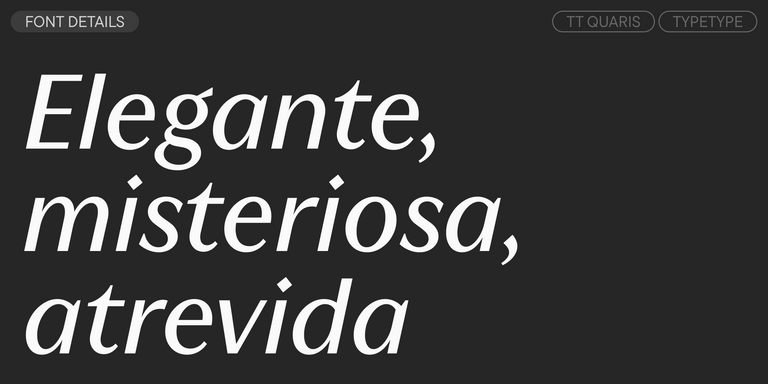
TT Quaris es una exquisita sans serif moderna de alto contraste cuyo diseño equilibra suavidad y nitidez. Las formas de los glifos son fluidas y tienden a la redondez, aunque también incorporan elementos afilados.
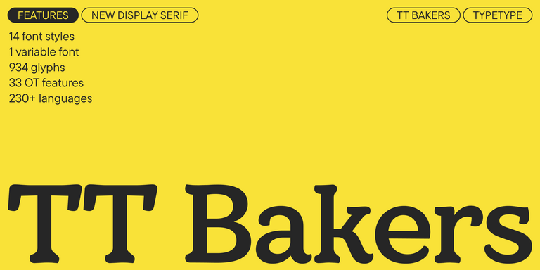
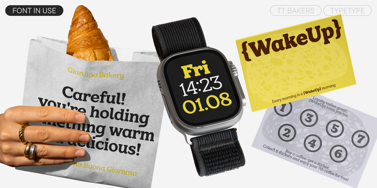
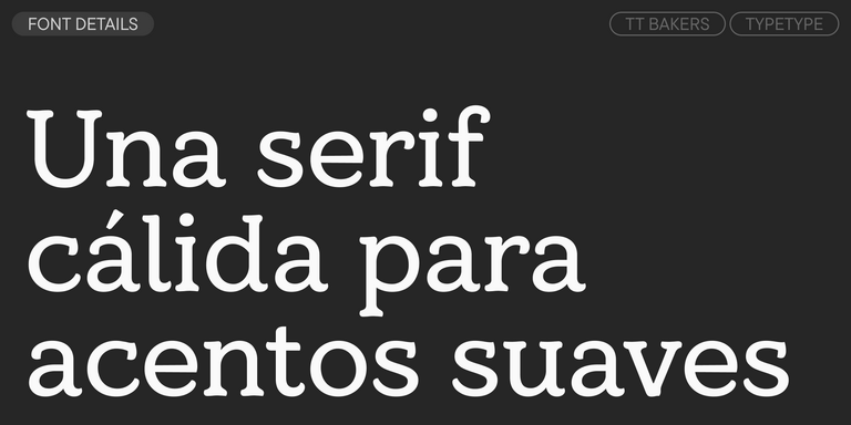
TT Bakers es una serif fluida con un carácter suave y vivaz. Esta tipografía recuerda a la repostería recién horneada: cálida y blanda, especialmente en sus pesos más gruesos.
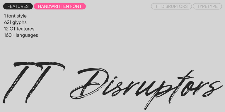
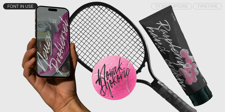
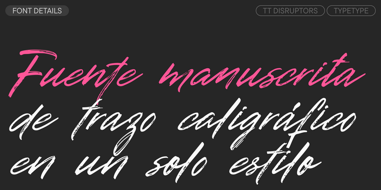
TT Disruptors es una tipografía manuscrita flexible dibujada con marcador. Su diseño es único: bordes desgastados, variaciones en el grosor de los trazos y ascendentes y descendentes alargados le aportan una textura viva y dinámica con una auténtica sensación artesanal. La personalidad de esta fuente es enérgica y emocional, pero también cálida y cercana.
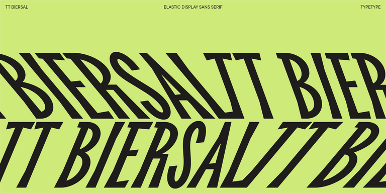
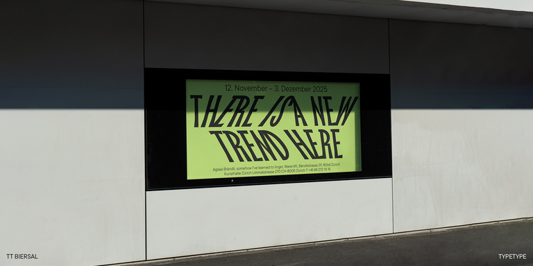
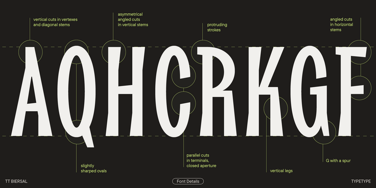
TT Biersal es una display sans serif con un carácter libre, juguetón y aventurero. El concepto de esta fuente nació a partir de un cartel alemán de principios de los años 30.
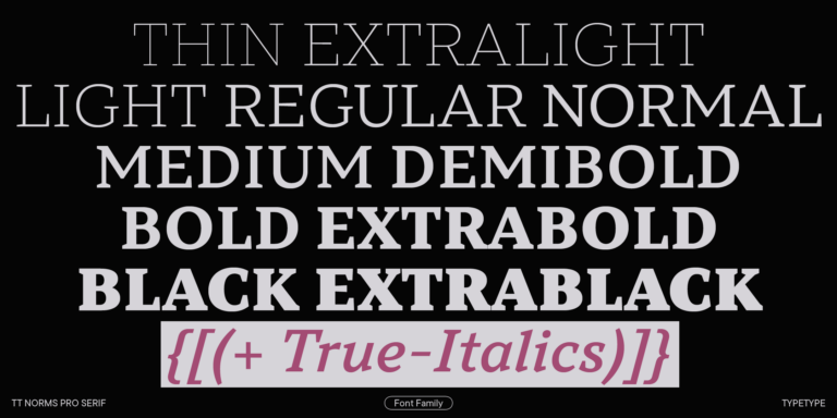
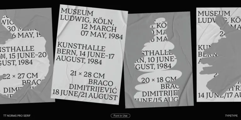
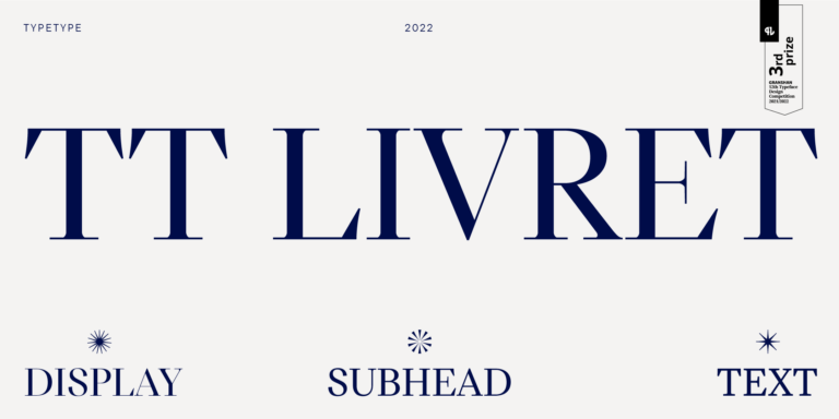
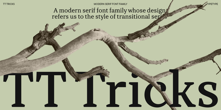
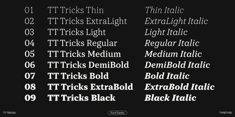
TT Tricks es una serif moderna para texto cuyo diseño refleja el estilo de las serifas transicionales. Esta tipografía posee un carácter sereno, elegante y moderadamente estricto.
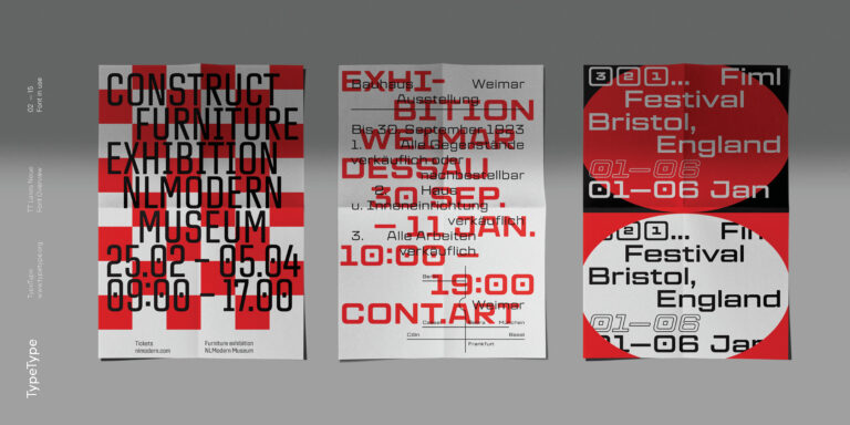
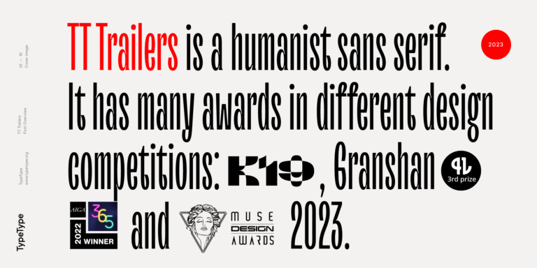
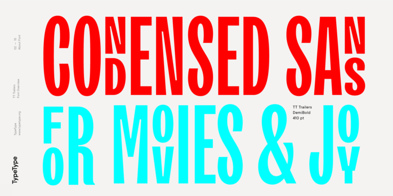
El punto de partida del proyecto TT Trailers fue la idea de desarrollar una nueva generación de tipografías estrechas para créditos cinematográficos y carteles.
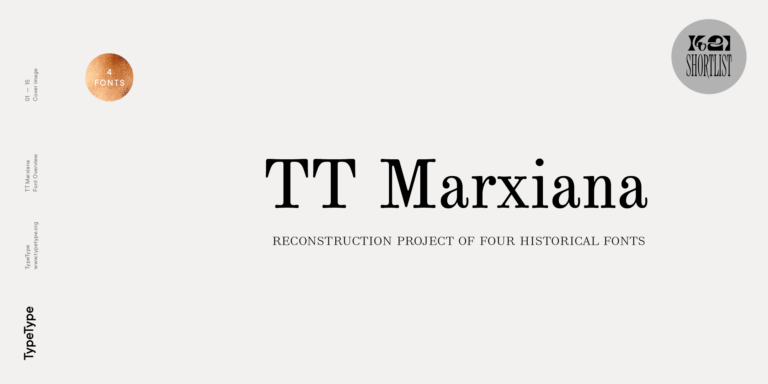
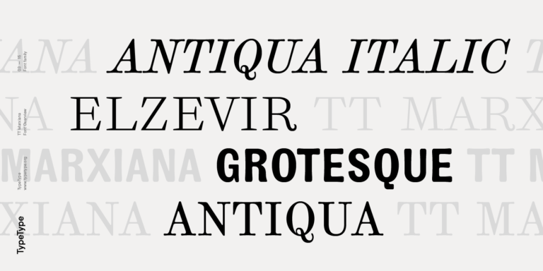
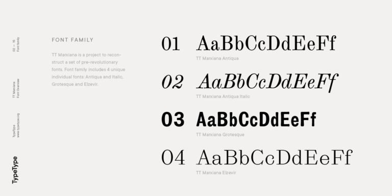
TT Marxiana Elzevir es una tipografía para títulos y encabezados basada en una recopilación de Elzevir monásticas que se utilizaban activamente en todas las publicaciones de la revista Niva.
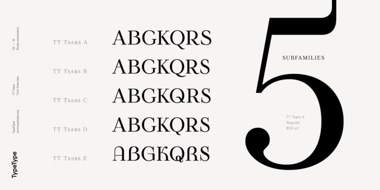
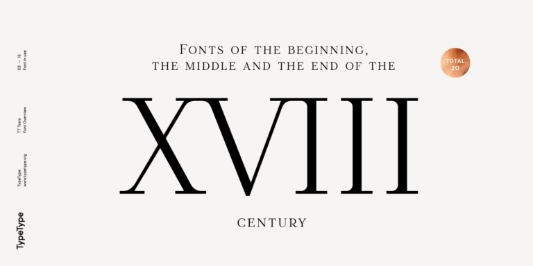
La familia tipográfica TT Tsars es una colección de fuentes serif display estilizadas para evocar las tipografías de principios, mediados y finales del siglo XVIII.
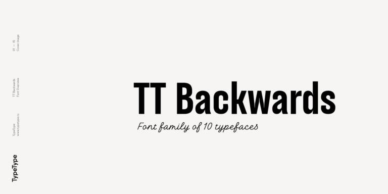
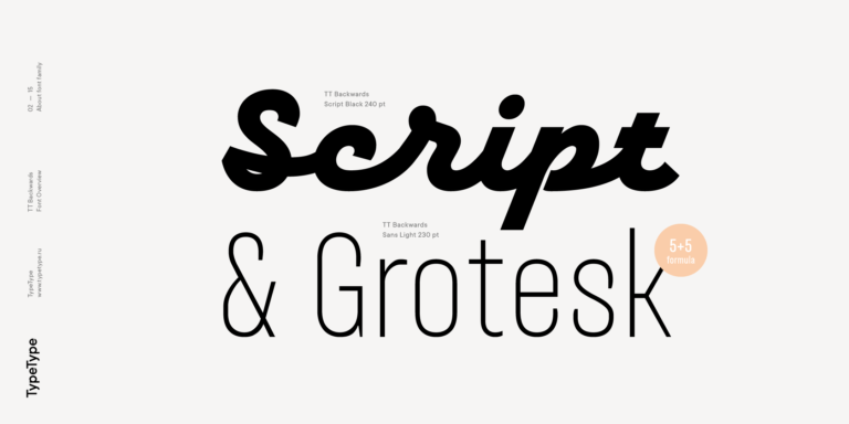
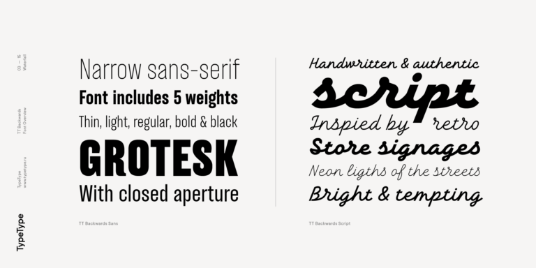
TT Backwards Sans es una grotesca estrecha cuyos caracteres flexibles nos devuelven al diseño editorial de finales de los años 70 y principios de los 80.