ttnormspro
Página principalBlogVersión personalizada de TT Hoves para la agencia True Digital

Versión personalizada de TT Hoves para la agencia True Digital

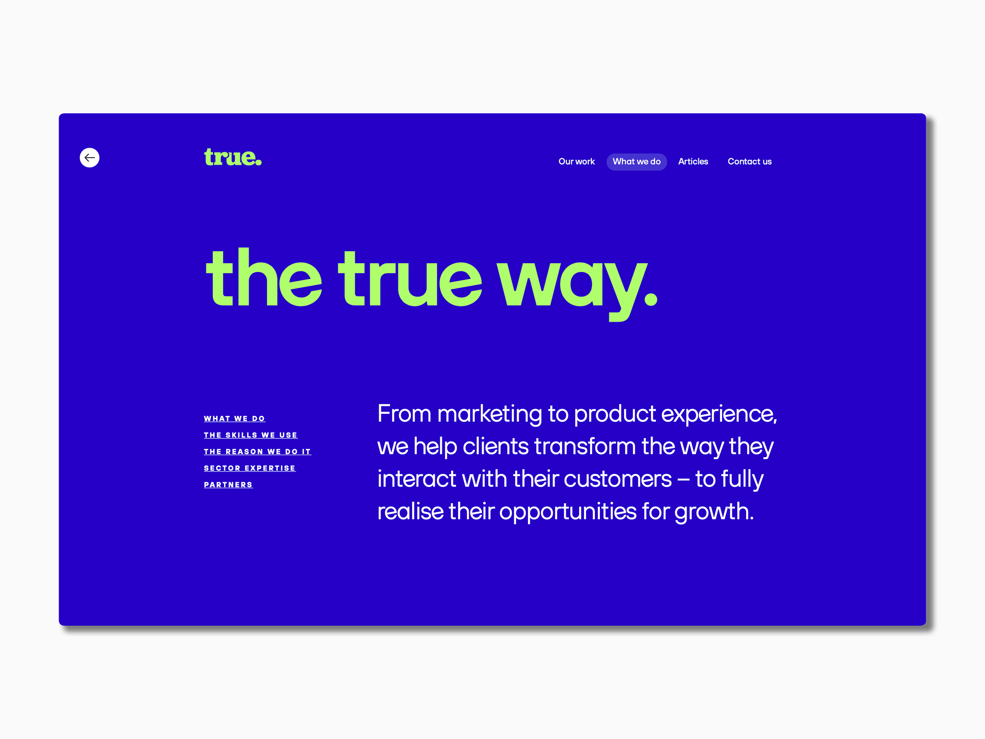
TypeType received a font customization request from True Digital Ltd, a marketing agency from Great Britain. The company emphasizes a sincere and involved approach to brand promotion. They wanted to underline their concept by adapting a font to their corporate style.

TT Hoves served as the basic font.
There were several large-scale tasks.

• Changing the style of the letter e, making it slightly tilted to the left.
• Replacing the square dots in characters and letters «! ? . ,; : … · j i » with round ones.
• Making the one-part shape of the letter default, and moving the two-part one into a stylistic set.

As a result, the adapted font got a new name—TT Hoves True. The customized version reflects the True Digital Ltd brand values: a modern and vibrant, but not an overwhelming look.

Step by step, the TypeType designers and technical specialists have generated the following changes.
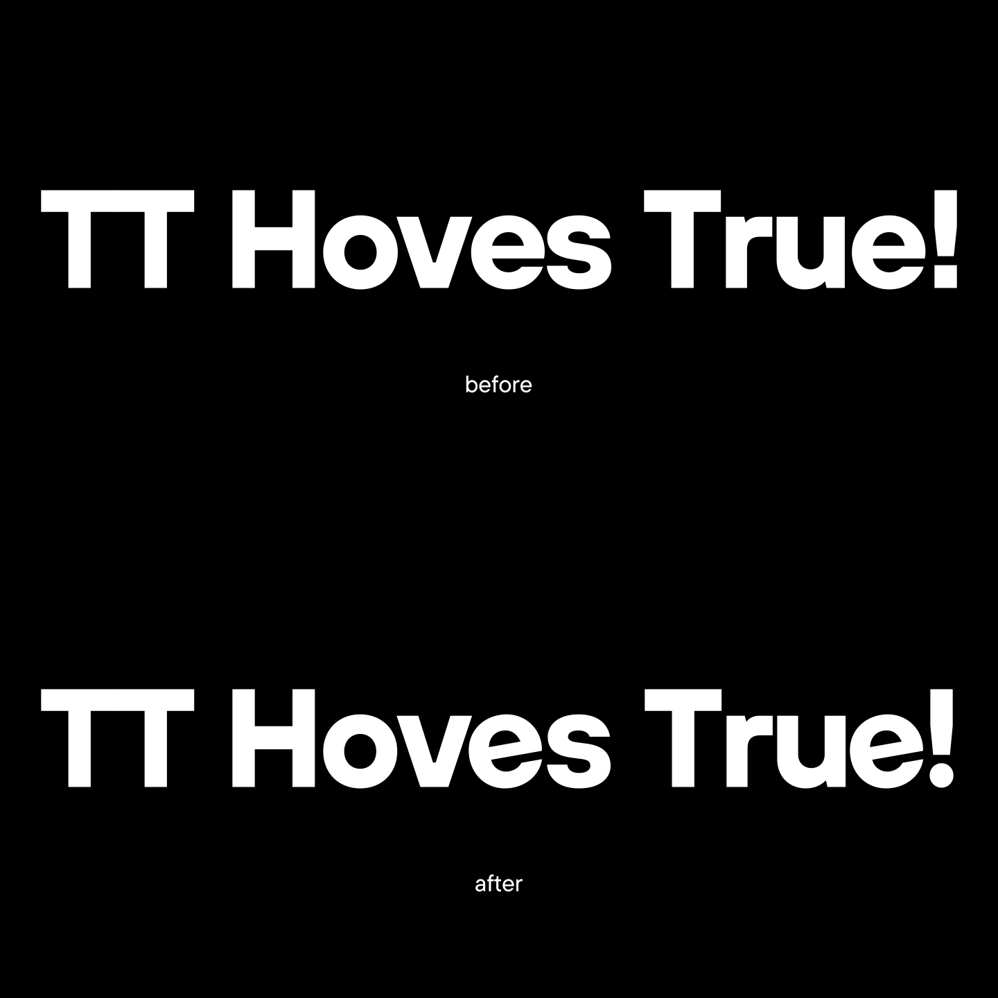
• New look of the letter e. In the new style, the letter looks playful, but does not stand out from the overall composition. The ideal tilt angle was chosen and the adapted was implemented in 20 TT Hoves styles: 10 upright and 10 italics.
Versión personalizada de TT Hoves para la agencia True Digital
New look of the letter e

• In the same faces, square dots were replaced with round dots in letters and symbols. The seriousness of perception has softened, and the symbols in the new font are more conducive to dialogue.

Versión personalizada de TT Hoves para la agencia True Digital
Changing shape of dots

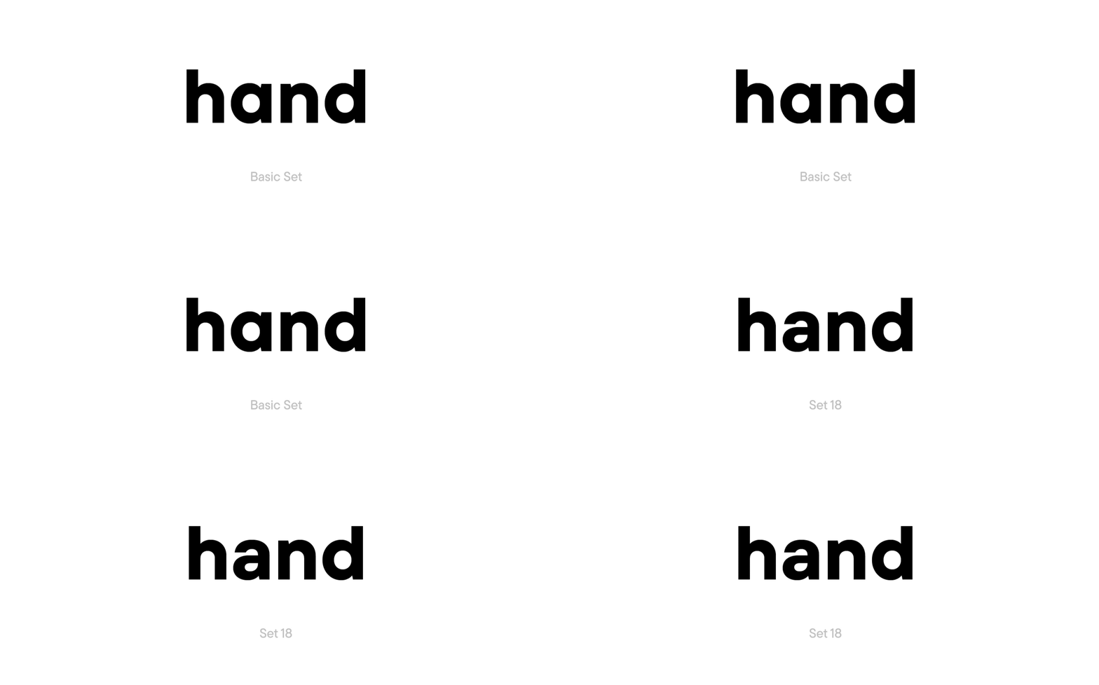
• The letter a complements the new font’s penchant for minimalism. The two-part shape has been replaced with a one-part one. Now the letter a matches the other rounded letters perfectly.
The one-part shape of the letter a became part of the main set, and the two-part shape was put into a new stylistic set.
Versión personalizada de TT Hoves para la agencia True Digital
Changing stylistic set

• At the final stage, new hinting was made for the customized characters, and the name of the adapted font was changed to TT Hoves True.

The result is an easier-to-read typeface that fits the agency’s concept perfectly with its fluid faces and a charming e.
Versión personalizada de TT Hoves para la agencia True Digital

Últimas publicaciones

Cómo Elegir las Mejores Fuentes para Infografías: Guía Completa

Cómo Elegir las Mejores Fuentes para Infografías: Guía Completa

Las infografías son una herramienta versátil y práctica que encuentra aplicación en todas partes: negocios, publicidad, ciencia, periodismo y más. Es una forma poderosa de comunicar información de manera simple y visual.

Buscar etiqueta
Las 10 principales tendencias tipográficas de 2024

Las 10 principales tendencias tipográficas de 2024

Do you want to keep your typography up-to-date and create genuinely inspiring projects? Experts and designers from the TypeType font studio are excited to share the key type trends of 2024 with you in this article. Stay trendy!

Buscar etiqueta
Las 15 mejores fuentes para revistas

Las 15 mejores fuentes para revistas

Las revistas son el lienzo perfecto sobre el que la tipografía puede revelar todas sus facetas. La fuente aquí no sólo transmite información al lector, sino que también influye directamente en el diseño. Transmite el mensaje de la revista, transmite valores e ideas. Este artículo habló sobre cómo elegir la mejor fuente para revistas y compiló una selección de 15 opciones actuales para publicaciones sobre diversos temas.

Buscar etiqueta
UniversiTTy: Lección 9. Caracteres en mayúsculas. Refinamiento detallado de contornos

UniversiTTy: Lección 9. Caracteres en mayúsculas. Refinamiento detallado de contornos

Welcome to the ninth lesson of our «UniversiTTy»! In this series, we guide you through the process of font design step by step. The font is a cohesive visual system. This can be seen on all levels: global (font type, weight, proportions, contrast, general forms) and at lower scales that encompass all graphic choices in individual characters. Let’s find out together how visual details influence the overall perception of fonts.

Buscar etiqueta
Las 15 mejores fuentes de contorno aprobadas por diseñadores en 2024

Las 15 mejores fuentes de contorno aprobadas por diseñadores en 2024

Las fuentes de contorno son una excelente manera de agregar variedad a su diseño y hacerlo atractivo y llamativo. ¿Qué son, dónde se utilizan y qué estilos de fuente se combinan con ellas? Hablamos de todo esto en nuestro artículo y también seleccionamos las mejores fuentes de contorno para varios proyectos.

Buscar etiqueta
Las 10 mejores fuentes para diseños de carteles

Las 10 mejores fuentes para diseños de carteles

Elegir la fuente adecuada para un proyecto es una tarea seria para un diseñador. ¿Cómo encontrar la mejor fuente entre muchas opciones y en qué criterios confiar a la hora de elegir? Te lo contamos en este artículo.

Buscar etiqueta
UniversiTTy: Lesson 8. Designing Basic Latin Characters. Uppercase characters

UniversiTTy: Lesson 8. Designing Basic Latin Characters. Uppercase characters

Welcome to lesson number 8 of our «UniversiTTy» series! Last time, we covered optical compensation, uppercase and lowercase character heights, and the concept of contrast. In this article, we will finally focus on glyph design specifically.

Buscar etiqueta
Cómo elegir una fuente: la guía definitiva para el diseñador

Cómo elegir una fuente: la guía definitiva para el diseñador

La fuente es uno de los elementos de diseño más importantes. Con su ayuda, puede enfatizar, complementar o incluso crear el ambiente del proyecto, colocar acentos y transmitir la información necesaria al usuario. ¿Cómo encontrar la mejor fuente entre muchas opciones y en qué criterios confiar a la hora de elegir? Te lo contamos en este artículo.

Buscar etiqueta
25+ mejores fuentes de juegos para tus proyectos en 2024

25+ mejores fuentes de juegos para tus proyectos en 2024

¿Qué criterios debes buscar al elegir fuentes de juegos? ¿Y qué fuentes gaming deberías elegir para tu proyecto en 2024? En nuestro artículo encontrarás consejos actuales sobre la elección de tipografías y una selección de las tipografías mejores pagas y gratuitas para videojuegos de diferentes géneros.

Buscar etiqueta

Buscar etiqueta

Creating a customized version of TT Trailers with pet-friendly diacritics

Creating a customized version of TT Trailers with pet-friendly diacritics

How often have you come across hidden kitties and puppies right in the letters? If never, do hurry to read this case.

Buscar etiqueta
TypeType conquers the USA!

TypeType conquers the USA!

We don’t know what the modern American dream is. We are opening our first office in the USA because forty percent of sales and a large number of interesting projects come to TypeType from America. The first step towards customers is at the same time another point of growth for the font foundry.

Buscar etiqueta
Creación de una fuente para la configuración del logotipo de Mail.ru Group

Creación de una fuente para la configuración del logotipo de Mail.ru Group

Today we will share a fascinating story of creating a font family to set logos for one of the largest brands. We promise you won’t be bored: in this story, you will have the chance to have a look at all stages of the work and will learn more about font creation.

Buscar etiqueta
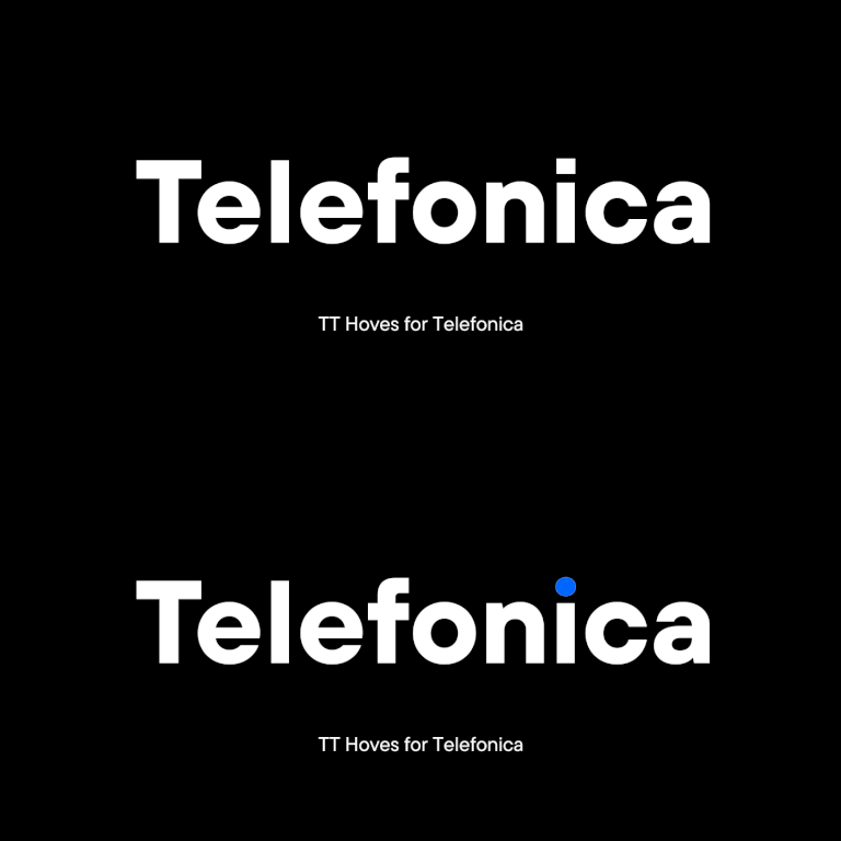
Personalización de TT Hoves para la legendaria marca Telefónica

Personalización de TT Hoves para la legendaria marca Telefónica

The TypeType team was approached by the Spanish telecommunications company Telefonica with a request to customize the TT Hoves font. Telefonica is one of the largest raditional and mobile phone companies in the world.

Buscar etiqueta
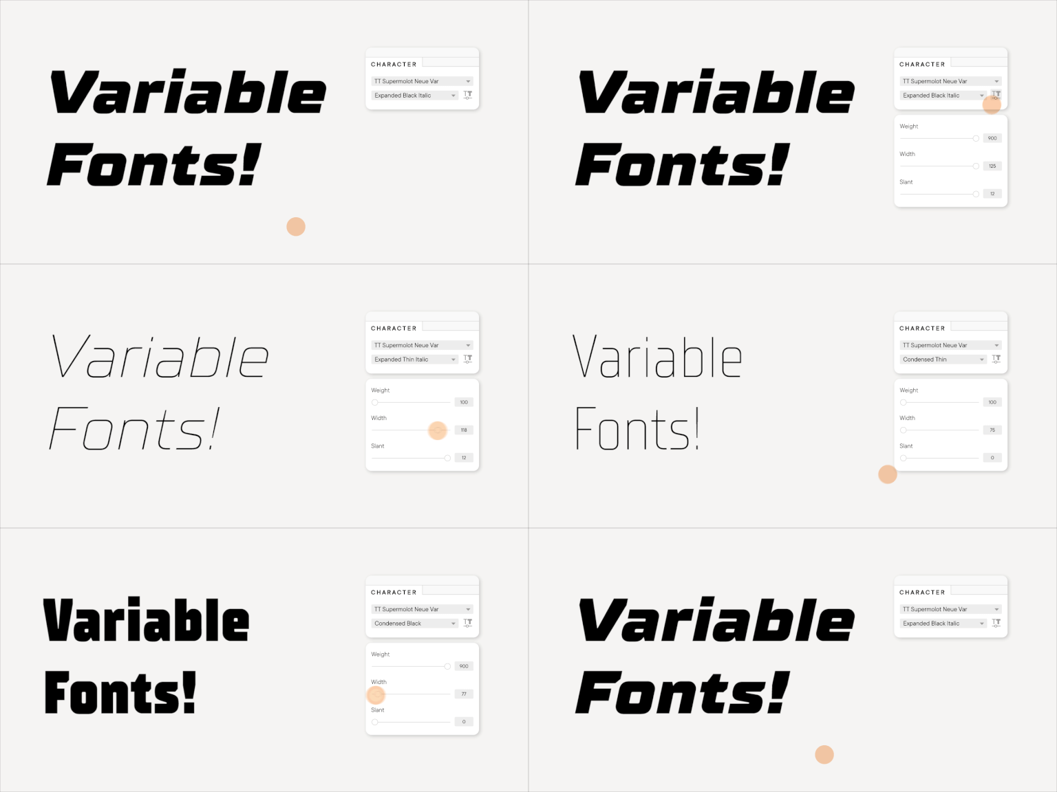
Fuentes variables: ¿qué novedades tienen para los diseñadores? 10 mejores fuentes para diseños de carteles

Fuentes variables: ¿qué novedades tienen para los diseñadores? 10 mejores fuentes para diseños de carteles

In this article we will tell you about variable fonts and what an interesting and useful, yet underrated instrument they are. We will also mention their disadvantages and nuances of working with them.

Buscar etiqueta
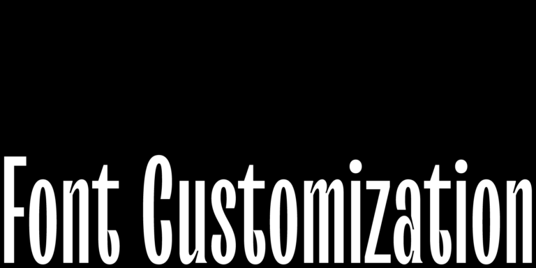
Font customization

Font customization

It often happens that existing fonts do not correspond to the needs of a certain project. But font is not a static instrument that functions only the way it was created. To convey the company’s individual style, the font can and should be adapted and customized to one’s needs that may range from simple changes like diminishing the character composition to complex design changes in all glyphs.

Buscar etiqueta
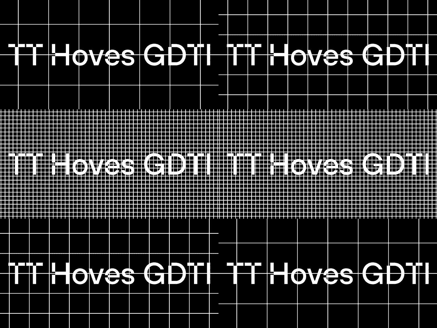
Converting TT Hoves Medium into an adapted TT Hoves GDTI

Converting TT Hoves Medium into an adapted TT Hoves GDTI

Monospace, a branding agency from Germany, creates corporate identities and designs for projects. The company believes that through design it is possible to create a brand though which customer interactions will be enjoyable and long-term.

Buscar etiqueta
Fuente corporativa para Red Collar

Fuente corporativa para Red Collar

In this article we will tell and show how we created the corporate font for the Red Collar digital agency. The spirit that the client wanted to see in the font would be supposed to reflect the agency’s self-positioning: “It’s technological, but affordable; it is brave, bold, but fully responsible for the result”.

Buscar etiqueta
Historia de creación de TT Ricordi

Historia de creación de TT Ricordi

The TT Ricordi font family is a collection of three display heading antiquas designed to significantly diversify the traditional font palette. With that, all three fonts are close in thickness and similar in their character compositions and are featured in the uppercase set and the small capitals set, which replaces lowercase characters.

Buscar etiqueta