

Mit diesem Artikel setzen wir unsere Serie über die Hintergründe der Typografie fort. Julia Gonina — TypeType Art Director und Schöpferin der Schriften TT Livret, TT Fellows, TT Autonomous und TT Ricordi Todi — teilt ihre Erfahrungen mit uns. Wir sprechen über die Anfänge der Arbeit an einer Schrift, nämlich das Briefing.
Bevor man mit dem Entwerfen von Buchstaben und dem Gestalten der Schrift beginnt, ist es wichtig, erste Vorbereitungen zu treffen, um eine klare Vorstellung vom Ergebnis des Projekts zu bekommen. In diesem Artikel konzentrieren wir uns auf das Wesentliche dieser Vorstufe und die Bedeutung dieser Arbeit, indem wir den Prozess der Aufgabenstellung beschreiben und analysieren.
Die Aufgabenstellung und ihr Einfluss auf den Prozess der Schriftentwicklung
Jedes Projekt sollte mit der Beschreibung der Aufgabenstellung beginnen. Wenn Sie entschlossen sind, das Projekt erfolgreich abzuschließen, wird die Aufgabenstellung zu Ihrem Fundament. Sie bildet den Rahmen für das Projekt, beantwortet Fragen und hilft, fundierte Entscheidungen zu treffen.
Wenn Sie keine externe Aufgabenstellung haben (z.B. eine Vorgabe eines Kunden), müssen Sie die Aufgabenstellung selbst definieren. Im Folgenden werde ich die wichtigsten Fragen auflisten, die Ihnen bei der Entscheidung über die Richtung Ihrer Arbeit helfen werden. Danach werde ich Ihnen zeigen, wie Ihre Antworten auf diese Fragen sowohl die grafischen als auch die technischen Entscheidungen beeinflussen können, die Sie treffen.

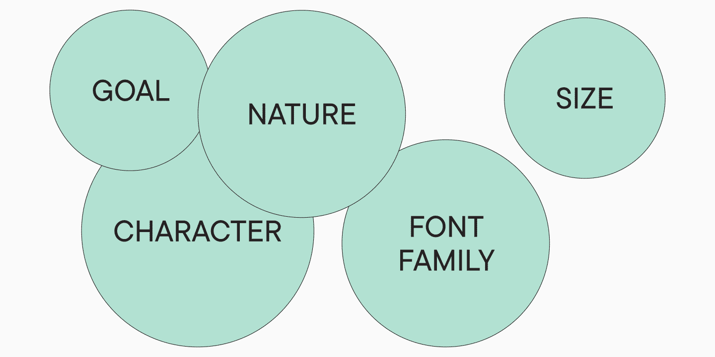
- Welchen Zweck soll Ihre Schrift erfüllen? Ist es eine vielseitige Schrift, die sich für verschiedene Kontexte eignet? Oder möchten Sie eine moderne Schrift für Plakate entwerfen? Oder soll Ihre Schrift für den Buchdruck oder die Gestaltung von Zeitschriften verwendet werden? In welchem Kontext soll die Schrift verwendet werden?
- Wie wollen Sie Ihre Schrift präsentieren? Handelt es sich um eine moderne Schrift, die den neuesten Trends folgt, oder um einen schlichten, zeitlosen Klassiker? Oder vielleicht der Versuch, eine jahrhundertealte Schrift in ihrer ursprünglichen Form zu rekonstruieren?
- Welchen Charakter soll Ihre Schrift haben? Ist sie fett, konservativ, freundlich, aggressiv, streng oder informell? Oder hat sie andere Eigenschaften?
- Wie soll die Schriftfamilie aussehen? Soll sie groß sein, mit einem breiten Spektrum an Strichstärken — von der dünnsten bis zur fettesten — oder umgekehrt, mit einer minimalen, durchdachten Anzahl an Schnitten? Wollen Sie verschiedene Versionen für kleine und große Schriftgrößen entwerfen? Oder möchten Sie Ihren Benutzern ein fertiges Schriftpaar zur Verfügung stellen, z.B. eine Serifenschrift und eine Sans Serif?
- Welche Schriftgröße bevorzugen Sie? Für Textblöcke, Überschriften oder beides?
Diese Fragen helfen Ihnen, besser zu verstehen, was für ein Projekt Sie erstellen. Sie ermöglichen es Ihnen, einen Schritt zurückzutreten und Ihre Idee genauer zu betrachten. Wie ein Künstler, der vor dem Malen eines Porträts Skizzen anfertigt, die Größe festlegt, die Technik und die Materialien auswählt, müssen Sie eine klare Vorstellung vom gesamten Projekt haben, bevor Sie eine Schrift entwerfen.
Es lässt sich leicht zeigen, wie viel einfacher es ist, an einem Projekt zu arbeiten, wenn man es verstanden hat. Die Antworten und Ideen, was und wie gezeichnet werden soll, kommen dann von selbst.
Planen Sie, eine Schrift für eine Zeitung zu entwerfen? Dann ist es wichtig, sie kompakt zu gestalten und die Oberlängen zu reduzieren, um möglichst viel Platz zu sparen. Wenn Ihr Ziel Vielseitigkeit ist, müssen Sie vielleicht Ihre kreative Seite besser kontrollieren. Sie haben ein historisches Original, das Sie in eine moderne Schrift verwandeln möchten? Analysieren Sie sorgfältig die Eigenschaften zeitgenössischer Schriften, um sie auf natürliche Weise in Ihr Projekt zu integrieren. Sie sehen Ihre Schrift nur in großen Größen als eigenständiges grafisches Statement? In diesem Fall müssen Sie alle Konturen, Kurven und Formen der Buchstaben perfektionieren und Elemente hinzufügen, die die Menschen näher betrachten wollen. Gestalten Sie eine gut lesbare Schrift? Dann spielt die Schönheit der Konturen eine untergeordnete Rolle, und ein gleichmäßiger Rhythmus steht im Mittelpunkt. Und Kontrast sollte in diesem Fall nicht missbraucht werden.
Schrift- und Schriftfamilienspezifikationen
Wenn Sie die obigen Fragen beantwortet haben, kennen Sie bereits den Verwendungskontext Ihrer zukünftigen Schrift und wissen, wer Ihre Konkurrenten sein könnten. Jetzt ist es an der Zeit, ein wenig zu recherchieren und herauszufinden, welche Entscheidungen andere Designer in ähnlichen Situationen getroffen haben. Stellen Sie eine Sammlung von 5-10 relevanten Schriften zusammen, die zu Ihrer Idee passen, und analysieren Sie diese.
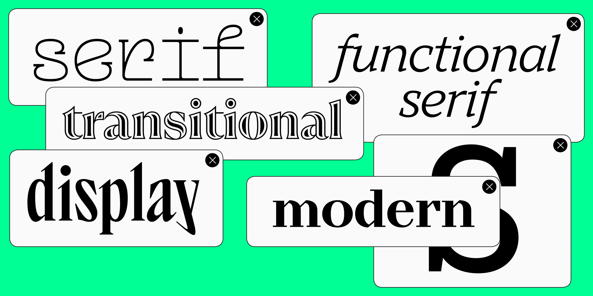
Sehen wir uns an einem Beispiel an, wie das aussehen könnte. Nehmen wir an, Sie entwerfen eine moderne, funktionale Serifenschrift, an die Ihre Benutzer visuell gewöhnt sind. Schauen Sie sich zunächst die gängigsten Serifenschriften an. Das sind Systemschriften wie Times New Roman, Georgia, New York und Noto Serif. Ergänzen Sie diese Liste um einige beliebte kostenlose Schriften von Google Fonts (PT Serif, IBM Plex Serif) und einige weit verbreitete Varianten wie Litereta, die für Google Play Books entwickelt wurden.
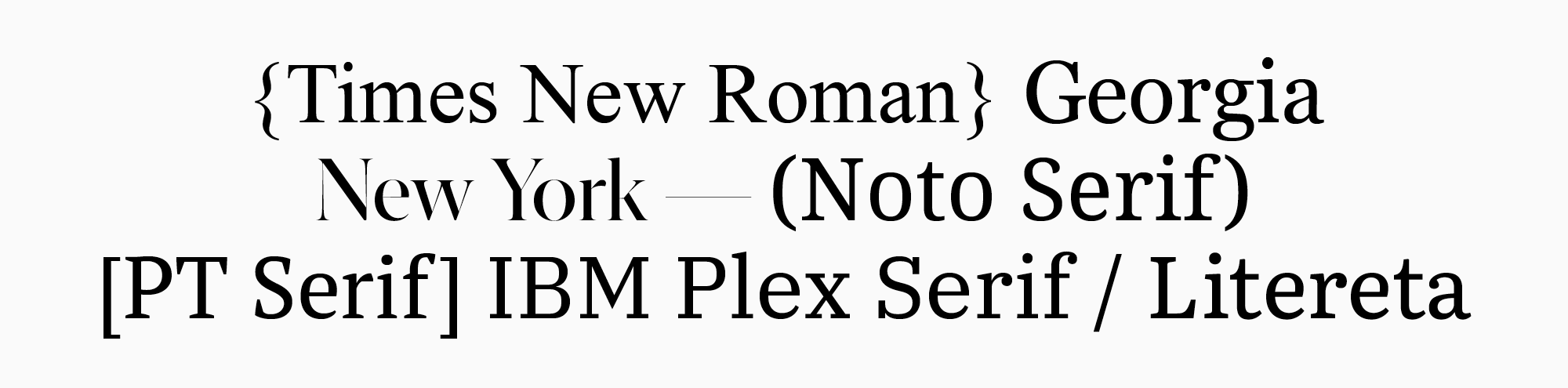
Da Sie eine moderne Serifenschrift erstellen möchten, können Sie die resultierende Liste in zeitgenössische und nicht-zeitgenössische Schriften unterteilen, um die Unterschiede zwischen ihnen zu analysieren. Times New Roman und Georgia, die im 20. Jahrhundert entwickelt wurden, fallen in die zweite Kategorie. Um das Bild mit modernen Schriften abzurunden, können Sie einige Serifen, die Ihnen besonders gefallen und die zu Ihrer Idee passen, separat hinzufügen.
Wenn Sie eine funktionale Serifenschrift benötigen, an welche Funktionen denken Sie dabei? Zunächst könnte man an die Verwendung im Text denken. Aber warum nicht auch für Überschriften? In diesem Fall könnten Sie eine Display-Subfamilie hinzufügen, die die Funktionalität der Schrift erheblich verbessert. Dann können Sie Ihre Recherche ausweiten und nach Beispielen für die Kombination einer Text- und einer Display-Schriftfamilie in einer Schrift suchen. Analysieren Sie, welche grafischen und technischen Eigenschaften dieser Schriften gleich bleiben sollten, welche sich unterscheiden dürfen und warum.
Je mehr Details Sie untersuchen, desto besser. Idealerweise sehen Sie sich die Schriften in gedruckter Form an, vergleichen Sie die Eindrücke, die sie vermitteln, und markieren Sie die Schriften, die Ihnen am besten gefallen.
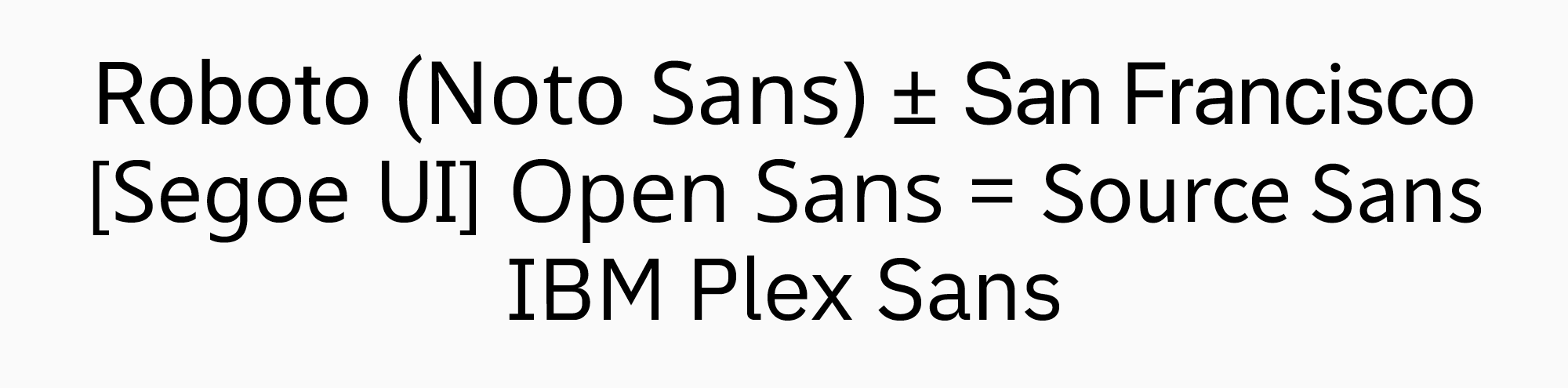
Nehmen wir ein anderes Beispiel. Nehmen wir an, Sie möchten eine Schrift entwerfen, die speziell in Benutzeroberflächen und mobilen Anwendungen eingesetzt werden soll. Auch in diesem Fall ist es am besten, mit der Liste der beliebtesten Schriften zu beginnen. Zuerst die Systemschriftarten wie Roboto, Noto, San Francisco und Segoe UI. Dann einige kostenlose Schriften wie Open Sans, Source Sans und IBM Plex. Warum diese Schriftarten? Alles für den Komfort des Benutzers. Wenn die technischen Eigenschaften der Schrift sich nicht allzu sehr von den gebräuchlichsten unterscheiden, werden die Benutzer keine Probleme haben, sich an Ihre neue Schrift zu gewöhnen.
Die nächsten Schritte in der Entwicklung:
- Messung der Schriftmaße (Höhe der Groß- und Kleinbuchstaben, Stärke der wichtigsten Schriftschnitte)
- Grafische Analyse der Schriften (zumindest der Kategorie, zu der sie gehören: geometrisch, humanistisch, neogrotesk)
- Zeichensatzrecherche (benötigt die Schrift bestimmte Zeichen?)
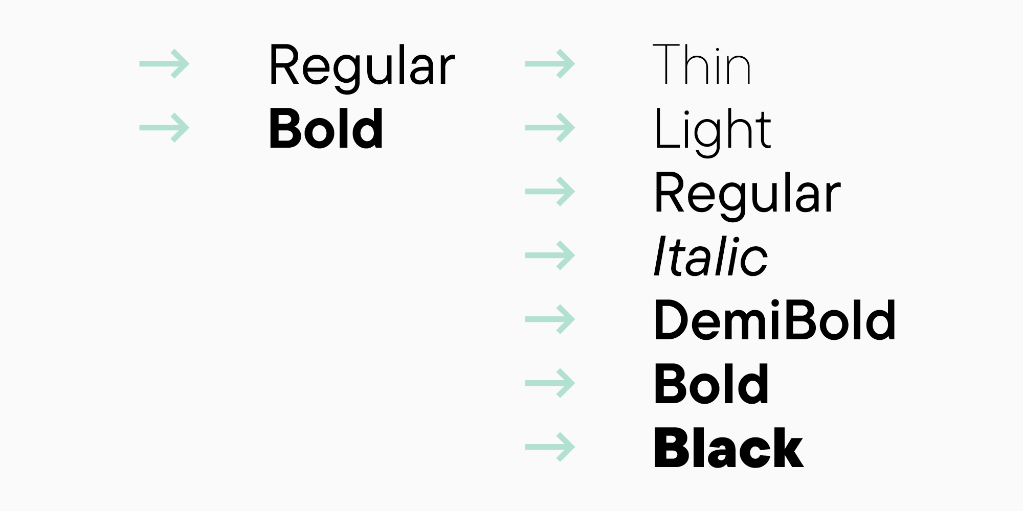
- Schriftfamilien-Recherche (lohnt es sich, sich auf einige wenige Schriftstärken und Kursivschnitte zu beschränken, oder ist es besser, auch andere Unterfamilien in Betracht zu ziehen?)
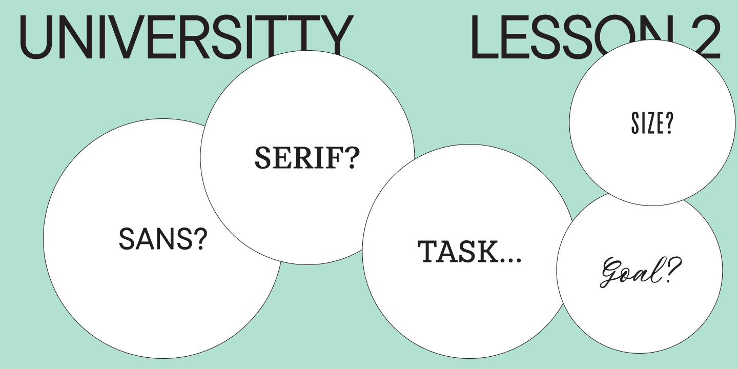
Schauen Sie sich die Schriften genau an und unterteilen Sie sie:
- In welche Kategorie(n) gehört sie? Zum Beispiel gibt es hauptsächlich Neo- und geometrische Groteskschriften.

- Wie viele Schriftschnitte gibt es in den Schriftfamilien?
- Wie unterscheiden sich Kursiv- und Antiquaschriften?

- Wie stark ist der Kontrast?

- Haben die Schriften statische oder dynamische Proportionen?

- Sind sie eher geschlossen oder offen?

- Wie groß ist der Höhenunterschied zwischen Groß- und Kleinbuchstaben und wie groß sind die Oberlängen?

Die obigen Beispiele sind vereinfachte Versionen der tatsächlichen Fälle, die zu den Schriften unserer TypeType-Sammlung führen. Sie zeigen eine mögliche logische Richtung bei der Analyse zukünftiger Projekte. Ihre Logik kann von diesen Beispielen abweichen und Ihre Schlussfolgerungen bleiben persönlich. Sie können zum Beispiel dem Weg der populärsten Schriften folgen und Ihre Schrift so gestalten, dass sie neben diesen ihren Platz einnimmt. Oder Sie können im Gegenteil ein Produkt schaffen, das sich von anderen abhebt.
Wie auch immer Sie sich entscheiden, diese Phase hilft Ihnen, den Kontext zu verstehen, in dem Ihre Schrift existieren wird. Sie entscheiden auch, woraus Ihre Schriftfamilie bestehen soll und welche Eigenschaften Ihre Schrift haben soll. Diese Entscheidungen werden sich wahrscheinlich im Laufe des Arbeitsprozesses ändern, und das ist völlig normal. Wichtig ist, dass Sie jetzt eine solide Grundlage haben.
Es kann auch sein, dass Sie bereits eine Idee haben, erste Skizzen angefertigt und sogar schon etwas in einem Schrift-Editor gezeichnet haben. In diesem Fall können Sie später, nach den ersten visuellen Recherchen, mit der Analyse beginnen. Die Praxis zeigt jedoch, dass man diese Phase nicht ausschließen sollte.
Zeichensatz
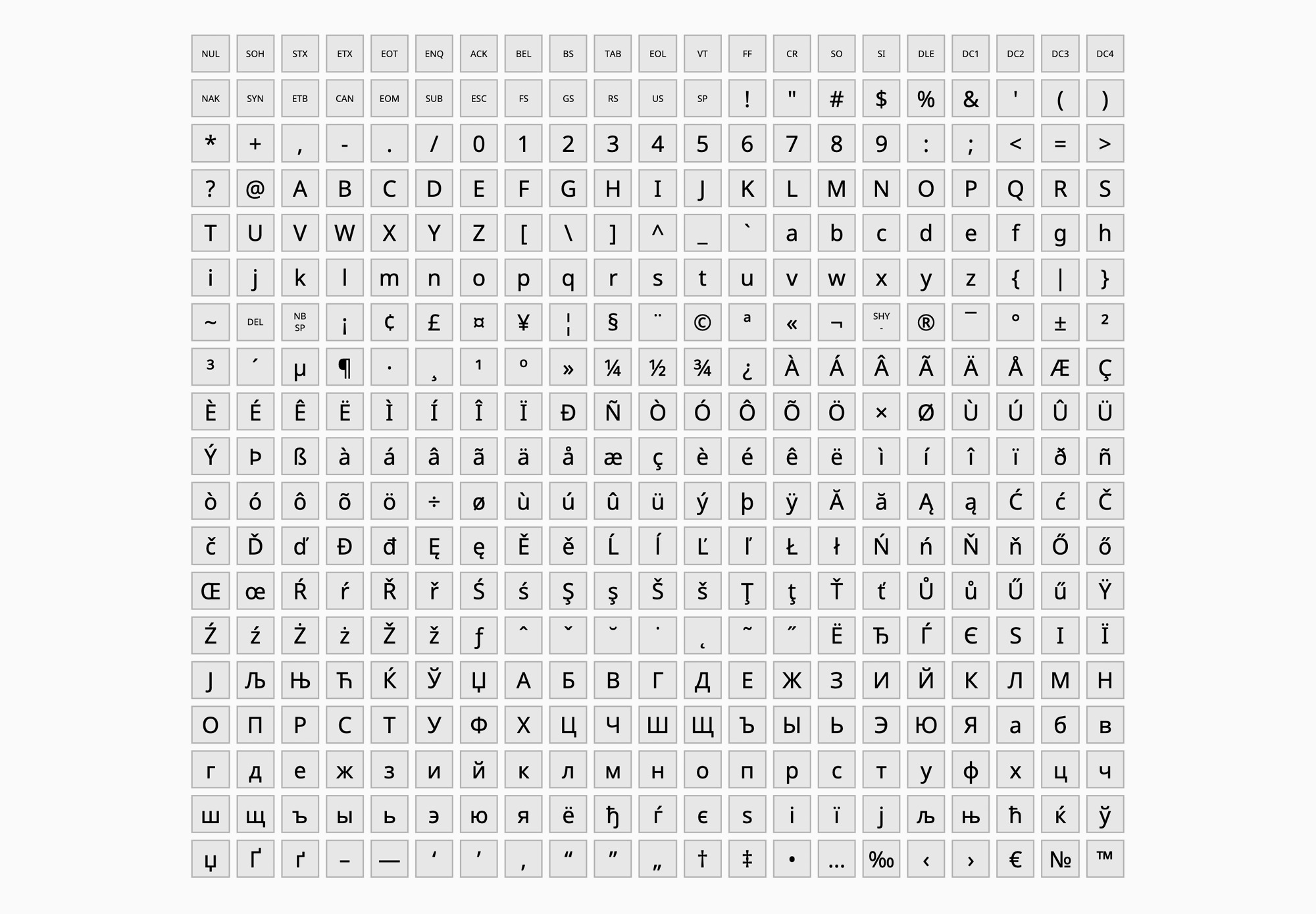
Nun ist es an der Zeit, über den Inhalt nachzudenken. Um die Schrift für den Gebrauch durch andere vorzubereiten, muss sie zumindest einen minimalen Zeichensatz unterstützen, der weit über das lateinische Alphabet hinausgeht.
Am Anfang kann es schwierig sein, die Hauptkomponenten der Schrift selbst zu definieren. Als Ausgangspunkt empfehle ich die Verwendung von Zeichensätzen, die von Firmen wie Apple oder Microsoft entwickelt wurden. Sie können diese später verändern oder unverändert lassen.
Wenn Sie Ihrem Font Zeichen hinzufügen, werden Sie feststellen, dass jedes Zeichen eine eindeutige Nummer im Format U+0000 oder uni0000 hat. Dabei handelt es sich um einen Code im international standardisierten Unicode-System, der es ermöglicht, die Zeichen Ihrer Schrift auf verschiedenen Plattformen zu erkennen. Weitere Informationen finden Sie auf der offiziellen Unicode-Website.
Meiner Meinung nach bilden die Microsoft-Sets 1250, 1251 und 1252 zusammen einen recht funktionalen Zeichensatz.
Sie können einen praktischen Service nutzen, um Ihren eigenen Zeichensatz zusammenzustellen, indem Sie die vorhandenen Zeichensätze kombinieren.
Bei TypeType verwenden wir unsere eigenen Zeichensätze, die wir im Laufe des Arbeitsprozesses entwickelt und unter Berücksichtigung des Feedbacks unserer Benutzer mehr als einmal korrigiert haben. Wenn Sie längere Zeit mit Schriften arbeiten, werden Sie wahrscheinlich Ihre eigenen Vorlieben für Zeichensätze entwickeln.
Um Ihr Wissen über die Zeichen, die in einer Schrift enthalten sein können, besser zu strukturieren, werfen wir einen genaueren Blick auf einen der Zeichensätze, die wir bei TypeType verwenden.
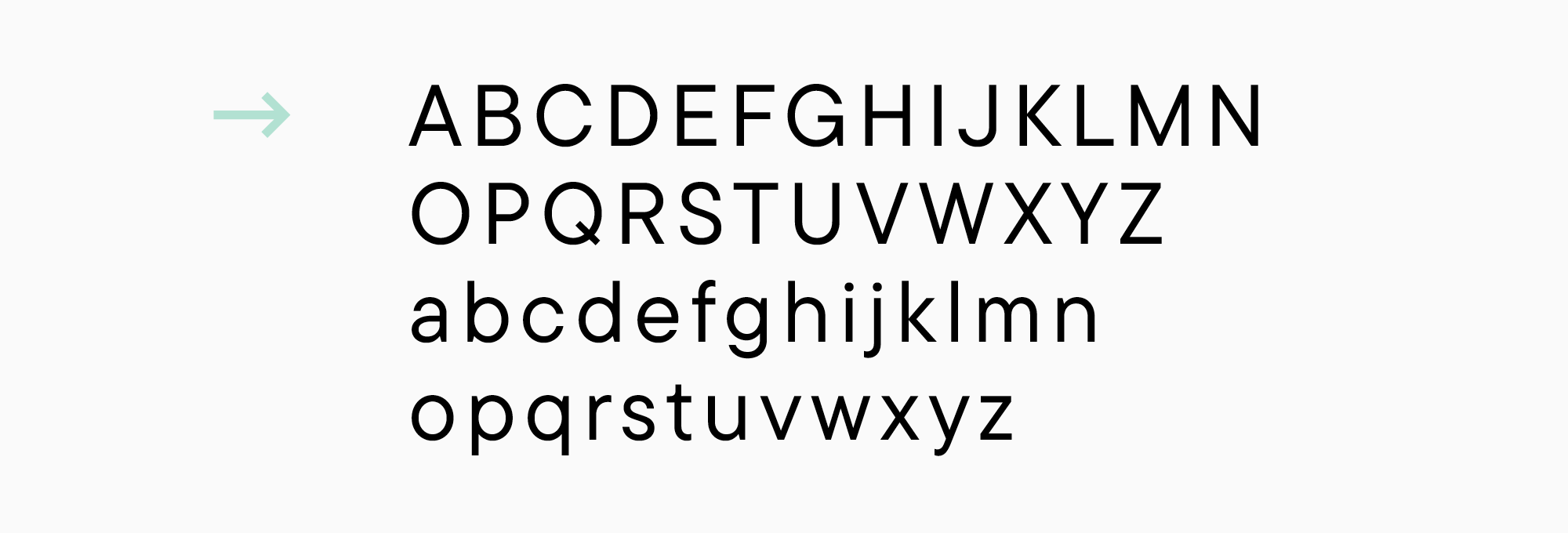
- Der lateinische Basiszeichensatz. So nennen wir das lateinische Alphabet — die Grundlage aller Schriften.
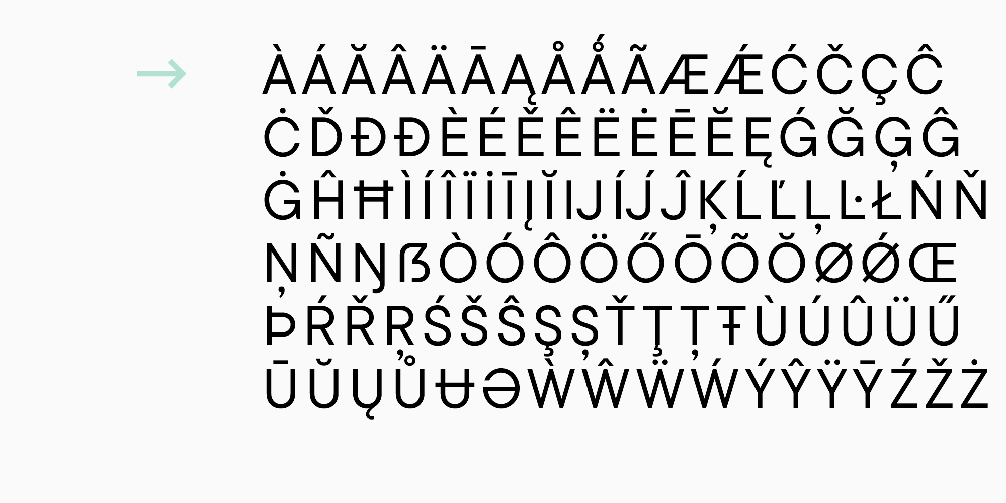
- Erweiterter lateinischer Zeichensatz, der die Zeichen West- und Mitteleuropas enthält.
- Kyrillischer Zeichensatz, der russische und westliche kyrillische Sprachen umfasst.
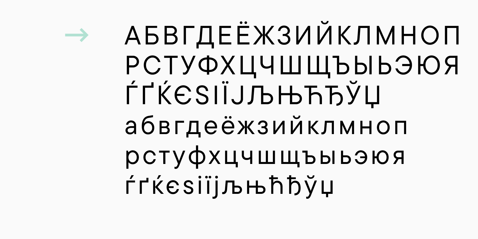
- Um diese sprachliche Vielfalt abzudecken, benötigen wir speziell gezeichnete diakritische Zeichen (in unserem Fall verschiedene Varianten von Klein- und Großbuchstaben).

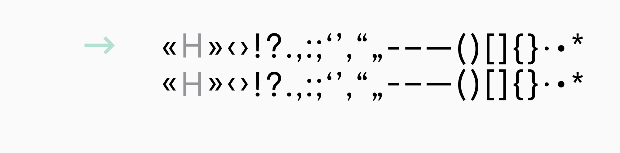
- Bei Bedarf werden auch Satzzeichen mit ihren Varianten für Groß- und Kleinschreibung benötigt.
Beim Zeichnen ist es üblich, die zentralen Satzzeichen und Symbole (wie Klammern oder Bindestriche) an den Kleinbuchstaben auszurichten, damit sie besser aussehen. Wenn in solchen Fällen nur mit Großbuchstaben geschrieben wird (mit aktivierter Großschreibung), erscheinen die Klammern niedriger als gewünscht. Um dies zu beheben, werden die mit Großbuchstaben ausgerichteten Zeichen separat gezeichnet und die Groß-/Kleinschreibung wird geschrieben.
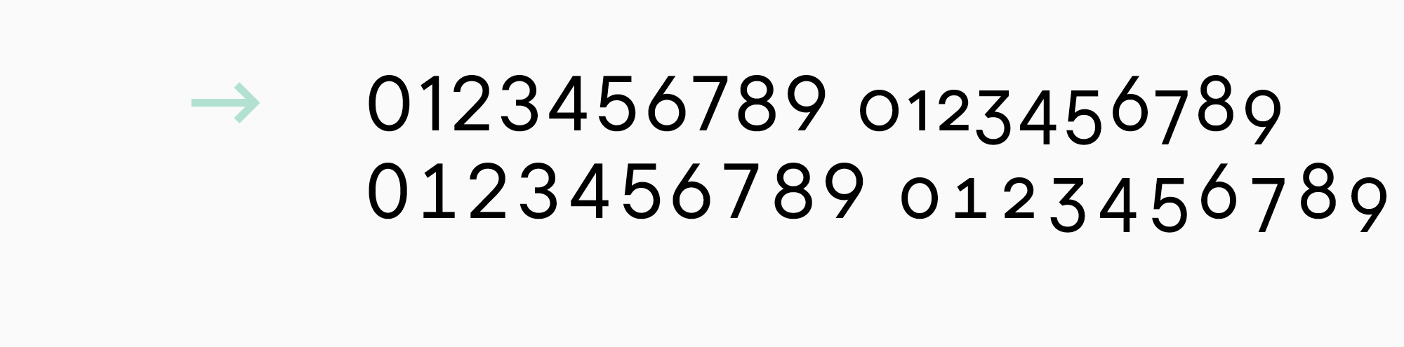
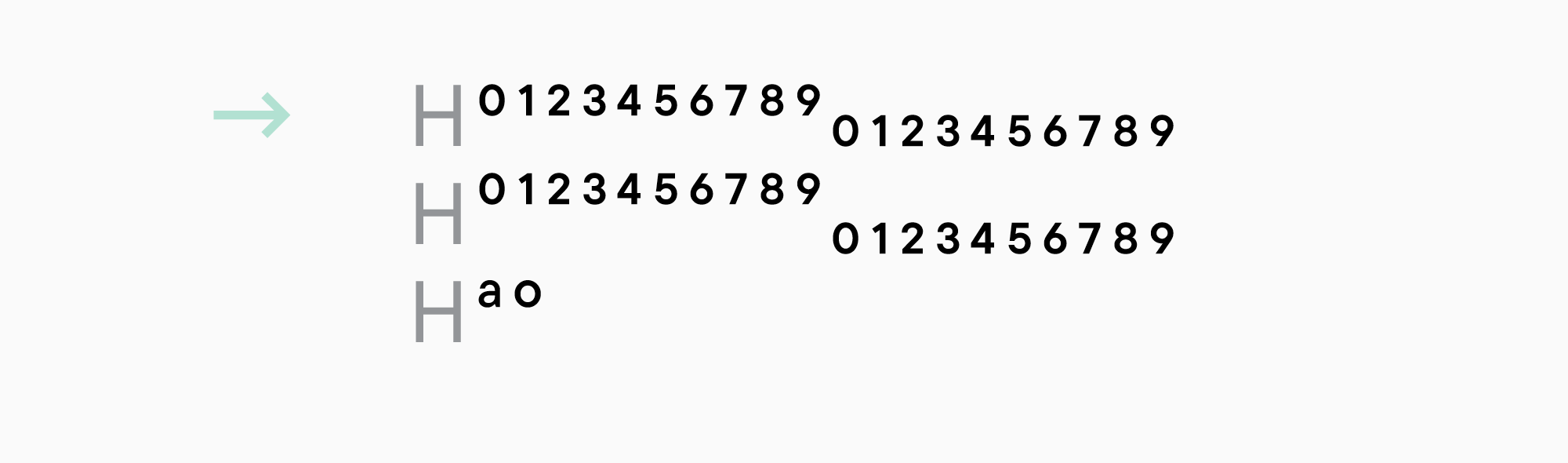
- Vier Arten von Zahlen: auf einer Linie (an Großbuchstaben ausgerichtet), nicht auf einer Linie (an Kleinbuchstaben ausgerichtet) und ihre tabellarischen Versionen (sie haben die gleichen quadratischen Abstände und sind praktisch für die Verwendung in Tabellen).
- Darüber hinaus erscheinen Zahlen als Zähler, Nenner, Unter- und Obergrenzen. Man findet sie in Brüchen, Fußnoten oder chemischen Formeln. Männliche und weibliche Ordinalzahlen (1а — prima, 1o — primo) gehören ebenfalls in diese Kategorie.
- Zähler und Nenner können direkt in Brüchen verwendet werden.

- Eine weitere Version der Zahlen ist eingekreist.

- Währungen und ihre tabellarischen Darstellungen.

- Symbole mit der Groß-/Kleinschreibung von @.

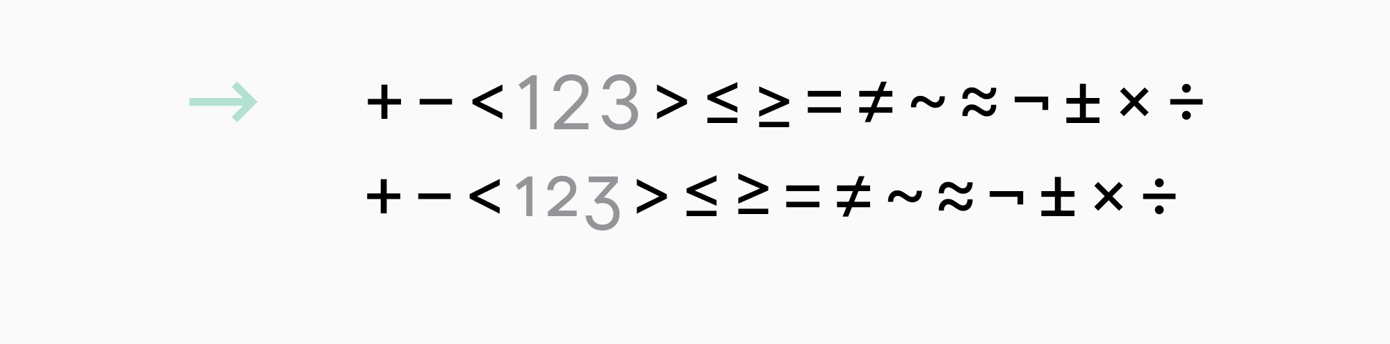
- Grundlegende mathematische Symbole mit ihren Versionen für nicht ausgefüllte Zeichen, falls erforderlich.
Hier gilt die gleiche Logik wie bei den Versionen mit Groß-/Kleinschreibung. Zunächst werden die mathematischen Symbole an den ausgefüllten Zeichen ausgerichtet, so dass sie neben den nicht ausgefüllten Zeichen zu hoch erscheinen können. In diesem Fall wird für die nicht ausgefüllten Zeichen eine niedrigere Version gezeichnet.
- Pfeile können hilfreich sein.

Vergessen Sie nicht das Leerzeichen und .notdef (ein Symbol, das im Fonteditor angezeigt wird, wenn ein Benutzer versucht, ein Zeichen einzugeben, das nicht in der Schriftart enthalten ist).
Überlegen Sie, ob Ihre Schriftart Kapitälchen benötigt oder nicht. Dadurch wird zwar der Zeichensatz erweitert, aber die Schrift erhält auch mehr Funktionalität.
Kapitälchen sind verkleinerte Großbuchstaben. Sie sind in der Regel etwas höher als die Kleinbuchstaben und haben ein ähnliches Gewicht. Sie werden für Abkürzungen verwendet oder wenn die Eingabe in Großbuchstaben erforderlich ist.

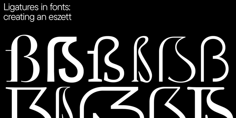
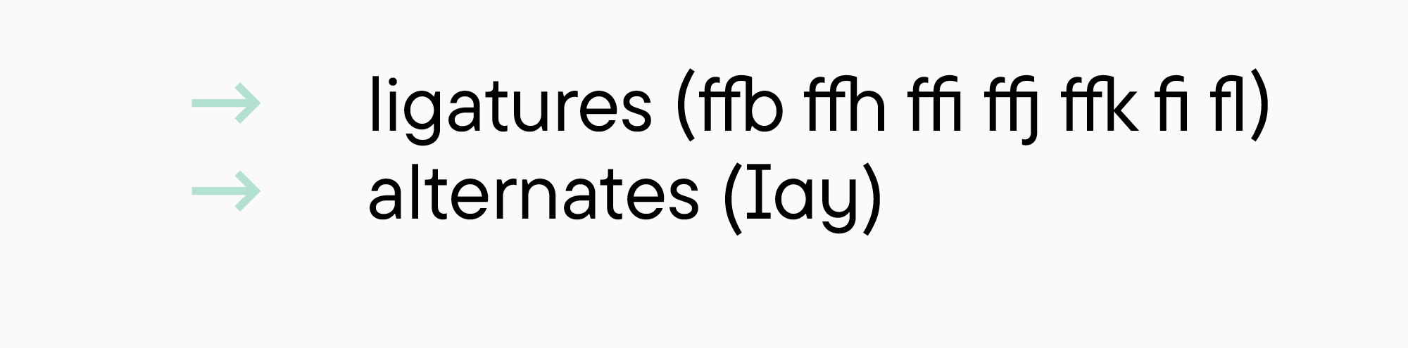
Neben den oben genannten Zeichen kommen bei der Gestaltung von Schriften häufig Ligaturen und stilistische Alternativen zum Einsatz.
Ein Zeichensatz wie dieser (672 Zeichen) ist größer als die Kombination aus Windows 1250, 1251 und 1252 (369 Zeichen ohne die technischen Symbole). Wir verwenden diesen Zeichensatz als Basis, die wir je nach Bedarf erweitern oder verkleinern können.
Ergebnis
Die obigen Ratschläge sollen Ihre Kreativität bei der Arbeit an einer Schrift in keiner Weise einschränken. Sie sollen Ihnen lediglich helfen, einen Entwurf zu erstellen, der Ihnen als Leitfaden für den gesamten Prozess dient.
Wenn Sie diese Empfehlungen befolgen, erhalten Sie eine kurze Beschreibung Ihrer Schrift. Sehen wir uns an, wie diese für eine Serifenschrift und eine Serifenlose aussehen könnte, die ich in den Beispielen erwähnt habe.
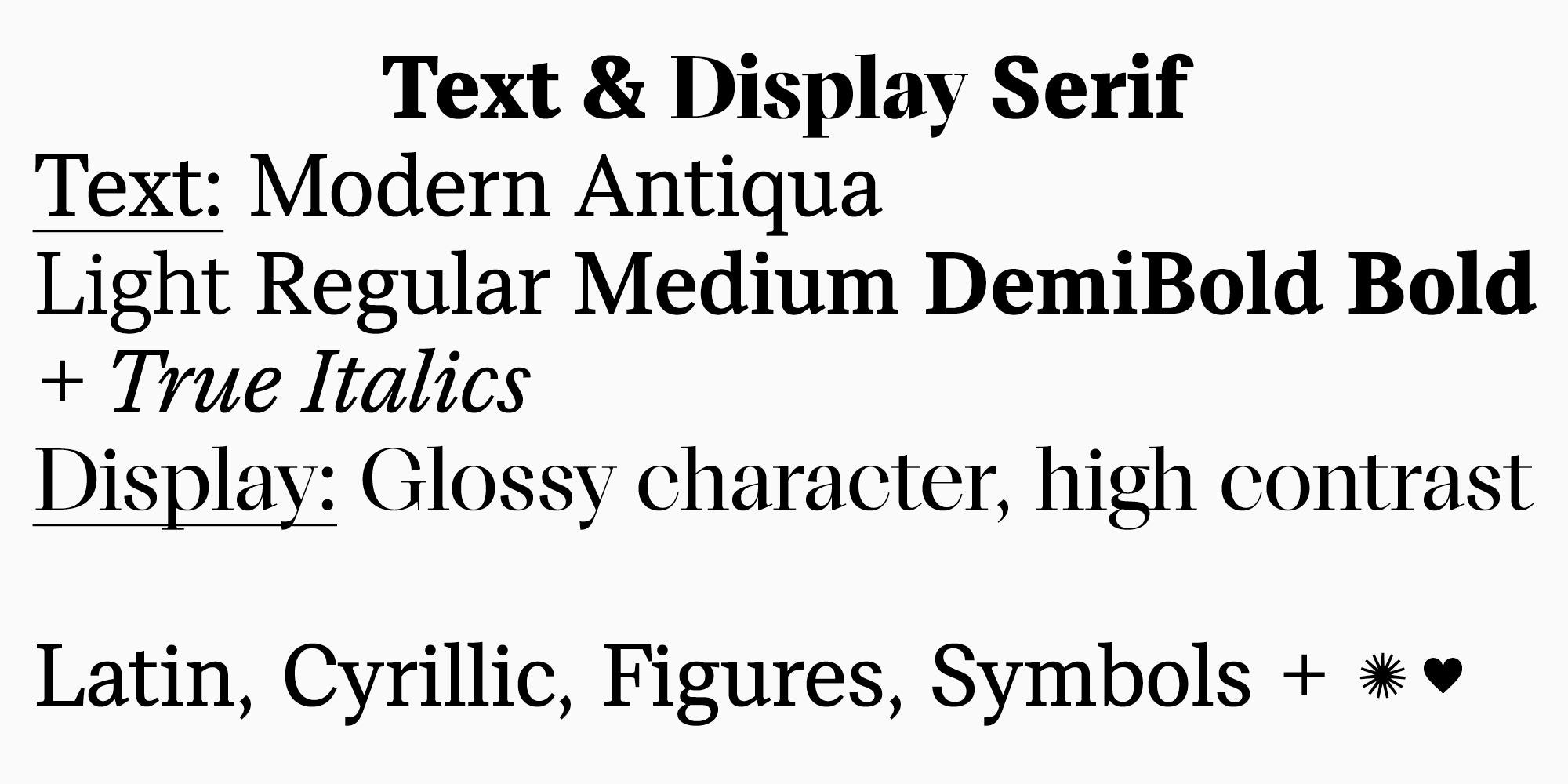
Aufgabe 1. Eine funktionelle und moderne Serifenschrift.
Die Schriftfamilie soll Varianten für Text und Überschriften enthalten.
Die Textvariante ist eine moderne Serifenschrift, die für lange Texte verwendet werden kann. Sie darf den Benutzer nicht abschrecken — sie soll dem modernen Auge vertraut sein und nicht altmodisch wirken. Das Erscheinungsbild der Serifenschrift sollte modern sein und die Eigenschaft haben, auch langfristig relevant zu sein.
Die Schriftfamilie sollte nicht zu groß sein, aber genügend funktionale Schriftschnitte bieten (am besten 5 Schnitte). Die Kursivschrift wird nach einer eigenen Logik gestaltet (nicht einfach eine schräge Schrift) und wird eine moderne Version der Konstruktion im alten Stil haben.
Die Variante für Überschriften ist eine Schrift mit einem ausgeprägteren «Magazinstil». Sie kann in großen Schriftgraden verwendet werden.
Die Textschrift ist kontrastarm, statisch und mittig offen. Die Unterfamilie der Überschriften wird kontrastreich sein, mit dynamischen Proportionen und geschlossenen Öffnungen, aber der Zeichenaufbau ist der gleiche wie bei der Textvariante. Die Höhe der Kleinbuchstaben im Verhältnis zu den Großbuchstaben ist weder hoch noch niedrig. Die Oberlängen entsprechen den Großbuchstaben oder sind etwas höher.
Der Zeichensatz muss das europäische lateinische und das westliche kyrillische Schriftsystem abdecken und alle Arten von Ziffern, die wichtigsten Satzzeichen und Symbole enthalten. Außerdem muss die Schrift Kapitälchen und eine kleine Anzahl dekorativer Elemente enthalten.
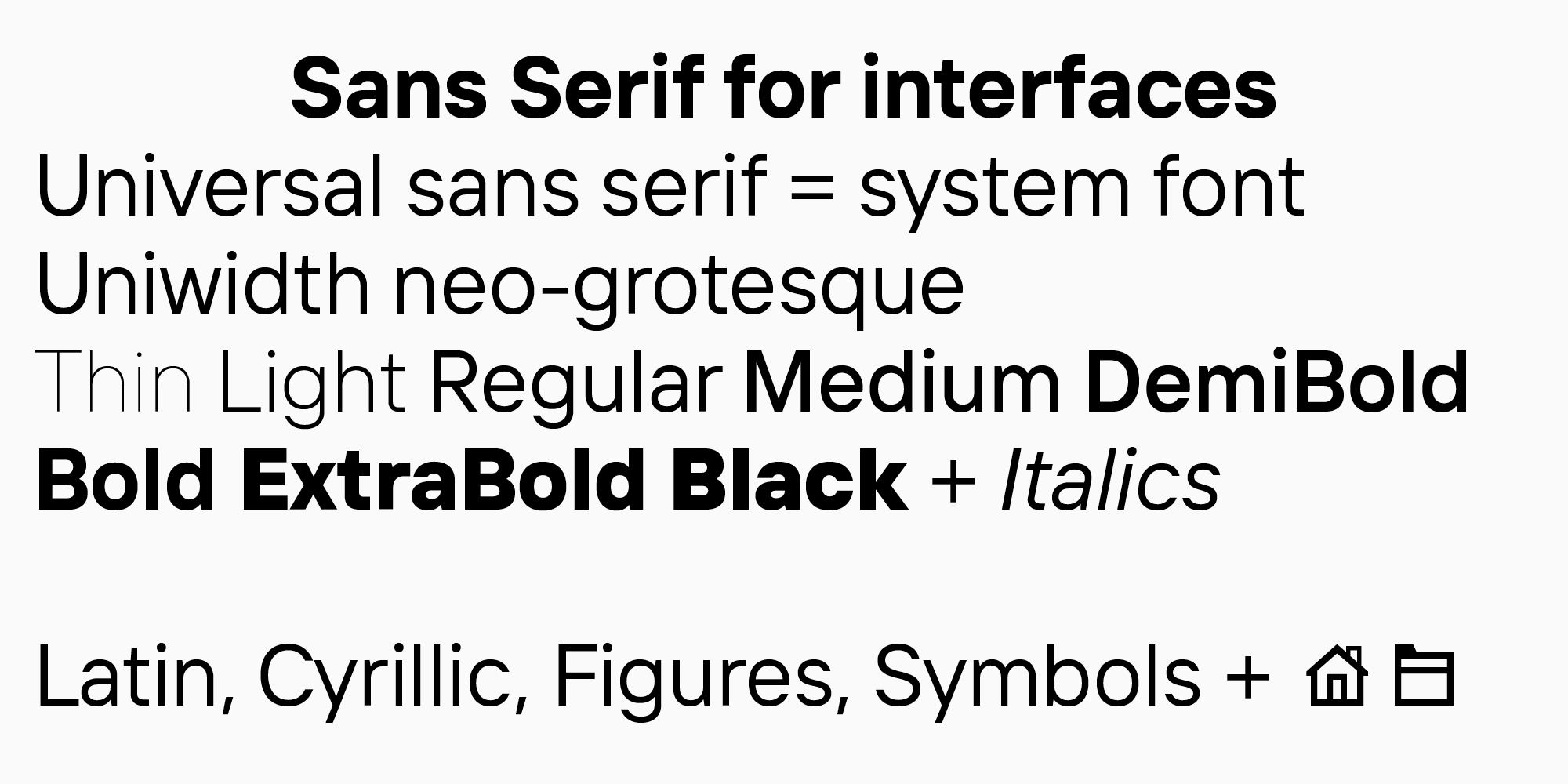
Aufgabe 2. Eine serifenlose Schrift für Benutzeroberflächen
Wir entwerfen eine vielseitige Groteskschrift für Benutzeroberflächen. Es ist wichtig, dass sie Systemschriften sicher ersetzen kann, d.h. ihre Proportionen und Metriken sollten in dieser Kategorie durchschnittlich sein, ebenso wie ihr Zeichen. Außerdem muss die Schrift, wie die Untersuchung zeigt, in die Kategorie der Neogroteskschriften fallen. Dementsprechend sind die Proportionen statisch und der Kontrast dient nur als optischer Ausgleich. Die Öffnungen sind mittelgroß oder geschlossen. Die Schriftfamilie muss eine breite Gewichtsskala (8-10) und einen schrägen Schnitt aufweisen.
Der Zeichensatz muss umfassend sein, mit erweiterten lateinischen und kyrillischen Zeichensätzen, allen Arten von Ziffern, allen notwendigen Satzzeichen und Symbolen. Außerdem muss eine Reihe der am häufigsten in Benutzerschnittstellen verwendeten Symbole hinzugefügt werden.
Abschließende Gedanken
Eine Schrift ist ein großes und komplexes System, in dem man leicht vom Weg abkommt, sich verliert und vergisst, wohin die kreative Idee eigentlich führen sollte. Oder man wird von einer ständig wachsenden Menge an Arbeit eingeholt. So kann es schwierig werden, ein Schriftdesign fertigzustellen, und Projekte werden nie veröffentlicht.
Wenn Sie jedoch eine mehr oder weniger klare Vorstellung vom Endprodukt haben und alle Aufgaben systematisieren, ist das Entwerfen einer Schrift durchaus machbar. Gehen Sie Schritt für Schritt vor — und Sie werden es schaffen!