

Monospace, eine Branding-Agentur aus Deutschland, entwickelt Corporate Identities und Projektdesigns. Das Unternehmen ist davon überzeugt, dass durch Design eine Marke geschaffen werden kann, die eine angenehme und langfristige Interaktion mit dem Kunden ermöglicht.
Monospace wollte Änderungen an der Schrift TT Hoves Medium vornehmen.
Die Anpassung wurde in folgenden Bereichen durchgeführt:
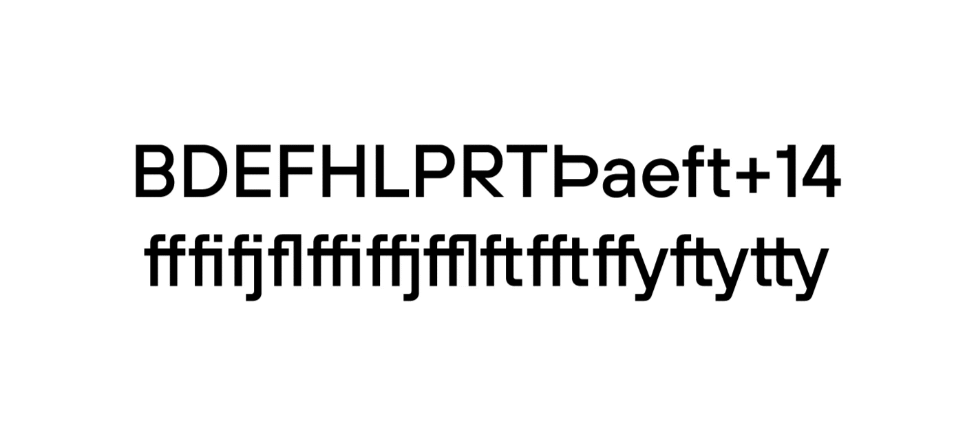
– Es war notwendig, die Grafik einiger Zeichen zu ändern und eine Display-Version der TT Hoves Medium zu erstellen;
– Zeichnen und Einbetten von zwei Firmenlogos in die Schriftdatei;
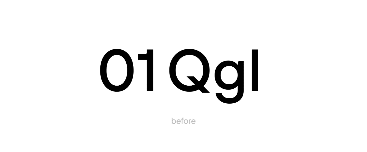
– die alternativen Formen der Zeichen 0, 1, Q, g, l als Standard festzulegen;
– Reduzierung des Zeichensatzes der Schriftdatei: Entfernung des kyrillischen Alphabets, der Kapitälchen, der erweiterten Ziffern und Symbole;
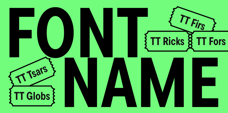
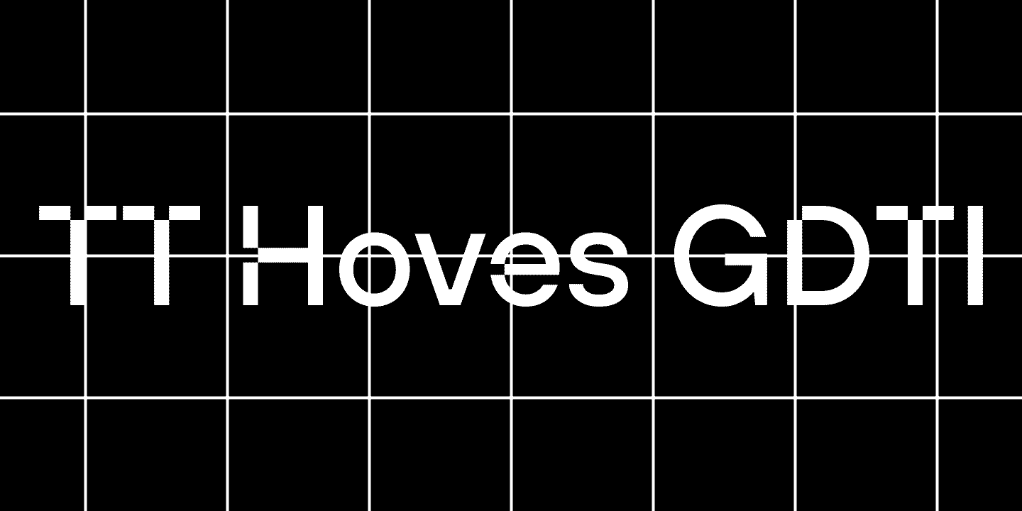
– Änderung des Fontnamens in TT Hoves GDTI.
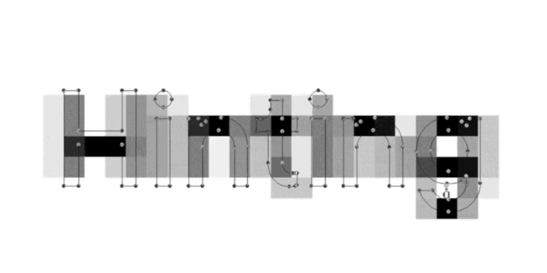
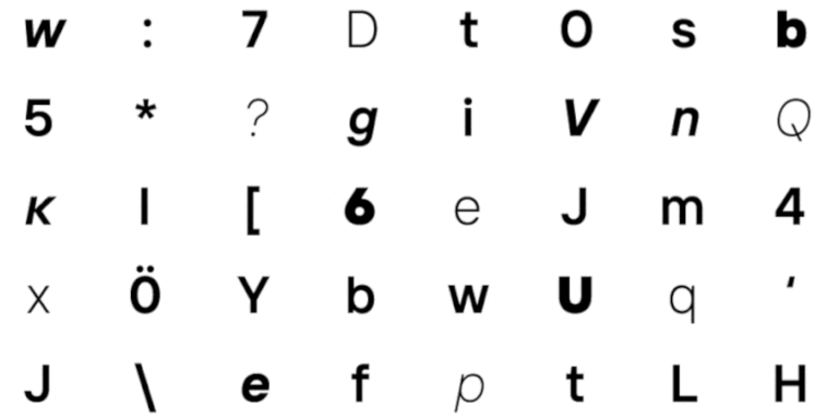
Das Team aus TypeType-Designern und technischen Spezialisten begann mit der Anpassung: Der Designer änderte die Grafik von 39 Originalzeichen in einem der Fonts. Außerdem wurde der Stil der Glyphen mit diakritischen Zeichen geändert.
Zwei Firmenlogos wurden der Schriftdatei hinzugefügt.
Die Schriftdatei selbst wurde verschlankt: Der Zeichensatz wurde von 1384 Zeichen auf 656 Zeichen reduziert.
Die technischen Spezialisten von TypeType ersetzten die Alternativ- und Hauptzeichen.
Zwei Firmenlogos wurden der Schriftdatei hinzugefügt.

Die Schriftdatei selbst wurde verschlankt: Der Zeichensatz wurde von 1384 Zeichen auf 656 Zeichen reduziert.
Bevor der Font an den Kunden geschickt wurde, fügte das Team automatisch eine Anmerkung hinzu und änderte den Namen in TT Hoves GDTI.
Während der Arbeit an der Schrift wurde eine weitere Änderung vorgenommen: Das Unternehmen wollte auch die Textversion von TT Hoves anpassen. Daher wurden die alternativen Formen der Zeichen 0, 1, Q, g, l als Standard in 8 verschiedenen Stilen von TT Hoves definiert, d.h. in 4 aufrechten und 4 kursiven Stilen. Diese Version der Schrift wurde auch in TT Hoves GDTI Text umbenannt.
In der Folge wurden von TypeType der Monospace Albert & Buettner GbR angepasste Versionen der TT Hoves Display- und Textschriften mit kleinerem Zeichensatz, neuen Grafiken für einige Glyphen und neuen Namen erstellt und ausgeliefert.
As a result, TypeType provided Monospace Albert & Buettner GbR with customized versions of TT Hoves display and text fonts with smaller character composition, new graphics for some glyphs, and new names.