Buy font Probar fuente

TT Cometus

TT CometusTT Cometus
Single style: desde $39.99 Familia de fuentes completa: 5 de los estilos desde $119

¿Tienes duda sobre una fuente o licencia?

Escoge las fuentes

Escoge las fuentes y las licencias

Después pulsa el botón "Añadir al carrito"

–25% al seleccionar licencias de fuentes de escritorio y web a la vez

Pack de promoción:
per style $23.80
desde  $119
desde $39.99
desde $39.99
desde $39.99
desde $39.99
desde $109
Pack de promoción:
per style $24.75
desde  $99
desde $39.99
desde $39.99
desde $39.99
desde $39.99
desde $109
desde $109

¿Tienes duda sobre una fuente o licencia?

Elige licencia de fuente

Antes de elegir una licencia, debes seleccionar un paquete o estilo de fuente

Selecciona las licencias que necesitas

La licencia es adecuada para cualquier persona que planee usar la fuente para crear logotipos, imágenes para sitios web y redes sociales, así como impresión, poligrafía, creación de souvenirs o mercancía de la marca. Texto completo de la licencia

A solicitud

Si planeas utilizar la fuente en encabezados o bloques de texto en el sitio web de tu proyecto, esta licencia es para ti. Texto completo de la licencia

A solicitud

Para el uso de la fuente en las apps de iOS, Android, Windows, Linux y otros sistemas operativos.
No tomamos en cuenta la cantidad de descargas de la app, sino que nos centramos únicamente en la cantidad de aplicaciones en las que se utilizará la fuente. Texto completo de la licencia

A solicitud

Apta para los banners, publicidad digital y anuncios en el internet, así como para promoción en las redes sociales.
Los tipos de licencia se varían dependiendo de la cantidad de visualizaciones de los materiales publicitarios. Texto completo de la licencia

A solicitud

Uso de la fuente en los vídeos: vlogs, canales de YouTube o televisión, transmisiones en vivo o grabaciones.
Los tipos de licencia dependen de la cantidad del contenido en el que se utiliza la fuente. Texto completo de la licencia

A solicitud

Licencia para desarrolladores de videojuegos. Te permite incrustar la fuente en el código de un videojuego. Texto completo de la licencia

A solicitud

Licencia para desarrolladores de videojuegos. Te permite incrustar la fuente en el código de un videojuego. Texto completo de la licencia

A solicitud

La licencia es apta para los sitios web y apps especiales donde los usuarios pueden crear un producto utilizando la fuente seleccionada sin una licencia de fuente adicional. Texto completo de la licencia

A solicitud

Cuando no te limites a un área de uso y quieres explorar todas las posibilidades de uso de este tipo de letra.
A los compradores de este tipo de licencia, a menudo les ofrecemos customización de fuentes como regalo. Texto completo de la licencia

A solicitud
No hay elementos seleccionados
Total
$0

TT Cometus

Sobre el tipo de fuentes tipográficas

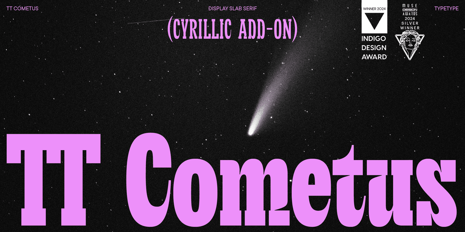
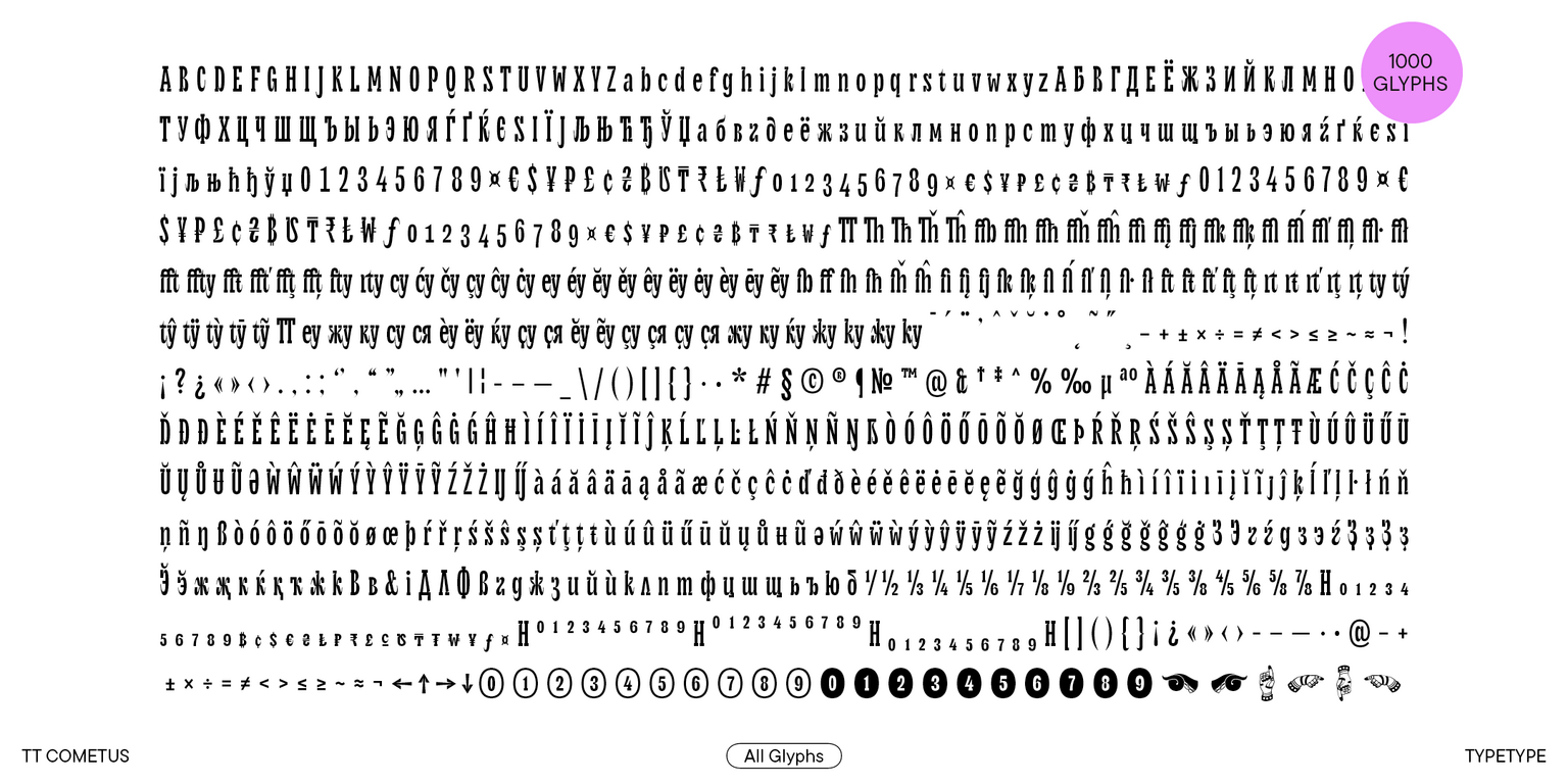
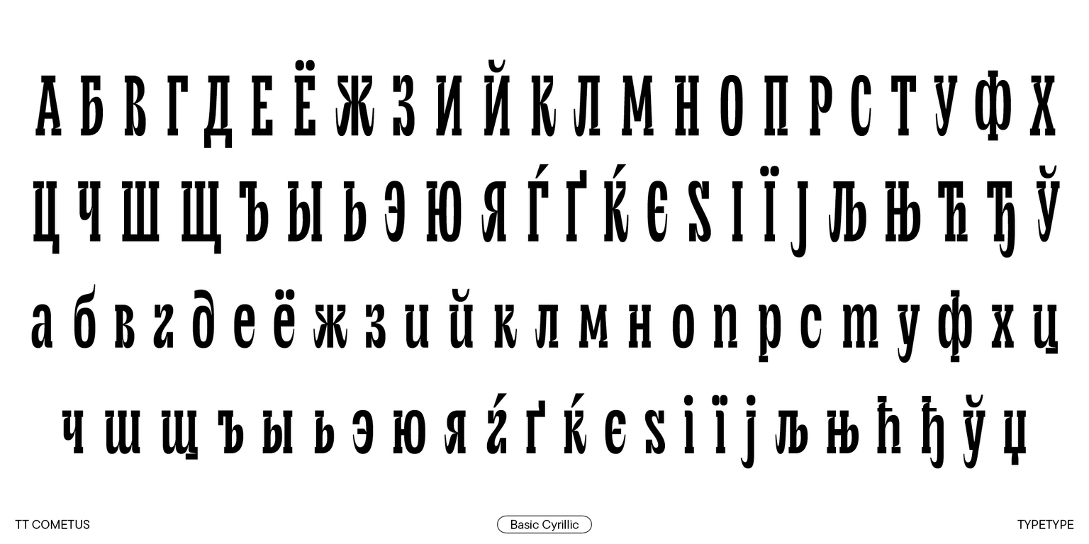
Introducing TT Cometus, version 2.000, which now supports Cyrillic alphabets! We significantly enhanced the font’s character set and technical features.

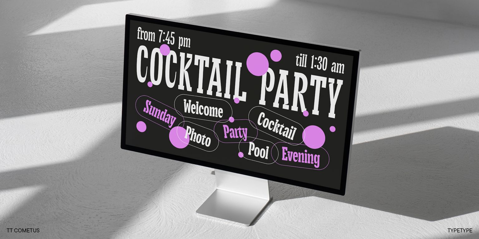
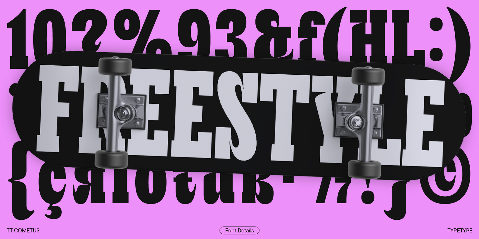
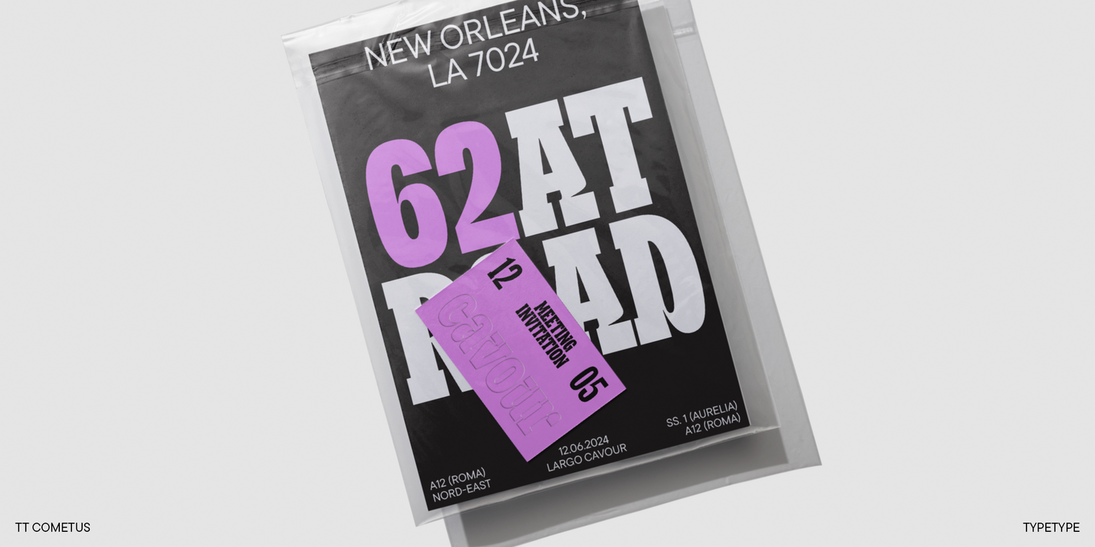
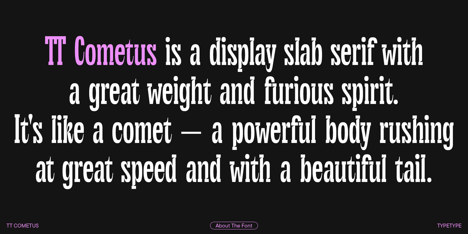
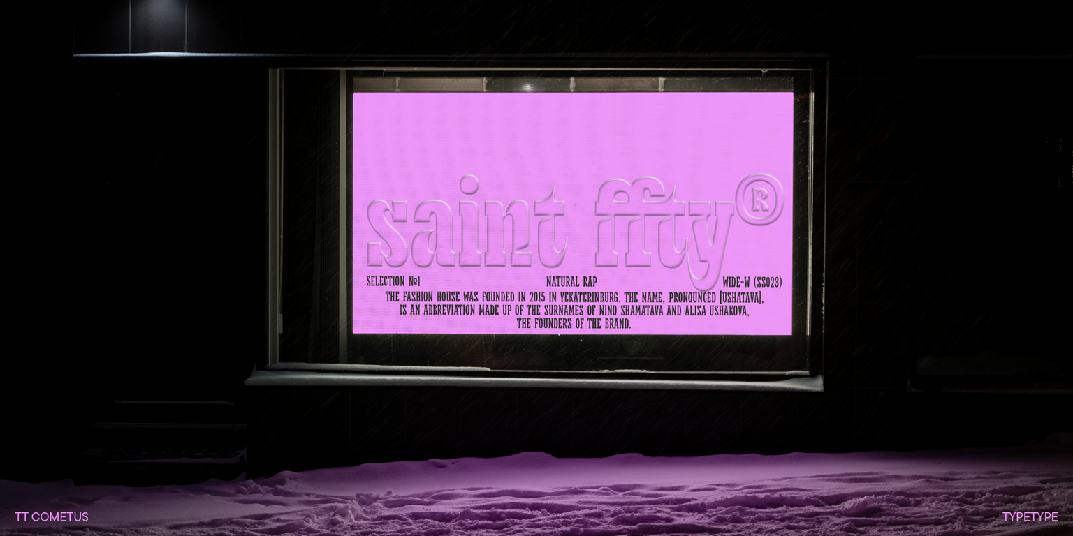
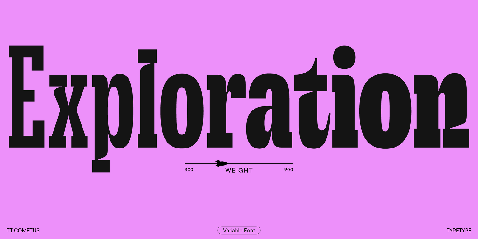
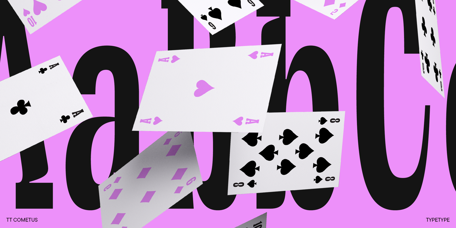
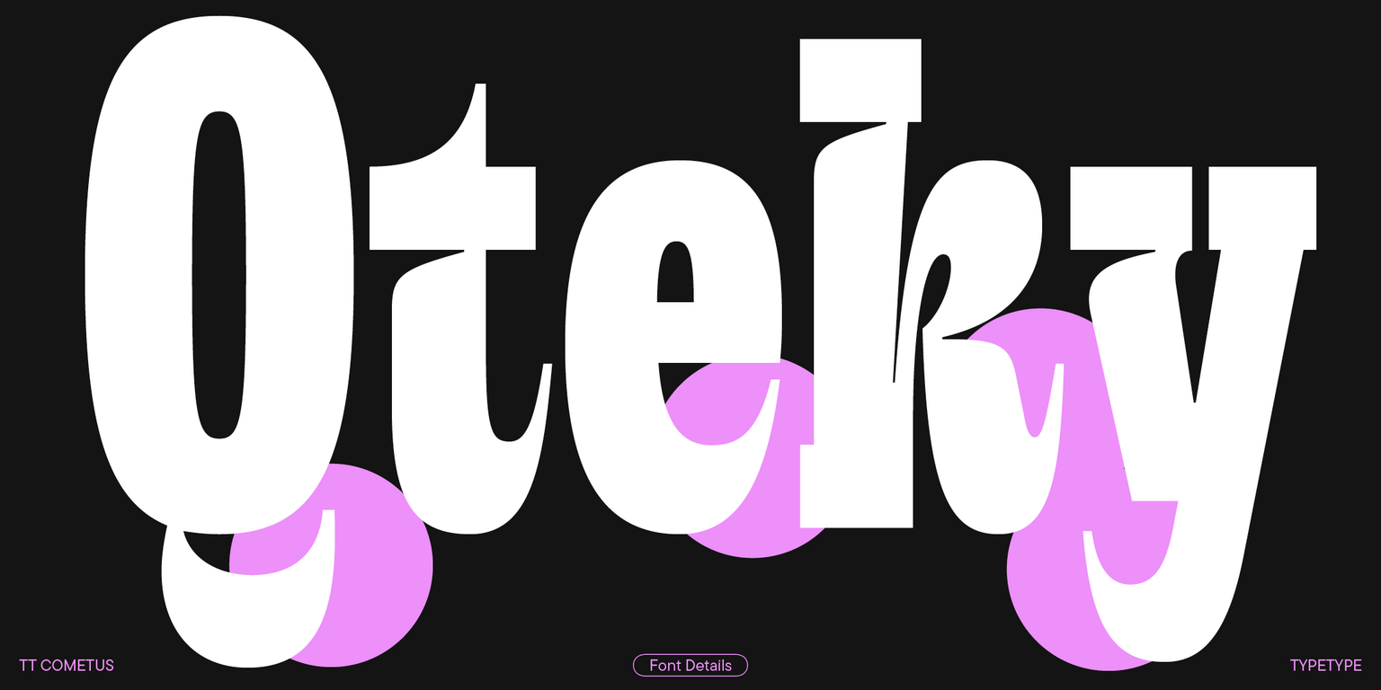
TT Cometus is a modern slab serif. The typeface’s name evokes the image of a comet—a powerful and weighty celestial body with a beautiful tail slicing through space at an incredible speed. This is the key to understanding this font.

TT Cometus embodies a balanced personality: impressive and sturdy but energetic and dynamic at the same time. When designing this typeface, we aimed to incorporate heavy serifs typical for slabs into a modern and dynamic appearance. To achieve this, we combined sturdy details with completely opposite shapes, added a handmade feel, and drew inspiration from brush movements in calligraphy.

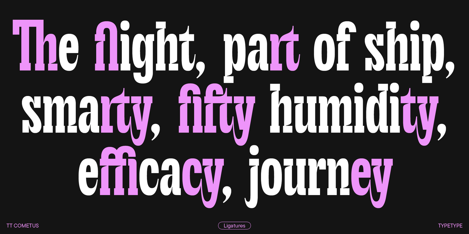
So, TT Cometus stands out for its sharp terminals resembling comet tails, which are particularly noticeable in the letters c, y, e, and t. Another curious detail is the stylized junctions of arcs and bowls that add fluidity to the font. Also, the typeface’s sturdy serifs allow it to maintain stability. The font features a slight contrast between horizontal and vertical element weights and a high contrast in serifs, junctions, and glyph terminals.

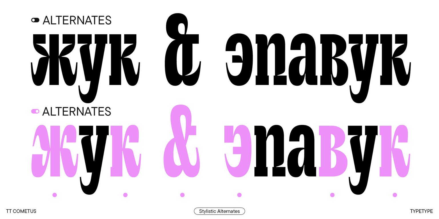
The enhanced version of the typeface boasts long-awaited Cyrillic alphabet support, new stylistic sets and OpenType features, entirely reworked kerning, and improved hinting.

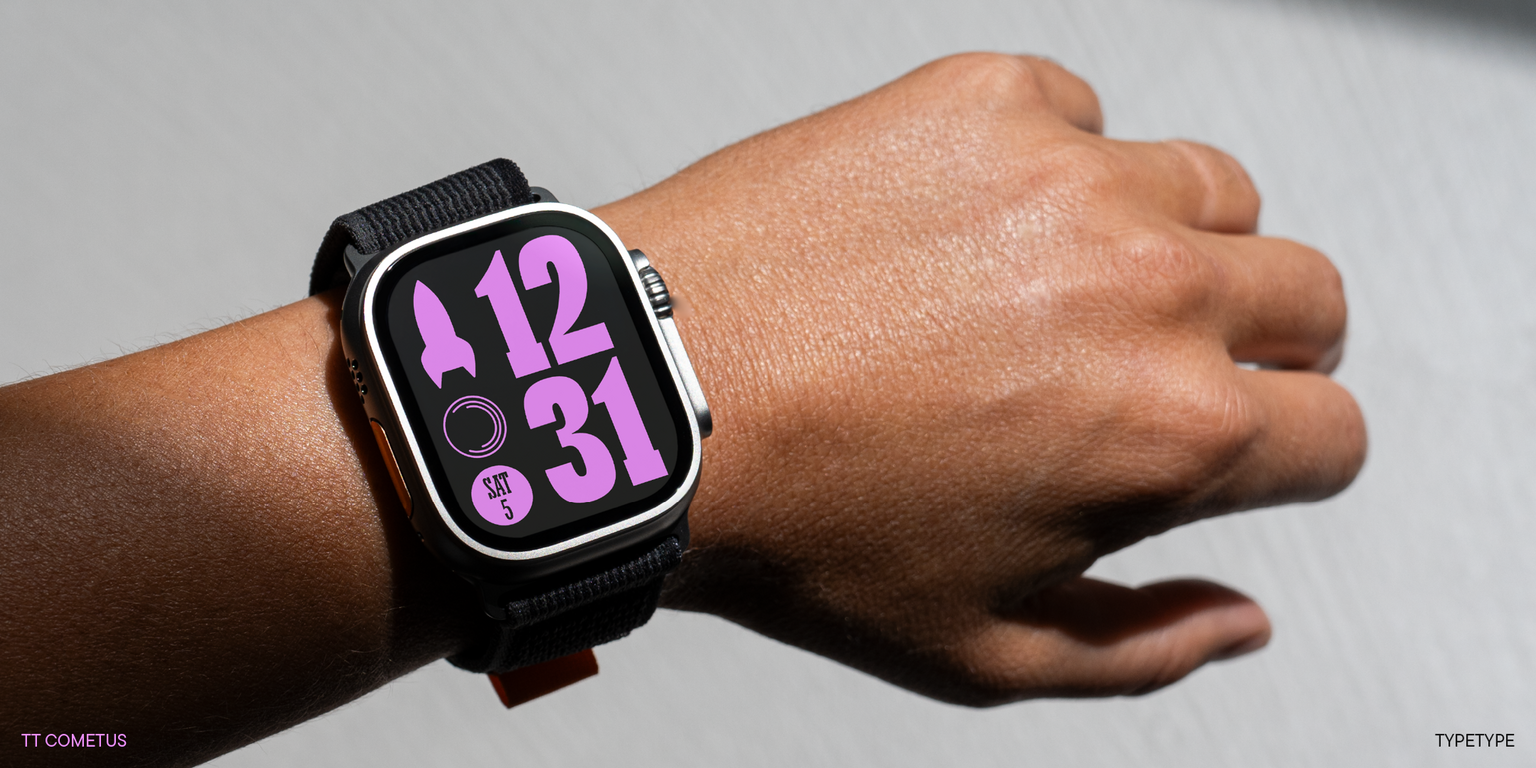
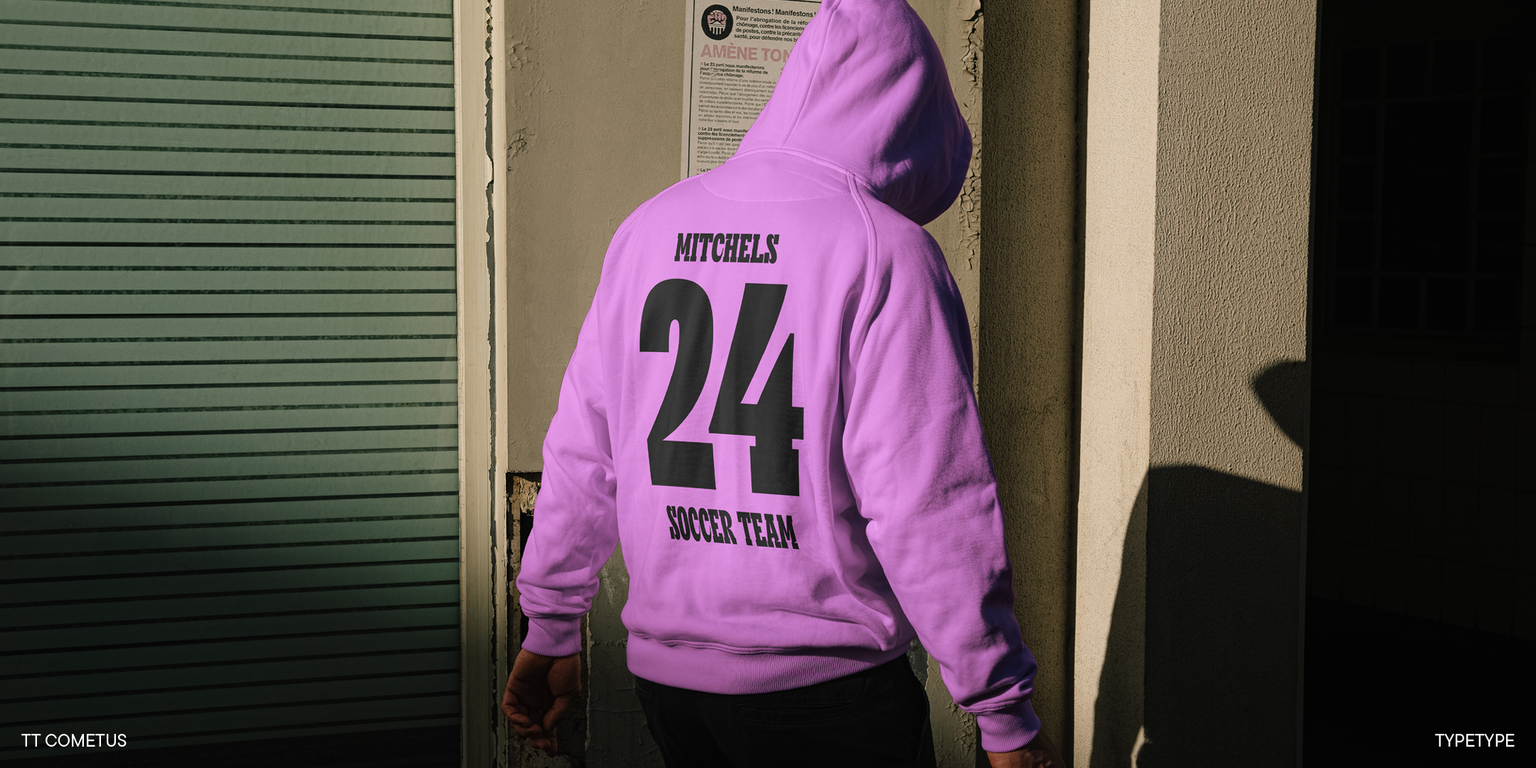
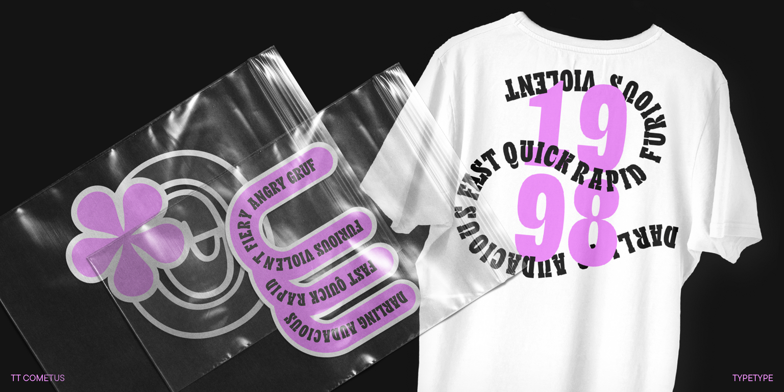
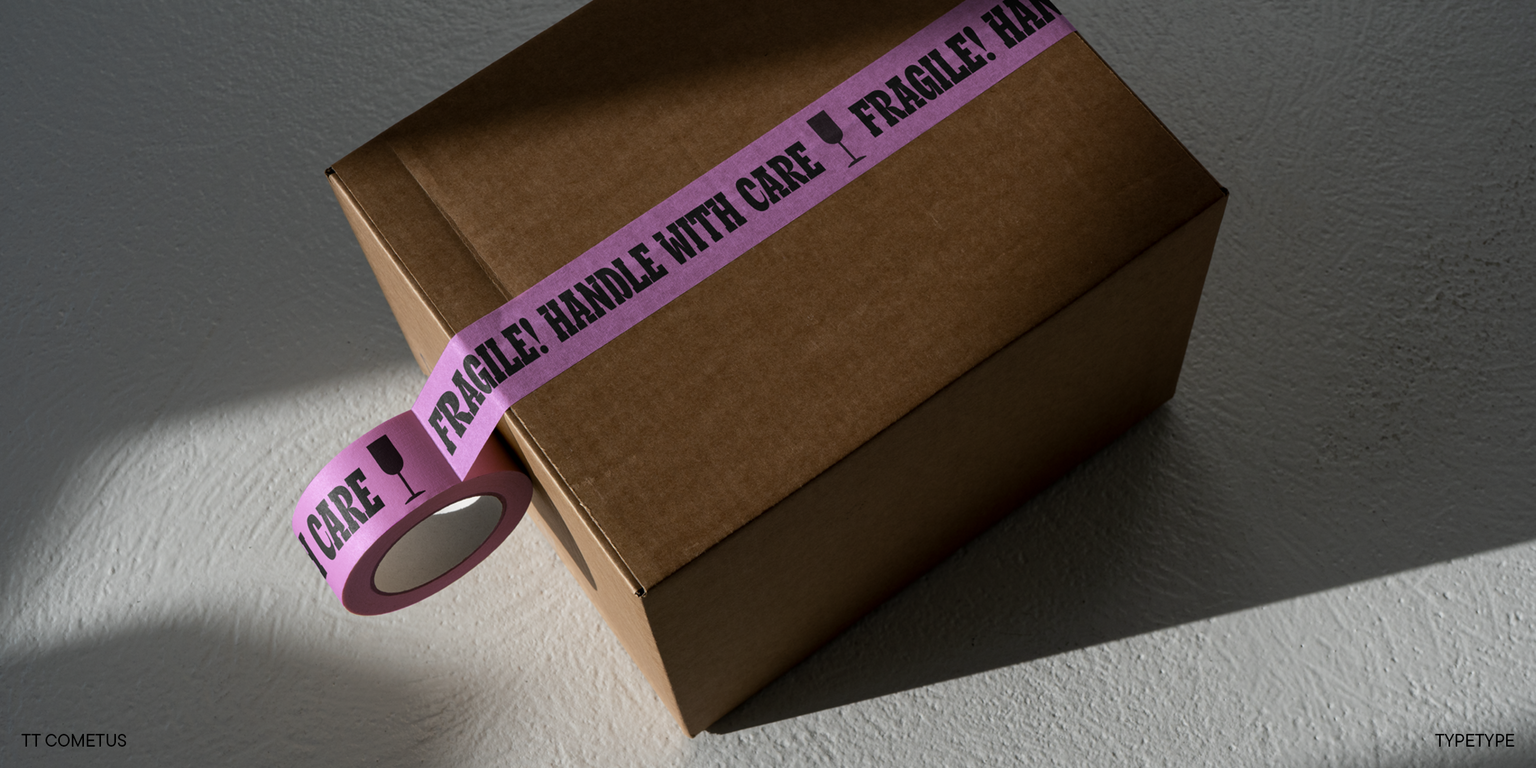
TT Cometus shines best in large point sizes. This font is anything but neutral! It’s eye-catching and looks flawless in headlines, logos, and branding — wherever attention needs to be captured.

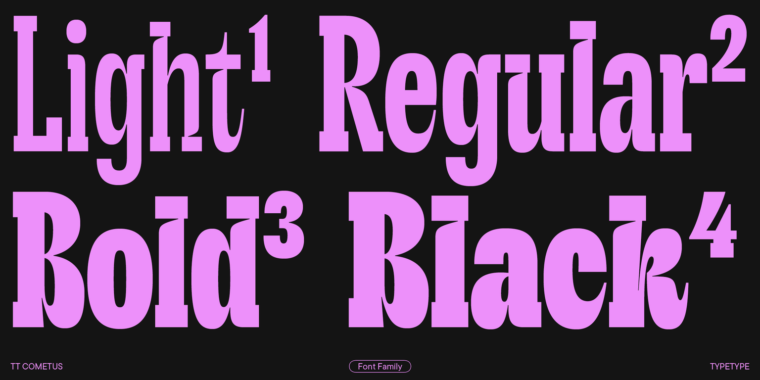
The updated TT Cometus includes:

  • 5 font styles: 4 upright and one variable font with a weight variation axis;
  • 1000 characters in each font style;
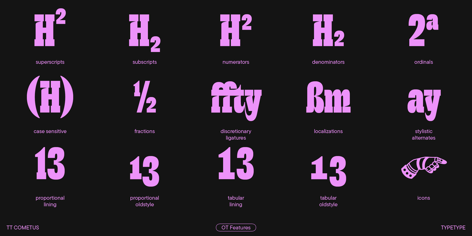
  • 33 OpenType features, counting in numerous ligatures and sets of alternate ampersand and letter g glyphs;
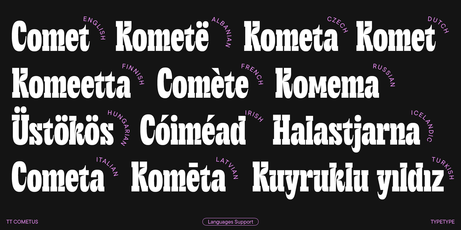
  • 230+ languages support.

Idiomas

+ Soporte De Idiomas Ampliado Mostrar todo

Equipo

Yulia Gonina—art director
Marina Khodak—design lead
Anna Tikhonova—type designer
Ksenia Karataeva—type designer
Yuri Nakonechny—mastering
Victor Rubenko—hinting
Stanislav Tikhonov—mastering & hinting
Ivan Gladkikh—kerning
Elizabeth Ostrovskaya—kerning

Fecha de lanzamiento y actualizaciones

Publicación: enero 31, 2023

Actualización: mayo 21, 2024

Qué ha cambiado en la fuente::
  • Cyrillic languages support, including Russian, and amplified Latin alphabets;
  • Larger character set that grew from 568 to 1000 glyphs;
  • More OpenType features: 33 instead of 18;
  • More extensive basic currency symbol set, a minuscule case for currency symbols (including tabular versions for both cases), and currency symbols for Numr and Dnom cases;
  • New fractions, numerators/denominators, and minuscule figures;
  • New stylistic sets;
  • Entirely redesigned kerning and improved hinting.

Extra

Specimen

Download font specimen (pdf)

Tipografìa para carteles

Presentación gráfica on Behance

Versiones personalizadas

¿Buscas una versión personalizada de esta fuente?

Idiomas

+ Soporte De Idiomas Ampliado
TT Cometus
Tamaño
Otf
Habilitar todo

The naming of the font family refers to a flying comet

TT Cometus
Tamaño
Otf
Habilitar todo

TT Cometus font family was originally conceived as a super display slab serif. If powerful and heavy serifs are essential for creating a slab serif, then why not to combine them with directly opposite forms and make the font family more dinamic? That’s how TT Cometus got the distinctive undercuts where the vertical stroke joins the serif. These undercuts were needed to make the typeface more man-made, not machine-like, as well as to create tension in the elements of the letters and to set important accents.

TT Cometus
Tamaño
Otf
Habilitar todo

TT Cometus is a font family of 5 typefaces: Light, Regular, Bold, Black and Variable.

TT Cometus
Tamaño
Otf
Habilitar todo
Var
Weight

TT Cometus works best in large sizes. It’s definitely not a neutral font!

Funciones de tipo abierto

ss01 | Double-storey g

ǵ ğ

ǵ ğ

ss02 | Pointed Cyrillic tails

З Ҙ Э

З Ҙ Э

ss03 | Curved Cyrillic terminals

ж ќ ҡ

ж ќ ҡ

ss10 | Bulgarian localization

ДЛФ вк

ДЛФ вк

ss14 | Circled Figures

567

567

liga | Standard Ligatures

ffi fk

ffi fk

ss04 | Standard Cyrillic ve

Вв

Вв

ss05 | Standard ampersand

&

&

Mostrar todo

Pares ideales para TT Cometus

What is a font pair, and what does it serve for?

A font pair is a combination of two fonts within one text block. Most often, one of the fonts in a pair is a more expressive headline font, and the other one serves to communicate information. Such fonts complement each other and help designers solve various tasks, like highlighting key elements, adding emotional expressiveness to the project, or separating semantic blocks.

How to choose fonts for a project: Several general recommendations

To begin with, establish the project's tone. Choose the fonts that stylistically match the main idea. After that, you need to determine the functions of each font in the project and their hierarchy: which font will complement the design and which one will serve to attract attention as the main element. You need to assess the difference between the fonts and decide what kind of information each of them should convey. First, we recommend choosing the base font you will use most, and then you can find a suitable pair for it.

Core principles of font pairing and recommendations from designers

The main rule you should follow when matching two fonts is that both similarities and differences must be visible between them. You can highlight the coherence of fonts by the following characteristics: contrast, proportions, width, openness of characters, individual letter shapes, and overall tone. Feel free to experiment with different combinations. We also recommend analyzing the projects you like: this way, you can enhance your visual skills, elevate your knowledge base, and gain confidence in dealing with typography.

Fuentes parecidas

Escoge las fuentes y las licencias