


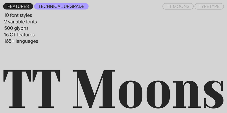
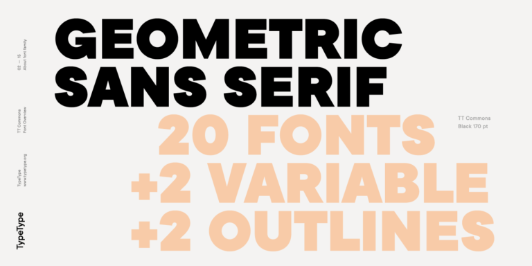
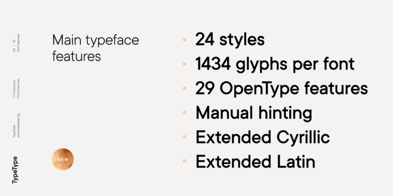
- Se han añadido dos estilos variables: uno para los pesos rectos y otro para los pesos cursivos. El número total de estilos ha pasado de 10 a 12.
- El número de glifos por estilo ha aumentado de 490 a 500.
- Las funciones OpenType han pasado de 10 a 16.
- Se ha realizado una revisión manual exhaustiva del kerning en todos los estilos.
- Se ha añadido hinting manual en todos los estilos.
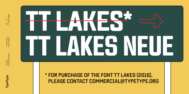
- La fuente se ha reconstruido, pasando del formato FontLab 5 al formato Glyphs.
Selección de Filipino fuentes
Selecciona una fuente adecuada que admita Filipino idiomas. Una enorme colección de familias de fuentes para cualquier propósito y tarea: escribir grandes conjuntos de texto, diseñar títulos para sitios web y publicaciones impresas, imprimir sobre textiles y otros materiales, diseñar letreros y carteles.
Cada una de las fuentes presentadas contiene el alfabeto Filipino. Una amplia selección de símbolos, moneda y signos de puntuación, estilos de fuente y funciones OpenType le permitirán utilizar una fuente para diferentes proyectos. Los caracteres latinos extendidos que contienen signos diacríticos ampliarán la usabilidad de la fuente en diferentes países.
Cada fuente es técnicamente impecable. Muchas fuentes de la colección incluyen un estilo variable, que puede usarse para crear un estilo único para tu proyecto.
Puedes utilizar etiquetas para seleccionar el estilo de fuente o carácter que necesita: geométrico o dinámico, universal o clásico, dinámico o suave. También será conveniente buscar por finalidad: fuente para revistas o sitios web, para emails o publicidad.
Cualquier fuente de la colección se puede personalizar técnica o gráficamente. Con la personalización, puedes agregar o eliminar una letra, agregar el logotipo de una empresa o reducir la composición del efectivo para aligerar el peso del archivo de fuente.
Hay pruebas gratuitas disponibles para fuentes de estudio utilizando una licencia de prueba. Para recibir una versión de prueba, selecciona el botón "fuente de prueba" y completa el formulario de solicitud. La fuente de prueba es idéntica a la versión comercial en términos de efectivo y composición técnica.
También puedes encargar el desarrollo de una fuente comercial desde cero basándose en una fuente que te guste de la colección o según tus deseos.
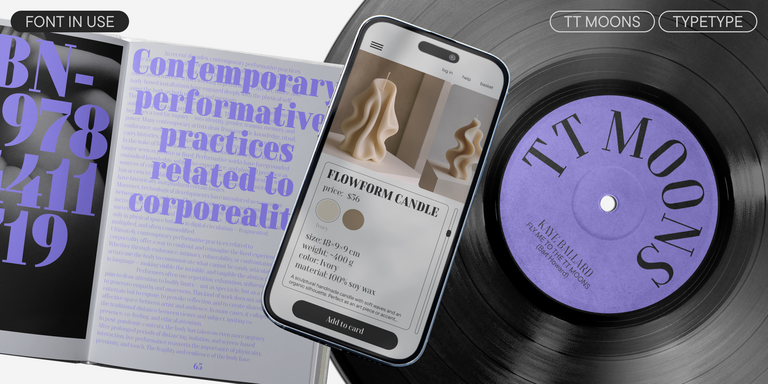
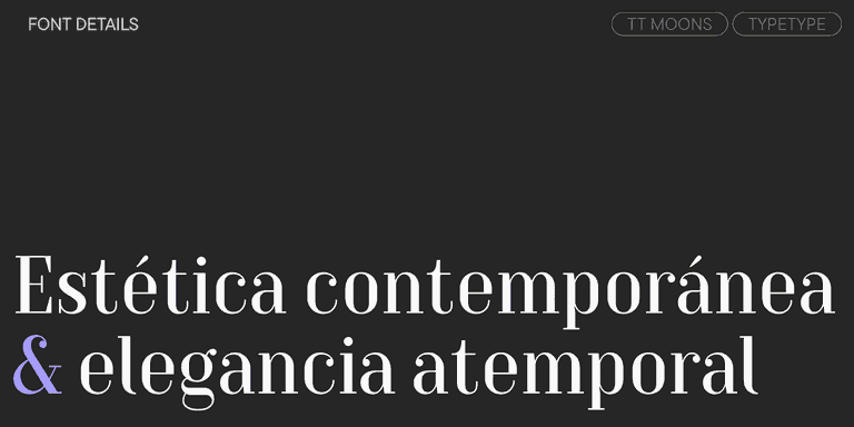
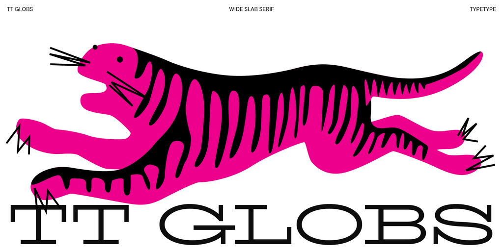
TT Moons is a slim and contrast serif. This font family works especially smart in classic design themes. TT Moons is a typeface of the glyptal modern typeface.
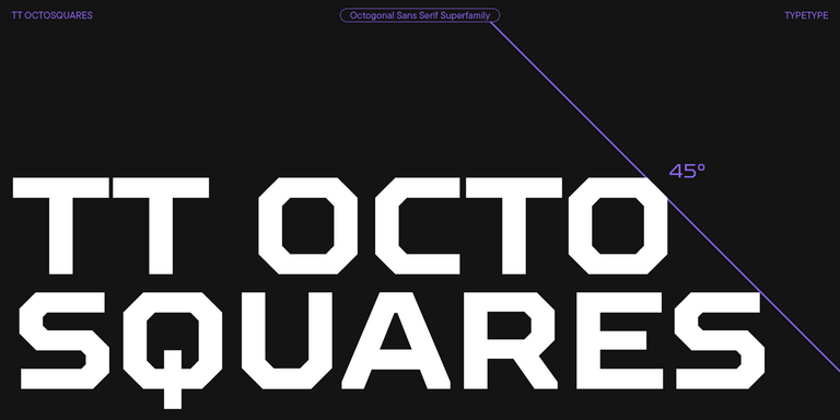
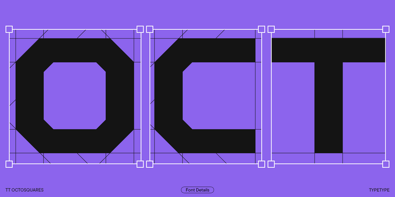
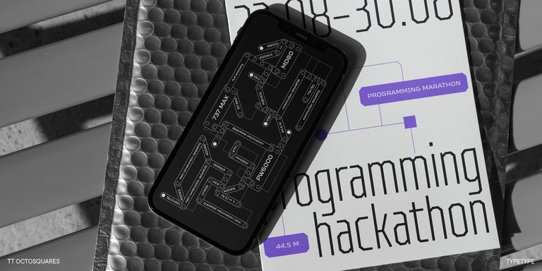
TT Octosquares is a fresh, revised, expanded, and significantly improved version of our first commercial font TT Squares & its narrow version.
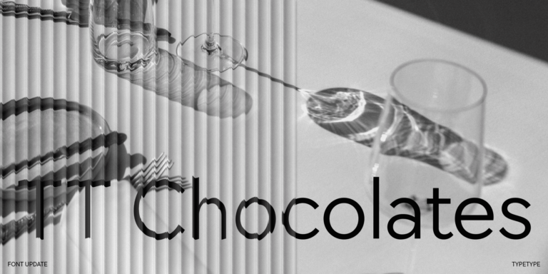
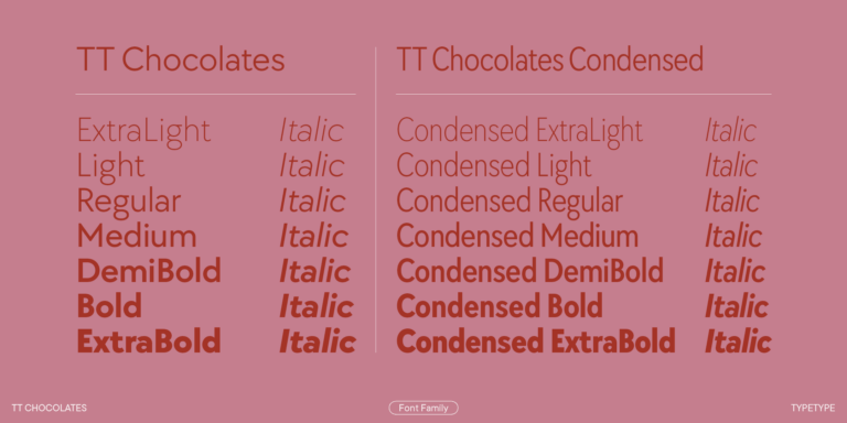
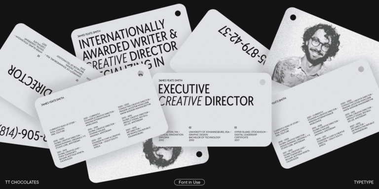
TT Chocolates typeface consists of 14 fonts: 7 weights and 7 obliques. Due to the extended language support and the introduction of useful features.
Descuentos en fuentes
Ver todas las fuentes con descuentos
Quedan:
0
0
días
0
0
horas
0
0
minutos
0
0
segundos
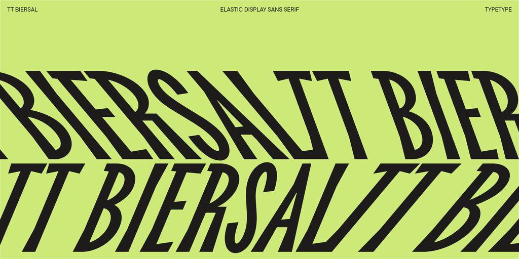
TT Biersal
- desde El precio original era: $39.99.$27.99El precio actual es: $27.99.
- –30% Descuento válido hasta el 17/10/2025

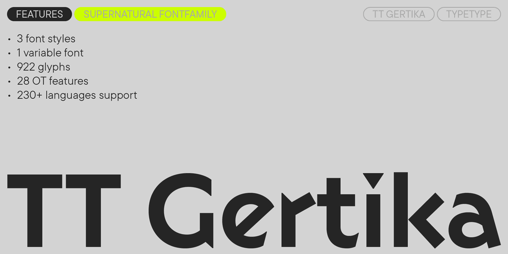
TT Gertika
- desde El precio original era: $39.99.$27.99El precio actual es: $27.99.
- –30% Descuento válido hasta el 24/10/2025

TT Ricordi Marmo
- desde El precio original era: $29.$20.30El precio actual es: $20.30.
- –30% Descuento válido hasta el 07/11/2025
TT Autonomous
- desde El precio original era: $39.99.$27.99El precio actual es: $27.99.
- –30% Descuento válido hasta el 14/11/2025
TT Ricordi Allegria
- desde El precio original era: $39.99.$20El precio actual es: $20.
- –50% Descuento válido hasta el 14/11/2025
We continue to expand the line of the studio's main bestseller TT Norms® Pro!
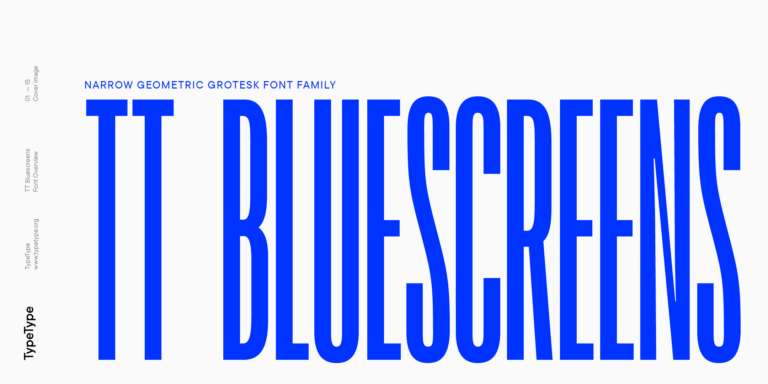
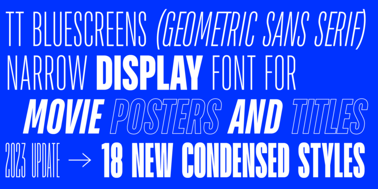
TT Bluescreens is a upgraded geometric sans serif with narrow proportions

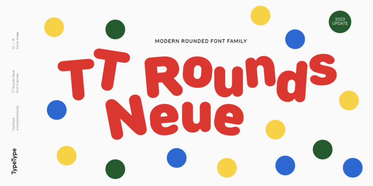
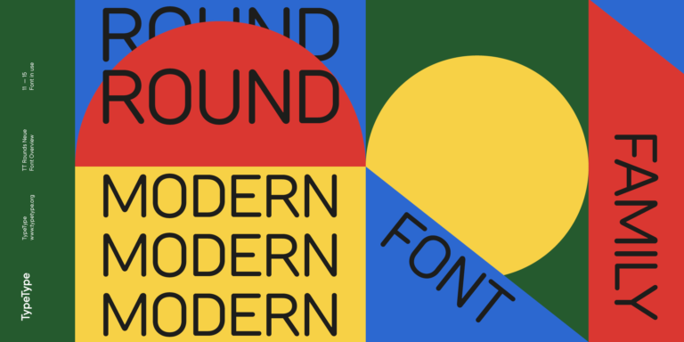
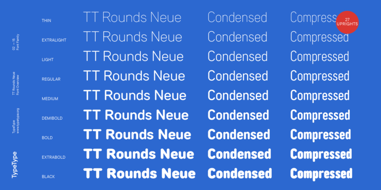
TT Rounds Neue soft, friendly, rounded sans serif fontfamily
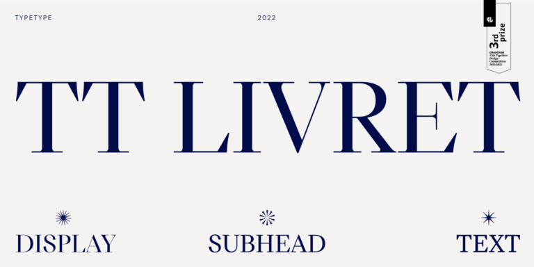
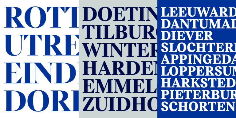
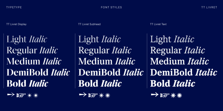
TT Livret is an elegant, modern and functional serif
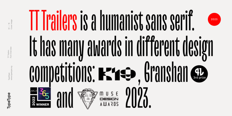
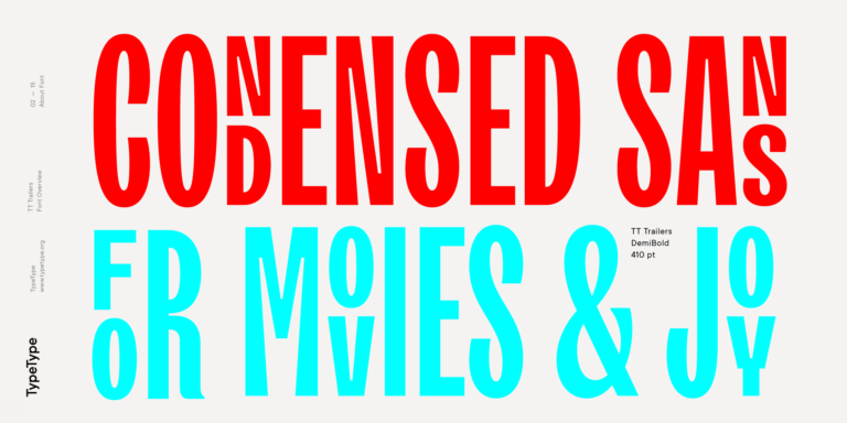
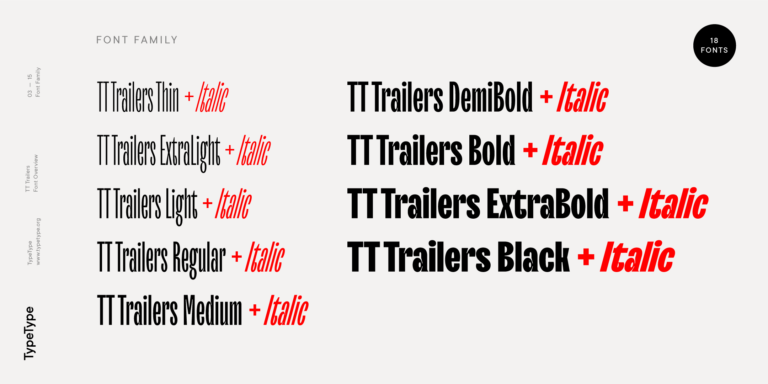
The starting point of the TT Trailers project was the idea to develop a new generation of narrow typefaces for use in movie credits and posters.
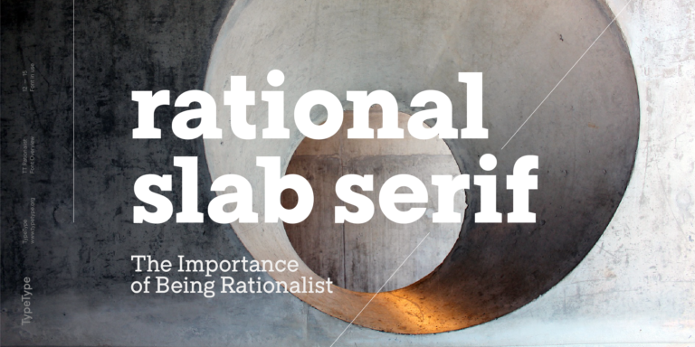
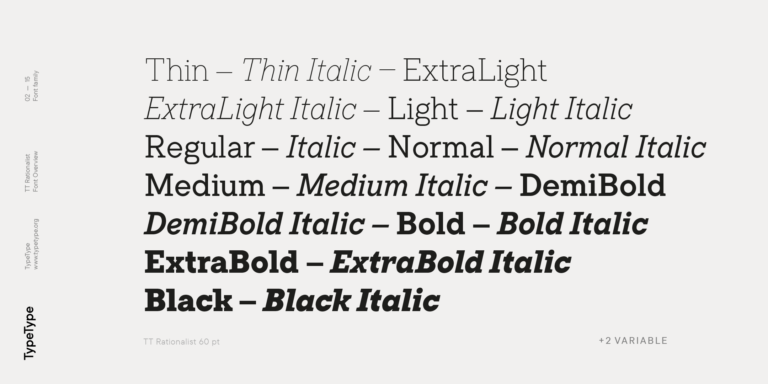
TT Rationalist is functional and neutral slab serif typeface.

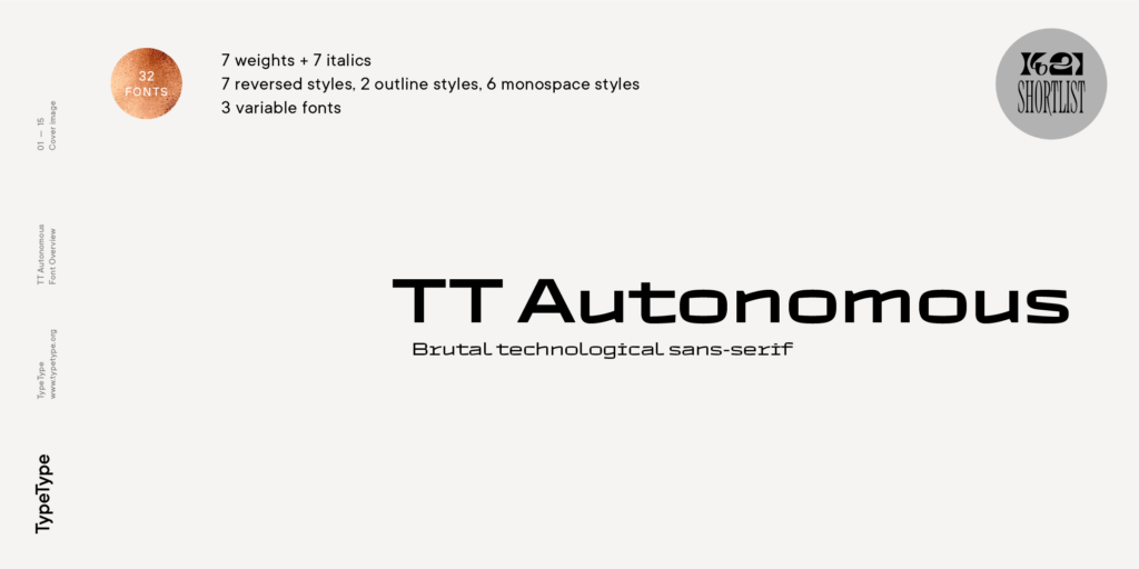
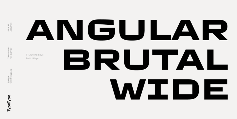
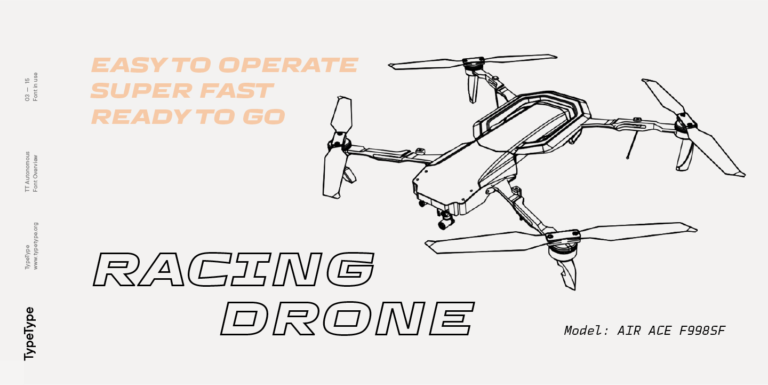
TT Autonomous is a modern techno sans serif with wide angular proportions.
- –30% Descuento válido hasta el 14/11/2025

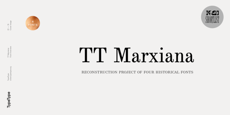
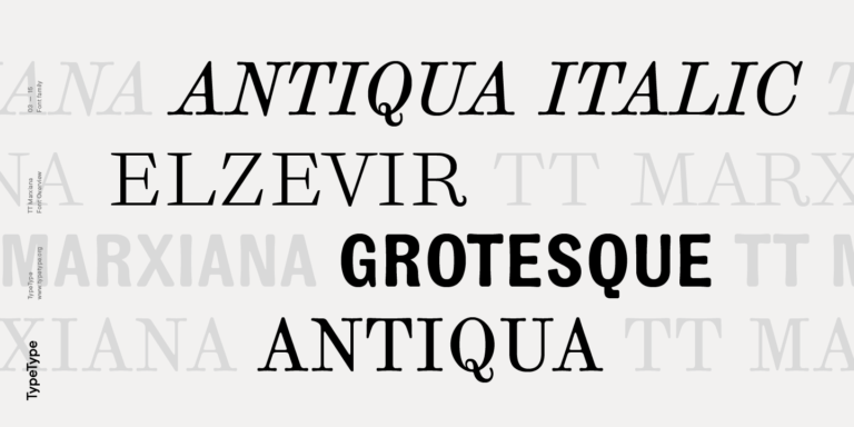
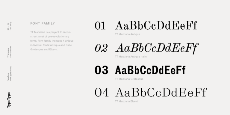
TT Marxiana Elzevir is a title or header font and is a compilation of monastic Elzevir that were actively used in the Niva magazine for all its prints.
desde $59
Comprar fuente
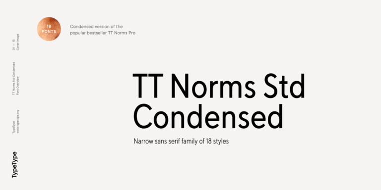
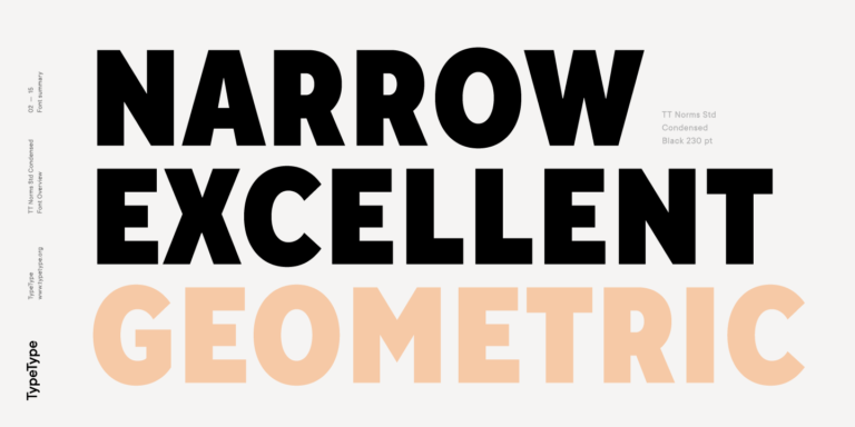
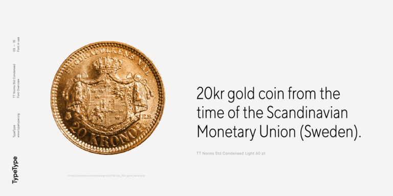
TT Norms Condensed continues to develop the ideas of neutrality and versatility stemming from our bestselling TT Norms.
desde $35
Comprar fuente
TT Geekette is an experimental variable serif with friendly and flexible character of shapes.
desde $29.99
Comprar fuente

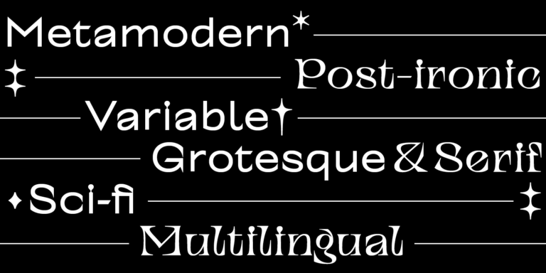
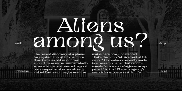
TT Alientz is a variable typeface that allows the user to make a visual journey from an extraterrestrial grotesque to a very prickly display serif.
desde $29.99
Comprar fuente

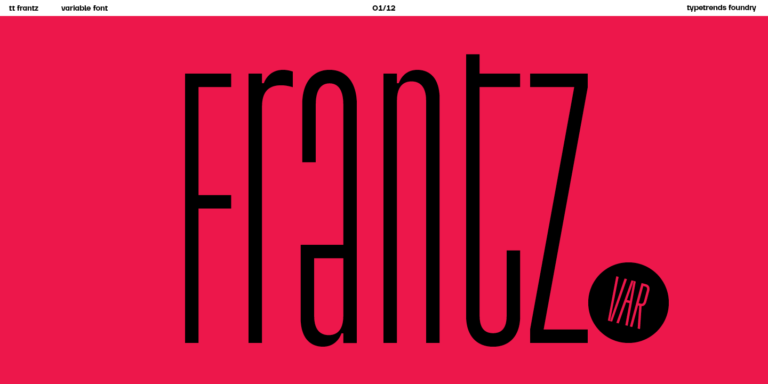
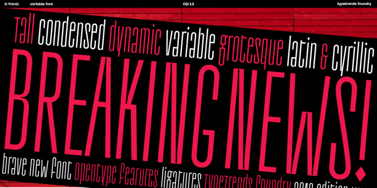
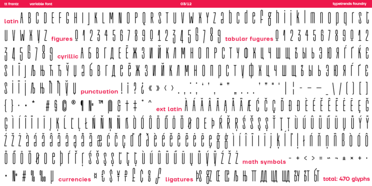
TT FRANTZ IS AN EXPERIMENTAL VARIABLE FONT, DISTINGUISHED BY ITS SLIMNESS AND LIGHTNESS. THE VARIATION IN THE FONT AFFECTS THE CHANGE IN THE HEIGHT OF THE MEAN LINE—BY MOVING THE AXIS ADJUSTMENT SLIDER YOU CAN EASILY RAISE OR LOWER THE MEAN LINE OF THE FONT.
desde $29.99
Comprar fuente
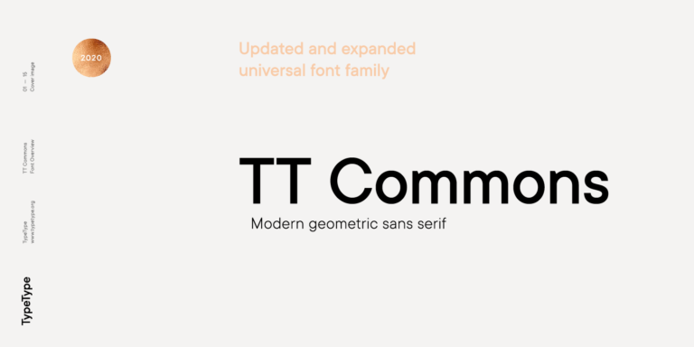
TT Commons™ Classic is a universal sans serif with a minimal contrast of strokes, a closed aperture, and geometric shapes of characters.
desde $39.99
Comprar fuente
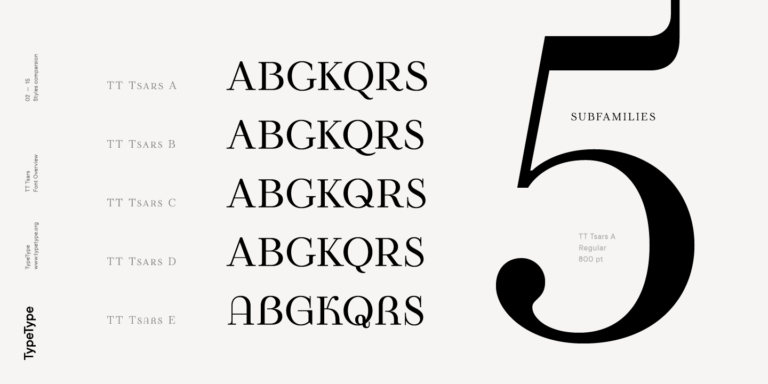
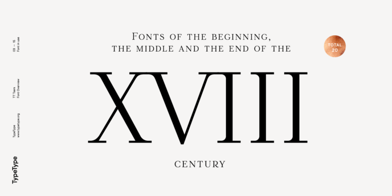
The TT Tsars font family is a collection of serif display fonts that are stylized to resemble the fonts of the beginning, the middle, and the end of the XVIII century.
desde $39
Comprar fuente

desde $29
Comprar fuente

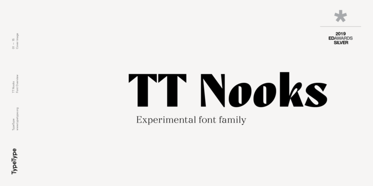
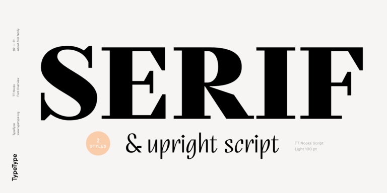
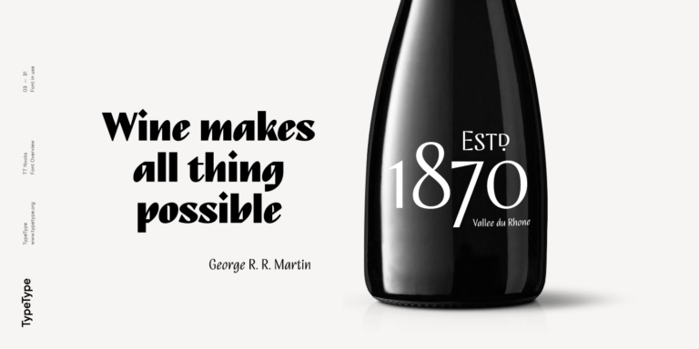
TT Nooks is an experimental project comprised of a high-contrast egocentric serif and an upright humanist italic.
desde $39
Comprar fuente
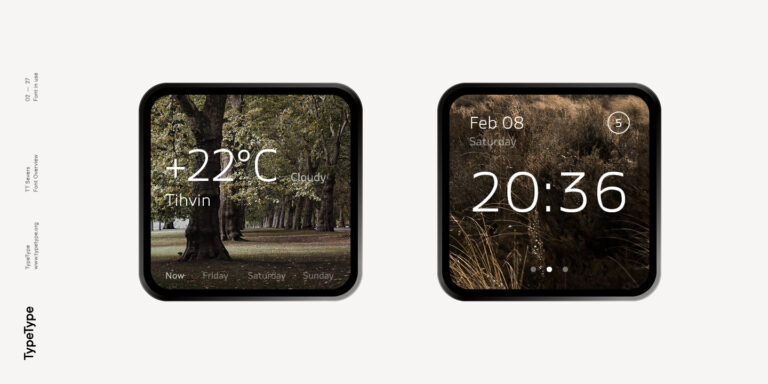
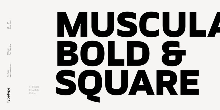
TT Severs is a geometric sans serif with emphasized elements of internal brackets. The main visual feature of TT Severs is the unusual form of internal ovals.
desde $29
Comprar fuente

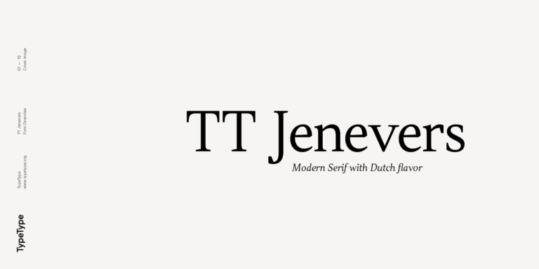
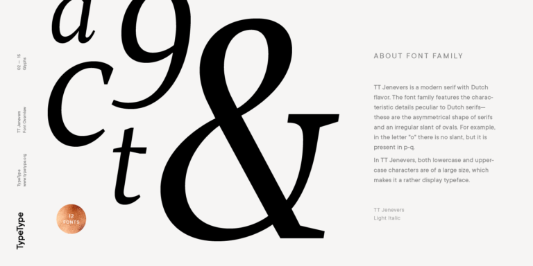
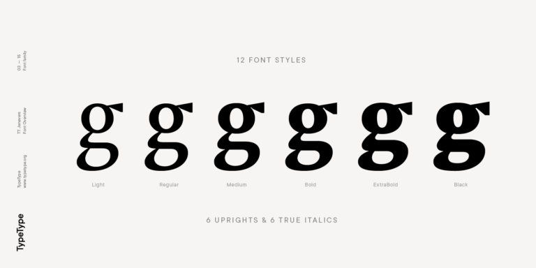
TT Jenevers is a modern serif with a Dutch flavor. The font family features the characteristic details peculiar to Dutch serifs—these are the asymmetrical shape of serifs and an irregular slant of ovals.
desde $35
Comprar fuente
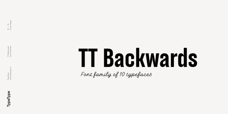
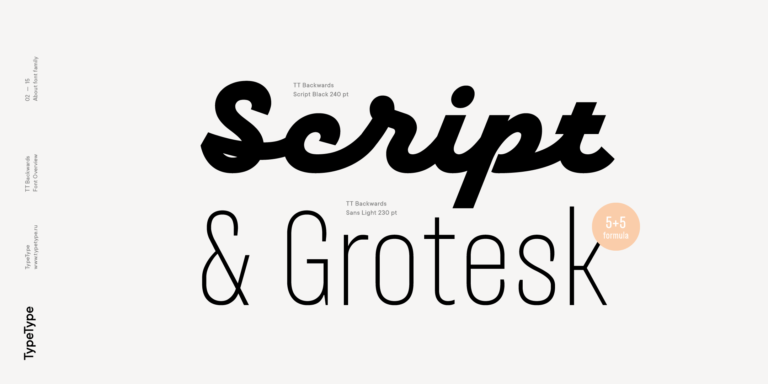
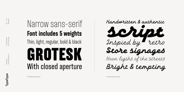
TT Backwards Sans is a narrow grotesque, which takes us back to the book design of late 70s and early 80s with its ductile characters.
desde $29
Comprar fuente
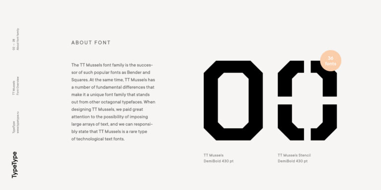
When designing TT Mussels, we paid great attention to the possibility of imposing large arrays of text, and we can state that TT Mussels is a rare type of technological text fonts.
desde $35
Comprar fuente