TT Commons™ Pro is a completely redesigned version of the well-established classic font family TT Commons.
Fuentes Periódicos
- Fuentes 73
- Sans Serif 47
- Serif 27
- Slab Serif 6
- Decorativas 40
- Script 10
- Variables 45
- Descuentos 16
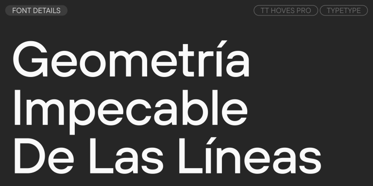
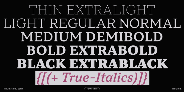
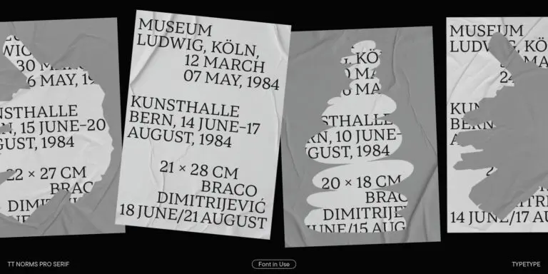
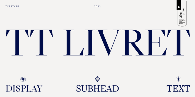
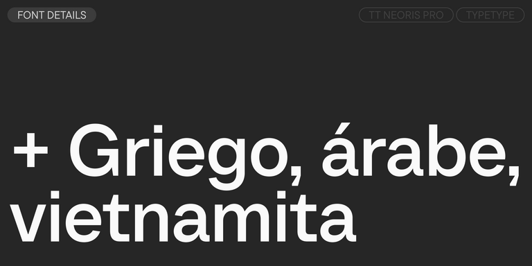
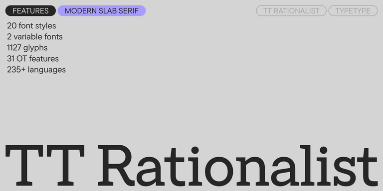
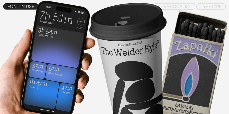
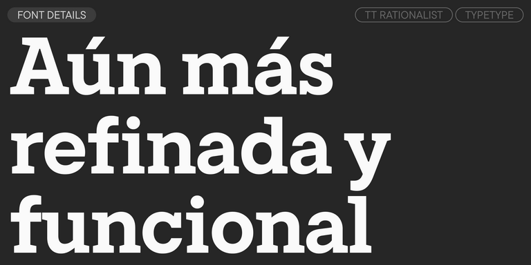
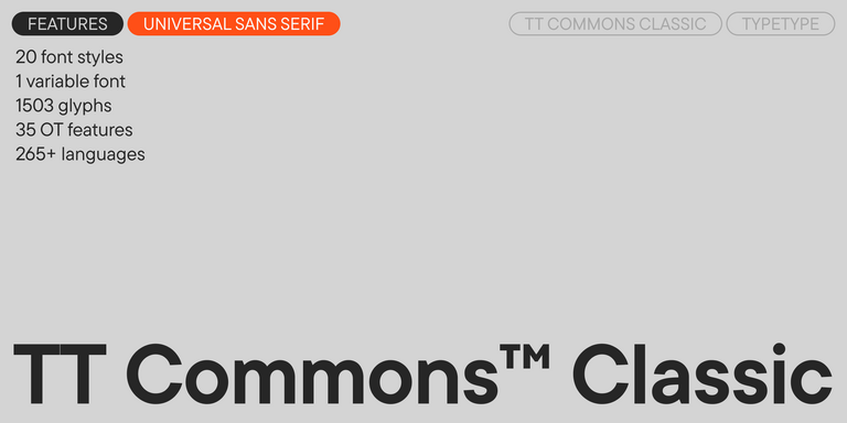
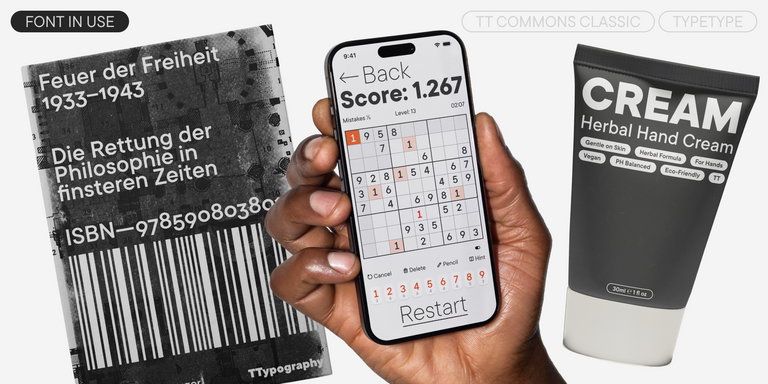
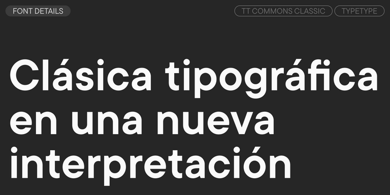
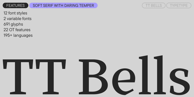
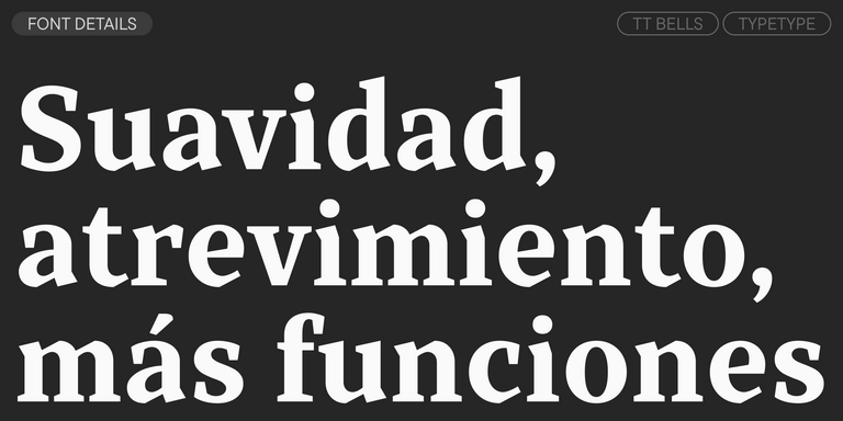
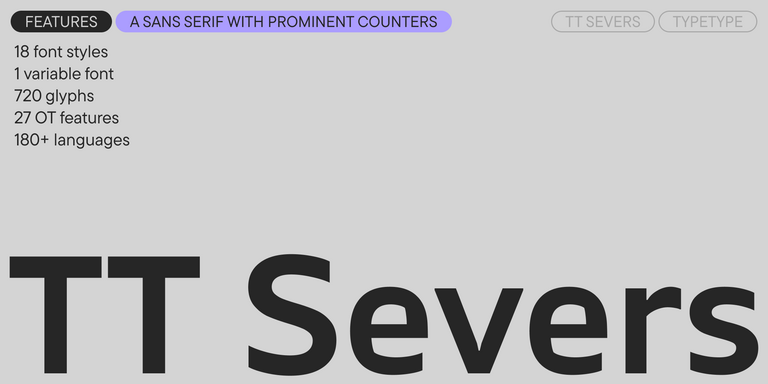
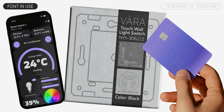
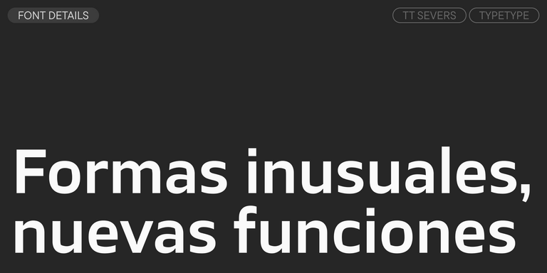
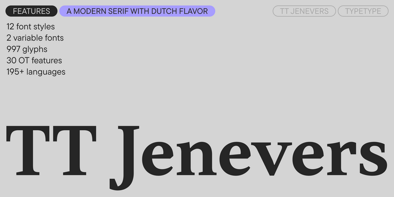
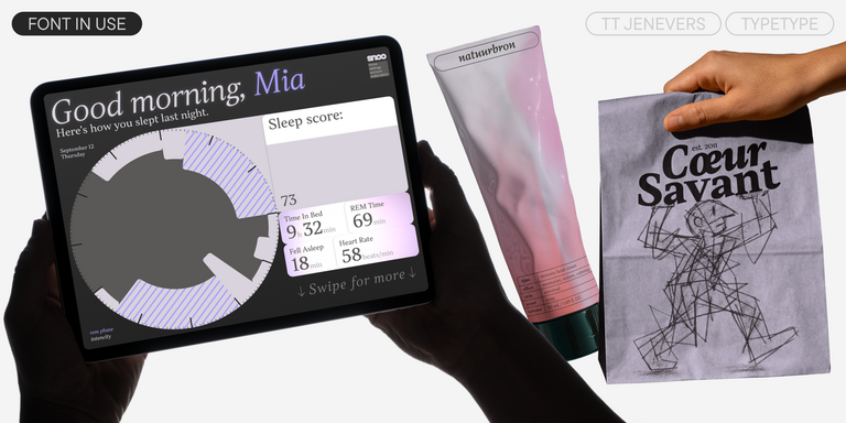
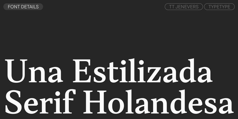
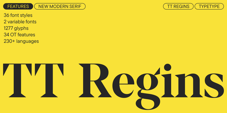
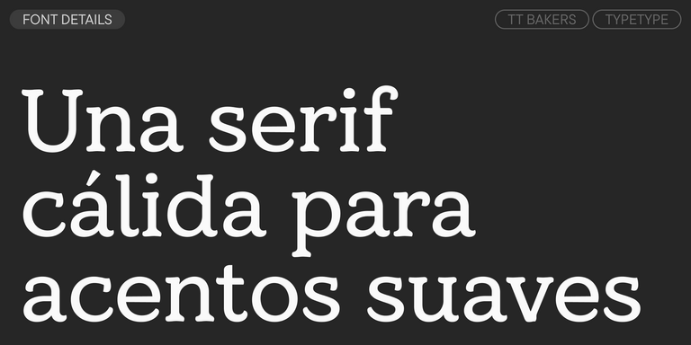
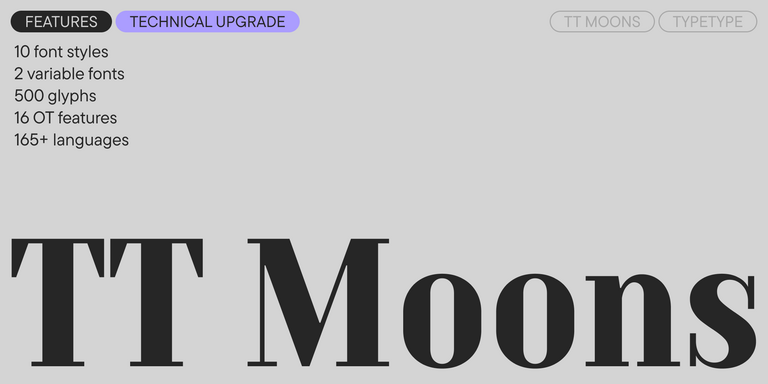
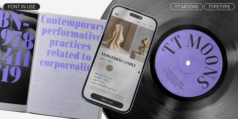
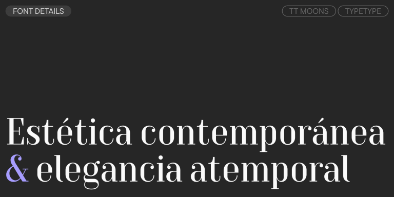
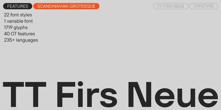
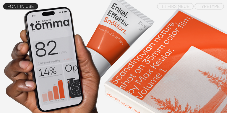
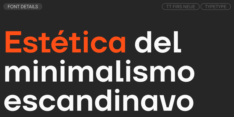
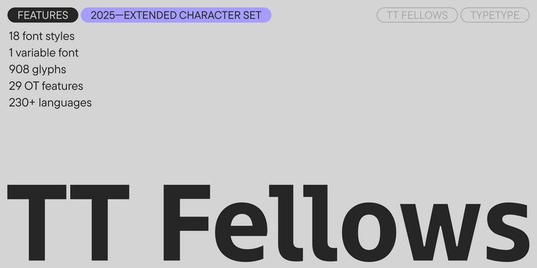
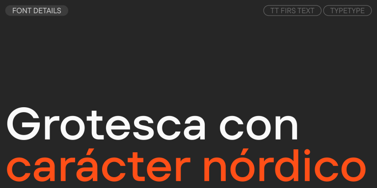
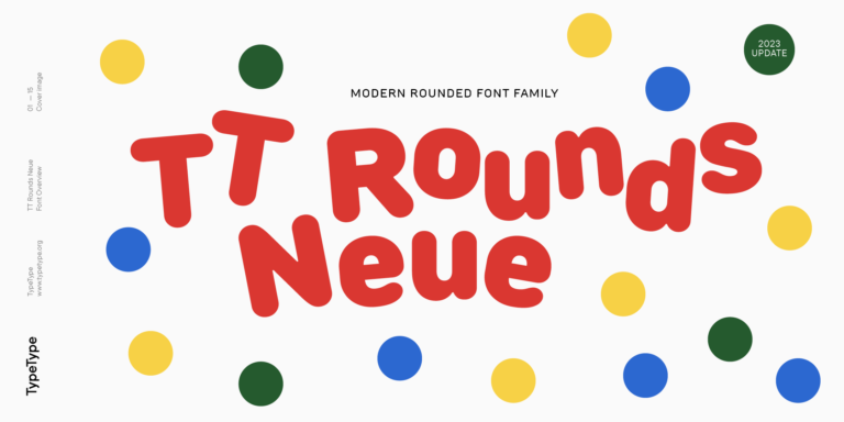
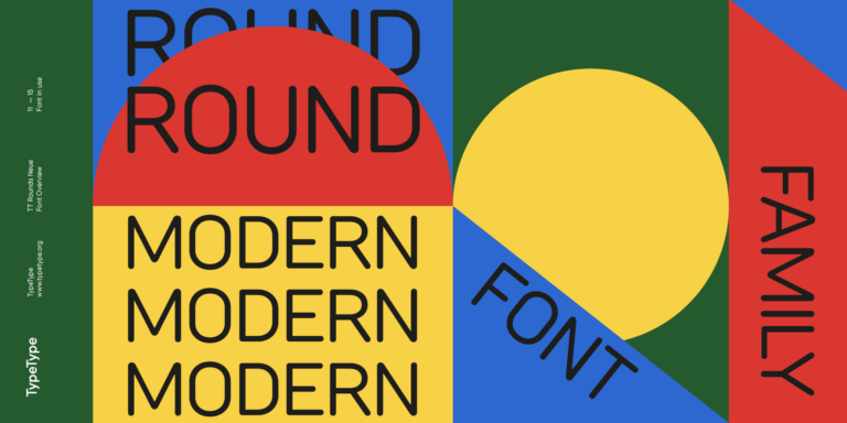
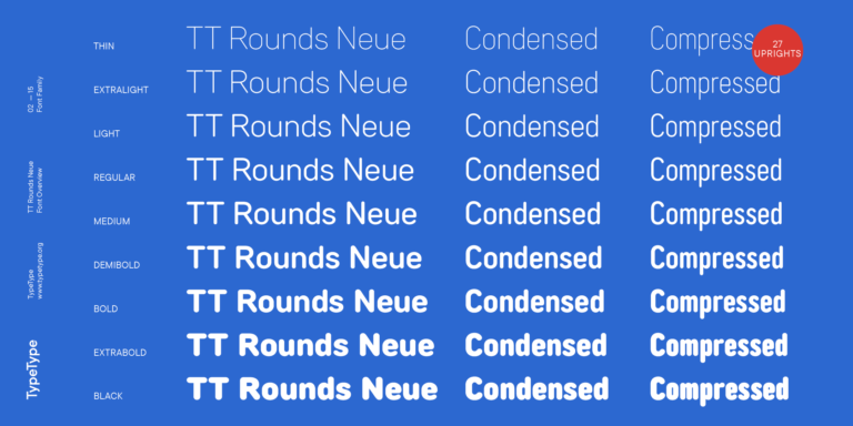
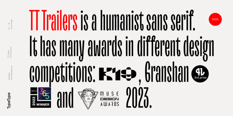
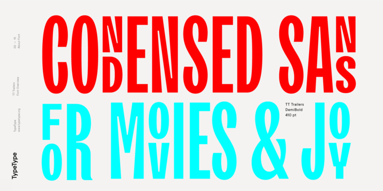
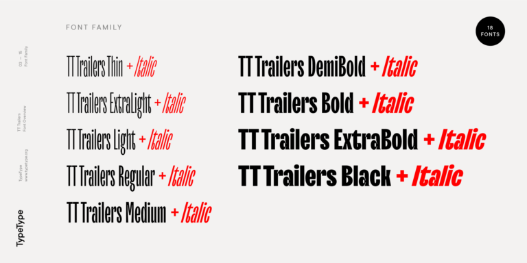
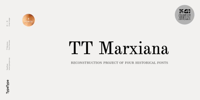
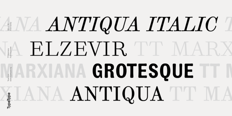
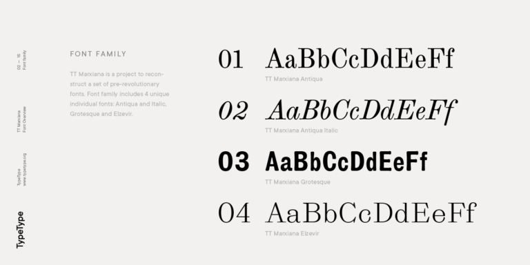
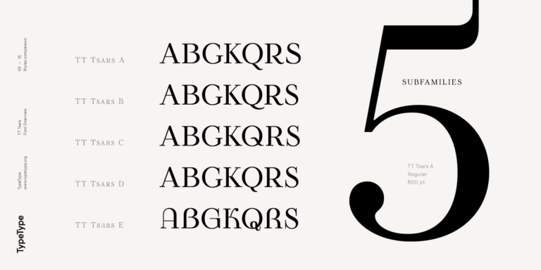
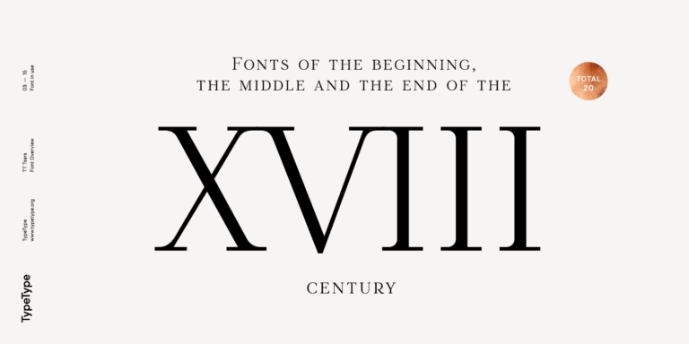
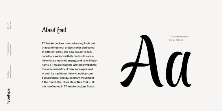
¿Buscas dónde comprar las mejores fuentes de Periódicos de la marca para crear tus propios diseños? El estudio de fuentes TypeType presenta su propia colección de fuentes de Periódicos disponibles para uso comercial en sus proyectos. Prueba todas nuestras fuentes de Periódicos populares en una sola página: elige entre una docena de familias de fuentes de alta calidad y técnicamente verificadas, una amplia variedad de estilos y estilos, prueba de forma gratuita y solicita el tipo de licencia adecuado. Para cada fuente de esta colección, puedes descargar versiones de prueba gratuitas, así como obtener el asesoramiento necesario de nuestros diseñadores y especialistas del departamento de atención al cliente.
- The quick brown fox jumps over a lazy dog.
- Pack my box with five dozen liquor jugs.
- Sphinx of black quartz, judge my vow
- 0123456789 !?.,:;—–()[]{}<> “quotes” ‘apostrophe’ @#%&*_+=/\| № $ € £ ₽ +−×÷=≠≤≥ … % © ® ™
- Aa Bb Cc Dd Ee Ff Gg Hh Ii Jj Kk Ll Mm Nn Oo Pp Qq Rr Ss Tt Uu Vv Ww Xx Yy Zz
TT Hoves Pro is a versatile sans-serif with a recognizable geometry
We continue to expand the line of the studio's main bestseller TT Norms® Pro!
TT Livret is an elegant, modern and functional serif
TT Rationalist is functional and neutral slab serif typeface.
TT Commons™ Classic is a universal sans serif with a minimal contrast of strokes, a closed aperture, and geometric shapes of characters.
TT Bells combines the elegant softness of Antiqua with a complex and daring temper reflected in straight stroke terminals and arrowheaded serifs. The typeface is based on the broad nib, which creates these hallmark terminals and serifs.
TT Severs is a geometric sans serif with emphasized elements of internal brackets. The main visual feature of TT Severs is the unusual form of internal ovals.
TT Jenevers is a modern serif with a Dutch flavor. The font family features the characteristic details peculiar to Dutch serifs—these are the asymmetrical shape of serifs and an irregular slant of ovals.
TT Regins is a Scottish modern serif. Striking contrast and sharp triangular serifs give this font a stern and commanding character, while refined forms, enlarged lowercase letters, and slightly condensed, static proportions add grace to its design.
TT Bakers is a fluid serif with a gentle and lively character. This font is like freshly baked goods: it’s warm and soft, especially in its bolder weights.
TT Moons is a slim and contrast serif. This font family works especially smart in classic design themes. TT Moons is a typeface of the glyptal modern typeface.
TT Neoris is an elegant Neo-Grotesque with unlimited potential and a font that encompasses all modern requirements and user desires.
TT Firs Neue is a contemporary reincarnation of the good old TT Firs sans serif.
TT Fellows is a humanist sans serif with a mechanical touch.
TT Carvist—peculiar, playful, and courageous—this font does an excellent job of grabbing attention!
We have released a brand-new font. Meet TT Firs Text—a geometric sans serif with a Nordic character!
TT Rounds Neue soft, friendly, rounded sans serif fontfamily
The starting point of the TT Trailers project was the idea to develop a new generation of narrow typefaces for use in movie credits and posters.
TT Marxiana Elzevir is a title or header font and is a compilation of monastic Elzevir that were actively used in the Niva magazine for all its prints.
The TT Tsars font family is a collection of serif display fonts that are stylized to resemble the fonts of the beginning, the middle, and the end of the XVIII century.
TT Nooks is an experimental project comprised of a high-contrast egocentric serif and an upright humanist italic.
TT Backwards Sans is a narrow grotesque, which takes us back to the book design of late 70s and early 80s with its ductile characters.
TT Knickerbockers Grotesk is a narrow contrast sans serif with characteristic elements sending us back to the 19th century in New York.
