ttnormspro
Página principalBlogTypeType conquers the USA!

TypeType conquers the USA!

TypeType conquers the USA!

We don’t know what the modern American dream is. We are opening our first office in the USA because forty percent of sales and a large number of interesting projects come to TypeType from America. The first step towards customers is at the same time another point of growth for the font foundry.

Entering a new era, we would like to sum up the previous one. So many events came together in a single formula, and we want to share the brightest ones with you now.

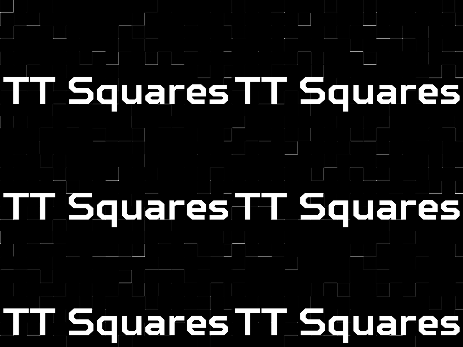
The first font was developed and released back in 2014. An octagonal sans serif called TT Squares was created by the studio’s founder and designer Ivan Gladkikh. There were only a few apprentice freelancers collaborating on it, but the plans were to create the best projects in the world. By the way, this font has been completely redesigned and released in 2019 under the name TT Octosquares.
TypeType conquers the USA!
The first font TT Squares

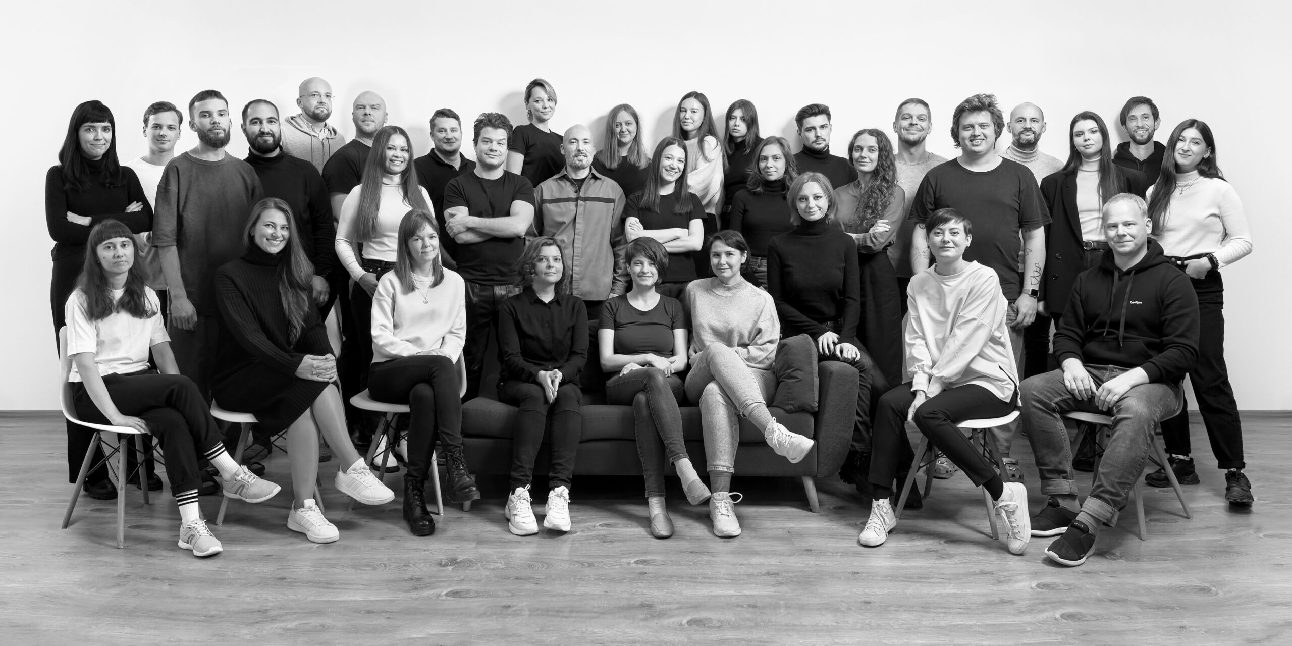
The first office was opened in 2016. It was a tiny room with the first staff of four: two designers, a marketing specialist, and a financial specialist. In 2017, we have moved to a new office as a team of 8 people, by 2019 we were already about 10 people. Now there are over 30 employees, and that’s only counting those working full-time! Today we are preparing to move to a larger office, and our specialists form several full-scale departments in various directions, from creative to commercial.

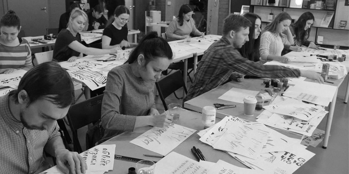
We raised some of the specialists ourselves, or rather organized training courses. In addition to the educational mission, we also looked for designers to hire, taking those most interested in the font business. The first course began in 2016, and six months later, two designers joined the TypeType team. After the second course, launched in 2018, four more designers joined the staff, and our circle of acquaintances expanded significantly.
TypeType conquers the USA!
Font course

Not only the staff grew, but also the practical skills of the entire studio, a new system of work was formed and the quality of the product improved. In 2016, we completely reimagined our approach to font creation with the release of TT Lakes. In it and in subsequent projects, the font character composition, the number of styles, and features appeared. In 2017 already, we released the studio’s first bestseller—TT Norms®️, which, like a rock star in the world of typefaces, blew up the charts on marketplaces and became a MyFonts bestseller for the entire 2017. We repeated our success the following year with TT Commons™, the studio’s second bestseller. These products are still the best-selling and most popular typefaces, so in 2021 we released new, completely redrawn versions of them—TT Norms®️ Pro and TT Commons™ Pro. In 2018, we took on the redevelopment of the first corporate typeface for a major brand. Later, this service would become usual for us.

We could not have achieved such results without constant reflection and improvement of internal processes. 2017 became a landmark year, because it was then that a programmer joined us and created all the functionality at our request: a validator that analyzes fonts, a language script, converters, and the rest of the software package. At the same time, we started to form the technical department, separating it from the creative one. A significant event for the latter was the appearance of the art director position filled by Yulia Gonina in 2019, after which the products improved significantly from a creative point of view, and the entire design team made progress in terms of font drawing.
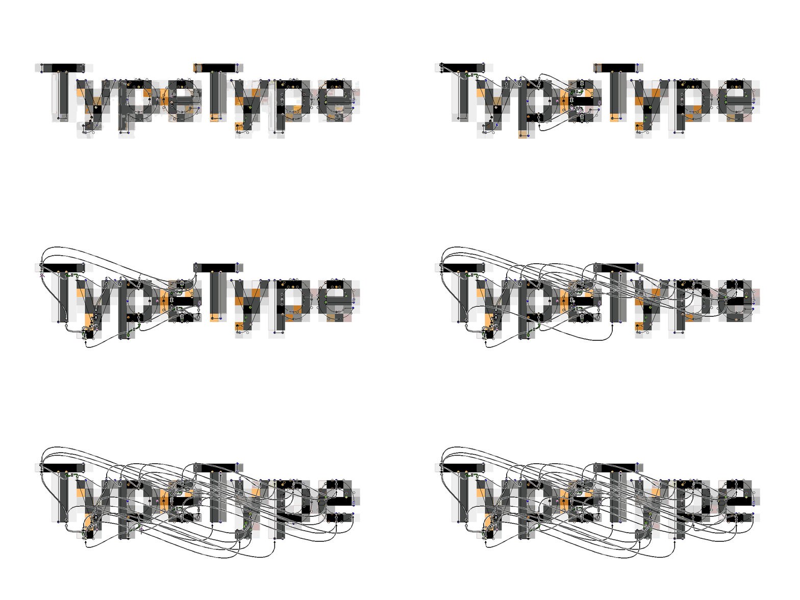
The technical department was in no way inferior. In addition to growing consistency and developing our own approach to kerning and the construction of debugged work algorithms, we have developed our own hinting. By 2019, each cycle was perfected, and projects with mastering of third-party fonts began to appear in our portfolio.
TypeType conquers the USA!
TypeType logo hinting

In 2021, we began to go beyond the horizon of working exclusively on the product and started expanding the sales and marketing departments. More than 50 fonts, 800 typefaces have appeared in our portfolio, and our typefaces have been used by 35,000 different clients from 110 countries.

We now need to take one more step towards our clients, namely, to be in the same legal field with them. Opening an office in the United States, it will become easier for projects from America, Europe and other countries to interact with the TypeType studio. So far, this is a legal formality that has every chance of growing into a full-fledged office with new employees, coffee breaks, and negotiations. Stay tuned, because the most interesting is yet to come!

Últimas publicaciones

Las 10 principales tendencias tipográficas de 2024

Las 10 principales tendencias tipográficas de 2024

Do you want to keep your typography up-to-date and create genuinely inspiring projects? Experts and designers from the TypeType font studio are excited to share the key type trends of 2024 with you in this article. Stay trendy!

Buscar etiqueta
Las 15 mejores fuentes para revistas

Las 15 mejores fuentes para revistas

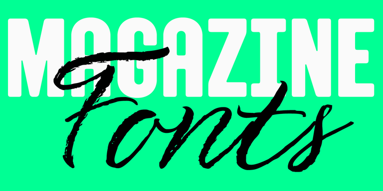
Las revistas son el lienzo perfecto sobre el que la tipografía puede revelar todas sus facetas. La fuente aquí no sólo transmite información al lector, sino que también influye directamente en el diseño. Transmite el mensaje de la revista, transmite valores e ideas. Este artículo habló sobre cómo elegir la mejor fuente para revistas y compiló una selección de 15 opciones actuales para publicaciones sobre diversos temas.

Buscar etiqueta
UniversiTTy: Lección 9. Caracteres en mayúsculas. Refinamiento detallado de contornos

UniversiTTy: Lección 9. Caracteres en mayúsculas. Refinamiento detallado de contornos

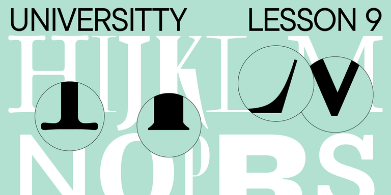
Welcome to the ninth lesson of our «UniversiTTy»! In this series, we guide you through the process of font design step by step. The font is a cohesive visual system. This can be seen on all levels: global (font type, weight, proportions, contrast, general forms) and at lower scales that encompass all graphic choices in individual characters. Let’s find out together how visual details influence the overall perception of fonts.

Buscar etiqueta
Las 15 mejores fuentes de contorno aprobadas por diseñadores en 2024

Las 15 mejores fuentes de contorno aprobadas por diseñadores en 2024

Las fuentes de contorno son una excelente manera de agregar variedad a su diseño y hacerlo atractivo y llamativo. ¿Qué son, dónde se utilizan y qué estilos de fuente se combinan con ellas? Hablamos de todo esto en nuestro artículo y también seleccionamos las mejores fuentes de contorno para varios proyectos.

Buscar etiqueta
Las 10 mejores fuentes para diseños de carteles

Las 10 mejores fuentes para diseños de carteles

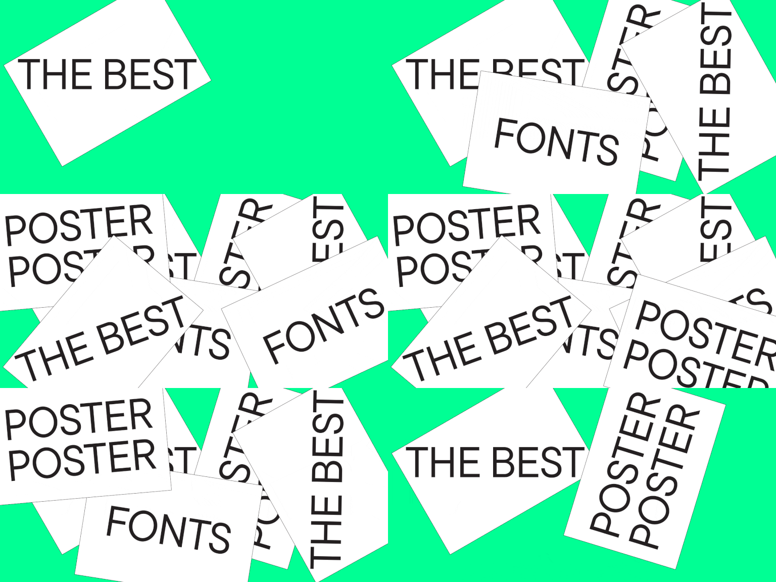
Elegir la fuente adecuada para un proyecto es una tarea seria para un diseñador. ¿Cómo encontrar la mejor fuente entre muchas opciones y en qué criterios confiar a la hora de elegir? Te lo contamos en este artículo.

Buscar etiqueta
UniversiTTy: Lesson 8. Designing Basic Latin Characters. Uppercase characters

UniversiTTy: Lesson 8. Designing Basic Latin Characters. Uppercase characters

Welcome to lesson number 8 of our «UniversiTTy» series! Last time, we covered optical compensation, uppercase and lowercase character heights, and the concept of contrast. In this article, we will finally focus on glyph design specifically.

Buscar etiqueta
Cómo elegir una fuente: la guía definitiva para el diseñador

Cómo elegir una fuente: la guía definitiva para el diseñador

La fuente es uno de los elementos de diseño más importantes. Con su ayuda, puede enfatizar, complementar o incluso crear el ambiente del proyecto, colocar acentos y transmitir la información necesaria al usuario. ¿Cómo encontrar la mejor fuente entre muchas opciones y en qué criterios confiar a la hora de elegir? Te lo contamos en este artículo.

Buscar etiqueta
25+ mejores fuentes de juegos para tus proyectos en 2024

25+ mejores fuentes de juegos para tus proyectos en 2024

¿Qué criterios debes buscar al elegir fuentes de juegos? ¿Y qué fuentes gaming deberías elegir para tu proyecto en 2024? En nuestro artículo encontrarás consejos actuales sobre la elección de tipografías y una selección de las tipografías mejores pagas y gratuitas para videojuegos de diferentes géneros.

Buscar etiqueta
Iconos e ilustraciones en fuentes: ¿Qué son y cuál es su propósito?

Iconos e ilustraciones en fuentes: ¿Qué son y cuál es su propósito?

In addition to the base set of letters, marks, and symbols, most typefaces also have other graphic elements. What does their appearance depend on? How and why are they designed? What variations do they come in? In this article, we will focus on these questions and showcase the most captivating icons and illustrations from TypeType typefaces.

Buscar etiqueta

Buscar etiqueta

Creación de una fuente para la configuración del logotipo de Mail.ru Group

Creación de una fuente para la configuración del logotipo de Mail.ru Group

Today we will share a fascinating story of creating a font family to set logos for one of the largest brands. We promise you won’t be bored: in this story, you will have the chance to have a look at all stages of the work and will learn more about font creation.

Buscar etiqueta
Personalización de TT Hoves para la legendaria marca Telefónica

Personalización de TT Hoves para la legendaria marca Telefónica

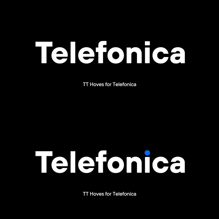
The TypeType team was approached by the Spanish telecommunications company Telefonica with a request to customize the TT Hoves font. Telefonica is one of the largest raditional and mobile phone companies in the world.

Buscar etiqueta
Fuentes variables: ¿qué novedades tienen para los diseñadores? 10 mejores fuentes para diseños de carteles

Fuentes variables: ¿qué novedades tienen para los diseñadores? 10 mejores fuentes para diseños de carteles

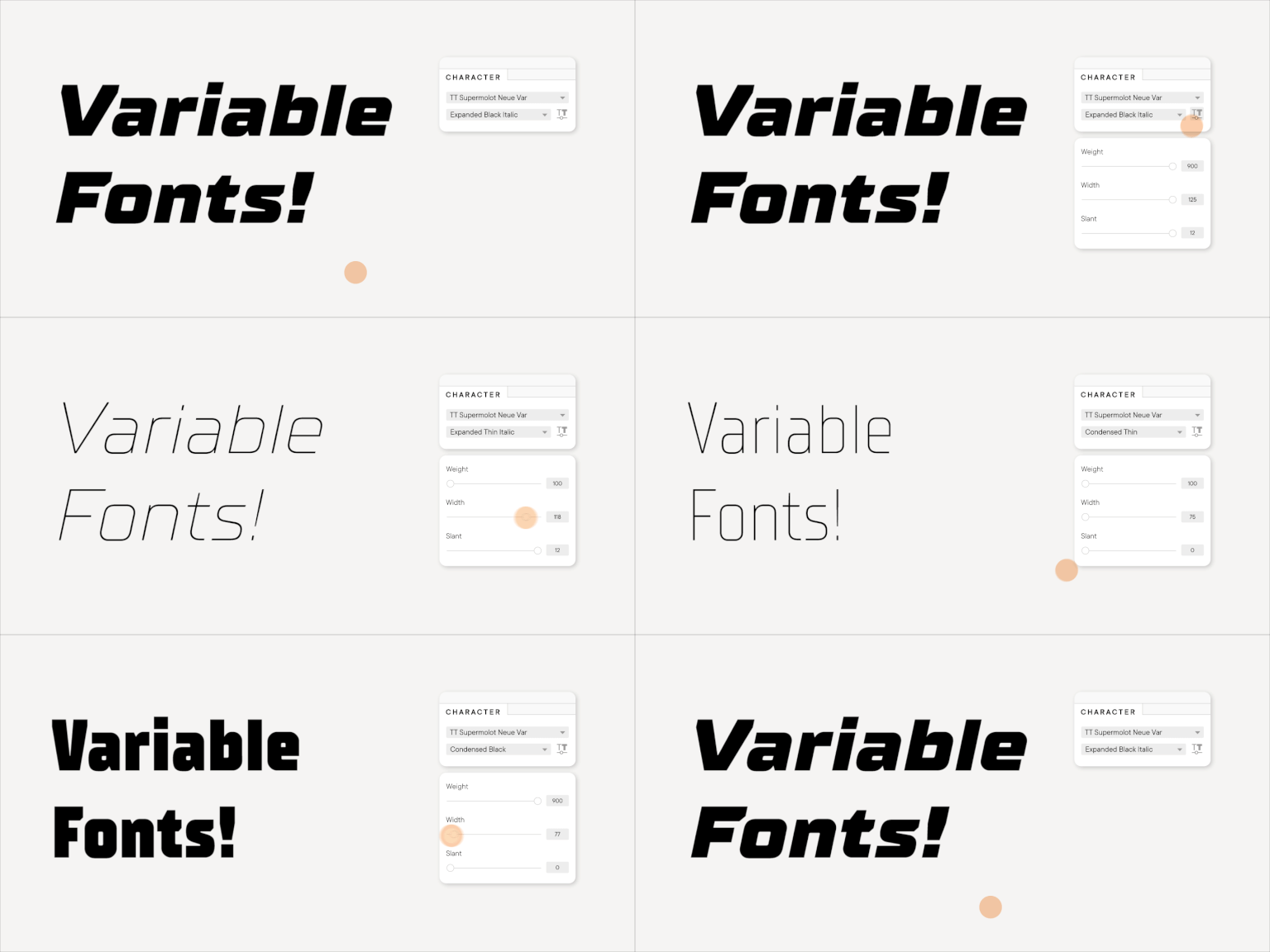
In this article we will tell you about variable fonts and what an interesting and useful, yet underrated instrument they are. We will also mention their disadvantages and nuances of working with them.

Buscar etiqueta
Font customization

Font customization

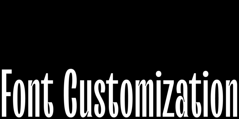
It often happens that existing fonts do not correspond to the needs of a certain project. But font is not a static instrument that functions only the way it was created. To convey the company’s individual style, the font can and should be adapted and customized to one’s needs that may range from simple changes like diminishing the character composition to complex design changes in all glyphs.

Buscar etiqueta
Converting TT Hoves Medium into an adapted TT Hoves GDTI

Converting TT Hoves Medium into an adapted TT Hoves GDTI

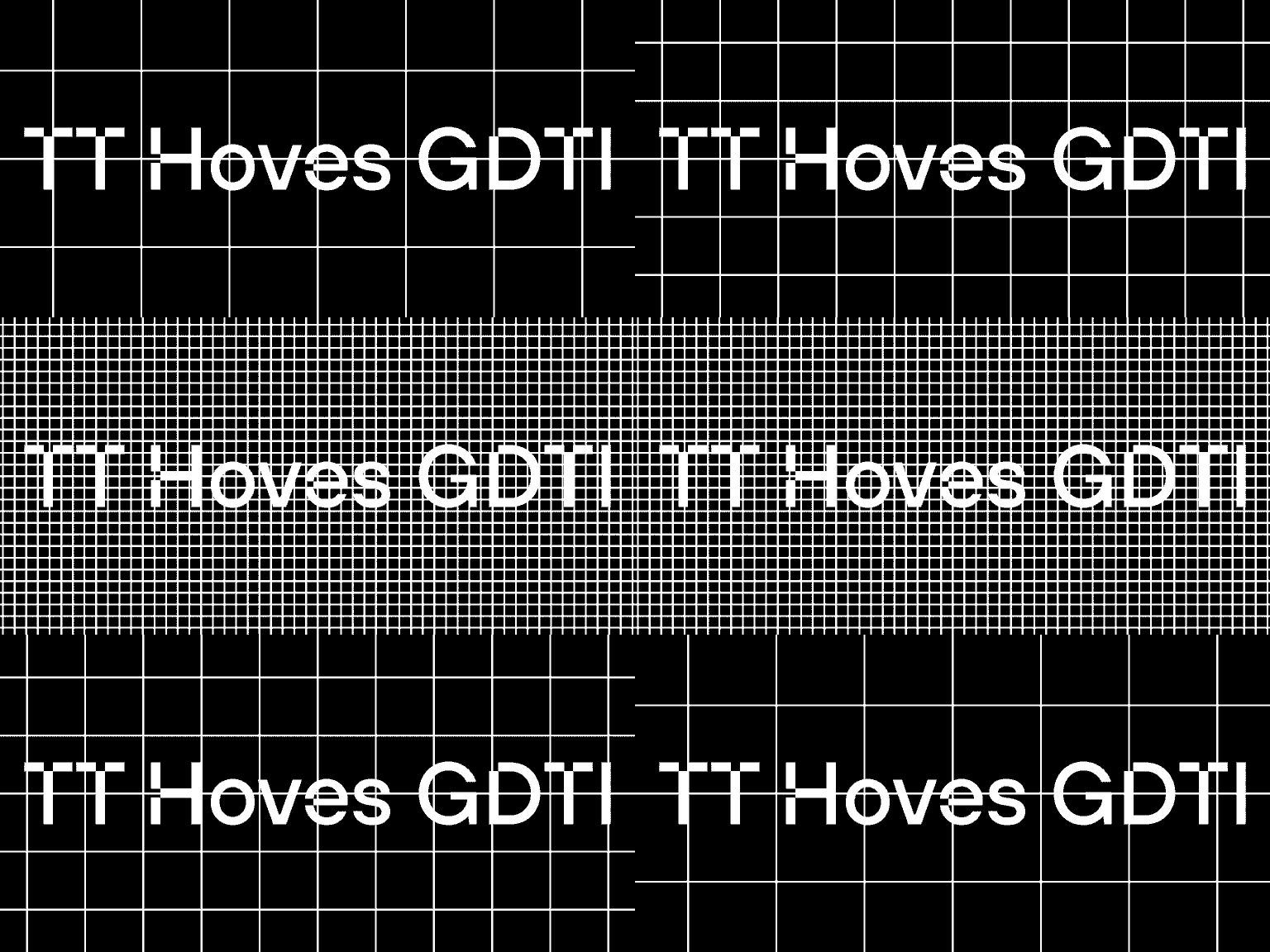
Monospace, a branding agency from Germany, creates corporate identities and designs for projects. The company believes that through design it is possible to create a brand though which customer interactions will be enjoyable and long-term.

Buscar etiqueta
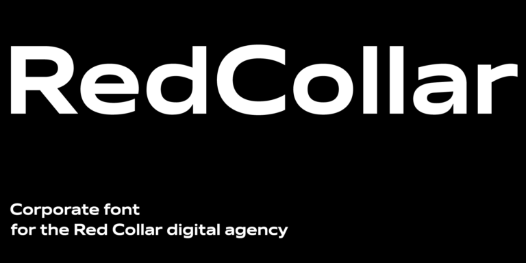
Fuente corporativa para Red Collar

Fuente corporativa para Red Collar

In this article we will tell and show how we created the corporate font for the Red Collar digital agency. The spirit that the client wanted to see in the font would be supposed to reflect the agency’s self-positioning: “It’s technological, but affordable; it is brave, bold, but fully responsible for the result”.

Buscar etiqueta
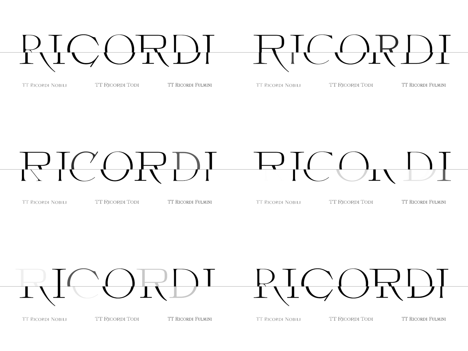
Historia de creación de TT Ricordi

Historia de creación de TT Ricordi

The TT Ricordi font family is a collection of three display heading antiquas designed to significantly diversify the traditional font palette. With that, all three fonts are close in thickness and similar in their character compositions and are featured in the uppercase set and the small capitals set, which replaces lowercase characters.

Buscar etiqueta
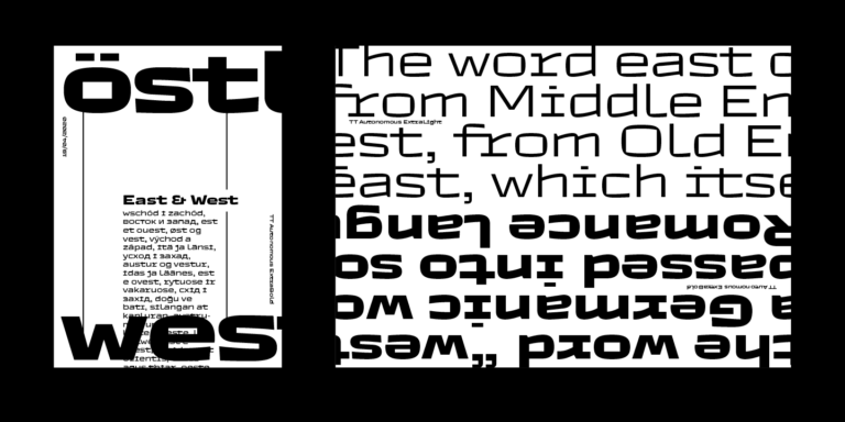
TT Autonomous creation story

TT Autonomous creation story

Today we want to share with you the short story of the TT Autonomous font creation. We’ll tell you what inspired the designers and what types of fonts are included in the family.

Buscar etiqueta
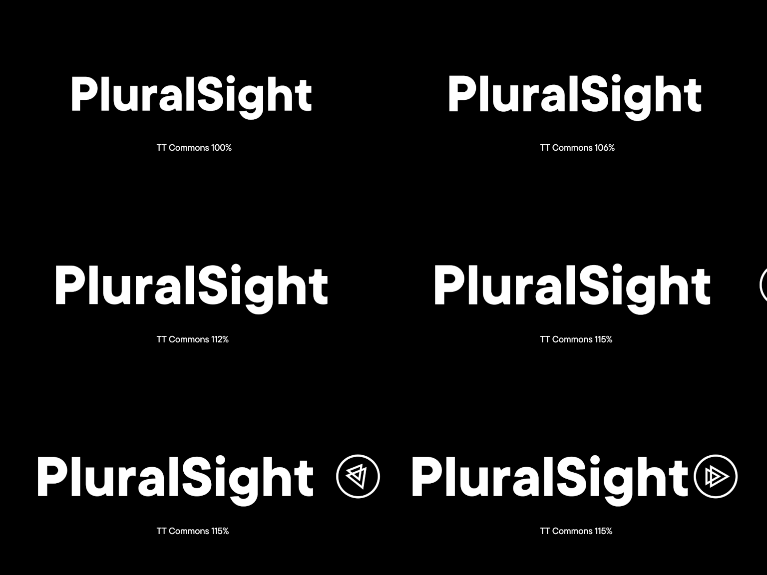
Cambio de tamaño de glifos en TT Commons™ Classic

Cambio de tamaño de glifos en TT Commons™ Classic

PluralSight has asked TypeType for trial versions of the TT Commons™ Classic and TT Interphases fonts to choose a suitable one. They were attracted by TT Commons™ Classic, but the non-standard size of glyphs made the font unsuitable for several directions.

Buscar etiqueta