

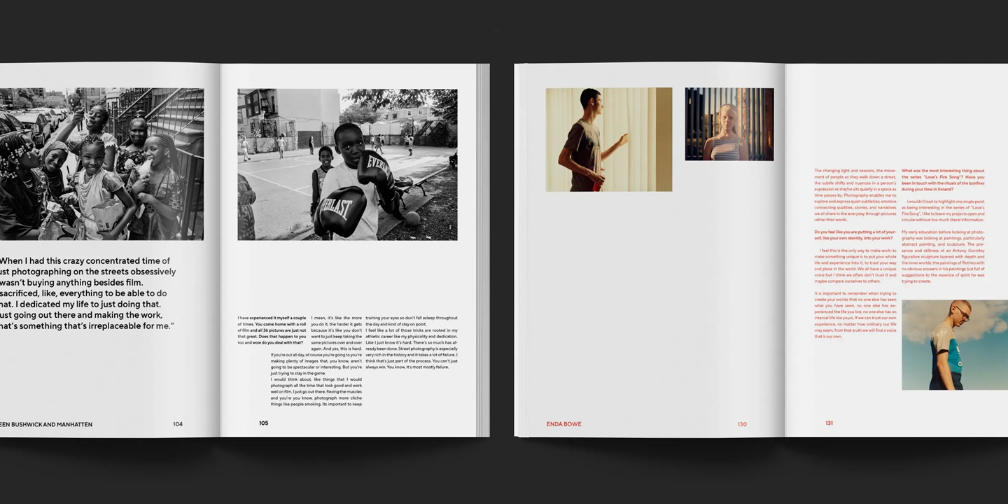
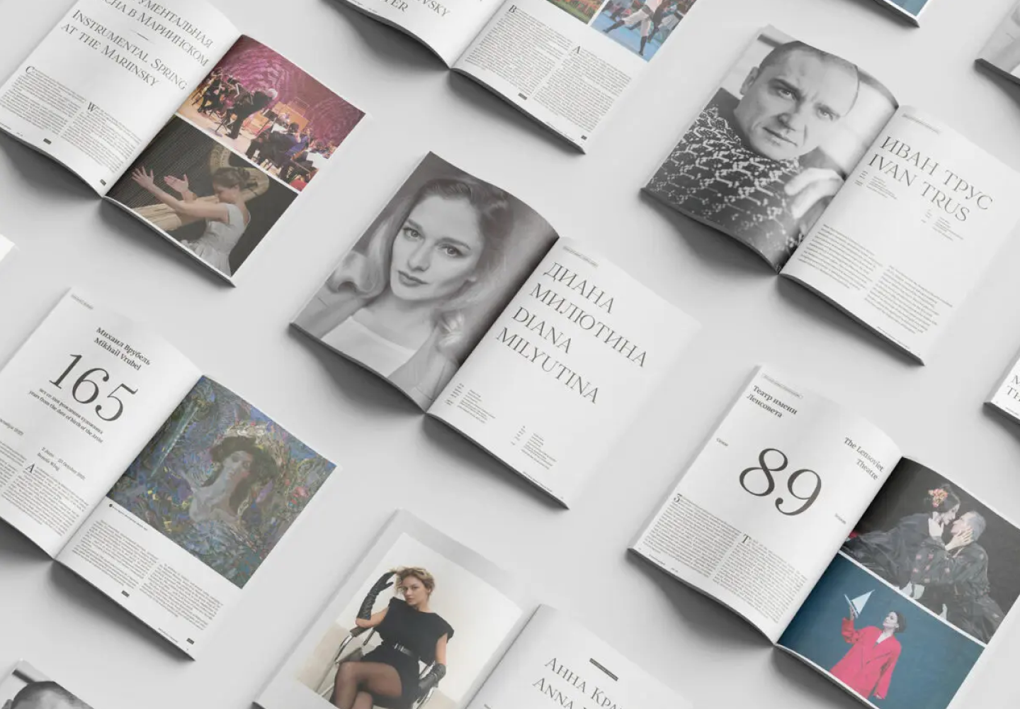
Las revistas son el lienzo perfecto sobre el que la tipografía puede revelar todas sus facetas. La fuente aquí no sólo transmite información al lector, sino que también influye directamente en el diseño. Transmite el mensaje de la revista, transmite valores e ideas. Con su ayuda, puedes hacer que el diseño de una revista aburrida sea emocional y pegadizo, darle el ambiente adecuado y crear la atmósfera de toda la publicación.
Este artículo habló sobre cómo elegir la mejor fuente para revistas y compiló una selección de 15 opciones actuales para publicaciones sobre diversos temas.
¿Cómo elegir fuentes para revistas?
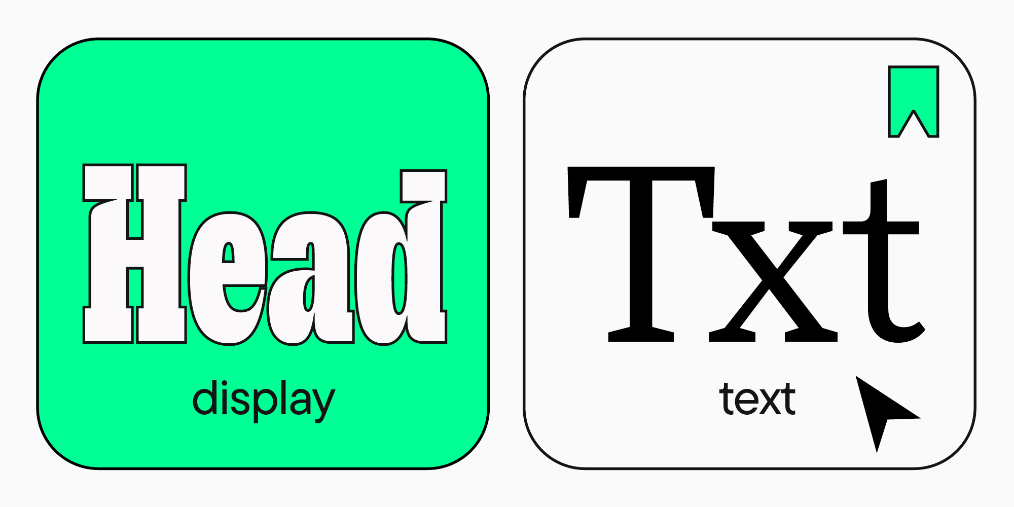
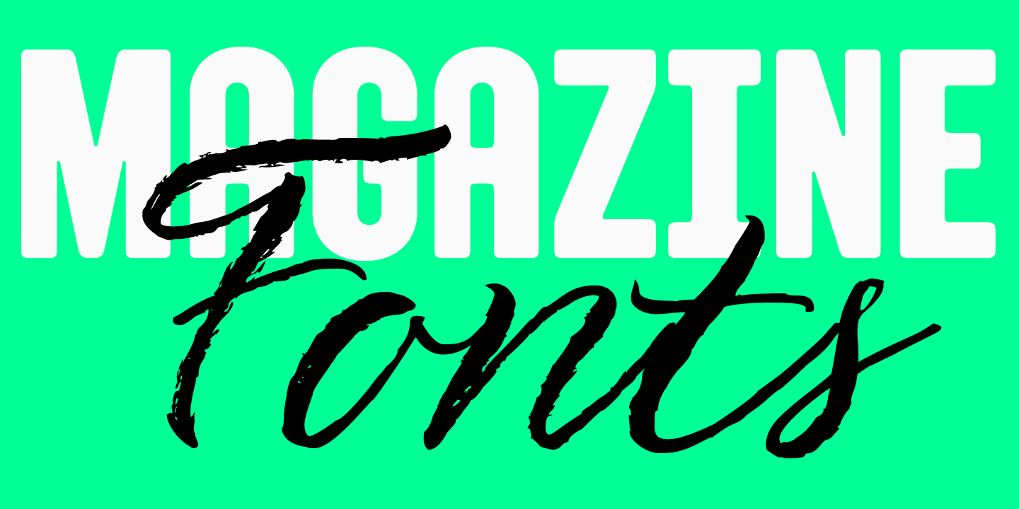
Las tipografías utilizadas en las revistas se pueden dividir en dos tipos: las que se utilizan para el texto principal y las que vemos en los titulares y en la portada. Tienen diferentes metas y objetivos, que determinan los criterios de selección. Hablemos con más detalle sobre cada tipo.
Fuente para el texto principal de la revista.
En primer lugar, cualquier publicación de su revista debe ser fácil y cómoda de leer. Por lo tanto, para escribir matrices de texto, se utilizan fuentes creadas especialmente para este propósito: se denominan fuentes de texto.
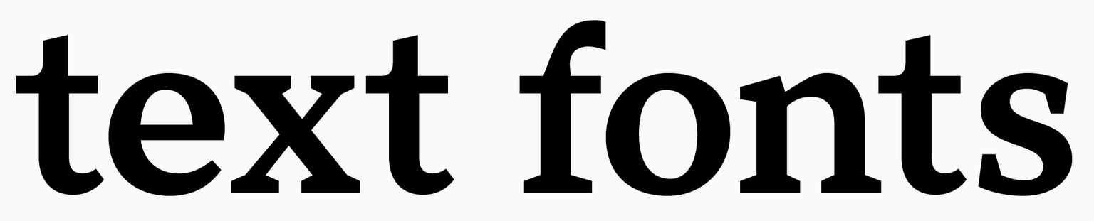
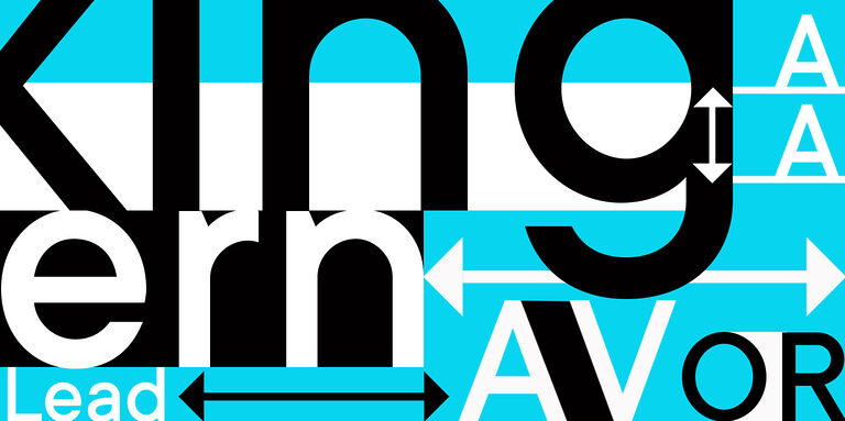
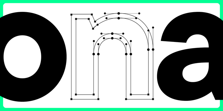
Las principales características distintivas de las fuentes de texto son la legibilidad y la legibilidad. La legibilidad se logra mediante la claridad de los caracteres y la precisión de su contorno. La legibilidad depende de cómo interactúan todos los signos entre sí.
Para que una fuente sea legible debe ser sencilla y neutra, sin elementos decorativos. Las fuentes con contornos redondeados, peso promedio, ancho de caracteres promedio y espacio entre letras promedio se leen mejor.
Además, la fuente debe tener una calidad suficiente. Si está creando una revista en línea, asegúrese de que la fuente se muestre igualmente bien en diferentes dispositivos y no pierda legibilidad al acercarla o alejarla.
Si su revista se va a imprimir, su calidad también se ve afectada por la calidad de la fuente misma. Por supuesto, la tipografía también juega un papel aquí: cualquier fuente puede estar mal impresa.
Para obtener más información sobre cómo elegir la fuente de texto adecuada, lea nuestro artículo.
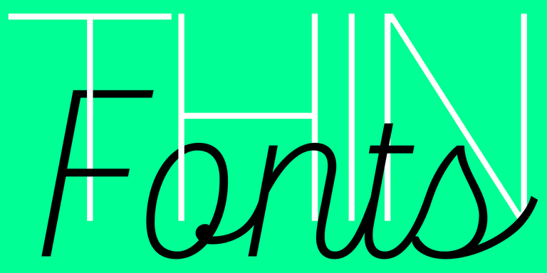
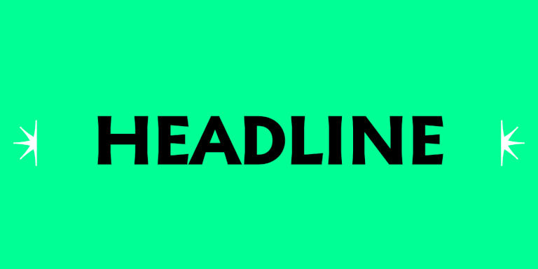
Fuentes para portadas y títulos de revistas.
Si una fuente de texto está destinada a transmitir información verbal al lector, entonces la fuente de la portada y de los títulos lo atraerá visualmente, marcará la estética de la revista y diseñará el material editorial. También se puede utilizar para diseñar el logo y el nombre de la revista. Para estos fines son adecuadas las denominadas fuentes de visualización (o display).
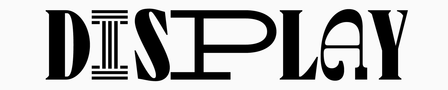
Las fuentes de visualización, a diferencia de las de texto, pueden ser muy diferentes: ricas en detalles, con formas y proporciones inusuales. La legibilidad no es su principal preocupación. Son interesantes a la vista, tienen un carácter distintivo y un estilo vibrante.
Lea más sobre las fuentes de visualización aquí.
Sin embargo, muchas fuentes de texto también se pueden utilizar como fuentes de visualización si desea mantener su diseño simple y conciso. En este caso, una fuente minimalista con letras grandes ayudará a enfatizar estas características.
Para comprender qué fuente es adecuada para el diseño de su revista, debe determinar la audiencia, el mensaje y la naturaleza de la publicación en sí. Después de eso, busque una fuente con el tono correspondiente. Por ejemplo, las fuentes estrictas y elegantes son adecuadas para publicaciones comerciales, mientras que las fuentes más creativas y modernas son adecuadas para revistas juveniles.
Una selección de las mejores tipografías para revistas
Hemos seleccionado las 15 mejores fuentes para revistas de la colección TypeType. Entre ellos se encuentran tanto los de texto, adecuados al texto principal de la revista, como los display, que decorarán la portada de la revista y le darán un cierto estilo a la publicación. Todas las fuentes de su selección son de alta calidad y cumplen con los requisitos técnicos modernos, por lo que se mostrarán igualmente bien en diferentes plataformas en línea y en revistas impresas.
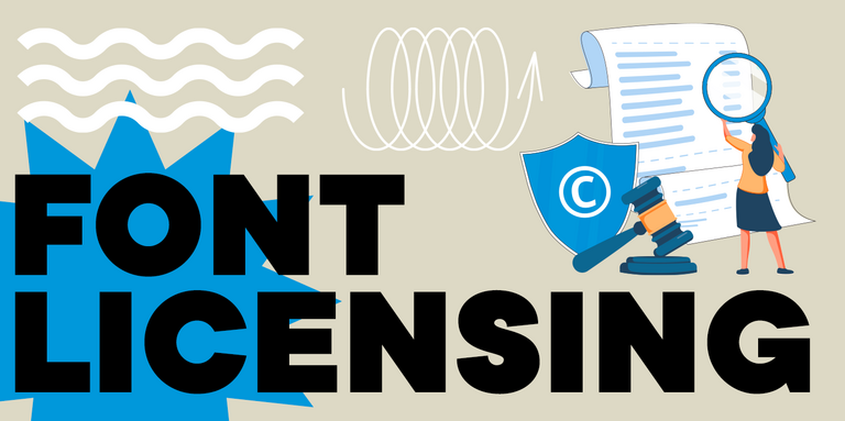
Para el uso comercial de fuentes de la lista, se requiere una licencia. Antes de comprar, puede descargar una versión de prueba gratuita de cualquier fuente; esta es una copia exacta de las de pago.
Fuentes universales para cualquier revista.
En esta lista encontrará fuentes de revistas lacónicas que son adecuadas para publicaciones completamente diferentes. Entre ellos se encuentran tanto los de texto como los que se pueden utilizar tanto para el conjunto principal como para inscripciones de gran tamaño. Todos los tipos de letra son muy funcionales, contienen fuentes variables y funciones útiles de OpenType que le permitirán ajustar los diseños para diversas tareas y el diseño será más fácil.
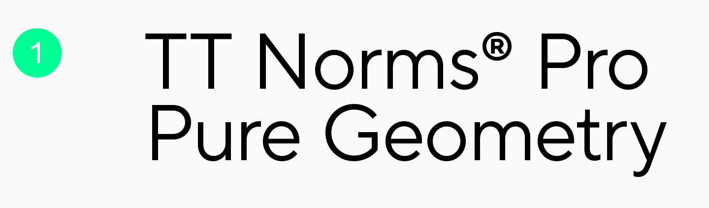
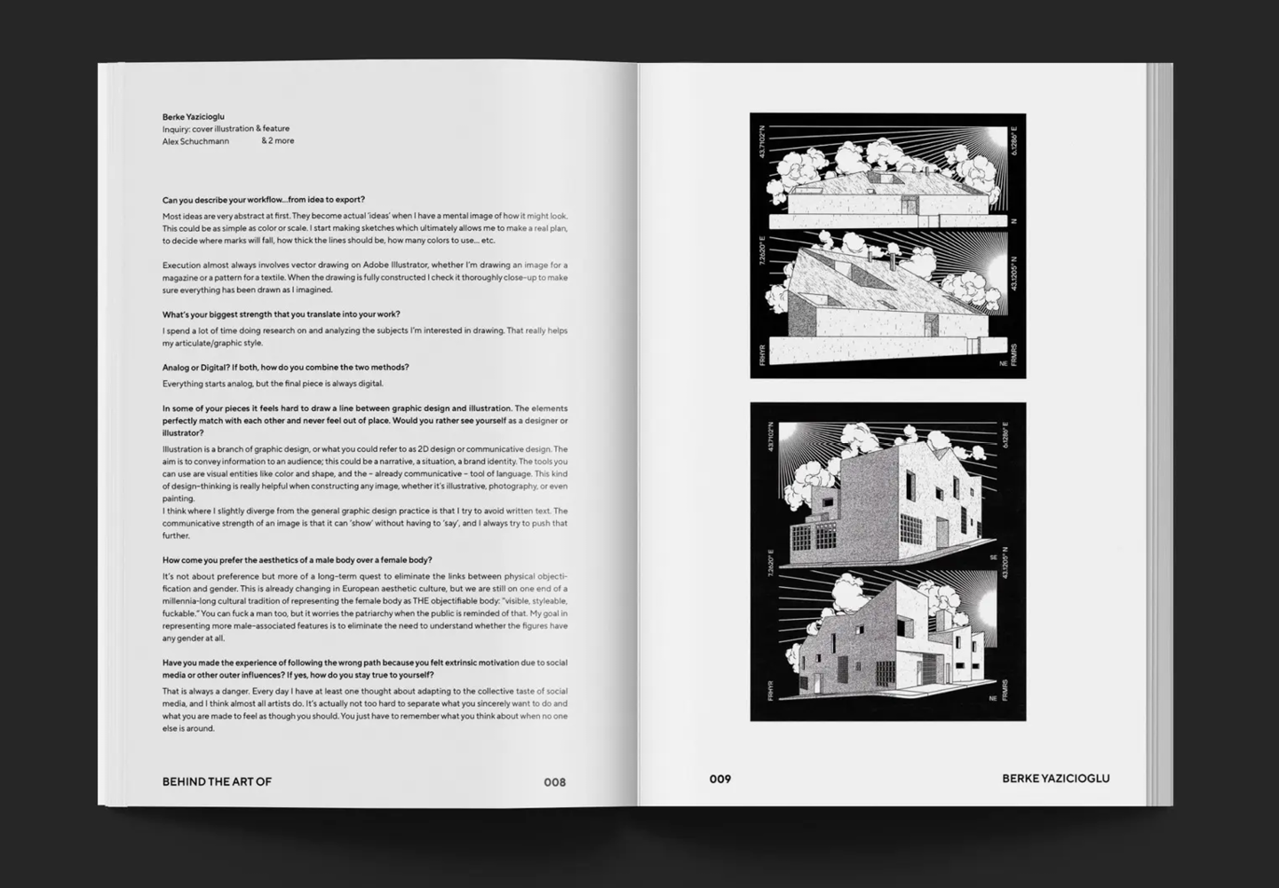
Una sans serif geométrica universal para crear diseños estéticos, una fuente popular de nuestro estudio. TT Norms® Pro tiene un carácter neutral, pero al mismo tiempo es una fuente hermosa y moderna. Esto permite su uso en cualquier publicación, independientemente de su temática. En el texto principal de la revista lucirá neutral y fácil de leer, y en la portada y en los titulares lucirá lacónico, elegante y sobrio. Por ejemplo, puede ver TT Norms® Pro en las páginas de la revista de arte Hometown Journal: todo su diseño, tanto el texto de los artículos como las inscripciones grandes, está realizado en esta fuente.
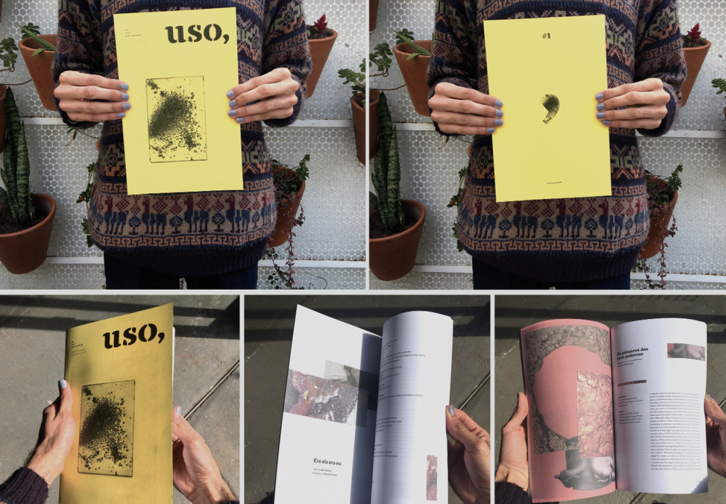
Otro ejemplo es la publicación brasileña Revista Uso, dedicada a la literatura y el arte independientes. Aquí, TT Norms® Pro se utiliza como complemento de texto de otra fuente de visualización de nuestra colección, TT Tricks. Además, el par ideal para esta sans serif sería la serif TT Norms® Pro Serif, pero puedes combinarla de forma segura con otras fuentes más brillantes.
Si desea aprender cómo combinar fuentes correctamente y seleccionar pares de fuentes, lea nuestro artículo.
TT Norms® Pro Serif es una fuente serif elegante pero bastante neutral. Se ve hermoso en inscripciones grandes y es fácil de leer, por lo que, si lo desea, puede usarse tanto para los títulos como para el texto de los artículos. La fuente es bastante versátil, pero quedará mejor en revistas sobre arte, arquitectura, literatura o historia, así como en catálogos de productos premium (por ejemplo, perfumes o joyas). TT Norms® Pro Serif le dará a su diario una sensación de estatus y sofisticación. Si busca un par de fuentes, le recomendamos utilizar este serif en combinación con TT Norms® Pro.
TT Commons™ Pro es una fuente sans-serif limpia. Se trata de un grotesco geométrico elegante con un carácter neutro, uno de los más vendidos de nuestro estudio. Tiene formas claras y proporciones precisas, que lo hacen fácil de percibir e ideal para la lectura. Y al mismo tiempo parece elegante y relevante, por lo que es adecuado para su uso en inscripciones grandes. Con este tipo de letra puedes crear un diseño completo de cualquier revista, utilizándolo tanto para el texto principal de los artículos como para el diseño de la portada y los títulos. O utilice TT Commons™ Pro como fuente de texto, eligiendo un par de visualización: combinará armoniosamente con casi cualquier fuente expresiva.
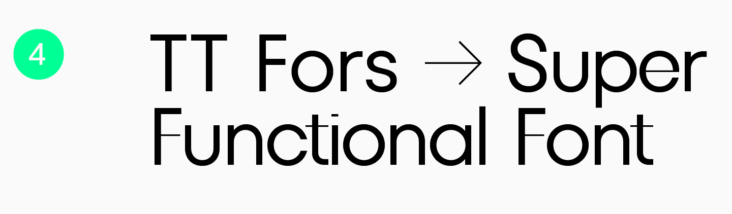
TT Fors es un grotesco geométrico cuyas proporciones se acercan lo más posible a las formas geométricas básicas (círculo, triángulo, cuadrado). Esta es una fuente lacónica, pero bastante reconocible, que se ve hermosa en inscripciones grandes y es ideal para escribir texto con un tamaño de punto pequeño. Además, los auriculares incluyen la subfamilia TT Fors Display. Se trata de un excelente par de modelos para la subfamilia principal, en el que se han conservado proporciones reconocibles, pero han aparecido detalles característicos más llamativos. Las revistas diseñadas por él tendrán un aspecto moderno y minimalista, transmitiendo una sensación de limpieza, precisión y «geometría».
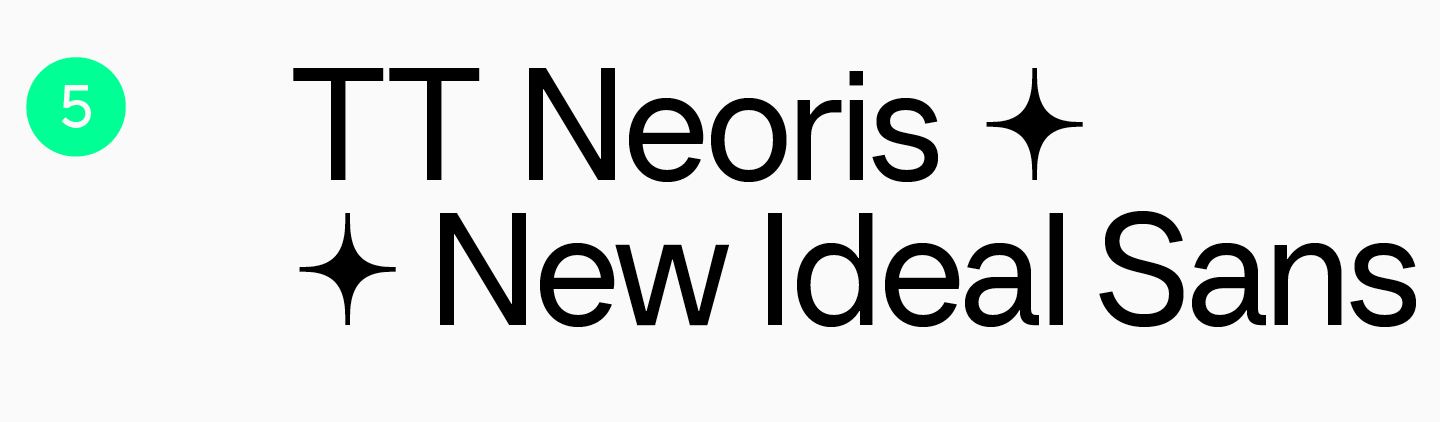
TT Neoris es un neogrotesco lacónico, elegante y moderno. Las funciones incluidas en el tipo de letra le permiten cambiar el estilo de fuente y no solo utilizar la versión estándar. Por lo tanto, la fuente se puede ajustar para adaptarse a diferentes temas de revistas. Se lee muy bien en artículos de revistas grandes y funciona igual de bien en tamaños grandes, revelando detalles interesantes. TT Neoris también lucirá interesante en combinación con otras fuentes: negrita, divertida, moderna o seria. Curiosamente, esta fuente se desarrolló durante dos años y medio basándose en una extensa investigación; lea más sobre esto en nuestro material.
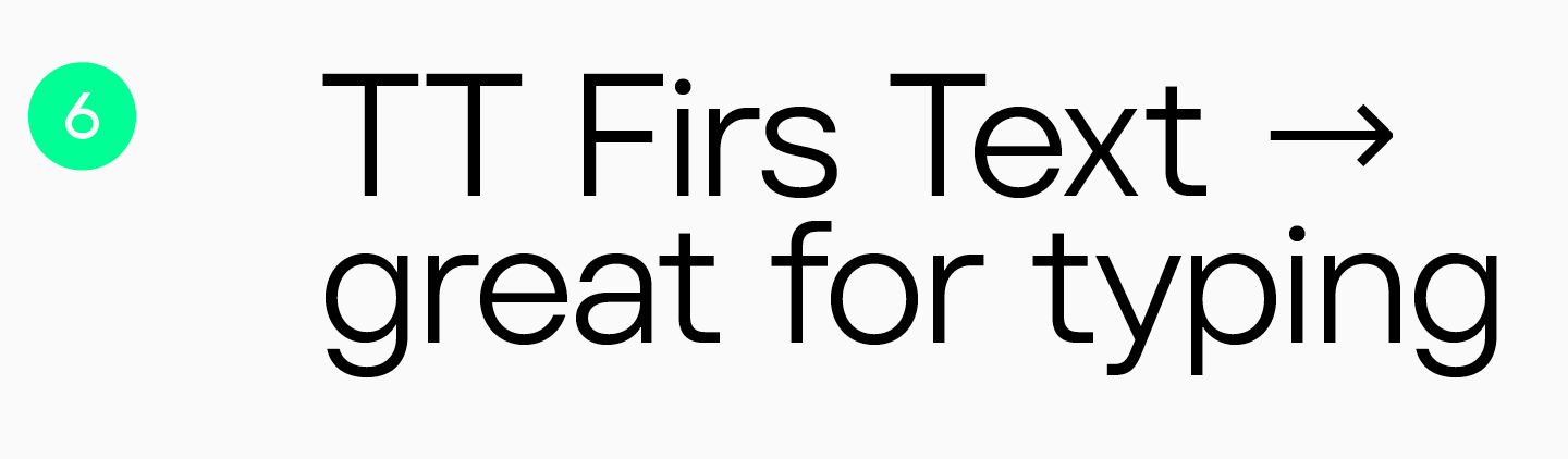
TT Firs Text es un grotesco geométrico con carácter nórdico. A pesar de su sencillez y laconismo, es reconocible gracias a la estética del minimalismo escandinavo. Esta fuente es a la vez estricta y elegante, fría y cautivadora. Por lo tanto, lucirá interesante y elegante tanto en los textos principales como en los titulares. Para un mayor énfasis, recomendamos combinarlo con TT Firs Neue u otras fuentes de visualización.
Fuentes características para revistas de diversos temas.
A continuación hemos recopilado fuentes con más carácter que ayudarán a darle un cierto tono a tu revista. Son adecuados para el diseño de portadas y títulos. La mayoría de los tipos de letra también contienen fuentes variables y funciones útiles, gracias a las cuales puedes hacer que tu diseño sea verdaderamente único, brillante e interesante.
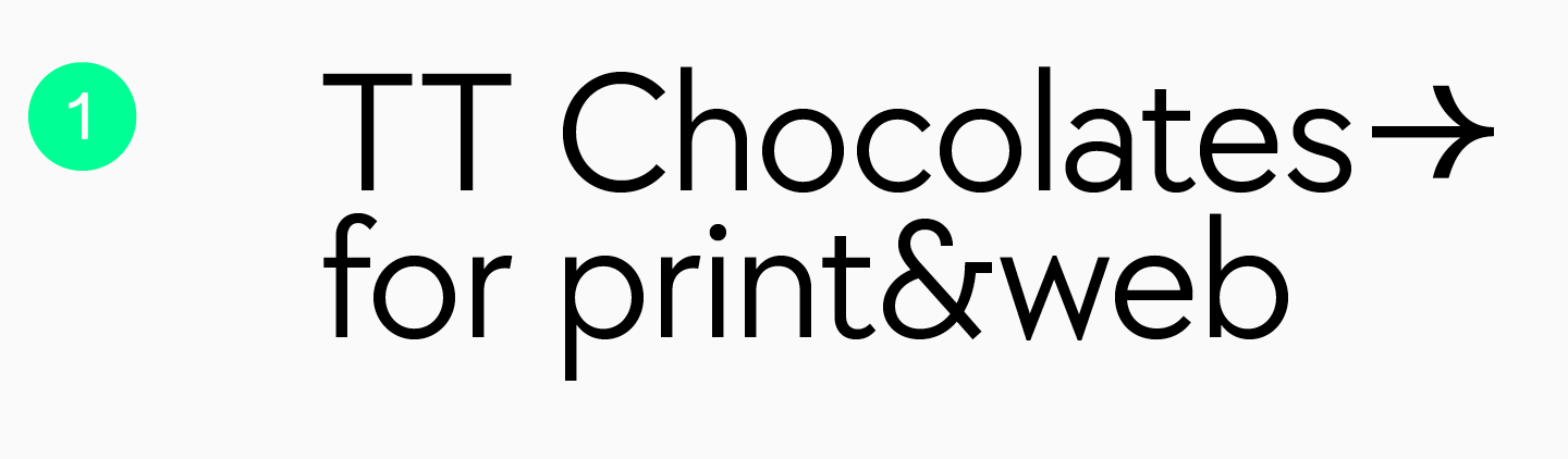
TT Chocolates es una elegante fuente sans-serif que presenta un conjunto denso, proporciones equilibradas y un carácter amigable. Como puedes adivinar por el nombre, ésta fue desarrollada como una fuente adecuada para productos de confitería. Por lo tanto, este grotesco humanista se puede elegir con seguridad para el diseño de revistas sobre comida, restaurantes y bares. Sin embargo, no se apresure a limitarse a este tema: TT Chocolates no lucirá menos armonioso, por ejemplo, en las páginas de publicaciones sobre diseño de interiores o estilo de vida.
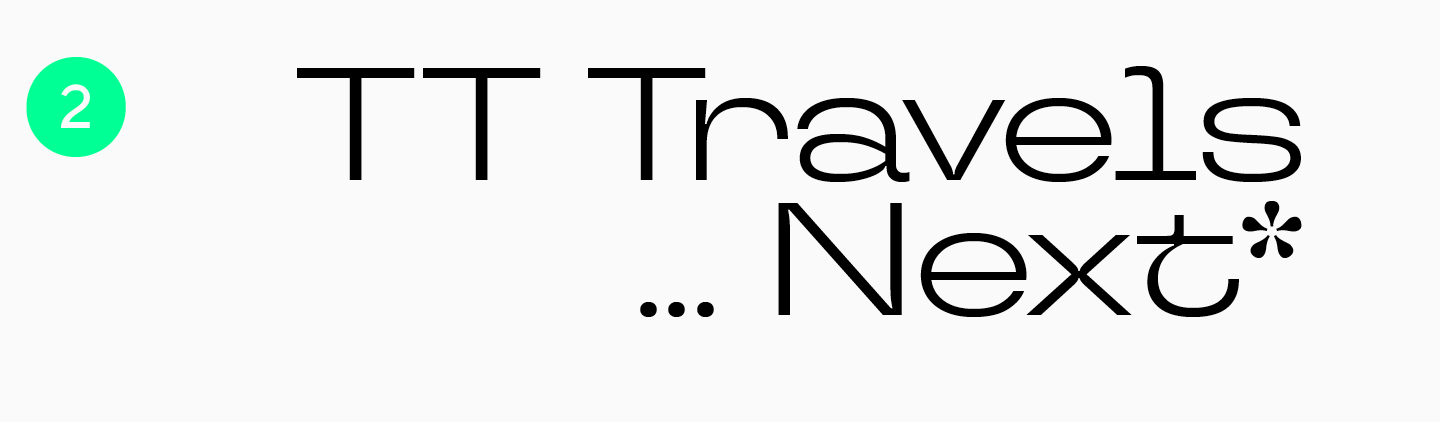
TT Travels Next es un grotesco ultramoderno con amplias proporciones. Esta es una fuente experimental con formas inusuales que llamarán la atención sobre tu revista. Gracias a su carácter atrevido y atrevido, complementará perfectamente las revistas juveniles o las publicaciones de viajes. TT Travels Next le dará a su diseño una sensación de confianza e inconformidad. TT Travels Text es ideal como par de textos.
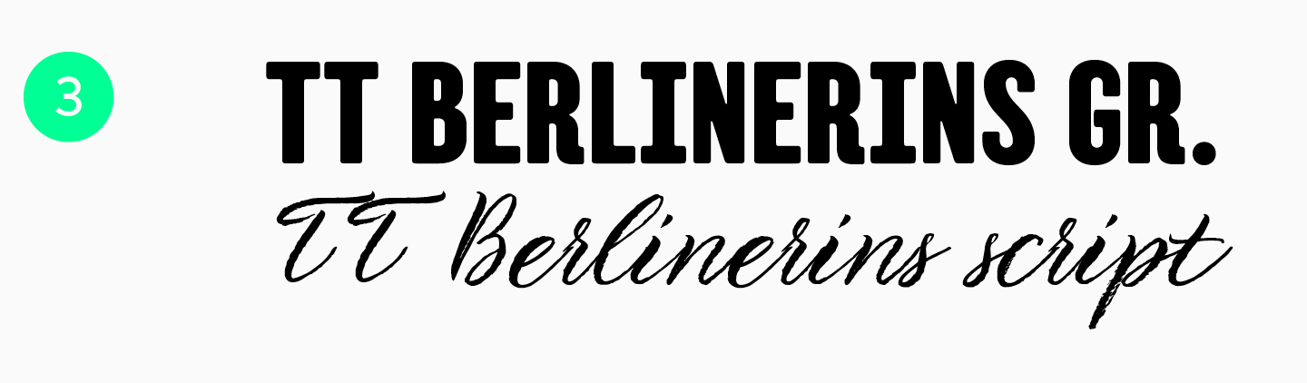
TT Berlinerins es un tipo de letra que consta de una fuente sans serif sólida y una fuente romántica manuscrita. Son completamente diferentes, pero combinan bien entre sí. Este par de fuentes está inspirada en Berlín, donde se entrelazan la historicidad y la modernidad. Por tanto, lucirán armoniosos en las portadas de revistas sobre arquitectura o la vida en una gran ciudad.
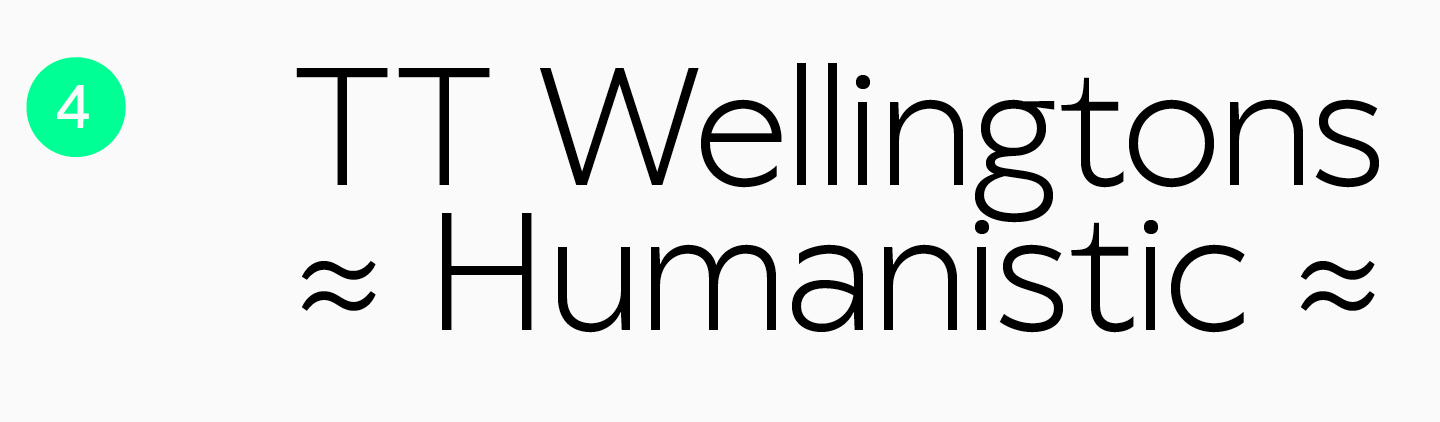
TT Wellingtons es otra fuente asociada con la gran ciudad. Es grotesco y recuerda a las fuentes humanísticas inglesas del siglo XX. Y con razón: al crearlo, los diseñadores se inspiraron en las fuentes que se utilizaban en el diseño del sistema de transporte de Londres en aquella época. Lacónica y al mismo tiempo memorable gracias a sus detalles inusuales, esta fuente decorará las páginas de revistas sobre arquitectura, diseño, viajes o estilo de vida. TT Wellingtons también puede funcionar bastante bien como fuente para una revista de moda.
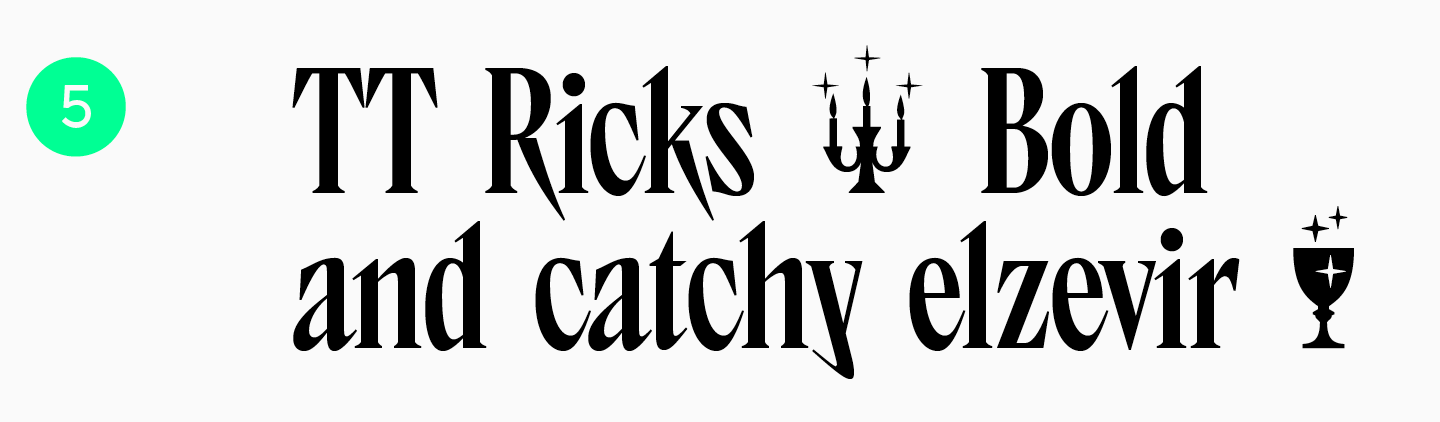
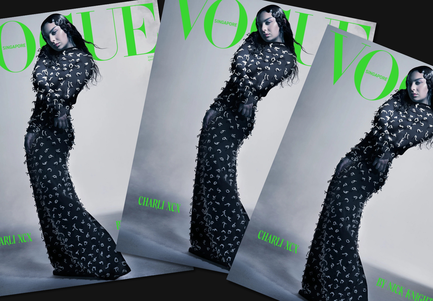
Expresiva, genial y «malvada», TT Ricks es un verdadero hallazgo para aquellos que necesitan una fuente inusual y llamativa para el diseño de su revista. La fuente se distingue por sus distintivas formas de caracteres estrechas y sus serifas se asemejan a puntas afiladas. Le dará a tu diseño una sensación de misterio y te ayudará a crear un diseño de portada que sea brillante, audaz y quizás incluso provocativo. Esta es una excelente solución para revistas y fanzines informales para jóvenes. También puedes usar esta fuente para una revista de moda: mira cómo luce TT Ricks en la portada de Vogue Singapore.
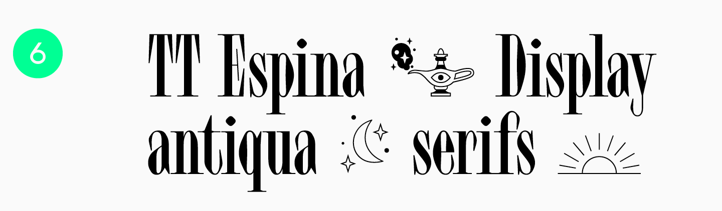
TT Espina es otra hermosa fuente con un toque de misterio. Tiene formas de diamantes inusuales, serifas expresivas y caracteres estrechos, lo que le da a esta antigüedad una estética especial. Esta tipografía, colocada en la portada de tu revista, llamará la atención. Aportará un encanto especial a publicaciones sobre arte, música, cine, esoterismo o moda.
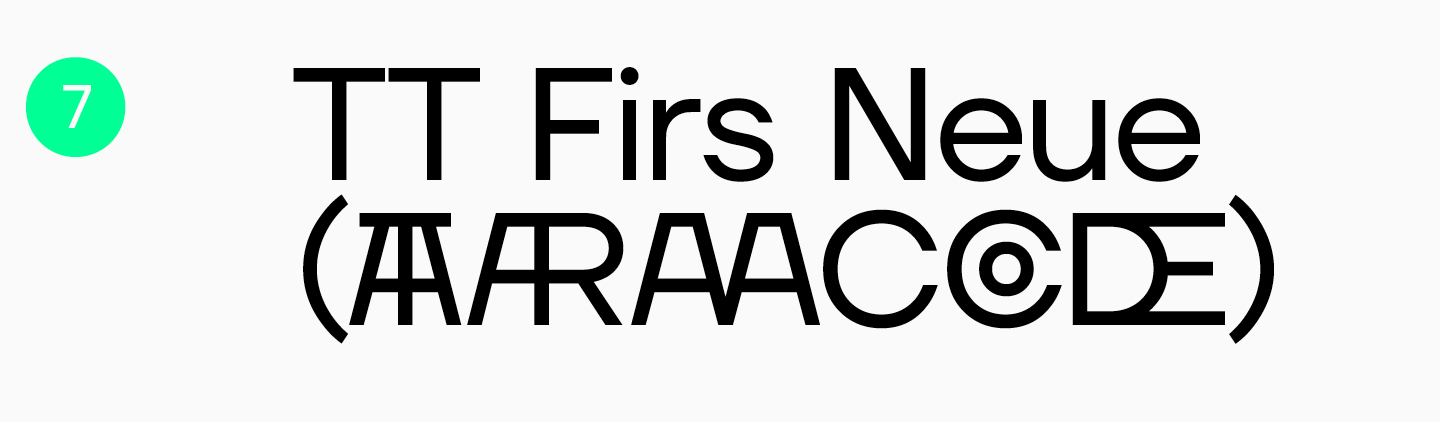
El grotesco escandinavo TT Firs Neue combina minimalismo y expresividad. Enfatizará el estilo lacónico de su revista, a la vez que lucirá moderna y no demasiado estricta, dándole a la publicación un carácter profesional. Se puede utilizar en el diseño de revistas sobre tecnología, ciencia, negocios, automóviles. Sin embargo, la fuente es bastante universal y encajará igual de bien en publicaciones de otros temas. TT Firs Text es ideal como par de texto.
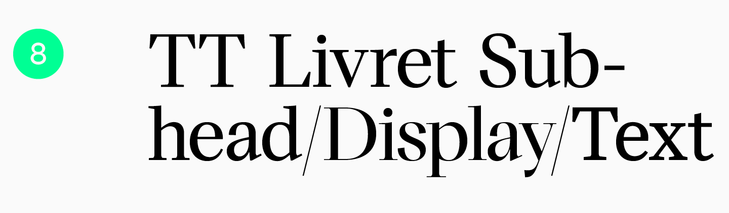
TT Livret es una fuente serif moderna. Los auriculares incluyen tres subfamilias: texto silencioso, subtítulos más expresivos y pantalla brillante. Gracias a esto, se puede utilizar para la portada, los títulos y el texto principal de los artículos. Una revista brillante con esta fuente lucirá cara y elegante. TT Livret es adecuado para publicaciones sobre moda y estilo, arte e historia.
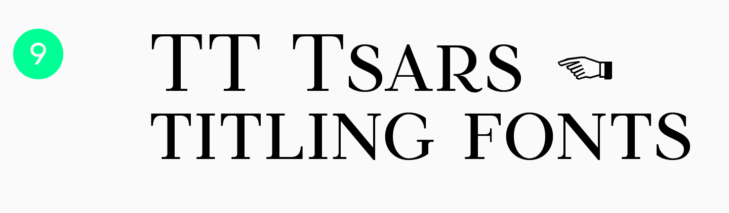
La tipografía TT Tsars es una colección de fuentes serif al estilo de mediados y finales del siglo XVIII. Todos lucen majestuosos y elegantes, evocan un sentimiento de nostalgia, historia y, al mismo tiempo, frescura y, por lo tanto, encajarán fácilmente en las publicaciones modernas. La serie es ideal para la portada de una revista sobre arte, cultura e historia. Vea cómo TT Tsars aparece en los titulares de la revista St. Petersburg Digest, dedicado a la vida cultural de San Petersburgo.
Conclusión
Como puedes ver, las tipografías utilizadas en las revistas son muy diversas. Así tendrás todas las herramientas para crear una revista atractiva y elegante que será un placer leer. Para sacarles el máximo partido, te recomendamos no sólo seguir las recomendaciones generales, sino también no tener miedo de usar la imaginación. Y, por supuesto, no olvides buscar ejemplos de trabajos que te inspiren.