


Die Gestaltung von Plakaten ist eine große kreative Spielwiese für die Arbeit mit Typografie. Wie wählt man Plakatschriften richtig aus, ohne seine Idee zu gefährden? Welche verschiedenen Plakatschriften gibt es und wie findet man die richtige? In diesem Artikel erfahren Sie es!
Warum sind Plakatschriften wichtig?
Die Schrift ist ein wesentlicher Bestandteil jedes Plakatdesigns. Egal, ob es sich um Veranstaltungsflyer für Kultur- oder Sportveranstaltungen, Schülerzeitungen, Werbeplakate oder Kampagnenplakate handelt, sie alle enthalten Text und tragen dazu bei, verschiedene Botschaften zu vermitteln.

Bei manchen Plakatentwürfen steht die Typografie im Vordergrund, grafische Elemente ergänzen den Text oder fehlen ganz. Wir werden später darauf zurückkommen.
Es liegt also auf der Hand, dass die richtige Wahl der Plakatschrift entscheidend ist, um ein stilvolles Plakat zu gestalten, das Aufmerksamkeit erregt und Ihre Idee gut vermittelt.
Arten von Plakatschriften
Lassen Sie uns zunächst die verschiedenen Schriftarten erkunden, die für die Gestaltung von Postern zur Verfügung stehen. Alle Schriften lassen sich in zwei große Gruppen einteilen: Display und Text.
Ausdrucksstarke Schriften dienen dazu, Akzente zu setzen: Sie können für Überschriften oder andere große, auffällige Texte verwendet werden. Diese Schriften haben einen ausgeprägten Charakter, komplexere Grafiken und viele kuriose Details. Diese Schriften sind für große und mittlere Punktgrößen konzipiert und funktionieren auch ohne grafische Elemente hervorragend als eigenständige Schriften.

Textschriften sind praktisch, wenn Sie eine Schrift benötigen, die auch in kleinen Schriftgraden gut lesbar ist. Sie sind neutrale Schriften mit einfachen grafischen Elementen, die nicht vom Lesen ablenken und für die visuelle Wahrnehmung geeignet sind. Textschriften können auch in großen Schriftgraden verwendet werden und kommen auf Plakaten gut zur Geltung. Sie eignen sich hervorragend für ein minimalistisches Plakat und sorgen für Eleganz und Sauberkeit im Design.

Fast jede Schriftart kann Teil des Plakatdesigns sein. Finden Sie heraus, wie Sie die richtige Schrift auswählen!
Wie man eine coole Schrift für Poster auswählt: Checkliste

Bevor wir eintauchen, sollten wir klarstellen, dass diese Tipps eher als Richtlinien für die Auswahl und nicht als strikte Anweisungen zu verstehen sind. Bei der Gestaltung von Postern wird die Typografie oft zum wichtigsten kreativen Werkzeug des Designers, um etwas Schönes und Einzigartiges zu schaffen. Scheuen Sie sich daher nicht, zu experimentieren und verschiedene Schriften auszuprobieren. Zu diesem Zweck können Sie Testversionen von Schriften kostenlos herunterladen.
Legen Sie die Idee für Ihr Poster fest
Entscheiden Sie zunächst, welche Ziele Sie mit Ihrem Plakat erreichen wollen: informativ oder dekorativ, werbend oder verkaufsfördernd. Welche Stimmung soll das Plakat vermitteln? Wie soll die Farbgebung sein? Soll es expressiv oder minimalistisch sein? Wenn Sie diese Fragen beantwortet haben, wählen Sie eine Schrift aus der Stilkategorie, die zu Ihrem Konzept passt. Die beste Plakatschrift ist die, die Ihre Idee am besten vermittelt.
Finden Sie den Platz und die Funktionen der Schrift im Design
Jetzt ist es an der Zeit, darüber nachzudenken, wie genau Sie die Schrift in Ihrem Design verwenden wollen. Wird sie eine Ergänzung zur Grafik oder ein auffälliges Element neben der Illustration sein? Oder wird sie das einzige Element auf dem Poster sein?
Wenn Sie die Schrift in großen Punktgrößen zusammen mit Grafiken verwenden, achten Sie auf Details: Bestimmte Glyphenelemente können durch Grafiken oder Ähnlichkeiten zwischen ihnen hervorgehoben werden. Wenn Sie die Schrift alleine verwenden, experimentieren Sie mit Schriftgrößen und -stärken, um Ihrem Text ein ungewöhnliches Muster zu geben. Wenn Sie eine Plakatschrift für kleine Punktgrößen benötigen, fahren Sie mit dem nächsten Schritt fort.
Lesbarkeit ist wichtig

Das Wichtigste bei Schriften für kleine Punktgrößen ist, dass sie gut lesbar sind. Um lesbar zu sein, sollten Schriften folgende Eigenschaften aufweisen: Einfachheit, Klarheit, neutrale Proportionen, standardisierte Zeichenbreiten und Strichstärken, keine dekorativen Elemente. Hier erfahren Sie mehr über die Auswahl der richtigen Schriftart.
Funktionalität sollte zum Zweck passen
Ein weiterer wichtiger Faktor bei der Auswahl einer coolen Schrift für Poster ist die Funktionalität. Bevor Sie sich für eine Schrift entscheiden, sollten Sie sich darüber im Klaren sein, welche Funktionen sie erfüllen soll. Wenn Sie auf Ihrem Poster mehrere Texte in verschiedenen Sprachen unterbringen möchten, sollten Sie darauf achten, dass der gewählte Font alle diese Sprachen unterstützt. Wenn Sie verschiedene Schriftarten auf einem Poster verwenden oder mehrere Poster im gleichen Stil erstellen möchten, wählen Sie eine Schriftart, die aus mehreren Schriftschnitten besteht. Von Vorteil ist es, wenn die Schriftart einen variablen Zeichensatz enthält. Auf diese Weise können Sie mit der Typografie experimentieren und ungewöhnliche Designentscheidungen treffen.

Lesen Sie mehr über die Auswahl von Schriften für ein Projekt in diesem Artikel.
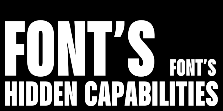
Icons und andere Zusatzgrafiken in Schriften
Schriften enthalten oft zusätzliche grafische Elemente, die über den Grundzeichensatz hinausgehen. Die einfachsten Symbole wie eingekreiste Zahlen, Pfeile und Zeichen finden sich in fast allen Schriften der TypeType-Sammlung und in vielen Schriften anderer Studios.
Komplexere Symbole und Illustrationen sind seltener — Schriftgestalter zeichnen sie für bestimmte Schriften, um ihre Stimmung und ihren Stil auszudrücken. Eine Schrift, die an etwas Mystisches und Hexenhaftes erinnert, könnte zum Beispiel Halbmonde oder magische Kugeln enthalten. Eine eher lustige Schrift würde ebenfalls entsprechende Symbole enthalten.

Wenn eine Schriftart Iconsets enthält, kann das die Arbeit sehr erleichtern. Zusätzlich zur Schrift können Sie diese grafischen Elemente in Ihrem Posterdesign verwenden und so perfekt auf den Stil Ihres Textes abstimmen. Und wenn Sie die richtige Schriftart für die Stimmung Ihres Posters wählen, ist die Wahrscheinlichkeit groß, dass auch die Icons zur Idee und zum Thema Ihres Projekts passen. In diesem Artikel erfahren Sie mehr über Icons in Schriften.
Die folgende Auswahl enthält Schriften mit Iconsets.
Die besten Poster-Schriften
Wir haben die besten Schriften für Poster in verschiedenen Stilen aus der TypeType-Sammlung ausgewählt. Wir haben auch Beispiele von realen Projekten mit diesen Schriften zusammengestellt, um zu zeigen, wie sie in verschiedenen Plakatdesigns funktionieren. Alle Schriften unterstützen zahlreiche lateinische und kyrillische Sprachen.
Sie können eine kostenlose Testversion jedes Fonts in der Liste herunterladen, um zu sehen, ob es zur Ästhetik Ihres Projekts passt.
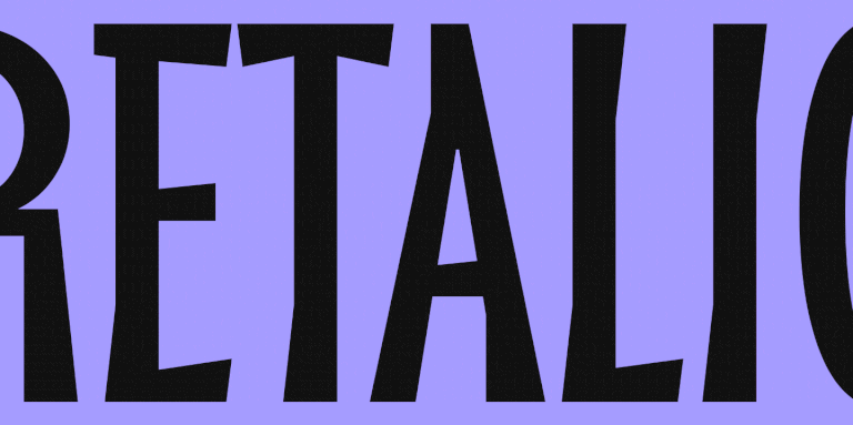
1. TT Trailers—eine lebendige Schrift für Plakate (und mehr)

TT Trailers ist eine ausdrucksstarke serifenlose Akzidenzschrift, die sich durch experimentelle Buchstabenformen und besonders schmale Proportionen auszeichnet. Die Schrift wurde für die Filmindustrie entwickelt und glänzt daher auf Plakaten wie ein echter Star. TT Trailers ist Teil der Identität des Theatre de la Croix Rousse geworden. Sehen Sie selbst, wie auffällig, elegant und modern sie auf den Plakaten des Theaters wirkt!

Das Einsatzgebiet dieser coolen Schrift ist jedoch weitaus größer: Sie kann für jede Art von Plakat verwendet werden. PAMIPE, eine spanische Tierfuttermarke, hat TT Trailers zu ihrer Hausschrift gemacht. Hier wird sie für Werbeplakate verwendet und sieht in Kombination mit Grafiken lustig und cool aus und zeigt ihre verspielte Seite.

Zu TT Trailers gehört übrigens auch ein Iconset zum Thema Kino. Es enthält Popcorn, Sitze, eine Leinwand und andere niedliche Bilder, die Sie für Ihr Plakat verwenden können.
2. Die vielseitige und ausdrucksstarke TT Travels

TT Travels ist eine breite, geometrische Sans Serif-Schrift. Ihre breiten Proportionen und die kühlen, lebendigen Details ziehen die Aufmerksamkeit auf sich, bleiben aber dennoch sehr anpassungsfähig, so dass diese Schrift in Projekten mit unterschiedlichen Themen und Farbtönen eingesetzt werden kann.
Pluxee, ein weltweit führender Partner für Mitarbeiterbeteiligung und -engagement, setzt TT Travels auf Plakaten ein. Hier wirkt sie freundlich und neutral. Beispiele sind Plakate mit Grafiken und solche, bei denen die Schrift fast allein wirkt.

Ganz anders verhält sich die Schrift auf Plakaten für den Teze Bazar, den ältesten Markt in Baku, Aserbaidschan. Hier ist sie eine perfekte Ergänzung zur Grafik und fügt sich nahtlos in den Gesamtstil und die Einzigartigkeit des Projekts ein.

3. Die minimalistische und stilvolle TT Firs Neue

TT Firs Neue ist eine skandinavische Sans Serif-Schrift, die Minimalismus mit Wiedererkennbarkeit verbindet. Diese Mischung ist auf den Plakaten des Theaters Lübeck, einem der größten Theater in Schleswig-Holstein, gut zu erkennen. Hier wirkt die Schrift allein als Blickfang und unterstreicht den Status und die Modernität des Hauses.

Die gleiche Schrift wird auf den Plakaten des Lissabon & Estoril Film Festivals (LEFFEST) verwendet. Hier arbeitet die Schrift mit der Grafik zusammen und wirkt eher neutral, ohne das Bild zu verkomplizieren, und verleiht den Plakaten eine einzigartige Atmosphäre.

4. TT Commons—die perfekte Basis für jedes Projekt

TT Commons TT Commons ist eine vielseitige, geometrische Groteskschrift, die sich für die unterschiedlichsten Projekte eignet. Dank ihres neutralen Charakters lässt sie sich mit fast jeder Grafik kombinieren oder auch solo einsetzen, wenn Ihre Plakatidee Eleganz verlangt.
Die Schrift eignet sich beispielsweise hervorragend für die Plakate von NanoAvionics, einem Unternehmen, das Nanosatelliten herstellt. TT Commons glänzt sowohl als eigenständige Schrift, die alle Grafiken ersetzt, als auch als sekundäre Schrift, die die Informationsfunktion übernimmt.

Charcoalblue Experience kombiniert TT Commons mit eleganten grafischen Elementen auf Plakaten, die sich gegenseitig unterstreichen und ergänzen. Die Betonung liegt hier auf den Linien.

5. Die außerirdische TT Alientz für ungewöhnliche Plakate

Wer ein cooles oder gar extravagantes Plakat gestalten möchte, sollte die TT Alientz ausprobieren. Diese Schrift ist auch ohne zusätzliche Grafiken ein echter Blickfang. Werfen Sie einen Blick auf das Plakat, das Svelt Studio für das Projekt von Cédric Orain und Guilherme Gomes SILÊNCIO von La Magnanerie entworfen hat. Hier kommt die TT Alientz in verschiedenen Schriftgrößen zum Einsatz — die Designer nutzten diesen Trick, um einen ungewöhnlichen Effekt zu erzielen und grafische Elemente mit nur einer Schrift zu ersetzen.

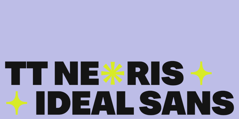
6. Die Chamäleon-Schrift TT Neoris

TT Neoris ist eine Schrift, die mehrere Schriften auf einmal ersetzen kann und sich an völlig unterschiedliche Projekte anpassen lässt. Ob cool, schräg, auffällig oder elegant — mit dieser Schrift können Sie verschiedene Projekte mit akzentuiertem oder neutralem Text gestalten. Sehen Sie selbst, wie gut die TT Neoris auf Postern aussieht. Auf dem Poster finden Sie auch einen vielseitigen Satz von Symbolen, die in der Schrift enthalten sind.

7. TT Ricordi Fulmini—eine moderne Schrift mit historischem Hintergrund

TT Ricordi Fulmini ist eine moderne Serifenschrift, spannend und sogar stachelig, aber dennoch weich und elegant. Diese auffällige Schrift kommt am besten in großen Schriftgraden zur Geltung und eignet sich daher nicht für kleine Texte. Sie bringt eine bestimmte Stimmung in Ihre Idee: geheimnisvoll, kühn, gewagt. Kein Wunder, dass die TT Ricordi Fulmini so gut zum Plakatdesign der Miniserie Dead Ringers passt.

8. «Angry» TT Ricks — für ein Plakat mit Persönlichkeit

Die scharfe und kantige TT Ricks ist eine weitere ausdrucksstarke Schrift, die auf Ihrem Plakat eine wichtige Rolle spielen wird. Diese Schrift kommt am besten in mittleren bis großen Schriftgraden zur Geltung. Ganz gleich, ob Sie sie allein oder in Kombination mit Grafiken verwenden, sie wird zweifellos die Aufmerksamkeit auf sich ziehen. Übrigens können Sie Ihr Plakatdesign mit den stilvollen Symbolen der Schrift aufwerten.

9. TT Norms Pro für jede Gelegenheit

TT Norms Pro ist eine funktionale und ästhetische geometrische Serifenlose und eine weitere Basisschrift in unserer Kollektion. Sie eignet sich für die unterschiedlichsten Gestaltungsideen, von Werbeflyern bis hin zu Veranstaltungsplakaten. Die Schrift lässt sich in jeder Punktgröße einsetzen und kann sowohl im Mittelpunkt einer Komposition stehen als auch andere Gestaltungselemente ergänzen. So sieht die TT Norms Pro zum Beispiel auf den Plakaten des Innovationslabors Onima aus.

10. TT Espina—eine Schrift, die verzaubert

TT Espina ist eine Display-Antiqua mit expressiven Serifen. Sie ist eine coole Schrift für Plakate mit folkloristischen, magischen, esoterischen oder ähnlichen Themen, denn die fesselnden Grafiken der TT Espina verleihen jedem Projekt eine einzigartige Ästhetik. Sie können auch das Icon-Set der Schrift verwenden, um weitere grafische Elemente hinzuzufügen und Ihre Plakatentwürfe zu vervollständigen.

Fazit
Wir hoffen, dass Ihnen dieser Artikel bei der Auswahl der besten Plakatschriften hilft und Sie bei der Gestaltung ungewöhnlicher und aufregender Plakate unterstützt! Seien Sie mutig beim Experimentieren, suchen Sie nach weiteren inspirierenden Beispielen und entwickeln Sie Ihren eigenen einzigartigen Stil!