ttcommonspro
Página principal Blog Nuestro resumen del año: El viaje de TypeType hasta 2023

Nuestro resumen del año: El viaje de TypeType hasta 2023

Nuestro resumen del año: El viaje de TypeType hasta 2023

2023 became a very important year for TypeType. Throughout 2023, we actively expanded and improved, embracing change and consistently moving forward. So, in this article, we are taking a step back to take a fresh look at our transformations, document achievements, and note down plans for the future. Let’s review our year!

This article features our most fascinating materials, memorable moments from the studio’s life, and some exciting projects to expect from us soon.

Fonts of the year
Nuestro resumen del año: El viaje de TypeType hasta 2023

New fonts

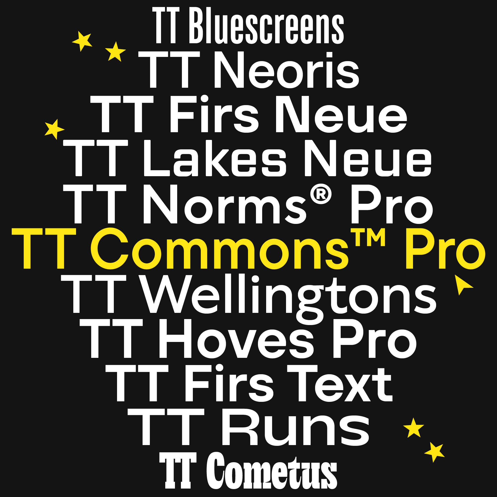
  • TT Neoris—our Neo-Grotesque with unlimited potential;
  • TT Firs Text—an elegant Scandinavian sans serif with a Nordic character;
  • TT Cometus—a dynamic, attractive, and eye-catching display font.

Updated fonts

  • TT Norms® Pro—one of the studio’s bestsellers, a functional geometric sans serif with an extensive character set. We updated this font twice and gave it a new Compact subfamily;
  • TT Commons™ Pro—another bestseller, a versatile geometric sans serif. This font was also updated twice and given a Compact subfamily. We also added the Greek language support in four subfamilies;
  • TT Hoves Pro—this bestseller from the top three versatile sans serifs was also improved and received new font styles along with the Vietnamese language support;
  • TT Wellingtons—this Humanist sans serif was transformed entirely but kept its simple yet memorable character;
  • TT Runs—we expanded the functionality of this sans serif with unusual and wide proportions;
  • TT Firs Neue—this Scandinavian sans serif was reassembled and given more relevant and versatile features;
  • TT Lakes Neue—we refined this geometric sans serif inspired by Finnish functionalism and expanded its application range;
  • TT Bluescreens—the geometric sans serif with narrow proportions now boasts a larger range of possibilities.

Our plans for 2024
Nuestro resumen del año: El viaje de TypeType hasta 2023

Our achievements in contests

Nuestro resumen del año: El viaje de TypeType hasta 2023
  • A’ Design Award. Our eye-catching and friendly TT Fellows received gold in the nomination «A’ Graphics, Illustration and Visual Communication Design Award»;
  • MUSE Awards. An elegant Florentine sans serif TT Ricordi Greto and a stylish, narrow TT Trailers secured gold in the category «Typography — Typefaces / Font System»;
  • Indigo Awards. TT Espina, a modern Antiqua with sharp serifs, won the gold prize in the nomination «Graphic Design — Typography.»

We have already begun applying for new competitions, so stay tuned!

Our website progress
Nuestro resumen del año: El viaje de TypeType hasta 2023
  • We created our online font store accepting card payments;
  • We implemented personal accounts where you can keep track of all your orders and receive personalized support;
  • We launched a new service called «Font subscription» with its own page on our website. The subscription includes the entire TypeType font collection;
  • We significantly updated the customization page;
  • We published many new cases of our fonts in use;
  • We released an electronic catalog featuring all the studio’s fonts subdivided into categories for your convenience;
  • We introduced an FAQ where you can find the answers to all your questions about licensing;
  • We added suitable font pairs for all the fonts from the catalog to make choosing typefaces for your projects easier;
  • We enhanced the search function on our website, so now, in addition to font names, you can look for articles, font design cases, and website pages using relevant keywords.

These are only the most significant changes. We are constantly working on making our website even more user-friendly and engaging. There are new sections and functions planned!

New articles in TypeType blog
Nuestro resumen del año: El viaje de TypeType hasta 2023

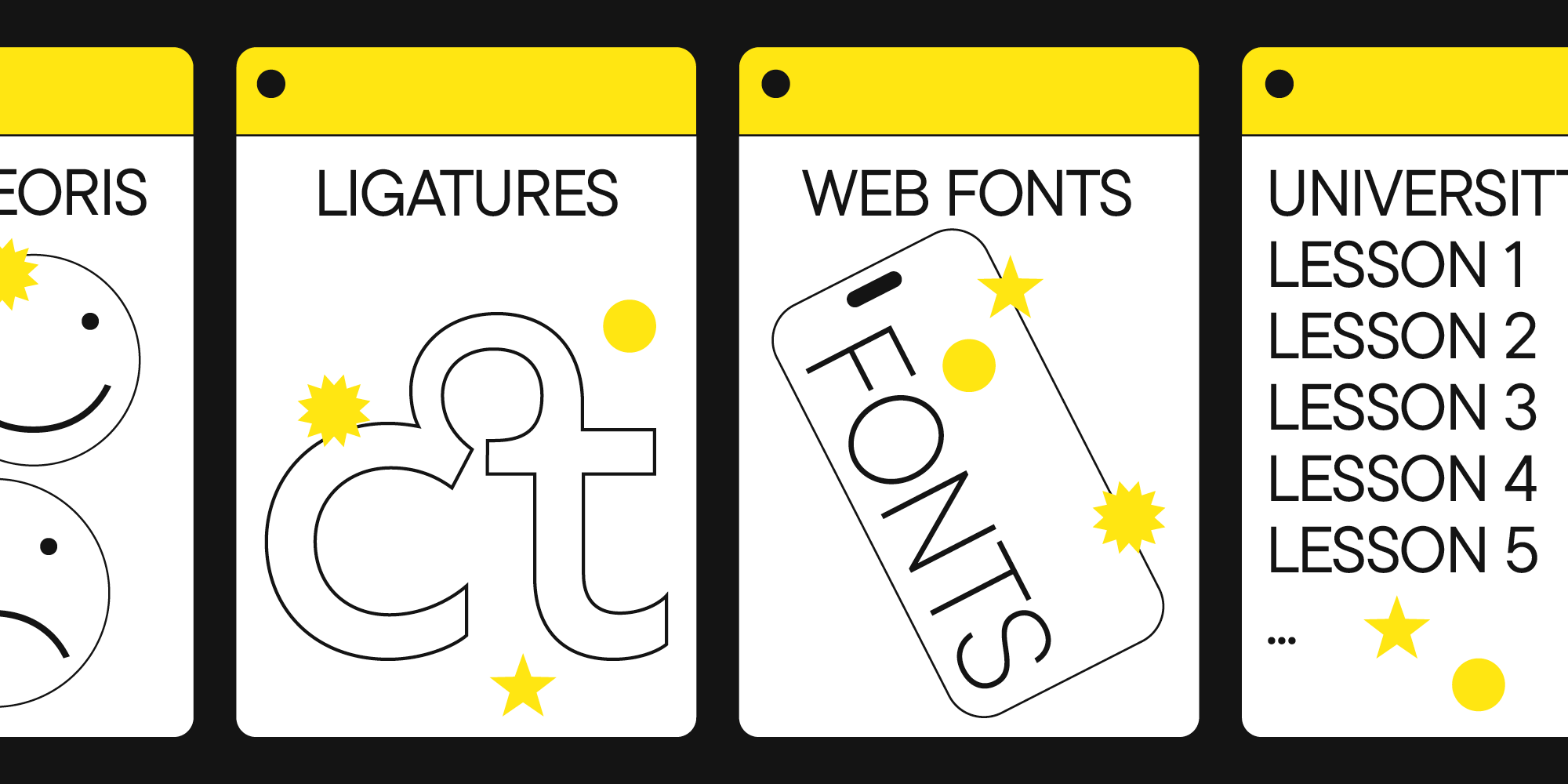
And there is much more to come. We regularly post new helpful and fascinating materials dedicated to fonts—don’t forget to check our blog for the latest updates!

Conclusion

Looking back at this list, we realize how eventful the previous year was for TypeType. And it’s all because of your support! Your interest in fonts inspires us to create and perfect them, learn and tell you more about them, look for new formats, and always be ready to experiment.

Thank you for being with us!

Últimas publicaciones

Licenciamiento de fuentes: guía completa para diseñadores y clientes corporativos

Licenciamiento de fuentes: guía completa para diseñadores y clientes corporativos

La concesión de licencias para fuentes es un área que a menudo puede resultar complicada de entender, ya que existen muchos tipos de licencias, cada una con sus particularidades sobre el uso de las fuentes. ¿Qué tipos de licencias de fuentes existen? ¿Cómo elegir correctamente una licencia según las necesidades específicas?

Buscar etiqueta
Las Mejores Fuentes Cursivas de 2024: Una Guía Completa de Diseño

Las Mejores Fuentes Cursivas de 2024: Una Guía Completa de Diseño

Las fuentes cursivas son una herramienta de diseño poderosa que puede realzar tus proyectos visuales cuando se usan de manera reflexiva. Sin embargo, la clave está en saber aplicarlas de forma efectiva y adecuada. En esta guía integral, exploraremos el mundo de las fuentes cursivas.

Buscar etiqueta
Cómo Elegir las Mejores Fuentes para Infografías: Guía Completa

Cómo Elegir las Mejores Fuentes para Infografías: Guía Completa

Las infografías son una herramienta versátil y práctica que encuentra aplicación en todas partes: negocios, publicidad, ciencia, periodismo y más. Es una forma poderosa de comunicar información de manera simple y visual.

Buscar etiqueta
Las 10 principales tendencias tipográficas de 2024

Las 10 principales tendencias tipográficas de 2024

Vivimos en una época en la que las tendencias cambian casi a diario, y las tendencias en diseño tipográfico no son la excepción. Todos interactuamos con la tipografía a diario: en internet, en los supermercados y en los escaparates y carteles. Un diseño anticuado, en el mejor de los casos, genera aburrimiento; en el peor, desconfianza hacia el producto o servicio.

Buscar etiqueta
Las 15 mejores fuentes para revistas

Las 15 mejores fuentes para revistas

Las revistas son el lienzo perfecto sobre el que la tipografía puede revelar todas sus facetas. La fuente aquí no sólo transmite información al lector, sino que también influye directamente en el diseño. Transmite el mensaje de la revista, transmite valores e ideas. Este artículo habló sobre cómo elegir la mejor fuente para revistas y compiló una selección de 15 opciones actuales para publicaciones sobre diversos temas.

Buscar etiqueta
UniversiTTy: Lección 9. Caracteres en mayúsculas. Refinamiento detallado de contornos

UniversiTTy: Lección 9. Caracteres en mayúsculas. Refinamiento detallado de contornos

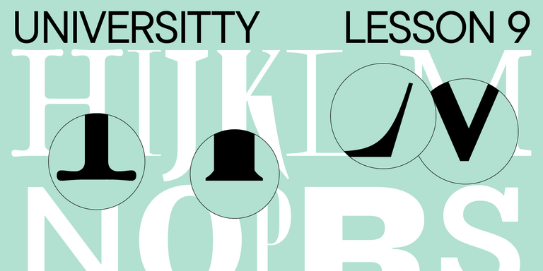
Welcome to the ninth lesson of our «UniversiTTy»! In this series, we guide you through the process of font design step by step. The font is a cohesive visual system. This can be seen on all levels: global (font type, weight, proportions, contrast, general forms) and at lower scales that encompass all graphic choices in individual characters. Let’s find out together how visual details influence the overall perception of fonts.

Buscar etiqueta
Las 15 mejores fuentes de contorno aprobadas por diseñadores en 2024

Las 15 mejores fuentes de contorno aprobadas por diseñadores en 2024

Las fuentes de contorno son una excelente manera de agregar variedad a su diseño y hacerlo atractivo y llamativo. ¿Qué son, dónde se utilizan y qué estilos de fuente se combinan con ellas? Hablamos de todo esto en nuestro artículo y también seleccionamos las mejores fuentes de contorno para varios proyectos.

Buscar etiqueta
Las 10 mejores fuentes para diseños de carteles

Las 10 mejores fuentes para diseños de carteles

Elegir la fuente adecuada para un proyecto es una tarea seria para un diseñador. ¿Cómo encontrar la mejor fuente entre muchas opciones y en qué criterios confiar a la hora de elegir? Te lo contamos en este artículo.

Buscar etiqueta
UniversiTTy: Lesson 8. Designing Basic Latin Characters. Uppercase characters

UniversiTTy: Lesson 8. Designing Basic Latin Characters. Uppercase characters

Welcome to lesson number 8 of our «UniversiTTy» series! Last time, we covered optical compensation, uppercase and lowercase character heights, and the concept of contrast. In this article, we will finally focus on glyph design specifically.

Buscar etiqueta

Buscar etiqueta

20+ mejores fuentes para títulos: TOP soluciones elegantes

20+ mejores fuentes para títulos: TOP soluciones elegantes

¿Qué fuentes es mejor elegir para los títulos y en qué criterios debería basar su selección? Hablamos de ello en este artículo y compilamos una lista de más de 20 mejores opciones.

Buscar etiqueta
UniversiTTy: Lección 5. Elección y combinación de tipos de letra: teoría y práctica

UniversiTTy: Lección 5. Elección y combinación de tipos de letra: teoría y práctica

Designing a font is a complex and meticulous process that requires a lot of experience. However, dealing with a fully crafted font can also take much work. Our clients often ask us how to use a specific typeface better and what other fonts they can match it with. We help choose a suitable type solution for the project, whether it’s an existing typeface from our collection or an entirely new font we design from scratch. In this article, we will share our experience with you.

Buscar etiqueta
Fuente y tipografía: ¿cuál es la diferencia?

Fuente y tipografía: ¿cuál es la diferencia?

Las palabras «fuente» y «tipo de letra» a menudo se usan indistintamente. En este artículo intentaremos entender cuál es la diferencia entre una fuente y un tipo de letra y por qué es importante distinguir entre estos conceptos.

Buscar etiqueta
TOP-10 mejores fuentes para leer

TOP-10 mejores fuentes para leer

Elegir la mejor fuente para leer es una tarea que se nos plantea con más frecuencia de lo que parece. Es posible que se necesite una fuente legible para proyectos a gran escala, como la creación de un sitio web, el diseño de un libro o el desarrollo de una aplicación móvil. ¿Qué fuente es más fácil de leer? ¿Qué determina la legibilidad de una fuente? ¿Qué fuente es mejor para leer libros y cuáles son mejores para leer en pantalla? Intentamos responder estas y otras preguntas en este artículo.

Buscar etiqueta
UniversiTTy: Lección 4. Planificación de una familia de fuentes

UniversiTTy: Lección 4. Planificación de una familia de fuentes

Expanding our exploration of sketches, the focus in this article will shift to more pragmatic sketches — those of a font family. You’ll find out why it’s essential to determine the contents of your typeface during the first stages of your project.

Buscar etiqueta
10+ mejores fuentes para apps en 2024

10+ mejores fuentes para apps en 2024

Elegir la fuente correcta es una de las tareas más importantes de un diseñador UX/UI al desarrollar aplicaciones móviles o web. En este artículo te diremos en qué criterios centrarte para no cometer errores, qué tipografías son más «adecuadas» para crear aplicaciones y por qué, y también seleccionaremos 10 fuentes adecuadas de la colección TypeType que cumplan con todos los requisitos de 2024.

Buscar etiqueta
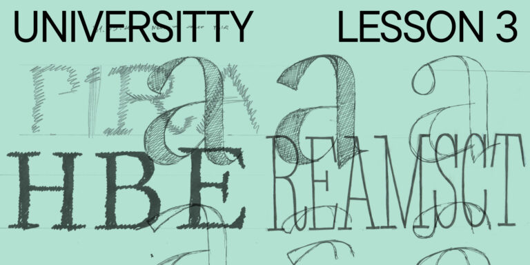
UniversiTTy: Lección 3. Tus Futuros Bocetos de Fuentes: Técnica, Digitalización y Pruebas

UniversiTTy: Lección 3. Tus Futuros Bocetos de Fuentes: Técnica, Digitalización y Pruebas

In our ongoing series about the first stages of crafting typefaces, let’s explore probably the most creative step—sketching.

Buscar etiqueta
El impacto de las fuentes en el diseño web en la experiencia del usuario

El impacto de las fuentes en el diseño web en la experiencia del usuario

In the ever-evolving landscape of web design, it’s not just the vibrant visuals or interactive elements that grip a visitor’s attention. Lurking quietly, yet undeniably powerfully, typography plays a pivotal role in shaping a user’s experience. Fonts, often overlooked, are the silent narrators of the digital tales we traverse daily.

Buscar etiqueta
15+ mejores fuentes de logotipos: cuál elegir en 2024

15+ mejores fuentes de logotipos: cuál elegir en 2024

Un logotipo es una parte integral de la identidad de cualquier marca.Puede ser moderno y atrevido, hermoso y elegante, moderno y lacónico. Lo principal es elegir el que más te convenga. En este artículo, le diremos cómo hacerlo bien y seleccionaremos las 15 mejores fuentes de logotipos de la colección TypeType que sean relevantes en 2024.

Buscar etiqueta