TT Severs is a geometric sans serif with emphasized elements of internal brackets. The main visual feature of TT Severs is the unusual form of internal ovals.
Menü-Schriftarten
- Schriftarten 73
- Sans Serif 47
- Serif 27
- Slab Serif 6
- Display 41
- Script 10
- Variabel 47
- Rabatte 16
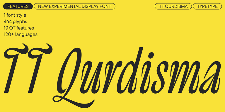
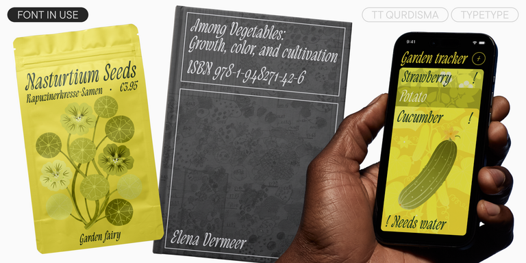
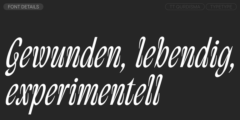
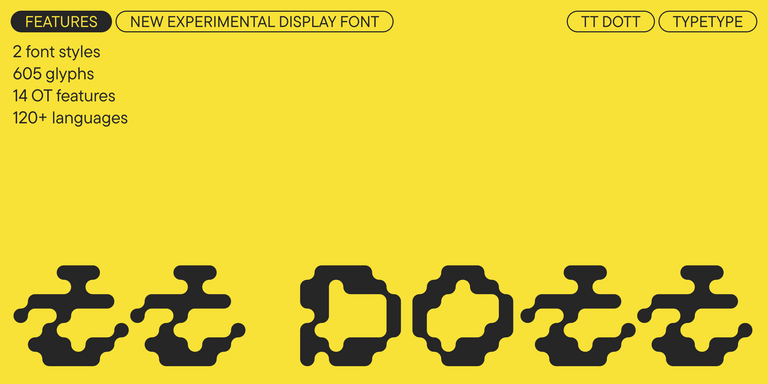
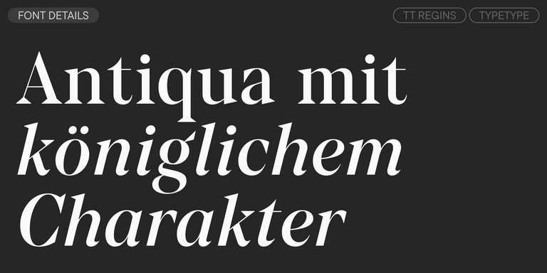
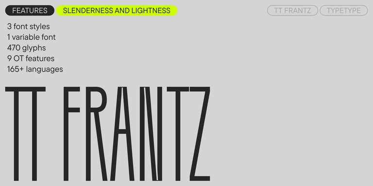
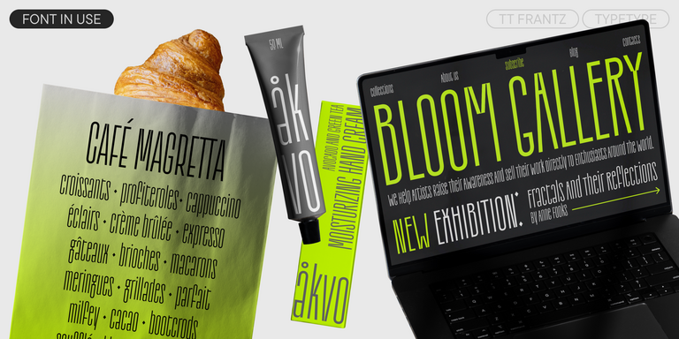
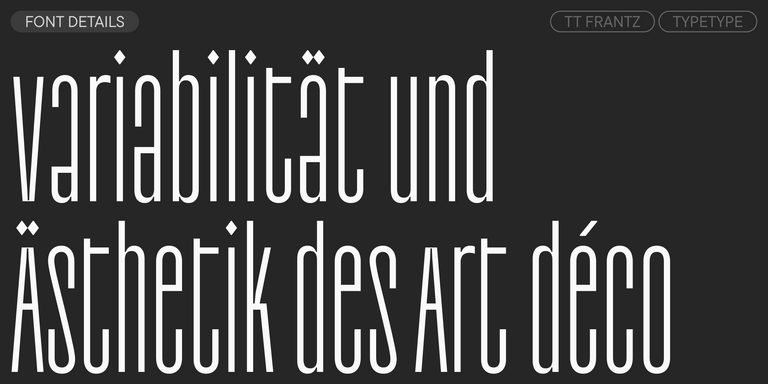
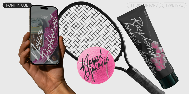
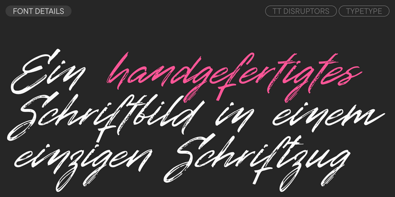
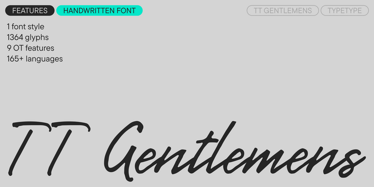
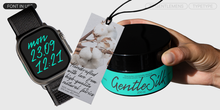
Wenn Sie auf der Suche nach den besten Menü-Schriften sind, um Ihr Markendesign zu vervollständigen, bietet Ihnen TypeType studio eine breite Palette von Schriften, die für kommerzielle Zwecke geeignet sind. Die spezifischen Stile und die kompletten Schriftfamilien finden Sie auf unserer Online-Seite: Sie können aus einer Vielzahl von gut gemachten und technisch geprüften Schriften wählen, sie kostenlos nutzen und eine Anfrage zum Kauf einer geeigneten Lizenzart hinterlassen. TypeType bietet Ihnen die Möglichkeit, Testversionen aller Menü-Schriften herunterzuladen, um sie in Ihren Projekten zu verwenden, und sich vom Design- oder Kundenbetreuungsteam beraten zu lassen. Sie können uns gerne über unser Formular auf der Website kontaktieren.
- Victor jagt zwölf Boxkämpfer quer über den großen Sylter Deich.
- Fix, Schwyz!” quäkt Jürgen blöd vom Paß.
- The quick brown fox jumps over a lazy dog.
- Typographie ist zweidimensionale Architektur und bedingt extra Qualitaet in jeder vollkommenen Ausfuehrung.
- Aa Bb Cc Dd Ee Ff Gg Hh Ii Jj Kk Ll Mm Nn Oo Pp Qq Rr Ss Tt Uu Vv Ww Xx Yy Zz Ää Öö Üü ß
TT Turns is a striking geometric sans serif with expressive elements. This versatile font works exceptionally well for running text, while at large point sizes, it takes on a distinct display character.
TT Jenevers is a modern serif with a Dutch flavor. The font family features the characteristic details peculiar to Dutch serifs—these are the asymmetrical shape of serifs and an irregular slant of ovals.
TT Regins is a Scottish modern serif. Striking contrast and sharp triangular serifs give this font a stern and commanding character, while refined forms, enlarged lowercase letters, and slightly condensed, static proportions add grace to its design.
TT FRANTZ IS AN EXPERIMENTAL VARIABLE FONT, DISTINGUISHED BY ITS SLIMNESS AND LIGHTNESS. THE VARIATION IN THE FONT AFFECTS THE CHANGE IN THE HEIGHT OF THE MEAN LINE—BY MOVING THE AXIS ADJUSTMENT SLIDER YOU CAN EASILY RAISE OR LOWER THE MEAN LINE OF THE FONT.
TT Quaris is an exquisite, modern high-contrast sans whose design balances between soft and sharp. The glyph shapes in the font are fluid and tend towards roundness, yet there are also sharp elements.
TT Ricordi Allegria is a sleek and intelligent contemporary Florentine grotesque.
TT Bakers is a fluid serif with a gentle and lively character. This font is like freshly baked goods: it’s warm and soft, especially in its bolder weights.
TT Modernoir ist eine serifenlose Displayschrift mit dynamischen Proportionen. Fließende Linien und zarte Jugendstilformen in dieser Schriftart fügen sich nahtlos in den rhythmischen Fluss und die improvisatorische Freiheit des Jazz ein.
TT Ricordi Greto is an experimental project, inspired by a floor plaque dating from 1423 found in the Basilica di Santa Croce, Florence.
TT Marks delivers a script with dynamic rhythm, heartfelt character, and nostalgic appeal inspired by the classic art of American sign painting. This craft, where skilled artists hand-painted storefront signage with brushes and careful technique, is experiencing a well-deserved renaissance in today’s design world.
Victor jagt zwölf Boxkämpfer quer über den großen Sylter Deich.
TT Gertika is a geometric sans serif with a dynamic character and a dancing rhythm. This font’s idea originates from the lettering featured on an American poster from the late 1930s.
TT Biersal is a display sans serif with a free-spirited, playful, and adventurous nature. The concept of this font was sparked by a German poster from the early 1930s.
TT Paplane ist eine ausdrucksstarke serifenlose Schrift, die vom Wind der Kindheit getragen wird.
TT Cometus is an expressive typeface that captivates from the first time.
TT Globs is the first font from the TypeType Starter Kit line.
TT Ricks is a flamboyant elzevir-type serif, for which the words “cute” or “calm” are not a fitting definition.
TT Carvist - eigenwillig, verspielt und mutig - diese Schrift zieht alle Blicke auf sich!
TT Espina is a display antiqua with expressive serifs
The starting point of the TT Trailers project was the idea to develop a new generation of narrow typefaces for use in movie credits and posters.
TT Ricordi Marmo is an original experimental project inspired by inscriptions at Basilica di Santa Croce in Florence.
TT Marxiana is a pre-revolutionary font reconstruction project. These fonts were used in the layout of the «Niva» (nee-vah, «Cultivated field») magazine published by the A. F. Marx publishing house in St. Petersburg in 1887.
