Für Designs, die verfeinerte stilistische Tiefe erfordern, bieten anspruchsvolle Schriften Eleganz mit akribischer Handwerkskunst. Mit sorgfältig gestalteten Öffnungen, sanften Strichübergängen und perfekt ausbalanciertem Abstand sind diese anspruchsvollen Schriften ideal für Premium-Branding, luxuriöse Publikationen und künstlerische Projekte. Die TypeType-Kollektion präsentiert exquisit kuratierte anspruchsvolle Schriften, die Raffinesse mit Funktionalität verbinden.
Wenn Sie auf der Suche nach den besten anspruchsvoll Schriftarten sind, um Ihr Design zu vervollständigen, bietet Ihnen TypeType studio eine breite Palette von Schriften, die für kommerzielle Zwecke geeignet sind. Die spezifischen Stile und die kompletten Schriftfamilien finden Sie auf unserer Seite online: Sie können aus einer Vielzahl von gut gemachten und technisch geprüften Schriften wählen, sie kostenlos nutzen und eine Anfrage zum Kauf einer geeigneten Lizenzart hinterlassen. TypeType bietet Ihnen die Möglichkeit, Testversionen aller anspruchsvoll Schriften herunterzuladen, um sie in Ihren Projekten zu verwenden, und sich von unseren Design- und Kundenbetreuern beraten zu lassen. Sie können uns gerne über unser Formular auf der Website kontaktieren.
Victor jagt zwölf Boxkämpfer quer über den großen Sylter Deich.
Fix, Schwyz!” quäkt Jürgen blöd vom Paß.
The quick brown fox jumps over a lazy dog.
Typographie ist zweidimensionale Architektur und bedingt extra Qualitaet in jeder vollkommenen Ausfuehrung.
Aa Bb Cc Dd Ee Ff Gg Hh Ii Jj Kk Ll Mm Nn Oo Pp Qq Rr Ss Tt Uu Vv Ww Xx Yy Zz Ää Öö Üü ß
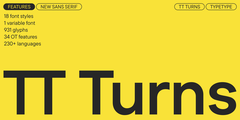
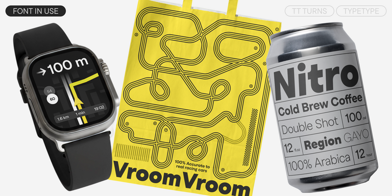
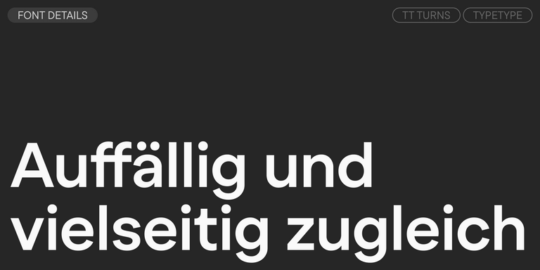
TT Turns ist eine markante geometrische Sans Serif mit expressiven Elementen. Diese vielseitige Schrift eignet sich hervorragend für Fließtext und entwickelt in großen Schriftgraden einen ausgeprägten Display-Charakter.
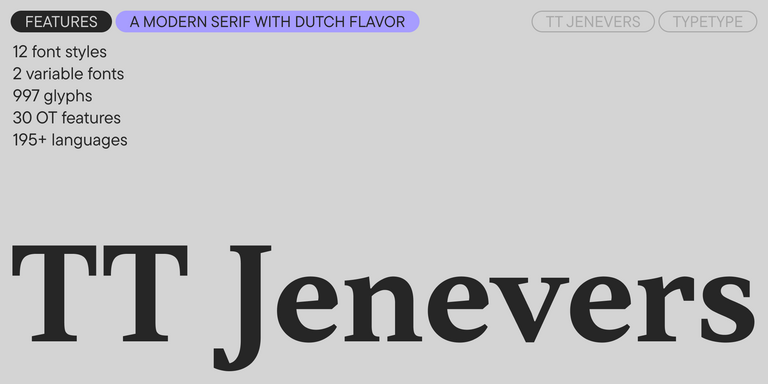
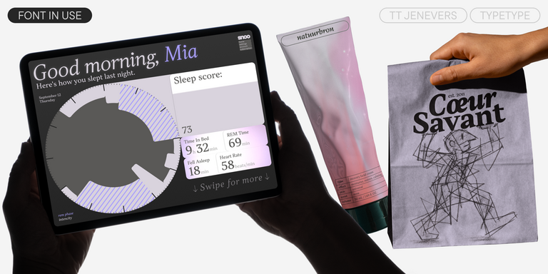
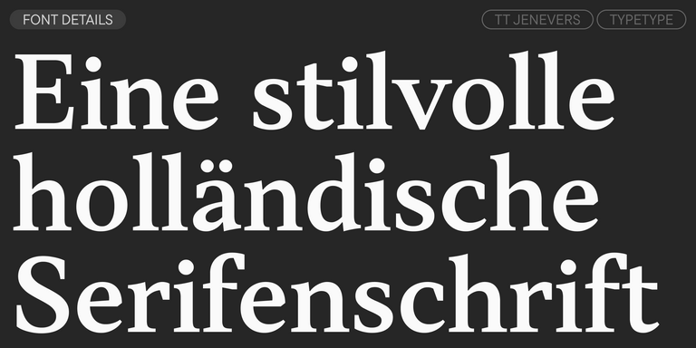
TT Jenevers ist eine moderne Serifenschrift mit niederländischem Charakter. Die Schriftfamilie besitzt typische Details niederländischer Serifen: asymmetrische Serifenformen und eine unregelmäßige Neigung der Ovale.
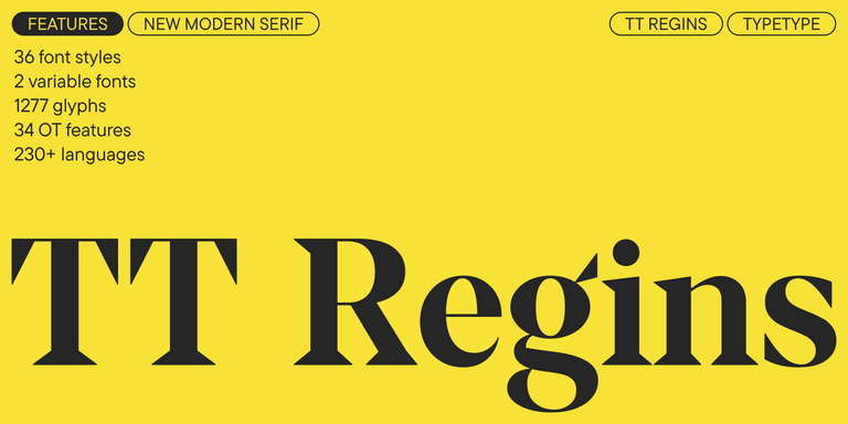
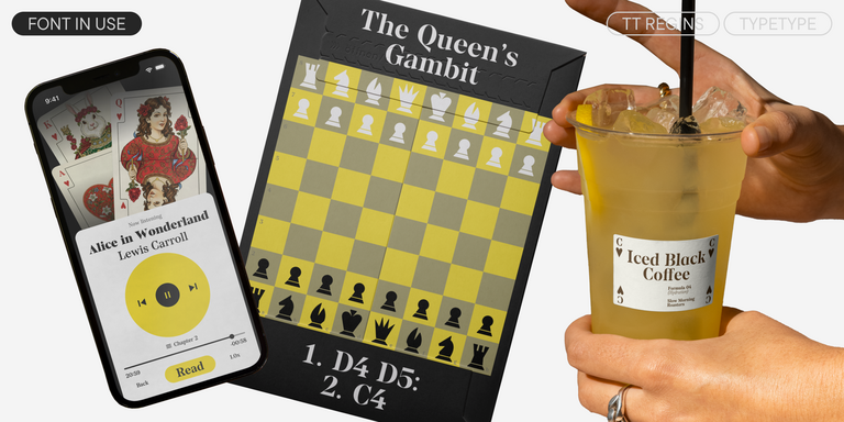
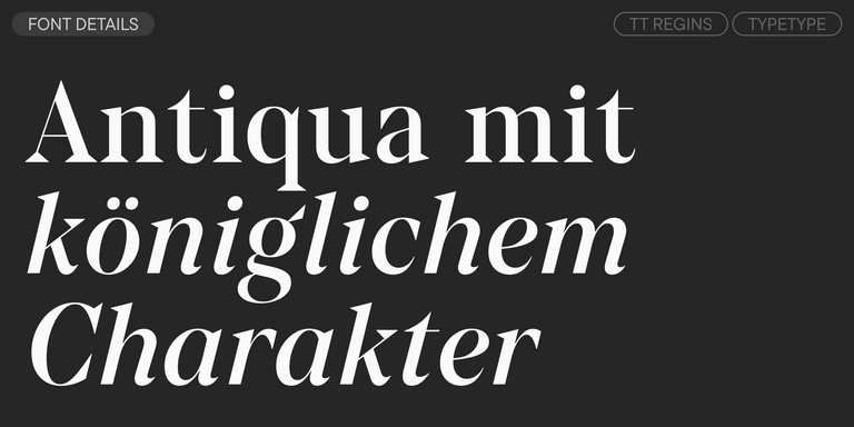
TT Regins ist eine moderne schottische Serifenschrift. Starker Kontrast und scharfe dreieckige Serifen verleihen ihr einen strengen und kraftvollen Charakter, während raffinierte Formen, vergrößerte Kleinbuchstaben und leicht kondensierte statische Proportionen dem Design Eleganz verleihen.
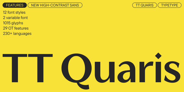
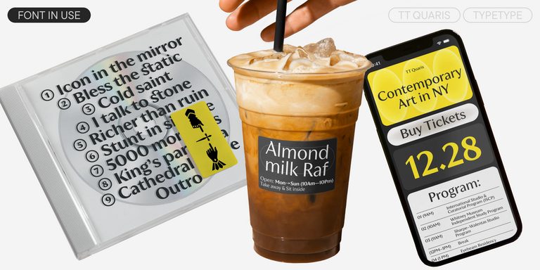
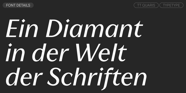
TT Quaris ist eine elegante moderne Sans Serif mit hohem Kontrast, deren Design zwischen weichen und scharfen Formen balanciert. Die Glyphenformen wirken fließend und tendieren zur Rundlichkeit, besitzen jedoch zugleich markante scharfe Elemente.
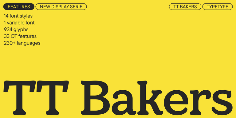
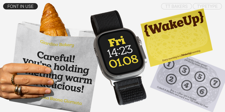
TT Bakers ist eine fließende Serifenschrift mit sanftem und lebendigem Charakter. Diese Schrift erinnert an frisch gebackenes Gebäck: warm und weich, besonders in den kräftigeren Schnitten.
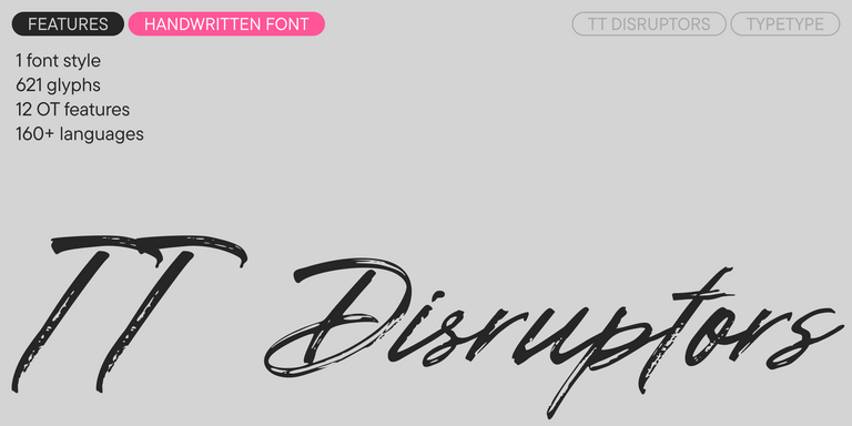
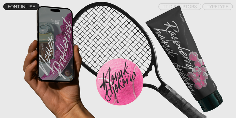
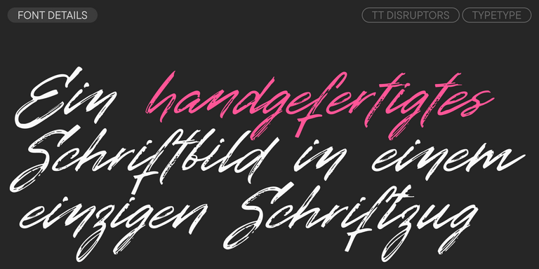
TT Disruptors ist eine flexible handgezeichnete Marker-Schrift. Ihr Design ist einzigartig: abgenutzte Kanten, variierende Strichstärken sowie verlängerte Ober- und Unterlängen verleihen ihr eine lebendige, dynamische Textur und handwerkliche Ausstrahlung. Der Charakter dieser Schrift ist temperamentvoll und emotional, zugleich aber warm und voller Seele.
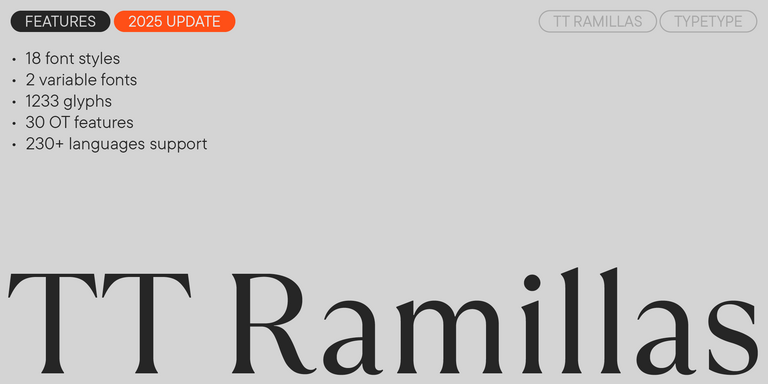
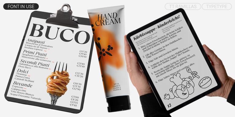
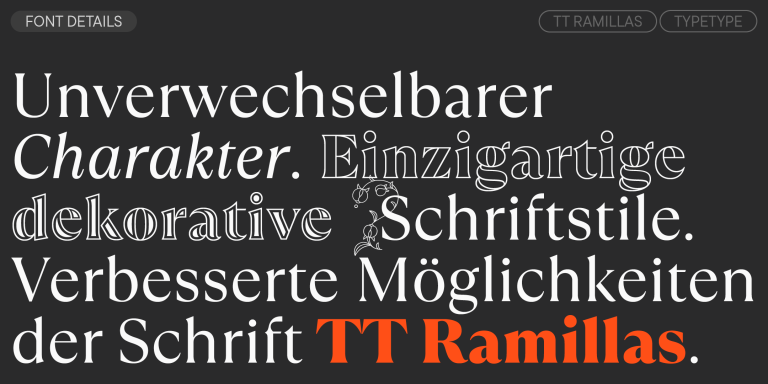
TT Ramillas ist eine zeitgemäße Serifenschrift mit editorieller Vielseitigkeit. Sie umfasst dekorative Schnitte und ornamentale Initialen mit floralen Motiven.
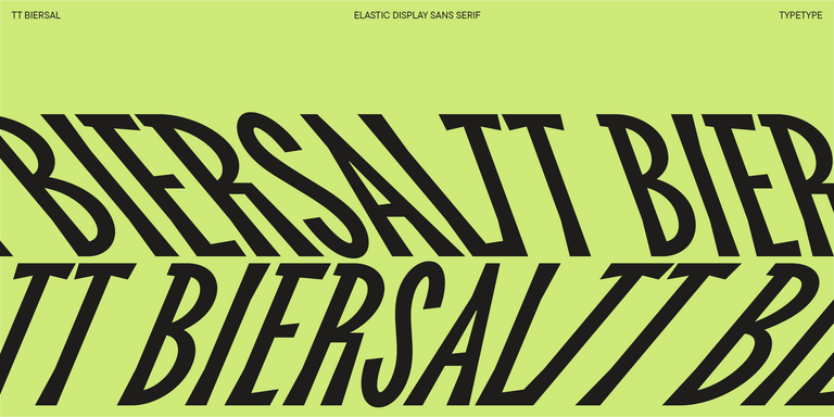
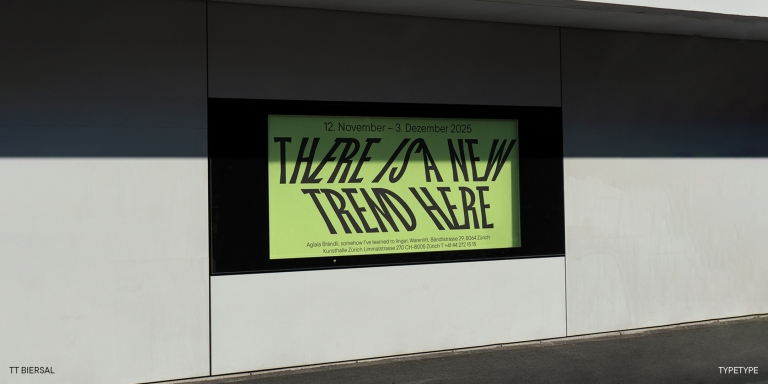
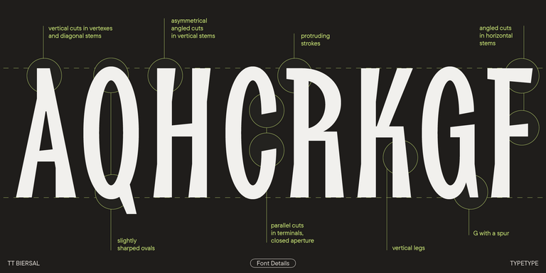
TT Biersal ist eine Display-Sans-Serif mit freigeistigem, verspieltem und abenteuerlustigem Charakter. Das Konzept dieser Schrift wurde von einem deutschen Plakat aus den frühen 1930er-Jahren inspiriert.
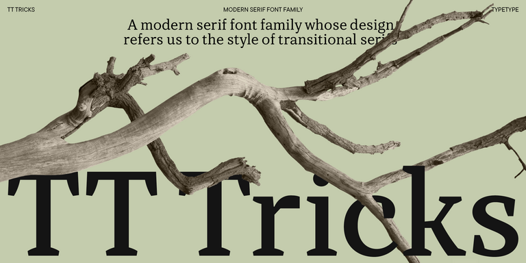
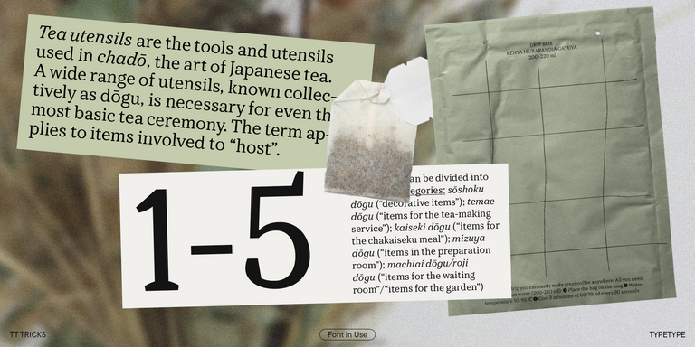
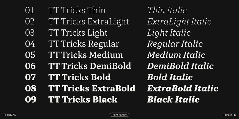
TT Tricks ist eine moderne Textserif, deren Design den Stil von Transitional-Serifen widerspiegelt. Die Schrift besitzt einen ruhigen, eleganten und maßvoll strengen Charakter.
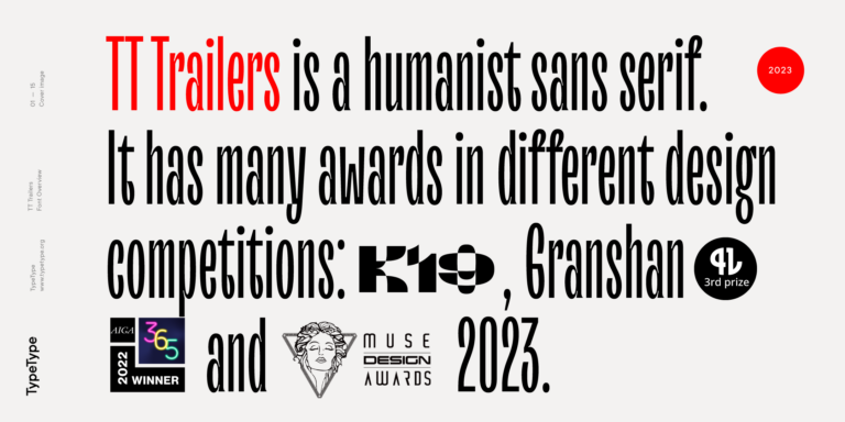
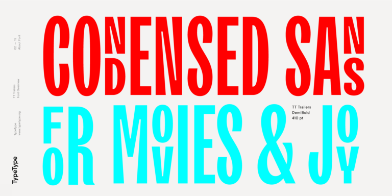
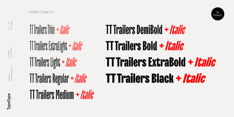
Ausgangspunkt des Projekts TT Trailers war die Idee, eine neue Generation schmaler Schriften für den Einsatz in Filmabspännen und Plakaten zu entwickeln.
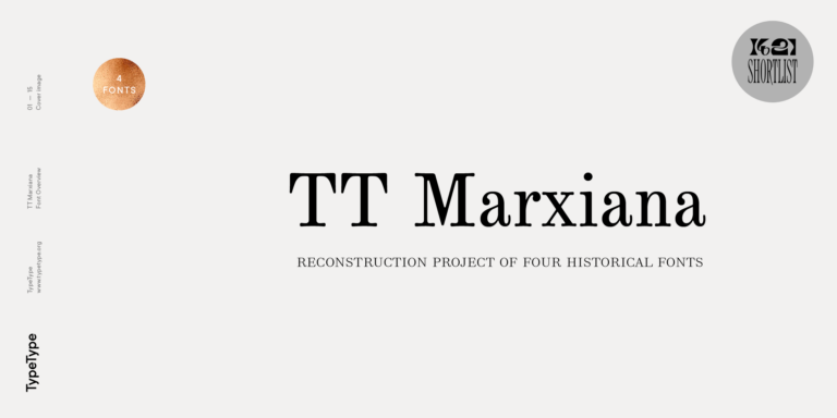
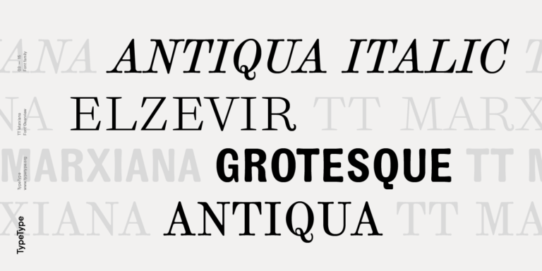
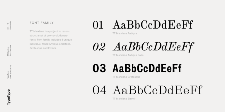
TT Marxiana Elzevir ist eine Schrift für Titel und Überschriften und basiert auf einer Sammlung monastischer Elzevir-Schriften, die in der Zeitschrift Niva in allen Ausgaben aktiv verwendet wurden.
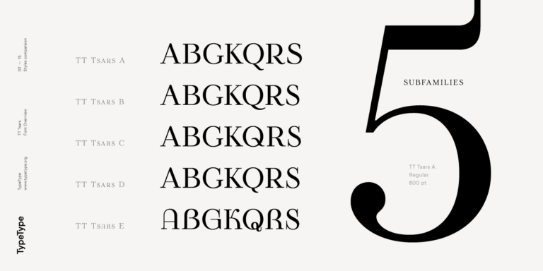
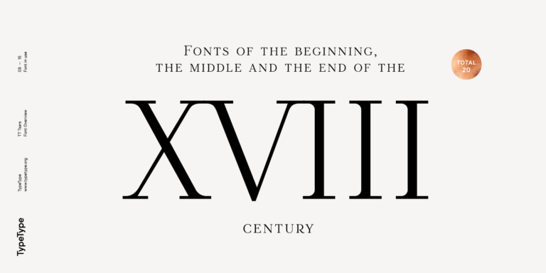
Die Schriftfamilie TT Tsars ist eine Kollektion von Serif-Display-Schriften, die stilistisch an Schriften vom Anfang, aus der Mitte und vom Ende des 18. Jahrhunderts angelehnt sind.
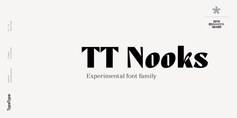
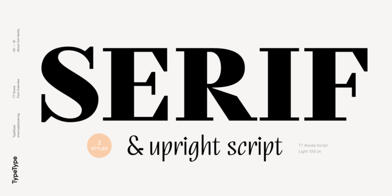
TT Nooks ist ein experimentelles Projekt, bestehend aus einer kontrastreichen, eigenwilligen Serifenschrift und einer aufrechten humanistischen Kursiven.
Sommer bei TypeType: Fangen Sie die Glücksstrahlen ein!
Geben Sie Ihre E-Mail-Adresse ein und drehen Sie das Sonnenrad, um Rabatte von bis zu 100 % oder Leistungen von TypeType zu gewinnen.
Teilnahmebedingungen:
Eine Teilnahme ist nur einmal pro Person möglich.
Jeder Promo-Code ist einzigartig und kann nur einmal eingelöst werden.
Der Rabattcode gilt ausschließlich für Einkäufe im TypeType-Onlineshop bis zu einem Bestellwert von 5.000 $.
Die Leistungen „Umbenennung der Schrift“, „Ihr Logo in der Schrift“ und „Leichte Customisierung“ gelten nicht für bereits erworbene Schriften und stehen ausschließlich für Neubestellungen zur Verfügung.
Wenn Sie eine Leistung gewinnen, wird sich unser Team innerhalb von drei Werktagen mit Ihnen in Verbindung setzen und alle Details besprechen.