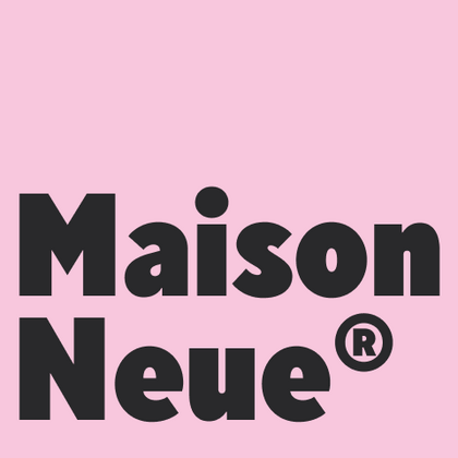
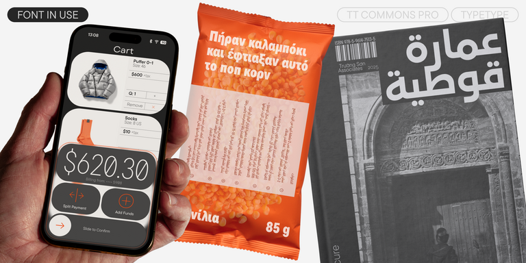
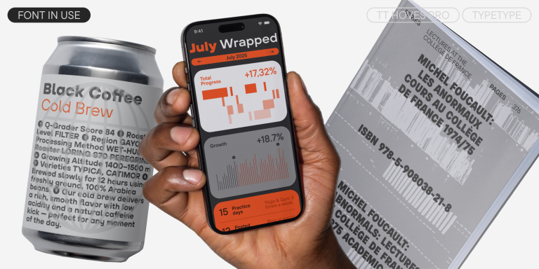
Wenn Designer nach einer Schrift mit klarer Geometrie und warmem Charakter suchen, greifen viele zu Maison Neue® wegen ihrer einzigartigen Balance aus Präzision und Freundlichkeit. Die TypeType-Kollektion bietet moderne Alternativen, die auf diesem Konzept aufbauen. Diese Schriften bewahren die erkennbaren Merkmale von Maison Neue — weiche Kurven und offene Formen — und machen sie zur idealen Wahl für Branding, Benutzeroberflächen und hochwertigen Druck.
Wenn Sie genug haben von “abgedroschenen” Schriften und auf der Suche nach einer Kopfzeile ähnlich wie Maison Neue sind, sehen Sie sich unsere besten Alternativen zu Maison Neue an. Das sind Schriftarten, die ähnliche Eigenschaften haben, aber gleichzeitig neue und einzigartige Designmerkmale aufweisen. Sie gehören z. B. zur gleichen Schriftkategorie, eignen sich für die gleichen Zwecke und haben ähnliche Merkmale, unterscheiden sich aber in Details oder Proportionen.
Bei TypeType finden Sie topaktuelle Schriftarten wie Maison Neue und noch besser: hier sind einige großartige und nicht so gängige Alternativen zu Maison Neue. Nutzen Sie diese Liste hochwertiger, an Maison Neue erinnernder Schriften nach Ihrem Geschmack. Auf diese Weise können Sie eine noch passendere Schriftart für Ihr Projekt finden, Ihre Auswahl erweitern oder Ihr Design auffrischen. Alle Schriften in dieser Sammlung sind in verschiedenen Formaten und zu erschwinglichen Preisen erhältlich, so dass Sie für jeden Bedarf eine passende Schrift finden werden!
Finden Sie einen großartigen Ersatz für Maison Neue und versuchen Sie, eine ähnliche Stimmung zu imitieren und das gewünschte Gefühl zu vermitteln, indem Sie sie in Ihren Designs verwenden. Jede auf dieser Seite vorgestellte Schriftart ist ein Zwilling der Schriftart Maison Neue, und zwar ihr vollständiges Analog.
Victor jagt zwölf Boxkämpfer quer über den großen Sylter Deich.
Fix, Schwyz!” quäkt Jürgen blöd vom Paß.
The quick brown fox jumps over a lazy dog.
Typographie ist zweidimensionale Architektur und bedingt extra Qualitaet in jeder vollkommenen Ausfuehrung.
Aa Bb Cc Dd Ee Ff Gg Hh Ii Jj Kk Ll Mm Nn Oo Pp Qq Rr Ss Tt Uu Vv Ww Xx Yy Zz Ää Öö Üü ß
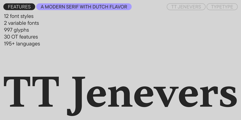
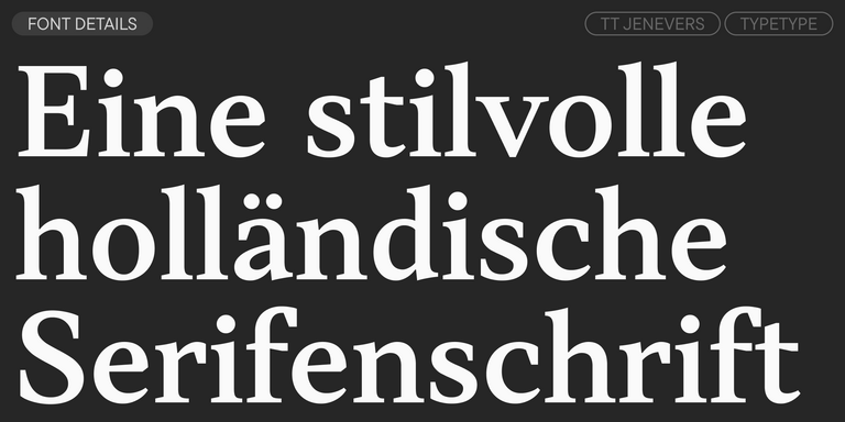
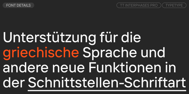
TT Jenevers ist eine moderne Serifenschrift mit niederländischem Charakter. Die Schriftfamilie besitzt typische Details niederländischer Serifen: asymmetrische Serifenformen und eine unregelmäßige Neigung der Ovale.
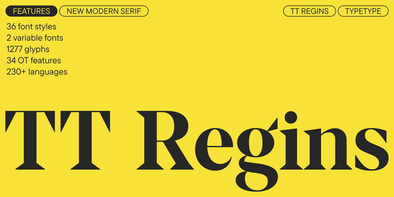
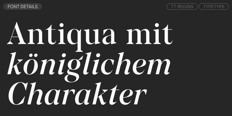
TT Regins ist eine moderne schottische Serifenschrift. Starker Kontrast und scharfe dreieckige Serifen verleihen ihr einen strengen und kraftvollen Charakter, während raffinierte Formen, vergrößerte Kleinbuchstaben und leicht kondensierte statische Proportionen dem Design Eleganz verleihen.
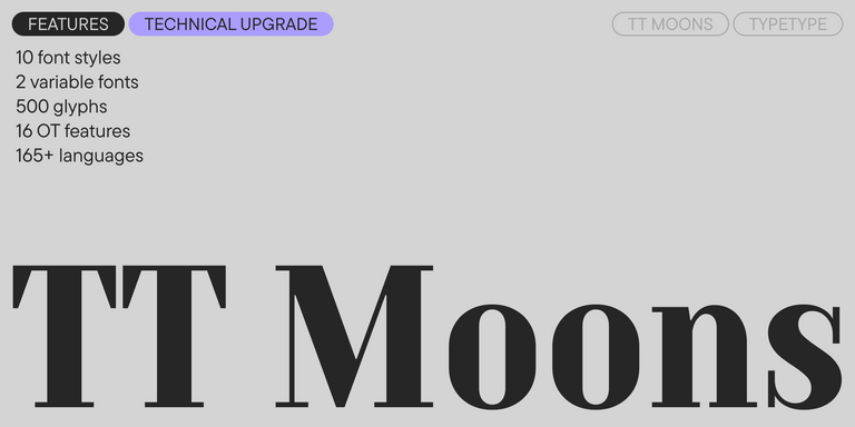
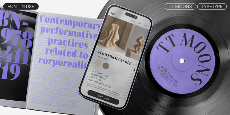
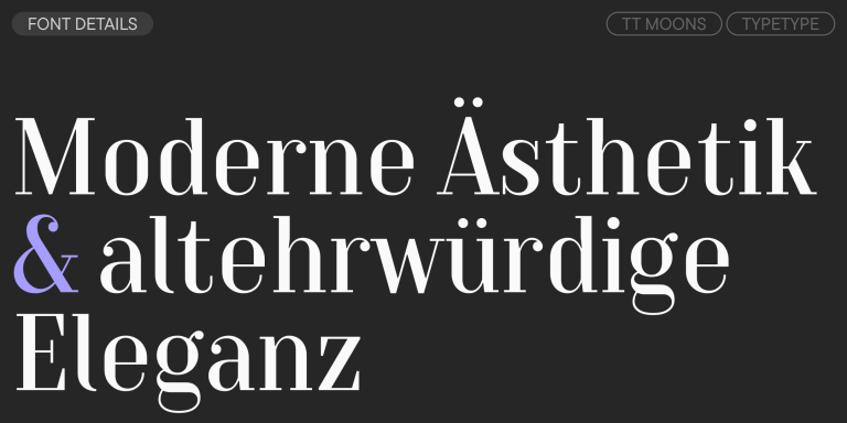
TT Moons ist eine schlanke kontrastreiche Serifenschrift. Diese Schriftfamilie funktioniert besonders gut in klassischen Designkonzepten. TT Moons gehört zur Ästhetik moderner Glyptal-Schriften.
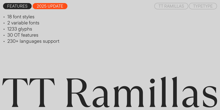
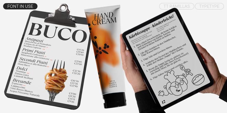
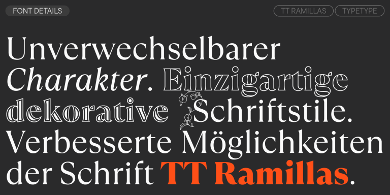
TT Ramillas ist eine zeitgemäße Serifenschrift mit editorieller Vielseitigkeit. Sie umfasst dekorative Schnitte und ornamentale Initialen mit floralen Motiven.
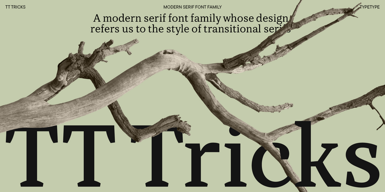
TT Tricks ist eine moderne Textserif, deren Design den Stil von Transitional-Serifen widerspiegelt. Die Schrift besitzt einen ruhigen, eleganten und maßvoll strengen Charakter.
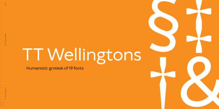
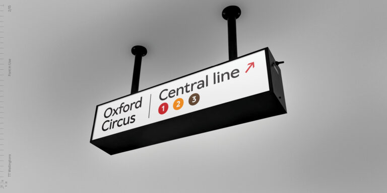
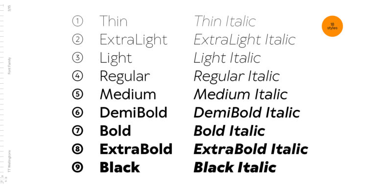
TT Wellingtons ist der Versuch, den Stil englischer humanistischer Sans-Serif-Schriften des frühen 20. Jahrhunderts mit den Anforderungen moderner geometrischer Groteskschriften zu verbinden.
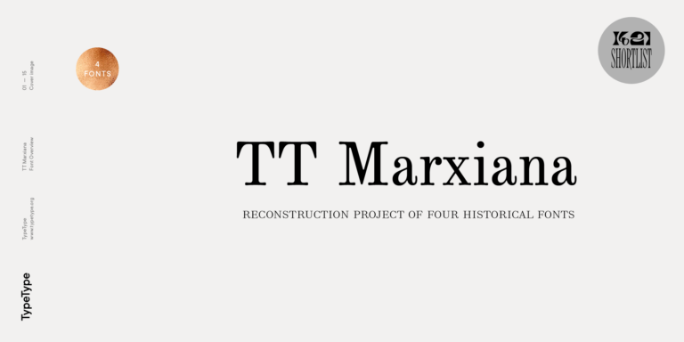
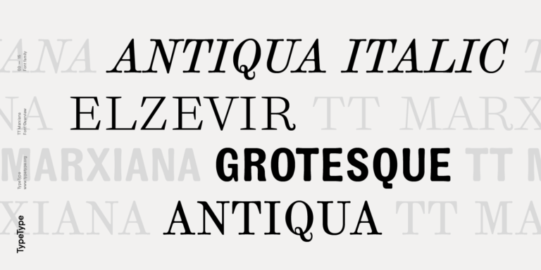
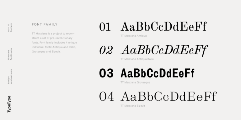
TT Marxiana Elzevir ist eine Schrift für Titel und Überschriften und basiert auf einer Sammlung monastischer Elzevir-Schriften, die in der Zeitschrift Niva in allen Ausgaben aktiv verwendet wurden.
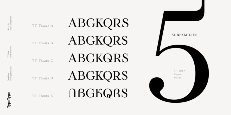
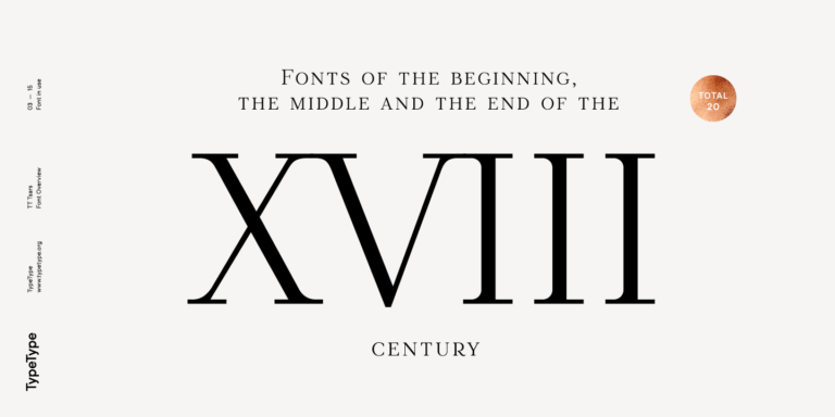
Die Schriftfamilie TT Tsars ist eine Kollektion von Serif-Display-Schriften, die stilistisch an Schriften vom Anfang, aus der Mitte und vom Ende des 18. Jahrhunderts angelehnt sind.
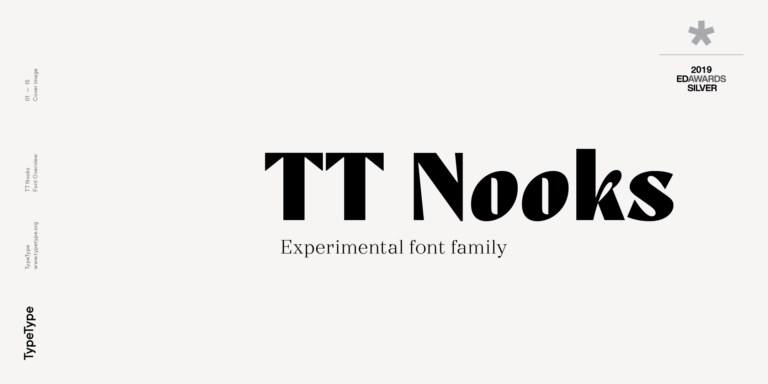
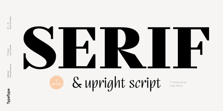
TT Nooks ist ein experimentelles Projekt, bestehend aus einer kontrastreichen, eigenwilligen Serifenschrift und einer aufrechten humanistischen Kursiven.
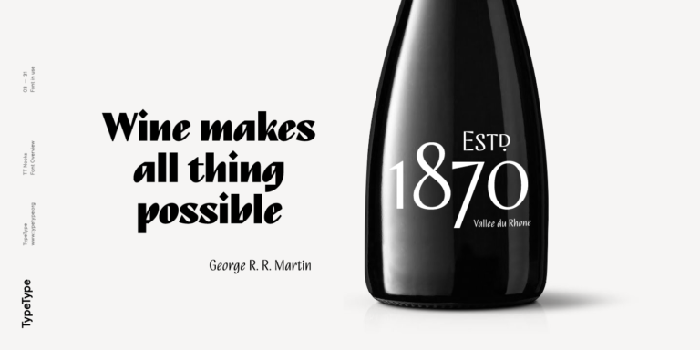
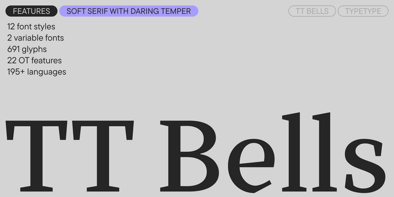
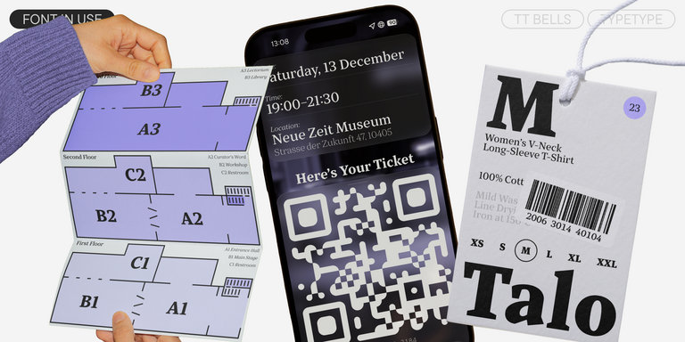
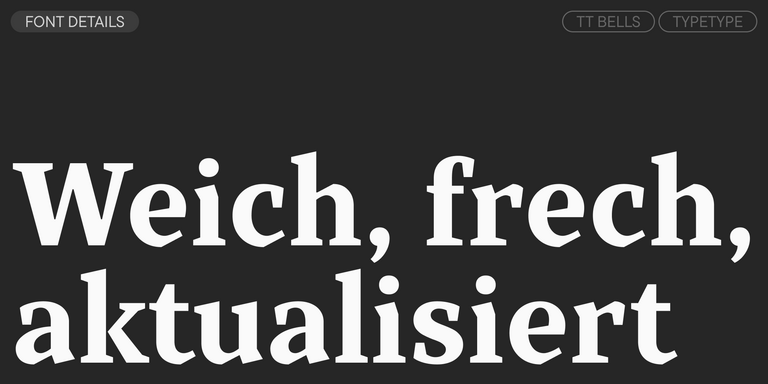
TT Bells verbindet die elegante Weichheit einer Antiqua mit einem komplexen und mutigen Temperament, das sich in geraden Strichabschlüssen und pfeilförmigen Serifen zeigt. Die Schrift basiert auf der Breitfeder, die diese charakteristischen Abschlüsse und Serifen erzeugt.
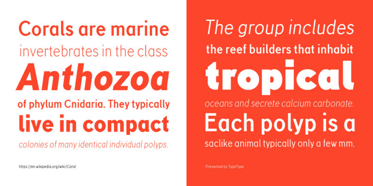
TT Corals ist eine moderne humanistische Sans Serif mit vielen typischen Merkmalen des frühen 20. Jahrhunderts. Für eine höhere Funktionalität der Schriftfamilie haben wir sechs Schnitte mit unterschiedlichen Strichstärken entwickelt.
Verwandte Tags für Schriftarten ähnlich wie Maison Neue
Sommer bei TypeType: Fangen Sie die Glücksstrahlen ein!
Geben Sie Ihre E-Mail-Adresse ein und drehen Sie das Sonnenrad, um Rabatte von bis zu 100 % oder Leistungen von TypeType zu gewinnen.
Teilnahmebedingungen:
Eine Teilnahme ist nur einmal pro Person möglich.
Jeder Promo-Code ist einzigartig und kann nur einmal eingelöst werden.
Der Rabattcode gilt ausschließlich für Einkäufe im TypeType-Onlineshop bis zu einem Bestellwert von 5.000 $.
Die Leistungen „Umbenennung der Schrift“, „Ihr Logo in der Schrift“ und „Leichte Customisierung“ gelten nicht für bereits erworbene Schriften und stehen ausschließlich für Neubestellungen zur Verfügung.
Wenn Sie eine Leistung gewinnen, wird sich unser Team innerhalb von drei Werktagen mit Ihnen in Verbindung setzen und alle Details besprechen.