


Wir setzen unsere Geschichte über den komplexen Prozess der Schriftdesignentwicklung fort. Das folgende Thema ist eine logische Fortsetzung der vorherigen, daher empfehlen wir, die früher veröffentlichten Artikel zu lesen, falls Sie dies noch nicht getan haben. In den Artikeln «Wie man sich bei der Arbeit an einer Schrift nicht verläuft. Die Kunst der Aufgabenstrukturierung» und «Ihre zukünftigen Schriftentwürfe: Technik, Digitalisierung, Testen» haben wir die allerersten Phasen des Schriftdesignprozesses behandelt.
Der vorherige Artikel konzentrierte sich auf das kreative Skizzieren. Hier werden wir die pragmatischere Seite davon erkunden — Skizzen einer Schriftfamilie. Julia Gonina, Art Director bei TypeType und Schöpferin der Schriften TT Livret, TT Fellows, TT Autonomous und TT Ricordi Todi, wird erklären, warum es wichtig ist, den Inhalt Ihrer zukünftigen Schriftart in den Anfangsstadien der Entwicklung zu definieren.
Skizzen der Schriftfamilie und Auswahl der Master
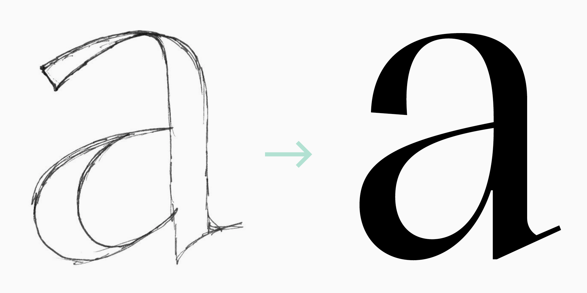
Nachdem die Hauptgrafiken der Schrift festgelegt und von Papier auf Vektor übertragen wurden, ist es Zeit, Skizzen für die zukünftige Schriftfamile zu erstellen. Lassen Sie mich erklären, warum es wichtig ist, sich sofort damit zu befassen.
Zunächst müssen Sie sicherstellen, dass alle grafischen Entscheidungen, die Sie für den regulären Schriftschnitt getroffen haben, auch auf die restlichen Stile angewendet werden können, sogar auf die dicksten und dünnsten (oder die breitesten und schmalsten, falls Sie diese einbeziehen wollen). Sie müssen im Hinterkopf behalten, dass dies Einschränkungen für die Grafik setzen kann.
Zweitens sollten Sie aus technischer Sicht die Masters auswählen, mit denen Sie arbeiten werden. Das wird Ihnen in Zukunft Zeit sparen. Wenn Sie mit einem modernen Schrifteditor wie Glyphs, Fontlab 6 oder einem fortschrittlicheren arbeiten, müssen Sie nicht alle Schriftschnitte der Familie zeichnen. Es reicht aus, die Grundlagen zu gestalten — die sogenannten Masters. Lassen Sie uns das im Kontext der Schriften (Serifen und Serifenlose) vertiefen, die wir in unserem vorherigen Artikel beschrieben haben.
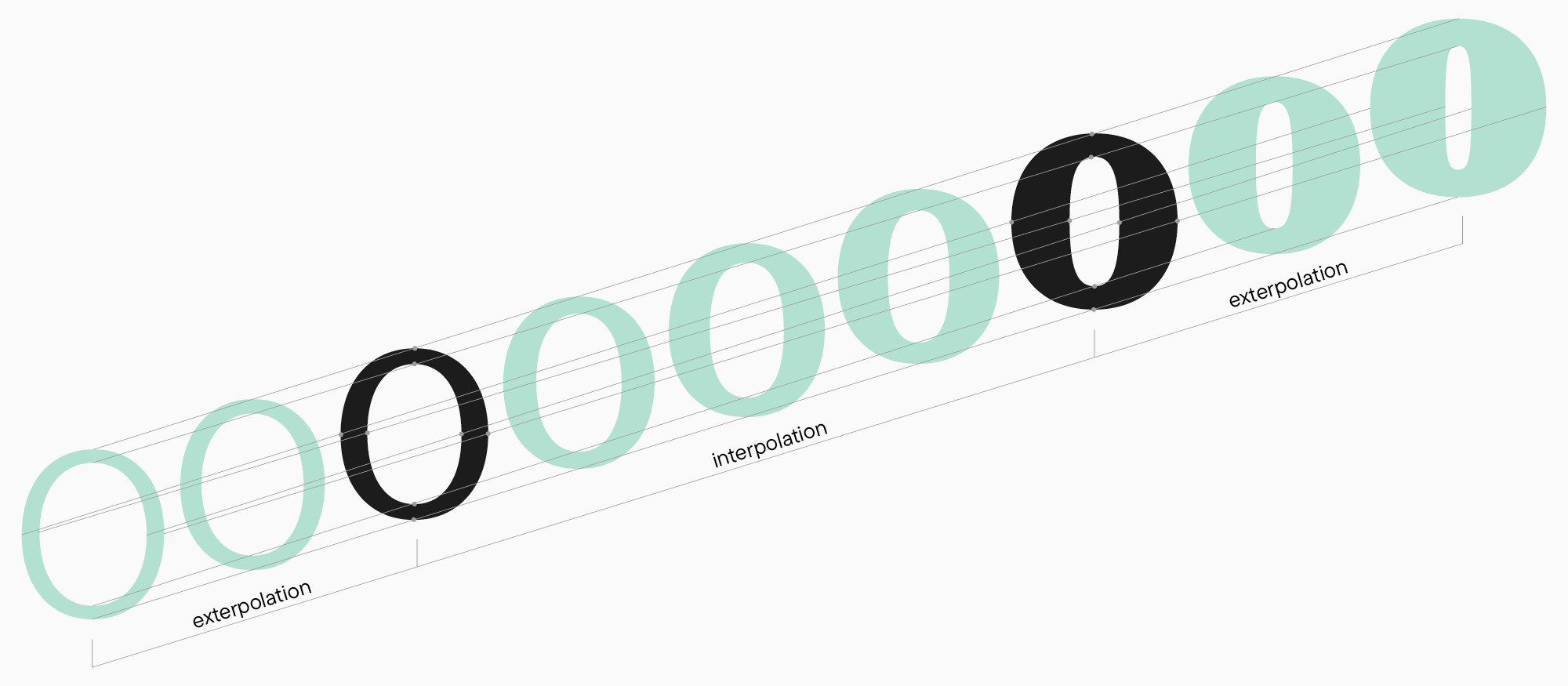
Beim Arbeiten an einem funktionalen Serifen-Briefing haben wir uns auf die Daten unserer Forschung verlassen und uns auf fünf Gewichte geeinigt. Theoretisch reicht es, nur die dicksten und dünnsten Schriftschnitte zu gestalten. Wenn die Anzahl der Punkte in jedem Zeichen in beiden Schriftschnitten übereinstimmt, kann das Programm alle dazwischenliegenden Werte — interpolieren — erstellen.
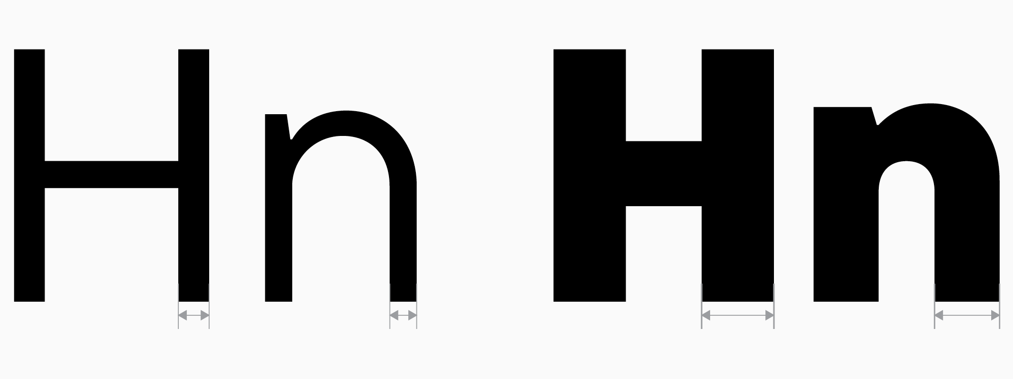
Das ist äußerst praktisch und spart Unmengen an Zeit. Aber wie bestimmen wir die Gewichte aller Stile? Bei Textfonts ist das Gewicht des Regular-Schriftschnitts entscheidend, da es der Stil ist, den die Leute am häufigsten verwenden und sehen. Daher gibt es ein allgemeines Bild des Gewichts eines Regular-Textfonts, damit es für den Benutzer bequem zu arbeiten ist. Wir empfehlen, einen Blick auf die Wettbewerbsanalyse zurückzuwerfen, die wir im vorherigen Artikel durchgeführt haben, und das Gewicht des Regular-Stils auszuwählen, das nicht zu sehr von den anderen in derselben Kategorie abweicht (sofern Hervorhebung nicht Ihre Priorität ist, natürlich). Auf diese Weise können Sie die Gewichte der Stiele von «H» und «n» in Ihrem Regular-Schriftschnitt bestimmen und später darauf aufbauen. Danach können Sie das Gewicht Ihres Bold-Schriftschnitts mit dem gleichen Ansatz bestimmen.
Der Bold-Schriftschnitt wird auch oft verwendet, daher ist es sinnvoll, ihn mit den anderen Schriften, die ähnliche Zwecke erfüllen, zu harmonisieren. Hier ist es jedoch möglich, von der Norm abzuweichen. Daher müssen Sie in diesem Stadium zwei Schriftschnitte mit zwei Gewichten haben, die als Grundlage für das Design der anderen Stile in der Familie durch Interpolation und Extrapolation (automatisches Projektieren der Designmerkmale auf die Schriftschnitte, die außerhalb des Intervalls zwischen zwei Masters liegen) verwendet werden können.
Wenn Sie mehr als zwei Schriftschnitte haben, wäre es eine gute Praxis, die anderen Gewichte gleichmäßig zu verteilen. Sie möchten nicht viele ähnliche fette Schriftschnitte haben und nur wenige dünne, die sehr unterschiedlich voneinander sind. Sie würden genau dieses Ergebnis erhalten, wenn Sie versuchen, die Gewichte in regelmäßigen Abständen zu verteilen.
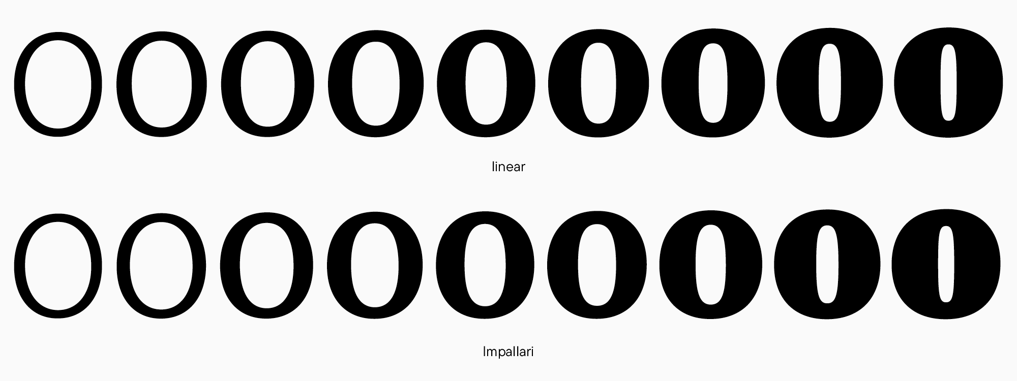
Es gibt spezielle Gleichungen für eine gleichmäßige Gewichtsverteilung. Sie können diesen Dienst nutzen, um die Werte basierend auf spezifizierten Parametern zu finden. Bei TypeType verwenden wir gewöhnlich die Gleichung von Pablo Impallari.
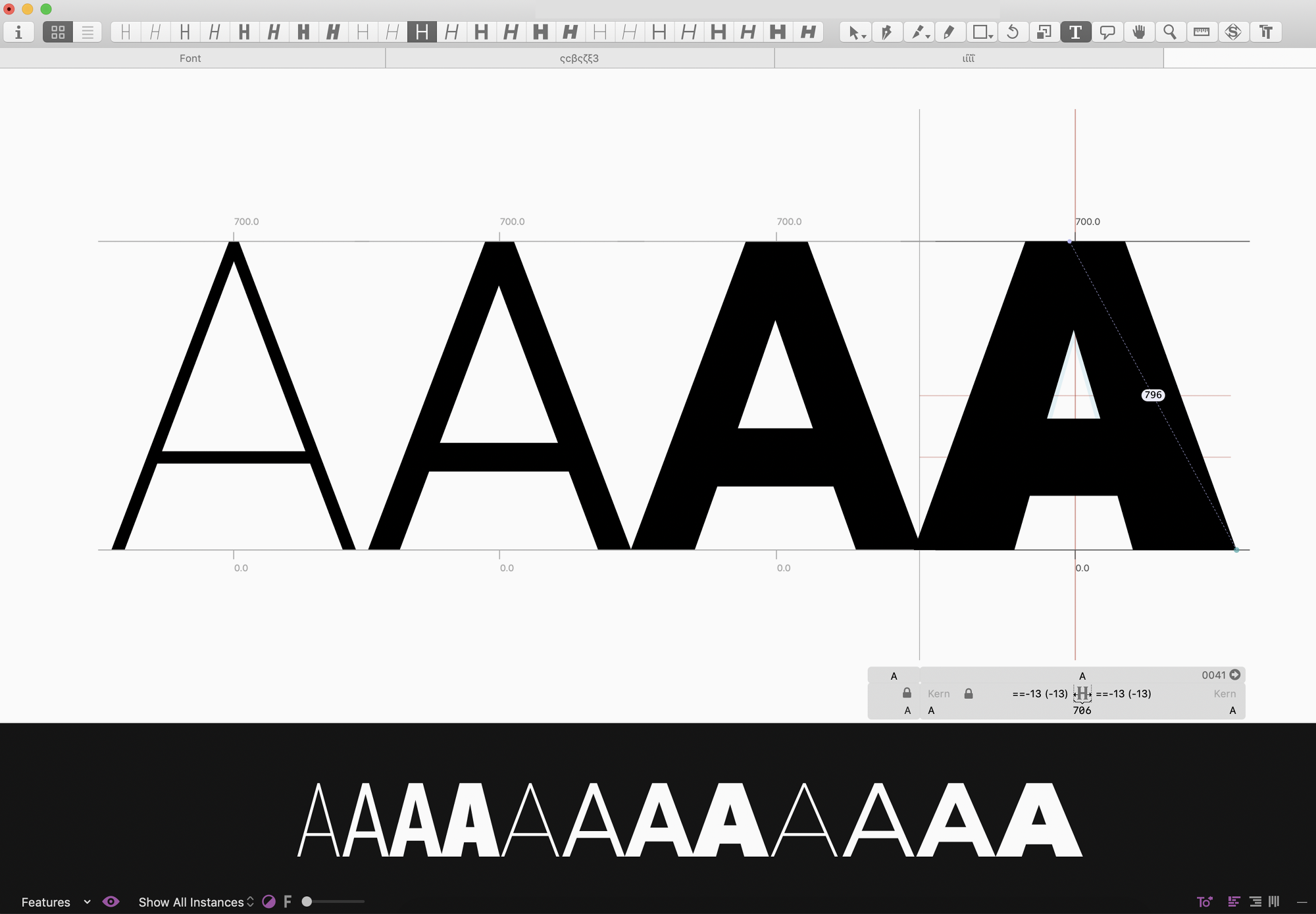
In unserem Fall gibt es einen bevorzugten Regular-Wert (es ist üblich, das Gewicht des «H»-Stiels als spezifischen Wert zu verwenden) und einen Bold-Wert, den wir anstreben. Nun experimentieren wir mit Werten, bestimmen, welche Schriftschnitte zuerst und zuletzt stehen (Light — Bold oder Regular — ExtraBold?), und wenden dann die Formel an, um die Zwischenwerte zu finden.
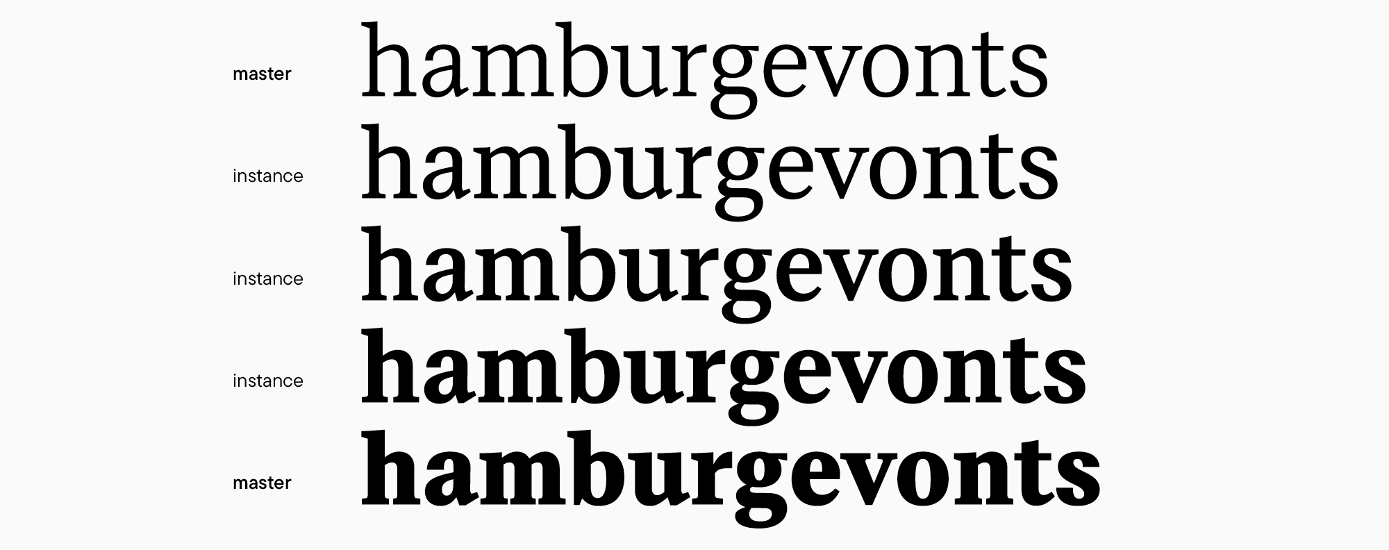
Folglich haben wir die folgenden Werte für den funktionalen Serif: Light (75*), Regular (92), Medium (114), DemiBold (137), Bold (160).
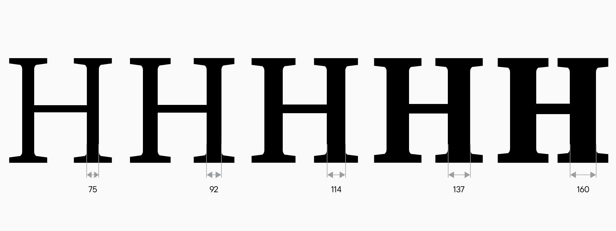
Hier wird das Gewicht des «H»-Stiels verwendet. Wenn Sie noch keine Großbuchstaben haben, können Sie das Gewicht des «n»-Stiels verwenden.
Je weniger Masters Sie haben, desto schneller sehen Sie Fortschritte. Obwohl andererseits, um ein anständiges Aussehen der Zwischenschnitte zu erreichen, mehr Arbeit erforderlich ist. Nun müssen Sie entscheiden, ob Sie nur mit den ersten und letzten Masters arbeiten können (Light und Bold in unserem Fall) oder ob Sie zusätzliche Zwischenbasis-Schriftschnitte gestalten müssen. Wenn Sie das Testwort in Ihrem ersten und letzten Schriftschnitt noch nicht gezeichnet haben, ist jetzt der Zeitpunkt dafür. In diesem Moment ist es wichtig, die Abstände (die sogenannten Instanzen — automatisch generierte Schriftschnitte) sorgfältig zu testen und sie in Text- und größeren Größen auszuprobieren, um sicherzustellen, dass die Gewichte, Breiten und der Kontrast in jedem Schriftschnitt zufriedenstellend sind. Zum Beispiel kann unser Serif mit nur zwei Mastern perfekt arbeiten.
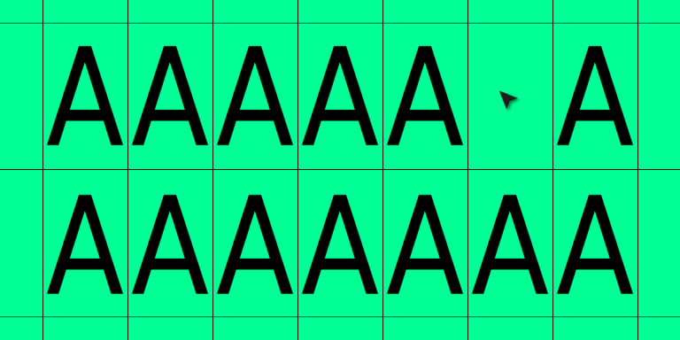
Nun betrachten wir unser Interface-Sans-Serif. Unser Ziel ist es, neun Gewichte in diese Schrift zu integrieren. In diesem Fall müssen wir die gleichen Schritte durchlaufen, um die Werte aller Schriftschnitte plus ihre Impallari-Gleichungswerte zu definieren und die ersten und letzten Masters zu gestalten. Was wir erhalten, ist die folgende Reihe: Thin (25), ExtraLight (40), Light (55), Regular (85), Medium (105), DemiBold (125), Bold (150), ExtraBold (180), Black (200). Lassen Sie uns sehen, was passiert, wenn wir versuchen, unsere große Familie mit nur zwei Mastern zu gestalten.
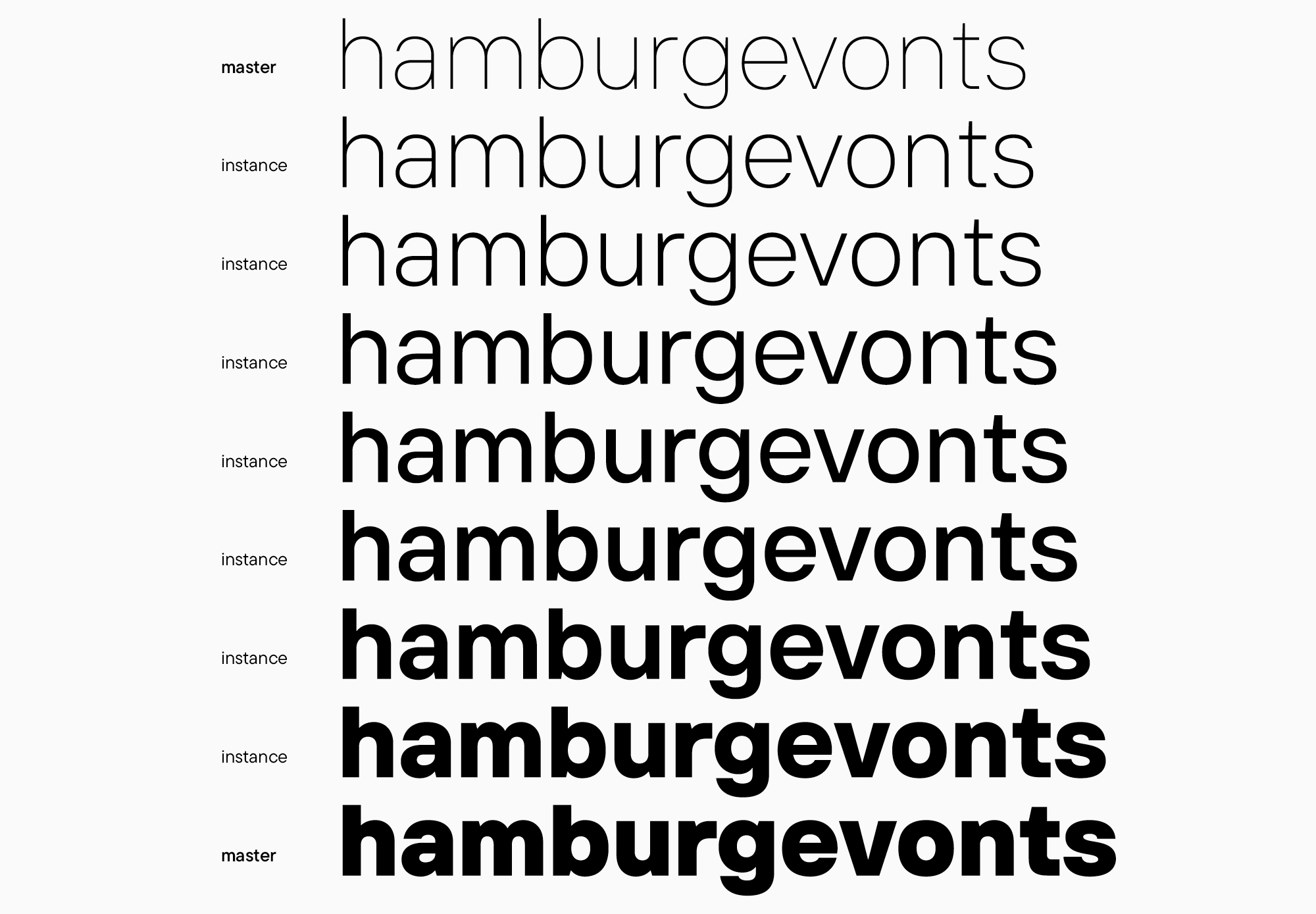
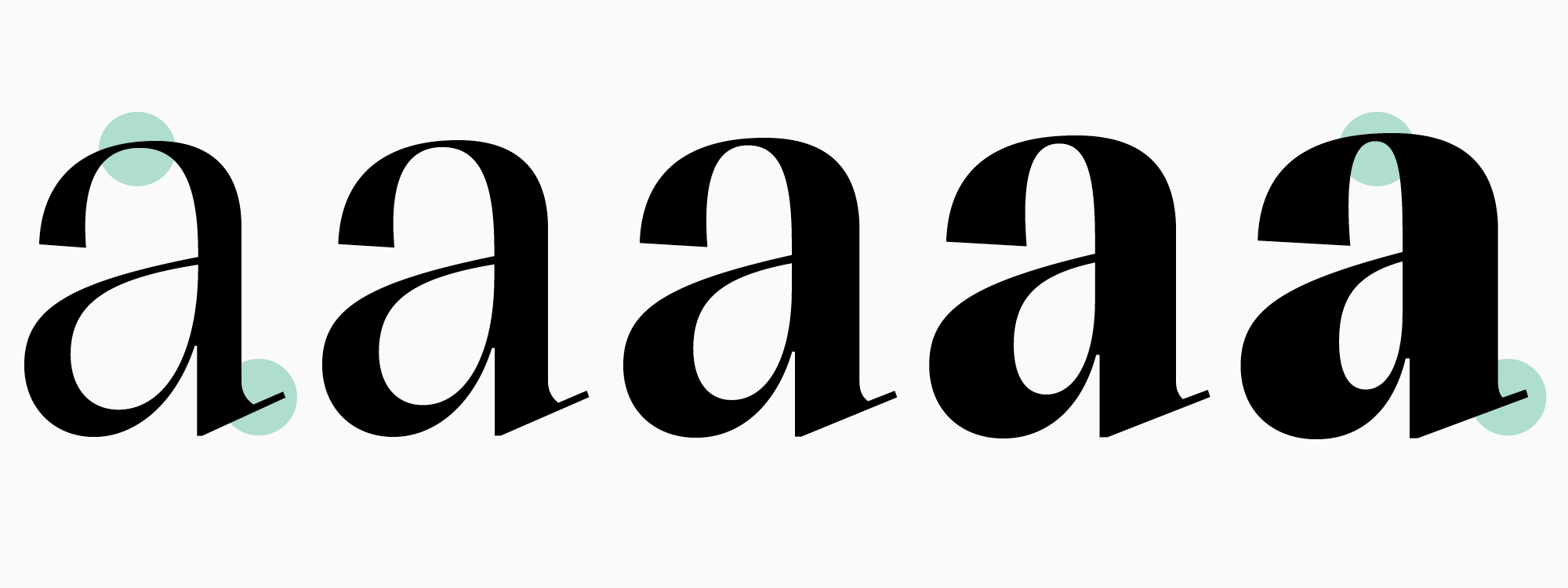
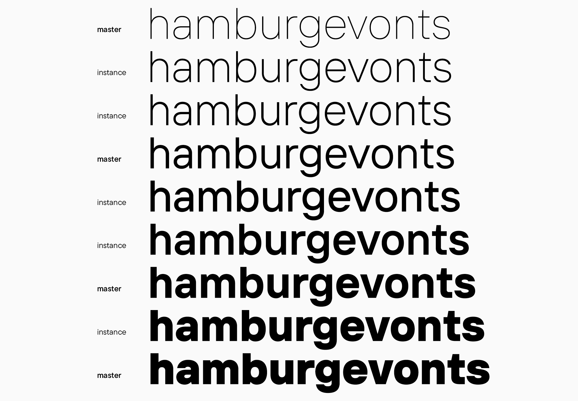
Angesichts des merklichen Unterschieds zwischen Thin und Black treten in den Zwischenschnitten unerwünschte Artefakte auf, zum Beispiel ein Kontrast, den diese Schrift nicht benötigt. Dies ist besonders offensichtlich bei den Buchstaben «a» und «e». In einem solchen Fall empfehlen wir, einen oder mehrere Masters hinzuzufügen. Unser Sans-Serif hat Regular und Bold Schriftschnitte, und das verbessert die Situation erheblich.
Das ist ein Standardfall. Typischerweise benötigen Serifen weniger Masters als Sans-Serifen, und das alles reduziert sich auf das Vorhandensein oder Fehlen von Kontrast.
Allerdings sollten Sie vorsichtig sein, wenn Sie mehr Masters hinzufügen, da sie die Menge an Arbeit, die Sie leisten müssen, erhöhen.
Letztendlich legt die anfängliche Schriftdesign-Phase den Grundstein für alle kommenden Aufgaben: Was zu zeichnen ist, wie es zu tun ist und in welcher Menge.
Als Ergebnis all dieser Manipulationen werden Sie haben:
- Ein vollständiges grafisches Konzept der Schrift;
- Ein Verständnis davon, wie dieses Konzept in allen geplanten Schriftschnitten funktioniert;
- Eine Vorstellung davon, mit welchen Schriftschnitten Sie weiterarbeiten werden;
- Eine vollständige Schriftfamiliennstruktur. .
Bezüglich des Designs einer Schriftfamilie habe ich mich nur auf das Arbeiten mit Gewichten konzentriert, da dies die beliebteste Erweiterungsoption für Schriften ist. Wenn Sie planen, zusätzliche Breiten zu zeichnen, müssen Sie dies ebenfalls sofort tun. Wenn es um Kursivschriften geht, werden wir sie in den kommenden Artikeln detailliert besprechen. Ich kann sagen, dass die Arbeit daran oft eine separate Phase wird.