

Wir sind hier, um die Artikelserie zum Thema Schriftdesign fortzusetzen. Falls Sie unseren vorherigen Artikel «Wie man sich beim Arbeiten an einer Schrift nicht verirrt. Die Kunst der Aufgabenstrukturierung» noch nicht gelesen haben, empfehlen wir Ihnen, dies zuerst zu tun, da er eng mit dem folgenden Text verbunden ist.
In diesem Artikel wird Julia Gonina — Art Direktorin von TypeType und Schöpferin der Schriften TT Livret, TT Fellows, TT Autonomous und TT Ricordi Todi — weiteres Wissen über die Anfangsphasen der Schriftentwicklung teilen. Diesmal konzentrieren wir uns auf wahrscheinlich den kreativsten Teil eines Projekts — das Skizzieren.
Skizzieren
Jeder Designer hat seine eigenen Vorlieben, wenn es um das Anfertigen von Skizzen geht. Meiner Meinung nach gibt es keinen Grund, auf eine bestimmte Methode zu bestehen: Das Wichtigste ist, eine bequeme Technik zu wählen. Ich werde meine persönliche Erfahrung teilen und erklären, warum ich auf diese Weise arbeite und nicht anders.
Ich empfehle allen, die relativ neu im Bereich des Schriftdesigns sind, so viel wie möglich auf Papier zu zeichnen, sei es, etwas von Grund auf zu erschaffen oder Buchstaben, die Ihnen gefallen, zu kopieren. Es wird Ihnen leichter fallen, die Formen der Buchstaben zu verstehen, wenn Sie diese durch Ihre eigene physische Erfahrung durchlaufen. Wenn ich beispielsweise Schwierigkeiten habe, eine bestimmte Form im Vektor zu entdecken, um ein schönes &-Symbol zu zeichnen oder ein spezielles Element zu erfinden, nehme ich ein Stück Papier und beginne zu zeichnen. Und wie durch ein Wunder «bewältigt» es meine Hand viel besser!
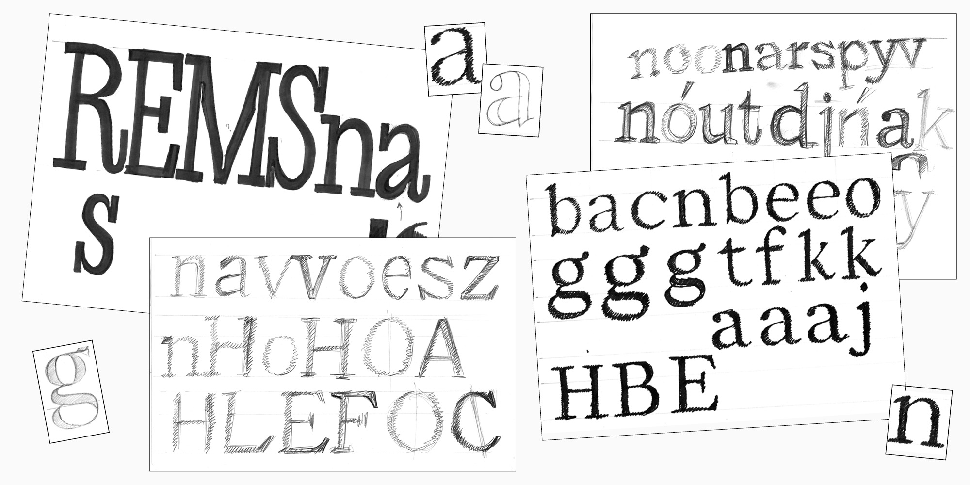
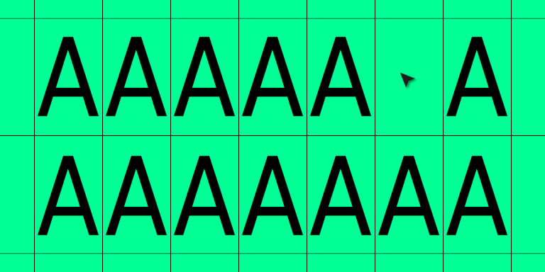
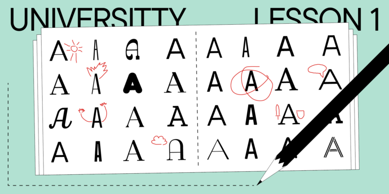
Der beste Weg, um zu beginnen, ist, Zeichen aus verschiedenen Gruppen auszuprobieren: quadratisch, gerundet und diagonal. Die Testwörter wie «handgloves» oder «hamburgevonts» sind bekannt und geeignet für Groß- und Kleinbuchstaben, aber Sie können auch eigene ausdenken. Ich mag es, mit dem Buchstaben «a» zu beginnen. Darin kann man die Form eines Bogens, die Breite aufrechter Zeichen und das mögliche Erscheinungsbild einer Schale und eines Terminals sehen. Es gibt einen guten Eindruck von der allgemeinen Atmosphäre der Schrift.
Wenn eine Schrift mehrere Schriftsysteme hat, zum Beispiel Latein und Kyrillisch, beginnt die Arbeit an der Schrift oft mit dem lateinischen Alphabet.
Handgezeichnete Skizzen
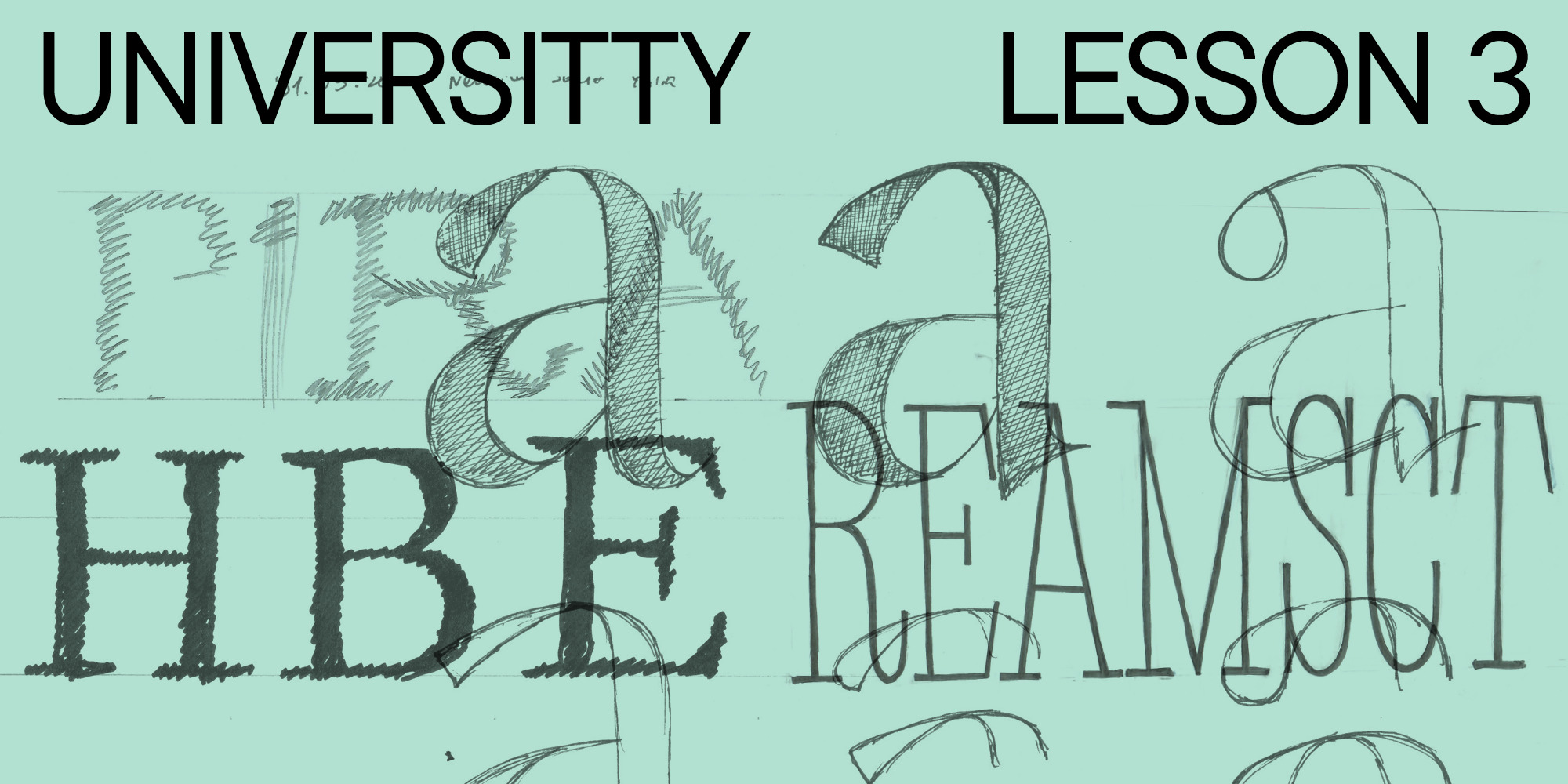
1. Es gibt verschiedene Arten, von Hand zu zeichnen. Die einfachste und auch bei den meisten Designern beliebteste ist das Schraffieren der Formen. Zuerst schraffieren Sie das Skelett eines Buchstabens auf einem Stück Papier mit einem Marker. Sie benötigen dazu keine vorausgeplante Umrisslinie einer Glyphe.
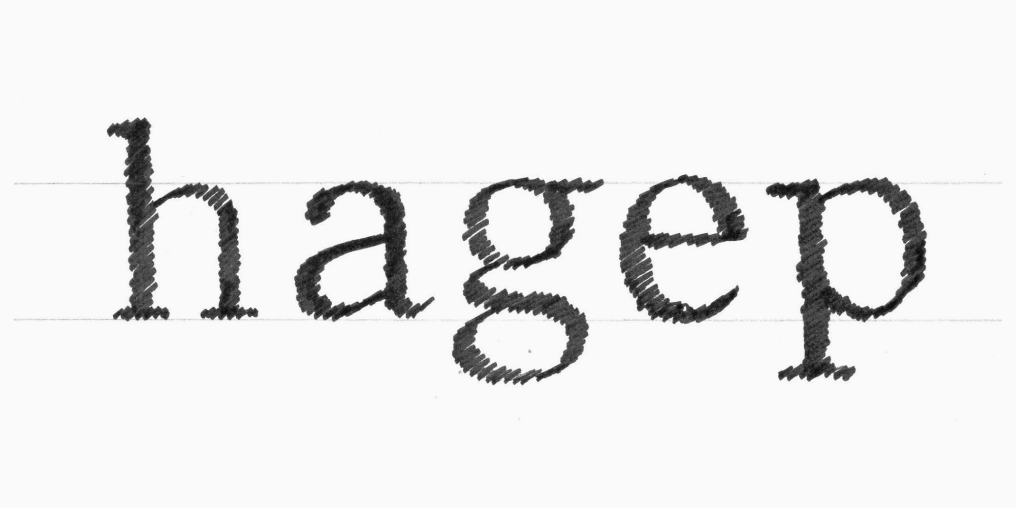
Beachten Sie, dass in diesem Beispiel die Buchstaben in einem Winkel geschrafft sind, als wären sie mit einer Flachfeder geschrieben. Dafür gibt es einen Grund. Die Beispielschrift wurde für eine Übergangsserifen (wofür wir im vorherigen Artikel ein Briefing vorbereitet haben) gemacht, was bedeutet, dass die ovale Achse in dieser Schrift schräg sein wird. Diese Art des Skizzierens hilft, von Anfang an zu bestimmen, wie das Gewicht auf das Skelett des Buchstabens verteilt wird.
Ich nenne diese Skizze absichtlich grundlegend: Sie kann als Ausgangspunkt dienen, als Grundlage, um mehr Details den Buchstabenformen hinzuzufügen. Es gibt auch zahlreiche Wege, die Details zu gestalten.
2. Sie können die Details von Hand weiter ausarbeiten. Wenn Sie die Proportionen und das Skelett weiter entwickeln möchten, können Sie weiter schraffieren. Nehmen Sie ein Stück transparentes Papier, legen Sie es über Ihre Skizze und schraffieren Sie neue Versionen der Glyphen. So müssen Sie die Buchstabenformen nicht von Grund auf neu zeichnen und bewahren auch Ihre erste Skizze unversehrt.
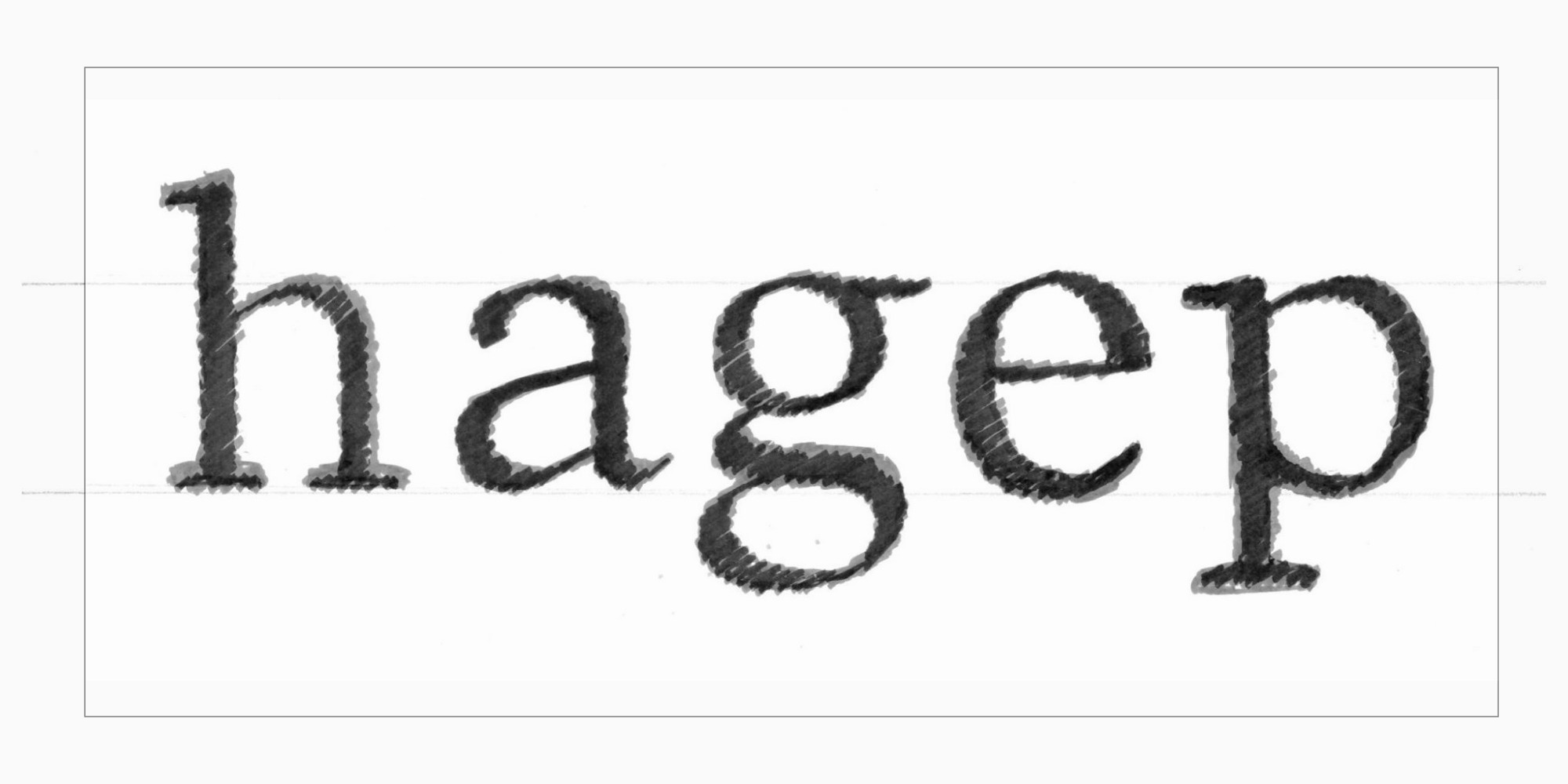
3. Wenn Sie mit den Formen und Proportionen der Buchstaben zufrieden sind, können Sie tiefer in die Details eintauchen. Nehmen Sie wieder transparentes Papier und legen Sie es über Ihre geschraffte Skizze, um diesmal die Glyphen mit einem dünneren Werkzeug zu umreißen, zum Beispiel mit einem Liner.
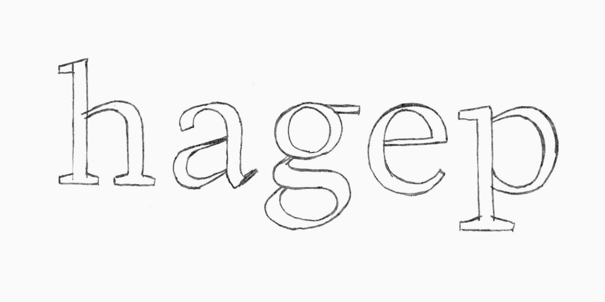
Durch diese Vorgehensweise gehen Sie die Feinheiten durch, wie Terminals, Serifenformen etc. Die Linie zeigt hier, wie das Vektorbild im Schrifteditor aussehen wird. Linien-Skizzieren ermöglicht es Ihnen, sowohl die gesamten Buchstabenformen zu optimieren als auch spezifische Teile zu erkunden.
4. Als nächstes können Sie die Buchstaben von Papier in einen Schrifteditor übertragen und dort weiter polieren.
In dieser Phase müssen Sie einige grundlegende Regeln zum Konstruieren von Buchstabenkonturen in einem Schrifteditor kennen:
а. Je weniger Punkte auf der Kontur, desto besser;
b. Kurven werden an Extrempunkten konstruiert, und mehr Punkte werden nur hinzugefügt, wenn sie unbedingt notwendig sind;
Extrempunkte sind die Spitzen einer Kurve auf den vertikalen und horizontalen Achsen.
c. Die Konturen können sich überlappen—das ist praktisch und korrekt.
Es gibt einen detaillierten, illustrierten Artikel auf der Website des Glyphs-Schrifteditors, wie man korrekt konturiert (die Regeln sind für alle Schrifteditoren die gleichen).
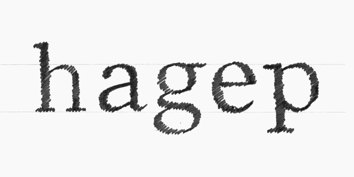
Lassen Sie uns einige Zeichen übertragen. Um das Beispiel klarer zu machen, platziere ich die Extrempunkte direkt auf der Skizze.
Die Kontur, die roh in einen Schrifteditor übertragen wird, sieht oft schlechter aus als auf Papier. Handzeichnungen haben diese charmante Schlampigkeit, die zahlreiche Fehler verdeckt. Vektorbilder hingegen sind unbarmherzig und präzise, sie machen alle Unvollkommenheiten sichtbar. Auch wenn die Skizze ordentlich aussieht, steht noch viel Arbeit an, wenn Sie zur digitalen Version im Schrifteditor übergehen. or.
Deshalb übertragen Designer oft die geschraffte Skizze in den Schrifteditor (Stufen 1 und 2) und konzentrieren sich dann auf alle Details der Buchstaben (Stufe 3). Manchmal überspringen Designer die Skizzenphasen und beginnen direkt im Schrifteditor mit der Gestaltung der Buchstaben. Jede Option ist möglich, daher hängt es nur von Ihrer Erfahrung und Ihren Vorlieben ab, wie Sie Ihren Arbeitsablauf organisieren. Ich würde jedoch Anfängern im Schriftdesign empfehlen, ihre ersten Projekte von Hand zu skizzieren.
Das Testen von Skizzen
Nun steht umfangreiches Testen und Polieren der Schriftidee an, zusammen mit der Feinabstimmung der Details. Die Art und Weise, wie Sie die Schrift testen, ist eng mit der spezifischen Aufgabe verbunden, die die Schriftsippe erfüllen soll (unser vorheriger Artikel konzentrierte sich darauf, wie man eine solche Aufgabe strukturiert). Zunächst sollten Sie über den Kontext nachdenken, in dem Ihre Schrift verwendet wird, und sie darin implementieren.
Zum Beispiel, wenn Sie eine Schrift für Benutzeroberflächen entwerfen, warum nicht ein Mockup in Figma erstellen, wo Sie Ihre Schrift hinzufügen und sehen können, wie sie aussieht? Wenn Sie eine Textschrift entwickeln, erstellen Sie ein Layout für eine Webseite eines Museumskatalogs mit ihr. Oder wenn Ihr Ziel ist, eine expressive Anzeigeschrift zu schaffen, gestalten Sie ein Plakat oder sogar eine Serie von Plakaten.

Ihr Zeichensatz ist noch sehr begrenzt, aber das ist kein Problem. Es gibt Dienste, die «Texte» mit nur wenigen Buchstaben generieren können (zum Beispiel Just Another Foundry). Es ist wichtig, beim Zeichnen der Buchstaben die richtigen Abstände zu berücksichtigen, um trotz ihres unregelmäßigen Rhythmus die Formen der Zeichen analysieren zu können. Wir werden uns im Rahmen eines kommenden Artikels mit der Abstimmung beschäftigen.
Während Sie an den Buchstabenformen arbeiten, ist es besser, diese in einer großen Punktschrift zu betrachten, auch wenn Sie eine Textschrift entwerfen. Richten Sie einen Platz an einer Wand ein, wo Sie alle Ihre Skizzen, Testwörter, Plakat- und Mockup-Drucke, Referenzen und Inspirationsquellen aufhängen können. So können Sie sofort einen schnellen Überblick über das Projekt bekommen. Sie können näher an diese «Wandgalerie» herantreten, um die Details genauer zu betrachten, oder einen Schritt zurücktreten, um alles in kleinerem Maßstab zu sehen. Dies erleichtert es, das Projekt jemandem zu zeigen, darüber zu diskutieren und Notizen direkt auf den Skizzen oder Drucken zu machen.
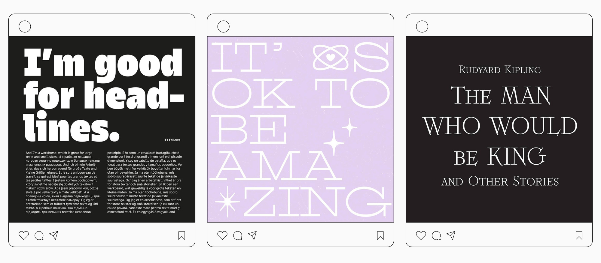
Eine weitere Methode, um Ihre Schrift zu testen (sowohl in den Skizzenphasen als auch darüber hinaus), die ich persönlich sehr schätze, ist das Erstellen von Beiträgen in sozialen Medien. Es mag nicht der Kontext sein, in dem Ihre Schrift in Zukunft verwendet wird, aber es ist eine echte Aufgabe, die die Schrift von Anfang an bewältigen muss. Indem Sie beobachten, wie die Schrift im echten Leben funktioniert, werden Sie leicht Unvollkommenheiten und mögliche Verbesserungen entdecken, die Ihnen im Arbeitsprozess nicht in den Sinn gekommen wären. Und Sie erhalten Reaktionen und Meinungen vom Publikum, was ebenfalls wesentlich ist.
Von der Skizze zum Vektor
Schließlich schauen wir uns an, wie eine anfängliche Skizze nach umfangreicher digitaler Bearbeitung weiterentwickelt werden kann. Als Beispiel nehmen wir dieselben funktionalen Serifen, die wir im vorherigen Artikel beschrieben haben.
Also haben wir einen langen Weg von einer Idee, die auf einem Stück Papier zum Leben erweckt wurde, bis zu ihrer geformten und digitalisierten Erscheinung zurückgelegt. Es gibt jedoch noch viel Arbeit zu tun. Und das ist ein Grund, die kommenden Artikel nicht zu verpassen!