

Heute möchten wir Ihnen die Entstehungsgeschichte der Schrift TT Autonomous erzählen. Wir erzählen Ihnen, was die Designer inspiriert hat und welche Schriftarten in der Familie enthalten sind.
Wie die Idee entstand
Die Idee entstand in Amsterdam, als einer unserer Kollegen das offizielle Elektrotaxi am Flughafen Schiphol benutzte. Damals dachten wir über eine neue, breite Sans Serif-Schrift nach, und während der Fahrt kam die interessante Frage auf, welche Schrift mit dem autonomen elektrischen Verkehr in Verbindung gebracht werden könnte. Dann dachten wir, es wäre schön, dieses Thema visuell zu erweitern.
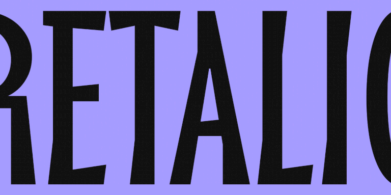
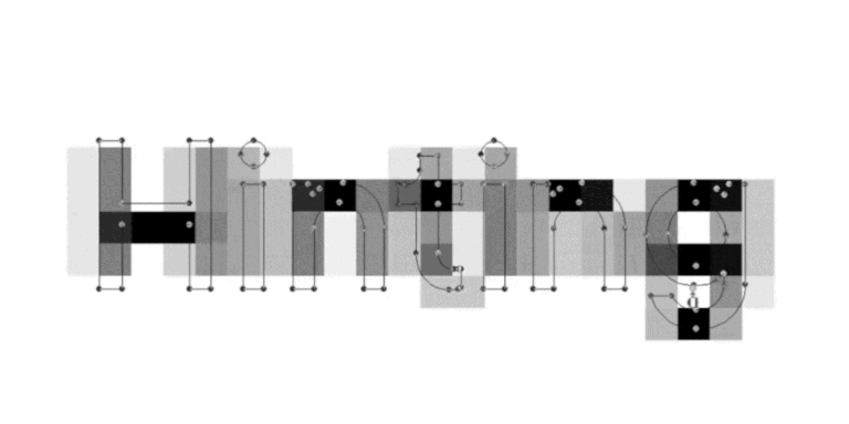
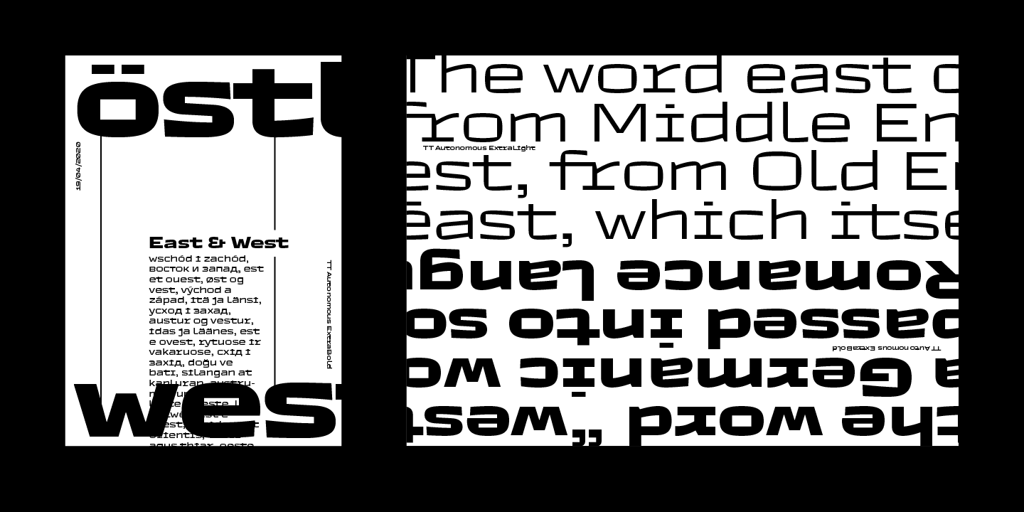
So entstand die Schriftfamilie TT Autonomous. Die TT Autonomous ist eine moderne, rohe, technologische Sans Serif-Schrift. Das visuelle Hauptmerkmal der Schrift ist die auffällige Eckigkeit der Zeichen und der eckige Innenraum. Außerdem wirken die Proportionen der Schrift eher einzeilig, sind aber nicht wirklich einzeilig. Die Breite der Zeichen orientiert sich an den Proportionen von Automobillogos, die in der Regel recht breit sind.
Monospaced-Schriften
Als wir das Projekt planten und mit der Arbeit daran begannen, dachten wir überhaupt nicht an eine monospaced Unterfamilie. Die Idee, eine eigene Monospaced-Subfamilie zu entwerfen, entstand während der Arbeit an den ersten Skizzen der Schrift und später während der Arbeit an den ersten Vektorzeichen.
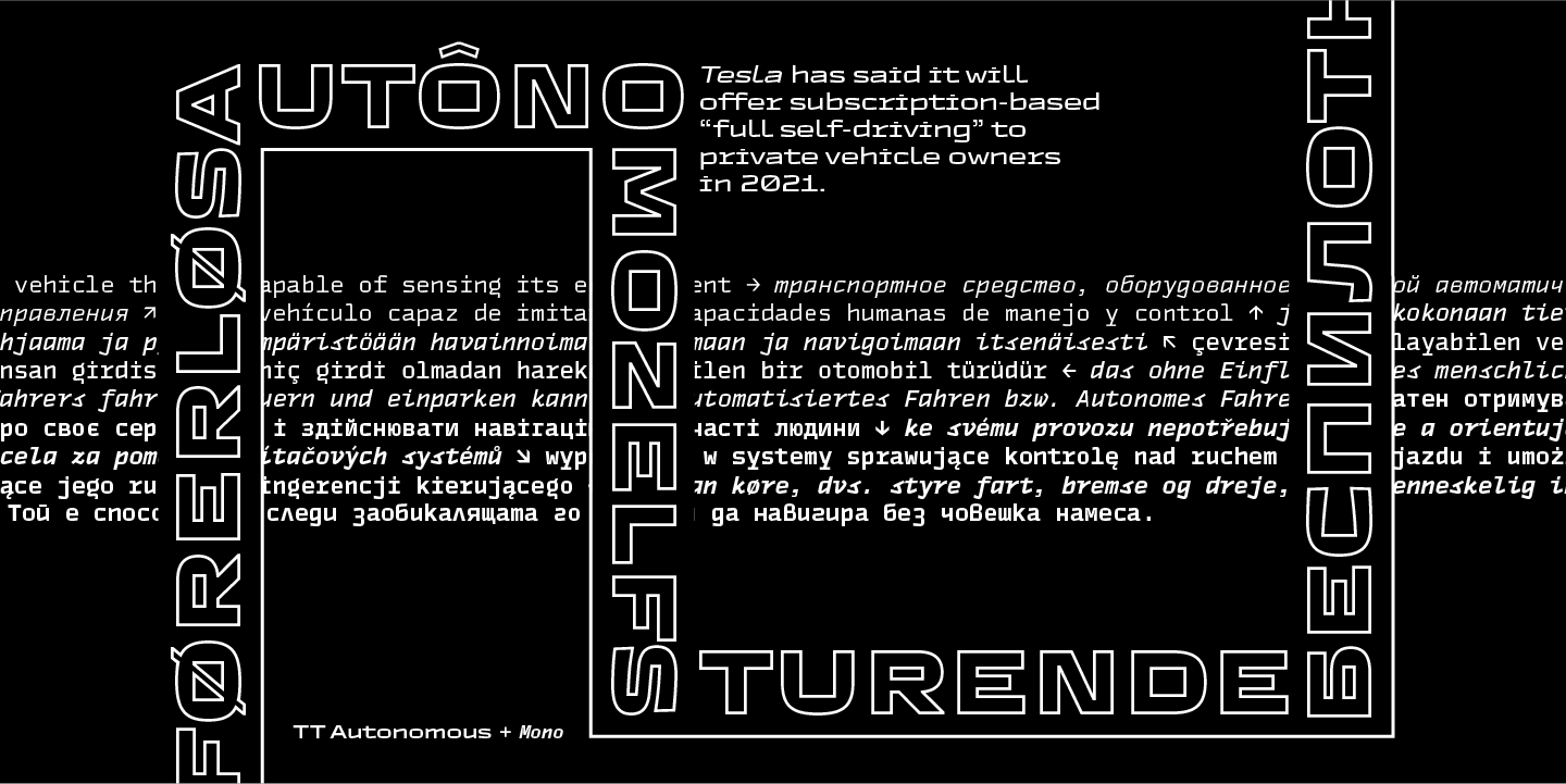
Bei einer unserer regelmäßigen Teambesprechungen fiel einem unserer Kollegen auf, dass die Form einiger Zeichen der Hauptschrift deutliche Bezüge zu Monospaced-Schriften aufwies. Es erschien uns logisch, diese Idee weiterzuentwickeln und eine eigene Monospaced-Subfamilie zu kreieren.
Durch die Verschmelzung ungewöhnlicher visueller Lösungen, die von der Hauptfamilie übernommen wurden, mit den typischen Merkmalen der Monospaced-Schriften wurde die Mono-Subfamilie zu einer unkonventionellen und originellen Schrift.
Als wir begannen, ihre schrägen Versionen zu entwerfen, beschlossen wir sofort, es nicht dabei bewenden zu lassen, sondern zu versuchen, sie mit etwas völlig Gegensätzlichem zu kombinieren – und so entstand die charakteristische monospaced True Italic.
Outline-Schriften
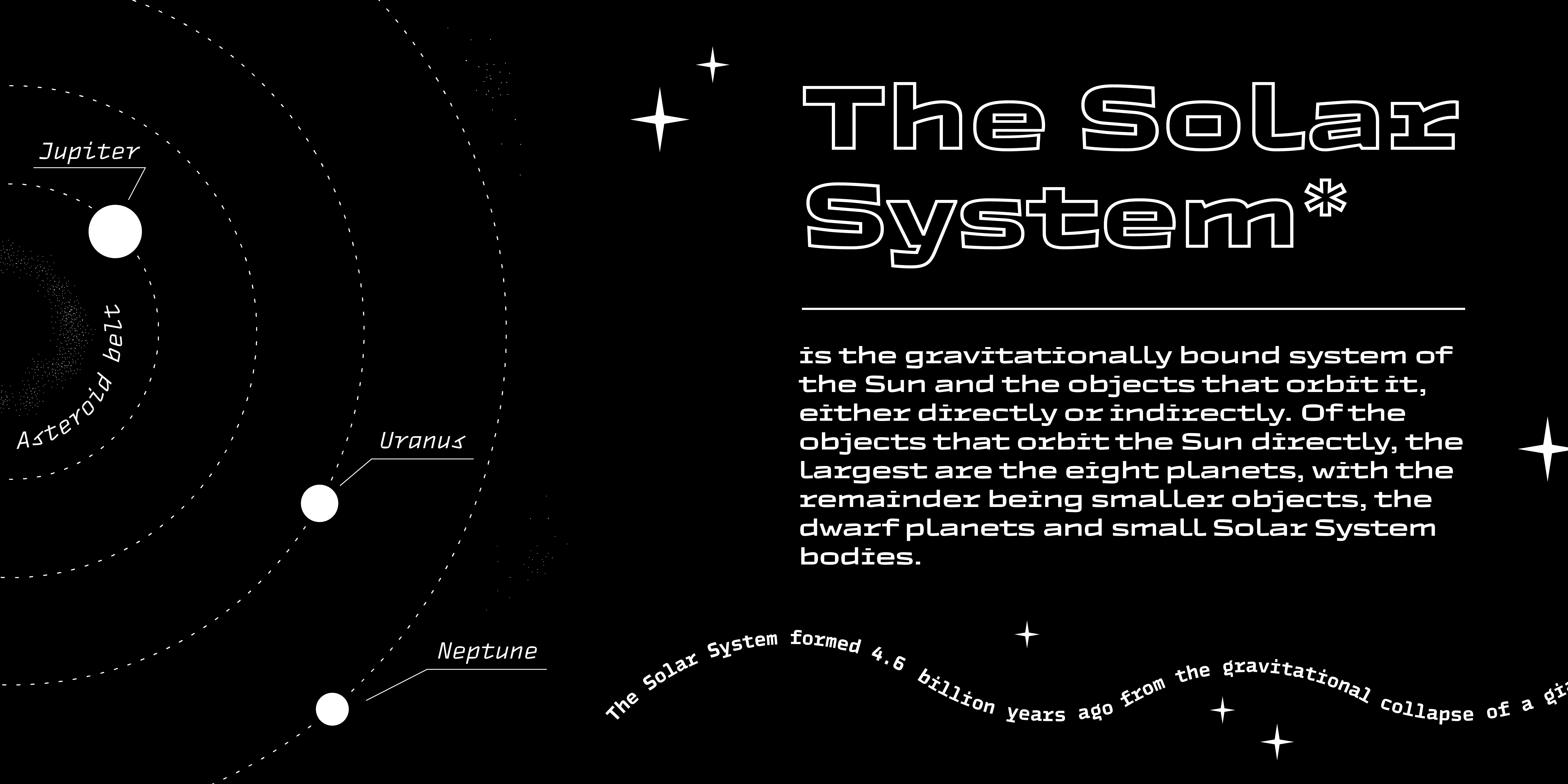
Darüber hinaus haben wir eine Reihe von Outline-Schriften entwickelt, die sich hervorragend für Titel und große Beschriftungen eignen und perfekt mit der Basic- und der Monospaced-Familie harmonieren. Im Gegensatz zu Outlines, die in Grafikeditoren erstellt werden können, haben wir bei der TT Autonomous Outline die schmalen und fragwürdigen Stellen herausgearbeitet, wodurch die Schrift professionell komplett und harmonisch wirkt.
Variable Schriften
Da die Schrift von Anfang an mit Blick auf die Technologien von morgen entwickelt wurde, konnten wir es uns nicht nehmen lassen, auch an die Variabilität zu denken und eine variable Schrift zu entwerfen. TT Autonomous bietet variable Versionen sowohl für die Grundschrift als auch für die monospaced Unterfamilien.
TT Autonomous in Zahlen
TT Autonomous ist eine komplexe Schriftfamilie, die aus 25 Fonts besteht, die ein breites Spektrum an Gestaltungsaufgaben lösen sollen. Insgesamt umfasst die Schriftfamilie 14 Regular-Fonts, 6 Monospaced-Fonts, 2 Outlinefonts und 3 Variabel-Fonts. Die Anzahl der Zeichen variiert zwischen 630+ bei den Monospaced-Fonts und 790+ bei den Basic-Fonts. Die Basic-Unterfamilie verfügt über Alternativzeichen, Ligaturen, Mediävalziffern, Nullen mit Schrägstrich und viele weitere nützliche Funktionen. Die Schrift ist in über 180 Sprachen verfügbar.
Wenn Sie TT Autonomous in Ihren Projekten ausprobieren möchten, senden wir Ihnen gerne eine Testversion zu. Füllen Sie dazu einfach das Anfrageformular aus.