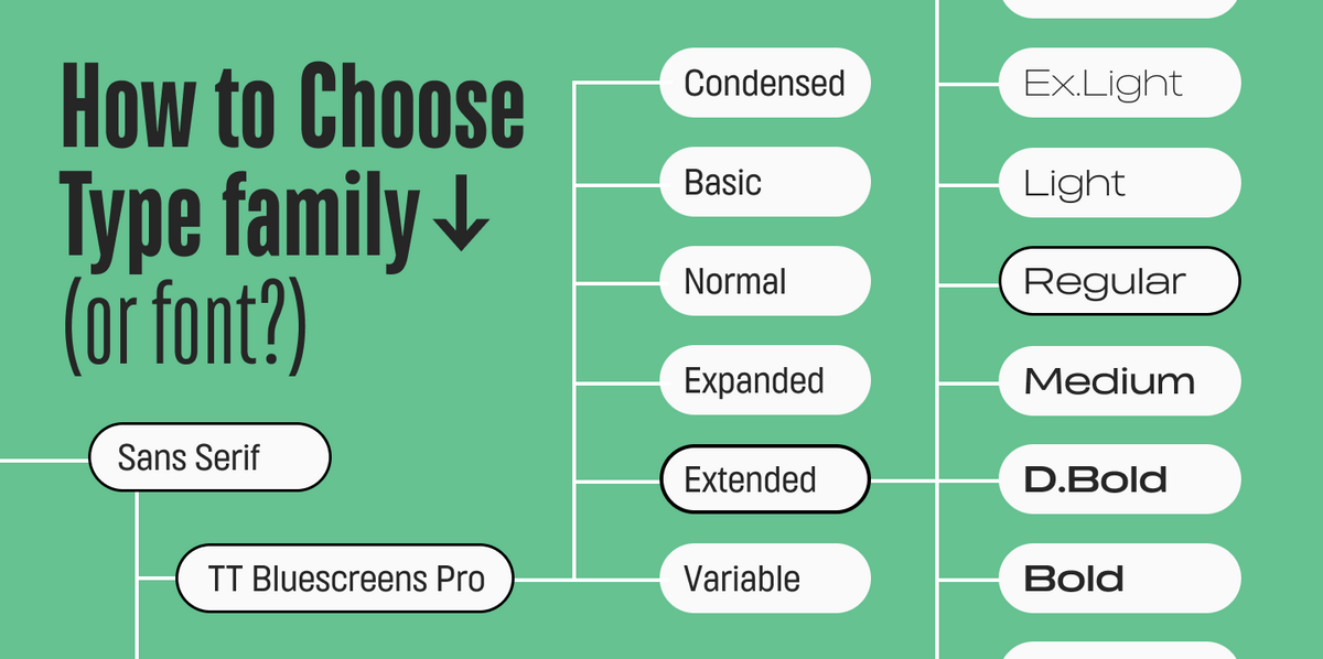
Willkommen zur neunten Lektion unserer Reihe „UniversiTTy“! In dieser Serie führen wir Sie Schritt für Schritt durch den Prozess des Schriftdesigns. Deshalb empfehlen wir, die früheren Artikel der Reihe durchzusehen, bevor Sie sich in diesen stürzen.
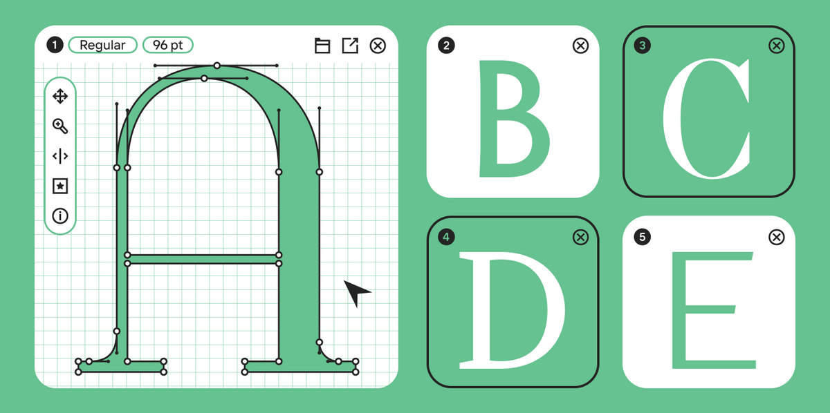
Unser letzter Artikel widmete sich dem Zeichnen von Großbuchstaben nach der Beschäftigung mit der grundlegenden Konstruktionslogik. Diesmal werden wir tiefer in das Thema eintauchen und uns der Detailverfeinerung widmen.
Ihre Lehrerin ist Antonina Zhulkova, Designleiterin bei TypeType. Antonina arbeitet seit über fünf Jahren im Schriftdesign. Sie ist die Konzeptautorin und leitende Designerin von Projekten wie TT Neoris, TT Ricordi Allegria, TT Globs und Ivi Sans Display. Außerdem war sie an der Entwicklung von TT Fellows, TT Fors, TT Interphases Pro, TT Commons und vielen anderen Schriften beteiligt.
Details und wie sie die gesamte Schrift beeinflussen
Die Schrift ist ein zusammenhängendes visuelles System. Das zeigt sich auf allen Ebenen: global (Schriftart, Gewicht, Proportionen, Kontrast, allgemeine Formen) und auf kleineren Ebenen, die alle grafischen Entscheidungen in einzelnen Zeichen umfassen. Lassen Sie uns gemeinsam herausfinden, wie visuelle Details die Gesamtwahrnehmung von Schriften beeinflussen.
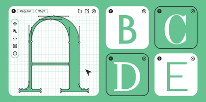
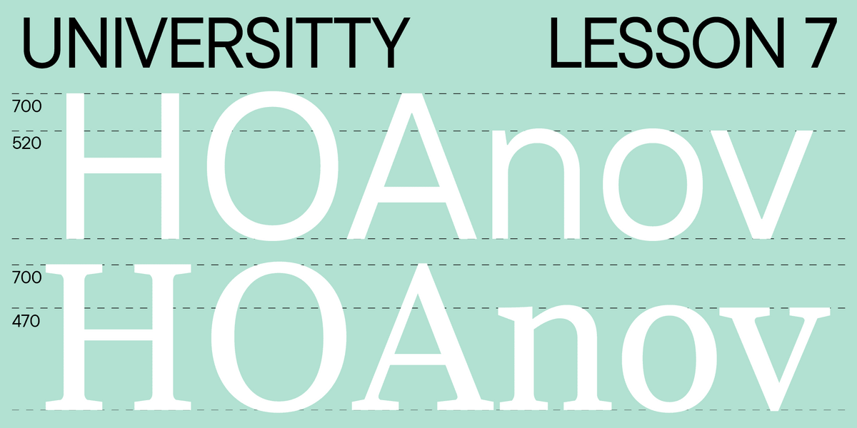
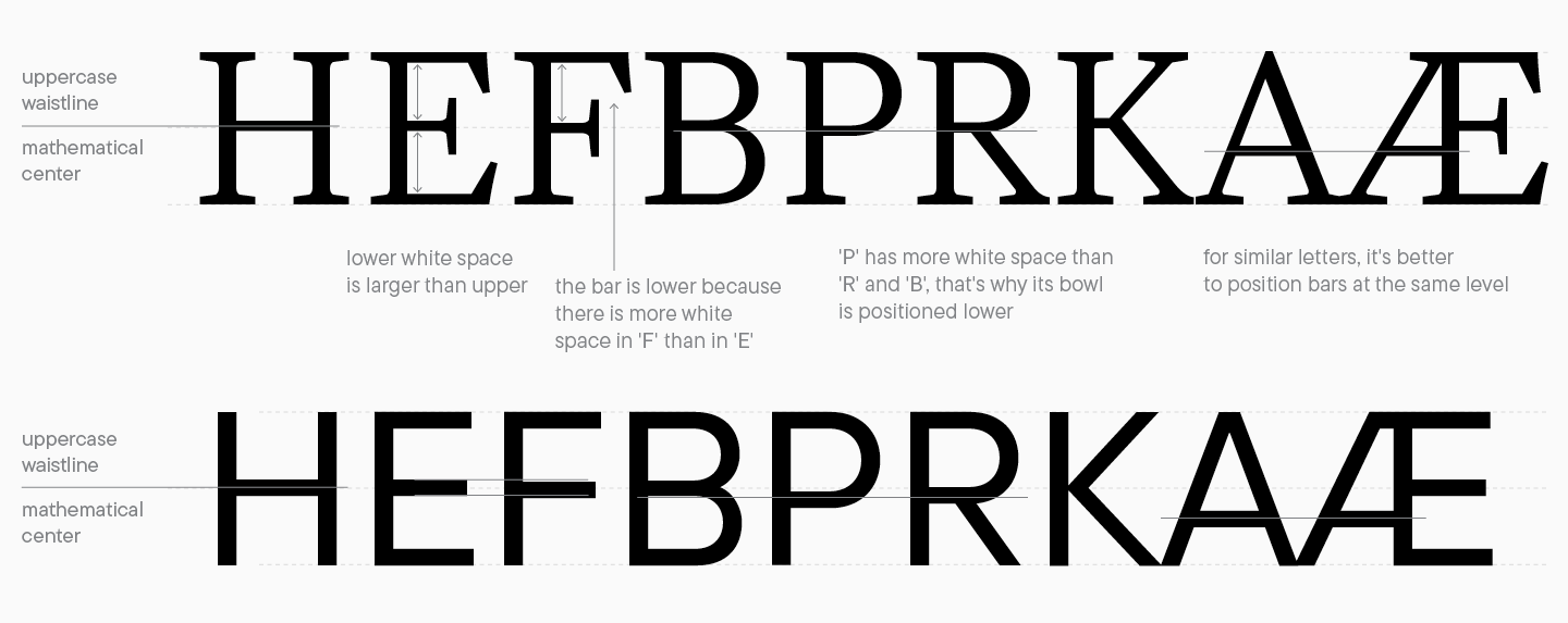
Taille eines Buchstabens
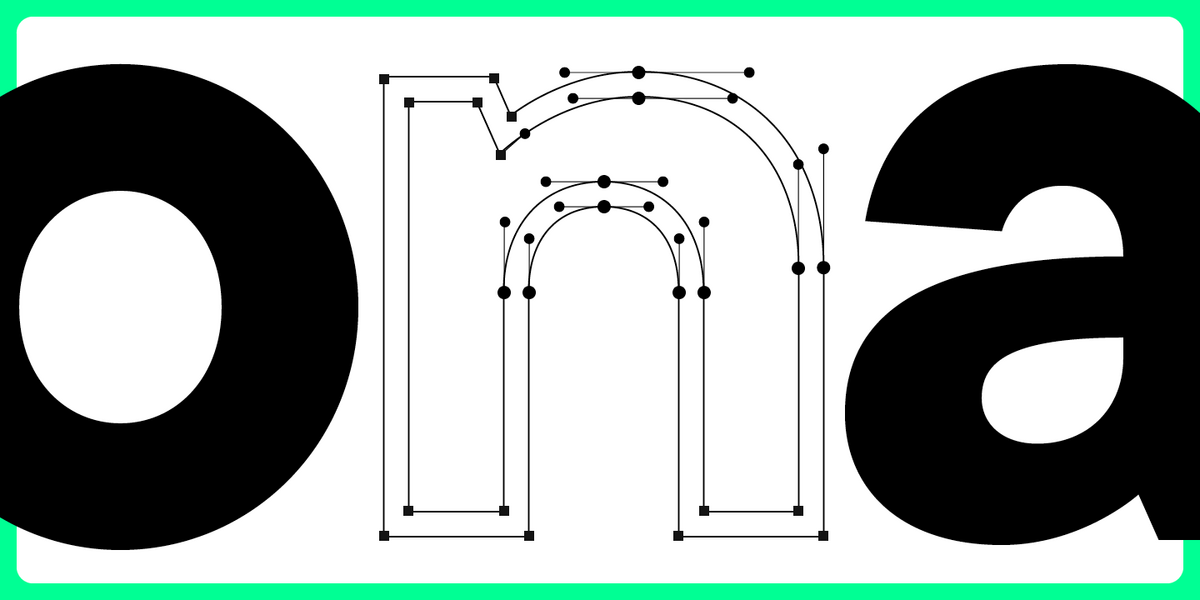
Die Taille ist eine Referenzlinie für horizontale Striche in Schriften. Dieser Parameter hilft uns, die richtige Buchstabenstruktur zu schaffen und mehr Logik in die Schrift zu bringen. Außerdem kann eine Änderung der Höhe dieser Linie die gesamte visuelle Ästhetik der Schrift verändern: Eine hohe Taille vermittelt beispielsweise, dass die Schrift zum Jugendstil gehört, während eine niedrige Taille ein ausdrucksstarkes Detail wird.
Es ist wichtig zu wissen, dass die Taille fast nie mathematisch in der Mitte des Symbols liegt. Wenn Sie die Taille genau durch die Mitte ziehen, wirkt es, als wären die horizontalen Striche tiefer positioniert. Dies hängt mit den Besonderheiten unserer visuellen Wahrnehmung zusammen: Der obere Teil eines Zeichens wirkt für uns immer schwerer als der untere.
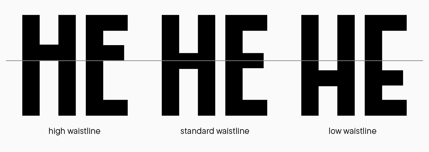
Am besten zeichnen Sie die Taille so, dass ähnlich aussehende Zeichen der gleichen Konstruktionslogik folgen. Das optimiert nicht nur Ihren Arbeitsprozess, sondern trägt auch zu einem einheitlicheren Erscheinungsbild der Schriftgrafik bei.
Balance der grafischen Elemente
Wir haben dieses Thema bereits in unserem vorherigen Artikel angeschnitten, als wir Buchstabengruppen und ihre Beziehungen untersucht haben. Nun wollen wir tiefer eintauchen.
Alle grafischen Techniken in den Buchstabenformen sollten mit den Zielen und Eigenschaften der Schrift übereinstimmen. Das betrifft sowohl große Formen, wie ovale, als auch die kleinsten Details. Beim Entwickeln von Schriften überladen Designer oft die Buchstabenformen mit Details, um ihre Fähigkeiten zu zeigen. Sie sollten diese Tendenz vermeiden und keine unnötigen Details in Ihre Schrift eindringen lassen.
Lassen Sie uns einige Probleme betrachten, auf die Sie bei Ihrem Projekt stoßen könnten. Diese Liste berücksichtigt nicht alle Details, kann aber einen Handlungsweg vorschlagen.
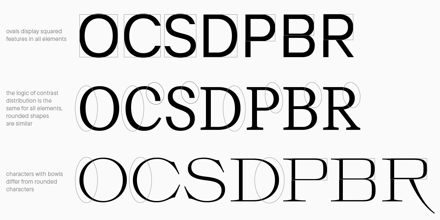
Abgerundete Ovale
Ovale und Klammerformen in einer Schrift sollten gut miteinander harmonieren: Dies ist ein wesentliches stilbildendes Element, das die Gesamtwahrnehmung der Schrift beeinflusst. Bei der Arbeit mit diesen Details wird empfohlen, die Zeichen in Gruppen aufzuteilen und an jeder Gruppe zu arbeiten.
Um ein korrektes grafisches System aufzubauen, sollten Sie den Charakter der abgerundeten Formen in der Schrift bestimmen: Sie könnten einem geometrischen Kreis näherkommen (wie bei geometrischen Sans-Serif-Schriften), sich einer ovalen Form annähern, einen eckigen Charakter haben oder sogar völlig gerade mit einem minimalen Krümmungsradius sein. Alle Buchstaben mit abgerundeten Elementen hängen von der spezifischen Klammerform ab.
Die Formen von Ovalen, Schalen und Klammern müssen jedoch nicht identisch sein. Zum Beispiel können Zeichen mit Schalen in ihrer Form von runden Glyphen abweichen. Dies ist eine sehr ausdrucksstarke Designentscheidung, also nutzen Sie sie bedacht. Bei einem Kontrast zwischen Formen wird empfohlen, dieses Element der entsprechenden Gruppe hinzuzufügen, nicht nur einem einzelnen Buchstaben.
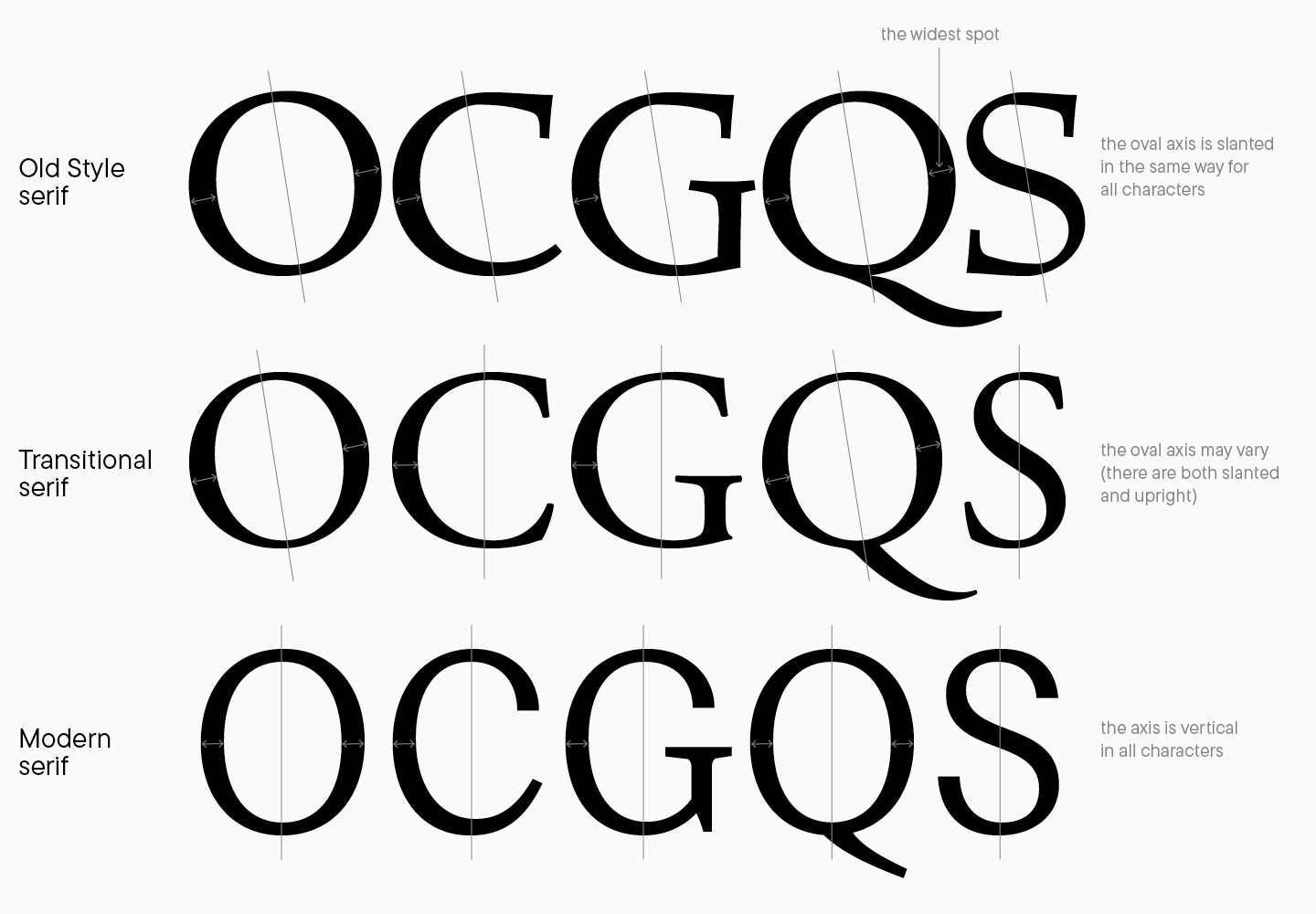
Kontrast runder Zeichen in Serif-Schriften
Die Arbeit mit Kontrast in Serif erfordert große Aufmerksamkeit für Details und ein Verständnis dafür, wie das Schreibwerkzeug die Glyphenformen beeinflusst. In unserer siebten Lektion haben Sie über verschiedene Kontrastarten gelesen: den zwischen breiter Feder und spitzer Feder. Dieser Parameter wirkt sich sowohl auf Strichvariationen als auch auf die Kontrastverteilung auf der Glyphenachse aus.
Die Ovalachse ist eine imaginäre Linie, die durch die dünnsten Teile der abgerundeten Zeichen verläuft (dies bestimmt, ob sie vertikal oder schräg positioniert sind). Wenn Sie Kalligrafie betreiben, sollten Sie wissen, wie sich Formen je nach Schreibwerkzeug und dessen Position auf dem Papier ändern. Schriften folgen derselben Logik: Wenn Sie eine Schrift basierend auf kalligrafischen Prinzipien oder den alten Serif-Stilen entwerfen, sollten alle abgerundeten Zeichen eine spezifische Neigung haben, und die breitesten Strichstellen sollten senkrecht zu dieser Neigung stehen. Um ein konsistentes und schönes Glyphen-Design zu erreichen, wird empfohlen, den Kontrasttyp zu berücksichtigen und die gewählte stilistische Richtung zu verfolgen.
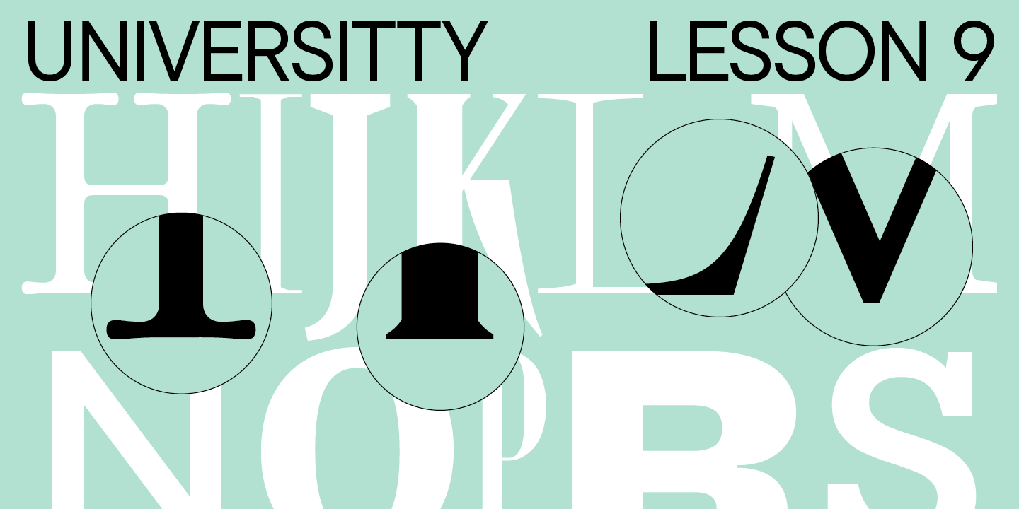
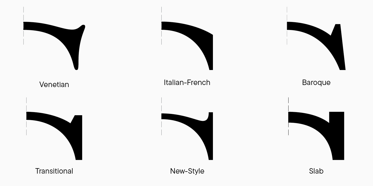
Serifen
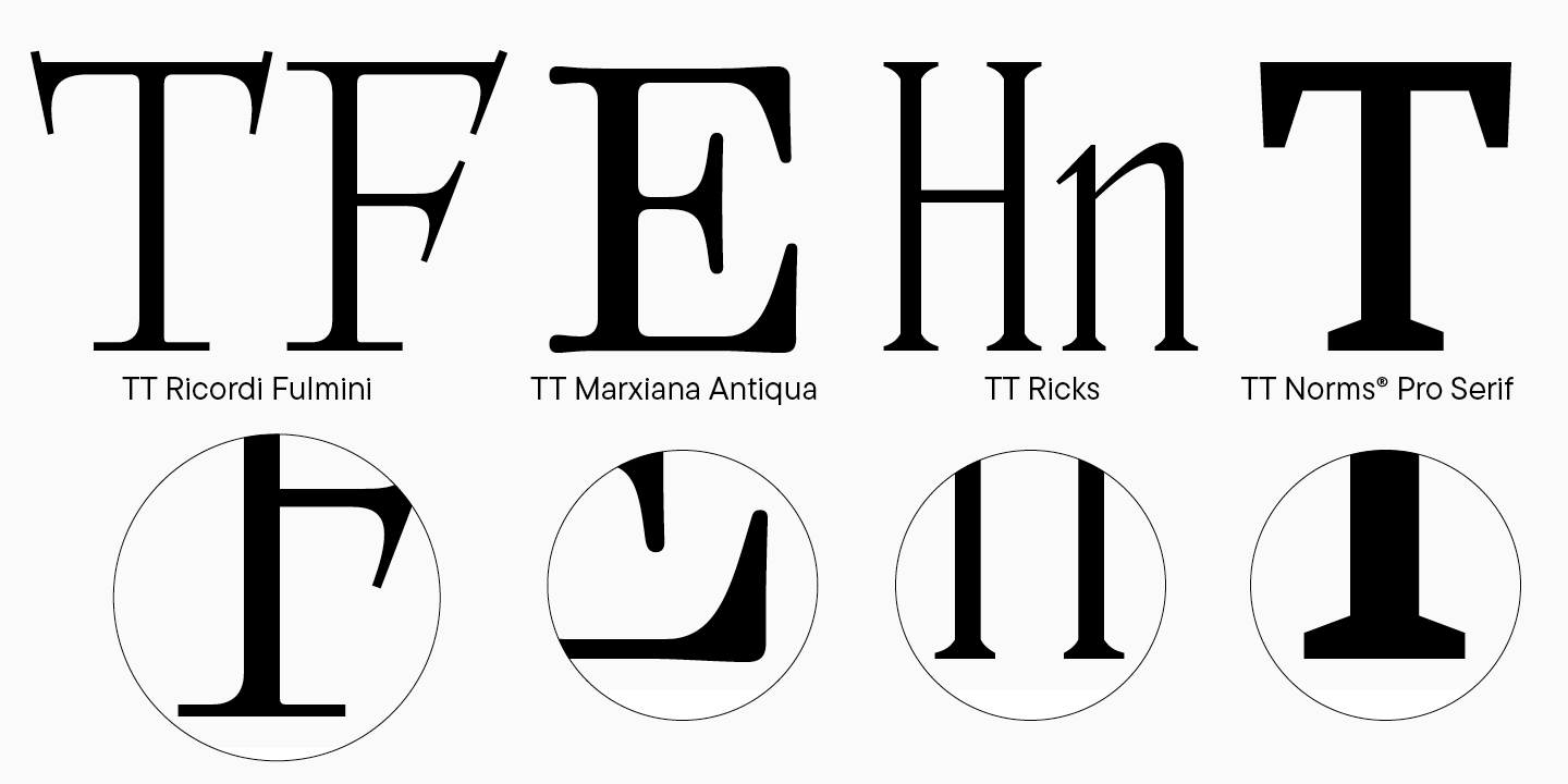
Serifen sind ein bemerkenswertes Unterscheidungsmerkmal von Antiqua-Schriften. Eine Serif ist ein kleiner Strich am Ende eines Stiels. Es gibt zahlreiche Arten von Serifen. Durch die Verwendung dieses Elements in Ihrer Schrift können Sie ihren Charakter und ihre Stimmung verändern, den Schriftsatz ausdrucksstärker oder weniger ausdrucksstark gestalten und Ihrer Schrift Persönlichkeit verleihen. Ich empfehle das Buch „The Elements of Typographic Style“ von Robert Bringhurst, um mehr über Serifen zu erfahren.
Nach der grundlegendsten Klassifikation von Serifen können sie nach Arten von Antiquas sortiert werden. In dynamischen und statischen Schriften können Serifen unterschiedlich aussehen: In dynamischen Antiquas sind sie oft asymmetrisch und folgen der Logik des Schreibwerkzeugs. In statischen Schriften haben sie eine fast geometrische Konstruktion.
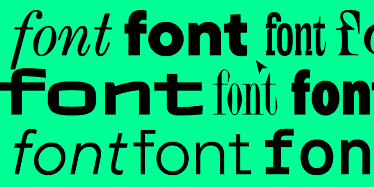
Die Länge und das Gewicht der Serifen hängen ebenfalls vom Stil der Schrift ab. In modernen, insbesondere Display-Schriften, ist die Vielfalt der Serifenformen beeindruckend, daher schauen wir uns besser einige Beispiele an. Sie können symmetrisch oder asymmetrisch in einer Glyphe sein, das gleiche Gewicht haben oder sich verjüngen, abgerundet, dreieckig, diamantförmig usw. sein.
Terminals
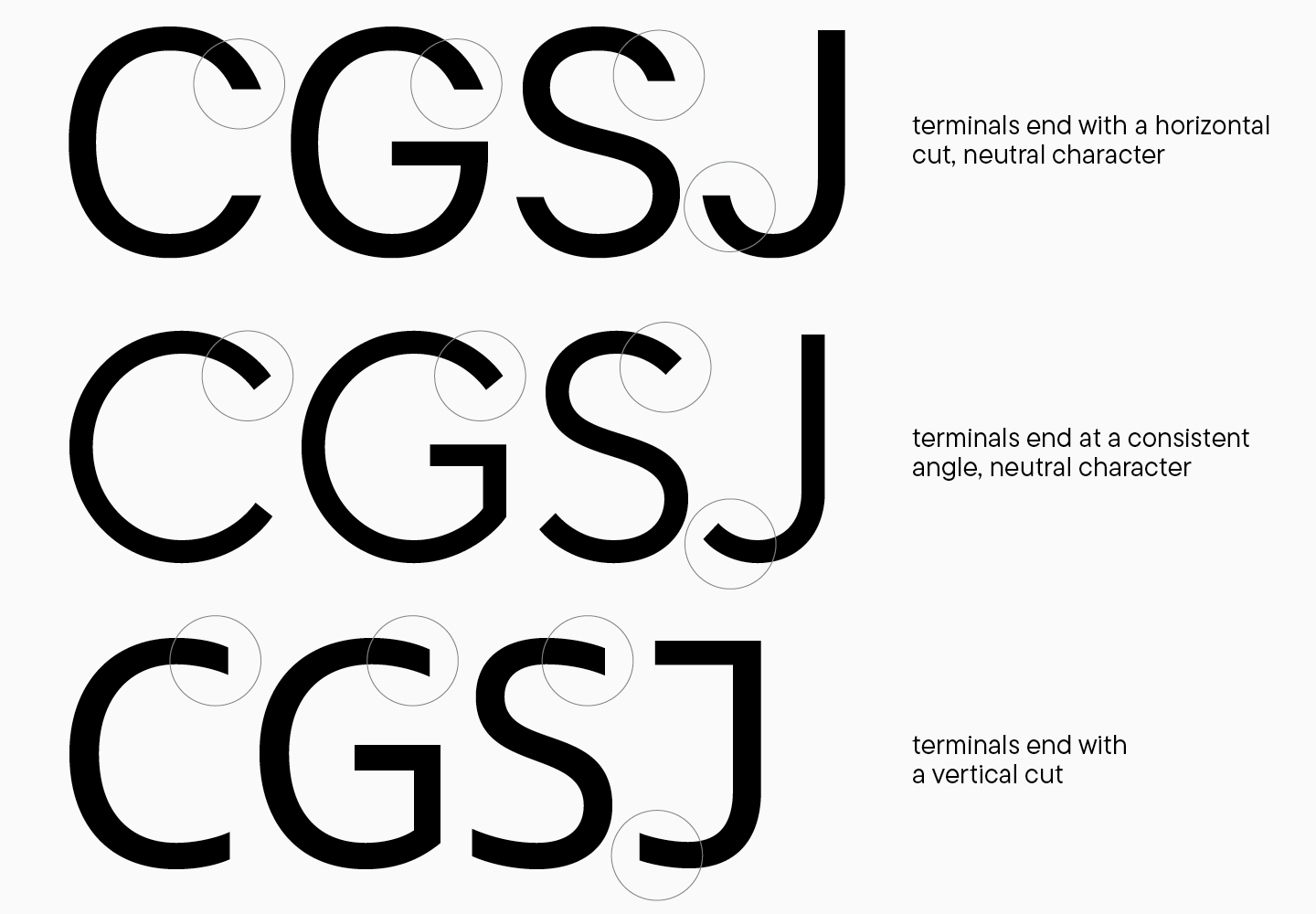
Ein Anschluss ist das gerade oder gebogene Ende eines Strichs. Anschlüsse im Glyphen-Design sind ebenfalls entscheidende Elemente, die die Konstruktionslogik widerspiegeln sollten. Die Form der Anschlüsse hängt weitgehend vom Grad der Glyphenöffnung (Apertur) und dem Stil der Schrift ab. Bei der Arbeit an Anschlüssen sollten zwei Dinge bedacht werden: die allgemeine Anschlussform und ihr Ende. Die Form des Strichendes bereitet die wenigsten Probleme, da sie der gesamten Glyphenform folgt und von den allgemeinen Schriftmerkmalen abhängt.
In Sans-Serif-Schriften sind Strichenden weniger variabel als in Serif-Schriften. Sie können neutral sein und die Gesamtform ergänzen (was für Textschriften wichtig ist) oder auffälliger gestaltet werden. Es gibt zahlreiche grafische Lösungen für Anschlüsse; es wird jedoch nicht empfohlen, mehrere Ansätze in einer Schrift zu kombinieren. Dies gilt insbesondere für Anschlussenden, die sogenannten „Schnitte“. Sie können senkrecht zur Richtung des Elements, vertikal und horizontal enden oder einen Winkel haben — und in diesem Fall sollten die Winkel innerhalb der gesamten Schrift ähnlich sein. Anschlüsse können auch in Sans-Serif-Schriften ein ausdrucksstarkes Merkmal werden, aber die Art der Nutzung dieser Technik hängt von der Aufgabe ab.
In Antiquas gibt es mehr Optionen für Strichenden: verschiedene Arten von Serifen und Tropfen. Tropfen werden am häufigsten in Kleinbuchstaben verwendet, daher werden wir sie später behandeln; bei Großbuchstaben können sie im Buchstaben J auftreten. Die Serif-Typen in Antiquas werden stark vom Stil der Schrift beeinflusst: Je ähnlicher sie historischen Vorbildern ist, desto stärker ist der Einfluss des Schreibwerkzeugs; in modernen Antiquas ist der Ansatz für Strichenden nicht so strikt. Um die Anschlussformen festzulegen, müssen Sie Ihre Antiqua einer Gruppe zuordnen und herausfinden, wie Serifen und Tropfen in ähnlichen Schriften aussehen. Es i 1a95 st auch hilfreich, die Skizzen erneut zu überprüfen und diesen Teil durch Zeichnen nochmals zu überarbeiten.
Verbindungen und Tintenfallen
Nun richten wir unsere Aufmerksamkeit auf weniger auffällige, aber ebenso wichtige Details. Das Hinzufügen von Tintenfallen und Verbindungen mit horizontalen Segmenten an den Schnittstellen der Striche ist eine gängige Praxis im Glyphen-Design. Im Kern handelt es sich um ein einziges konzeptionelles Element; der Unterschied liegt lediglich in seiner „Skala“ innerhalb des Zeichens. Was Tintenfallen, auch Kompensatoren genannt, auszeichnet, ist, dass dieses Detail größer ist und in die Hauptstriche der Glyphe einbezogen wird.
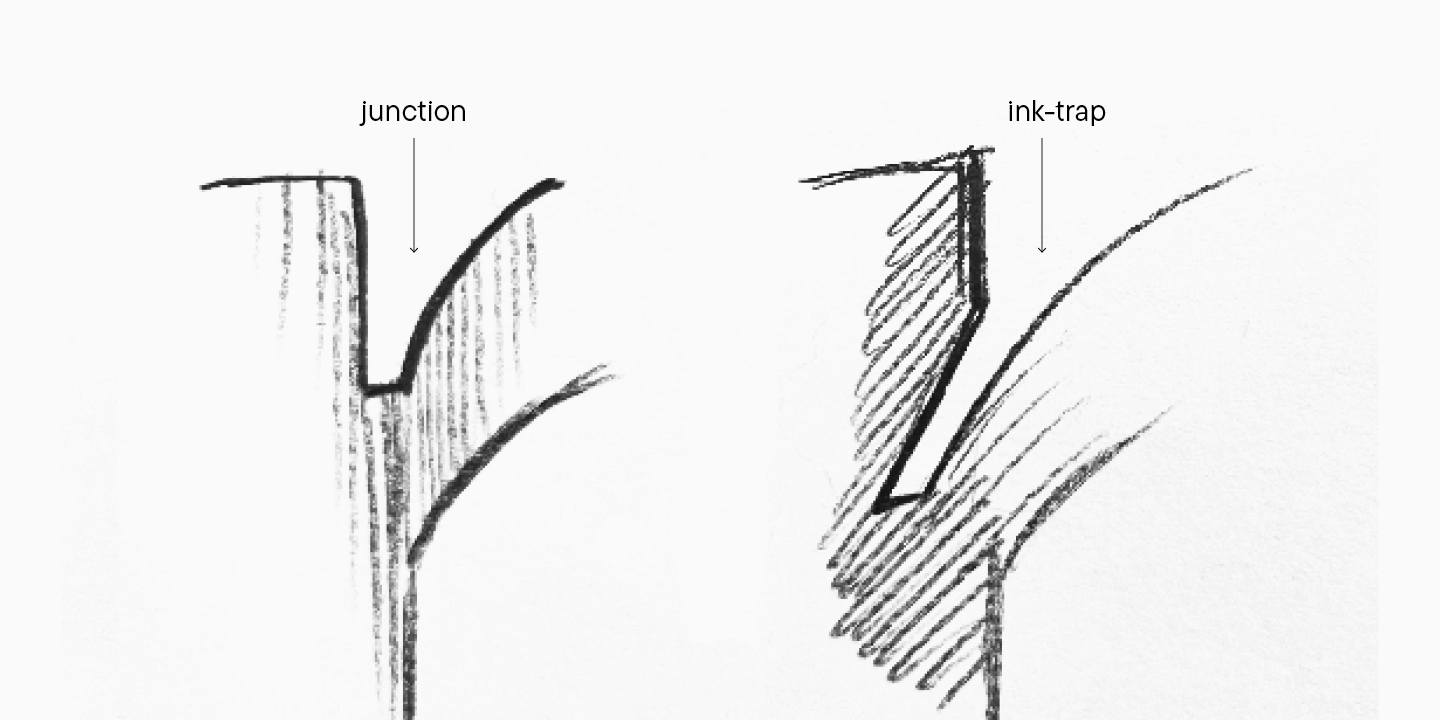
Während der Ära des Metalltyps dienten diese Elemente als funktionale Details, die es Designern ermöglichten, einen kleinen negativen Raum zum Zeichen hinzuzufügen und den Tintenverlaufseffekt an den Strichkreuzungen zu vermeiden. Die Zeiten haben sich geändert, und diese Details sind nun eigenständige Gestaltungselemente geworden.
Verbindungen mit horizontalen Segmenten können sowohl relativ kleine als auch große grafische Elemente sein. Meine Empfehlung ist, sie nicht kleiner als 5 Punkte zu gestalten, wenn Sie im System von 1000 Einheiten pro Em arbeiten, da Sie sonst beim Export der Datei Probleme mit den Konturen haben könnten. Verbindungen sollten auch der allgemeinen Logik folgen, die sich sowohl bei der Größe als auch bei der Position der Verbindungen wiederholt, sodass sie an Stellen mit ähnlichem Kontext auftreten.
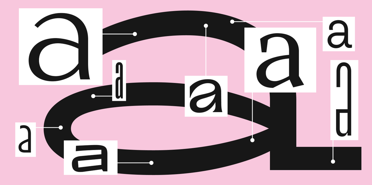
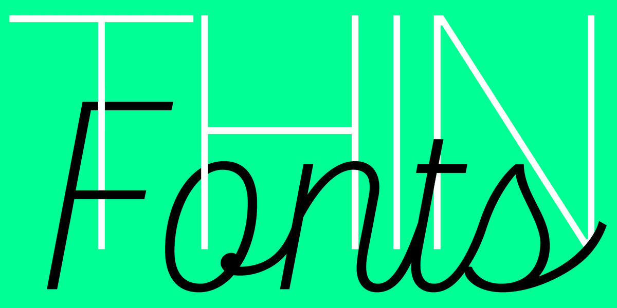
Glyphencharakter
Kehren wir zum kreativen Teil des Zeichnens zurück. In diesem Abschnitt habe ich erklärt, wie man Konsistenz in die Symbolgrafik bringt. Auf den ersten Blick mag es scheinen, dass das Zeichnen von Glyphen bedeutet, alle kreativen Impulse zu unterdrücken. Das stimmt jedoch nicht. Der Aufbau einer einheitlichen Logik innerhalb der Schriftgrafik ist ein Werkzeug, um die Schönheit der Buchstaben hervorzuheben. Mitten in der allgemeinen Einheitlichkeit funktionieren stilistische Entdeckungen besser.
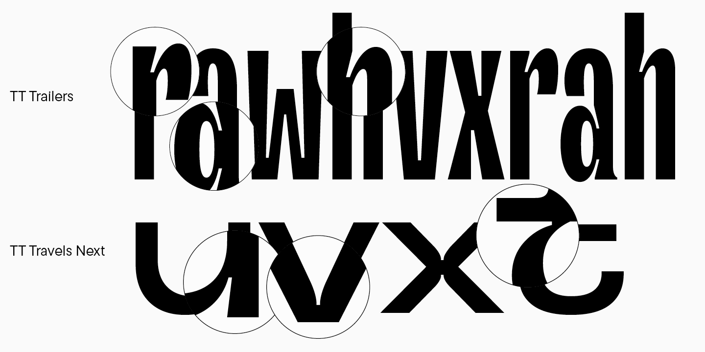
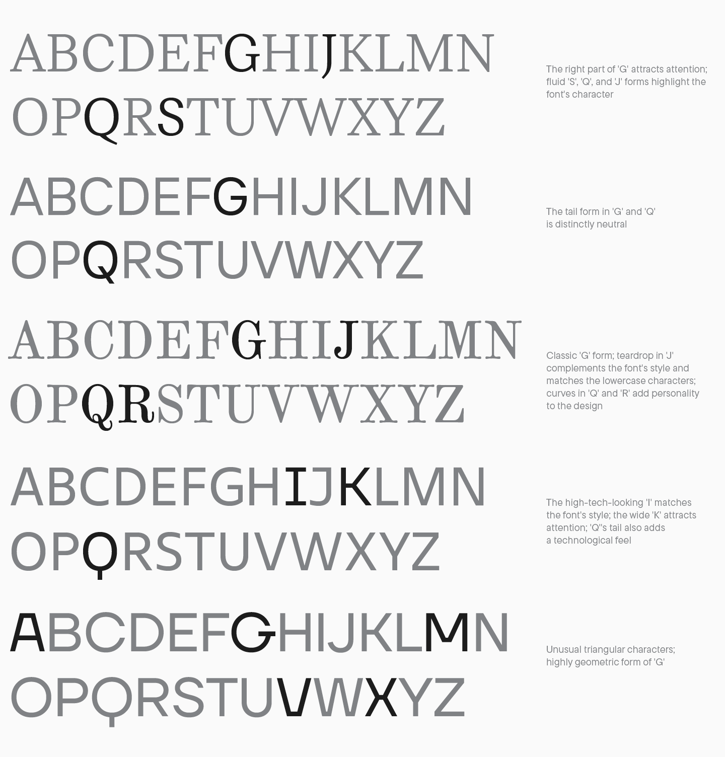
Welche Methoden können also verwendet werden? Arbeiten Sie zunächst mit den Buchstabendetails und suchen Sie nach unkonventionellen Lösungen. Diese werden hauptsächlich vom Stil der Schrift beeinflusst, zum Beispiel durch einen historischen Bezug oder Ihre eigenen originellen Erkenntnisse. Sie können sich auf spezifische Elemente der Buchstabenform konzentrieren, wie die Form von J, G, den Schwanz von Q, die Beinformen von R, K und die Fließfähigkeit von S. Dieser Punkt ist eng mit dem Begriff des „semantischen Reims“ verbunden, der in allen Glyphen der Schriftart auftreten muss. Damit Ihre handgefertigten, komplexen Zeichen mit ungewöhnlichen Formen zusammenhängend wirken, sollten Sie diese grafische Entscheidung bei jedem anderen Buchstaben desselben Falls beibehalten. Hier sind einige Beispiele dafür mit charaktervollen Buchstaben in Schriften. Sie können Ihre Aufmerksamkeit schulen, indem Sie die semantischen Reime in jedem Beispiel analysieren.
Alles, was bereits zu den Schriftmerkmalen beschrieben wurde, kann zu einem ausdrucksstarken grafischen Element werden: Proportionen, Kontrast, Serifen, Anschlüsse und vieles mehr. Künstlerische Entscheidungen zu treffen ist eine der faszinierendsten Aufgaben der Schriftentwicklung, und das Sammeln von theoretischem Wissen wird Ihre Möglichkeiten nur erweitern.
Zunächst erscheint das Schriftdesign sehr komplex und schwer zu erfassen. Sie sollten sich jedoch keine Sorgen machen — decken Sie dieses Wissen Schritt für Schritt auf, und Sie werden Ihre Ziele erreichen! Anhand unserer Großbuchstaben haben wir alle Schlüsselprinzipien des Glyphen-Designs in der gesamten Schrift untersucht. Dieses Wissen ist Ihre Grundlage, um im Schriftdesign und in der Verfeinerung voranzugehen.
Im nächsten Artikel werden wir uns darauf konzentrieren, Kleinbuchstaben zu zeichnen. Bleiben Sie dran!