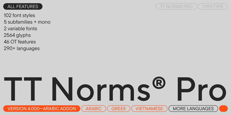
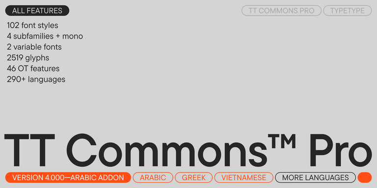
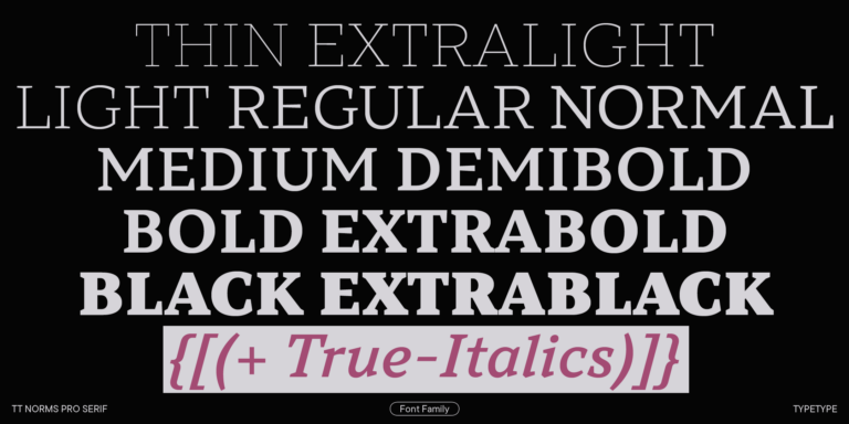
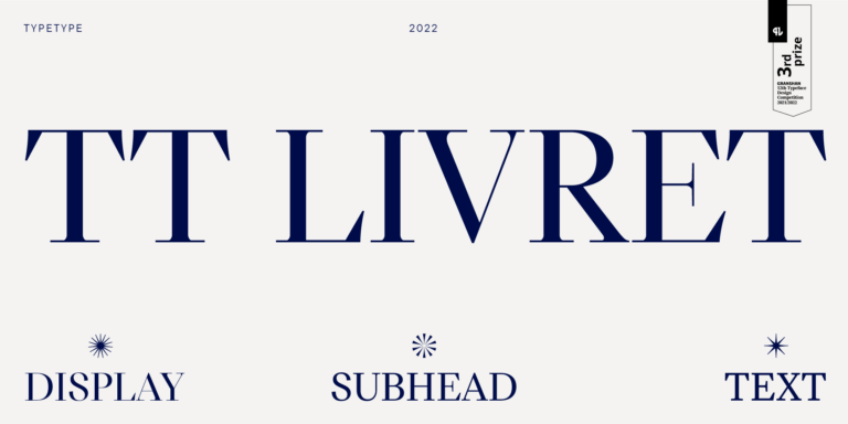
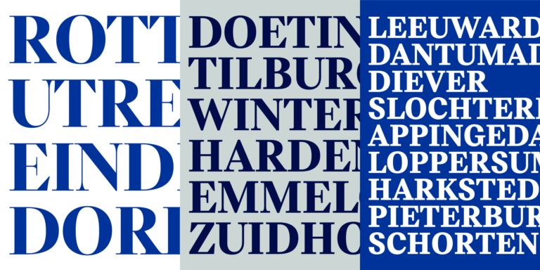
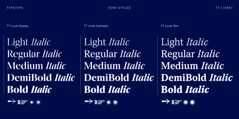
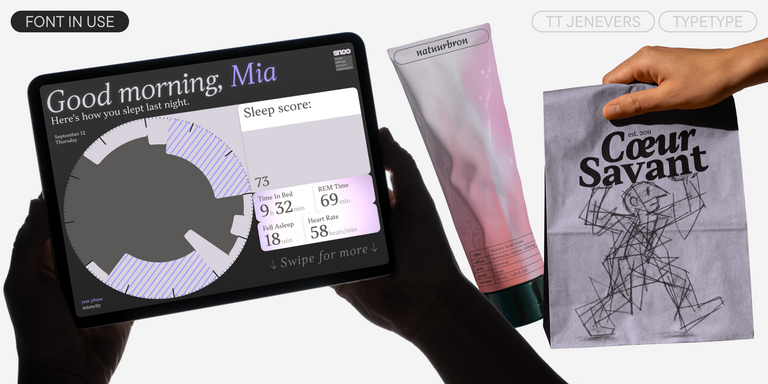
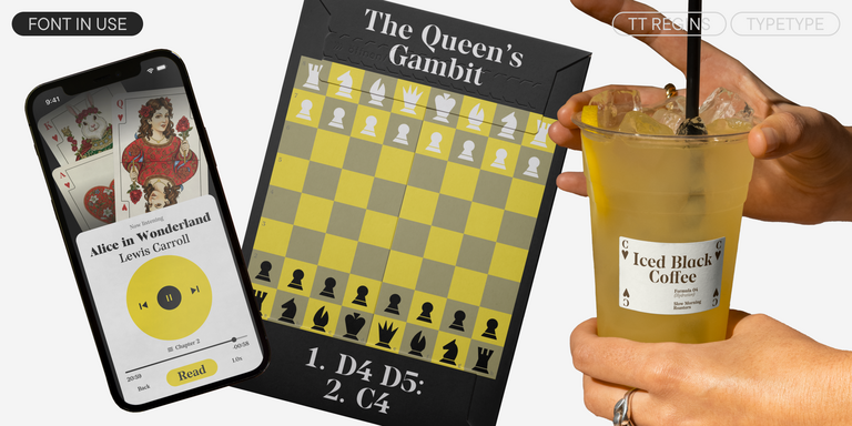
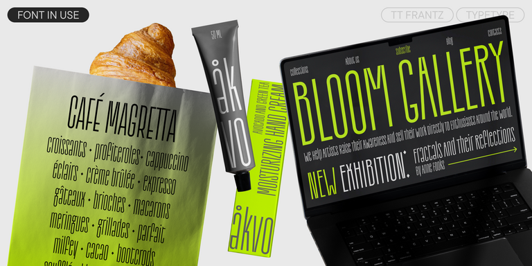
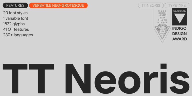
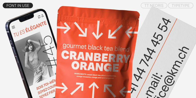
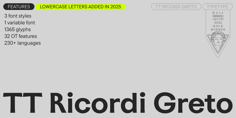
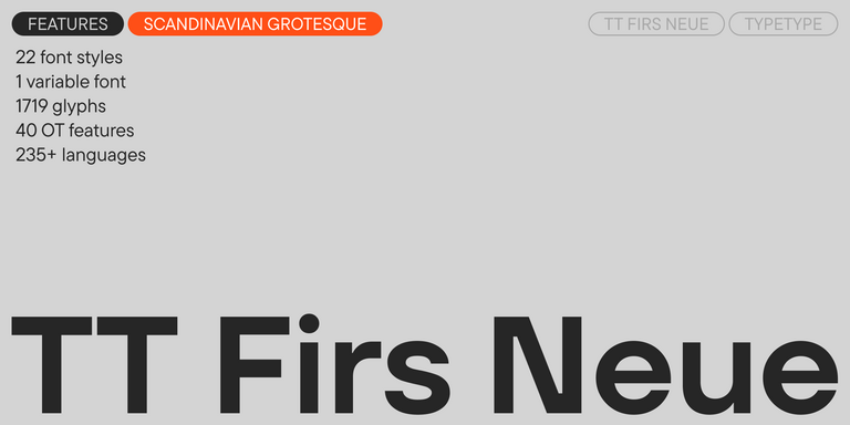
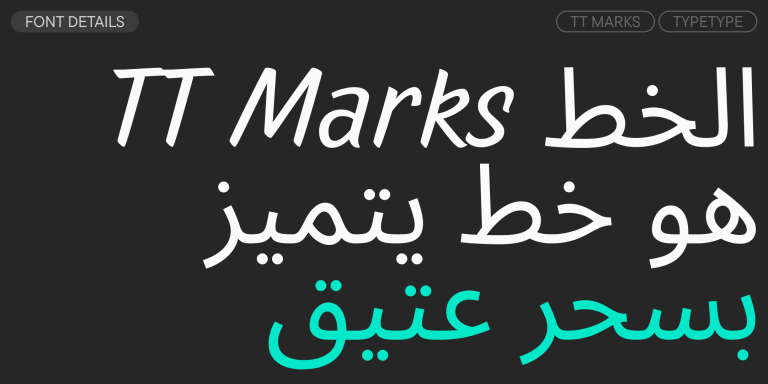
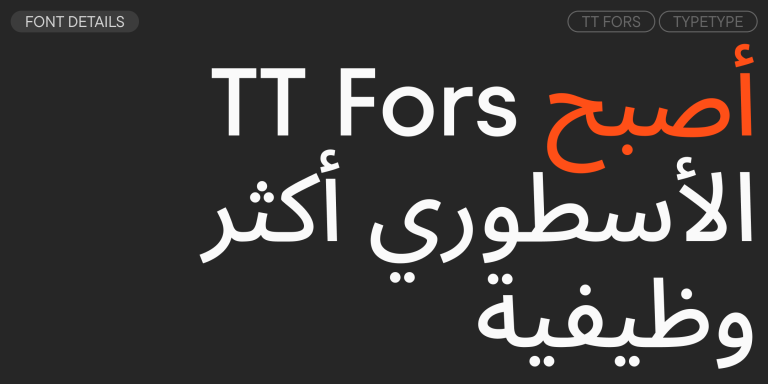
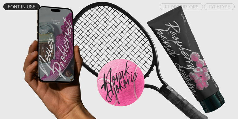
تحتوي المجموعة على خطوط عصرية وجذابة وعالية الجودة بأنماط وشخصيات واستخدامات متنوعة. من الخطوط بدون الذنابات المتعددة الاستخدامات إلى الخطوط ذات الذنابات التعبيرية، ومن خطوط النصوص المحايدة إلى خطوط العناوين الجذابة — الآلاف من الخيارات حيث ستجد ما يُكمل تصميم مشروعك.
قمنا بتوفير تنقل سهل وبديهي عبر الصفحات لتسهيل العثور على الفئات والأنماط المطلوبة من الخطوط. استخدم العلامات لاختيار الخطوط من بين الخيارات المقترحة التي تناسب احتياجاتك.
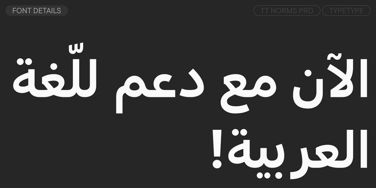
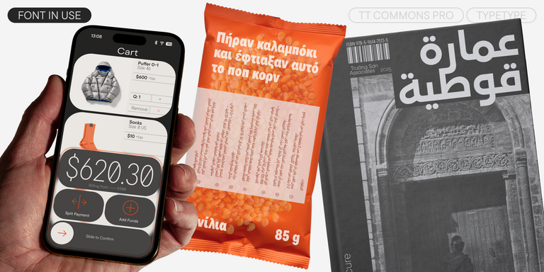
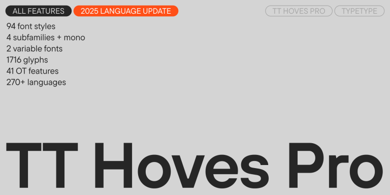
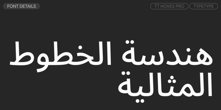
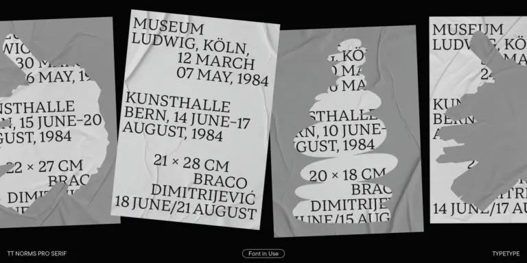
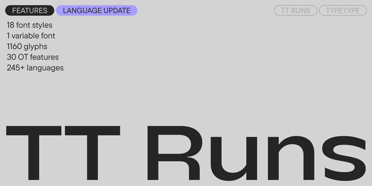
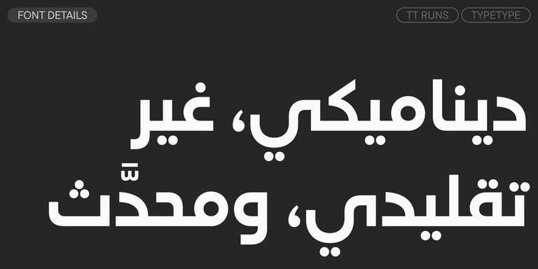
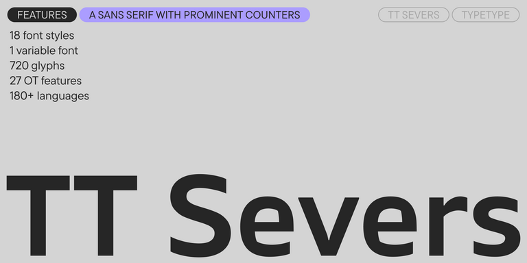
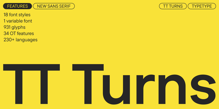
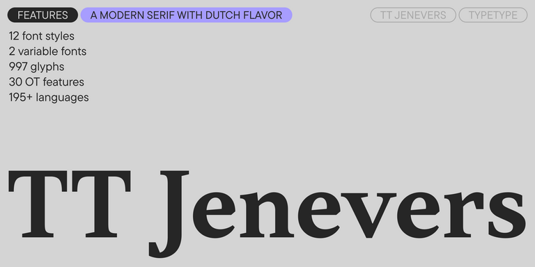
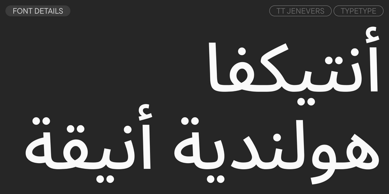
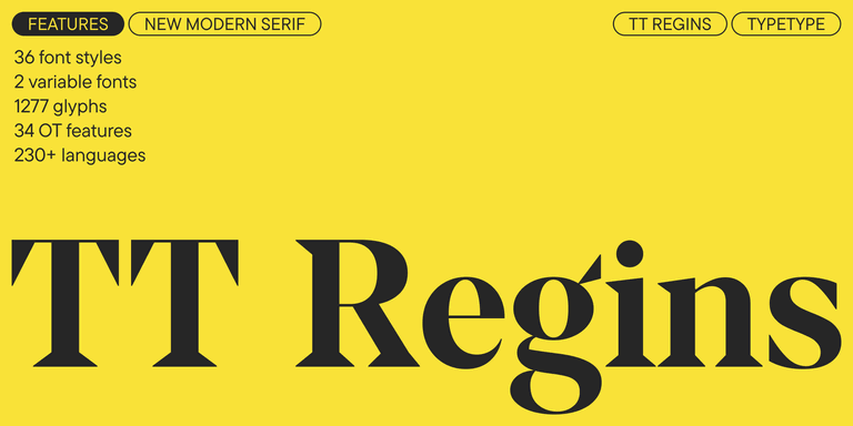
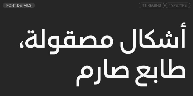
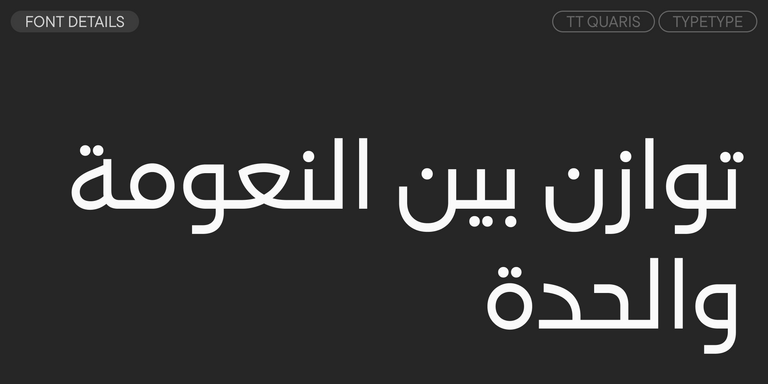
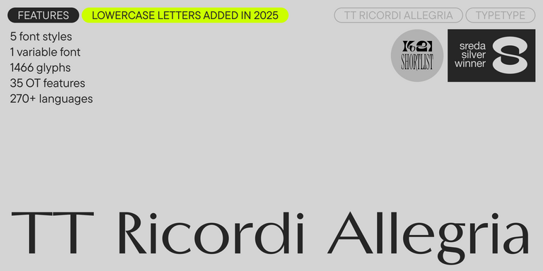
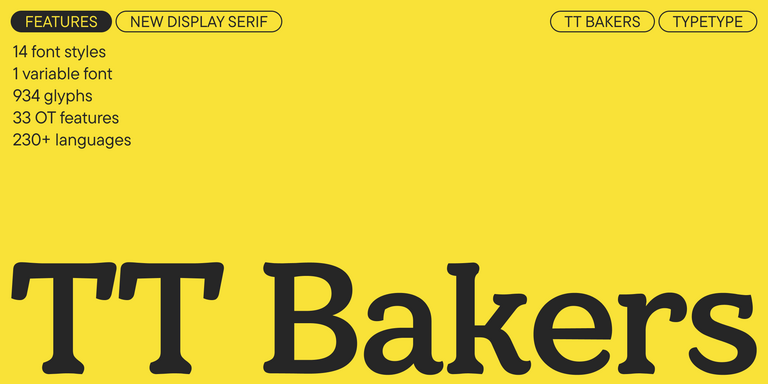
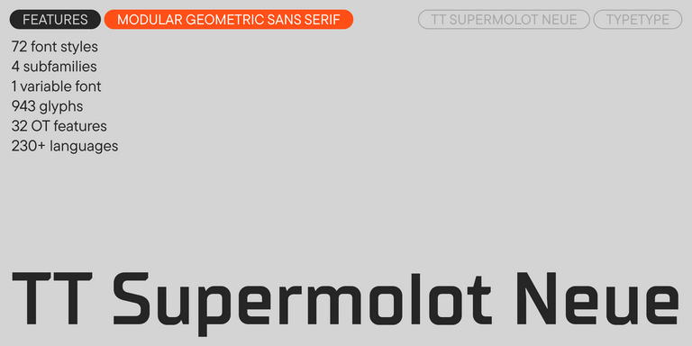
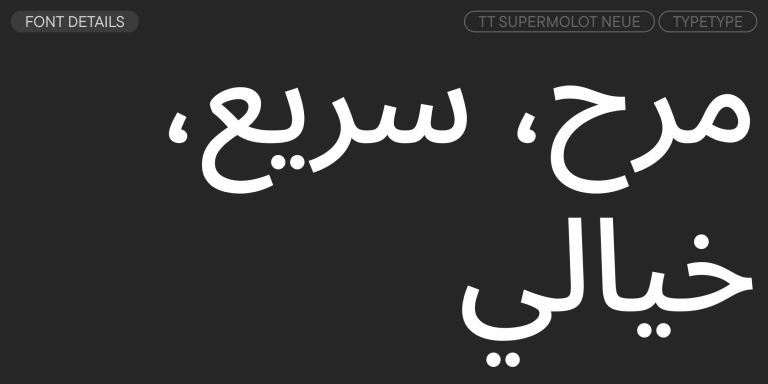
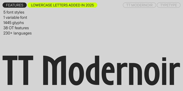
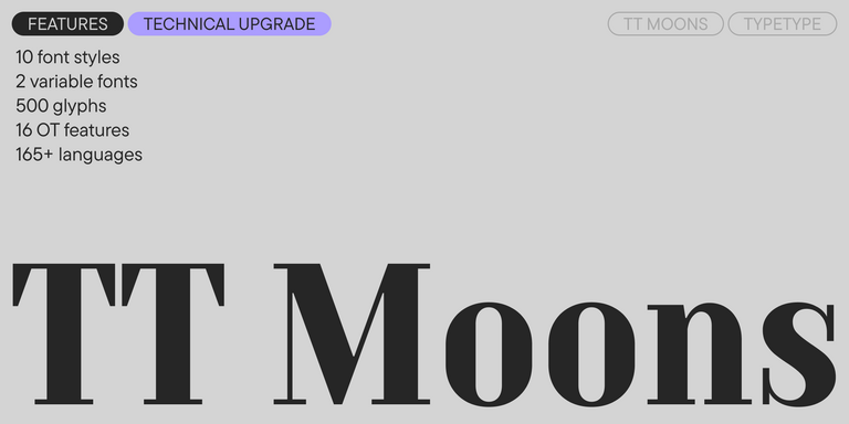
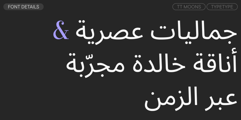
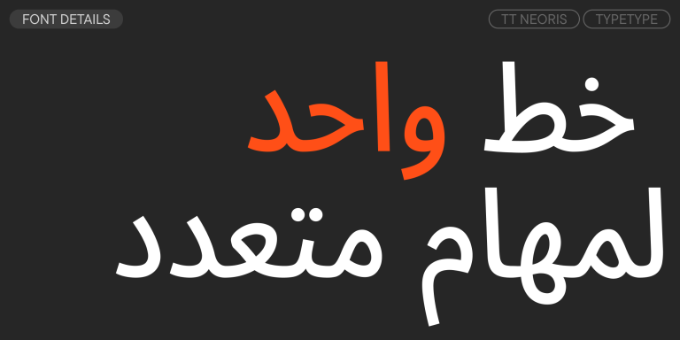
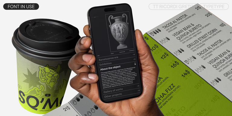
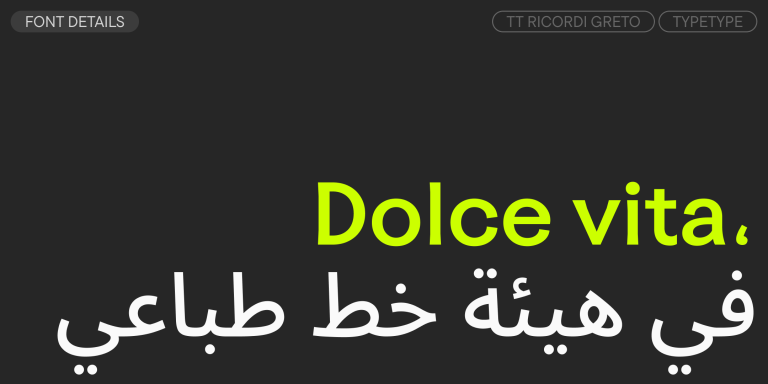
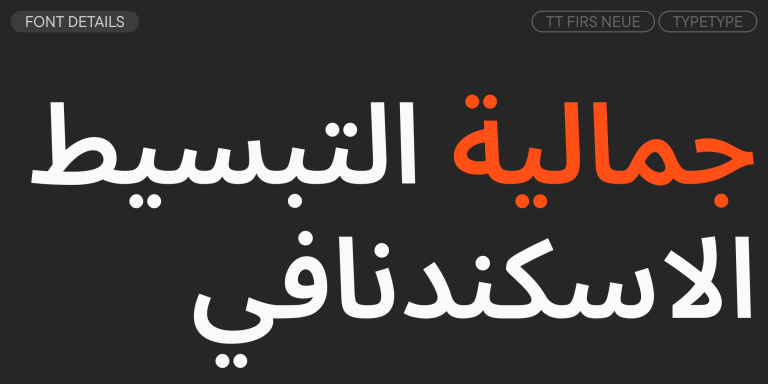
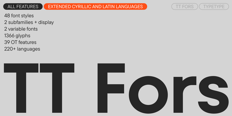
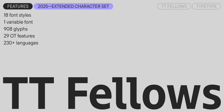
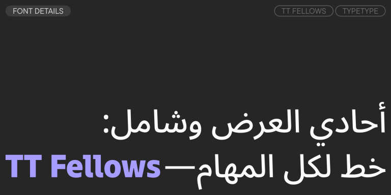
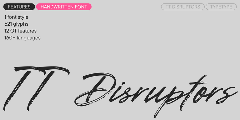
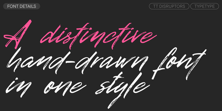
يدعم كل خط في المجموعة عددًا كبيرًا من اللغات والأحرف والرموز وميزات OpenType. تحتوي معظم الخطوط على أبجديات لاتينية وسيريلية مُوسعة بالإضافة إلى العديد من ميزات التوطين. بفضل تحسين العرض اليدوي وتعديل التباعد بين الأحرف، سيكون النص المكتوب بخطوطنا قابلاً للقراءة بشكل مثالي على أي جهاز، حتى في الأحجام الصغيرة.
بمجرد فتح عينة الخط، يمكنك استكشاف جميع أنماط وأوزان الخطوط المدرجة في عائلة الخطوط. عند اختيار التراخيص، يمكنك تحديد الأنماط التي تحتاجها أو شراء عائلة الخطوط كاملة.