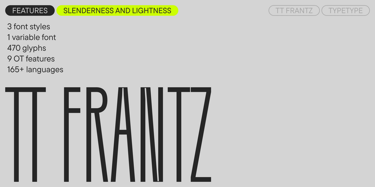
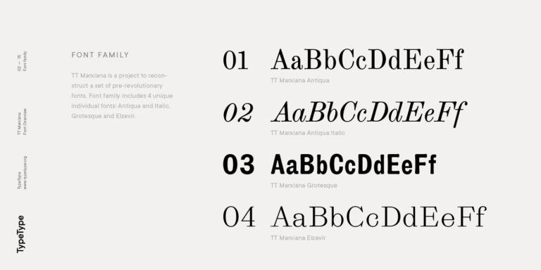
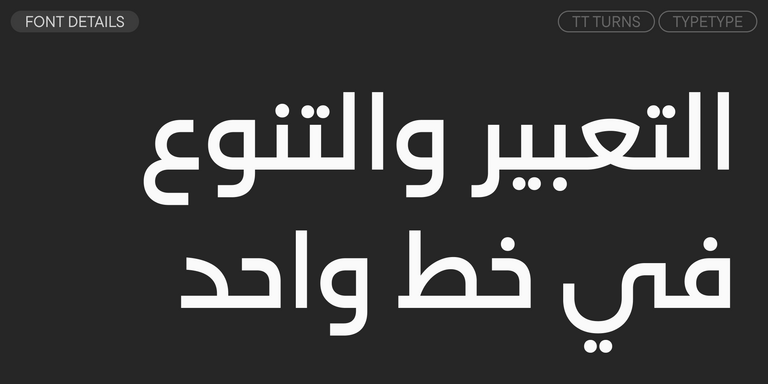
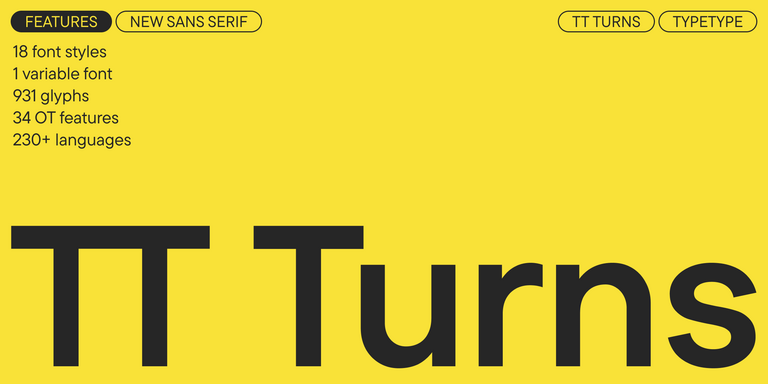
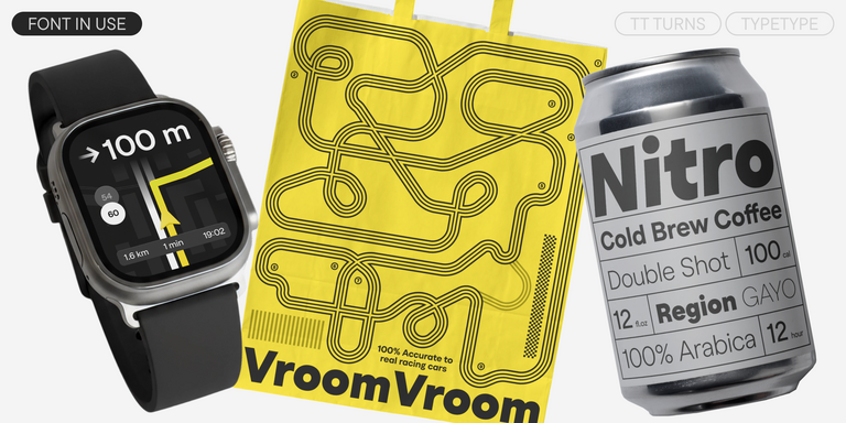
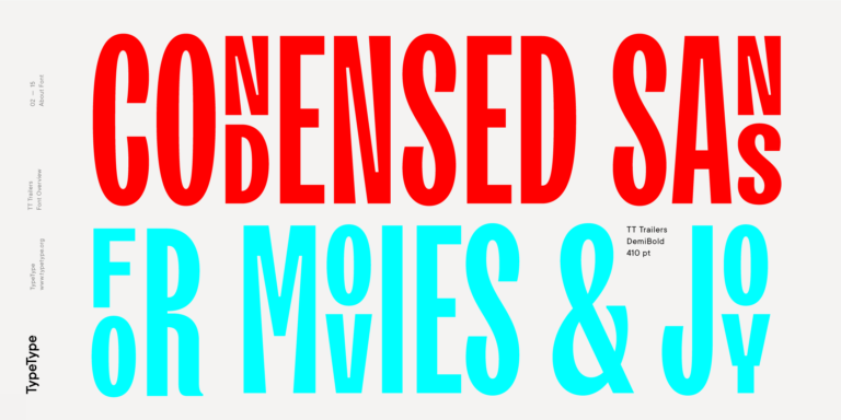
TT Turns is a striking geometric sans serif with expressive elements. This versatile font works exceptionally well for running text, while at large point sizes, it takes on a distinct display character.
المرحة خطوط
عندما يكون الهدف هو نقل مشاعر الفرح والعفوية، تأتي الخطوط المرحة لتؤدي هذا الدور — وهي خطوط تتميز بخطوطها "غير المثالية" عمدًا وتفاصيلها الشقية. في كتالوج TypeType، ستجد خيارات مثالية لتصميم عبوات الحلويات، وتترات الرسوم المتحركة، والتسويق الإيجابي، حيث تكتسب حتى الحروف السيريلية الصارمة طابعًا ودودًا ومبهجًا.
- جميع الخطوط 73
- بدون الذنابات 47
- مع الذنابات 27
- سلاب 6
- العرض 41
- مكتوبة بخط اليد 10
- متغيرة 47
- بيع الخطوط 11
إذا كنت تبحث عن أفضل المرحة الخطوط لتكمل تصميمك، فإن استوديو TypeType يوفر مجموعة واسعة من الخطوط المناسبة للأغراض التجارية. يمكنك العثور على الأنماط المحددة والعائلات الكاملة للخطوط على صفحتنا على الإنترنت: يمكنك الاختيار من بين مجموعة متنوعة من الخطوط المصممة بعناية والمُتحقق منها تقنيًا، واستخدمها مجانًا، وقدم طلبًا لشراء نوع الترخيص المناسب. يمنحك TypeType فرصة لتحميل الإصدارات التجريبية لجميع المرحة الخطوط لاستخدامها في مشاريعك، بالإضافة إلى الحصول على نصائح من فرق التصميم أو خدمة العملاء. لا تتردد في التواصل معنا عبر النموذج الموجود على موقعنا الإلكتروني.
- The quick brown fox jumps over a lazy dog.
- Pack my box with five dozen liquor jugs.
- Sphinx of black quartz, judge my vow
- 0123456789 !?.,:;—–()[]{}<> “quotes” ‘apostrophe’ @#%&*_+=/\| № $ € £ ₽ +−×÷=≠≤≥ … % © ® ™
- Aa Bb Cc Dd Ee Ff Gg Hh Ii Jj Kk Ll Mm Nn Oo Pp Qq Rr Ss Tt Uu Vv Ww Xx Yy Zz
TT FRANTZ IS AN EXPERIMENTAL VARIABLE FONT, DISTINGUISHED BY ITS SLIMNESS AND LIGHTNESS. THE VARIATION IN THE FONT AFFECTS THE CHANGE IN THE HEIGHT OF THE MEAN LINE—BY MOVING THE AXIS ADJUSTMENT SLIDER YOU CAN EASILY RAISE OR LOWER THE MEAN LINE OF THE FONT.
TT Modernoir is a display sans serif with dynamic proportions. Fluid lines and delicate Art Nouveau forms in this typeface blend seamlessly with the rhythmic flow and improvisational freedom of jazz.
TT Marks delivers a script with dynamic rhythm, heartfelt character, and nostalgic appeal inspired by the classic art of American sign painting. This craft, where skilled artists hand-painted storefront signage with brushes and careful technique, is experiencing a well-deserved renaissance in today’s design world.
The quick brown fox jumps over a lazy dog.
TT Ramillas is a fully reconsidered high contrast transitional serif, which is perfectly adapted to modern realities and requirements.
TT Gertika is a geometric sans serif with a dynamic character and a dancing rhythm. This font’s idea originates from the lettering featured on an American poster from the late 1930s.
TT Biersal is a display sans serif with a free-spirited, playful, and adventurous nature. The concept of this font was sparked by a German poster from the early 1930s.
TT Paplane is a squared-looking display sans serif.
TT Carvist—peculiar, playful, and courageous—this font does an excellent job of grabbing attention!
The starting point of the TT Trailers project was the idea to develop a new generation of narrow typefaces for use in movie credits and posters.
TT Marxiana Elzevir is a title or header font and is a compilation of monastic Elzevir that were actively used in the Niva magazine for all its prints.
TT Geekette is an experimental variable serif with friendly and flexible character of shapes.
TT Alientz is a variable typeface that allows the user to make a visual journey from an extraterrestrial grotesque to a very prickly display serif.
TT Backwards Sans is a narrow grotesque, which takes us back to the book design of late 70s and early 80s with its ductile characters.
TT Berlinerins is a grotesque inspired by the wood-type poster types of the first third of the 20th century is responsible for the historic component of Berlin.
The quick brown fox jumps over a lazy dog.
