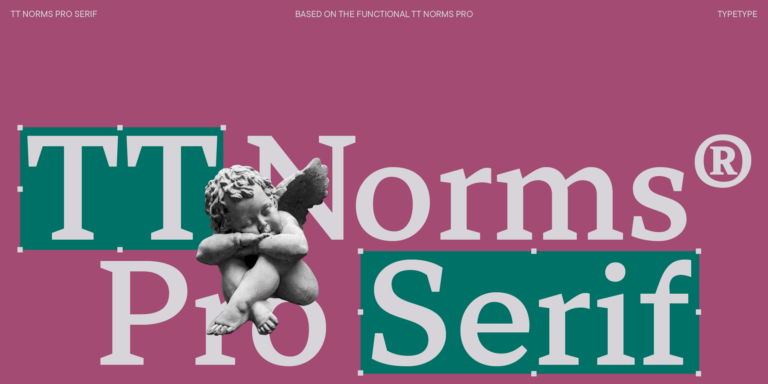
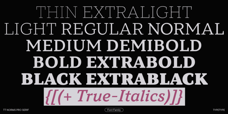
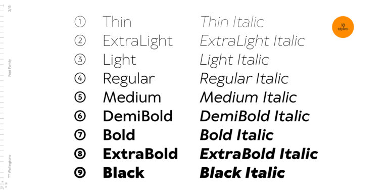
TT Norms® Pro
Regular
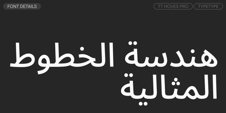
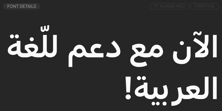
104 أنماط خط
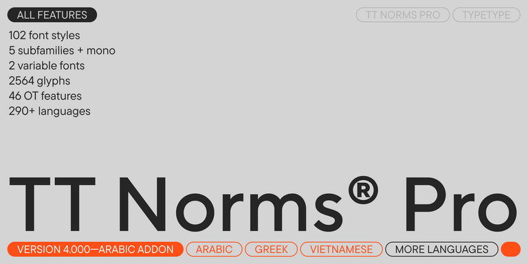

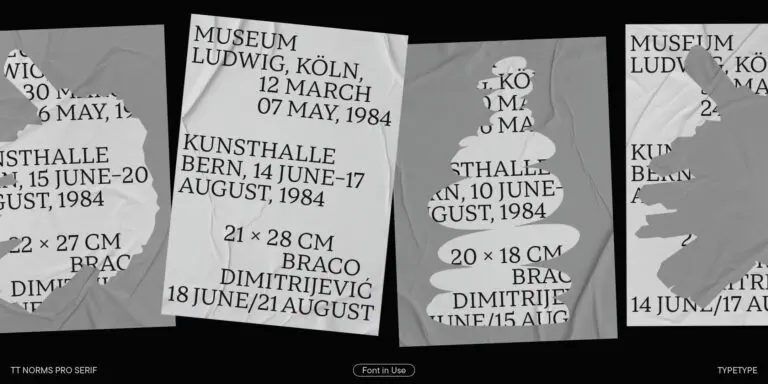
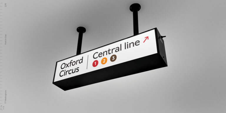
The bestseller TT Norms® Pro—a geometric sans serif, trouble-free workhorse