تعرّفوا على TT Frantz إصدار 1.010! لقد قمنا بتحديث مجموعة الرموز في خطّنا المستوحى من عناصر الآرت ديكو.
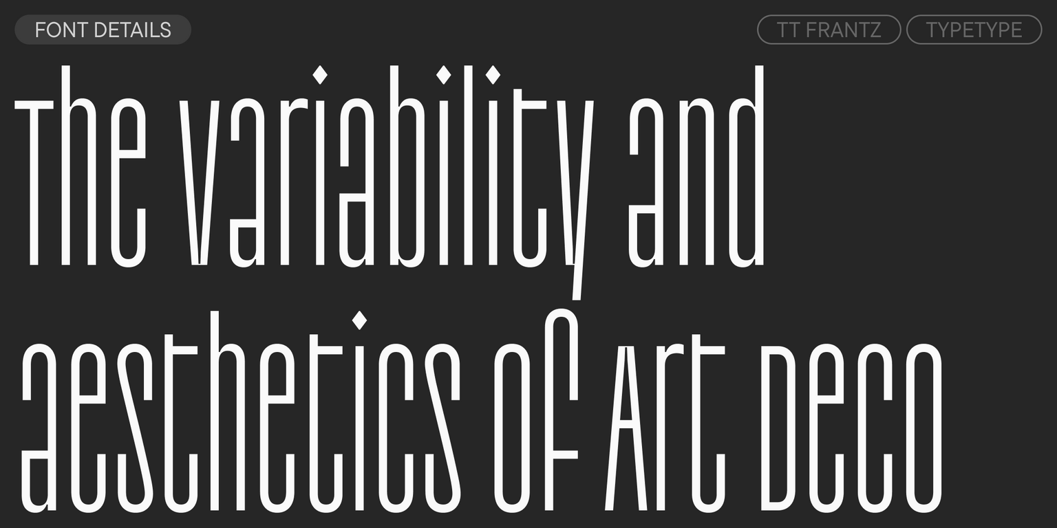
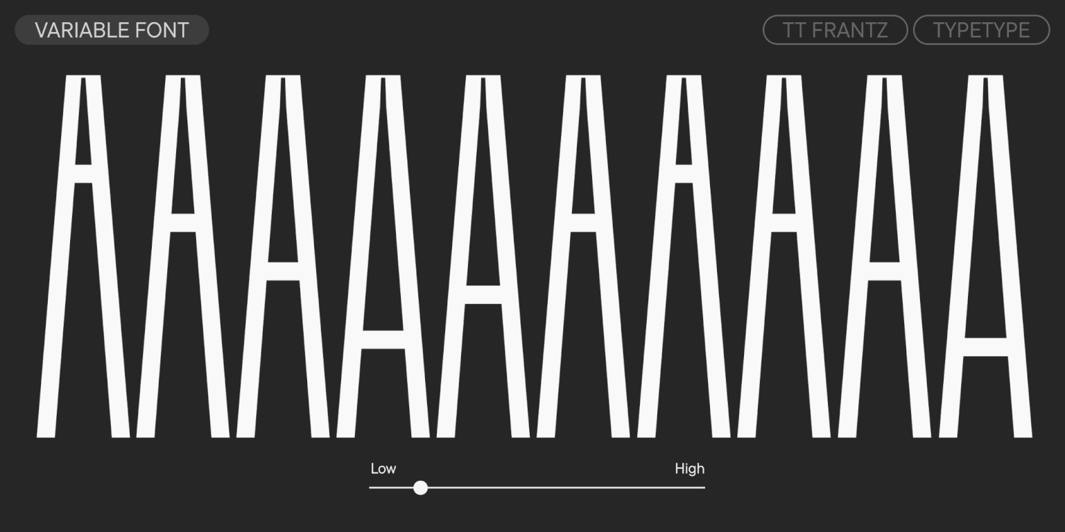
TT Frantz — خط غروتيسك تجريبي للعرض يتميز بتناسبات ضيقة. يمكن العثور فيه على إشارات طفيفة لأسلوب الآرت ديكو، والتي تظهر في الخصر المنخفض جدًا أو المرتفع جدًا للحروف. يمكنك تعديل ارتفاع الخط الأوسط بنفسك بفضل ميزة التغيّر. بالإضافة إلى ذلك، يتغير مستوى انغلاق الفتحات في بعض الحروف وفقًا لموضع مؤشر التحكم في المحور.
من أجل الحفاظ على الميزة الأساسية لخط TT Frantz — وهي تغيير ارتفاع الخط الأوسط — جعلنا ارتفاع الحروف الصغيرة والكبيرة متماثلًا، مع إبقاء بعض العناصر البارزة الصغيرة في الحروف الكبيرة. ومن المثير للاهتمام أن الحروف السيريلية «з»، «с»، «а»، «е» تمتلك نمطًا مختلفًا من التغيّر في الفتحات مقارنةً بنظيراتها اللاتينية.
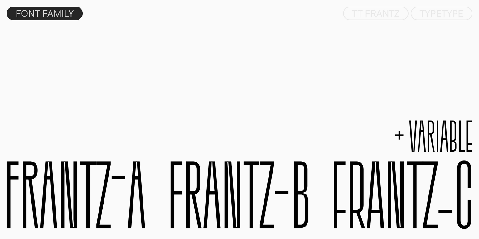
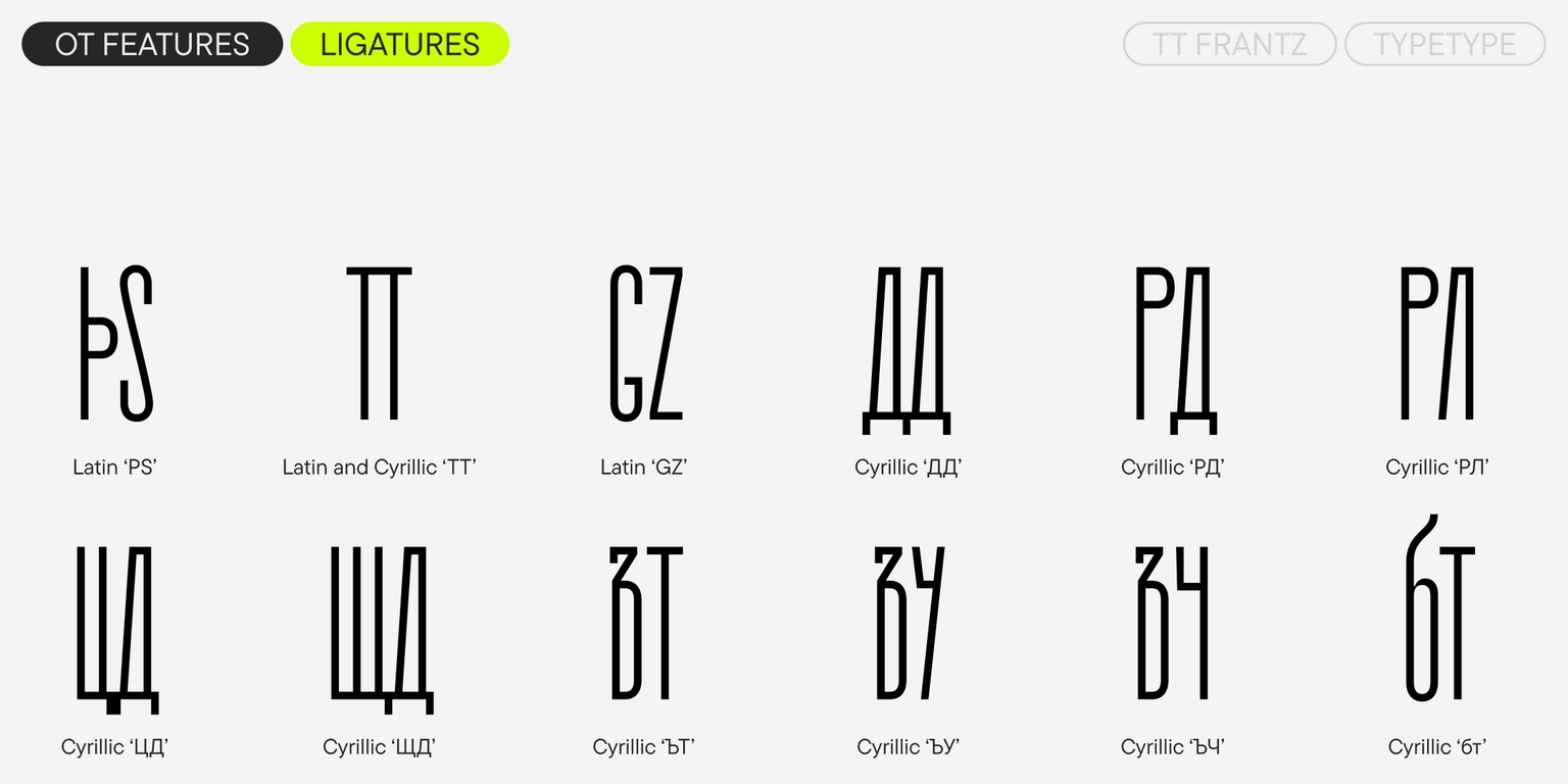
أثناء العمل على TT Frantz حرصنا على أن لا تتغير عرض الحروف عند تبديل درجات التغيّر، بحيث تظل نسب الخط محفوظة. كما أضفنا أيضًا روابط (Ligatures) وبدائل سياقية. وتتضمن العائلة ثلاثة أوزان ثابتة منفصلة (Frantz A, Frantz B, Frantz C) حيث يكون الخط الأوسط مثبتًا في موضع محدد (مرتفع، متوسط أو منخفض).
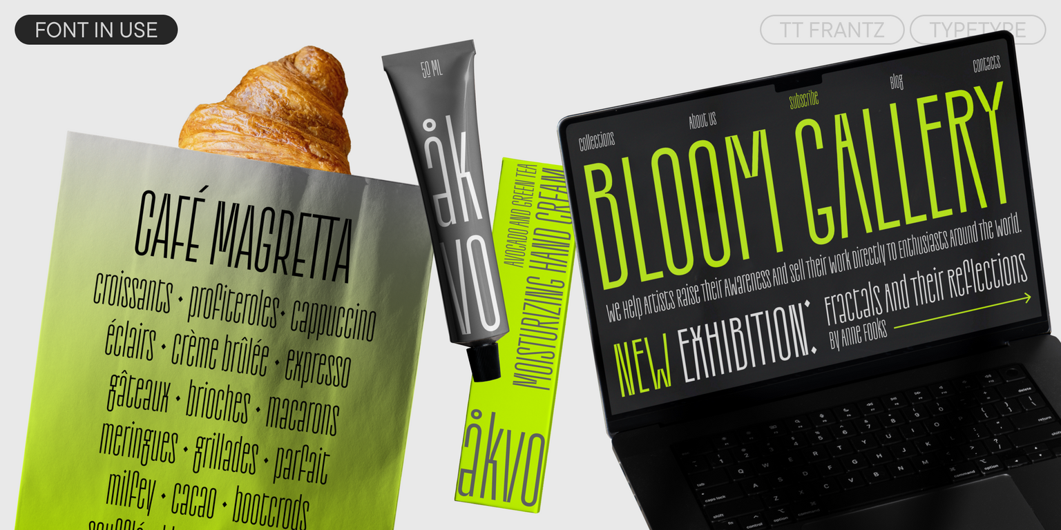
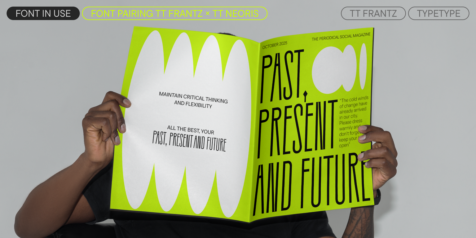
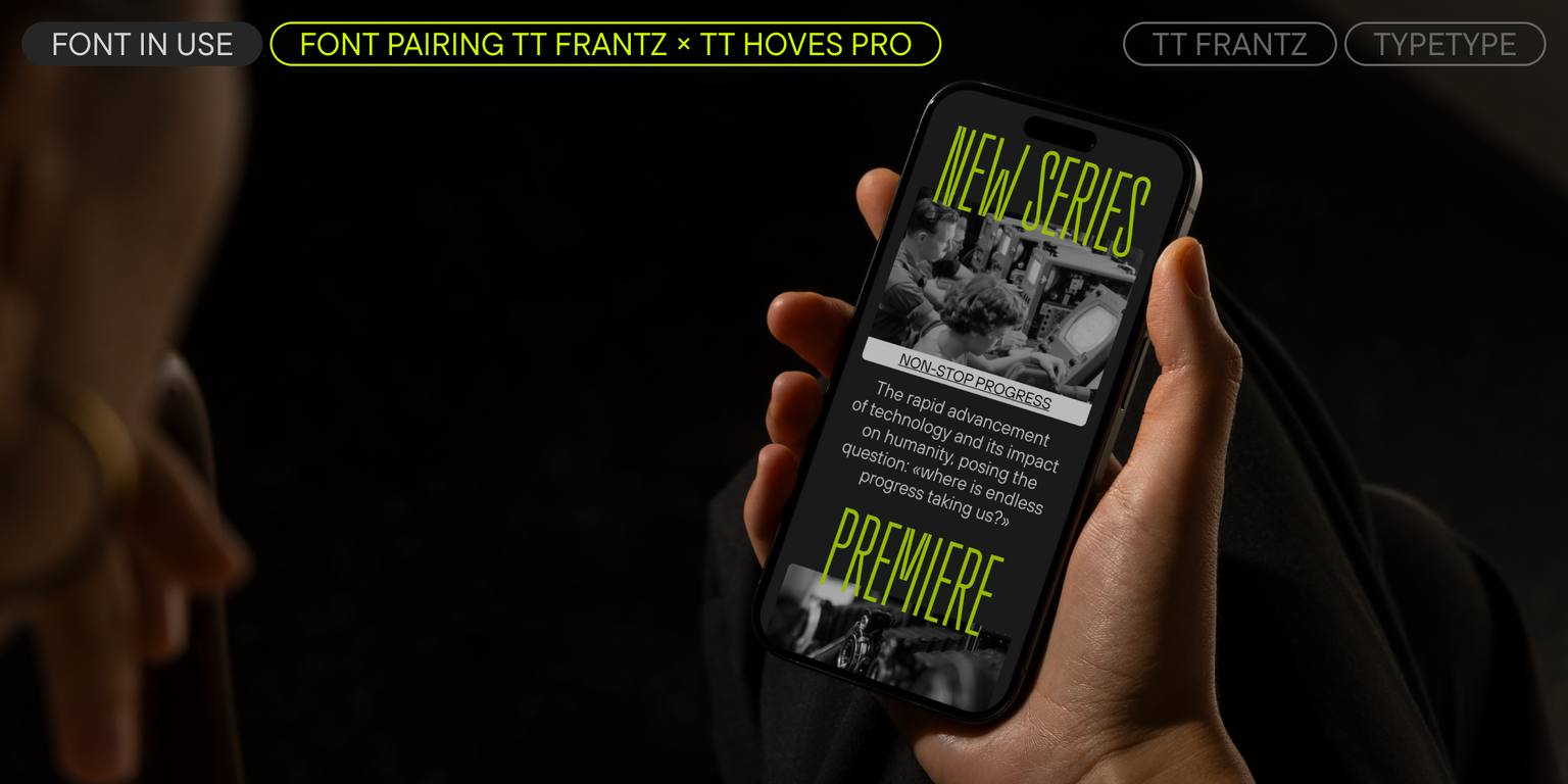
TT Frantz — خط زخرفي مناسب للاستخدام في الأحجام الكبيرة والمتوسطة. سيضفي سحرًا على أي مشروع: إذ سيبدو ملفتًا في تصميم عبوات مستحضرات التجميل والعطور، وعلى أغلفة مجلات الموضة والفن، وكذلك على ملصقات المسرحيات والمعارض الفنية.
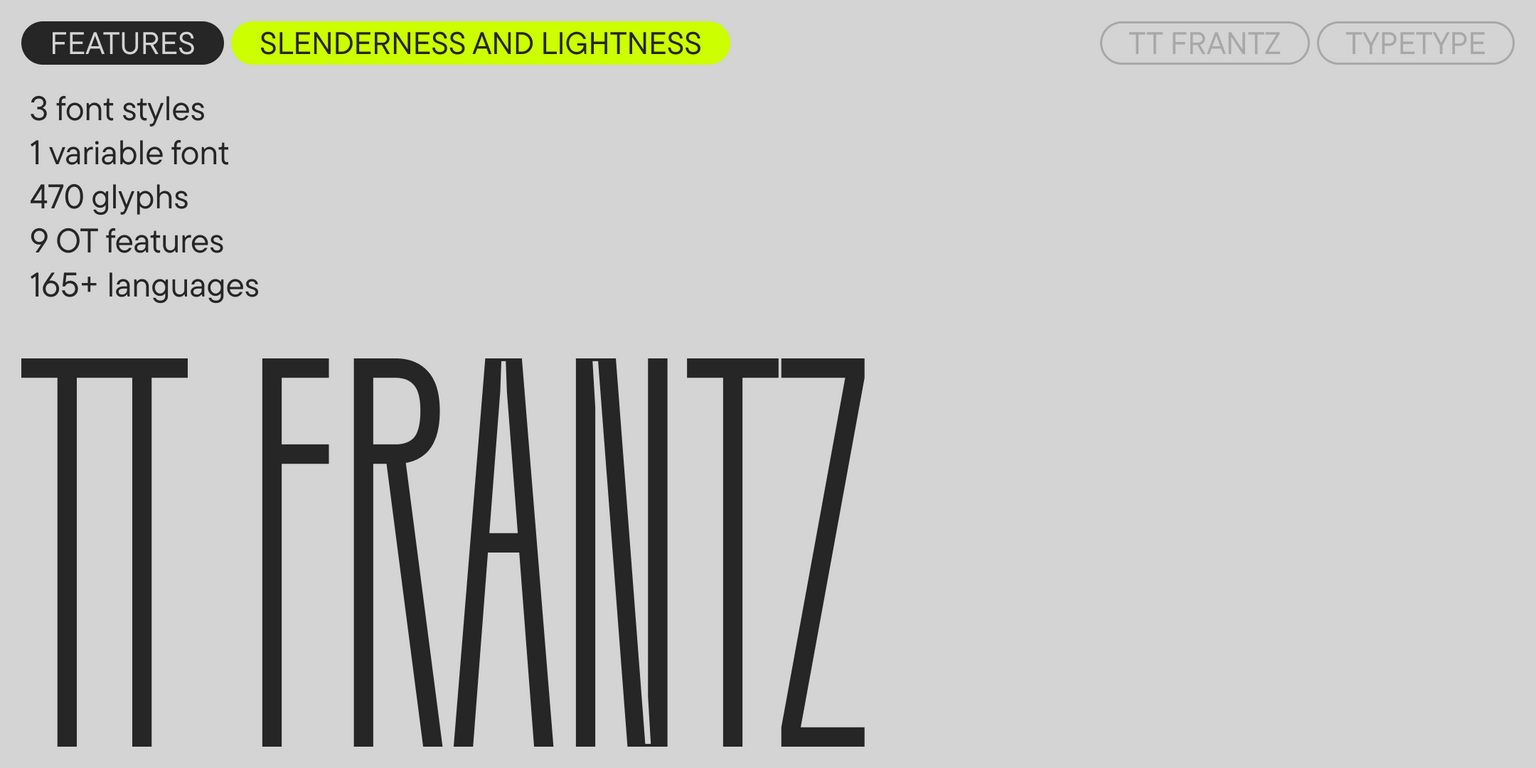
TT Frantz 1.010 — هو:
- 4 أوزان: 3 مستقيمة و خط 1 متغيّر؛
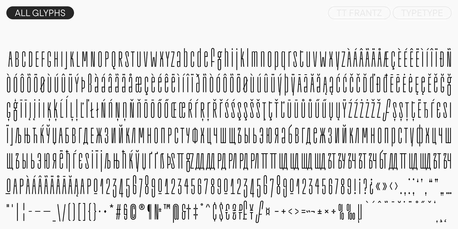
- 470 رمزًا في كل وزن؛
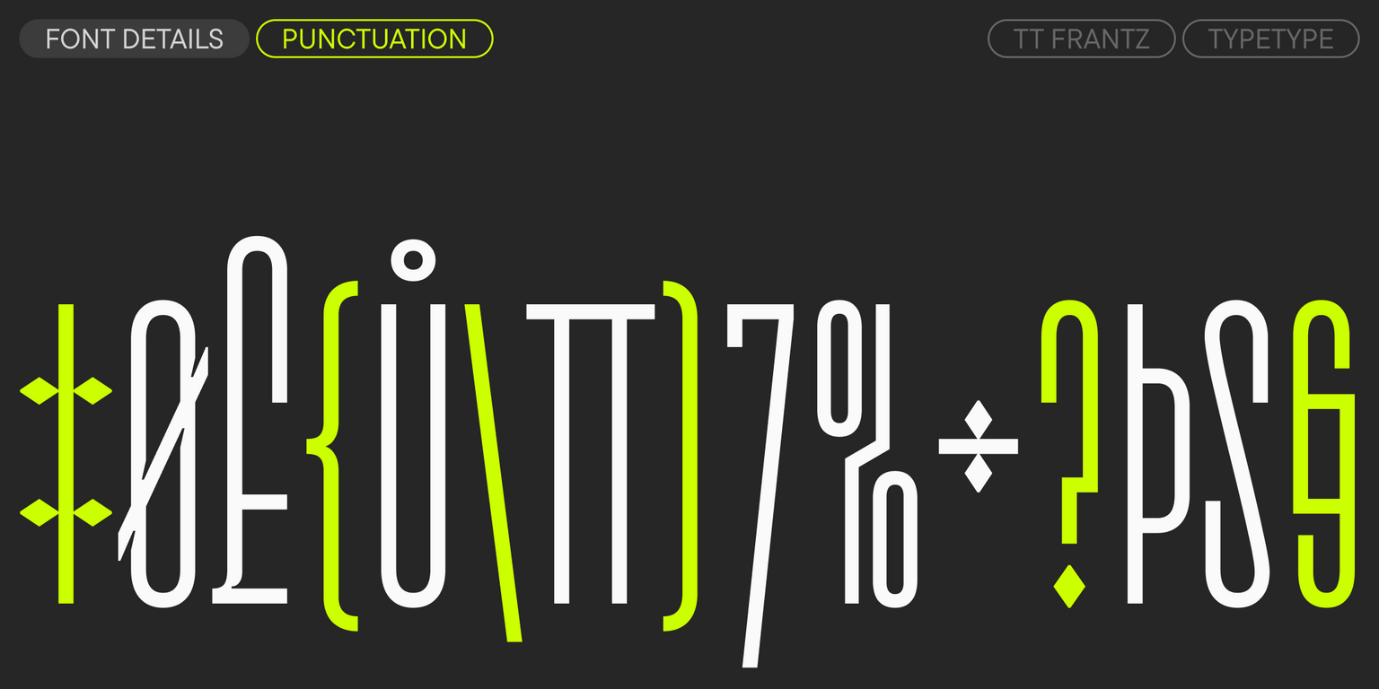
- 9 ميزات OpenType؛
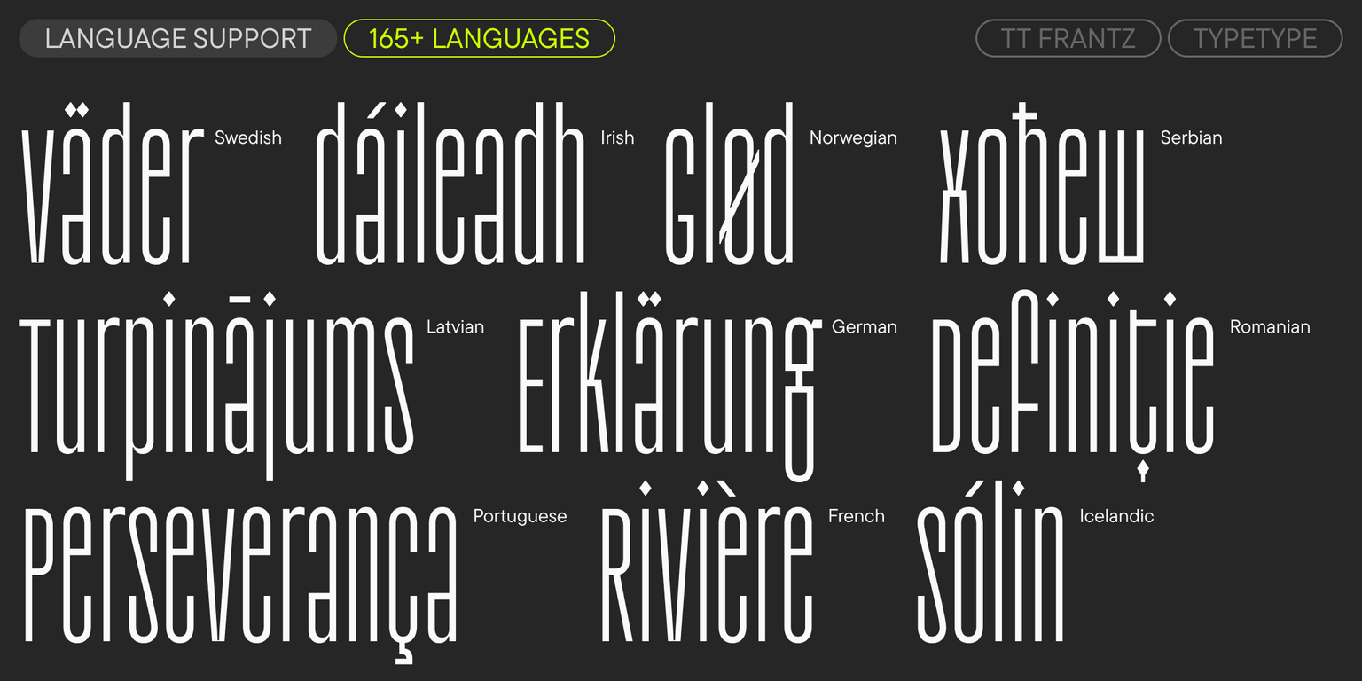
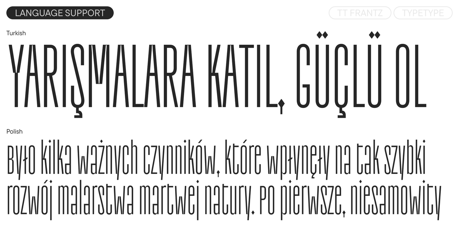
- دعم لـ 165 لغة.