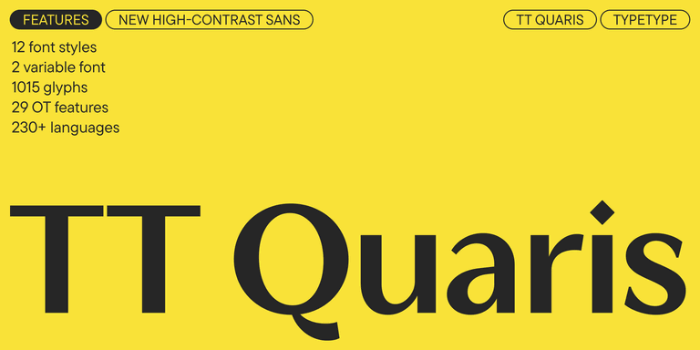
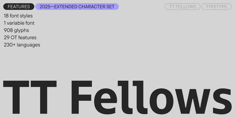
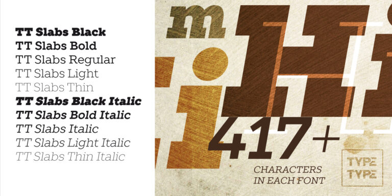
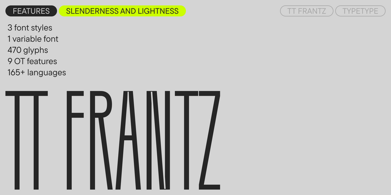
TT FRANTZ IS AN EXPERIMENTAL VARIABLE FONT, DISTINGUISHED BY ITS SLIMNESS AND LIGHTNESS. THE VARIATION IN THE FONT AFFECTS THE CHANGE IN THE HEIGHT OF THE MEAN LINE—BY MOVING THE AXIS ADJUSTMENT SLIDER YOU CAN EASILY RAISE OR LOWER THE MEAN LINE OF THE FONT.
الغريبة خطوط
النصوص التي تحتوي على تجارب جريئة في الطباعة تكسر التصورات التقليدية عن شكل الحروف والرموز. تصميم الخطوط الغريبة يتوازن على حافة الفن والوظيفية: من التواءات نفسية إلى تشوهات غروتيسكية. تقدم TypeType خطوطًا غير تقليدية حيث يتحدى كل عنصر التقاليد، بينما يظل أداة عملية للمصممين. هذه الخطوط لا تنقل النصوص فحسب، بل تخلق أيضًا تأثيرًا بصريًا قويًا، مما يحوّل أي رسالة إلى عمل فني.
- جميع الخطوط 73
- بدون الذنابات 47
- مع الذنابات 27
- سلاب 6
- العرض 41
- مكتوبة بخط اليد 10
- متغيرة 47
- بيع الخطوط 11
إذا كنت تبحث عن أفضل الغريبة الخطوط لتكمل تصميمك، فإن استوديو TypeType يوفر مجموعة واسعة من الخطوط المناسبة للأغراض التجارية. يمكنك العثور على الأنماط المحددة والعائلات الكاملة للخطوط على صفحتنا على الإنترنت: يمكنك الاختيار من بين مجموعة متنوعة من الخطوط المصممة بعناية والمُتحقق منها تقنيًا، واستخدمها مجانًا، وقدم طلبًا لشراء نوع الترخيص المناسب. يمنحك TypeType فرصة لتحميل الإصدارات التجريبية لجميع الغريبة الخطوط لاستخدامها في مشاريعك، بالإضافة إلى الحصول على نصائح من فرق التصميم أو خدمة العملاء. لا تتردد في التواصل معنا عبر النموذج الموجود على موقعنا الإلكتروني.
- The quick brown fox jumps over a lazy dog.
- Pack my box with five dozen liquor jugs.
- Sphinx of black quartz, judge my vow
- 0123456789 !?.,:;—–()[]{}<> “quotes” ‘apostrophe’ @#%&*_+=/\| № $ € £ ₽ +−×÷=≠≤≥ … % © ® ™
- Aa Bb Cc Dd Ee Ff Gg Hh Ii Jj Kk Ll Mm Nn Oo Pp Qq Rr Ss Tt Uu Vv Ww Xx Yy Zz
TT Quaris is an exquisite, modern high-contrast sans whose design balances between soft and sharp. The glyph shapes in the font are fluid and tend towards roundness, yet there are also sharp elements.
TT Bakers is a fluid serif with a gentle and lively character. This font is like freshly baked goods: it’s warm and soft, especially in its bolder weights.
TT Modernoir is a display sans serif with dynamic proportions. Fluid lines and delicate Art Nouveau forms in this typeface blend seamlessly with the rhythmic flow and improvisational freedom of jazz.
TT Fellows is a humanist sans serif with a mechanical touch.
TT Gertika is a geometric sans serif with a dynamic character and a dancing rhythm. This font’s idea originates from the lettering featured on an American poster from the late 1930s.
TT Biersal is a display sans serif with a free-spirited, playful, and adventurous nature. The concept of this font was sparked by a German poster from the early 1930s.
TT Paplane is a squared-looking display sans serif.
TT Carvist—peculiar, playful, and courageous—this font does an excellent job of grabbing attention!
TT Espina is a display antiqua with expressive serifs
TT Rounds Neue soft, friendly, rounded sans serif fontfamily
The starting point of the TT Trailers project was the idea to develop a new generation of narrow typefaces for use in movie credits and posters.
TT Autonomous is a modern techno sans serif with wide angular proportions.
The TT Tsars font family is a collection of serif display fonts that are stylized to resemble the fonts of the beginning, the middle, and the end of the XVIII century.
TT Bricks is the answer for lovers of Soviet culture. We’ve tried going back a hundred years and rethinking the constructivist era.
TT Slabs. Slab serif, also called «square serif». They originate shortly after the Industrial Revolution (1850), when the advertising industry began to grow.
