ttgertika
Página principalBlogCambio de tamaño de glifos en TT Commons™ Classic

Cambio de tamaño de glifos en TT Commons™ Classic

Cambio de tamaño de glifos en TT Commons™ Classic

The educational project PluralSight from the USA is created to develop technical skills and make them accessible, understandable and democratic.

PluralSight has asked TypeType for trial versions of the TT Commons™ Classic and TT Interphases fonts to choose a suitable one. They were attracted by TT Commons™ Classic, but the non-standard size of glyphs made the font unsuitable for several directions.

The TypeType team suggested customizing the font so that the company could use an ideal version of TT Commons™ Classic in their projects.

In the discussion, a number of tasks to solve were defined:

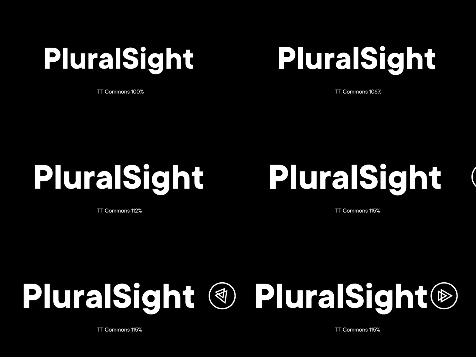
  • scaling TT Commons™ Classic up to 115%, that is, to increase the size of glyphs;
  • changing the Line Height parameter for correct display of enlarged glyphs;
  • carrying out manual hinting so that the ways to use TT Commons™ Classic for PluralSight become almost unlimited;
  • adding the project logos to the TT Commons™ Classic font files;
  • changing the original name of the font to PS TT Commons™ Classic.

Upon approval, TypeType’s designers and technical specialists set off to work.

As a result, we changed the font size parameters and the line height to those that met PluralSight’s demands. Next we carried out manual hinting of the font so that the characters are impeccably displayed in all areas of use.

Cambio de tamaño de glifos en TT Commons™ Classic
Changes of the font size parameters and the line height
Cambio de tamaño de glifos en TT Commons™ Classic
Drawing and adding company logos to the font

As a result, we got an updated version of the font called PS TT Commons™ Classic, suitable for use in all PluralSight communications. Regardless of the altered glyph size, the font maintained its neutrality, simplicity and ease of use in different forms.

Últimas publicaciones

Las Mejores Fuentes Cursivas de 2024: Una Guía Completa de Diseño

Las Mejores Fuentes Cursivas de 2024: Una Guía Completa de Diseño

Las fuentes cursivas son una herramienta de diseño poderosa que puede realzar tus proyectos visuales cuando se usan de manera reflexiva. Sin embargo, la clave está en saber aplicarlas de forma efectiva y adecuada. En esta guía integral, exploraremos el mundo de las fuentes cursivas.

Buscar etiqueta
Cómo Elegir las Mejores Fuentes para Infografías: Guía Completa

Cómo Elegir las Mejores Fuentes para Infografías: Guía Completa

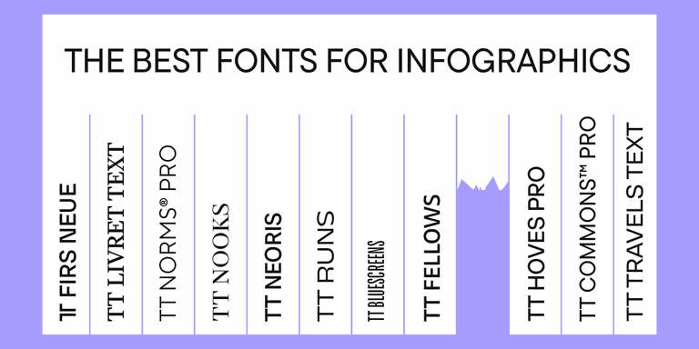
Las infografías son una herramienta versátil y práctica que encuentra aplicación en todas partes: negocios, publicidad, ciencia, periodismo y más. Es una forma poderosa de comunicar información de manera simple y visual.

Buscar etiqueta
Las 10 principales tendencias tipográficas de 2024

Las 10 principales tendencias tipográficas de 2024

Do you want to keep your typography up-to-date and create genuinely inspiring projects? Experts and designers from the TypeType font studio are excited to share the key type trends of 2024 with you in this article. Stay trendy!

Buscar etiqueta
Las 15 mejores fuentes para revistas

Las 15 mejores fuentes para revistas

Las revistas son el lienzo perfecto sobre el que la tipografía puede revelar todas sus facetas. La fuente aquí no sólo transmite información al lector, sino que también influye directamente en el diseño. Transmite el mensaje de la revista, transmite valores e ideas. Este artículo habló sobre cómo elegir la mejor fuente para revistas y compiló una selección de 15 opciones actuales para publicaciones sobre diversos temas.

Buscar etiqueta
UniversiTTy: Lección 9. Caracteres en mayúsculas. Refinamiento detallado de contornos

UniversiTTy: Lección 9. Caracteres en mayúsculas. Refinamiento detallado de contornos

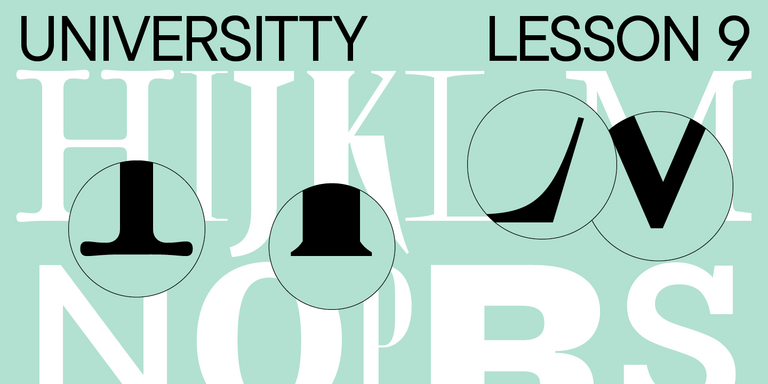
Welcome to the ninth lesson of our «UniversiTTy»! In this series, we guide you through the process of font design step by step. The font is a cohesive visual system. This can be seen on all levels: global (font type, weight, proportions, contrast, general forms) and at lower scales that encompass all graphic choices in individual characters. Let’s find out together how visual details influence the overall perception of fonts.

Buscar etiqueta
Las 15 mejores fuentes de contorno aprobadas por diseñadores en 2024

Las 15 mejores fuentes de contorno aprobadas por diseñadores en 2024

Las fuentes de contorno son una excelente manera de agregar variedad a su diseño y hacerlo atractivo y llamativo. ¿Qué son, dónde se utilizan y qué estilos de fuente se combinan con ellas? Hablamos de todo esto en nuestro artículo y también seleccionamos las mejores fuentes de contorno para varios proyectos.

Buscar etiqueta
Las 10 mejores fuentes para diseños de carteles

Las 10 mejores fuentes para diseños de carteles

Elegir la fuente adecuada para un proyecto es una tarea seria para un diseñador. ¿Cómo encontrar la mejor fuente entre muchas opciones y en qué criterios confiar a la hora de elegir? Te lo contamos en este artículo.

Buscar etiqueta
UniversiTTy: Lesson 8. Designing Basic Latin Characters. Uppercase characters

UniversiTTy: Lesson 8. Designing Basic Latin Characters. Uppercase characters

Welcome to lesson number 8 of our «UniversiTTy» series! Last time, we covered optical compensation, uppercase and lowercase character heights, and the concept of contrast. In this article, we will finally focus on glyph design specifically.

Buscar etiqueta
Cómo elegir una fuente: la guía definitiva para el diseñador

Cómo elegir una fuente: la guía definitiva para el diseñador

La fuente es uno de los elementos de diseño más importantes. Con su ayuda, puede enfatizar, complementar o incluso crear el ambiente del proyecto, colocar acentos y transmitir la información necesaria al usuario. ¿Cómo encontrar la mejor fuente entre muchas opciones y en qué criterios confiar a la hora de elegir? Te lo contamos en este artículo.

Buscar etiqueta

Buscar etiqueta

Sugerencias de fuentes: desde los primeros desarrollos hasta el uso en la práctica

Sugerencias de fuentes: desde los primeros desarrollos hasta el uso en la práctica

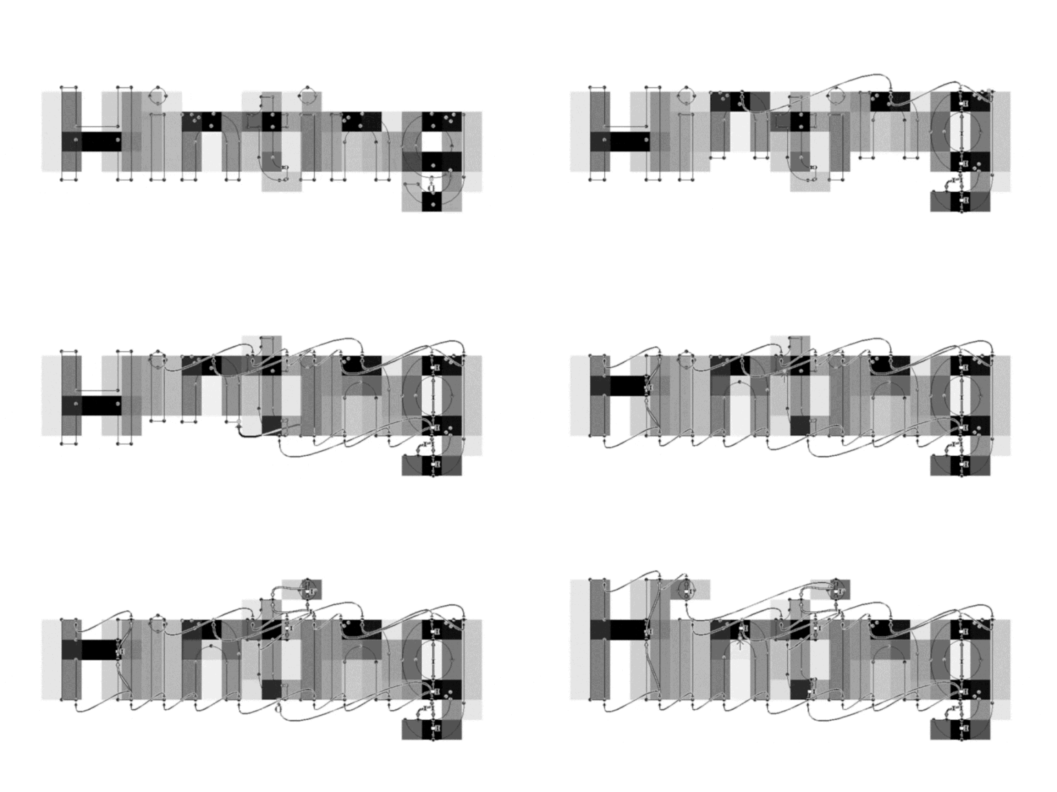
In this article, we will tell you the history of font hinting development. We will share our own experience of working with fonts and explain what tasks hinting solves.

Buscar etiqueta
Desactivación de ligaduras en TT Norms® Pro

Desactivación de ligaduras en TT Norms® Pro

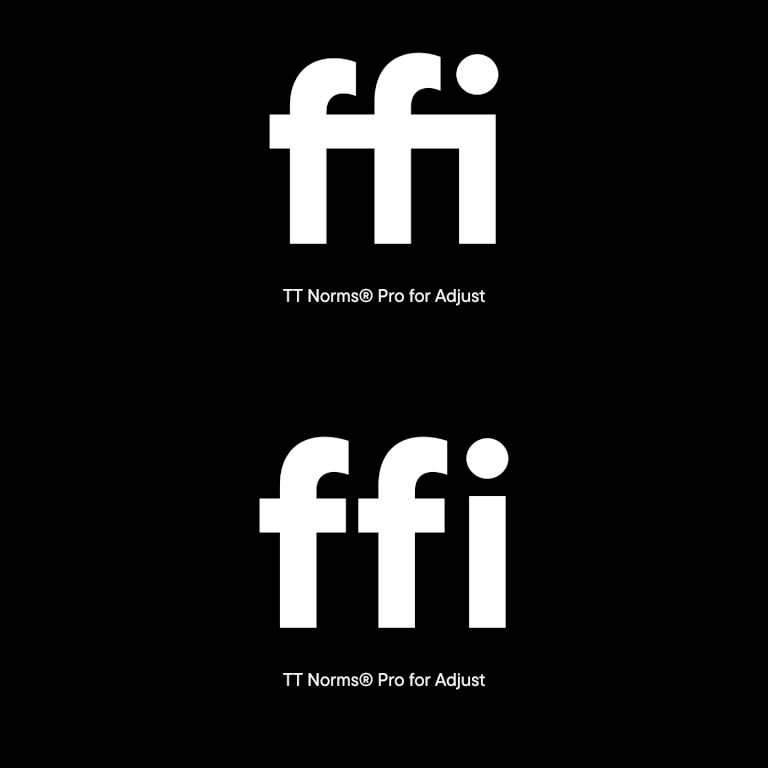
The German marketing analytics platform Adjust has addressed TypeType with a request to customize the TT Norms® Pro font. Adjust provides services for company development all around the world.

Buscar etiqueta
Creación de TT Marxiana

Creación de TT Marxiana

TT Marxiana is a pre-revolutionary font reconstruction project. These fonts were used in the layout of the “Niva” (nee-vah, “Cultivated field”) magazine published by the A. F. Marx publishing house in Saint Petersburg. In our project we decided to focus on a very specific set of fonts that were used in preparation and printing of the “Niva” magazine in 1887 — Antiqua, Antiqua Italic, Grotesque, and the Elzevir.

Buscar etiqueta
Creación de TT Interphases

Creación de TT Interphases

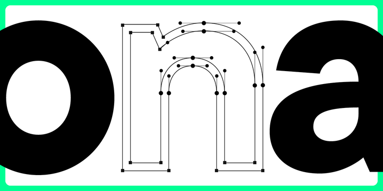
We decided to try to tell you about the creation of a complex font family TT Interphases at independent font foundry. We hope you enjoy our story and discover something interesting and new.

Buscar etiqueta