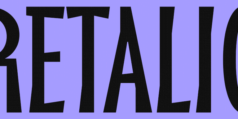


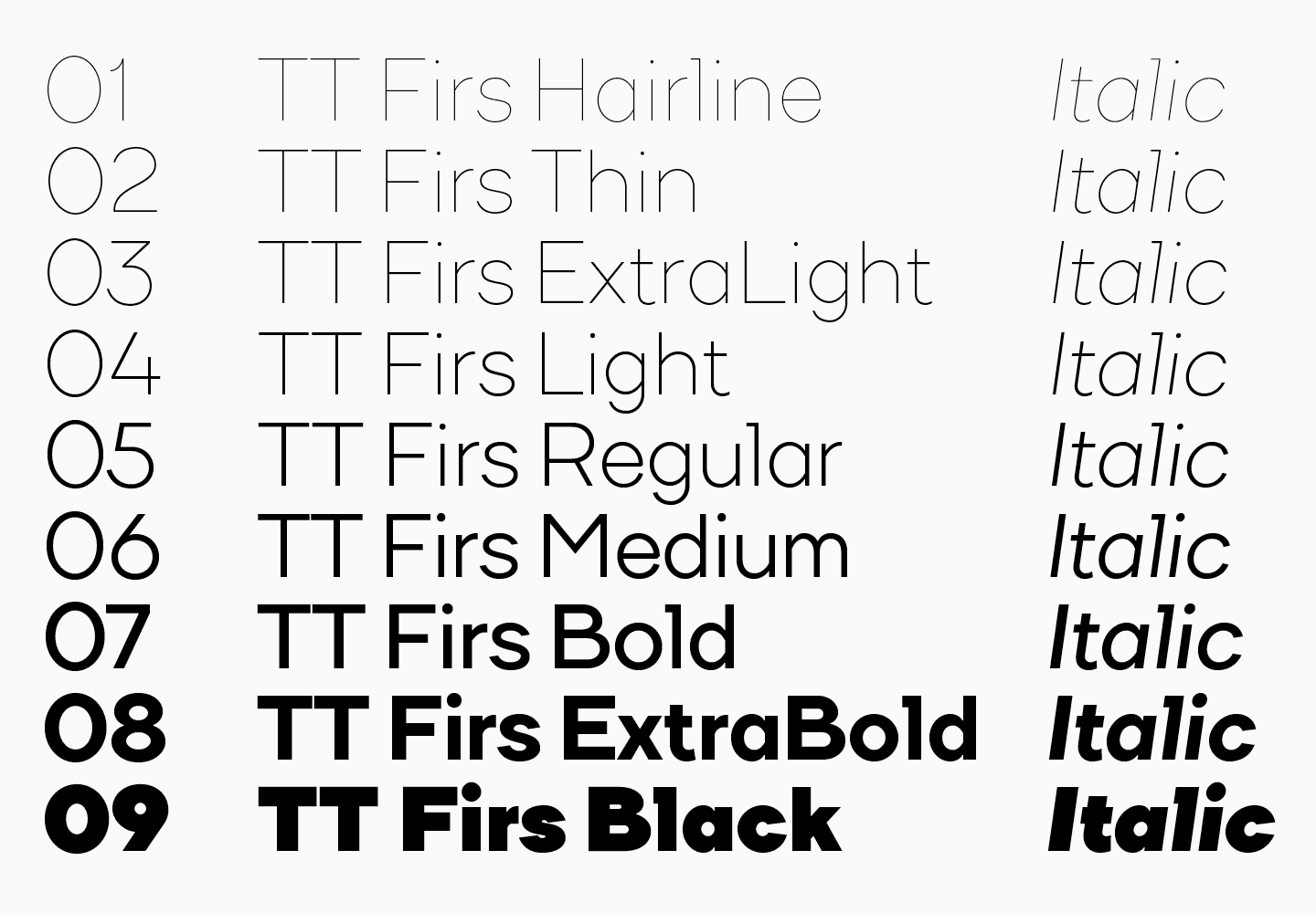
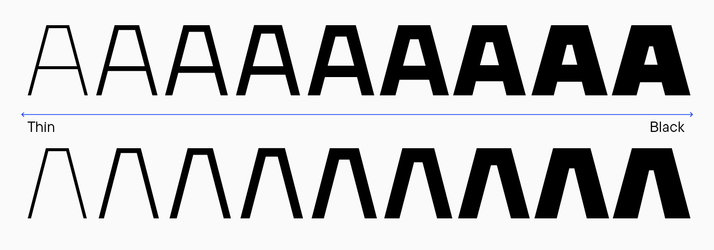
Im Jahr 2023 hauchten wir der beliebten skandinavischen Sans Serif TT Firs Neue neues Leben ein, indem wir sie grundlegend verfeinerten und auf den neuesten Stand brachten. Kurz darauf haben wir sie als Textschrift TT Firs Text auf den Markt gebracht.
In diesem Artikel erfahren Sie, wie alles begann, warum wir uns entschlossen haben unsere TT Firs Neue zu aktualisieren, was wir hinzugefügt und geändert haben und wie die TT Firs Text entstanden ist.
Wie die TT Firs Wurzeln schlug
Die Geschichte von TT Firs begann 2014, als TypeType noch in den Kinderschuhen steckte. Die Idee für die Schrift entstand in Helsinki: Ivan Gladkih, Mitbegründer des Studios, unternahm mit seiner Familie einen Wochenendausflug dorthin.
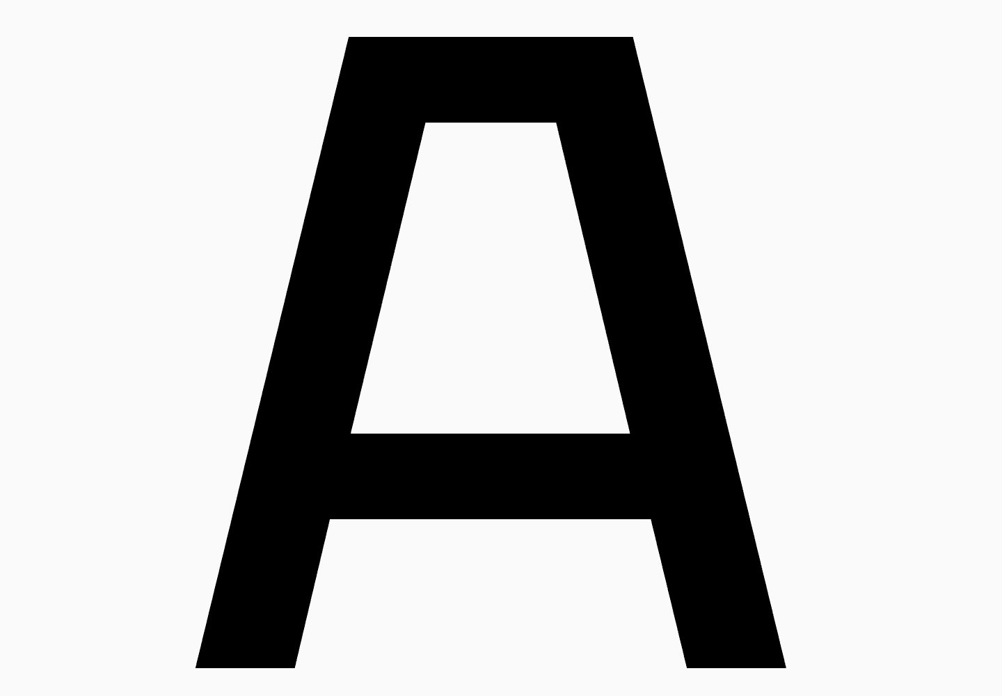
«Wir besuchten das Café Fazer, das zunächst nur ein nach seinem Gründer benanntes Café war. Später begann man, die berühmte Schokolade unter dieser Marke herzustellen. Das Café liegt im Zentrum von Helsinki und wurde 1891 gegründet. Es sieht aus wie eine einfache Kantine, aber hier werden fantastische Desserts serviert, so dass der Laden immer gut besucht ist. Das Café passt perfekt in die Umgebung. Dort sah ich ein altes Schild mit dem Namen Fazer. Als ich es mir genauer ansah, fand ich es sehr auffällig, einzigartig und interessant. Und so kam mir die Idee, eine skandinavische Schrift zu entwerfen. Ich ließ mich von dem Buchstaben ’A’ auf dem Schild inspirieren, mit einem massiven horizontalen Strich am oberen Ende, und begann, die zukünftige Firs zu skizzieren».
Ivan Gladkih, CTO, Mitbegründer von TypeType
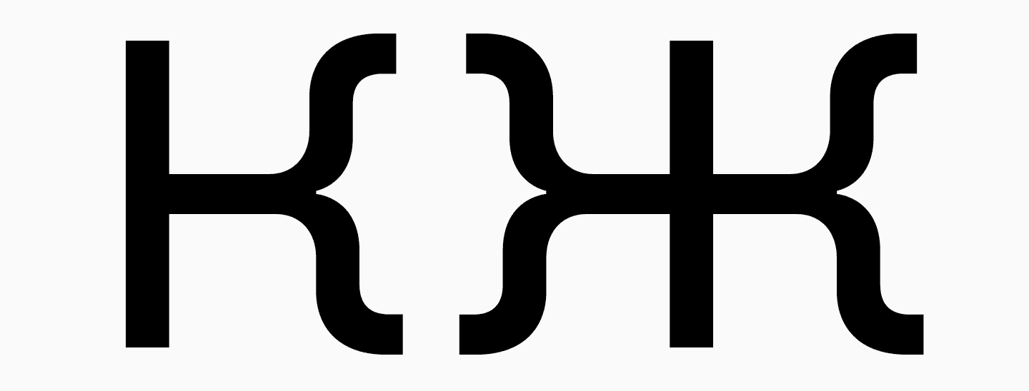
«Damals haben wir alles intuitiv gezeichnet, ohne jegliche Recherche. Wir erstellten ein Moodboard mit skandinavischen Designreferenzen und skandinavischen Schriften. Als ich diese serifenlose Schrift entwarf, ging es mir vor allem darum, wofür die Leute sie verwenden würden und wie sie sich in das Design einfügen würde. Die Umsetzung des kyrillischen Alphabets war eine besondere Herausforderung, da es keine vergleichbaren Schriften mit kyrillischen Glyphen gibt. Wenn wir das horizontale Element des Buchstabens ’A’ in den kyrillischen Buchstaben ’Д’ und ’Л’ verwenden, was eine Anspielung auf die 1960er Jahre der Sowjetzeit ist, wäre es logisch, andere pseudosowjetische Buchstaben zu entwerfen — und so entstanden die verzweigten ’К’ und ’Ж’. Im Großen und Ganzen habe ich mich auf mein persönliches Gefühl verlassen.»
Ivan Gladkih, CTO, Mitbegründer von TypeType
So entstand 2015 die erste Version unserer skandinavischen Serifenlosen. Die Schrift bestand aus 9 lateinischen und 9 kursiven Schnitten und der Zeichensatz war minimal. Die fette Schrift war eher solide, hatte aber Nuancen, die mit der Verteilung von Kontrast und Gewichtungen zu tun hatten. Dazu später mehr. Dennoch ist die Schrift wirklich einzigartig und von einer skandinavischen Atmosphäre durchdrungen.
«Wir hatten damals die Tradition, alle Schriften so zu benennen, dass ihr Name auf ein ‚s‘ endete. Als ich darüber nachdachte, wie ich eine skandinavische serifenlose Schrift benennen sollte, fiel mir ein, dass eines der charakteristischen Merkmale Skandinaviens die Tannen sind. So erhielt die Schrift den Namen TT Firs, der sich durchsetzte und auch in der dritten Ausgabe der Schrift noch existiert.»
Ivan Gladkih, CTO, Mitbegründer von TypeType
Nach der Veröffentlichung führte die TT Firs ein Eigenleben — wir beobachteten sie von der Seite und sahen viele Beispiele, in denen sie in Designs verwendet wurde. Obwohl sie weder über Hinting noch über OpenType-Funktionen verfügte, war sie einzigartig, fesselnd und bei den Benutzern beliebt. Deshalb haben wir uns entschlossen, die Schrift zu aktualisieren und zu verbessern.
Wie sich die TT Firs «verzweigte» und zur TT Firs Neue wurde
Wir haben die TT Firs wirklich geliebt. Aber je mehr Schriften wir veröffentlichten, desto klarer wurde uns, dass diese skandinavische Sans Serif nicht mit der Qualität unserer Schriftbibliothek mithalten konnte. Deshalb beschlossen wir 2017, dass es an der Zeit sei, die Schrift zu überarbeiten.
Erste Änderungen
Damals arbeiteten wir mit Filipp Nurullin zusammen, einem Gast-Art Director für Schriften bei TypeType. Er war es, der die erste Überarbeitung der TT Firs vornahm und die ersten Tests durchführte.
Filipp versuchte, die Schrift mit einer künstlerischen Vision neu zu gestalten, um sie moderner und effektiver für verschiedene Projekte zu machen. So tauchten in der Schrift scharfe Kanten auf, zum Beispiel beim Buchstaben «g», der einen abgerundeten Teil in Kombination mit einem scharfen Winkel aufweist. Auch der Buchstabe «f» weist einen eckigen Winkel auf. Einerseits erscheint dieses Element nicht logisch. Andererseits bietet es eine einzigartige Möglichkeit, Kleinbuchstaben hervorzuheben, die vorher eher neutral wirkten.
Darüber hinaus hat Filipp die Beine des «A» und die Arme des «K» und des «Ж» überarbeitet, um sie härter und intensiver erscheinen zu lassen und ihnen einen europäischen Charakter zu verleihen. Die verzweigten Buchstaben der vorherigen Version wurden als Alternative beibehalten. Auf diese Weise erhielten wir einen Basissatz von Glyphen, die standardmäßig in TT Firs verwendet werden, um diese Schrift und einen alternativen Satz zu repräsentieren (Spoiler: wir werden diese Logik mit den alternativen Buchstaben bei der Arbeit an zukünftigen Iterationen beibehalten).
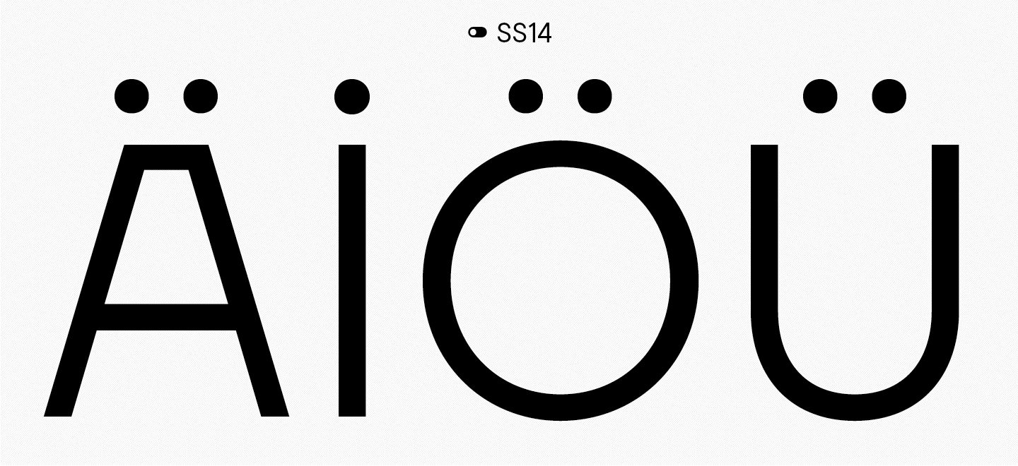
Während der Arbeit wurde klar, dass eines der einzigartigen Merkmale der skandinavischen Typografie die diakritischen Zeichen innerhalb der Buchstaben sind. Zum Beispiel der charakteristische Buchstabe «U», bei dem die Umlaute oft innerhalb des Buchstabens liegen, wie Beeren in einem Schnapsglas.
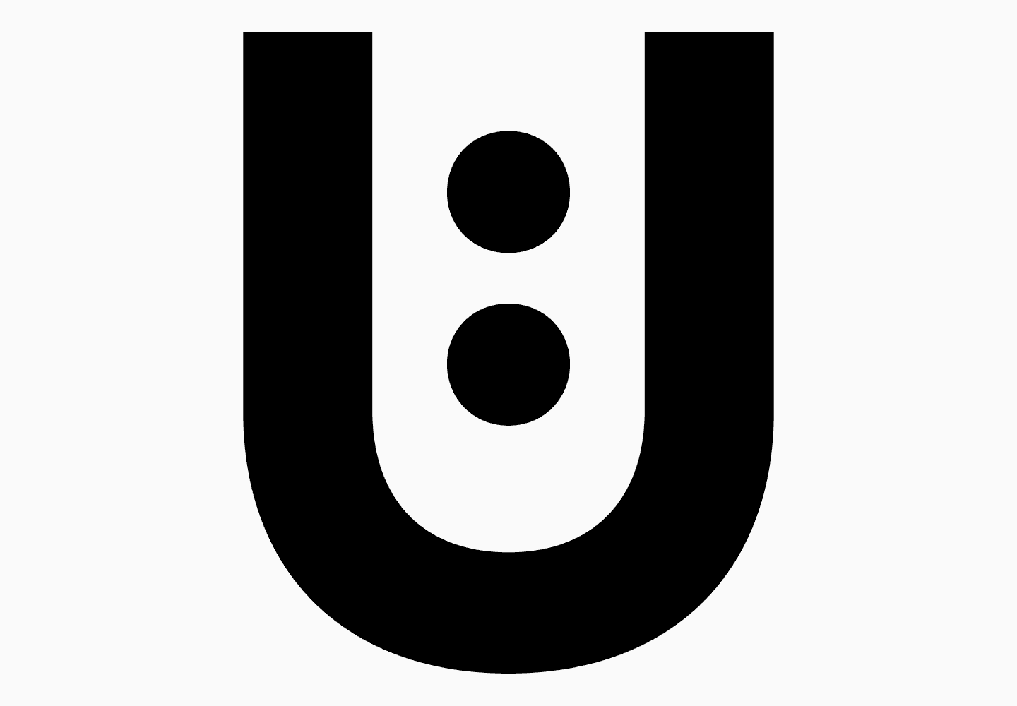
Die diakritischen Zeichen sind also entweder in die Buchstaben integriert, gegen sie gepresst oder seitlich von ihnen platziert. Wir haben diese Besonderheit zu einem der Hauptmerkmale unserer Schrift gemacht und ihren skandinavischen Geist betont, indem wir einen Satz mit solchen diakritischen Zeichen entworfen haben (ein ähnlicher, aber erweiterter Satz wurde in der letzten Version von TT Firs Neue beibehalten).
Dieses Update enthielt auch viele Display-Ligaturen. Sie waren unerwartet, einzigartig und verliehen der Schrift Ausdrucksstärke und visuelles Gewicht.
«Ich finde es wirklich cool, dass Designer den visuellen Stil eines Buchstabens, eines Wortes, eines Textes oder eines Logos allein durch die Verwendung dieser Ligaturen aufpeppen können, ohne zusätzliche grafische Elemente verwenden zu müssen. Es mag überraschend klingen, aber ich habe solche Ligaturen noch nie in Aktion gesehen. Obwohl ich sie gerne sehen würde, denn sie sind wirklich genial und haben bis in die aktuelle Schriftversion „überlebt“ (nur in abgewandelter Form — Anm. d. Red.)».
Ivan Gladkih, CTO, Mitbegründer von TypeType
So entstand die überarbeitete Version der TT Firs. Wir haben sie 2018 unter dem Namen TT Firs Neue (1.100) veröffentlicht. Zu diesem Zeitpunkt umfasste die Schrift mehr als 900 Glyphen (im Gegensatz zur ersten Version mit etwa 400 Glyphen). TT Firs Neue, Version 2.000, wird mehr als 1.700 Glyphen enthalten — aber der Reihe nach.
Interessanterweise hat sich die Wahrnehmung von TT Firs Neue stark verändert. Je mehr Projekte sie verwendeten, desto neutraler erschien sie, da sie allgegenwärtig geworden war: Wir sahen sie in YouTube-Videos, Branding, Logos und vielem mehr.
«Die Schrift ist visuell neutral geworden, so seltsam das auch klingen mag. All ihre ausdrucksstarken und super wiedererkennbaren Formen, wie die dreieckigen „Д“ und „Л“ sowie die „t“, „f“, „g“ und „j“ mit ihren eckigen Winkeln, sind alltäglich geworden, als hätten sie schon immer so aussehen sollen. Das war für mich eine Überraschung. Wie das Sprichwort sagt, funktioniert Schrift auf geheimnisvolle Weise. Zuerst schien unsere Schrift etwas Außergewöhnliches zu sein, und nach einer Weile denkt man, dass es nur eine Schrift ist und nichts Besonderes an ihrem Aussehen.»
Ivan Gladkih, CTO, Mitgründer von TypeType
Ein Neuanfang: Das Design der TT Firs Neue 2.000
Mit der Zeit entwickelte sich das Studio weiter und erlernte neue Werkzeuge. Unsere Schriften wuchsen mit uns. Nach dem Umstieg auf Glyphs kamen wir in den Genuss von Variationsachsen. Dieses Tool hilft uns, variable Schriften zu erstellen und die Logik innerhalb einer Schrift beizubehalten.
Im Jahr 2022 entwarfen wir ein neues Design für die TT Firs Neue, die sowohl bei uns als auch bei unseren Benutzern sehr beliebt war. Die Schrift war bereits hervorragend, aber wir beschlossen, sie noch besser zu machen! Wir überarbeiteten akribisch jedes noch so kleine Detail und feilten bis zur Perfektion. Das Ergebnis war, dass wir die Schrift nicht nur aktualisiert, sondern praktisch von Grund auf neu entwickelt haben.
Teil 1: Auf der Suche nach Unebenheiten
Zunächst hat sich unsere Lead Designerin Antonina Zhulkova die bestehende TT Firs Neue angesehen und mögliche Verbesserungen vorgeschlagen. Gehen wir sie gemeinsam durch.
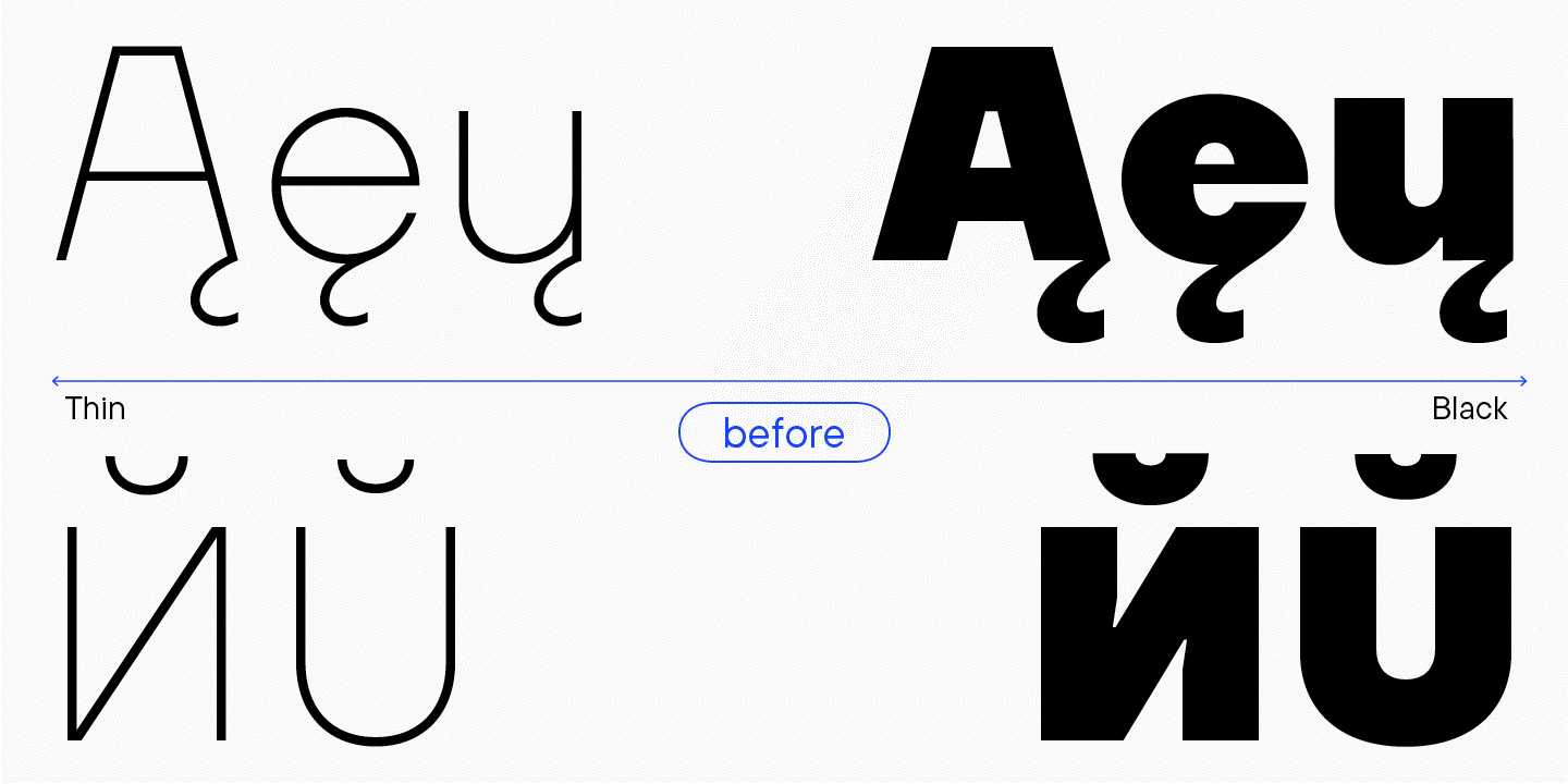
Bitte beachten Sie, dass wir in diesem Text oft das Wort «seltsam» (oder seine Synonyme) verwenden werden. Was meinen wir, wenn wir von der Seltsamkeit einer Schrift oder einzelner Zeichen sprechen? Wir sehen es als ein kleines Fähnchen: «Etwas sticht aus dem Gesamtbild heraus». Zuerst «scannen» wir die Schrift schnell, um ein Gefühl für sie zu bekommen. TT Firs Neue ist rau, nordisch, statisch, attraktiv, wiedererkennbar. Sie ist leicht zu merken, vor allem wegen der horizontalen Fugen zwischen den Diagonalen. Der Buchstabe «A», den Ivan bereits erwähnt hat, könnte als Logo für diese Schrift dienen. Ein weiteres stilprägendes Detail sind die kantigen Enden einiger Buchstaben. Sie sind Teil des Charakters der Schrift. Der Rest der expressiven Elemente wird kritisch auf ihren Zweck hin untersucht. Wir markieren Dinge als «seltsam» oder «unerwartet» und analysieren, ob sie dem Grundkonzept der Schrift widersprechen oder es unterstreichen. Wenn etwas den Charakter der Schrift ergänzt, verstärkt und unterstützt, behalten wir es vielleicht bei. Wenn ein Detail keinen Einfluss auf den Charakter der Schrift hat oder ihm sogar widerspricht, dann gehört es nicht hierher.
Visuelle Kompensatoren
Es ist wichtig zu verstehen, dass die erste Version von TT Firs in FontLab 5 erstellt wurde und das letzte Update in Glyphs. Wir mussten also mit der Datei arbeiten, die von FontLab 5 nach Glyphs in einem etwas falschen Format übertragen wurde.

Das stellte uns vor einige Herausforderungen. Zum Beispiel enthielt die vorherige Version der Schrift Tintenfallen in den fetten Schriftschnitten. Dies verlieh der Schrift ein zusätzliches Flair und löste das Problem des Verklumpens der Glyphen in kleinen Punktgrößen. Nach der Umstellung auf Glyphen erhielten auch die helleren Schriftschnitte Tintenfallen, die jedoch nur als Notlösung dienten. Bei der Überarbeitung kamen wir zu zwei Schlussfolgerungen. Einerseits hatten diese Kompensationen einen funktionalen Zweck, nämlich Variabilität zu ermöglichen. Andererseits ließen sie die fetten Buchstaben expressiver erscheinen, und die gesamte Grafik wirkte inkonsistent.
Zum Beispiel erscheint der Buchstabe «N» in der Schriftart Slim normalerweise ruhig, und in der Schriftart Black scheinen die Kompensatoren seinen Charakter leicht zu verändern. Während sie beim «N» nicht übermäßig auffallen und die technische Funktion haben, die dicken Stämme nicht mit den Diagonalen zu verkeilen, werden sie beim «M» dünner und viel aggressiver. Und beim «Und» verändern sie wieder ihre Form.
Die Tintenfallen waren also nicht in allen Schriftstilen vorhanden und sahen sogar innerhalb eines Schriftstils unterschiedlich aus, was zu visuellem Rauschen führte.
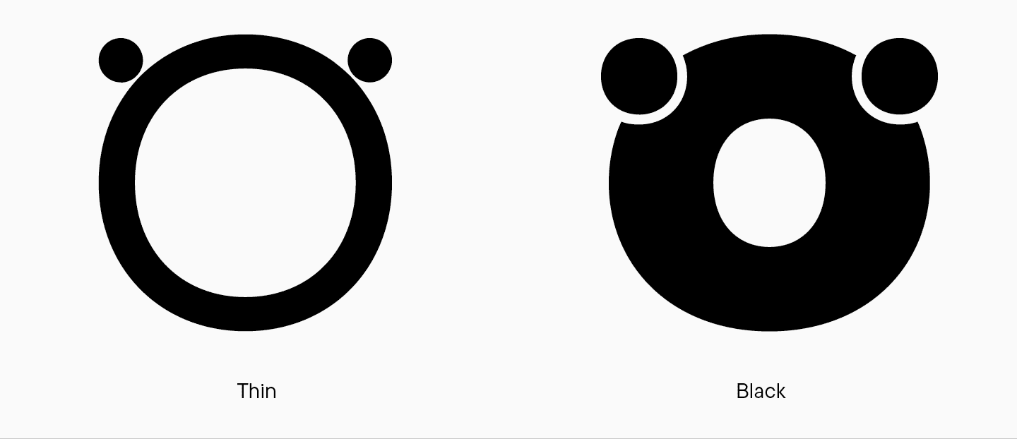
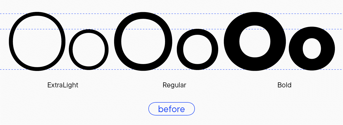
Unterschiedliche Überhänge bei gerundeten Zeichen
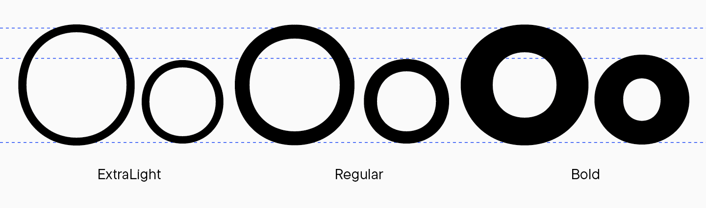
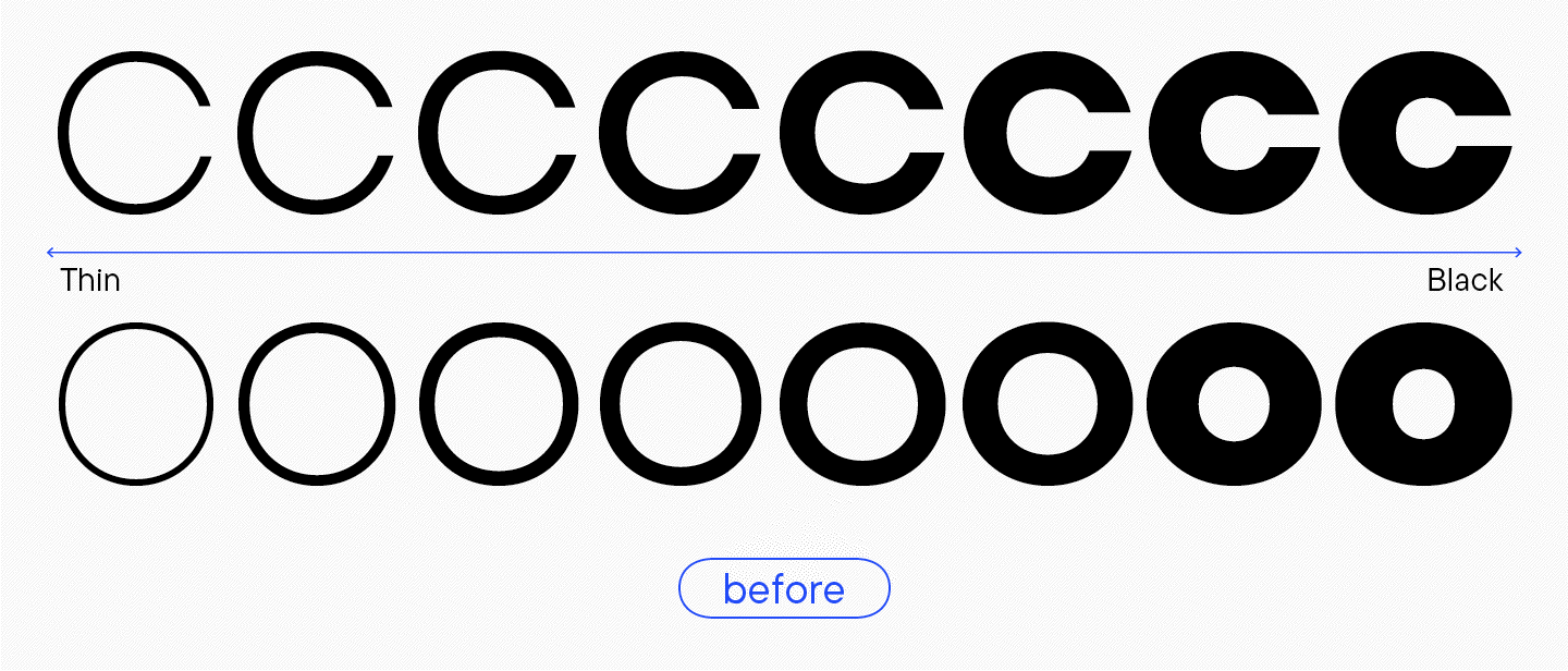
Die Logik der abgerundeten Zeichen war fehlerhaft. Beispielsweise sah der Großbuchstabe «O» im Schriftschnitt Thin zwar rund aus, war aber vertikal leicht gedehnt. In den Schriftschnitten Bold und Black war er maximal rund und horizontal gestreckt. Bei den Kleinbuchstaben war dieser Effekt noch ausgeprägter.
Unterschiedliche Endbuchstaben
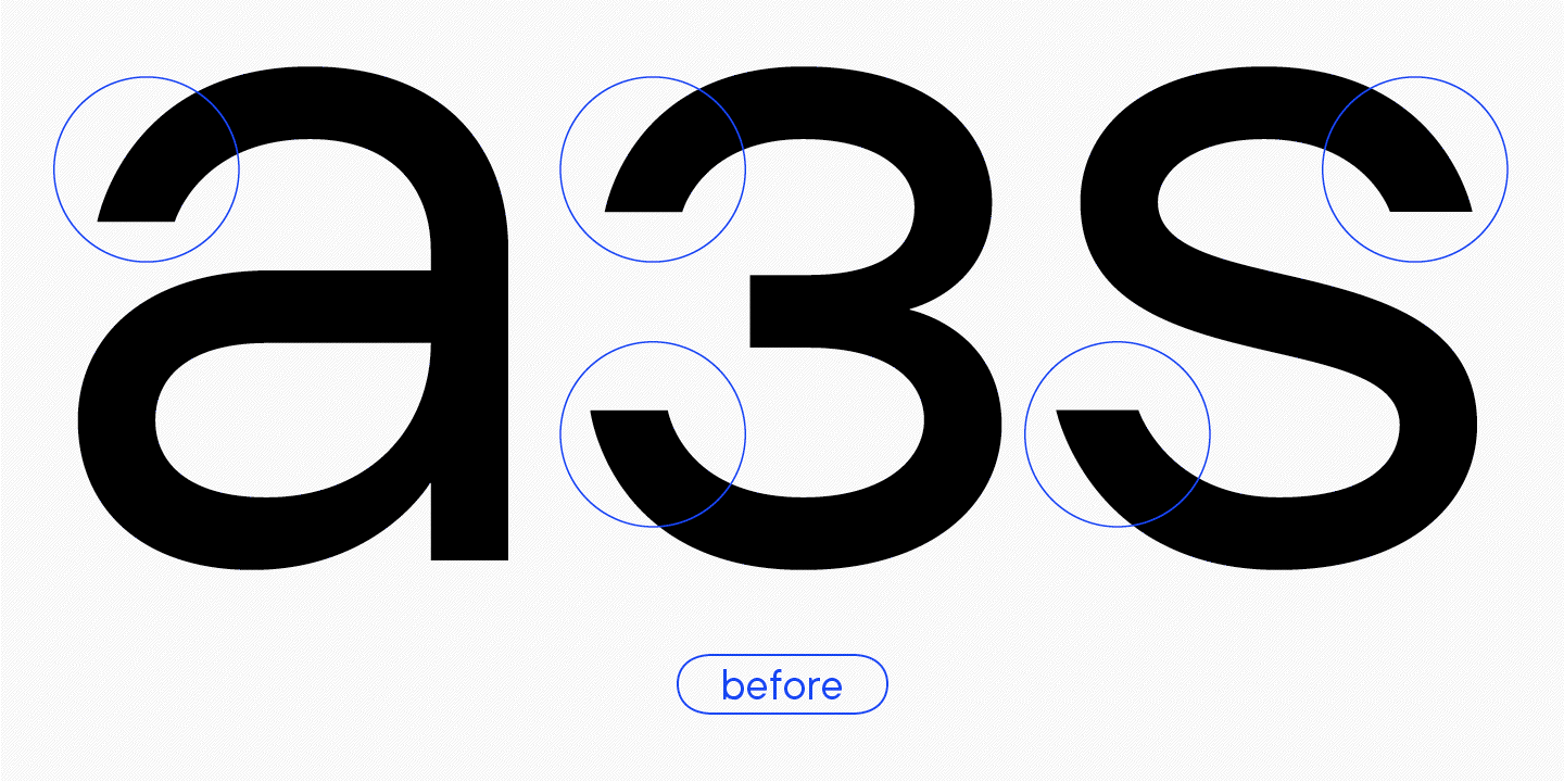
«Interessanterweise war dies eines der Merkmale, die mir halfen, die alte TT Firs Neue von der neuen Version zu unterscheiden, wenn ich die Schrift irgendwo auf der Straße sah. Diese alten Terminals ziehen die Aufmerksamkeit auf sich; ich nannte sie ’Skorpionschwänze’».
Marina Khodak, Leitende Designerin bei TypeType
Der Buchstabe «a» zum Beispiel hatte ein glattes, symmetrisches Terminal, bei dem der linke Teil der Klammer fast genauso aussah wie der rechte. Ja, er war auf der linken Seite etwas stärker abgeschrägt, aber insgesamt sah er ähnlich aus. Der Buchstabe «з» hat auf der rechten Seite ein ausgefülltes Oval, während das linke Ende flach ist und der Winkel sich dramatisch verjüngt — wie der Schwanz eines Skorpions vor einem Schlag.
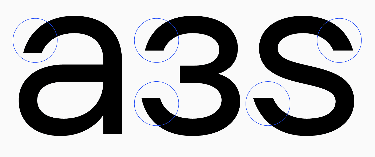
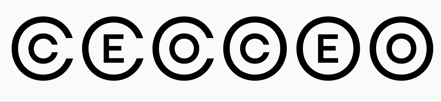
Dies ist bei den Großbuchstaben «S» und «З» ebenso auffällig wie bei den abgerundeten Buchstaben («C», «G»). Der obere Teil der Buchstaben scheint sein Gewicht und seine Rundung zu verlieren.
Generell haben beide Varianten ihre Berechtigung, aber wir mussten herausfinden, was für unsere Schrift besser ist: abgerundete, volle Enden oder scharfe «Schwänze».
«Wenn man bedenkt, dass die Schrift ziemlich hart und ernst wirkt, war es logisch, die Enden so zu gestalten, dass sie denen des Buchstabens ‚a‘ ähneln: symmetrisch, aber ohne das Gewicht zu verlieren.»
Marina Khodak, Chefdesignerin von TypeType
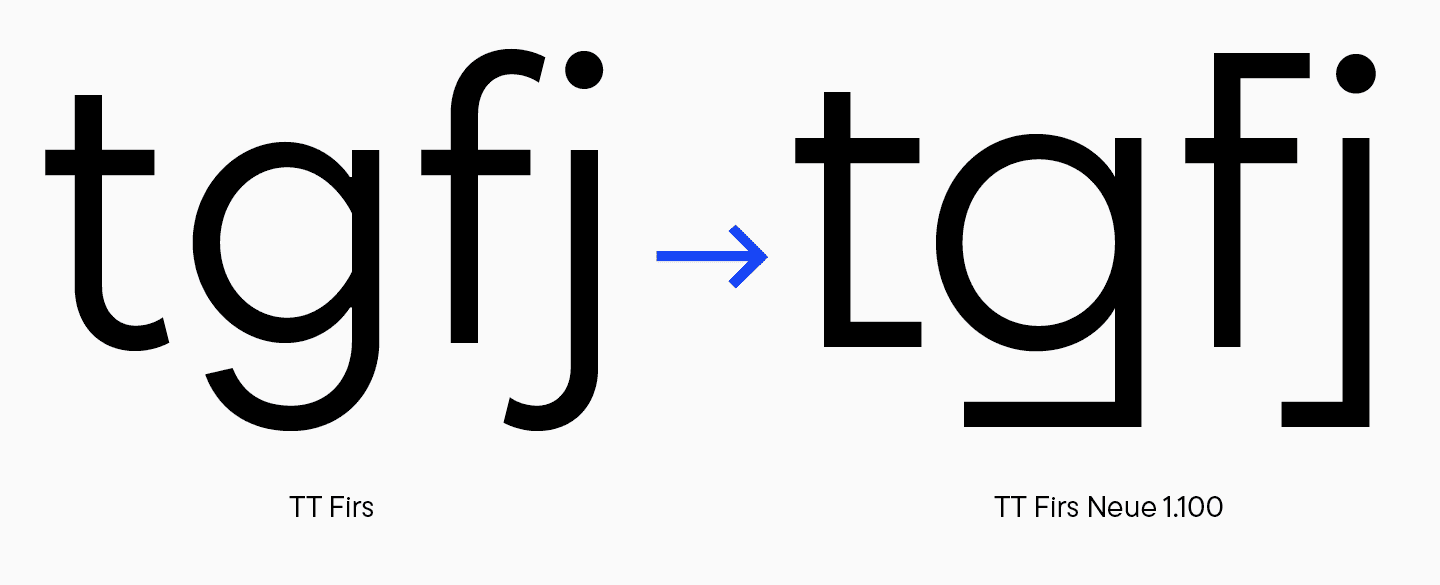
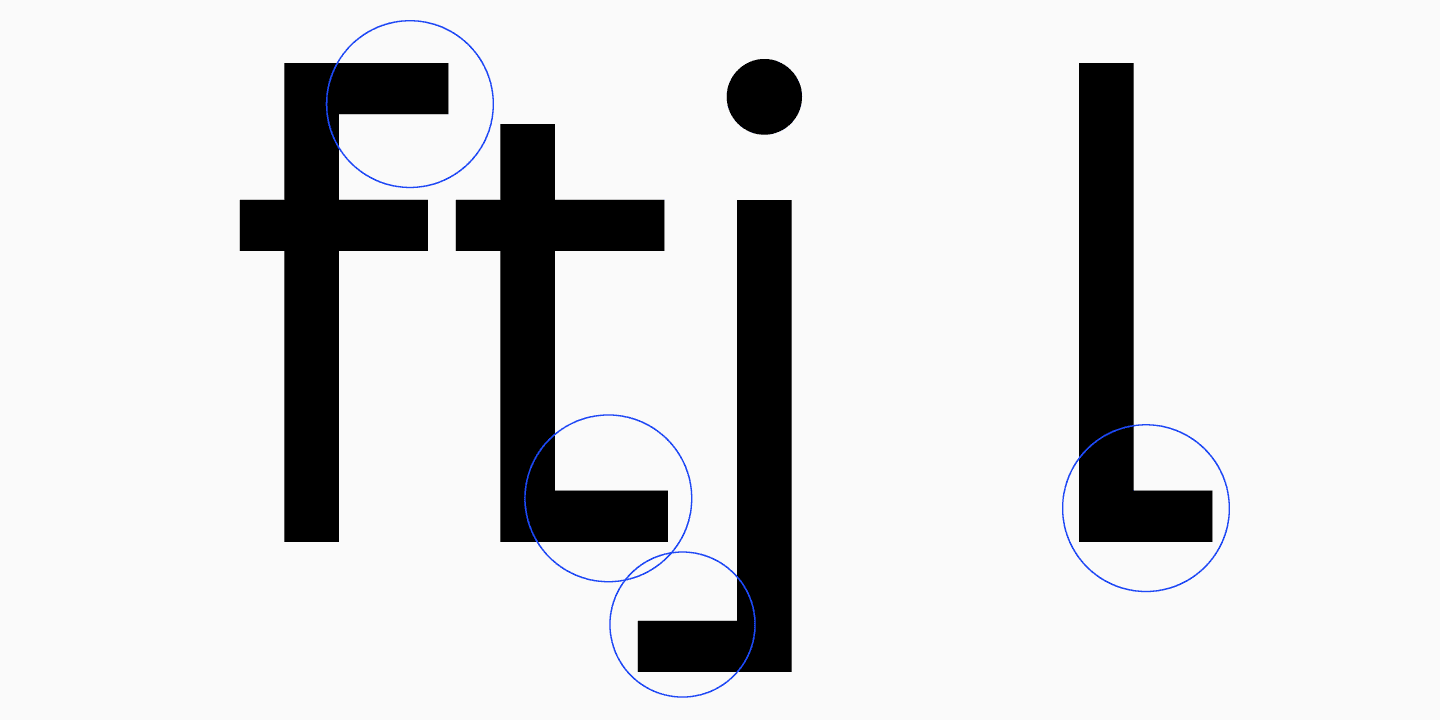
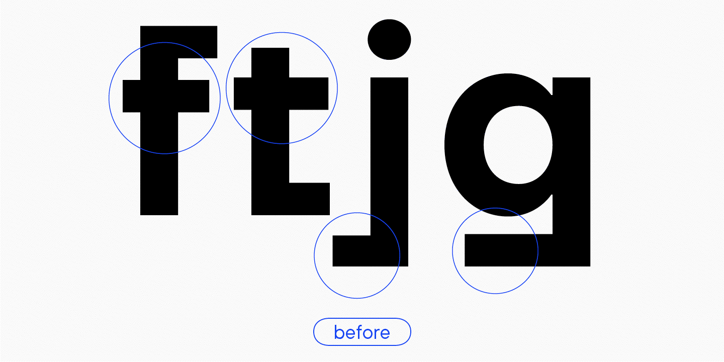
Ein weiteres Problem bestand darin, dass die Endungen nicht nur unterschiedlich breit, sondern auch unterschiedlich lang waren. Deutlich wird dies bei den Buchstaben «t», «j», «l» und «f». Zum Beispiel ist das Terminal für «j» viel breiter als das für «l». Dies wirkt befremdlich, insbesondere wenn man bedenkt, dass die Form des Terminals sehr ausdrucksstark und auffällig ist.
Inkonsistente Formenwahl
In älteren Versionen unserer Schriften gab es eine auffällige Tendenz, den schwarzen Schriftschnitt ungewöhnlicher zu gestalten. Das tun wir jetzt nicht mehr. Erstens sollten die Buchstabenformen in allen Schriftschnitten einheitlich sein, damit die Variabilität richtig funktioniert (die Anzahl der Punkte muss in allen Schriftschnitten gleich sein). Zweitens sehen wir solche Design-Entscheidungen als einen Bruch in der Logik der Schriftfamilie. Aus diesem Grund haben einige Formen der alten TT Firs unsere neue Selbstzensur nicht überstanden.
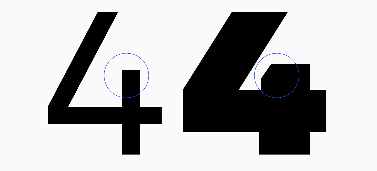
Zum Beispiel hatte die Nummer 4 in der Schrift Black einen schrägen Schaftwinkel, der mehr Negativraum im Inneren zuließ. Damals dachten wir wahrscheinlich, dass dies die beste Entscheidung war. Aber es war nicht die beste. Wir mussten eine andere Lösung finden, die die Form der Glyphe nicht zerstören würde.
Abstände zwischen den Buchstaben (Aproshes)
Die Zwischenräume mussten verfeinert werden.
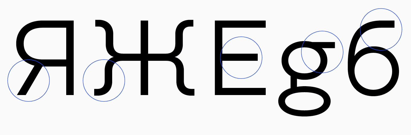
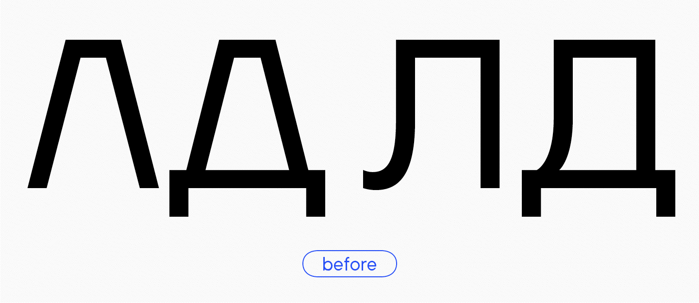
Dreieckige Zeichen
Inkonsistente Formlogik, unterschiedliche Vorlagenbreiten, zu wenig Neigung bei «A», «Л» und «Д».
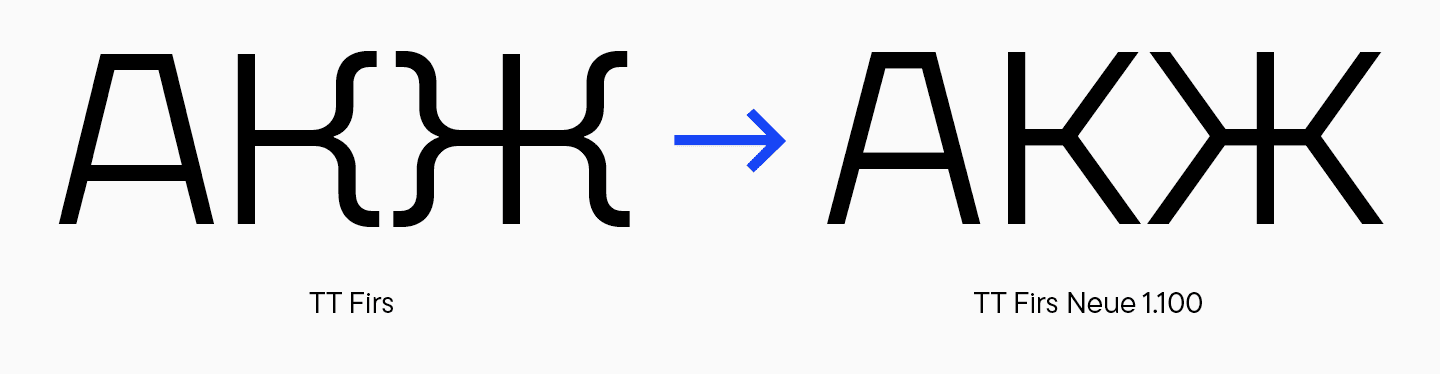
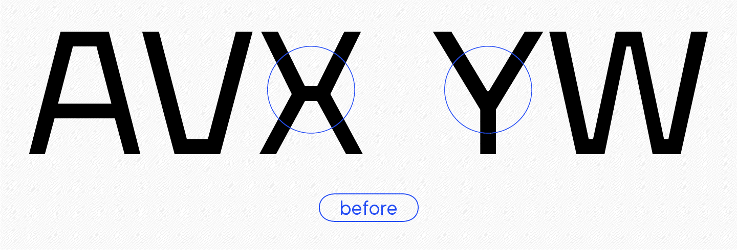
Dies ist eine sehr wichtige Nuance, denn diese Verbindungspunkte, die horizontalen Balken, sind ein stilbildendes Element der Schrift. In der TT Firs sind sie im Vergleich zu den anderen Schriften unserer Sammlung am stärksten ausgeprägt.
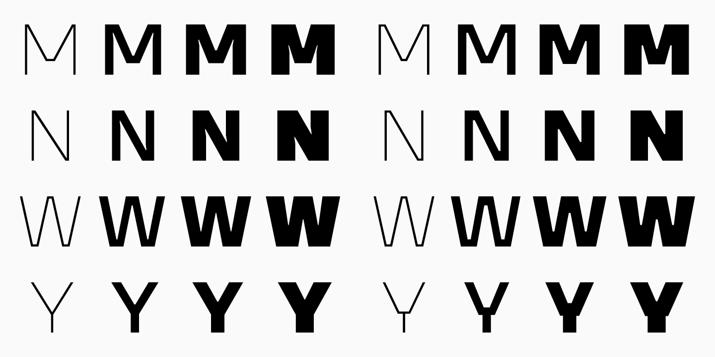
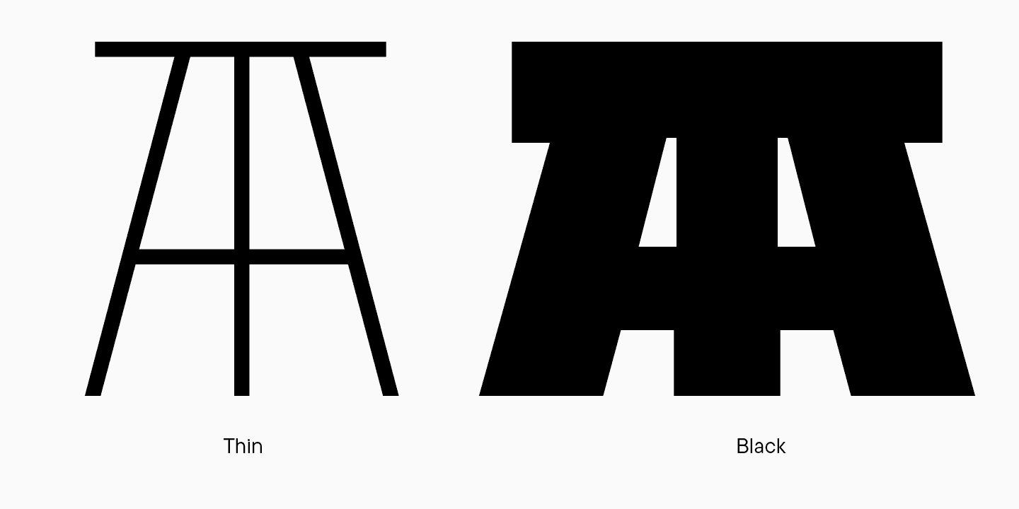
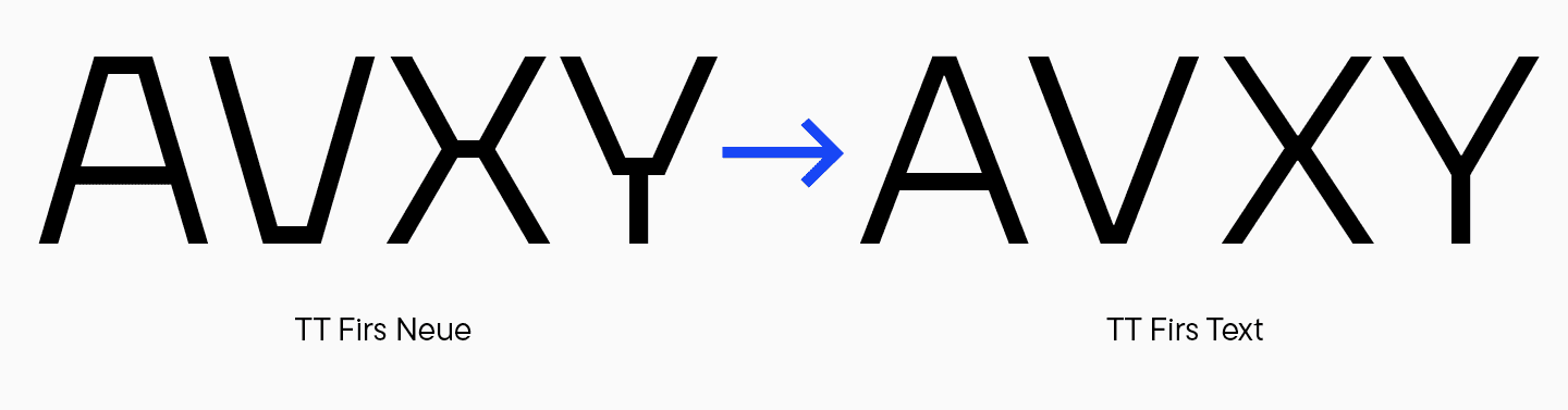
Besonders auffällig sind sie zum Beispiel bei den Buchstaben «A» und «V». Bei den beiden Buchstaben «X» ist sie identisch. Bei den Buchstaben «Y» und «W» ist sie jedoch nicht sichtbar, was sie zu ganz normalen Buchstaben ohne expressive Elemente macht. Auf diese Weise wird die Logik der Glyphengestaltung in der Schrift Black durchbrochen.
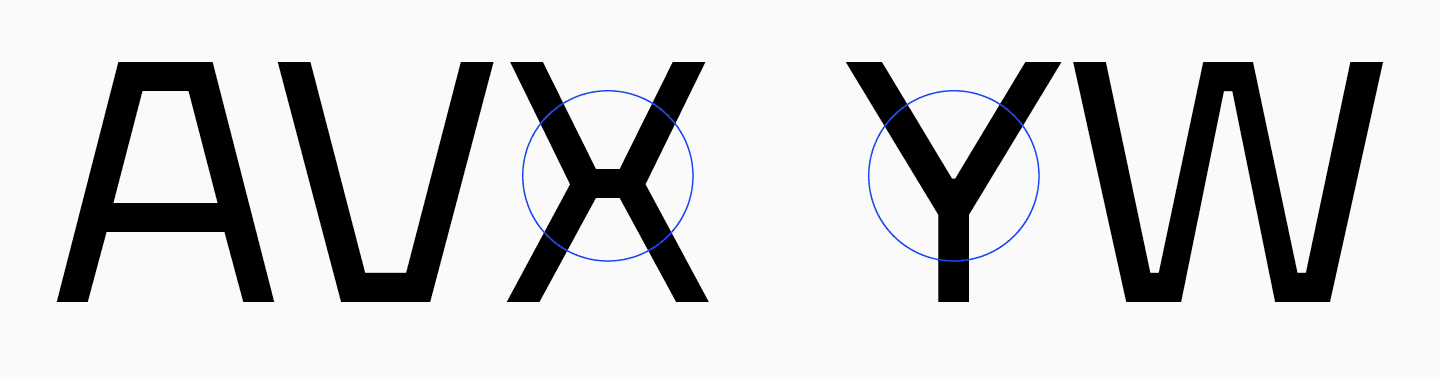
Das gleiche Problem tritt bei den dreieckigen Kleinbuchstaben (kyrillisch und lateinisch) auf: «v», ‚w‘, ‚x‘, ‚y‘, ‚л‘, ‚д‘, ‚м‘ und ‚и‘.
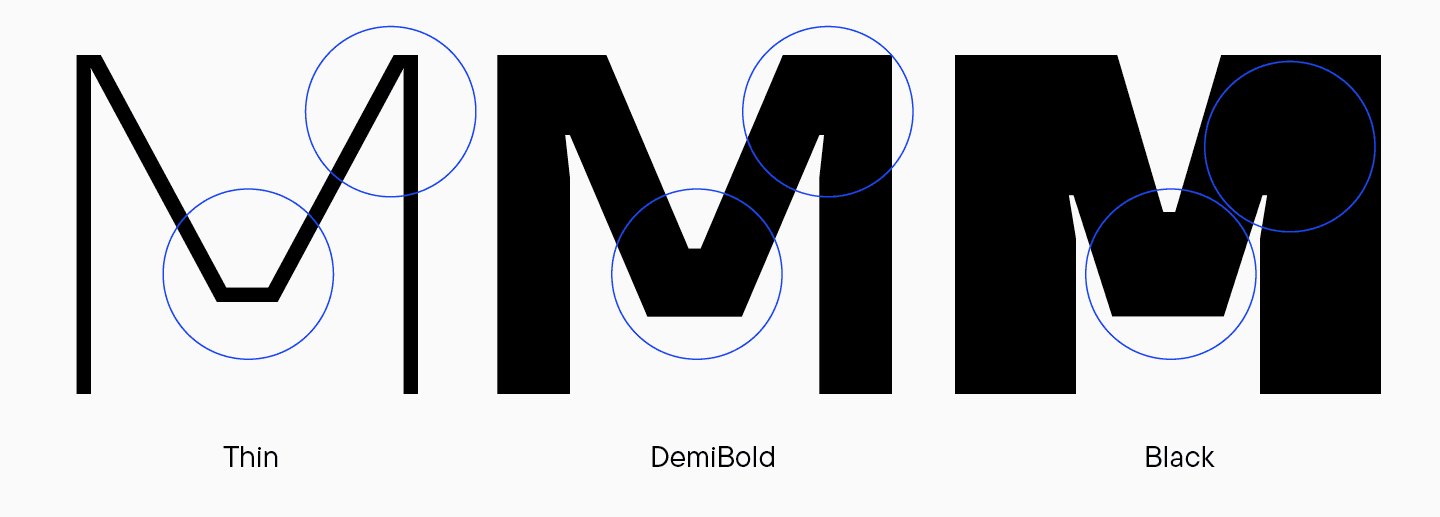
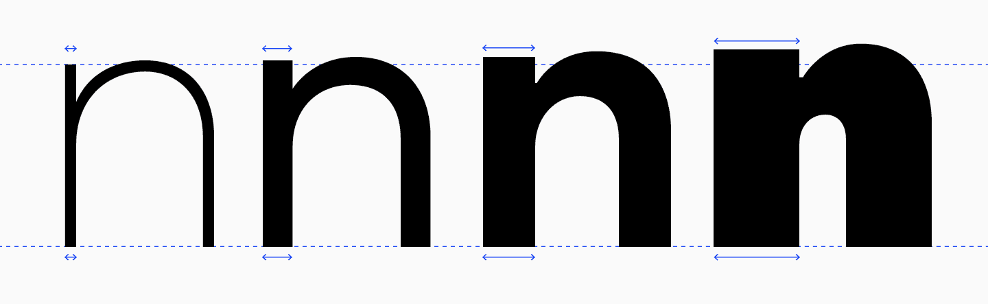
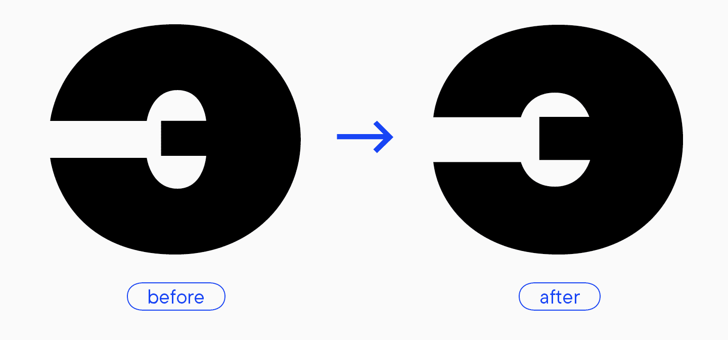
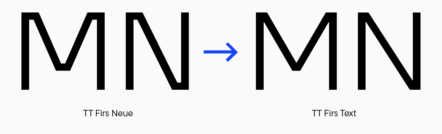
Werfen wir nun einen Blick auf die ganze Familie. Abgesehen von den Farbfehlern in den fett gedruckten Meistern gibt es einige Unklarheiten bei den Verbindungen. Der Buchstabe ’M’ im Schriftschnitt ’Bold’ hat unten einen waagerechten Strich, oben jedoch nicht. Im Schriftschnitt Thin ist er ebenfalls nur unten zu sehen. Außerdem ist die Breite dieses Details in den verschiedenen Schriftarten unterschiedlich: In Thin ist es viel breiter als in Bold oder Black.
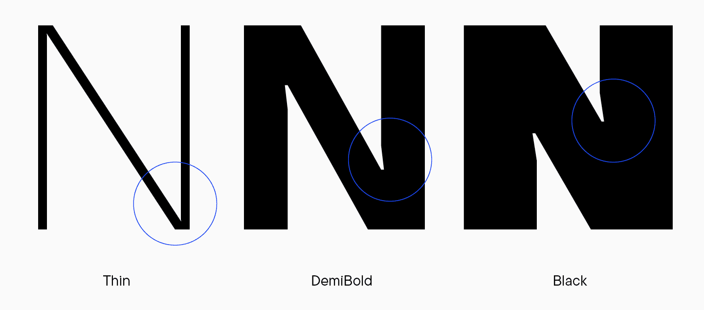
Der Buchstabe «N» enthält überhaupt kein solches Element. Außerdem sind die Tintenfallen in der fetten Version vorhanden, nicht aber in der dünnen.
Betrachten wir den Buchstaben «W». Wie das «M» sollte es im oberen Teil der Diagonale eine Kreuzung und im unteren Teil spitze Winkel aufweisen. Beim «W» in der schlanken Version gehen jedoch alle Kreuzungen durch diese Kreuzung und sind nicht in der fettgedruckten Version enthalten, und auch die Tintenfalle ist nicht enthalten.
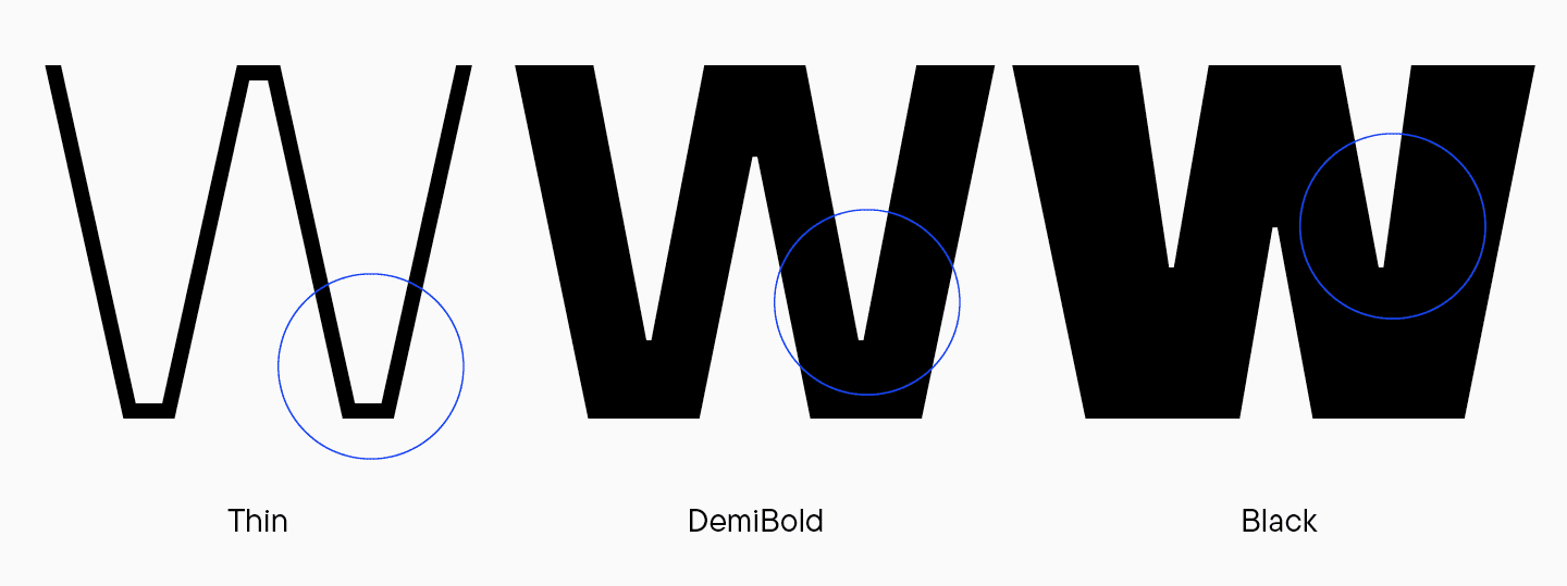
Es sieht so aus, als ob die Logik sowohl innerhalb als auch zwischen den Schriftstilen nicht stimmt.
«Für die Aktualisierung könnten wir folgende Ansätze in Betracht ziehen: Hin zur Expressivität oder weg davon. Zum Beispiel könnten wir überall Tintenfallen einbauen. Im Team entschieden wir, dass diese grafische Wahl das Projekt in diesem Fall nicht auffrischen würde, und dass der Verzicht darauf die Schrift moderner machen würde. Außerdem macht es keinen Sinn, Tintenfallen in helle Schriften einzufügen, da sie dort nicht gut sichtbar sind. Eine weitere Frage war, ob wir überall Verzweigungen einbauen oder auf sie verzichten sollten. Hätten wir sie weggelassen, hätten wir ein neutraleres Design gehabt. Eine solche Entscheidung passte nicht zu TT Firs Neue, wurde aber in TT Firs Text umgesetzt (wir werden später darüber berichten — Anm. d. Red.)».
Marina Khodak, Leitende Designerin bei TypeType
Wir entschieden uns, die horizontalen Elemente beizubehalten. Es stellte sich jedoch die Frage, wie sie aussehen sollten: wie im «M» oder im «W». Diese Buchstaben haben den auffälligsten Unterschied in der Konstruktion der Kreuzungen.
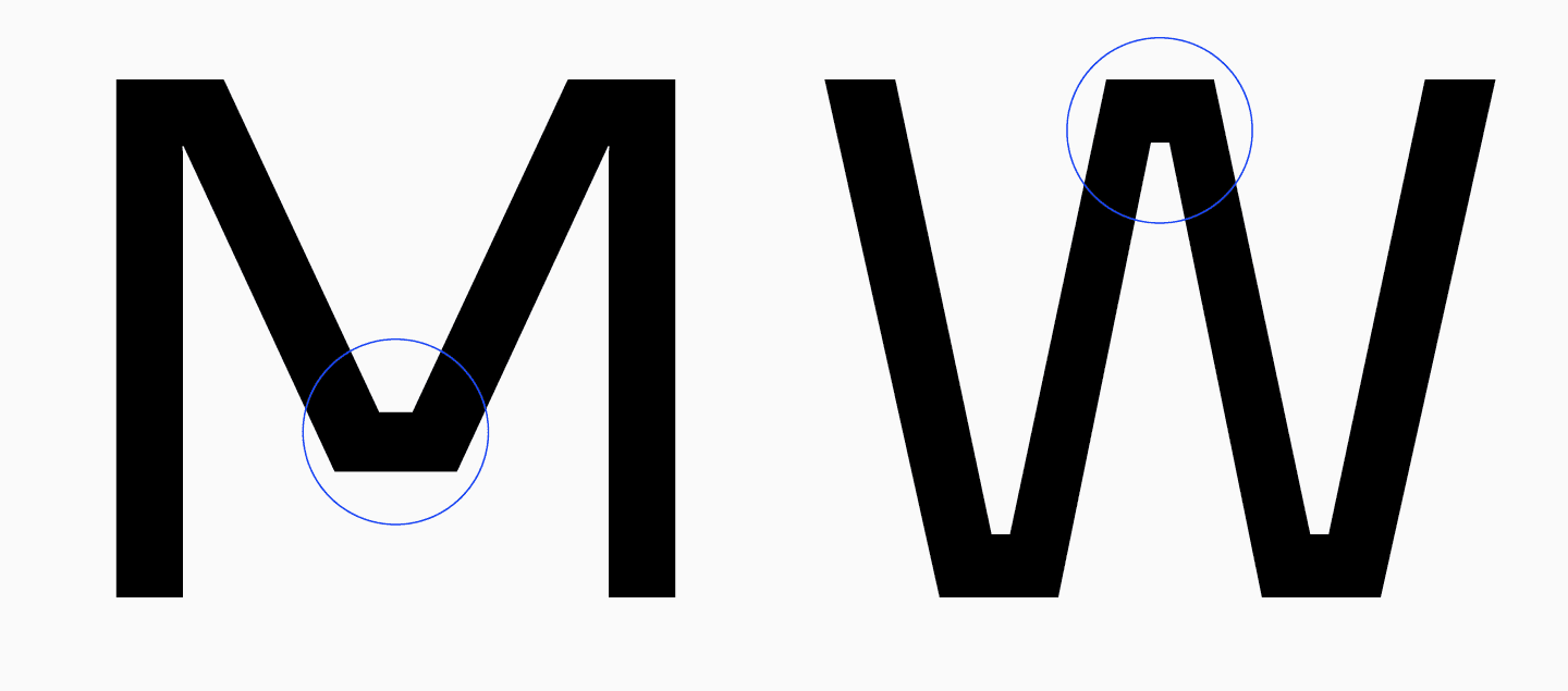
In ihrem Interview schlug Antonina vor, eine einheitlichere Version zu entwerfen: überall Abzweigungen wie beim «W» hinzufügen und sie in mittlerer Breite zu gestalten. Sie fertigte eine Skizze an, die als Inspiration für die weitere Entwicklung der Schriftfamilie diente.
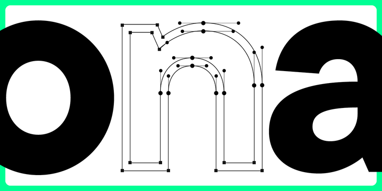
Runde Buchstaben
«Als ich mit der Arbeit an der Schrift begann, entwarf ich die runden Buchstaben völlig neu. Wenn man sich die alte Version der Schrift anschaut, sieht man, dass die Proportionen der rechteckigen Buchstaben in allen Schnitten unterschiedlich sind. Zum Beispiel ist der Buchstabe „H“ im Schriftschnitt „Thin“ sehr schmal, und das Verhältnis zwischen „H“ und „O“ ist in diesem Schriftschnitt anders als in den Schriftschnitten „Regular“, „Bold“ und „Black“. Tatsächlich war der Buchstabe „H“ in Thin nicht nur extrem schmal, sondern wirkte auch viel schmaler als der Buchstabe „O“. Das „O“ wirkte runder, und das „H“ war vertikal sehr lang. Bei der Schrift Bold gab es diesen Unterschied nicht. Es sah also so aus, als würde sich das „H“ mit zunehmendem Gewicht ausdehnen und seine Proportionen verändern».
Marina Khodak, Leitende Designerin bei TypeType
Dasselbe geschah mit den Kleinbuchstaben. Vergleicht man den Buchstaben «o» mit dem einstöckigen «a», stellt man fest, dass diese Buchstaben in der Thin sehr ähnliche Proportionen haben: Das «a» ist etwas schmaler als das «o», wirkt aber runder. In der Schrift Regular wird das «a» jedoch vertikaler, während sich das «o» horizontal ausdehnt. Wie bei den Versalien verstärkt sich diese Tendenz mit zunehmendem Gewicht. Das «a» und ähnliche Zeichen werden schmaler und nehmen eine vertikale Form an, während das «o» im Gegensatz dazu breiter wird.
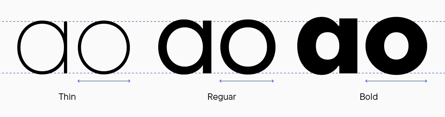
Außerdem ähneln sich in der Dünnschrift die linken Seiten des «o» und des einbündigen «a», doch verschwindet diese Ähnlichkeit mit zunehmender Schriftstärke. Außerdem erscheinen die Verbindungsstellen der runden Buchstaben in der Schrift Bold heller.
Marina änderte schließlich die Proportionen der Buchstaben, um dieses Problem zu lösen. Im Folgenden wird das Ergebnis gezeigt und erläutert.
Buchstaben mit Schalen
Der nächste Punkt auf der Überarbeitungsliste war die gebrochene Logik bei der Korrelation und Verteilung der ovalen Formen zwischen den Schriftstilen. Außerdem schienen die Schalenhöhen zu groß zu sein, vor allem im Schriftschnitt Thin. Der Buchstabe «Я» ist kleiner und schmaler als die Buchstaben «Р», «В» und «Ь».
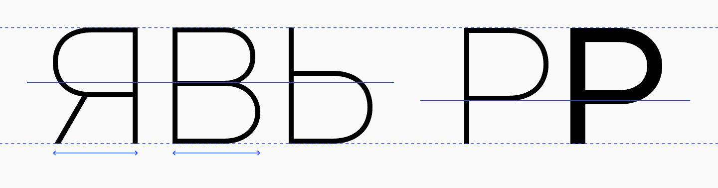
«Wenn wir zum Beispiel den Buchstaben ‚P‘ in den Thin und Regular Mastern vergleichen, können wir den Unterschied in der Korrelation sehen. In der Regular-Version ist die Taille höher als in der Thin-Version, wodurch der Buchstabe wie eine kleine Fahne auf einem Stock aussieht. Es ist, als wäre das Oval kein wesentlicher Bestandteil des Buchstabens, sondern nur ein zusätzliches Element.
Marina Khodak, Leitende Designerin bei TypeType
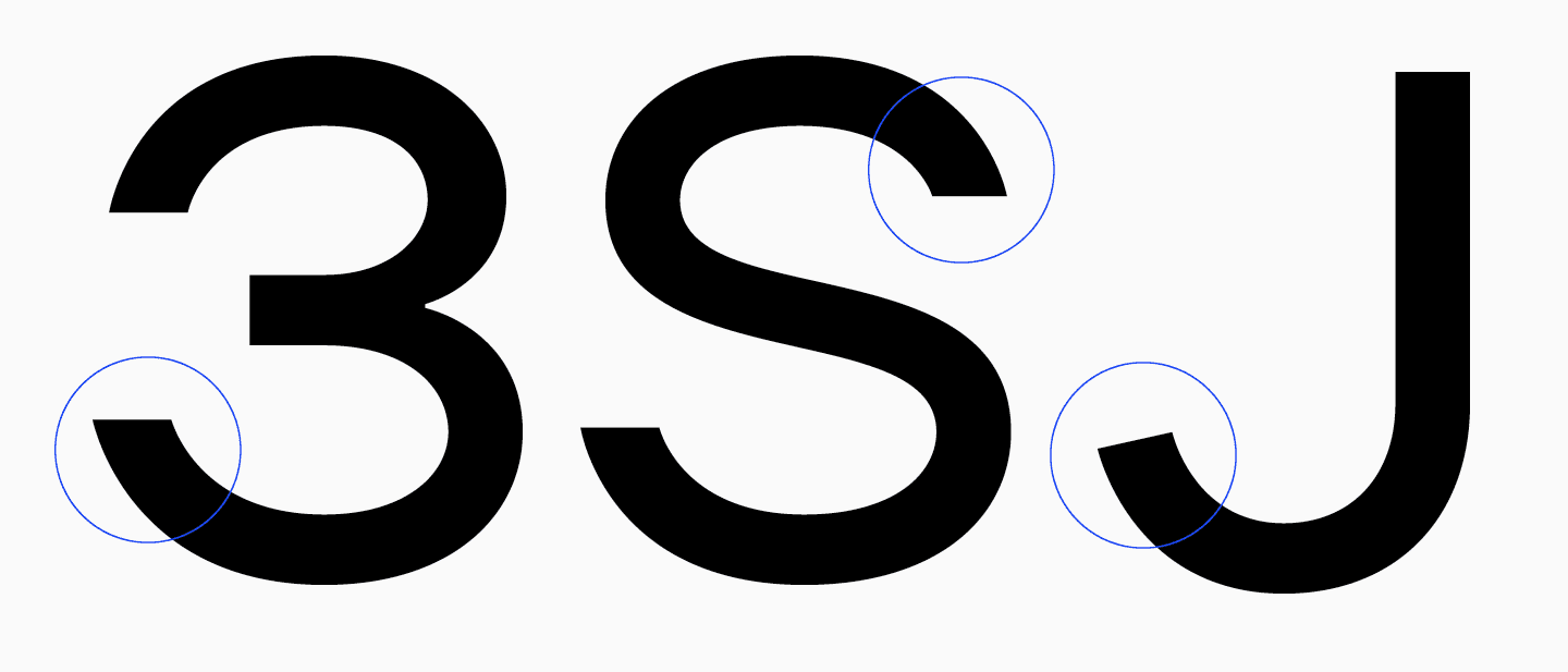
S, З, J
Der Charakter dieser Buchstaben unterscheidet sich deutlich von dem der anderen Glyphen im Set, was besonders bei den Kleinbuchstaben auffällt.
Der linke obere Teil des «З» ist etwas kurz. Das «S» ist zu fließend, das «J» hat ein zu lebhaftes Ende — der einzige Buchstabe in der Schrift, dessen Ende schräg abgeschnitten ist. Bei allen anderen Buchstaben sind die Enden horizontal geschnitten. TT Firs ist eine statische, harte, serifenlose Schrift, und wenn solche Schriften ein dynamisches Aussehen haben, dann sollte das auch begründet sein.
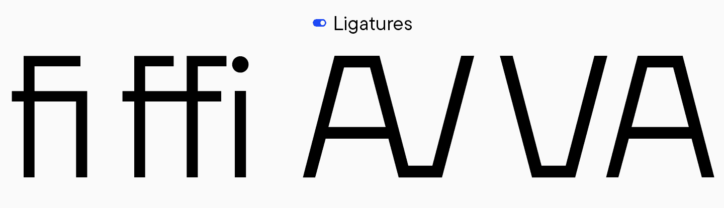
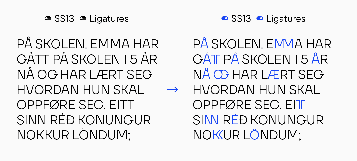
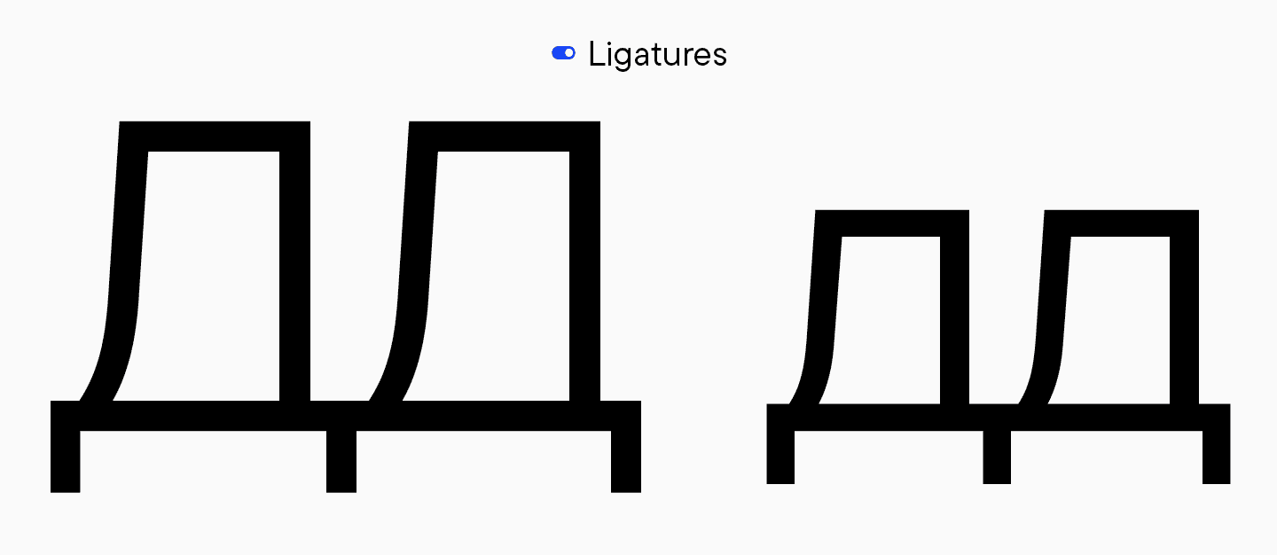
Ligaturen
Auch die Ligaturen waren ein Thema. Zum Beispiel enthalten die Kleinbuchstaben «fi» und nicht «ffi». Bei einigen Ligaturen in Großbuchstaben fehlen die umgekehrten Versionen — es gibt «AV», aber kein «VA», und «TA», aber kein «AT». Das ist kein Fehler, wirft aber Fragen auf, was da eigentlich passiert.
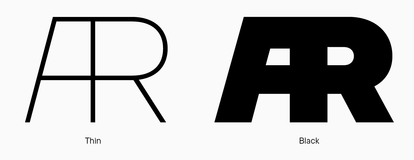
Die Logik zwischen den Meistern in den Ligaturen ist ebenfalls fehlerhaft. In der Buchstabenkombination «AR» ist das «A» in der Schriftart «Thin» schmaler als das «R». In der Schriftart «Black» verschiebt sich dieses Verhältnis und das «A» wird deutlich breiter und nimmt fast so viel Platz ein wie das «R». Dasselbe gilt für «RJ».
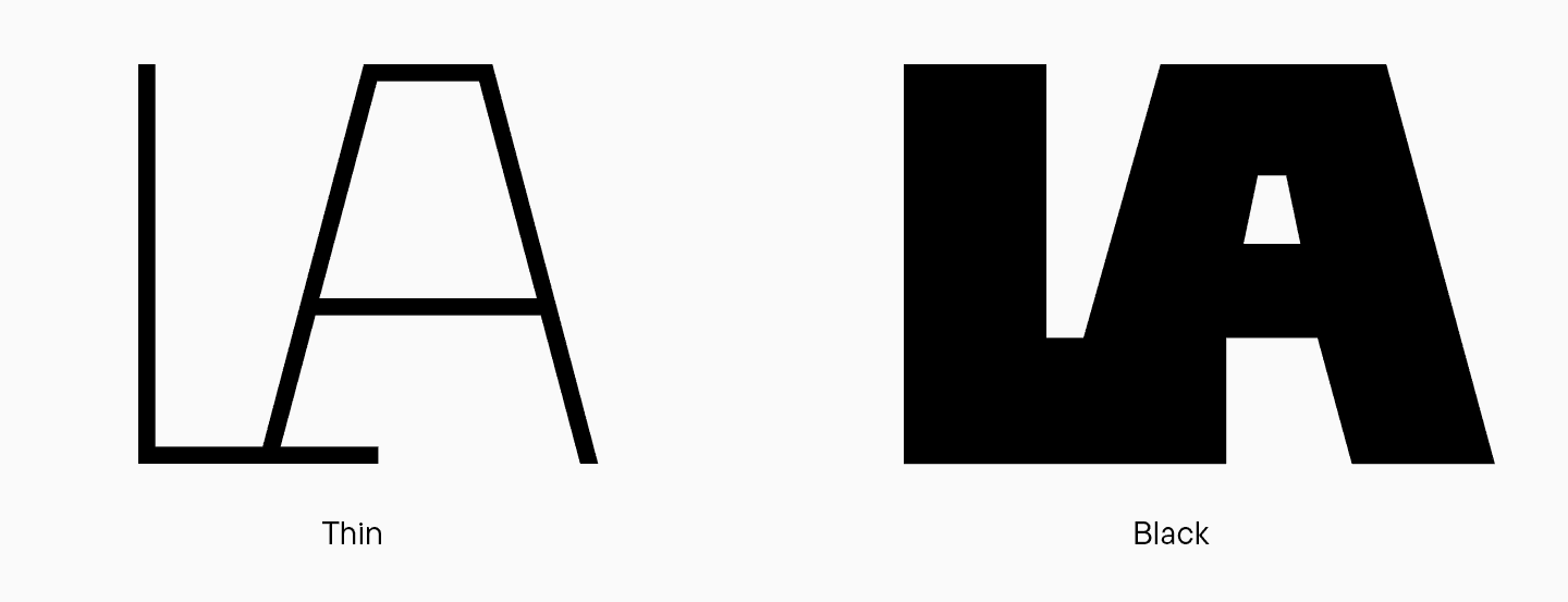
«LA» hat eine merkwürdige Verbindung, die in den verschiedenen Mastern nicht einheitlich ist.
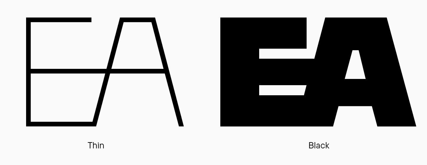
Eine weitere merkwürdige Designentscheidung ist der gemeinsame horizontale Strich bei «EA». Er ist an sich interessant, aber nicht ganz durchdacht. In der Schriftart Schwarz verklumpt alles, und die Ligatur sieht eher wie ein kyrillisches «БА» aus, da der untere Teil des «E» eine ovale Form bildet.
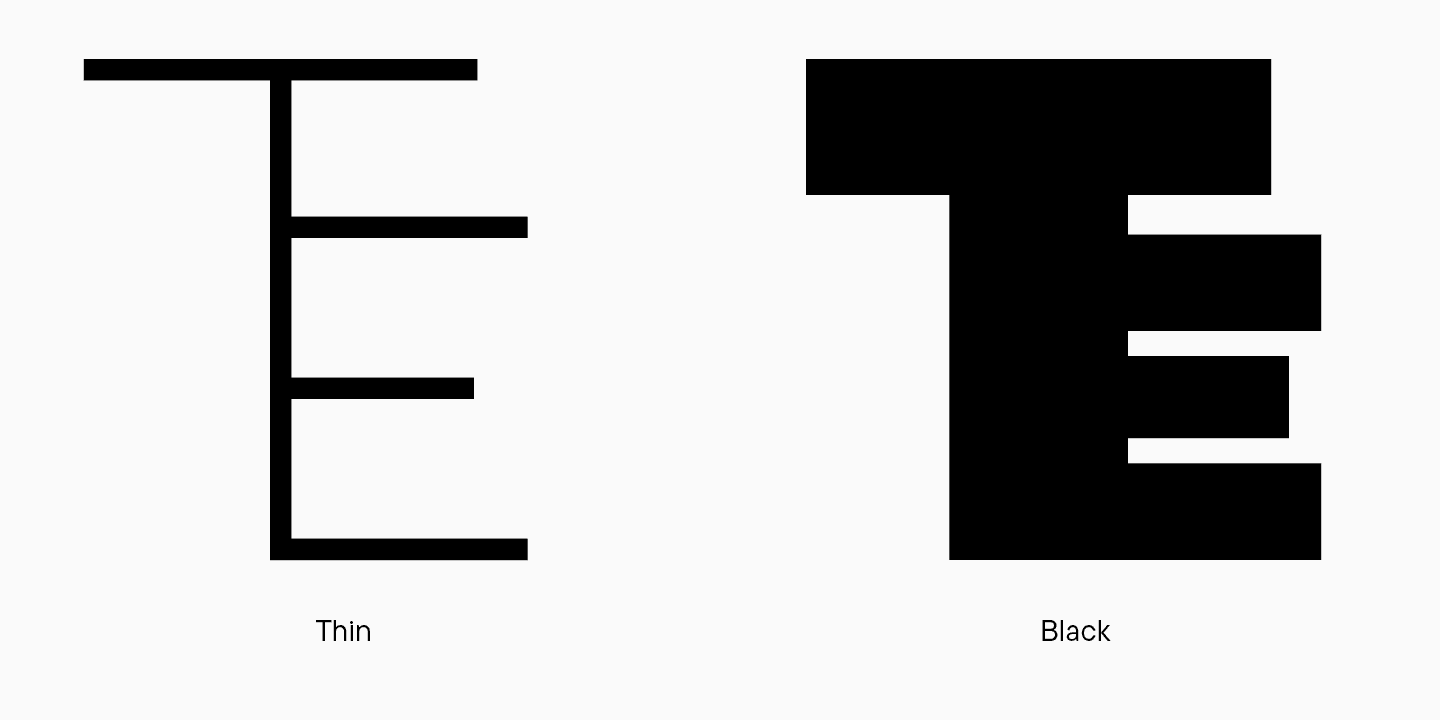
«TE» sieht auch seltsam aus und erinnert an einen Haarkamm. Wenn ein Buchstabe an etwas anderes erinnert, wird er zu einem Symbol oder einer Illustration. Es sieht so aus, als ob die Grafik bei der Gestaltung überbetont wurde.
Schließlich die Ligatur «АТ», die leider wegen ihrer zu komplizierten Form völlig unleserlich ist.
Der Schriftschnitt Regular war zu breit
Nach dem ersten TT Firs-Update erschien der Schriftschnitt Regular zu fett, da die Schrift von FontLab 5 auf Glyphs umgestellt wurde. Die Schlussfolgerung über die übermäßige Gewichtung wurde aus der ähnlichen Verteilung der Gewichte in den Schriftstilen vieler Schriften gezogen. Benutzer haben Erwartungen, wie (theoretisch) ein normaler oder fetter Schriftschnitt aussehen sollte, und Schriftdesigner kennen die Werte.

Antonina Zhulkova schlug folgende Lösung vor: alle Werte aus der alten TT Firs Neue zu nehmen und den Regular-Schnitt etwas leichter zu machen. Zu diesem Zeitpunkt war diese Lösung optimistisch, da wir davon ausgingen, dass es sich um ein schnelles Update handeln würde, bei dem wir nur kleine Anpassungen an der Schrift vornehmen würden. Nachdem wir uns jedoch entschieden hatten, die Schrift komplett zu überarbeiten, schlus Marina Khodak eine andere Lösung vor, über die wir später noch sprechen werden.
Unlogischer Stilsatz
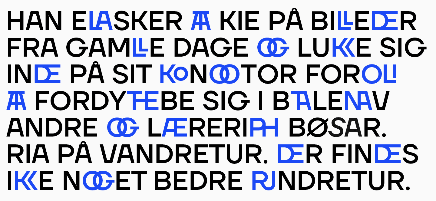
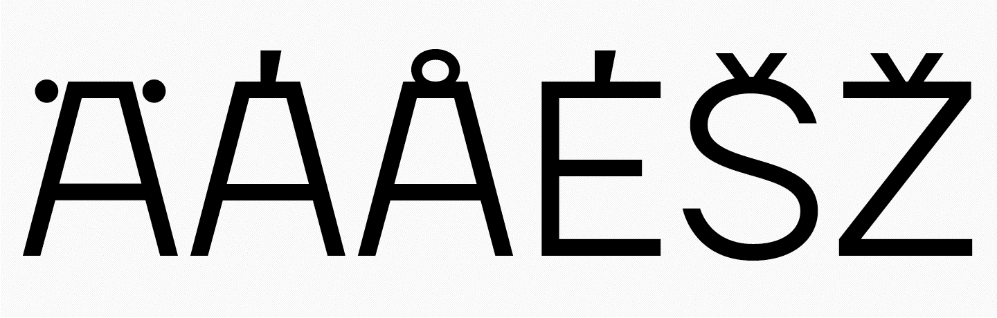
Wir haben bereits erwähnt, dass die erste TT Firs neben vielen seltsamen Ligaturen auch einen Satz mit eingebauten Diakritika hatte. Das Problem war, dass die diakritischen Zeichen nur für einige wenige Zeichen gemacht wurden und das Design inkonsistent war. Bei einigen Glyphen war das diakritische Zeichen in der Nähe des Buchstabens angebracht, bei anderen war es entweder gequetscht oder in das Zeichen integriert. Einige Zeichen hatten überhaupt keine diakritischen Zeichen. Wir mussten für alles eine einheitliche Logik finden.
Die diakritischen Zeichen variierten auch von Schrift zu Schrift. Zum Beispiel hatte das erkennbare «O» mit «Ohren» nur in der Schrift Black ein diakritisches Zeichen. Im Schriftschnitt Thin stehen die Punkte neben dem Buchstaben, im Schriftschnitt Regular sind sie an den Buchstaben geklebt. Dasselbe geschieht mit dem Buchstaben «A» und einigen anderen Zeichen. Das sieht merkwürdig aus und erfordert die Suche nach einer einheitlichen Logik.
Erweiterung des Zeichensatzes
Der Zeichensatz des erweiterten kyrillischen Alphabets für alle Buchstabenfälle (Kleinbuchstaben, Großbuchstaben, Kapitälchen) entsprach nicht unseren heutigen Standards.
Es gab keine eingekreisten Ziffern, keine Brüche und keine Kleinbuchstaben.
Weitere Kritikpunkte
Einige Zeichen mussten grafisch überarbeitet werden. Zum Beispiel war die Logik der Stilsätze gebrochen; es gab einen Satz für das kyrillische Alphabet mit den ausgefallenen Strichen «К» und «Ж», aber der verwandte Buchstabe «Я» hatte keinen solchen Strich. Der Mittelstrich des «E» war zu kurz. Das Oval des zweistufigen «g» war zu groß und wirkte unausgewogen. Antonina schlug vor, einen deutlicheren Unterschied zwischen den Ovalen zu schaffen und zu versuchen, den Balken zwischen den Ovalen zu verschieben. Die Form des Astes im «б» machte den Buchstaben der Zahl 6 zu ähnlich.
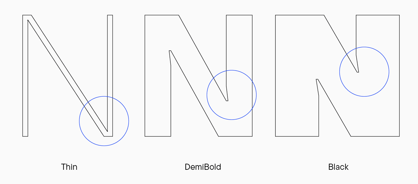
Die Verzweigungen an den Kreuzungen, zum Beispiel im Buchstaben «n». Sie dienten dem optischen Ausgleich. In der Schrift «thin» war dieses Element nur 1 Punkt breit. Es sollte entweder stärker betont oder ganz weggelassen werden.
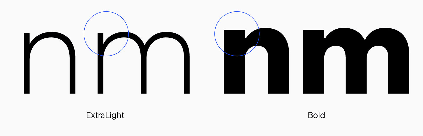
Der obere Teil des Stabes im «n», rechts vom Bogen, hatte das gleiche Gewicht wie der Rest. Antonina schlug vor, diesen «Stachel» schmaler zu machen. Es ist üblich, ihn etwas dünner zu machen als den Hauptstiel. Auf diese Weise wirkt er nicht zu kräftig und groß.
Inkonsistente diakritische Zeichen. Das kyrillische und das lateinische Breve waren in einigen Stilen identisch, in anderen unterschiedlich. Die Flamme war zu kalligraphisch und passte nicht zum Charakter der Schrift.
Außerdem verlangten die aktualisierten Grafiken die besten neuen Abstände und Andeutungen.
Teil 2: Verfeinerung der Schrift
In dieser Phase wurde Marina Khodak zur leitenden Designerin des Projekts. Auf der Grundlage von Antoninas Recherchen und der Suche nach eigenen Lösungen begann Marina mit der kompletten Überarbeitung der TT Firs Neue. Für die Version 2.000 wurde die Schrift praktisch von Grund auf neu entwickelt.
Werfen wir einen Blick auf die interessantesten Änderungen.
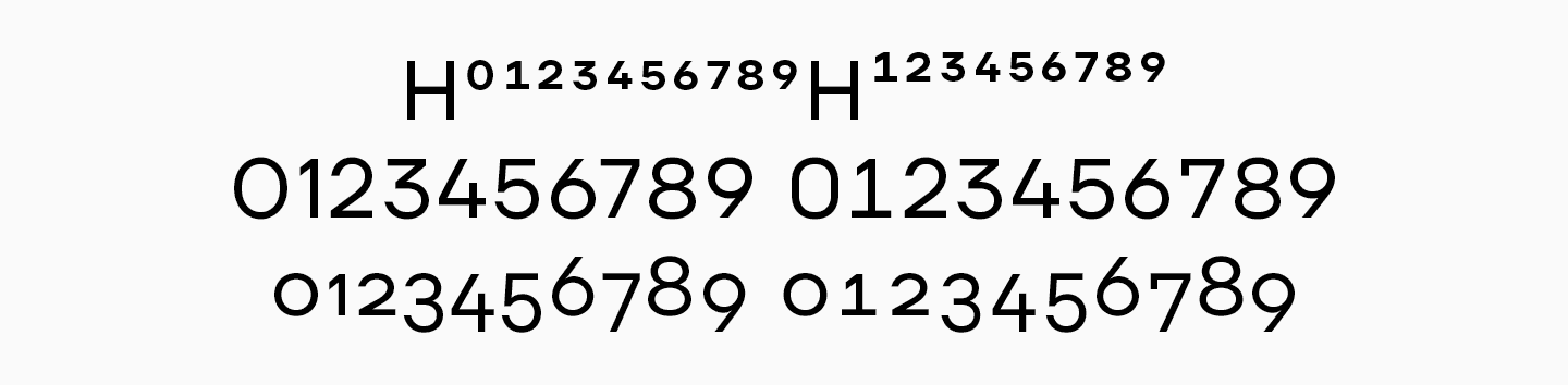
Ausgewogener Regular-Schnitt
Regular ist der wichtigste Schriftschnitt der Schrift. Die Aufgabe bestand darin, es den Benutzern einfach und sicher zu machen, die alte TT Firs Regular, die sie anfangs verwendet hatten, durch die neue TT Firs zu ersetzen, ohne dass alles gewagter aussieht. Deshalb war es sehr wichtig, die Ähnlichkeiten zwischen den grundlegenden Schriftstilen der meisten Schriften beizubehalten.
«Als klar wurde, dass wir die Schrift grundlegend überarbeiten wollten, haben wir alle Schnitte neu berechnet. Das Ergebnis war, dass die Gewichtung des Regular-Schnittes in TT Firs Neue 2.000 70 Punkte betrug — wie es sein sollte. Außerdem fügten wir einen Schriftschnitt Normal mit einer Basisstärke von 90 Punkten hinzu. Diesen Schriftschnitt fügen wir den serifenlosen Schriften aufgrund der großen Nachfrage oft hinzu. In der alten TT Firs Neue hatte die Regular eine Gewichtung von 90 Punkten, in der neuen von 70. Wir haben die 90 Punkte für diejenigen beibehalten, die diese besondere Gewichtung in der früheren Version der Schrift mochten.
Marina Khodak, Leitende Designerin bei TypeType
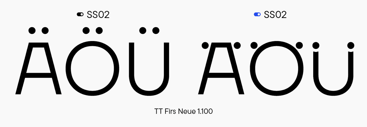
Entwicklung einer universellen Logik für den Satz mit komprimierten diakritischen Zeichen
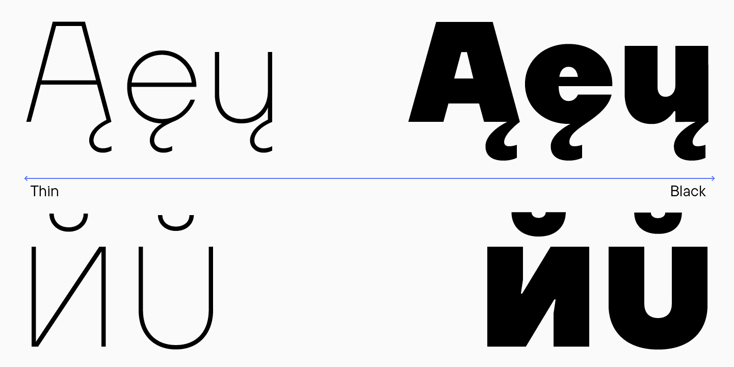
Um die an die Buchstaben angehängten diakritischen Zeichen in die Gesamtlogik einzufügen, analysierte Marina die Häufigkeit der Zeichen in den skandinavischen Sprachen.
«Unsere Schriftart enthielt einen Satz dieser komprimierten diakritischen Zeichen, und ich wollte verstehen, warum diese Zeichen hinzugefügt wurden und warum sie nur auf bestimmte Buchstaben angewendet wurden. Ich hatte eine Version, in der sie nur den Buchstaben der skandinavischen Sprachen hinzugefügt wurden: Schwedisch, Norwegisch, Isländisch und Dänisch. Die finnische Sprache gehört nicht zur skandinavischen Gruppe, wird aber aufgrund ihrer geographischen Zugehörigkeit ebenfalls so genannt. Außerdem betrachtete ich Englisch als die am weitesten verbreitete Sprache und die auf dem Kyrillischen basierenden Sprachen als unsere Muttersprachen. Meine Theorie hat sich nicht bestätigt. Es stellte sich heraus, dass der Satz nicht alle Buchstaben enthielt, die in diesen Sprachen am häufigsten verwendet werden. Wir haben einfach komprimierte diakritische Zeichen für alle Großbuchstaben entworfen. Diese Designentscheidung wurde zum Alleinstellungsmerkmal der Schrift, so dass nun fast jeder Text mit diakritischen Zeichen gestaltet werden kann.»
Marina Khodak, Leitende Designerin bei TypeType
Neben der ss13 mit eng gesetzten diakritischen Zeichen haben wir die ss14 entwickelt, bei der die diakritischen Zeichen in die Buchstaben integriert sind.
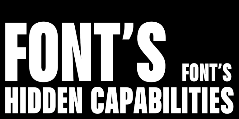
«TT Firs Neue 2.000 hat eine gut durchdachte Logik für ihre Schriftsätze. Viele Designer verwenden sie jedoch nicht, entweder weil sie nicht wissen, dass es sie gibt, oder weil sie das Werkzeug einfach unbequem finden. Wir empfehlen daher immer, vor der Installation einer Schrift diese auszuprobieren und sich mit ihren Funktionen vertraut zu machen. Es gibt eine Fülle von Funktionen, die, wenn sie genutzt werden, die Schrift in einem neuen Licht erscheinen lassen und ihr eine neue Dimension verleihen.»
Ivan Gladkih, CTO, Mitgründer von TypeType
Wenn Sie mehr darüber erfahren möchten, wie Sie Stilsätze und andere Funktionen finden und nutzen können, lesen Sie unseren Article.
Verfeinerte Ligaturen
Die alte Version hatte unvollständige Ligatursätze. Marinas Ausgangspunkt war, dass unsere Schrift zu den skandinavischen serifenlosen Schriften gehört. Deshalb wählte sie diese Richtung für ihre Recherche.
«Ich habe mir die am häufigsten verwendeten Buchstabenkombinationen in den skandinavischen Sprachen angesehen. Aus diesen könnten wir einfach Ligaturen entwerfen, aber sie sehen in Kombination nicht immer harmonisch aus. Deshalb haben wir zwei logische Ansätze gewählt: zum einen die Häufigkeit und zum anderen ästhetisch ansprechende und interessante Buchstabenkombinationen. Auf der Grundlage dieser Analyse und Logik haben wir Paare gebildet, die in die Schrift eingeflossen sind.»
Marina Khodak, Chefdesignerin von TypeType
Hier sind einige interessante Beispiele von Ligaturen, die wir erstellt haben:
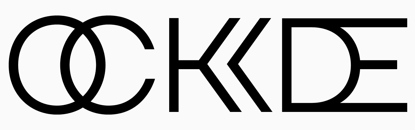
- Unkonventionelles «DE».
- Bei «Eл und «Fл bleibt die Designkontinuität mit einem gemeinsamen horizontalen Strich der alten Schrift erhalten.
- Eine Form des Buchstabens «G», die in der skandinavischen Typografie häufig vorkommt, war in der alten Schrift sehr präsent. Wir fügten sie den Ligaturen hinzu und reimten den horizontalen Akzent mit «Eл und «Fл.
- Ligaturen mit «verdoppelten» Buchstaben stammen ebenfalls aus dem Finnischen.
- «WE» sieht ziemlich spannend aus.
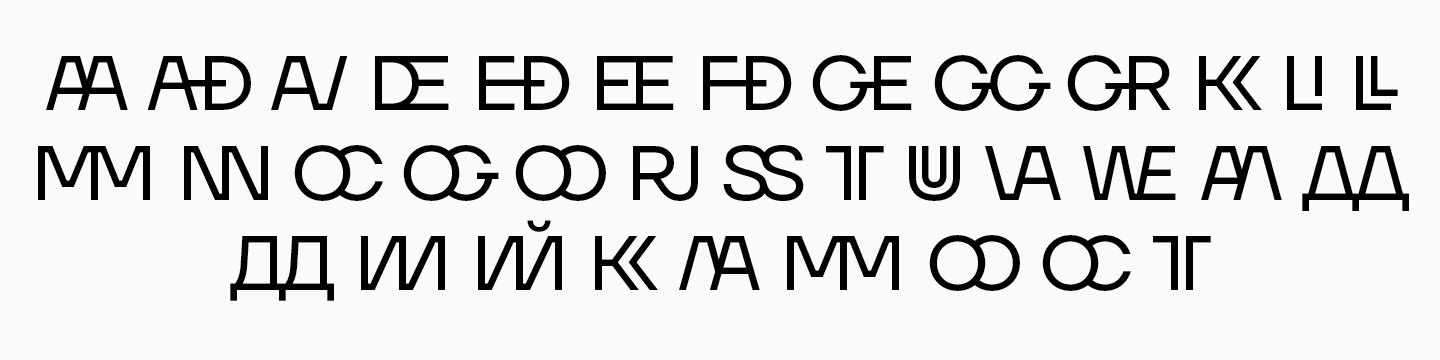
Die Großbuchstaben der alten Schrift hatten viele spezifische Ligaturen — sie wurden stark verändert, aber die Logik blieb die gleiche. TT Firs Neue, Version 2.000, bietet zwei Arten von Ligaturen: einfache Ligaturen und Ligaturen aus dem Satz ss15 — Buchstabe für Buchstabe.
Die Großbuchstaben der alten Schrift hatten viele spezielle Ligaturen — sie wurden stark verändert, aber die Logik blieb die gleiche. TT Firs Neue, Version 2.000, bietet zwei Arten von Ligaturen: einfache Ligaturen und Ligaturen aus dem ss15-Set — Buchstabe für Buchstabe.
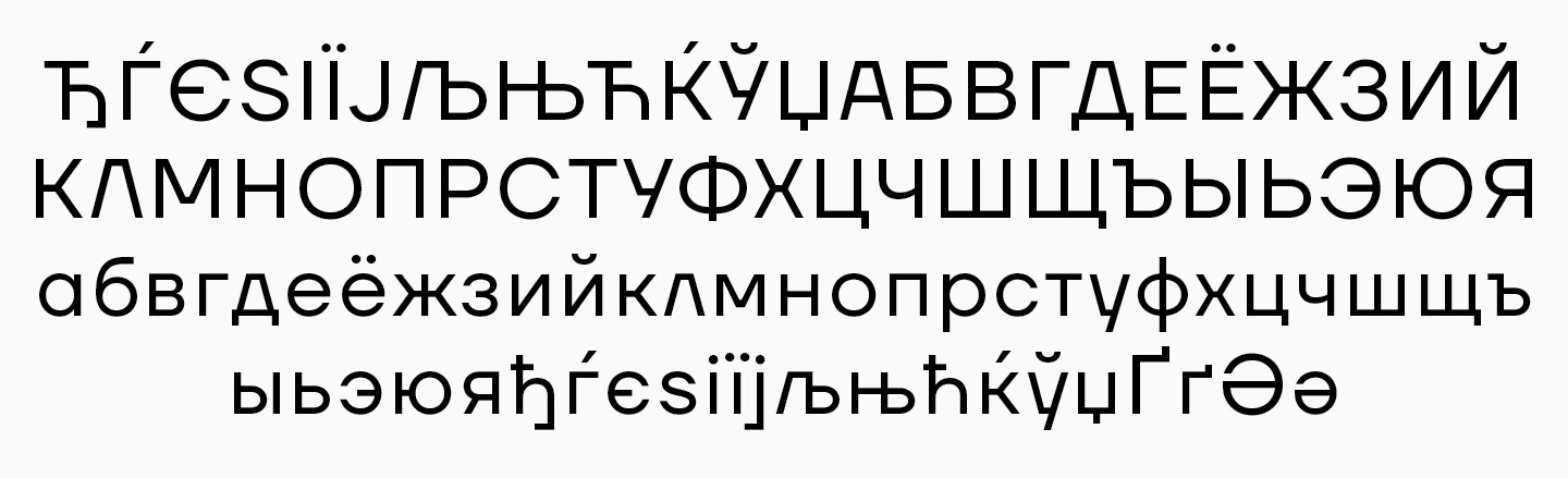
Erweiterte Unterstützung für kyrillische Sprachen
Der aktualisierte Font bietet erweiterte Sprachunterstützung, insbesondere für Sprachen, die auf dem kyrillischen Alphabet basieren.
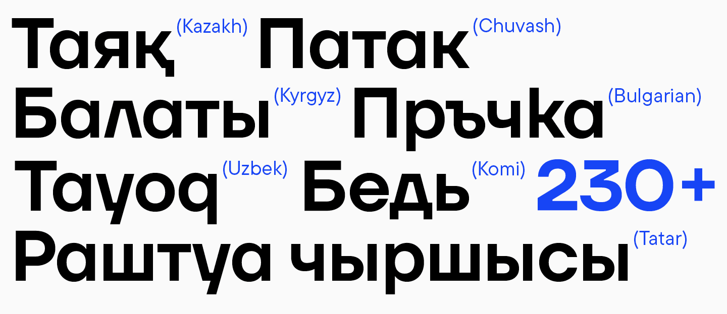
«Vor einigen Jahren haben wir festgestellt, dass die Welt der kyrillischen Alphabete sehr groß ist. Deshalb haben wir 2022 damit begonnen, erweiterte kyrillische Zeichensätze zu integrieren — nicht nur für die wichtigsten kyrillisch-basierten Sprachen, sondern auch für Sprachen kleinerer ethnischer Gruppen, die von mehr als einer Million Menschen gesprochen werden, wie Tatarisch, Kasachisch, Kirgisisch und andere. Und TT Firs Neue ist keine Ausnahme von diesem neuen Ansatz.»
Ivan Gladkih, CTO, Mitbegründer von TypeType
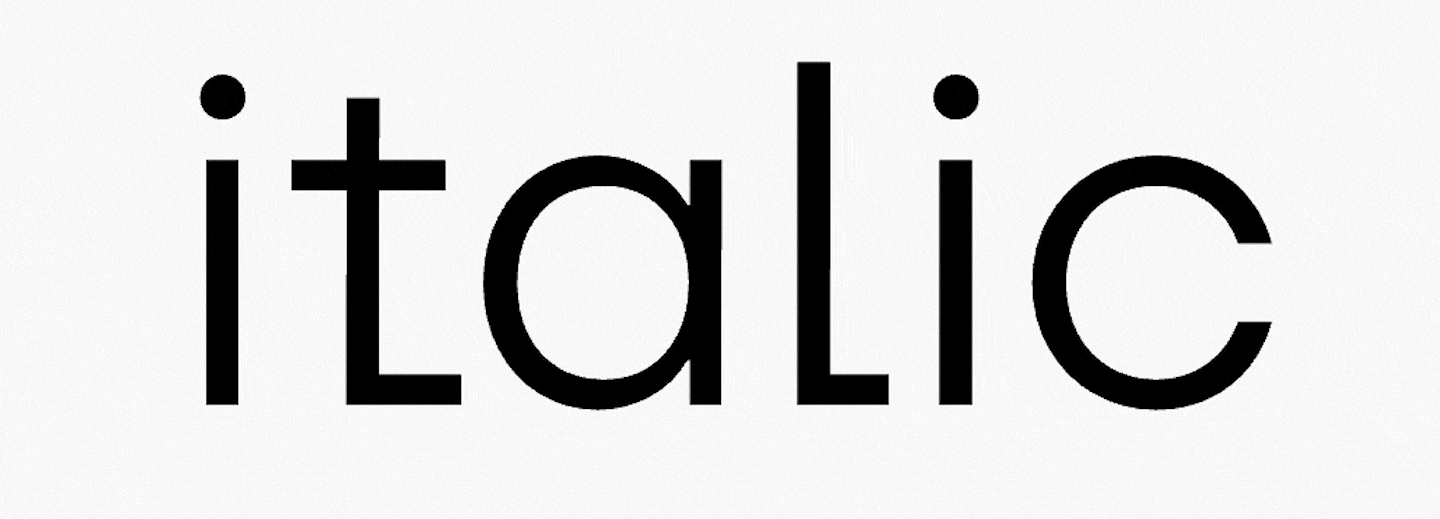
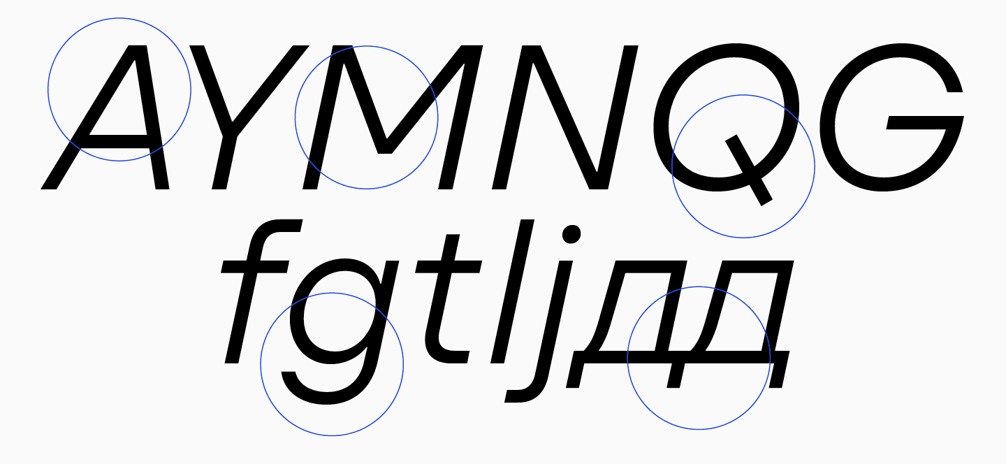
Fesselndere Kursivschrift hinzugefügt
Die TT Firs Neue ist die erste serifenlose Schrift, bei der wir uns besonders viel Mühe bei der detaillierten Entwicklung der Kursivschnitte gegeben haben. Normalerweise wird die einfachste Slant mit Artefaktkompensation als Paar für serifenlose Schriften entworfen. Die Proportionen bleiben gleich. In diesem Fall haben wir jedoch einen anderen Ansatz gewählt.
«Wir haben viel Zeit, Mühe und Herzblut in die Verfeinerung der aktualisierten Schrift gesteckt. Wir wollten mehr — etwas wirklich Besonderes.»
Marina Khodak, Chefdesignerin von TypeType
Als wir an den Entwürfen für die Kursive arbeiteten, beschlossen wir, sie dynamischer zu gestalten, indem wir den Neigungswinkel von 10° auf 12° erhöhten und die Proportionen der runden Buchstaben veränderten. Ohne diese wichtige Änderung ließen die großen, runden Formen das Auge nicht über die schräge Linie «gleiten». Jetzt erfüllt das dynamischere Design der Kursiven in Kombination mit einer statischen, aufrechten Schrift besser ihren Hauptzweck: die Hervorhebung wichtiger Ideen im Text. Außerdem ist die Kursivschrift einfach wunderschön geworden.
Weitere Änderungen
Nach der Aktualisierung ist die Schrift stabiler, robuster, solider und einheitlicher geworden. Wir haben die Übergänge, Breiten, Ovalverhältnisse, Kontraste, Abstände und Proportionen neu gestaltet, um all die Probleme zu lösen, die wir im vorherigen Abschnitt besprochen haben.
Zum Beispiel:
- Wir haben runde Zeichen komplett neu gestaltet und ihre Proportionen in allen Mastern ausbalanciert, was zu einheitlicheren Formen geführt hat.
- Die Kreuzungen in den dreieckigen Zeichen wurden visuell einheitlich gestaltet.
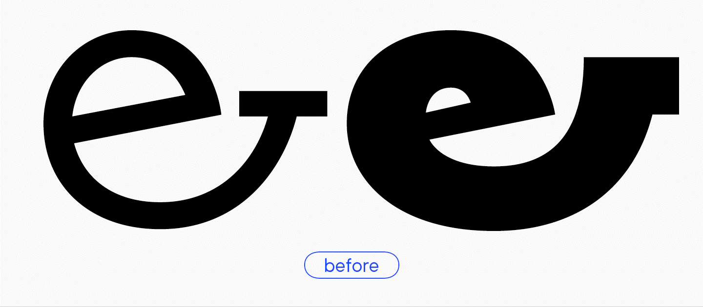
- Die spitzen Enden, die so genannten «Skorpionschwänze», wurden entfernt.
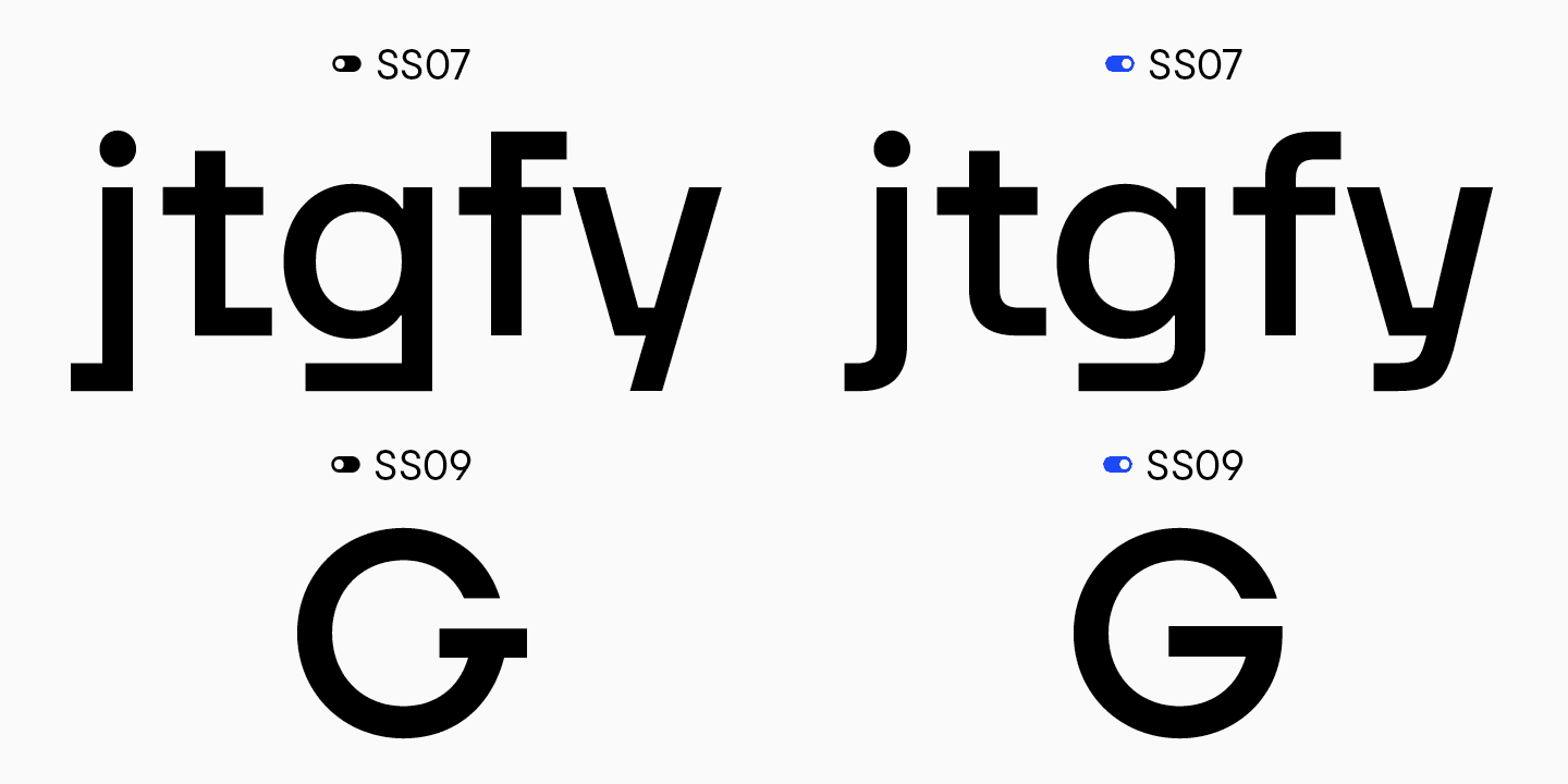
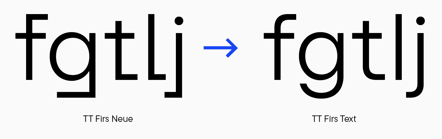
- Die Enden der Buchstaben «t», «f», «j», «g» und ähnlicher Buchstaben wurden geglättet und sind nun gleichmäßiger in Gewicht und Länge. Dies ist besonders auffällig, wenn man zwei Versionen von «g» vergleicht.
- Der Schriftsatz ss7 mit abgerundeten Enden wurde hinzugefügt. Dieser Satz wurde später in den Hauptzeichensatz von TT Firs Text aufgenommen, ebenso wie ss9, wo der Buchstabe «G» dieses attraktive horizontale Element nicht hatte.
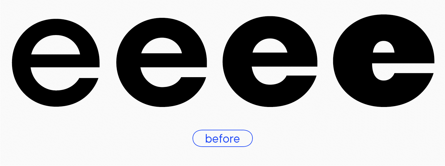
- Der übermäßige Kontrast des Buchstabens «e» in der fetten Schrift wurde entfernt.
- «C» and «O» erhielten ausgewogenere Proportionen zwischen den Mastern.
- Der Zweig in «б» wurde neu gestaltet.
- Die diakritischen Zeichen, die in der kyrillischen Breve deutlich sichtbar sind, wurden in Gewicht und Form ausgeglichen.
- Der Buchstabe «Э», der früher seltsame Proportionen und einen starken Kontrast aufwies, ist jetzt in der richtigen Ordnung.
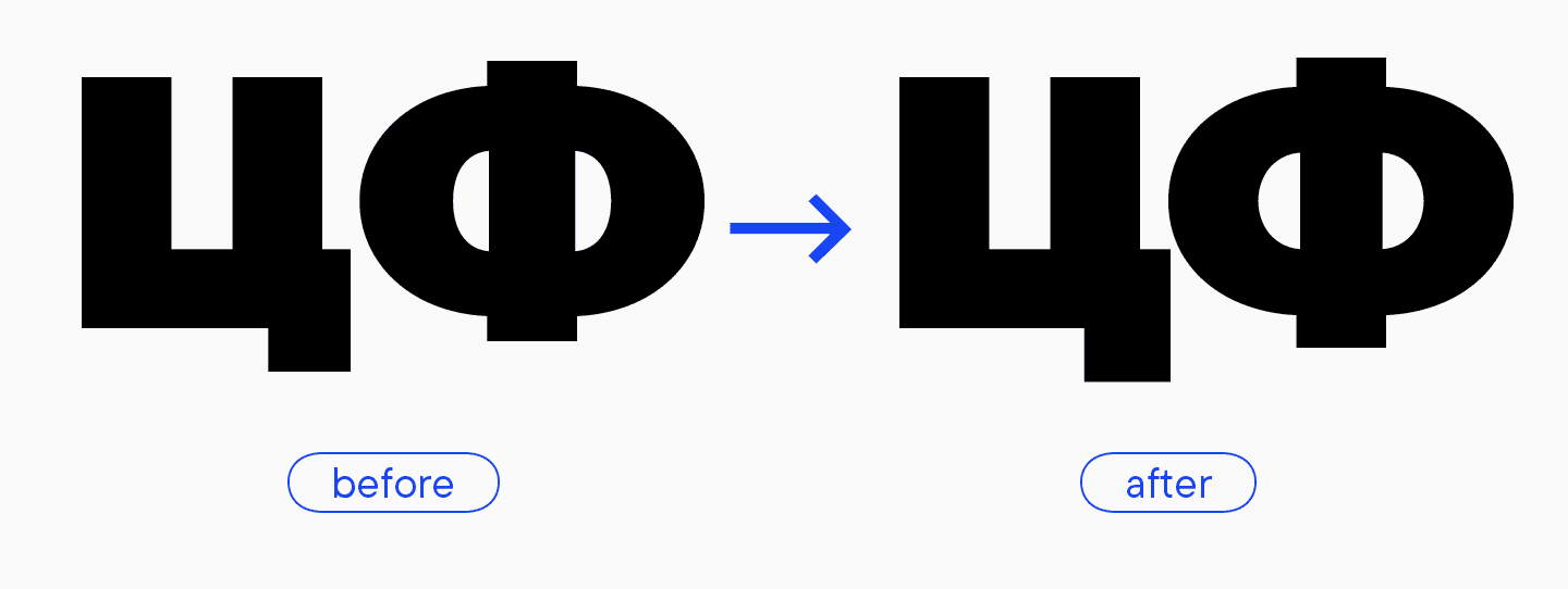
- Der Schwanz des Buchstabens «Ц» und die Enden des Buchstabens «Ф» sind selbstbewusster und klarer geworden.
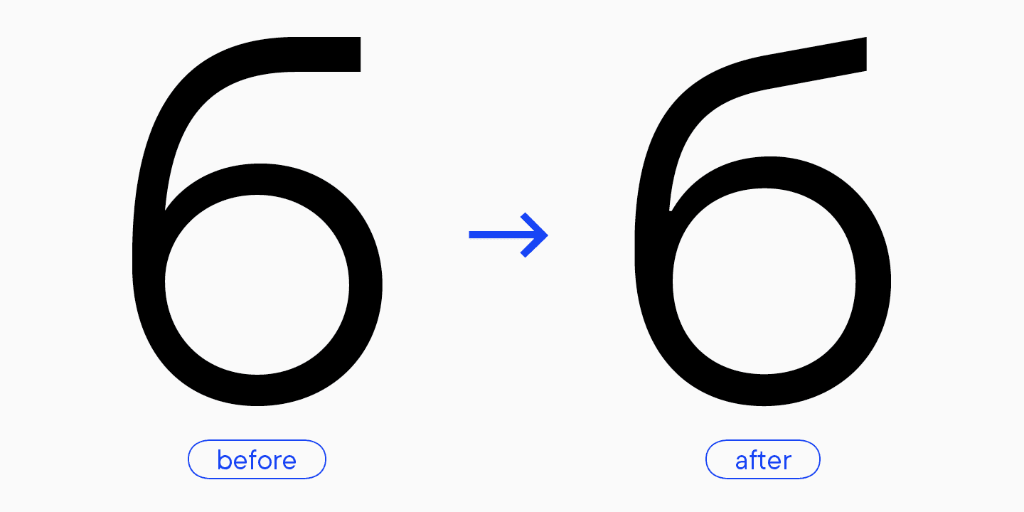
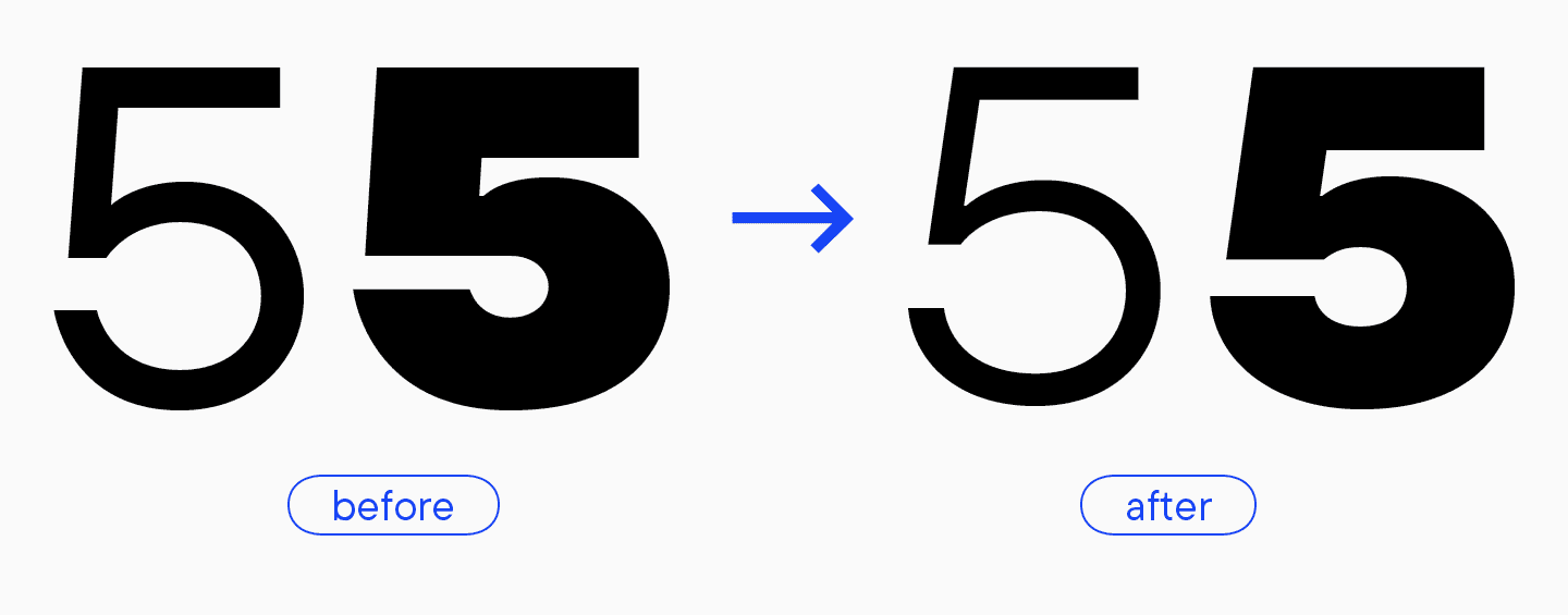
- Wir haben die Form der Zahl 5 verändert und ihre «Fremdheit» beseitigt. Die klassischere Version der Zahl passte besser zum Design.
- Die Form des Ampersands wurde ebenfalls verändert und ausdrucksstärker gestaltet.
«Es ist lustig, dass die Form der ersten Version von TT Firs sehr ähnlich ist, obwohl ich sie nicht als Referenz hatte. Offensichtlich ist sie vom Stil der Schrift inspiriert und gehört natürlich hierher.»
Marina Khodak, Chefdesignerin von TypeType
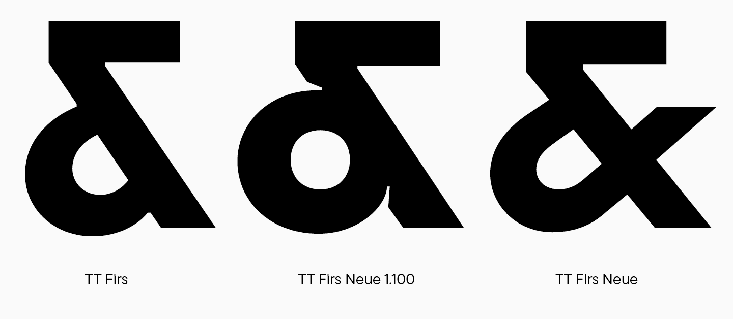
- Die Version mit dem kleingeschriebenen kaufmännischen Und-Zeichen wurde beibehalten, allerdings ohne das horizontale Element, wodurch die Form insgesamt ausgewogener wirkt. Die Probleme mit der Interpolation und der Verwendung des variablen Fonts wurden ebenfalls behoben.
- Im primären Zeichensatz von TT Firs Neue haben die Buchstaben «Л» und «Д» eine trapezförmige Form, die das Aussehen des Buchstabens «A» unterstützt. Für den alternativen Satz haben wir primäre Textformen entworfen. Ihr Charakter war weicher und naiver als der der gesamten Schrift. In der TT Firs Neue 2.000 haben wir diese alternativen Glyphen beibehalten, um die Funktionalität der Schrift zu erweitern, und sie im gewünschten Stil neu gestaltet. Später werden diese Zeichen den primären Textsatz der TT Firs bilden, auf den wir weiter unten näher eingehen werden.
Das Ergebnis des TT Firs Neue 2.000 Designs
Das Ergebnis unserer harten Arbeit und unseres Engagements ist eine perfekt ausbalancierte skandinavische Sans Serif-Schrift mit ausdrucksstarken grafischen Elementen und großer Vielseitigkeit in der Anwendung.
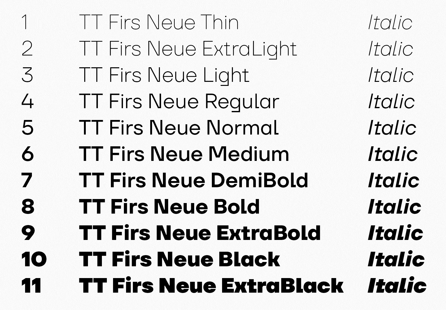
Die TT Firs Neue 2.000 enthält:
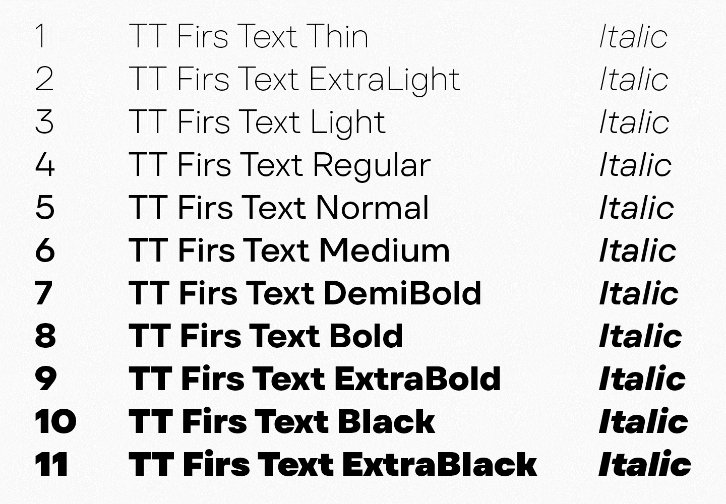
- 23 Schnitte: 11 Antiqua- und 11 Kursivschnitte sowie ein variabler Schnitt mit zwei Variationsachsen: Gewicht und Neigung;
- 1719 Zeichen in jedem Schriftschnitt
- 40 OpenType-Funktionen;
- Unterstützung von über 235 Sprachen.
«Überraschenderweise ist die zweite Ausgabe der TT Firs besonders beliebt im europäischen Branding. Sie wird von verschiedenen Museen, Architekturbüros und Cafés geliebt — alles, was in die Kategorie skandinavischer Vibe fällt. Das bedeutet, dass unsere Vision wie erwartet zum Leben erweckt wurde.»
Ivan Gladkih, CTO, Mitbegründer von TypeType
Von einer einzelnen Tanne zu einem ganzen Wald: Die Gestaltung eines Textschriftenpaares
Als wir die TT Firs Neue verwendeten, fanden wir sie sehr ausdrucksstark und begannen, ein Schriftpaar für sie zu entwerfen — die TT Firs Text.
Normalerweise bestehen Schriftpaare aus Schriften verschiedener Gruppen, wie zum Beispiel Serifen- und Sans-Serif-Schriften, die miteinander kontrastieren. Wir gingen einen etwas anderen Weg, indem wir die Proportionen der TT Firs Neue beibehielten und ein Textpaar für sie entwarfen. Im Wesentlichen haben wir dies getan, um das Erscheinungsbild der Schrift weitgehend beizubehalten und gleichzeitig sicherzustellen, dass alle Zeichen für die Textgestaltung geeignet sind.
Wir stellten uns die Aufgabe, eine einfache Textschrift auf der Basis der TT Firs Neue 2.000 zu entwerfen, die Expressivität und zusätzliche Details zu eliminieren und den Zeichensatz auf das Wesentliche zu beschränken.
Wir stützten uns dabei auf frühere Studien der Schrift TT Neoris und überarbeiteten einige Glyphenformen, um sie an die von Designern am häufigsten verwendeten Zeichen anzupassen.
Hier sind einige der Details, die wir geändert haben:
- Die Kreuzungen in den dreieckigen Zeichen wurden entfernt, wodurch die Formen weniger expressiv wirken;
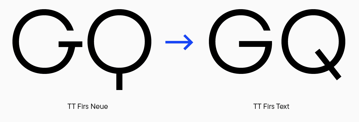
- Einige Formen erhielten ein klassischeres Aussehen (z. B. «G» oder «Q»);
- Quadratische Endungen wurden bei «f», «g», «j», «l» und «t» durch abgerundete Endungen ersetzt;
- Die Proportionen von Zeichen mit Kreuzungen wurden visuell ausgeglichen;
- Fast alle Ligaturen wurden entfernt, die verbleibenden dienen eher technischen als ästhetischen Zwecken;
- Die kursiven Schriftarten wurden ebenfalls umgestaltet.
«Das Ergebnis ist eine serifenlose Schrift mit traditionelleren Buchstabenformen. Die Schrift ist eher neutral, aber immer noch erkennbar. Sie hat einen besonderen Stil und die Ausstrahlung der TT First Neue».
Toma Streltsova, leitende Schriftdesignerin
Das Ergebnis der Gestaltung der TT Firs Text
TT Firs Text ist eine elegante, geometrische, serifenlose Schrift mit nordischem Charakter, die Einzigartigkeit und Neutralität vereint.
Die TT Firs Text enthält:
- 23 Schriftschnitte: 11 Antiqua- und 11 Kursivschnitte sowie ein variabler Schnitt mit Gewichtungs- und Neigungsachse;
- 898 Zeichen in jedem Schriftschnitt
- 31 OpenType-Funktionen;
- Unterstützung von über 235 Sprachen.
«Wir haben eine starke serifenlose Schrift mit einem subtilen skandinavischen Touch geschaffen, die perfekt zur TT Firs Neue 2.000 passt. Für uns ist klar, dass TT Firs Text ein „Arbeitstier“ für eine Vielzahl von Aufgaben ist. Das zeigt sich auch in der Praxis, denn die Schrift ist bei unseren Anwendern bereits sehr beliebt.»
Ivan Gladkih, CTO, Mitbegründer von TypeType