

Outline-Schriften sind ein hervorragendes Mittel, um ein Design abwechslungsreich, attraktiv und auffällig zu gestalten. Wie sehen sie aus? Wo werden sie eingesetzt? Zu welchen Schriftarten passen sie?
In diesem Artikel gehen wir auf all diese Fragen ein und haben eine Auswahl der besten Outline-Schriften für verschiedene Projekte zusammengestellt.
Was sind Outline-Schriften?
Der Begriff „Outline-Schrift“ kann zwei Bedeutungen haben: eine technische und eine stilistische.
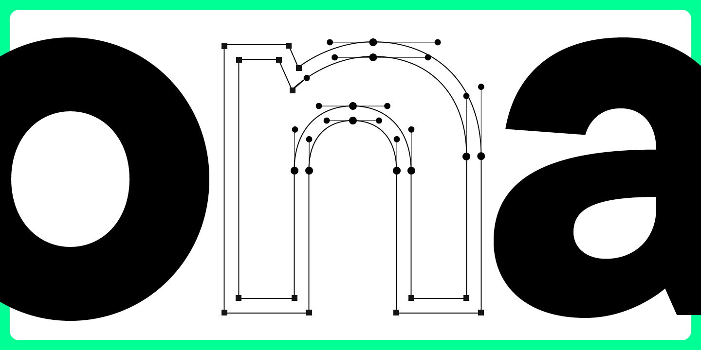
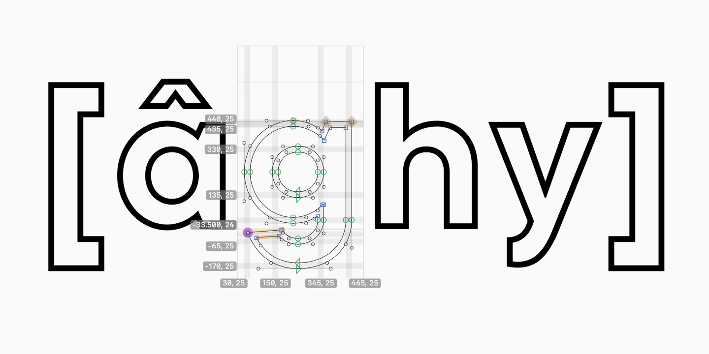
Im technischen Sinne sind Outline Fonts (Vektorfonts) digitale Schriften, bei denen die Glyphen mit Hilfe von Vektoren konstruiert werden, die die Koordinaten von Ankerpunkten festlegen. Diese Ankerpunkte werden durch Linien verbunden, die die Umrisse der Glyphen bilden.
Aus stilistischer Sicht sind Outline-Schriften eine besondere Art von Schriften, bei denen die Buchstaben nur Konturen aufweisen. Es handelt sich um Hohlschriften, bei denen jedes Zeichen umrandet ist. Man sieht nur die Ränder einer solchen Schrift, das Innere wirkt „leer“. Das hat zur Folge, dass Hintergrundfarben und Texturen durch diese Schriften hindurchscheinen. Dieses Feature ermöglicht es Designern, aufregende Projekte zu gestalten und mit Grafiken zu experimentieren.
In diesem Artikel konzentrieren wir uns auf Outline-Schriften in ihrer stilistischen Bedeutung.
Wie und wo werden Outline-Schriften typischerweise verwendet?
Outline-Schriften werden eingesetzt, um Aufmerksamkeit zu erregen: auf Buch- und Zeitschriftenumschlägen, Plakaten, im Verpackungsdesign, für Beschilderungen, in Logos, großen Texten auf Websites und in Apps.
Einer der wichtigsten Punkte, den es bei der Verwendung von Outline-Schriften zu beachten gilt, ist, dass sie bei mittleren und großen Punktgrößen am besten lesbar sind. Bei kleinen Punktgrößen verschwimmen die Ränder solcher Schriften und die Buchstaben wirken unscharf.
Kombination von Outline-Schriften mit anderen Schriften
Outline-Schriften wirken unabhängig von ihrem Stil immer sehr ausdrucksstark. Ein Text, der in einer solchen Schriftart geschrieben ist, wird die Aufmerksamkeit auf sich ziehen, vor allem wenn die Outline-Schriftart mit dem grafischen Design synergetisch zusammenwirkt. Deshalb ist es besser, eine einfachere, neutralere Schrift für eine Outline-Schrift zu wählen.
Wenn Sie Outline-Schriften mit anderen Schriften kombinieren möchten, sollten Sie die Grundprinzipien der Schriftkombination beachten. Vermeiden Sie z. B. die Verwendung von mehr als zwei Schriften in einem Projekt, verteilen Sie die Aufgaben sorgfältig und wählen Sie Schriften aus, die in Stil und Stimmung zu Ihrem Projekt passen. In einem anderen Artikel erfahren Sie mehr über die Auswahl von Schriften für Projekte.
Achten Sie beim Kombinieren von Schriften sowohl auf Ähnlichkeiten als auch auf Unterschiede. Der Kontrast zwischen ihnen sollte sichtbar sein, aber sie sollten auch ähnliche stilistische Merkmale aufweisen. Am einfachsten ist es, verschiedene Schriftschnitte einer Schriftart zu verwenden, so dass die ausgewählten Schriften immer den richtigen Stil haben. Hier erfahren Sie mehr über die Prinzipien der Schriftkombination.
Die besten Outline-Schriften für kreative Designprojekte: unsere Top-Auswahl
In unserer Schriftauswahl finden Sie kostenlose und kostenpflichtige Outline-Schriften in verschiedenen Stimmungen. Viele von ihnen sind Teil von Schriftfamilien, so dass Sie Outline-Schriften und Standardschriften aus derselben Schriftfamilie verwenden können, um Kompatibilität und Funktionalität sicherzustellen.
Vielseitige Outline-Schriften der TypeType-Kollektion
Wir haben die besten Outline-Schriften aus unserem Studio ausgewählt: funktionell, vielseitig und modern. Diese Schriften eignen sich für eine Vielzahl von Anwendungen, z. B. Webdesign, Druck, Branding, Beschilderung oder Poster. Sie können sie überall dort einsetzen, wo Sie ausdrucksstarken und auffälligen Text gestalten möchten.
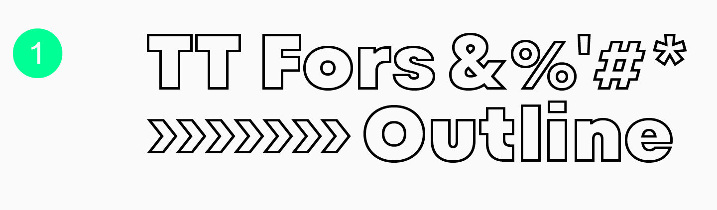
Die TT Fors Outline ist eine schwarze Outline-Schrift, die zur TT Fors-Schriftfamilie gehört. Wie die gesamte Schriftfamilie hat sie einen neutralen Charakter und fein abgestimmte Proportionen. Die Buchstabenformen dieser Schrift ähneln geometrischen Formen (Kreis, Dreieck, Quadrat). Das macht die Outline-Schriften der TT Fors so vielseitig einsetzbar. Sie kann einen auffälligen Akzent setzen oder sich in ein minimalistisches Design einfügen. Die Schrift hat insgesamt zwei Outlines: eine gerade TT Fors Outline und eine schräge TT Fors Black Outline Italic.
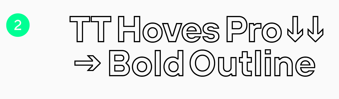
TT Hoves Pro, eine der Basisschriften unserer Kollektion, enthält auch eine neutrale Serifenlose. Sie ist eine skandinavische Serifenlose, schlicht und neutral, aber dennoch unverwechselbar. Horizontale und vertikale Striche dominieren das Schriftbild. Die Schriftfamilie TT Hoves Pro bietet zwei Outline-Schriften: die vertikale TT Hoves Pro Bold Outline und die schräge TT Hoves Pro Bold Outline Italic. Sie eignen sich hervorragend für Branding, Verpackungsdesign, Web und Print und können mit jeder neutralen Schrift kombiniert werden, um informative Textblöcke zu gestalten.
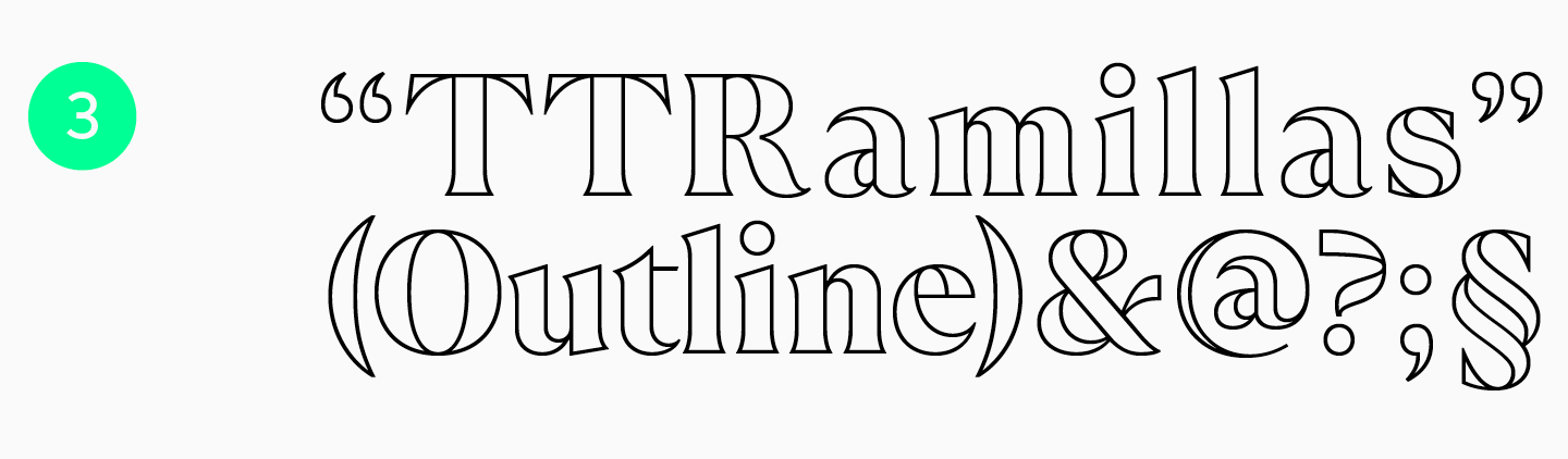
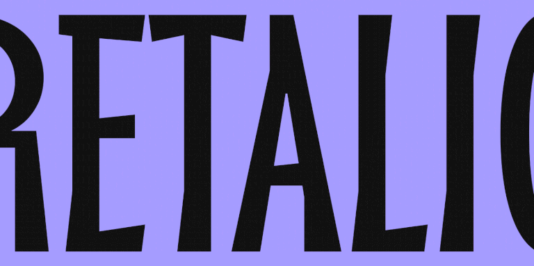
TT Ramillas ist eine ästhetische, experimentelle Serifenschrift, die jedem Design eine elegante Note verleiht. Die Schrift umfasst dekorative, umrandete Schriftstile mit charakteristischen, ausladenden Serifen und einer offenen Apertur. Die Schrift verfügt über zwei Outline-Stile: Condensed und Kursiv. Diese Outline-Schriften sind ideal für Überschriften und andere auffällige Texte. Besonders harmonisch wirken sie in Projekten aus den Bereichen Kunst, Mode oder Parfümerie.
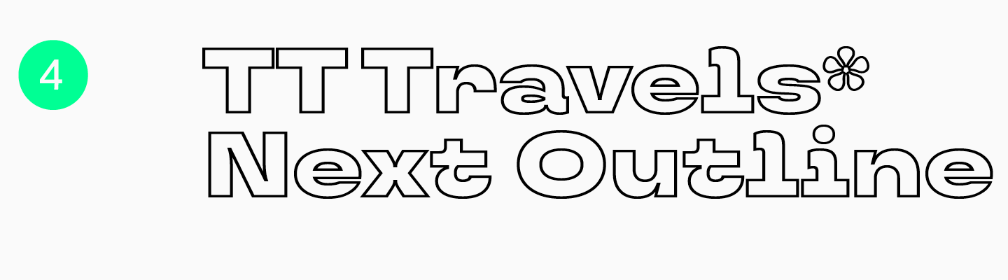
TT Travels Next ist eine ultramoderne Akzidenzschrift mit fettem Charakter. Diese breite serifenlose Schrift ist eine seltsame Mischung aus fließenden und scharfen Formen. Wie ihre Vorgänger verfügt sie über zwei Outlines: eine vertikale TT Travels Next Black Outline und eine schräge TT Travels Next Black Outline Italic. Sie eignen sich hervorragend als ausdrucksstarke Schriften und fügen sich harmonisch in Basisschriften ein. Trotz ihres lebhaften Charakters passt die TT Travels Next problemlos zu nahezu jedem Projektthema, vom Branding von Lebensmitteln und Getränken bis hin zur visuellen Identität großer öffentlicher Veranstaltungen.
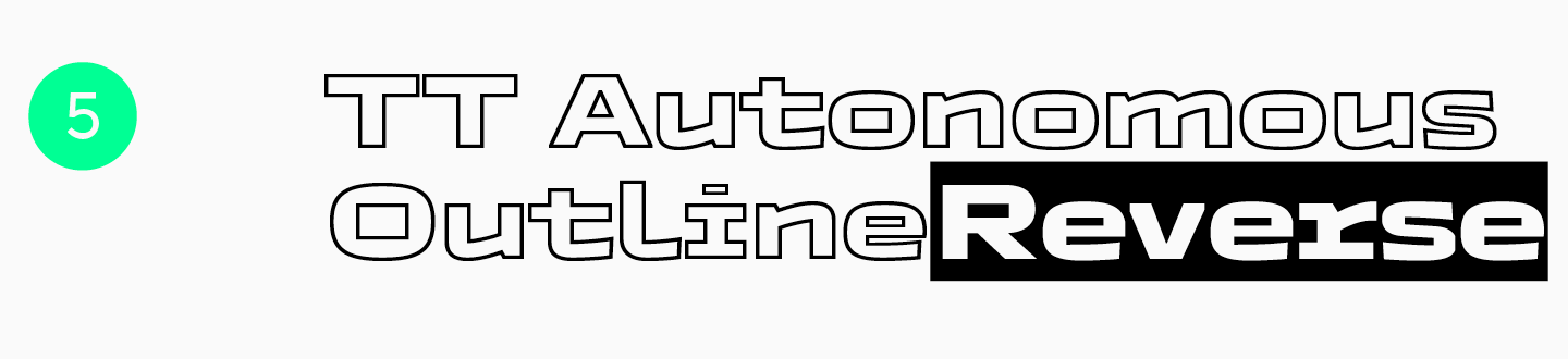
TT Autonomous ist eine grobe, technologische Sans Serif-Schrift mit auffallend eckigen Glyphen und eckigen Ziffern. Ihre Proportionen wirken eher monospaced und wecken Assoziationen an etwas Technisches und Maschinenhaftes. Wie die anderen Schriften der Familie wirkt auch die Outline futuristisch und kraftvoll. Die TT Autonomous ExtraBold Outline vermittelt ein Gefühl von Stabilität, während die TT Autonomous ExtraBold Outline Italic für mehr Dynamik sorgt. Übrigens: Neben den Outlinefonts bietet die Schrift auch kuriose Reverse-Fonts, mit denen Sie Akzente setzen und Blocktext gestalten können.
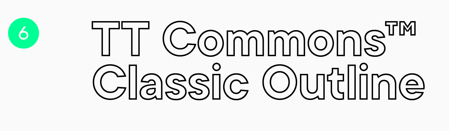
TT Commons™ Classic ist eine weitere vielseitige serifenlose Schrift mit geometrischen Glyphenformen. Diese elegante, ausgewogene und schlichte Outline-Schrift eignet sich für alle alltäglichen Anwendungen. Es gibt zwei Schriftschnitte mit Outlines: TT Commons™ Classic Bold Outline und die entsprechende schräg gestellte TT Commons™ Classic Bold Outline Italic. Ihre Umrisse ähneln fetten Schriften und haben einen neutralen Charakter. Diese Schriften können helfen, notwendige Akzente zu setzen und lassen sich gut mit Textschriften dieser oder anderer Schriften kombinieren.
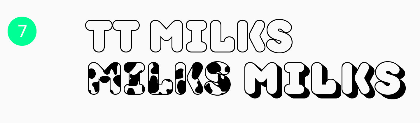
Die TT Milks ist eine weiche und sanfte Schriftfamilie. Wir haben diese Schrift speziell für das Branding und die Verpackung von Milchprodukten entwickelt, was sich auch in ihrem Namen widerspiegelt. Die Outline-Fonts dieser Schrift wirken besonders originell und witzig: Neben der Outline-Schrift gibt es eine Hohlschrift mit Schatten und sogar eine Version mit Kuhaufdruck. TT Milks enthält insgesamt drei Outlineschriften, die nur Großbuchstaben enthalten und Tabellenziffern sowie Groß- und Kleinschreibung unterstützen.
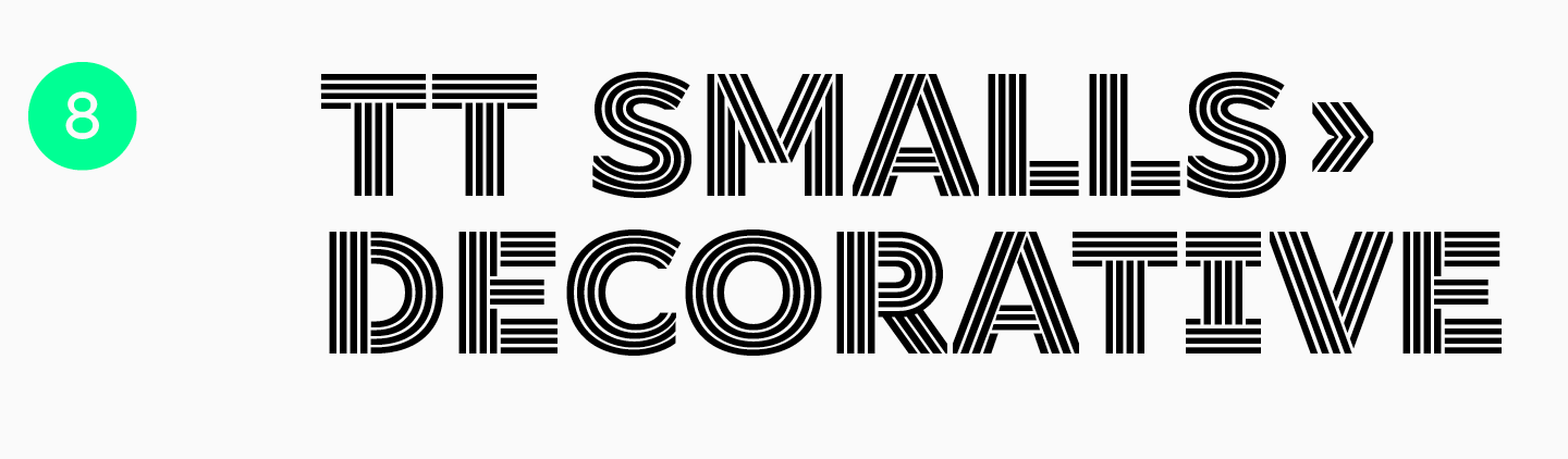
Die TT Smalls ist eine dekorative Schriftfamilie. Die Glyphenkonstruktion dieser Schrift basiert auf einer geometrischen Serifenlosen, was die Formen einfach und vielseitig macht. Jeder Buchstabe besteht jedoch aus Strichen, deren Anzahl je nach Gewicht der Schrift variiert. Inhalte in diesen Schriften sehen in mittleren und großen Schriftgraden auch auf schwarzem, weißem oder einem anderen einfarbigen Hintergrund ohne zusätzliche grafische Elemente gut aus.
Outline Fonts für kreatives Design von anderen Studios
Nachfolgend haben wir eine Liste mit kostenpflichtigen und kostenlosen Outline-Schriften in verschiedenen Stilen zusammengestellt, falls Sie auf der Suche nach einer etwas ausgefalleneren Variante sind:
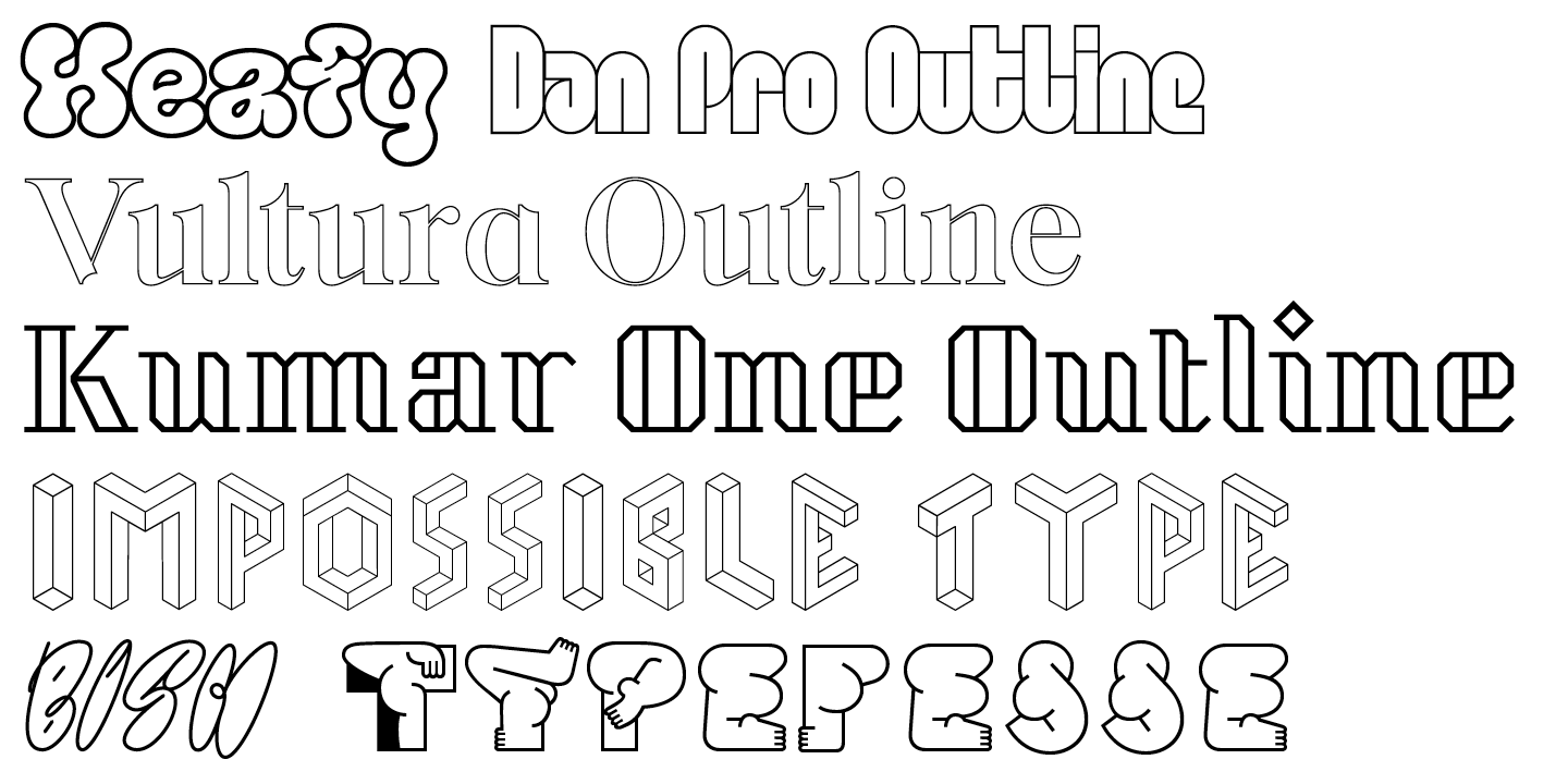
- Kumar One Outline von Indian Type Foundry;
- Typefesse von Velvetyne;
- Heafy Display Font von Migomojo Type;
- BISH von Anastazja Oakhill;
- Vultura von SG Type;
- Dan Pro von Fontfabric;
- Impossible Type von Fleta.
Fazit
Outline-Schriften gehören zu den faszinierendsten Werkzeugen für Designer. Sie ermöglichen es, der eigenen Kreativität freien Lauf zu lassen. Wir hoffen, dass Ihnen dieser Artikel dabei hilft, die beste Outline-Schrift für Ihr Projekt zu finden. Das Wichtigste ist, dass Sie sich nicht scheuen, Neues auszuprobieren und Ihren Betrachtungshorizont ständig zu erweitern!