The bestseller TT Norms® Pro—a geometric sans serif, trouble-free workhorse
Fuentes para jovenes
- Fuentes 73
- Sans Serif 47
- Serif 27
- Slab Serif 6
- Decorativas 40
- Script 10
- Variables 45
- Descuentos 16
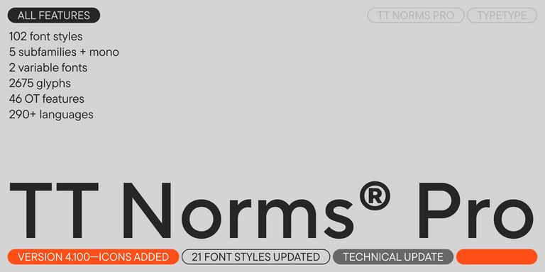
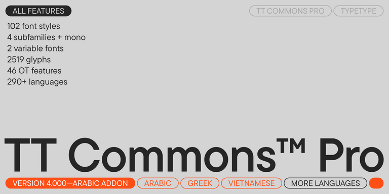
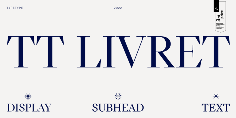
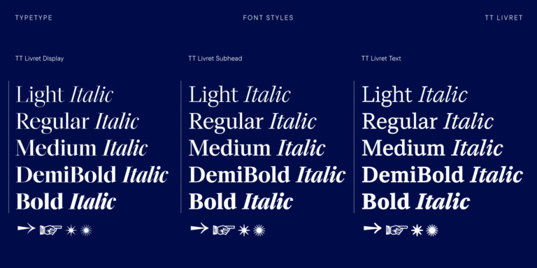
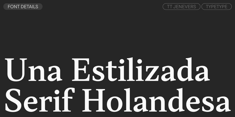
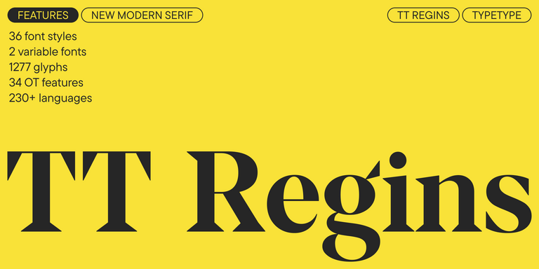
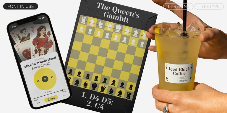
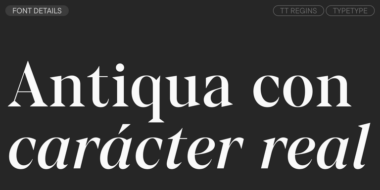
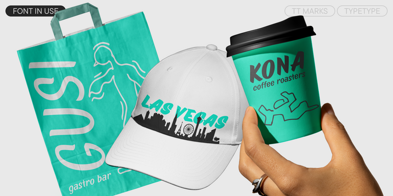
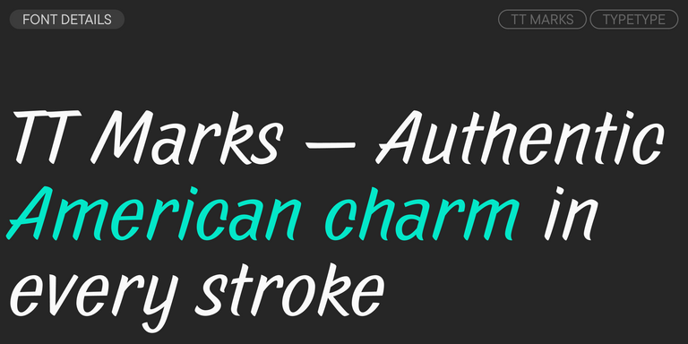
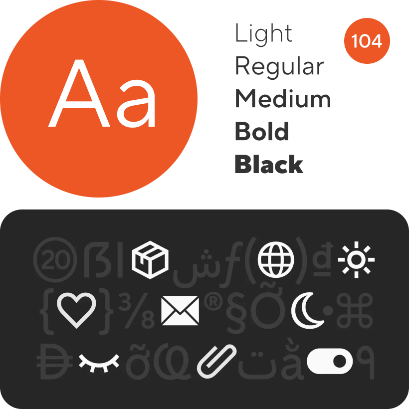
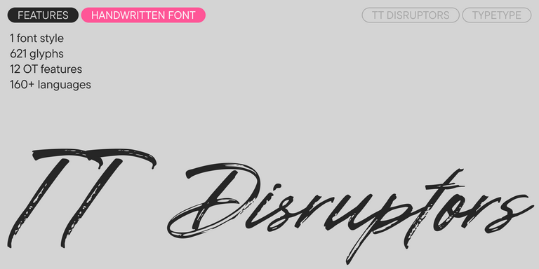
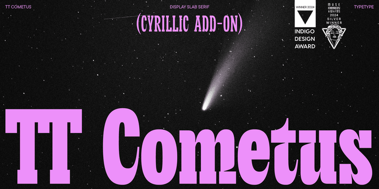
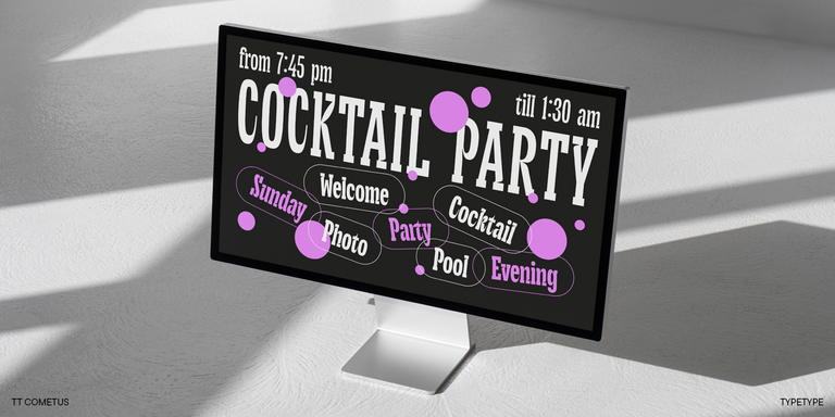
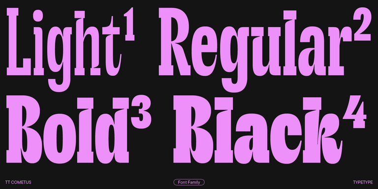
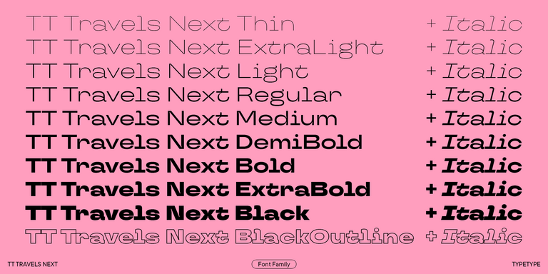
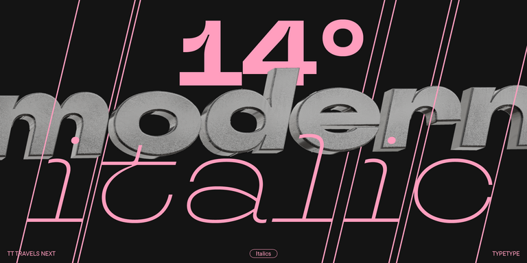
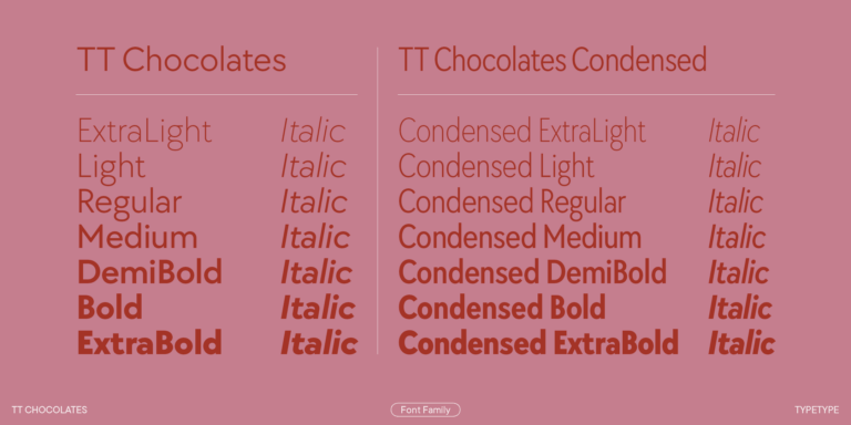
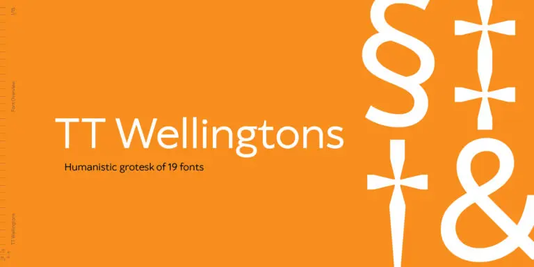
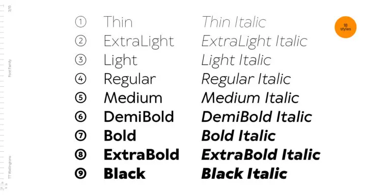
Si estás buscando Fuentes para jovenes para complementar tu diseño, TypeType Studio es el indicado para ofrecerte una amplia variedad de fuentes adecuadas para fines comerciales. Los estilos específicos y las familias tipográficas completas están disponibles en nuestra página web: puedes elegir entre una selección de fuentes bien diseñadas y verificadas técnicamente, usarlas de forma gratuita y dejar una solicitud para adquirir el tipo de licencia adecuado. TypeType te da la oportunidad de descargar versiones de prueba de todos los Fuentes para jovenes para utilizarlos en tus proyectos, así como de recibir asesoramiento de nuestros equipos de diseño o atención al cliente. No dudes en contactarnos a través del formulario en nuestro sitio web.
- The quick brown fox jumps over a lazy dog.
- Pack my box with five dozen liquor jugs.
- Sphinx of black quartz, judge my vow
- 0123456789 !?.,:;—–()[]{}<> “quotes” ‘apostrophe’ @#%&*_+=/\| № $ € £ ₽ +−×÷=≠≤≥ … % © ® ™
- Aa Bb Cc Dd Ee Ff Gg Hh Ii Jj Kk Ll Mm Nn Oo Pp Qq Rr Ss Tt Uu Vv Ww Xx Yy Zz
TT Commons™ Pro is a completely redesigned version of the well-established classic font family TT Commons.
TT Hoves Pro is a versatile sans-serif with a recognizable geometry
TT Livret is an elegant, modern and functional serif
TT Bells combines the elegant softness of Antiqua with a complex and daring temper reflected in straight stroke terminals and arrowheaded serifs. The typeface is based on the broad nib, which creates these hallmark terminals and serifs.
TT Turns is a striking geometric sans serif with expressive elements. This versatile font works exceptionally well for running text, while at large point sizes, it takes on a distinct display character.
TT Jenevers is a modern serif with a Dutch flavor. The font family features the characteristic details peculiar to Dutch serifs—these are the asymmetrical shape of serifs and an irregular slant of ovals.
TT Regins is a Scottish modern serif. Striking contrast and sharp triangular serifs give this font a stern and commanding character, while refined forms, enlarged lowercase letters, and slightly condensed, static proportions add grace to its design.
TT Neoris is an elegant Neo-Grotesque with unlimited potential and a font that encompasses all modern requirements and user desires.
TT Ricordi Greto is an experimental project, inspired by a floor plaque dating from 1423 found in the Basilica di Santa Croce, Florence.
TT Marks ofrece un estilo manuscrito con un ritmo dinámico, un carácter entrañable y un atractivo nostálgico inspirado en el arte clásico de la rotulación a pincel. Este oficio —donde artistas expertos pintaban a mano los letreros de tiendas con pinceles y gran técnica— está viviendo un merecido renacimiento en el mundo del diseño actual.
The quick brown fox jumps over a lazy dog.
TT Interphases Pro is a neo-grotesque sans serif with equal-width proportions
TT Ramillas is a fully reconsidered high contrast transitional serif, which is perfectly adapted to modern realities and requirements.
TT Cometus is an expressive typeface that captivates from the first time.
TT Travels Next is a very trendy and modern wide display sans serif for use in different sets, be they print or web.
TT Chocolates typeface consists of 14 fonts: 7 weights and 7 obliques. Due to the extended language support and the introduction of useful features.
TT Wellingtons is an attempt to combine the style of English humanist sans serifs of the early 20th century with the requirements for modern geometric grotesques.
The TT Ricordi font family is a collection of three display heading serifs.
TT Marxiana Elzevir is a title or header font and is a compilation of monastic Elzevir that were actively used in the Niva magazine for all its prints.
The TT Tsars font family is a collection of serif display fonts that are stylized to resemble the fonts of the beginning, the middle, and the end of the XVIII century.
TT Backwards Sans is a narrow grotesque, which takes us back to the book design of late 70s and early 80s with its ductile characters.
TT Hazelnuts is a display sans serif font family containing a set of elegant and delicate decorative elements.
The quick brown fox jumps over a lazy dog.
