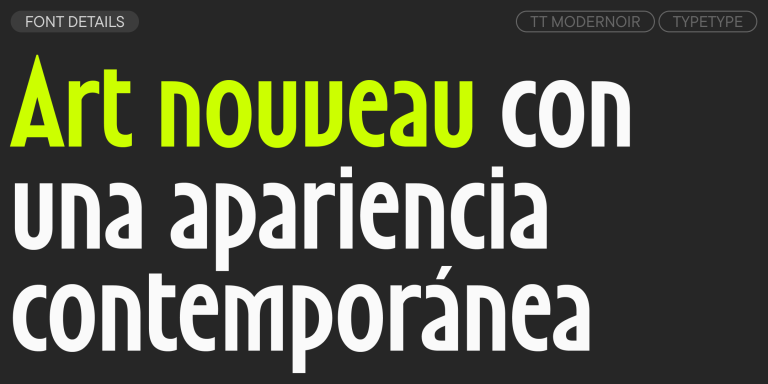
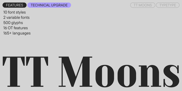
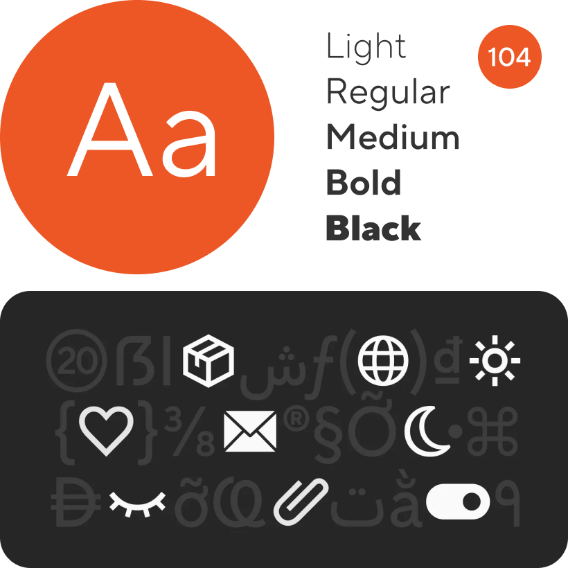
TT Hoves Pro
Regular
96 de los estilos
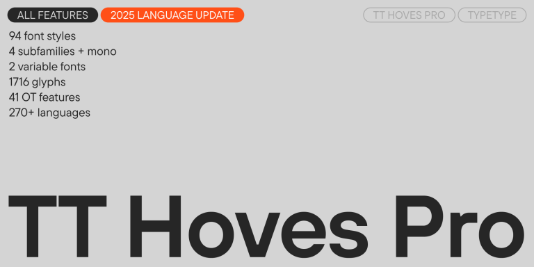
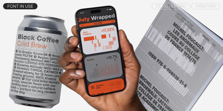
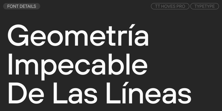
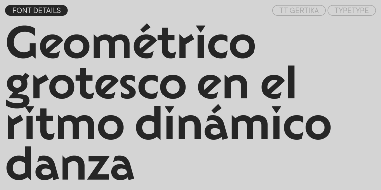
TT Hoves Pro es una sans serif versátil con una geometría reconocible.