TT Livret
Text Regular
32 de estilo
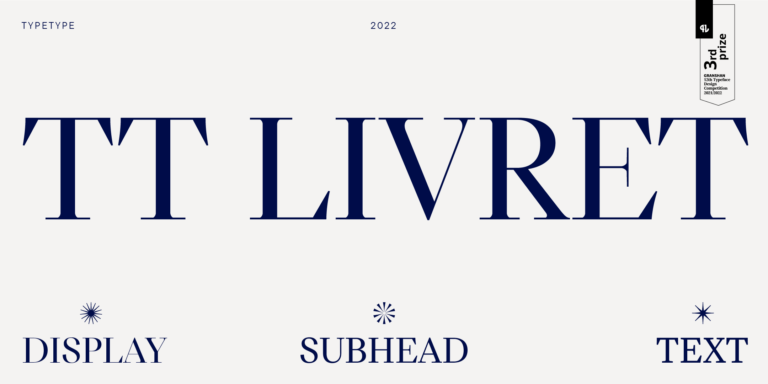
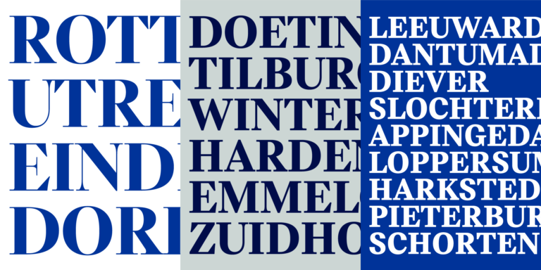
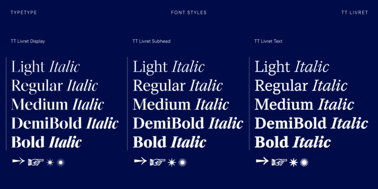
TT Livret es una serif elegante, moderna y funcional.

Si estás buscando Fuentes de One Piece para complementar tu diseño, TypeType Studio es el indicado para ofrecerte una amplia variedad de fuentes adecuadas para fines comerciales. Los estilos específicos y las familias tipográficas completas están disponibles en nuestra página web: puedes elegir entre una selección de fuentes bien diseñadas y verificadas técnicamente, usarlas de forma gratuita y dejar una solicitud para adquirir el tipo de licencia adecuado. TypeType te da la oportunidad de descargar versiones de prueba de todos los Fuentes de One Piece para utilizarlos en tus proyectos, así como de recibir asesoramiento de nuestros equipos de diseño o atención al cliente. No dudes en contactarnos a través del formulario en nuestro sitio web.
TT Livret es una serif elegante, moderna y funcional.
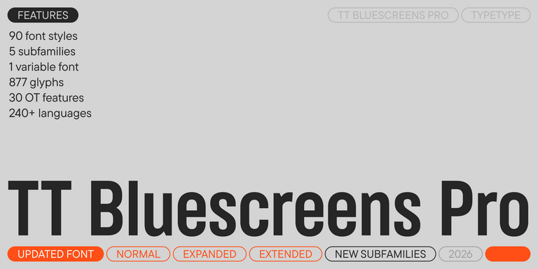

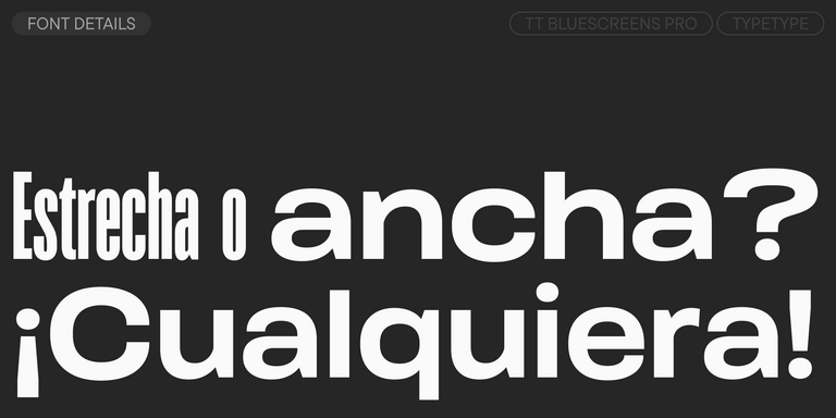
TT Bluescreens es una sans serif geométrica mejorada con proporciones estrechas.
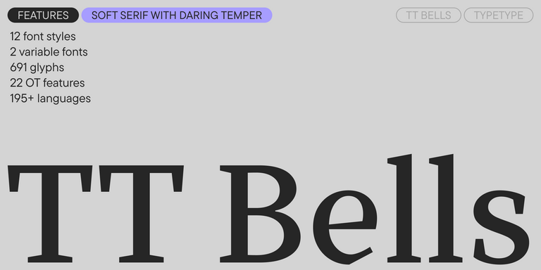

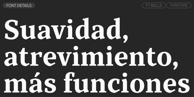
TT Bells combina la elegante suavidad de las Antiqua con un carácter complejo y audaz reflejado en terminales rectos y serifas en forma de flecha. La tipografía está basada en la pluma de punta ancha, responsable de estos característicos terminales y serifas.
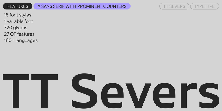
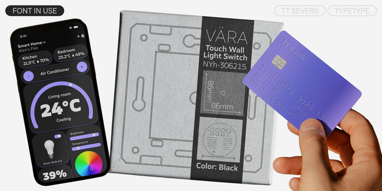
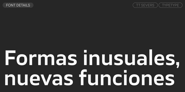
TT Severs es una sans serif geométrica con elementos internos enfatizados. La principal característica visual de TT Severs es la forma inusual de sus óvalos interiores.
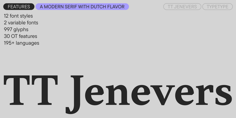
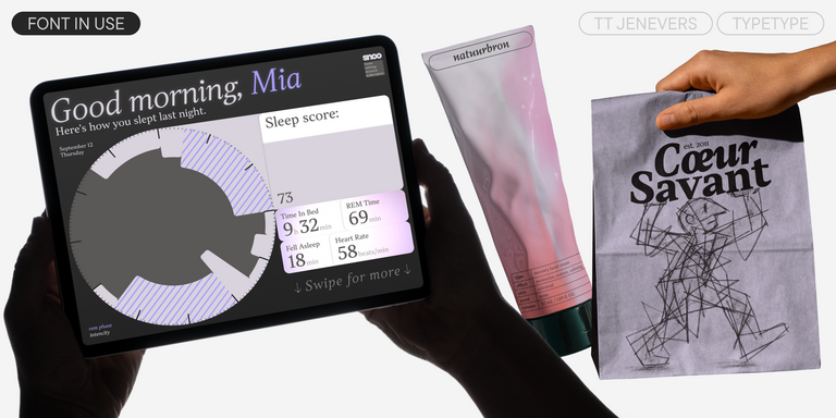
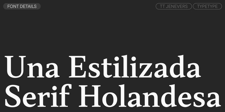
TT Jenevers es una serif moderna con carácter neerlandés. La familia tipográfica presenta detalles característicos de las serifas holandesas, como las serifas asimétricas y la inclinación irregular de los óvalos.
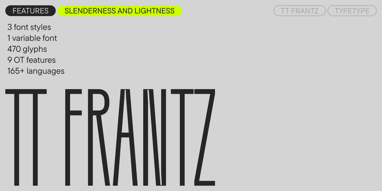
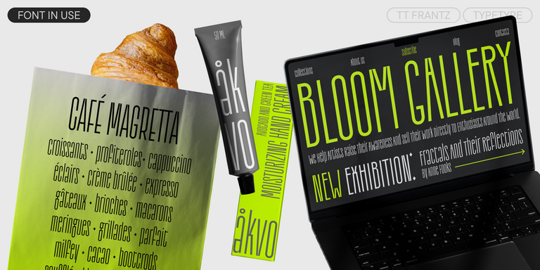
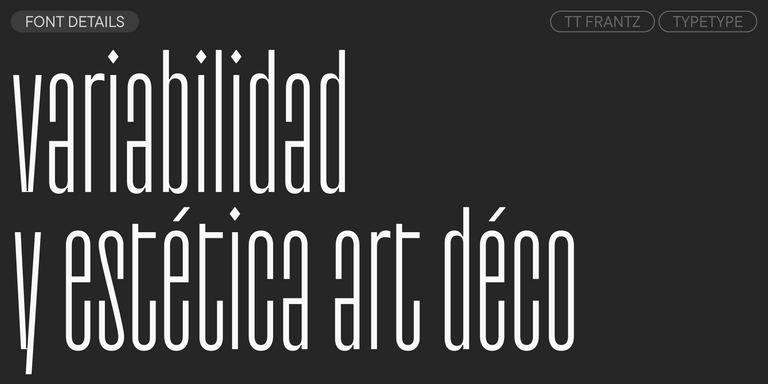
TT FRANTZ ES UNA FUENTE VARIABLE EXPERIMENTAL QUE DESTACA POR SU DELGADEZ Y LIGEREZA. LA VARIACIÓN DE LA FUENTE AFECTA EL CAMBIO EN LA ALTURA DE LA LÍNEA MEDIA: MOVIENDO EL CONTROL DESLIZANTE DEL EJE PUEDES SUBIR O BAJAR FÁCILMENTE LA LÍNEA MEDIA DE LA TIPOGRAFÍA.
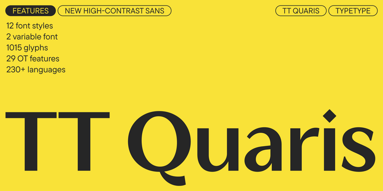
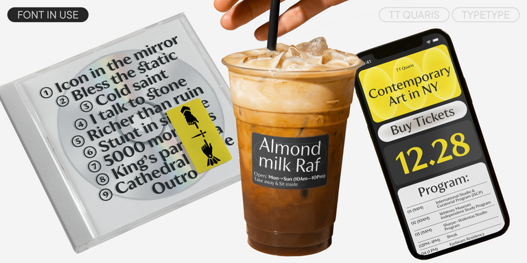
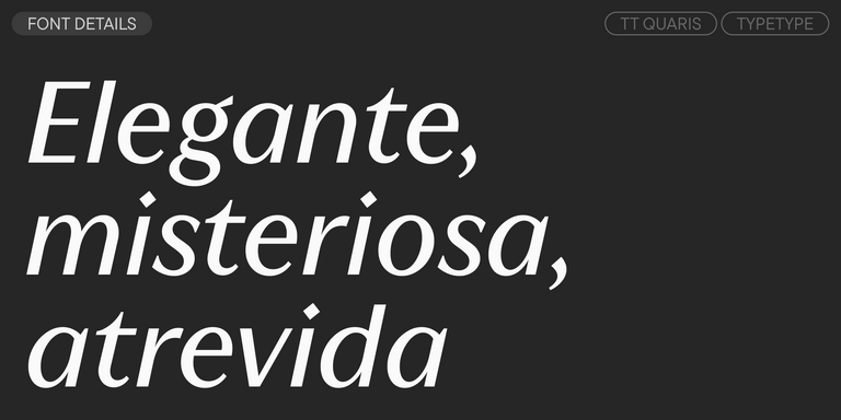
TT Quaris es una exquisita sans serif moderna de alto contraste cuyo diseño equilibra suavidad y nitidez. Las formas de los glifos son fluidas y tienden a la redondez, aunque también incorporan elementos afilados.
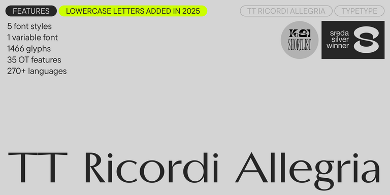
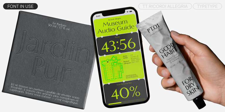
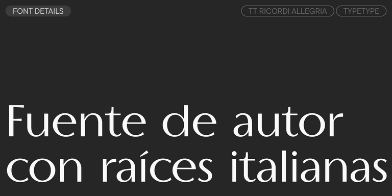
TT Ricordi Allegria es una grotesca florentina contemporánea, elegante e inteligente.
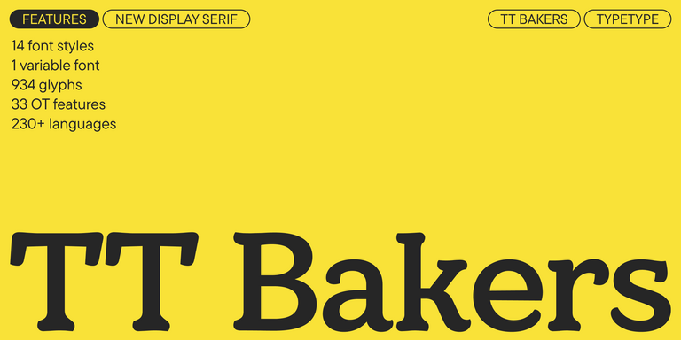
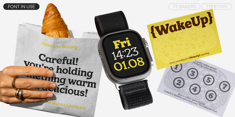
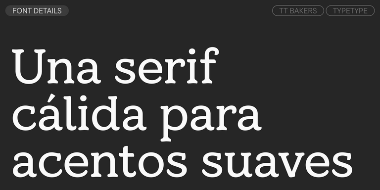
TT Bakers es una serif fluida con un carácter suave y vivaz. Esta tipografía recuerda a la repostería recién horneada: cálida y blanda, especialmente en sus pesos más gruesos.
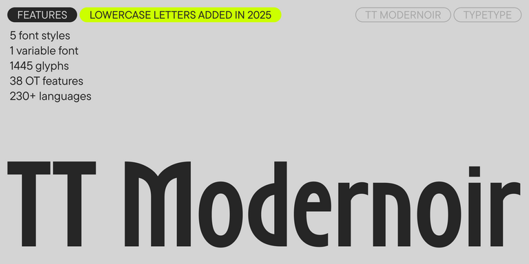
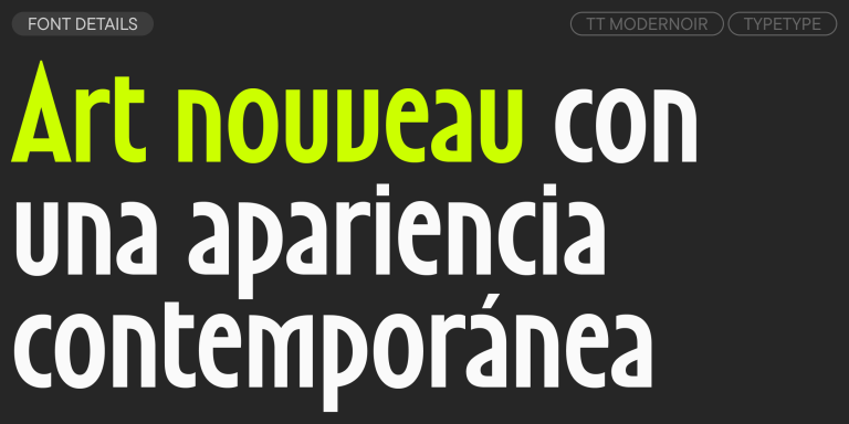
TT Modernoir es una display sans serif con proporciones dinámicas. Las líneas fluidas y las delicadas formas Art Nouveau se combinan perfectamente con el flujo rítmico y la libertad improvisadora del jazz.
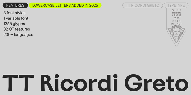
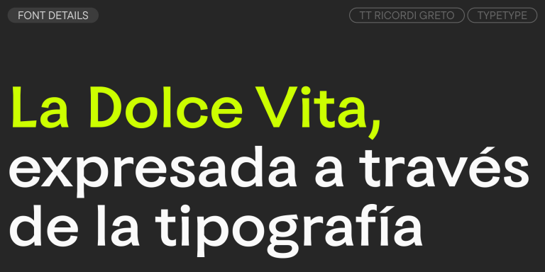
TT Ricordi Greto es un proyecto experimental inspirado en una placa de suelo fechada en 1423 encontrada en la Basílica de Santa Croce de Florencia.
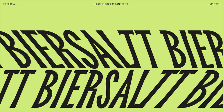
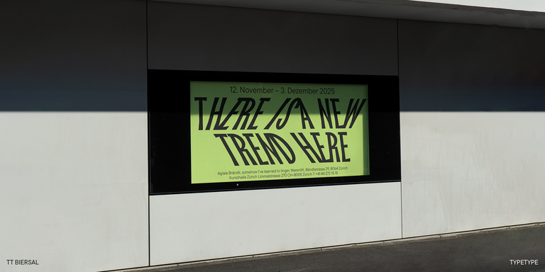
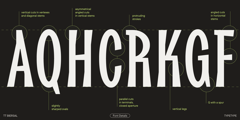
TT Biersal es una display sans serif con un carácter libre, juguetón y aventurero. El concepto de esta fuente nació a partir de un cartel alemán de principios de los años 30.
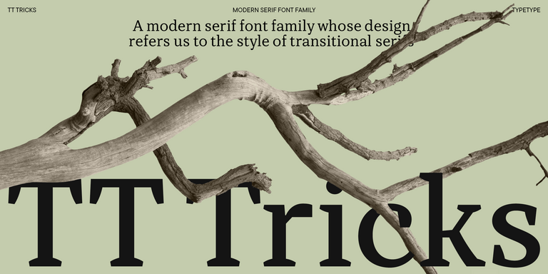
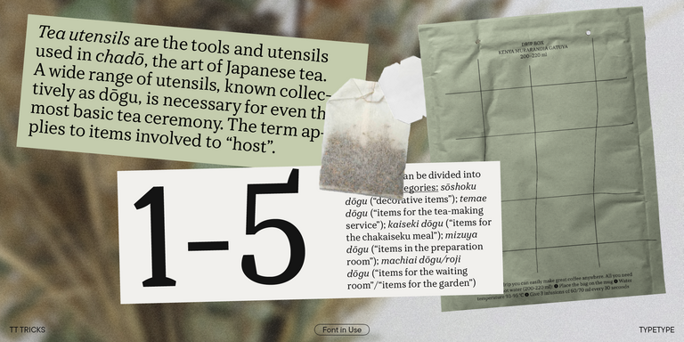
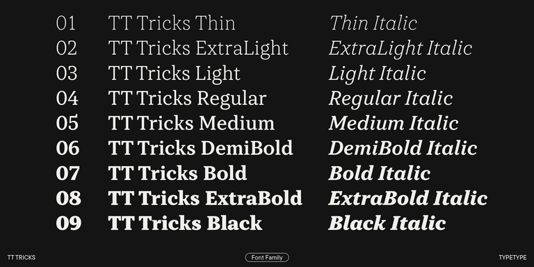
TT Tricks es una serif moderna para texto cuyo diseño refleja el estilo de las serifas transicionales. Esta tipografía posee un carácter sereno, elegante y moderadamente estricto.
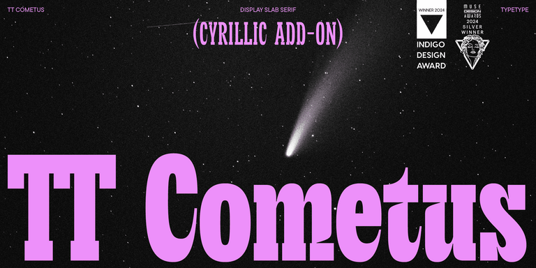
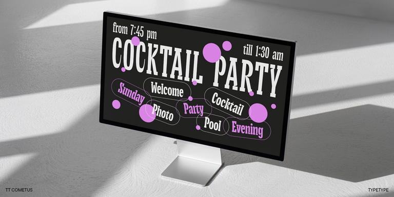
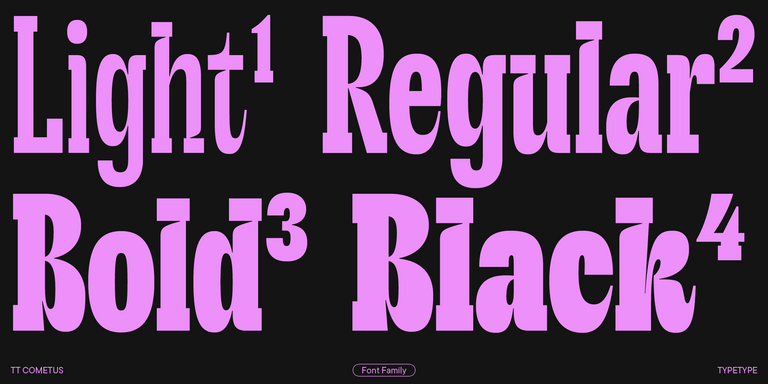
TT Cometus es una tipografía expresiva que cautiva desde el primer instante.
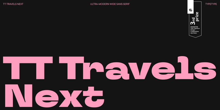
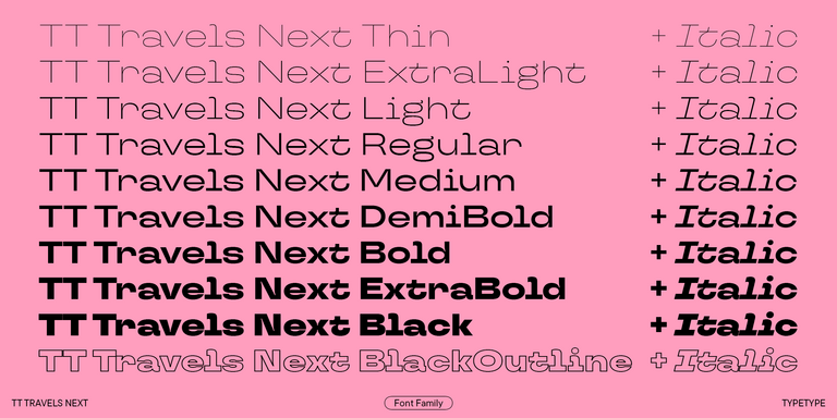
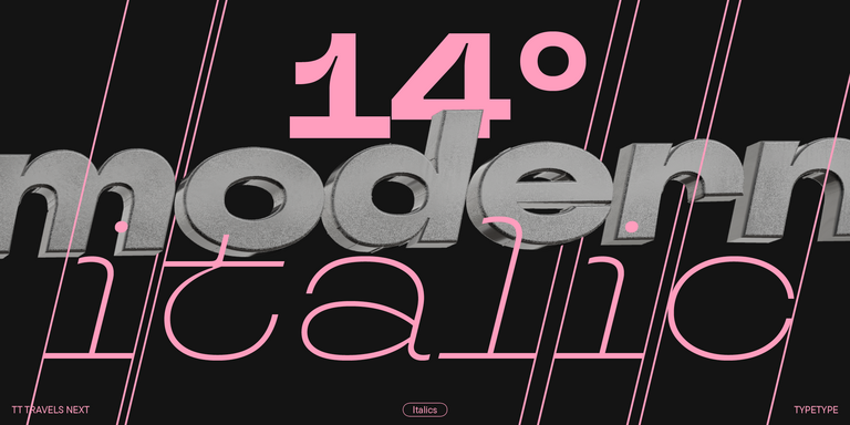
TT Travels Next es una moderna y muy actual sans serif display de gran anchura, diseñada para utilizarse tanto en medios impresos como digitales.
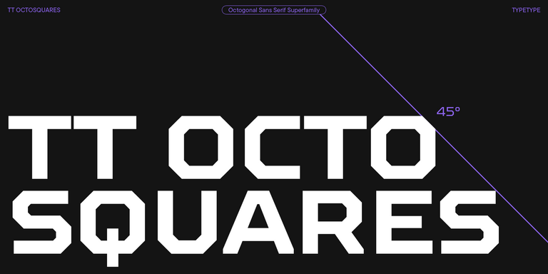
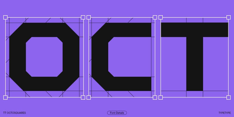
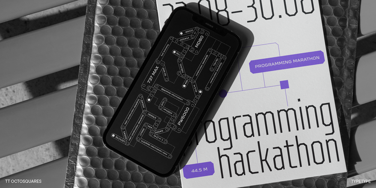
TT Octosquares es una versión renovada, revisada, ampliada y significativamente mejorada de nuestra primera tipografía comercial TT Squares y de su versión estrecha.
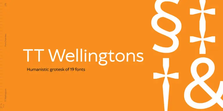
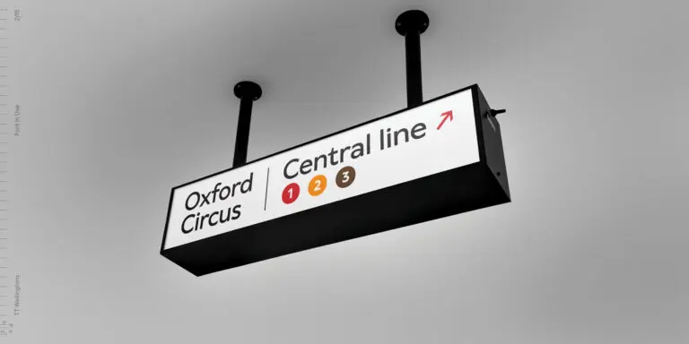
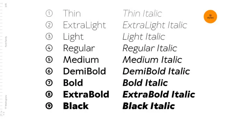
TT Wellingtons es un intento de combinar el estilo de las sans serif humanistas inglesas de principios del siglo XX con las exigencias de las grotescas geométricas modernas.
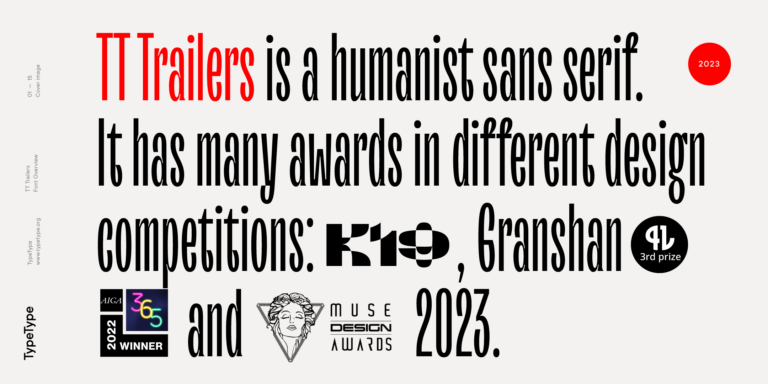
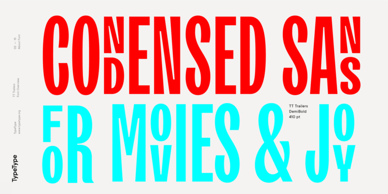
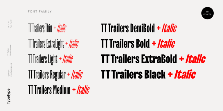
El punto de partida del proyecto TT Trailers fue la idea de desarrollar una nueva generación de tipografías estrechas para créditos cinematográficos y carteles.

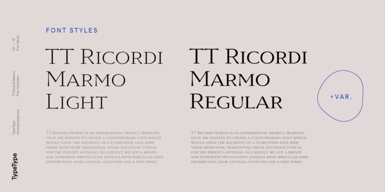
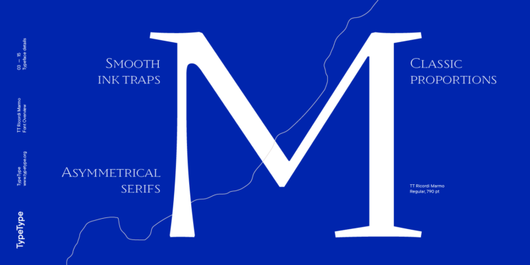
TT Ricordi Marmo es un proyecto experimental original inspirado en las inscripciones de la Basílica de Santa Croce en Florencia.
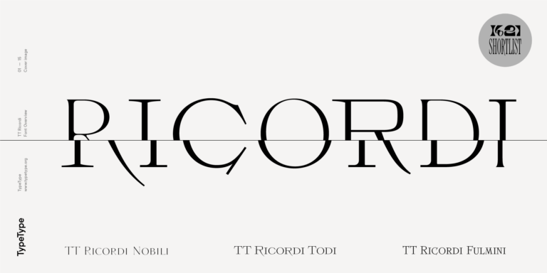
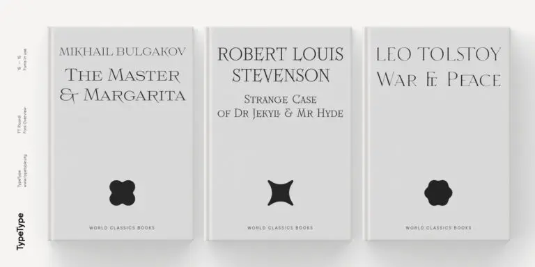
La familia tipográfica TT Ricordi es una colección de tres serifas display para titulares.
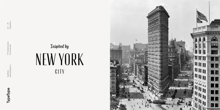
TT Knickerbockers Grotesk es una sans serif estrecha y contrastada con elementos característicos que nos transportan al Nueva York del siglo XIX.

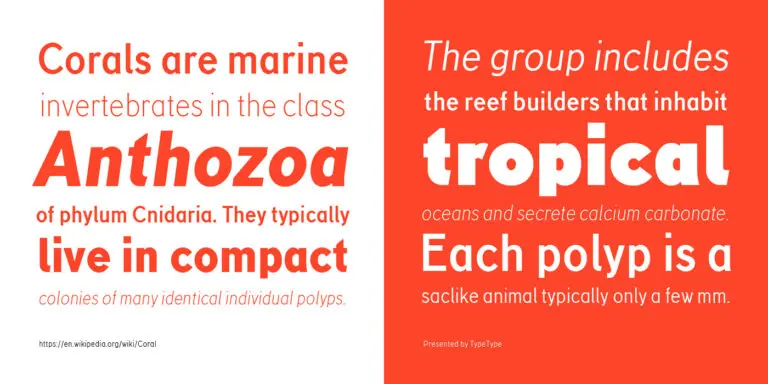
TT Corals es una moderna sans serif humanista con numerosos rasgos característicos de principios del siglo XX. Para ampliar la funcionalidad de la familia tipográfica, hemos creado 6 estilos con diferentes grosores.