TT Livret
Text Regular
32 أنماط خط
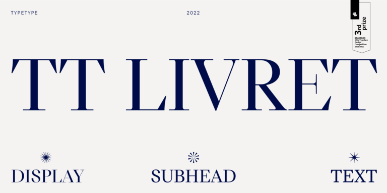
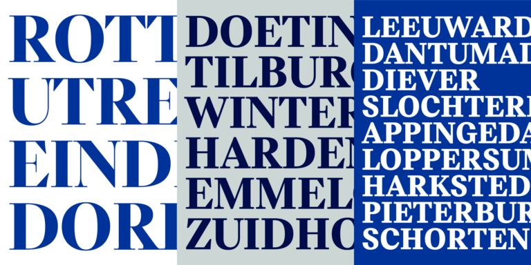
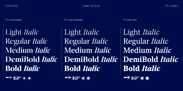
TT Livret is an elegant, modern and functional serif

إذا كنت تبحث عن خطوط ون بيس لتكمل تصميمك، فإن استوديو TypeType هو المكان المثالي الذي يوفر مجموعة واسعة من الخطوط المناسبة للأغراض التجارية. يمكنك العثور على أنماط محددة وعائلات خطوط كاملة على صفحتنا عبر الإنترنت: اختر من بين مجموعة متنوعة من الخطوط المصممة باحتراف والمُختبرة تقنيًا، استخدمها مجانًا، أو قدّم طلبًا لشراء الترخيص المناسب.
يوفر TypeType فرصة تحميل الإصدارات التجريبية لجميع خطوط ون بيس لاستخدامها في مشاريعك، بالإضافة إلى إمكانية الحصول على استشارة من فرق التصميم أو دعم العملاء. لا تتردد في الاتصال بنا عبر نموذج التواصل على موقعنا.
TT Livret is an elegant, modern and functional serif
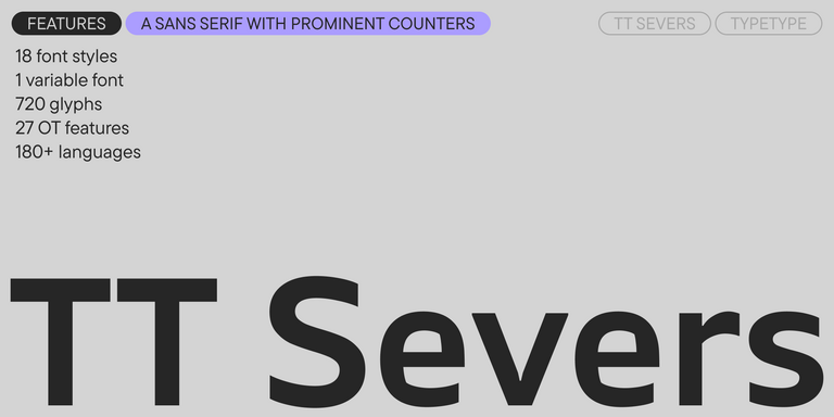

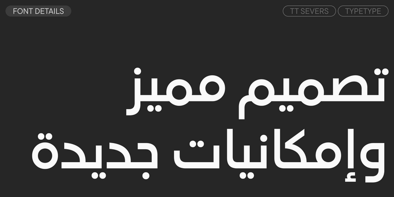
TT Severs is a geometric sans serif with emphasized elements of internal brackets. The main visual feature of TT Severs is the unusual form of internal ovals.
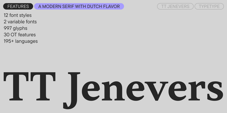
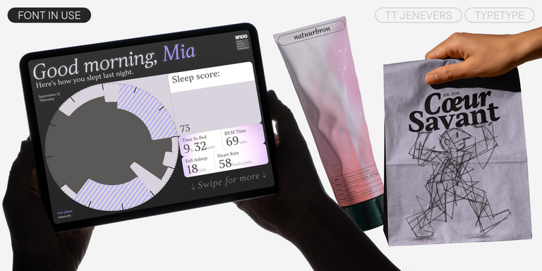
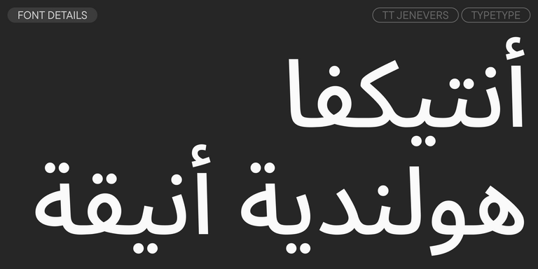
TT Jenevers is a modern serif with a Dutch flavor. The font family features the characteristic details peculiar to Dutch serifs—these are the asymmetrical shape of serifs and an irregular slant of ovals.
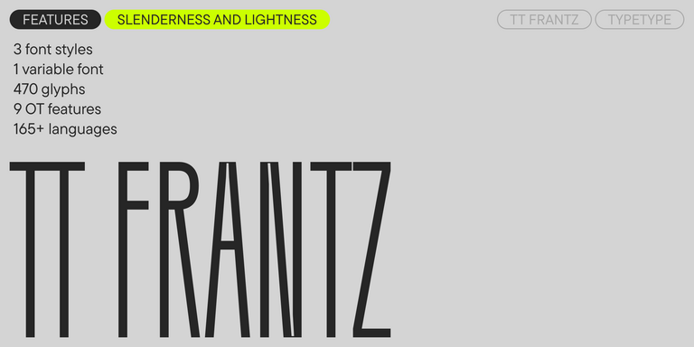
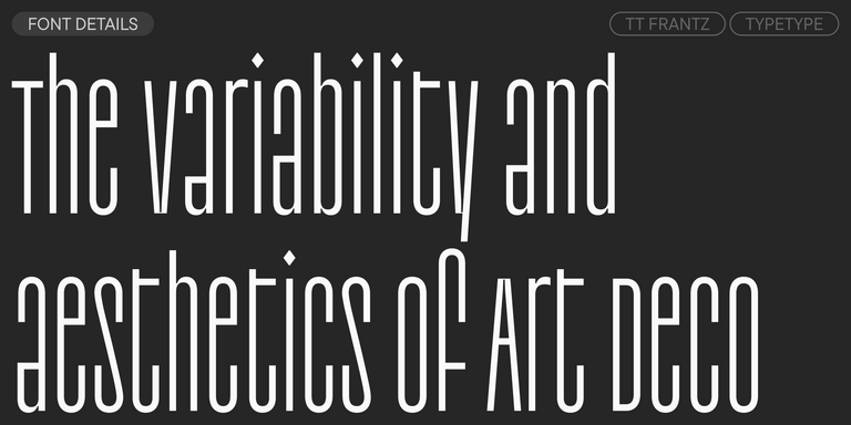
TT FRANTZ IS AN EXPERIMENTAL VARIABLE FONT, DISTINGUISHED BY ITS SLIMNESS AND LIGHTNESS. THE VARIATION IN THE FONT AFFECTS THE CHANGE IN THE HEIGHT OF THE MEAN LINE—BY MOVING THE AXIS ADJUSTMENT SLIDER YOU CAN EASILY RAISE OR LOWER THE MEAN LINE OF THE FONT.
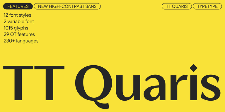
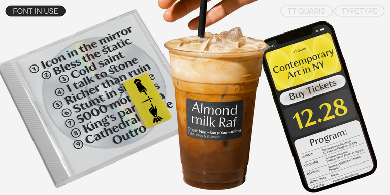
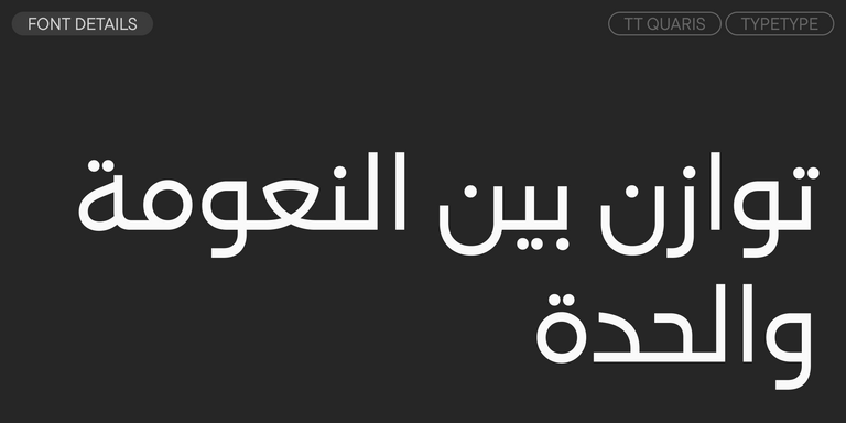
TT Quaris is an exquisite, modern high-contrast sans whose design balances between soft and sharp. The glyph shapes in the font are fluid and tend towards roundness, yet there are also sharp elements.
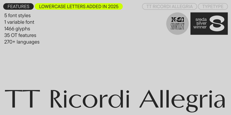
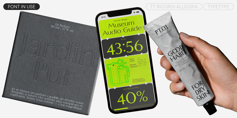

TT Ricordi Allegria is a sleek and intelligent contemporary Florentine grotesque.
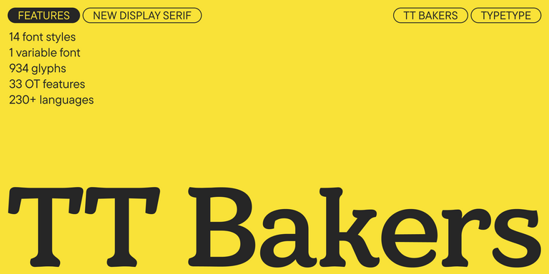
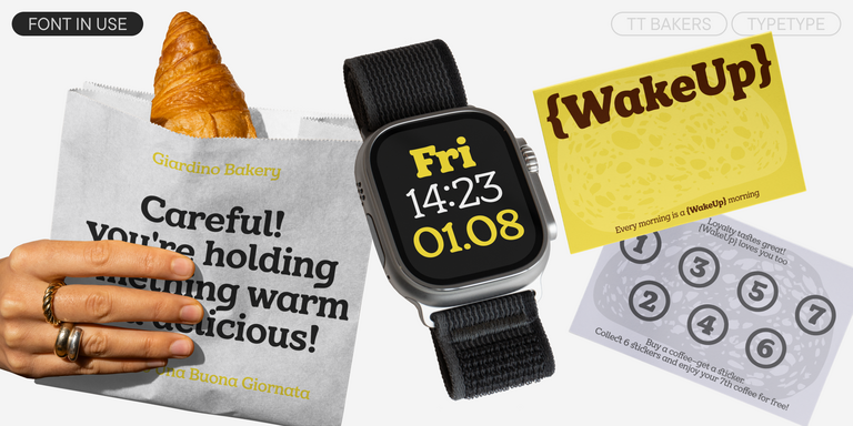

TT Bakers is a fluid serif with a gentle and lively character. This font is like freshly baked goods: it’s warm and soft, especially in its bolder weights.
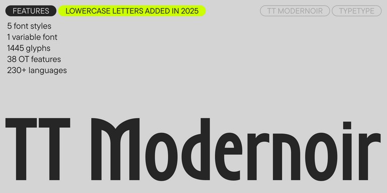
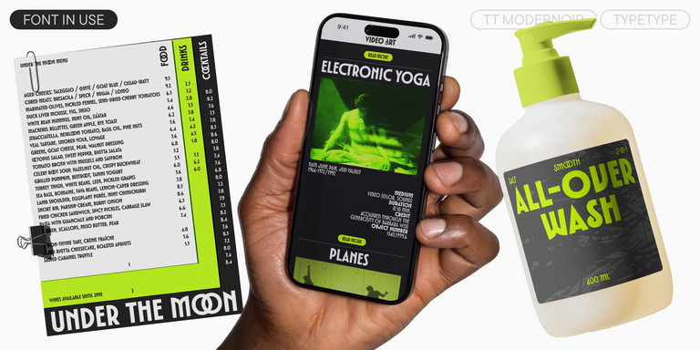
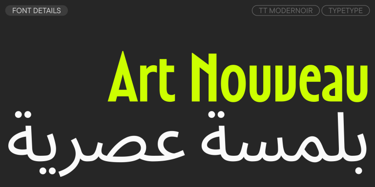
TT Modernoir is a display sans serif with dynamic proportions. Fluid lines and delicate Art Nouveau forms in this typeface blend seamlessly with the rhythmic flow and improvisational freedom of jazz.
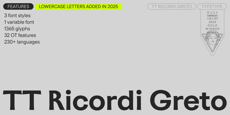
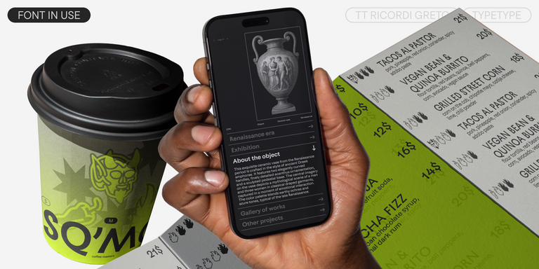
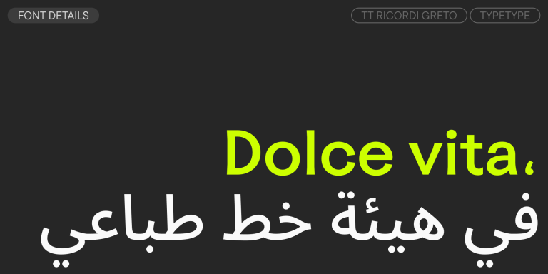
TT Ricordi Greto is an experimental project, inspired by a floor plaque dating from 1423 found in the Basilica di Santa Croce, Florence.
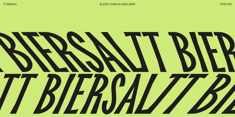
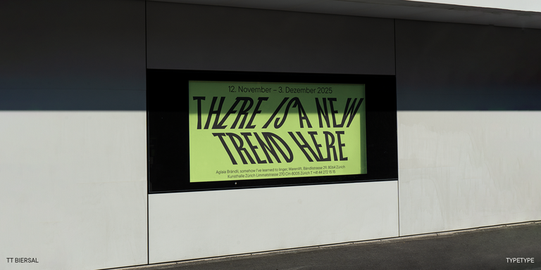
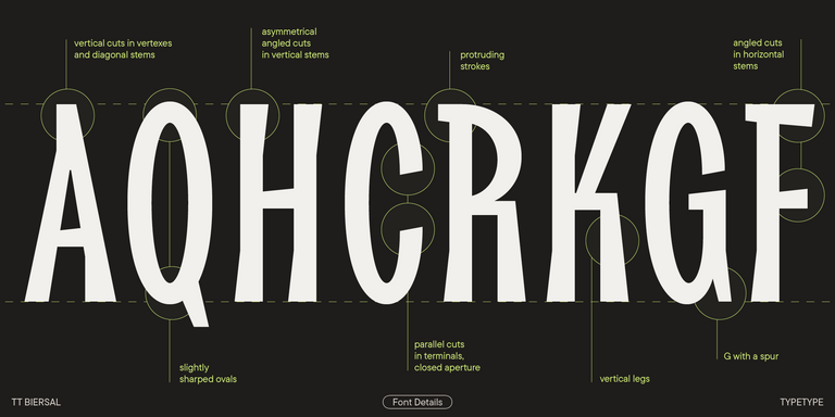
TT Biersal is a display sans serif with a free-spirited, playful, and adventurous nature. The concept of this font was sparked by a German poster from the early 1930s.
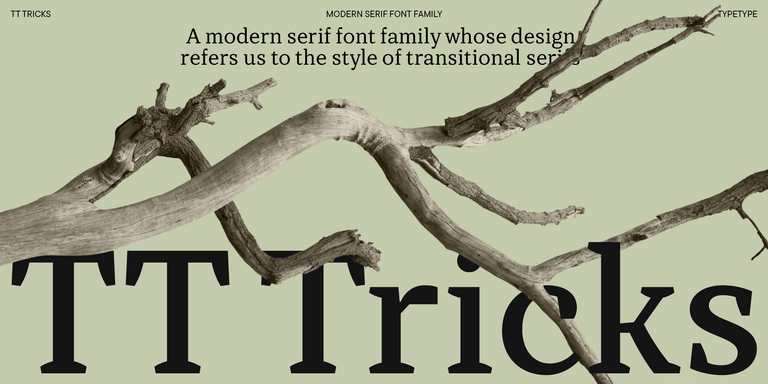
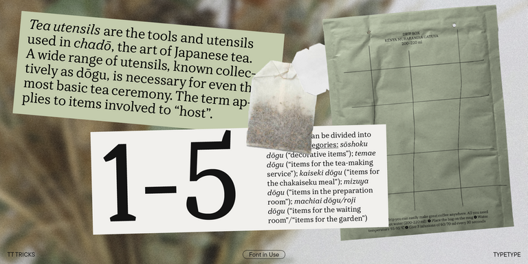
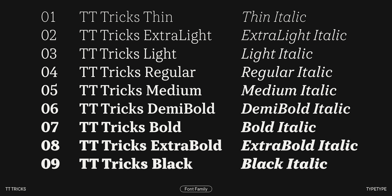
TT Tricks is a modern text serif with a design reflecting the style of Transitional serifs. This font has a calm, elegant, and moderately stern character.
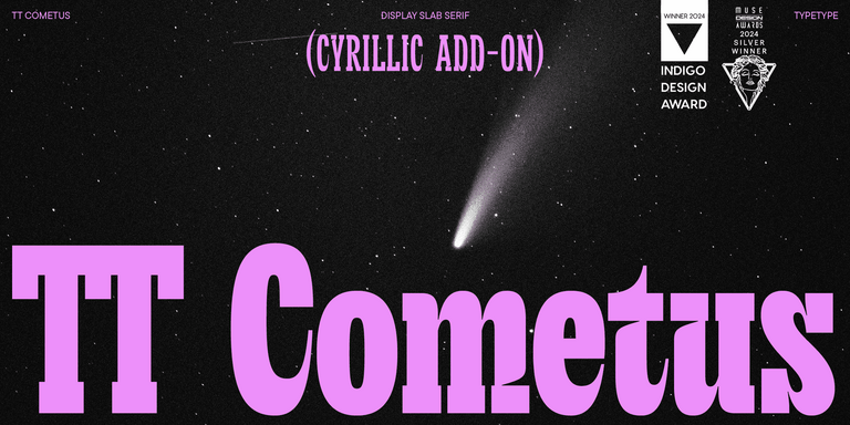
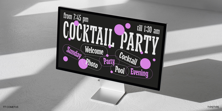
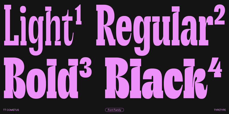
TT Cometus is an expressive typeface that captivates from the first time.

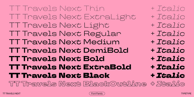
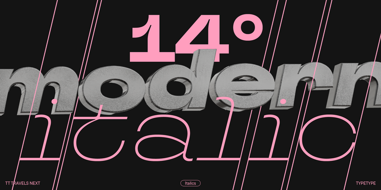
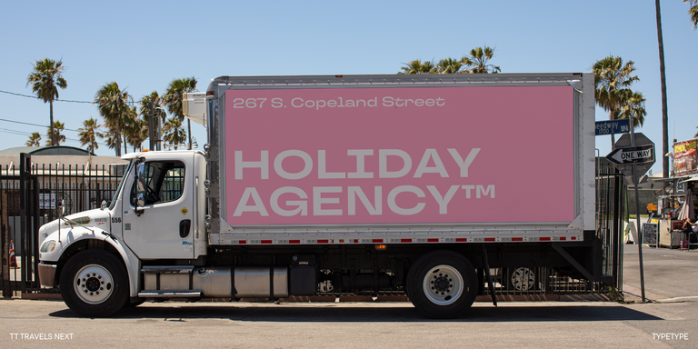
TT Travels Next is a very trendy and modern wide display sans serif for use in different sets, be they print or web.
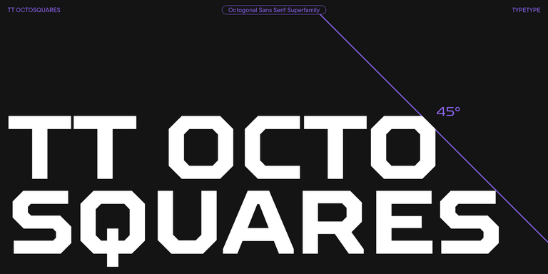
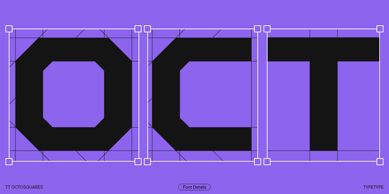
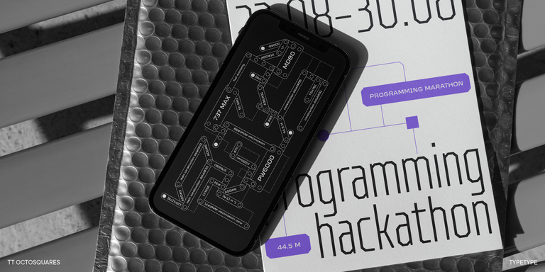
TT Octosquares is a fresh, revised, expanded, and significantly improved version of our first commercial font TT Squares & its narrow version.
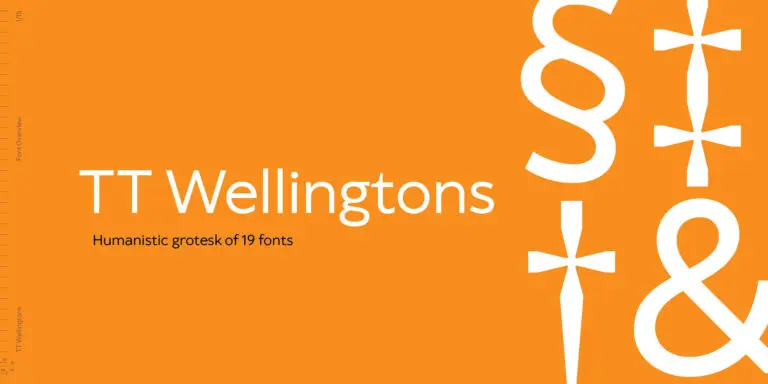
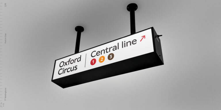
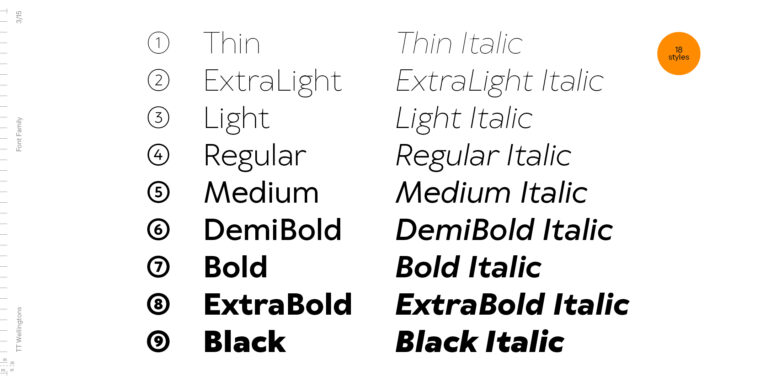
TT Wellingtons is an attempt to combine the style of English humanist sans serifs of the early 20th century with the requirements for modern geometric grotesques.
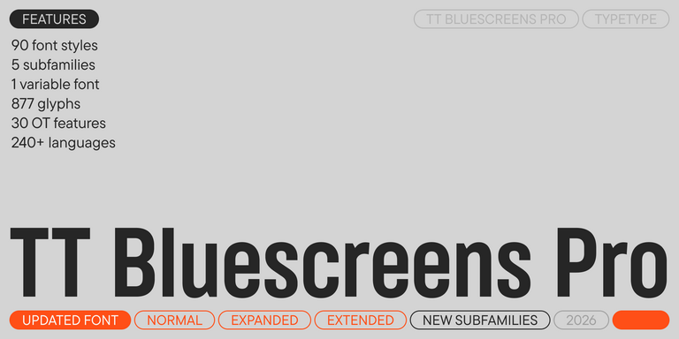
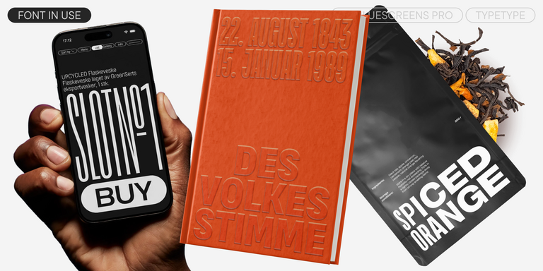

TT Bluescreens is a upgraded geometric sans serif with narrow proportions
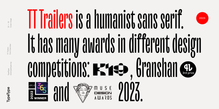
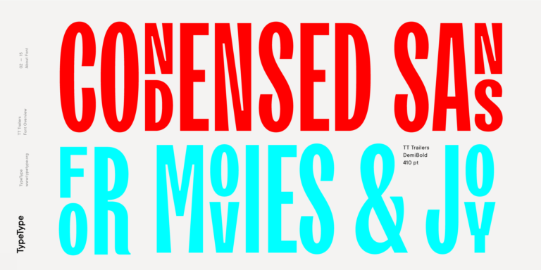
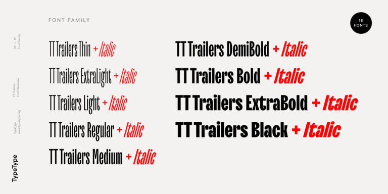
The starting point of the TT Trailers project was the idea to develop a new generation of narrow typefaces for use in movie credits and posters.

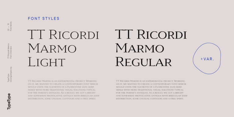
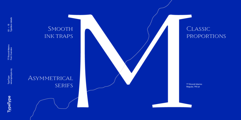
TT Ricordi Marmo is an original experimental project inspired by inscriptions at Basilica di Santa Croce in Florence.
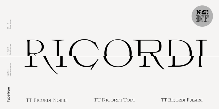
The TT Ricordi font family is a collection of three display heading serifs.
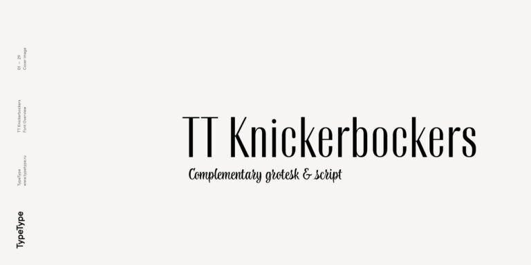
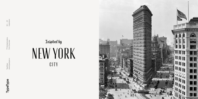
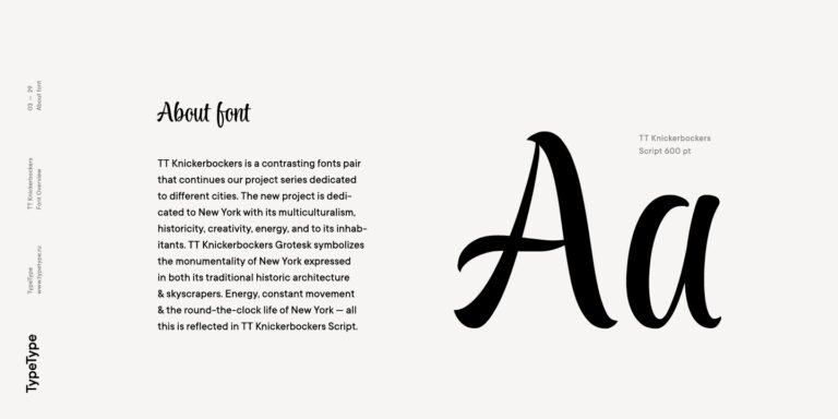
TT Knickerbockers Grotesk is a narrow contrast sans serif with characteristic elements sending us back to the 19th century in New York.
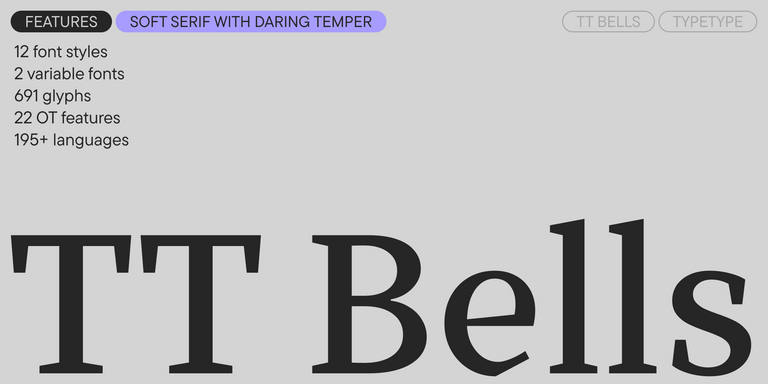
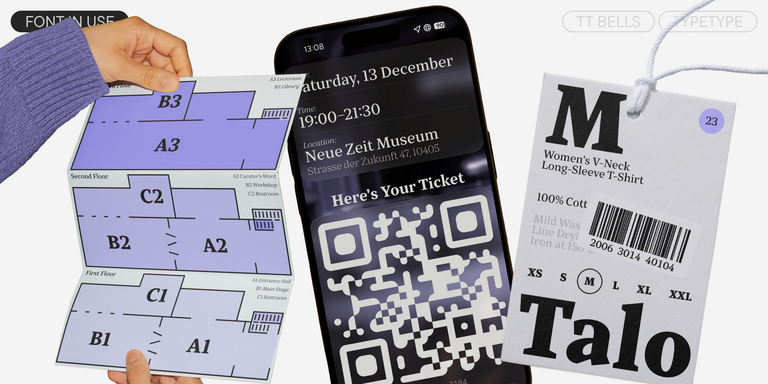

TT Bells combines the elegant softness of Antiqua with a complex and daring temper reflected in straight stroke terminals and arrowheaded serifs. The typeface is based on the broad nib, which creates these hallmark terminals and serifs.

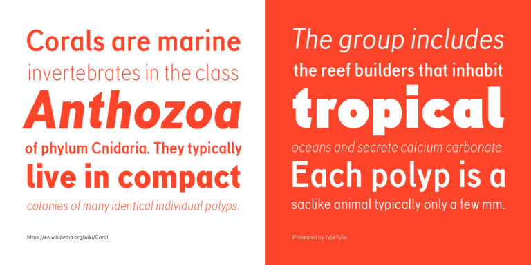
TT Corals is a modern humanistic sans serif which has many typical traits of the beginning of the 20th century. For an increased functionality of the font family, we’ve created 6 styles of various weights.