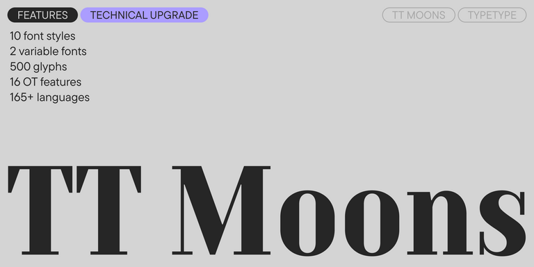
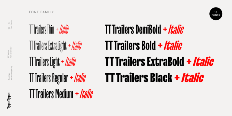
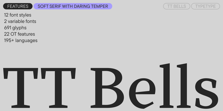
TT Bells
Regular
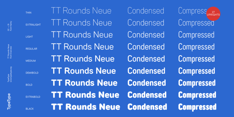
14 de los estilos

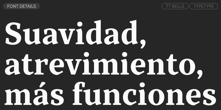
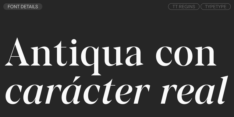
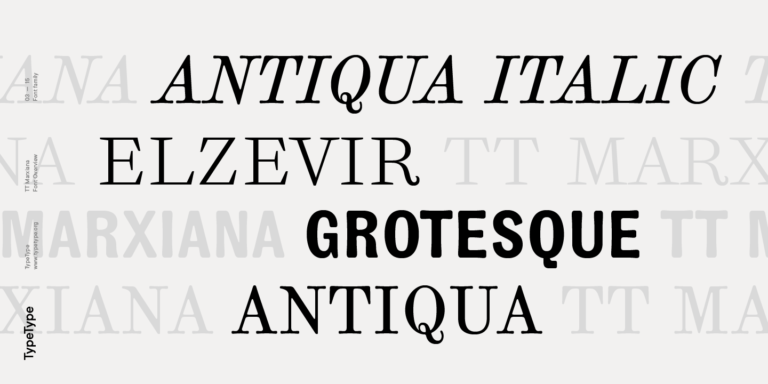
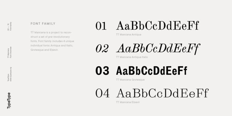
TT Bells combina la elegante suavidad de las Antiqua con un carácter complejo y audaz reflejado en terminales rectos y serifas en forma de flecha. La tipografía está basada en la pluma de punta ancha, responsable de estos característicos terminales y serifas.