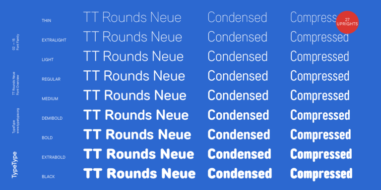
TT Jenevers
Regular
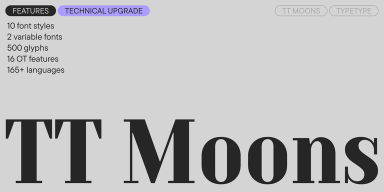
14 Stile
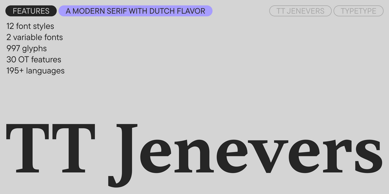
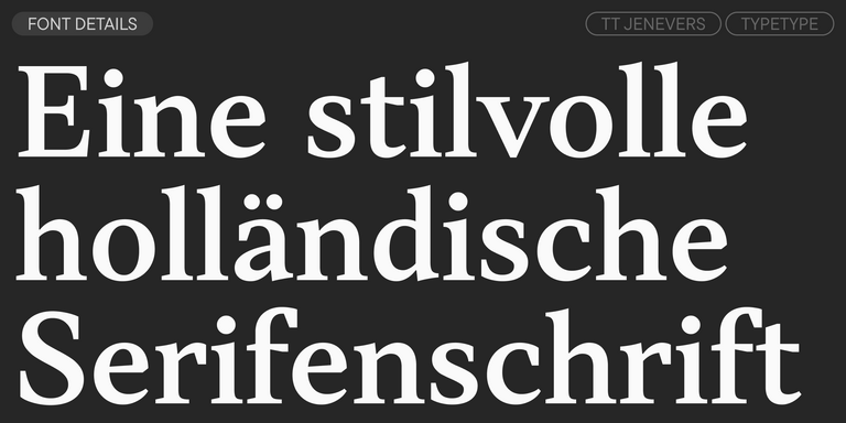
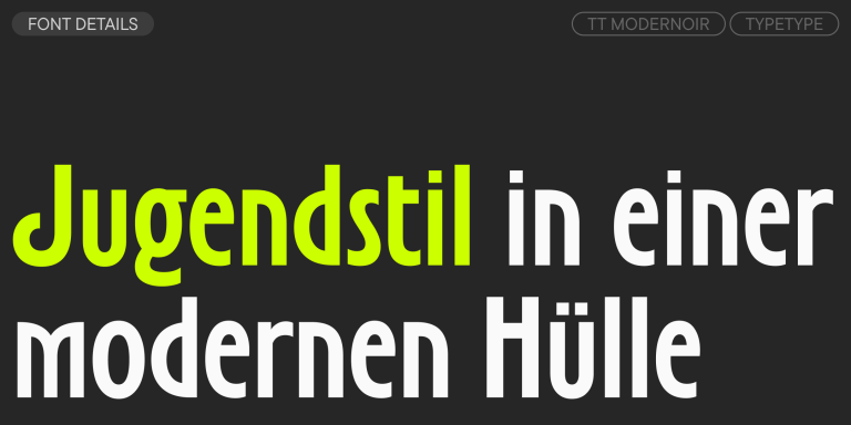
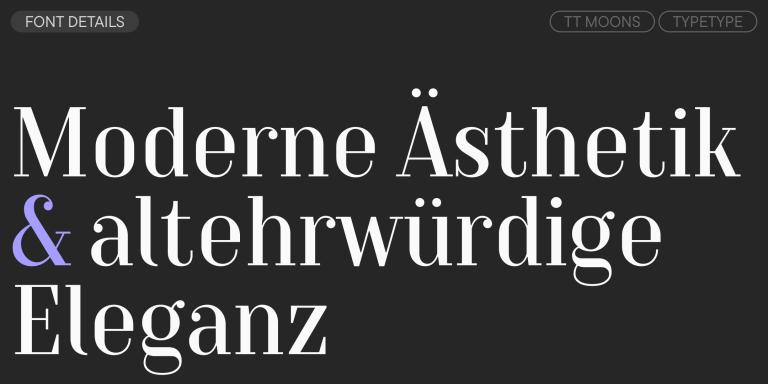
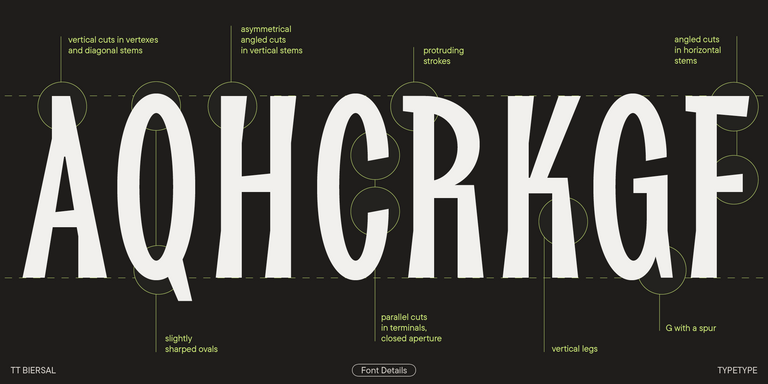
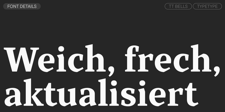
TT Jenevers ist eine moderne Serifenschrift mit niederländischem Charakter. Die Schriftfamilie besitzt typische Details niederländischer Serifen: asymmetrische Serifenformen und eine unregelmäßige Neigung der Ovale.