TT Livret
Text Regular
32 de estilo
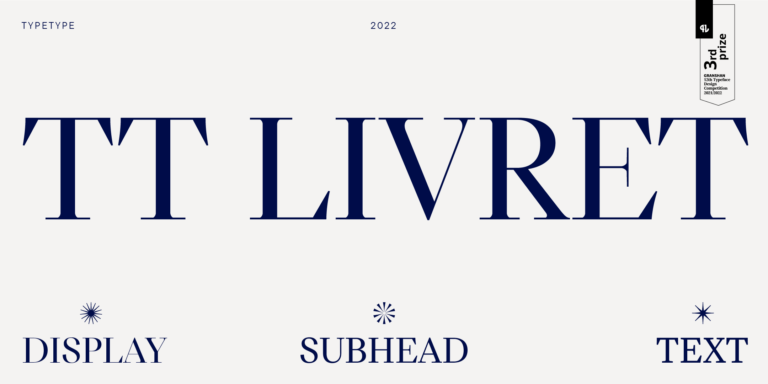
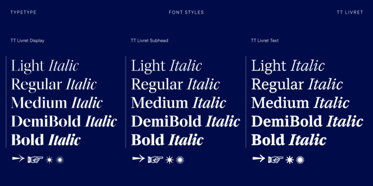
TT Livret es una serif elegante, moderna y funcional.

Si estás cansado de las fuentes desgastadas y busca tipos de letra similares a Frunchy Sage, consulta nuestras principales alternativas a Frunchy Sage. Estas son fuentes que tienen características similares, pero al mismo tiempo tienen características de diseño nuevas y únicas. Por ejemplo, pertenecen a la misma categoría de fuentes, son adecuadas para los mismos fines y tienen características similares, pero difieren en detalles o proporciones.
En TypeType encontrarás fuentes de vanguardia, tales como Frunchy Sage e incluso mejores: aquí hay algunas alternativas excelentes y menos comunes a Frunchy Sage. Utiliza esta lista de fuentes de alta calidad con apariencia Frunchy Sage que se adapten a tus gustos. De esta manera podrás elegir una fuente aún más adecuada para tu proyecto, ampliar la selección o actualizar tu diseño. Todas las fuentes que aparecen en esta colección están disponibles en diferentes formatos y a precios asequibles, por lo que podrás encontrar una que se adapte a cada necesidad.
Encuentra un excelente reemplazo para Frunchy Sage e intenta emular un estado de ánimo similar usándolo en sus diseños. Cada fuente presentada en esta página es un doble de la fuente Frunchy Sage, de hecho, su análogo completo.
TT Livret es una serif elegante, moderna y funcional.
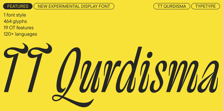
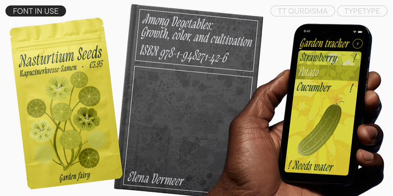
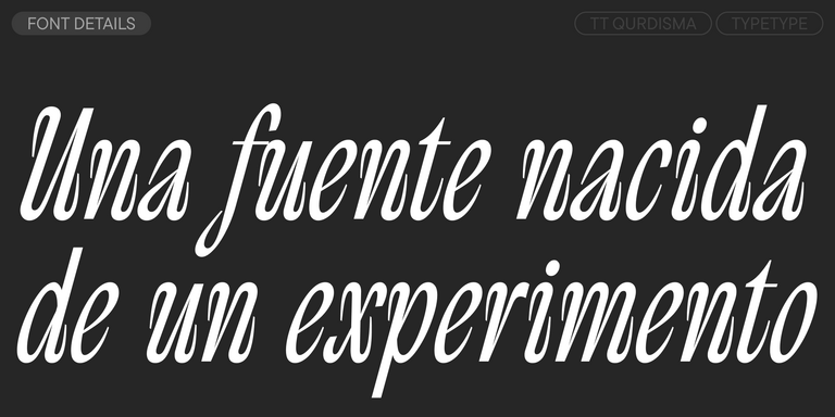
TT Qurdisma — una fuente decorativa estrecha y compacta que recuerda a una planta extravagante. Sus contornos curvos y fluidos crean un ornamento vegetal.
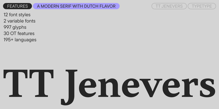
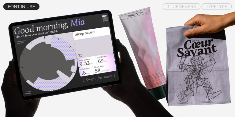
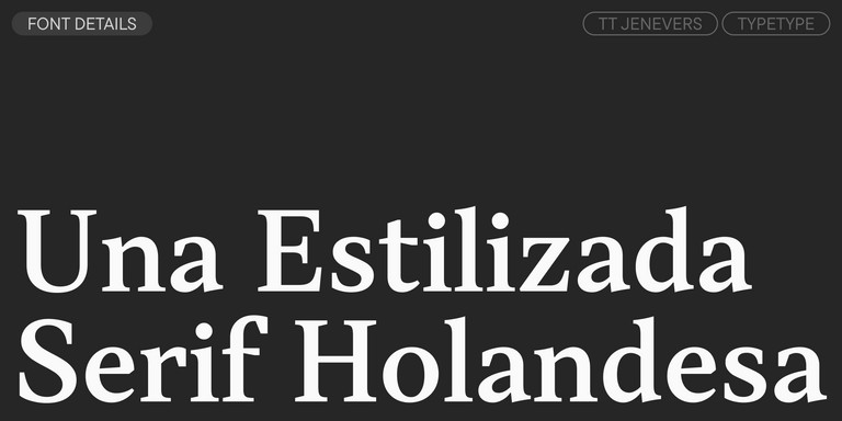
TT Jenevers es una serif moderna con carácter neerlandés. La familia tipográfica presenta detalles característicos de las serifas holandesas, como las serifas asimétricas y la inclinación irregular de los óvalos.
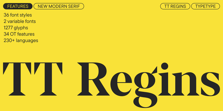
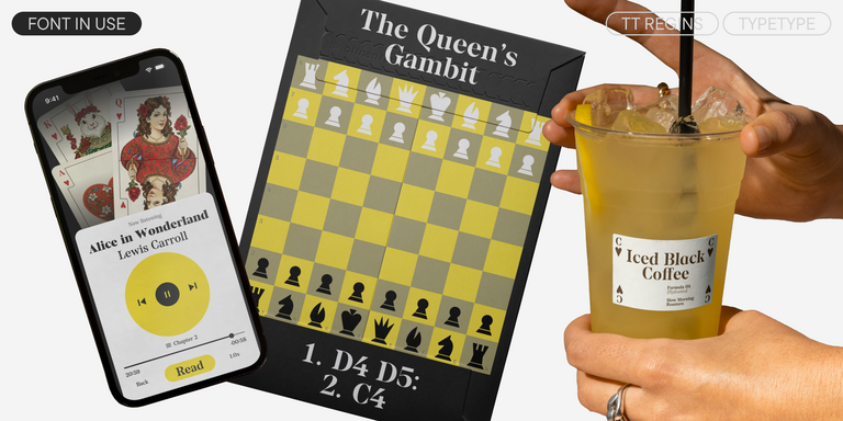
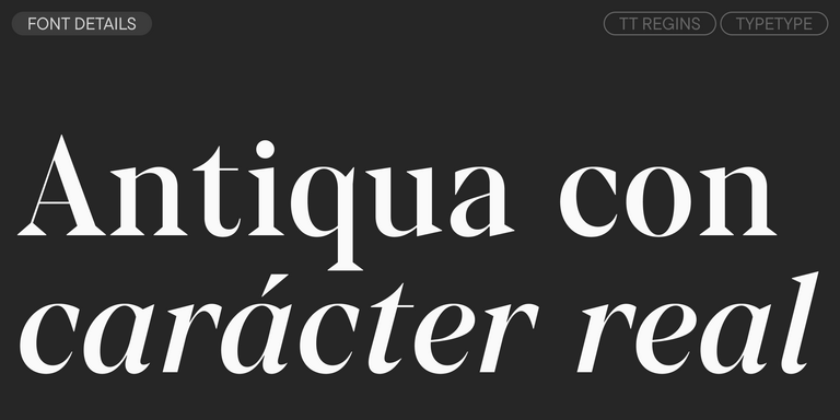
TT Regins es una serif moderna escocesa. Su fuerte contraste y sus afiladas serifas triangulares le otorgan un carácter severo y dominante, mientras que las formas refinadas, las minúsculas ampliadas y las proporciones ligeramente condensadas y estáticas aportan elegancia al diseño.
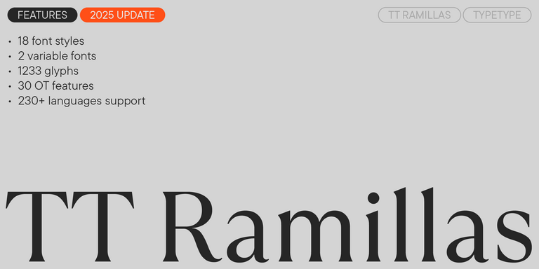
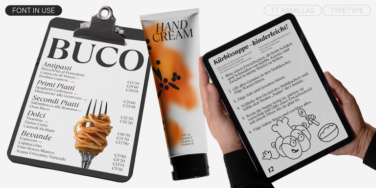
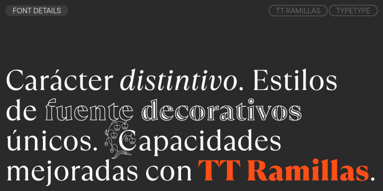
TT Ramillas es una serif contemporánea con gran versatilidad editorial. Incluye estilos decorativos e iniciales ornamentales con motivos florales.
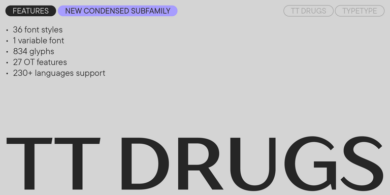
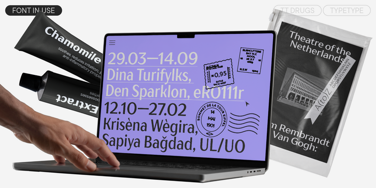
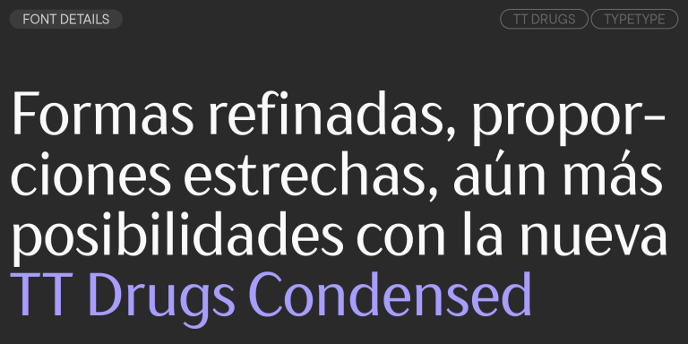
TT Drugs es una tipografía sin serifas que destaca por su alto contraste.
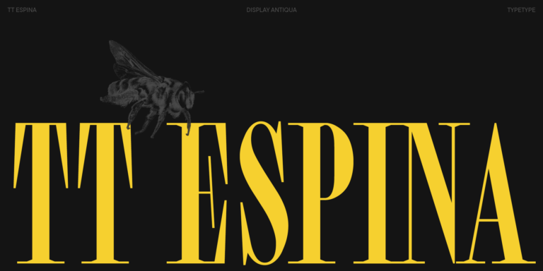
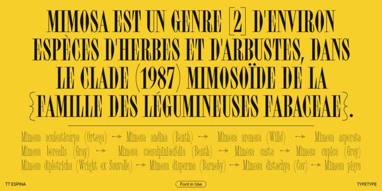
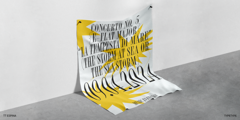
TT Espina es una antiqua display con serifas expresivas.
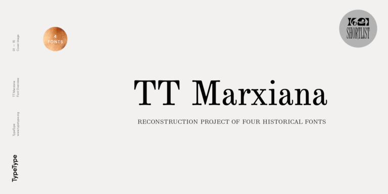
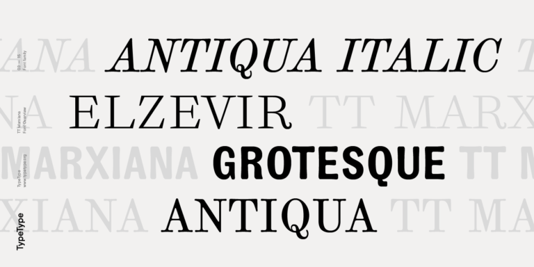
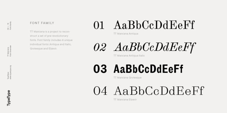
TT Marxiana Elzevir es una tipografía para títulos y encabezados basada en una recopilación de Elzevir monásticas que se utilizaban activamente en todas las publicaciones de la revista Niva.

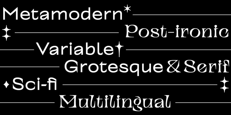
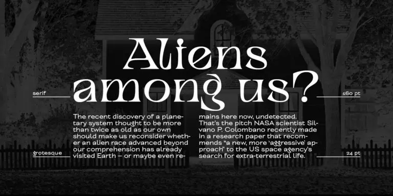
TT Alientz es una tipografía variable que permite al usuario realizar un viaje visual desde una grotesca extraterrestre hasta una display serif extremadamente afilada.

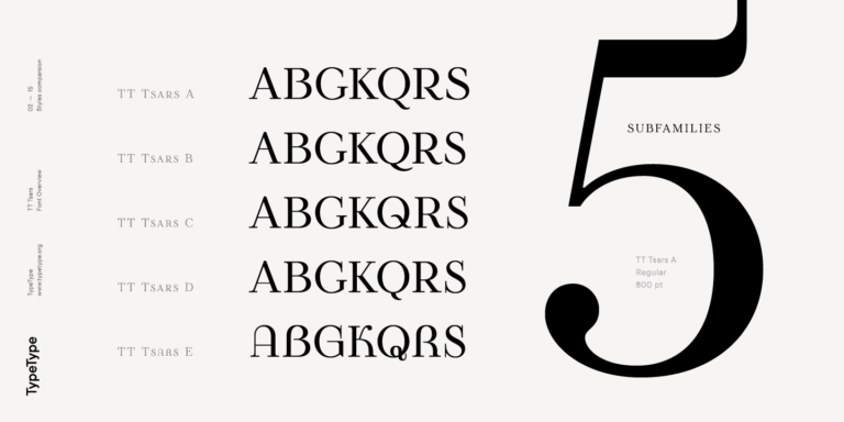
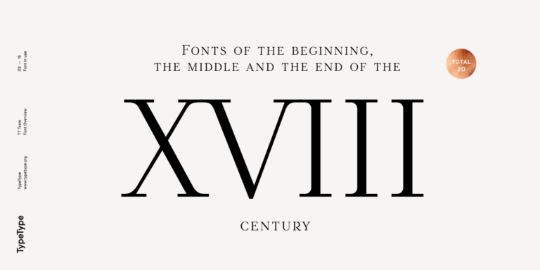
La familia tipográfica TT Tsars es una colección de fuentes serif display estilizadas para evocar las tipografías de principios, mediados y finales del siglo XVIII.
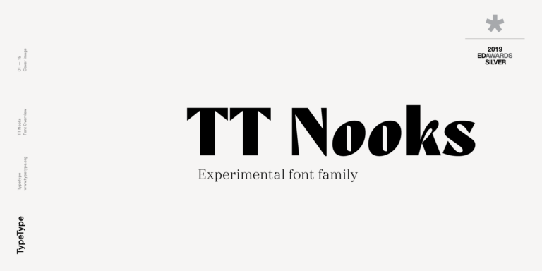
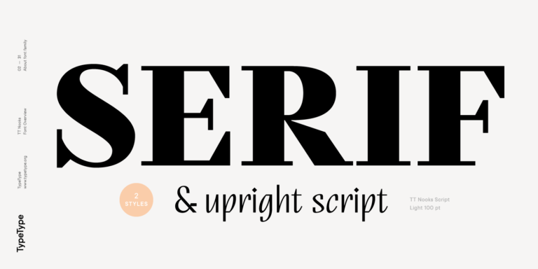
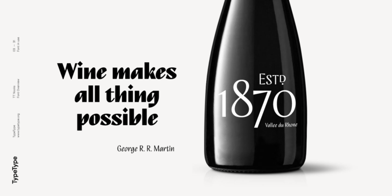
TT Nooks es un proyecto experimental compuesto por una serif egocéntrica de alto contraste y una cursiva humanista vertical.
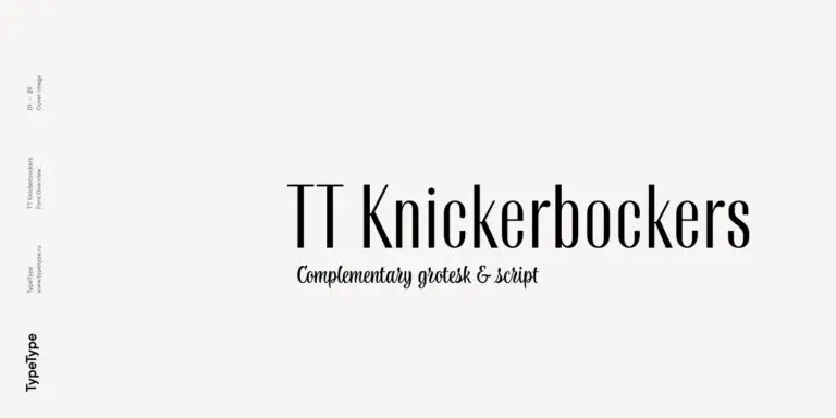
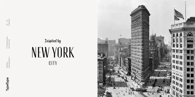
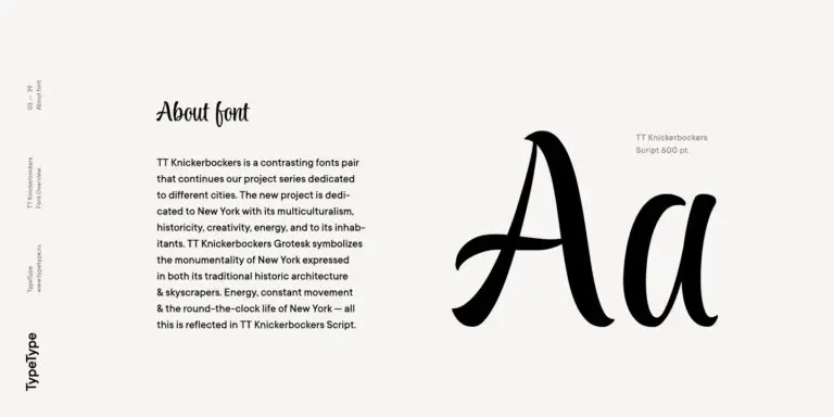
TT Knickerbockers Grotesk es una sans serif estrecha y contrastada con elementos característicos que nos transportan al Nueva York del siglo XIX.
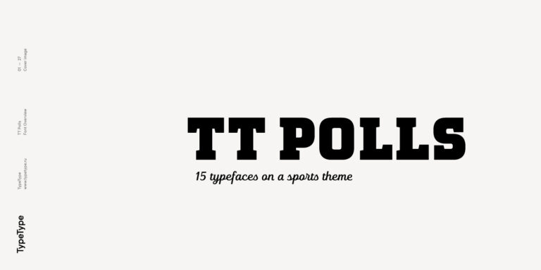
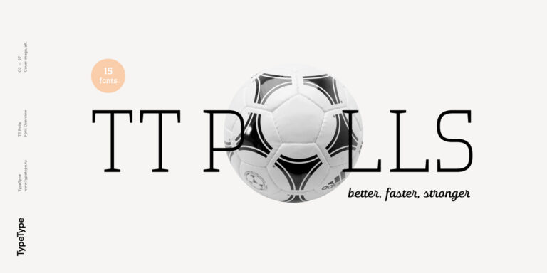
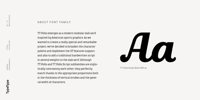
TT Polls es una moderna familia slab serif modular creada para diseños relacionados con el deporte.