TT Livret
Text Regular
32 de estilo
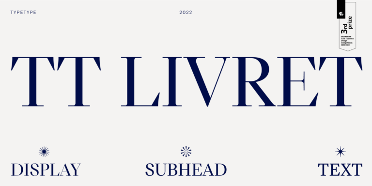
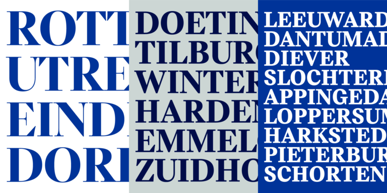
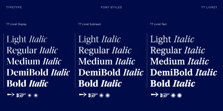
TT Livret es una serif elegante, moderna y funcional.

Si estás cansado de las fuentes desgastadas y busca tipos de letra similares a Droid Serif, consulta nuestras principales alternativas a Droid Serif. Estas son fuentes que tienen características similares, pero al mismo tiempo tienen características de diseño nuevas y únicas. Por ejemplo, pertenecen a la misma categoría de fuentes, son adecuadas para los mismos fines y tienen características similares, pero difieren en detalles o proporciones.
En TypeType encontrarás fuentes de vanguardia, tales como Droid Serif e incluso mejores: aquí hay algunas alternativas excelentes y menos comunes a Droid Serif. Utiliza esta lista de fuentes de alta calidad con apariencia Droid Serif que se adapten a tus gustos. De esta manera podrás elegir una fuente aún más adecuada para tu proyecto, ampliar la selección o actualizar tu diseño. Todas las fuentes que aparecen en esta colección están disponibles en diferentes formatos y a precios asequibles, por lo que podrás encontrar una que se adapte a cada necesidad.
Encuentra un excelente reemplazo para Droid Serif e intenta emular un estado de ánimo similar usándolo en sus diseños. Cada fuente presentada en esta página es un doble de la fuente Droid Serif, de hecho, su análogo completo.
TT Livret es una serif elegante, moderna y funcional.
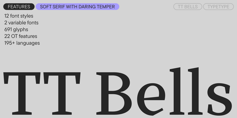

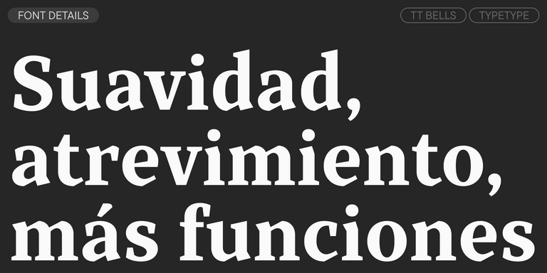
TT Bells combina la elegante suavidad de las Antiqua con un carácter complejo y audaz reflejado en terminales rectos y serifas en forma de flecha. La tipografía está basada en la pluma de punta ancha, responsable de estos característicos terminales y serifas.
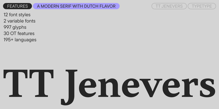
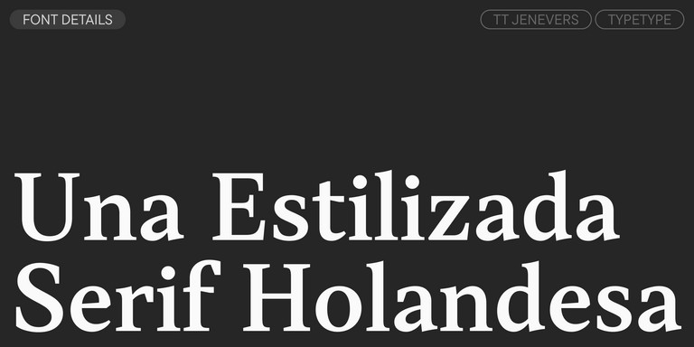
TT Jenevers es una serif moderna con carácter neerlandés. La familia tipográfica presenta detalles característicos de las serifas holandesas, como las serifas asimétricas y la inclinación irregular de los óvalos.
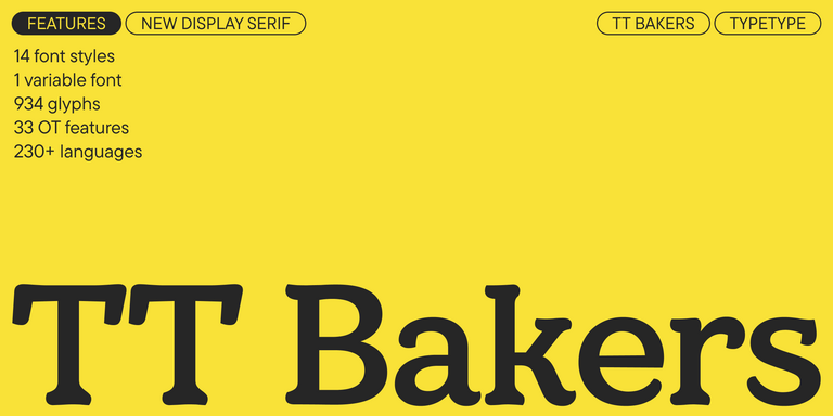
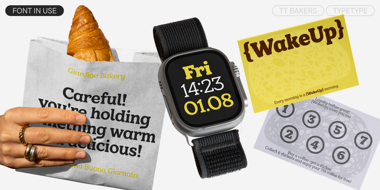
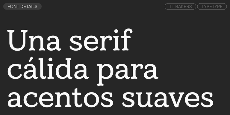
TT Bakers es una serif fluida con un carácter suave y vivaz. Esta tipografía recuerda a la repostería recién horneada: cálida y blanda, especialmente en sus pesos más gruesos.
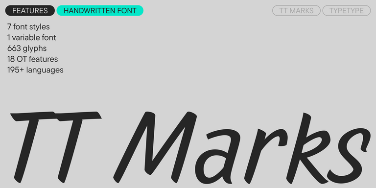
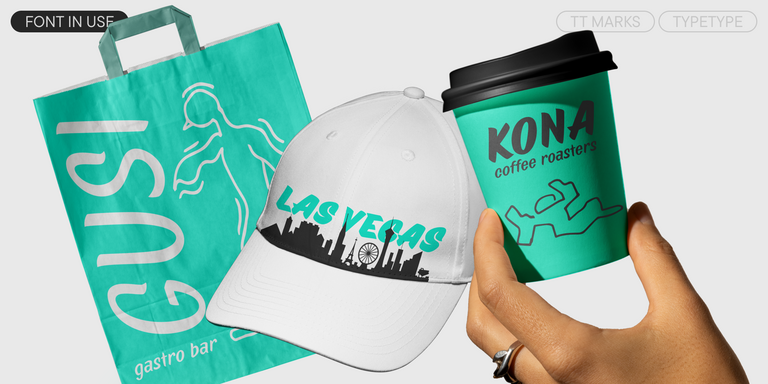
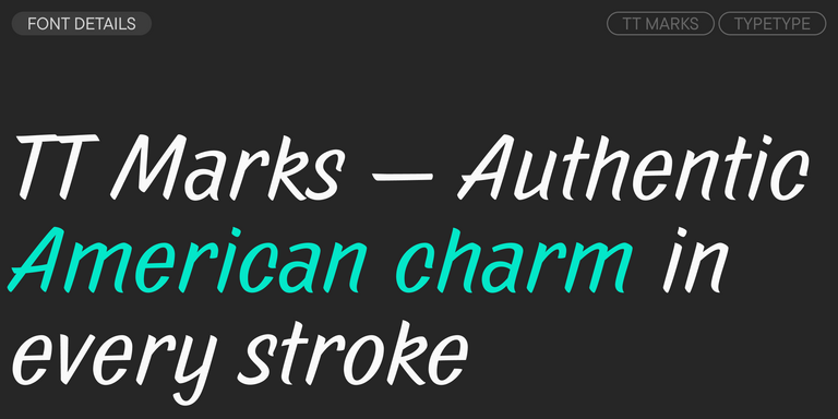
TT Marks ofrece una escritura con ritmo dinámico, carácter emocional y un atractivo nostálgico inspirado en el arte clásico estadounidense de la rotulación manual. Este oficio, en el que artistas especializados pintaban letreros comerciales a mano con pinceles y gran precisión, vive hoy un merecido renacimiento en el mundo del diseño.
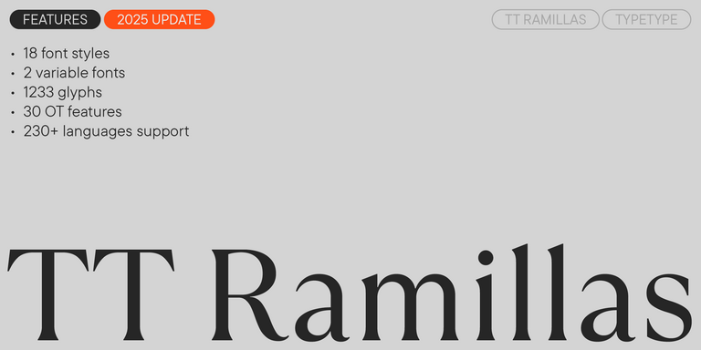
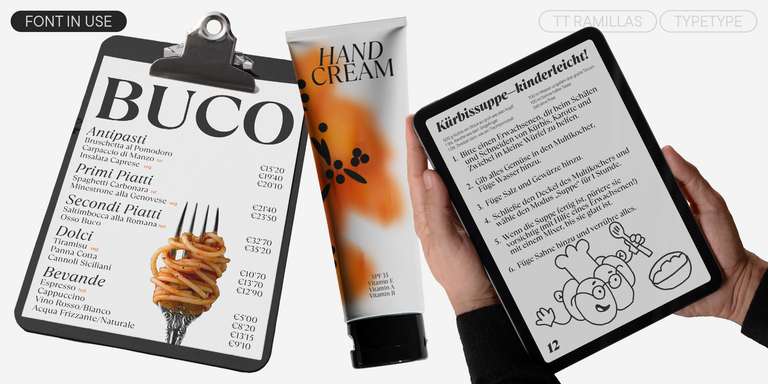
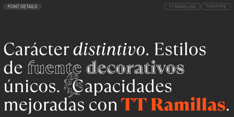
TT Ramillas es una serif contemporánea con gran versatilidad editorial. Incluye estilos decorativos e iniciales ornamentales con motivos florales.
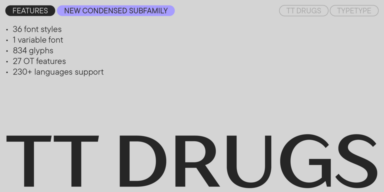
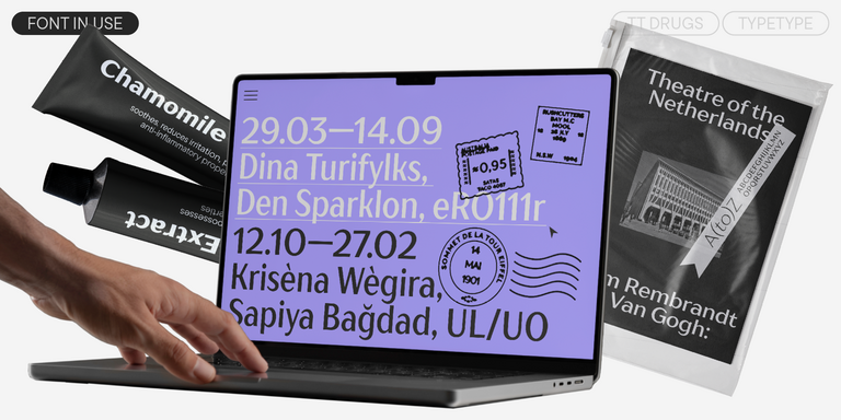
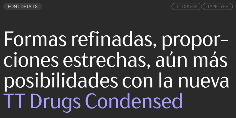
TT Drugs es una tipografía sin serifas que destaca por su alto contraste.
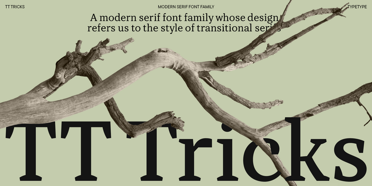
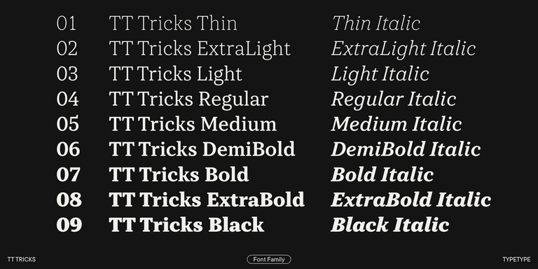
TT Tricks es una serif moderna para texto cuyo diseño refleja el estilo de las serifas transicionales. Esta tipografía posee un carácter sereno, elegante y moderadamente estricto.
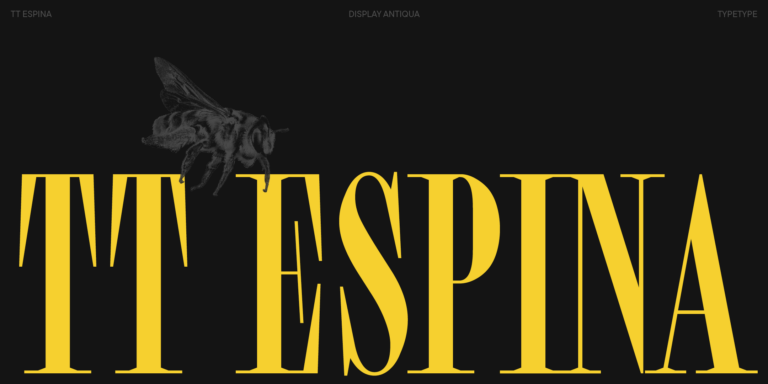
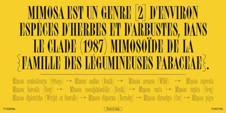
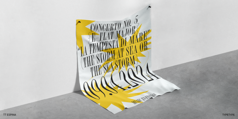
TT Espina es una antiqua display con serifas expresivas.
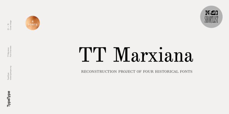
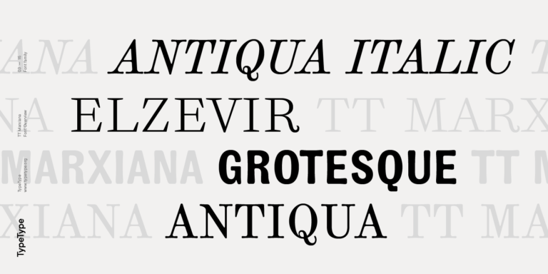
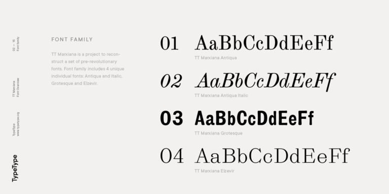
TT Marxiana Elzevir es una tipografía para títulos y encabezados basada en una recopilación de Elzevir monásticas que se utilizaban activamente en todas las publicaciones de la revista Niva.

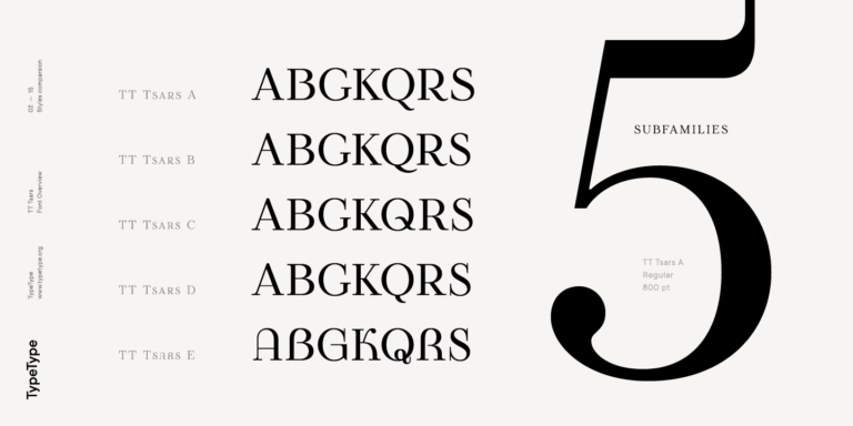
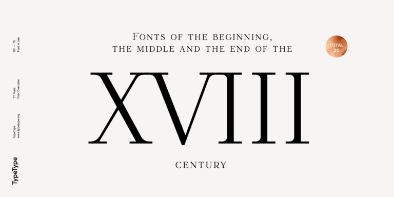
La familia tipográfica TT Tsars es una colección de fuentes serif display estilizadas para evocar las tipografías de principios, mediados y finales del siglo XVIII.
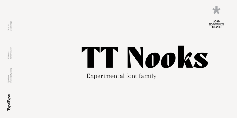
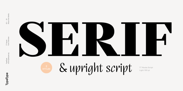
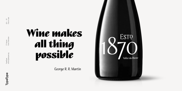
TT Nooks es un proyecto experimental compuesto por una serif egocéntrica de alto contraste y una cursiva humanista vertical.
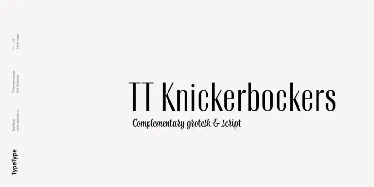
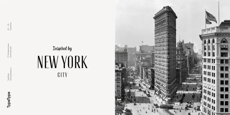
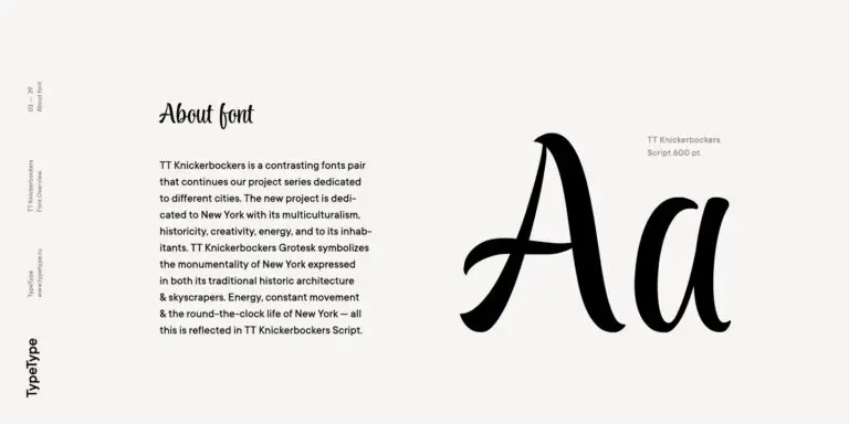
TT Knickerbockers Grotesk es una sans serif estrecha y contrastada con elementos característicos que nos transportan al Nueva York del siglo XIX.
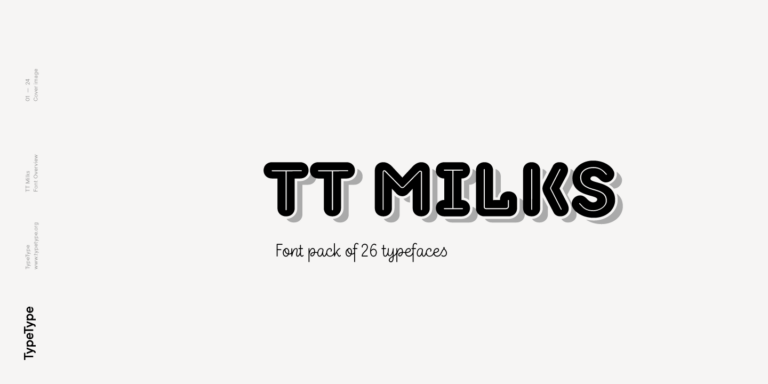
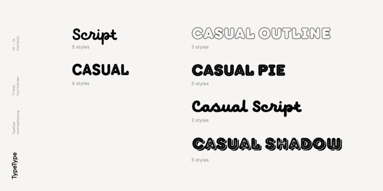
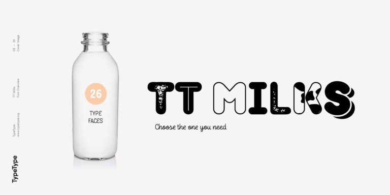
TT Milks es una colección de tipografías para branding.
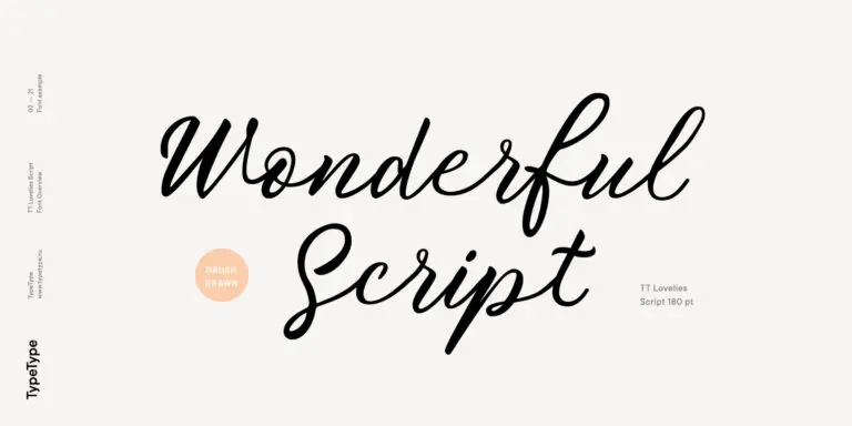
Sin falsa modestia, podemos decir que TT Lovelies Script es uno de los proyectos más complejos que hemos realizado: incluye 1115 glifos, más de 2000 alternativas contextuales, 10 000 pares de kerning y una gran cantidad de funciones OpenType, entre ellas ligaduras y cifras Old Style.