top_banner_ttnormspro0426
Fundición tipográficaFuentesBritannic Bold

Fuentes similares a Britannic Bold

Alternativa de fuente: Britannic Bold

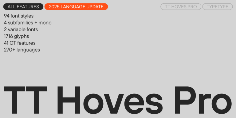
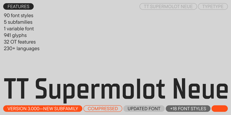
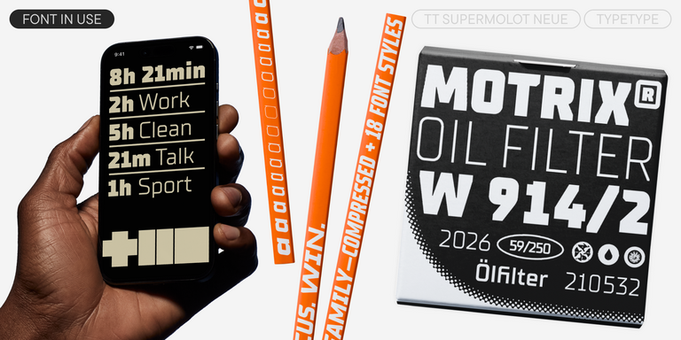
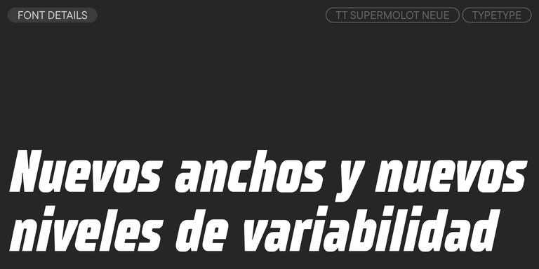
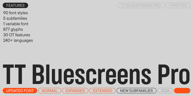
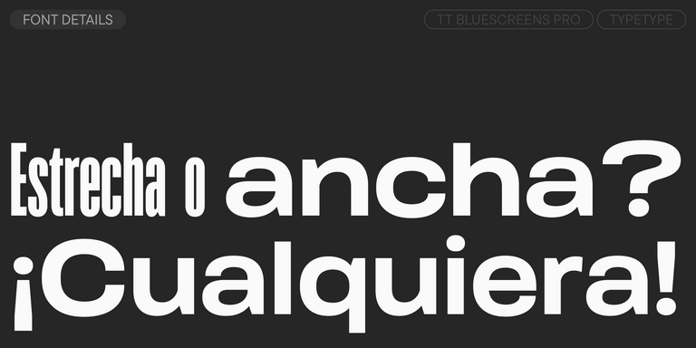
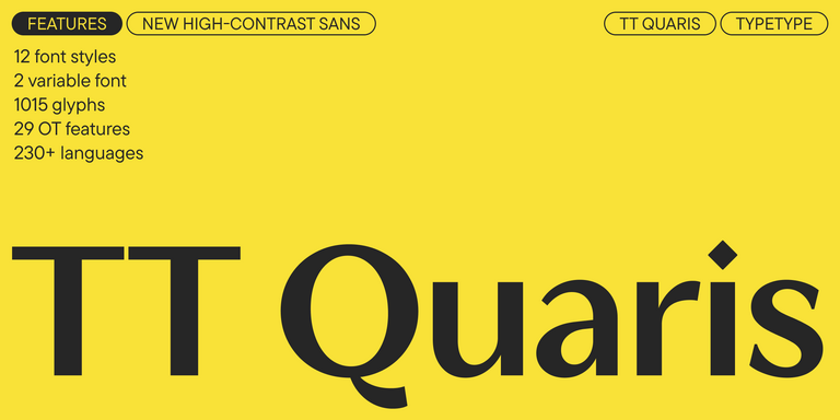
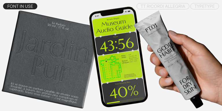
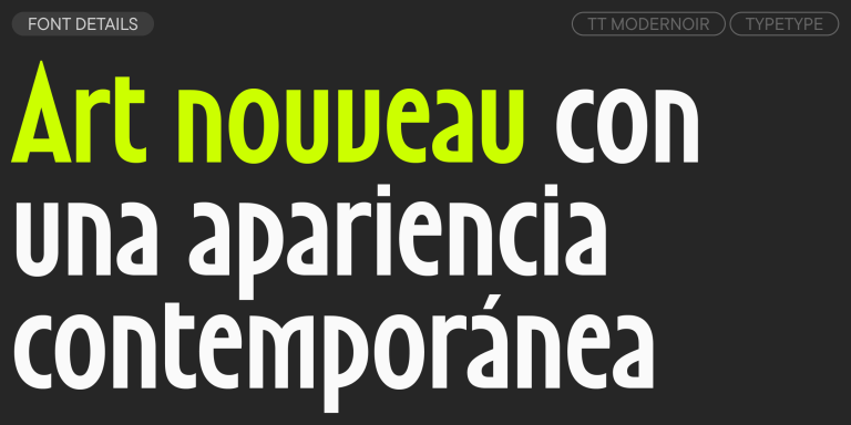
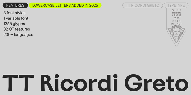
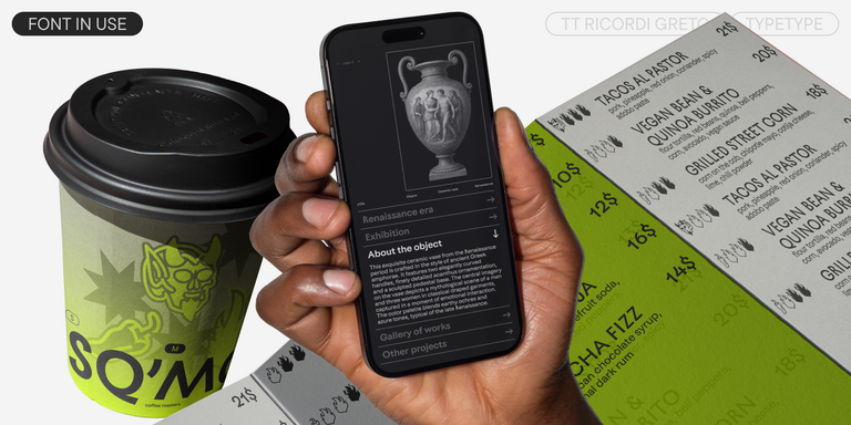
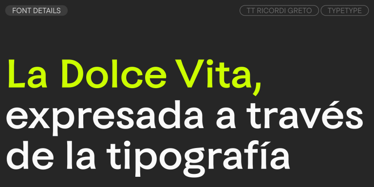
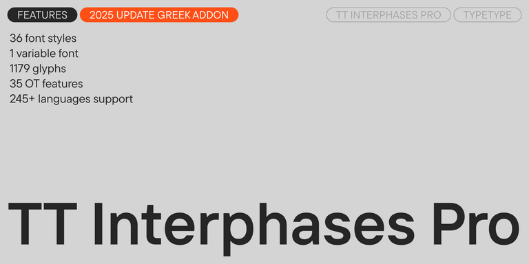
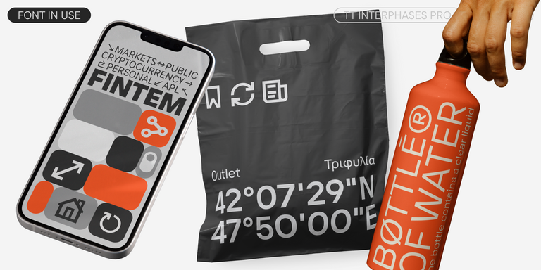
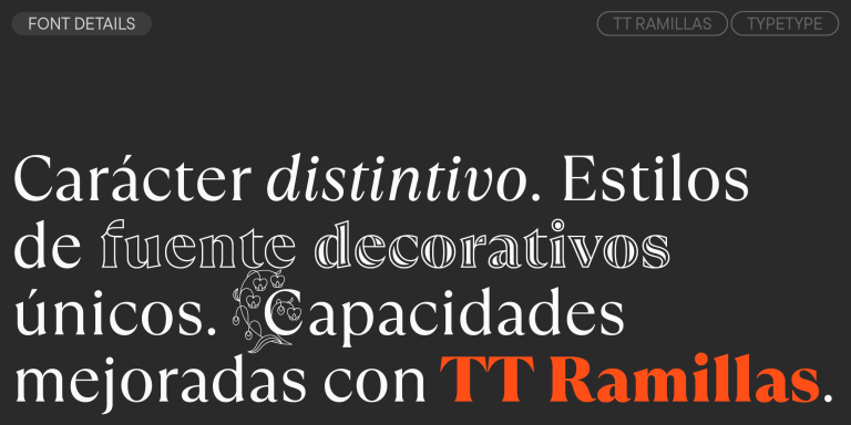
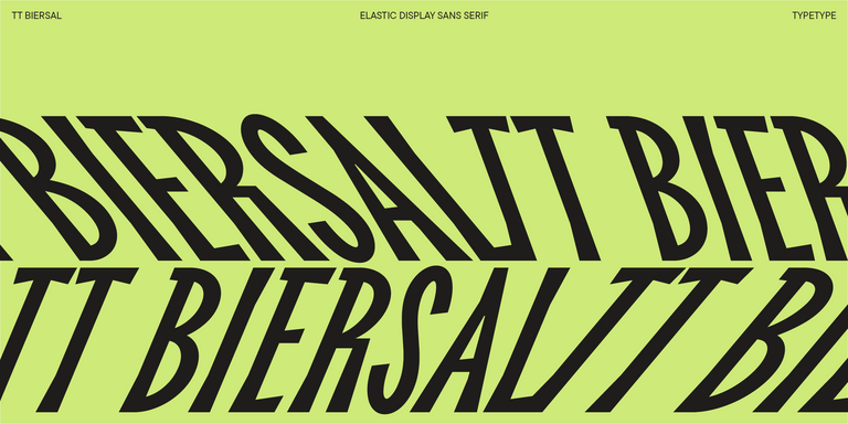
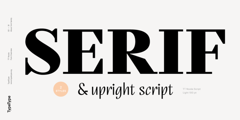
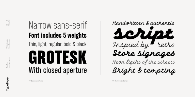
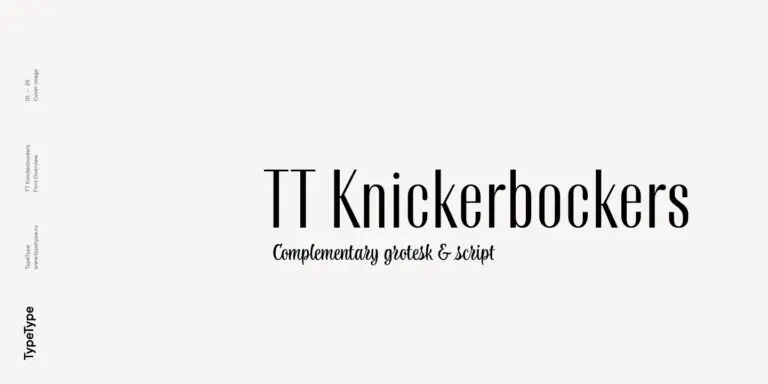
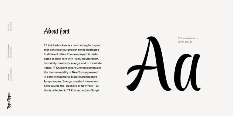
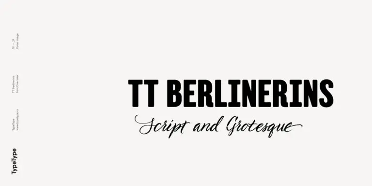
Si estás cansado de las fuentes desgastadas y busca tipos de letra similares a Britannic Bold, consulta nuestras principales alternativas a Britannic Bold. Estas son fuentes que tienen características similares, pero al mismo tiempo tienen características de diseño nuevas y únicas. Por ejemplo, pertenecen a la misma categoría de fuentes, son adecuadas para los mismos fines y tienen características similares, pero difieren en detalles o proporciones.
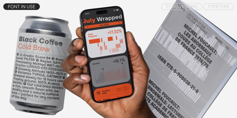
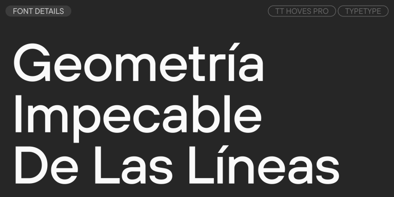
En TypeType encontrarás fuentes de vanguardia, tales como Britannic Bold e incluso mejores: aquí hay algunas alternativas excelentes y menos comunes a Britannic Bold. Utiliza esta lista de fuentes de alta calidad con apariencia Britannic Bold que se adapten a tus gustos. De esta manera podrás elegir una fuente aún más adecuada para tu proyecto, ampliar la selección o actualizar tu diseño. Todas las fuentes que aparecen en esta colección están disponibles en diferentes formatos y a precios asequibles, por lo que podrás encontrar una que se adapte a cada necesidad.
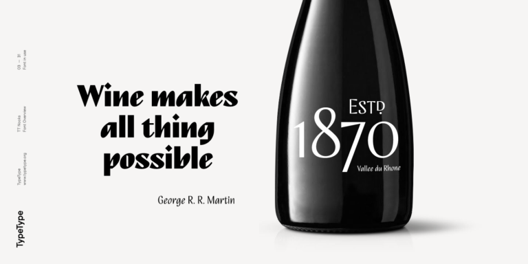
Encuentra un excelente reemplazo para Britannic Bold e intenta emular un estado de ánimo similar usándolo en sus diseños. Cada fuente presentada en esta página es un doble de la fuente Britannic Bold, de hecho, su análogo completo.

  • The quick brown fox jumps over a lazy dog.
  • Pack my box with five dozen liquor jugs.
  • Sphinx of black quartz, judge my vow
  • 0123456789 !?.,:;—–()[]{}<> “quotes” ‘apostrophe’ @#%&*_+=/\| № $ € £ ₽ +−×÷=≠≤≥ … % © ® ™
  • Aa Bb Cc Dd Ee Ff Gg Hh Ii Jj Kk Ll Mm Nn Oo Pp Qq Rr Ss Tt Uu Vv Ww Xx Yy Zz
Interlineado
1.1
Kerning
0px
Superventas
TT Hoves Pro Regular
96 de los estilos

TT Hoves Pro is a versatile sans-serif with a recognizable geometry

Superventas
91 estilo

TT Supermolot Neue is a redesigned, extended, and greatly enhanced reincarnation of the popular font family

91 estilo

TT Bluescreens is a upgraded geometric sans serif with narrow proportions

Novedad
TT Quaris Regular
14 de los estilos

TT Quaris is an exquisite, modern high-contrast sans whose design balances between soft and sharp. The glyph shapes in the font are fluid and tend towards roundness, yet there are also sharp elements.

6 de los estilos

TT Ricordi Allegria is a sleek and intelligent contemporary Florentine grotesque.

TT Modernoir Regular
6 de los estilos

TT Modernoir is a display sans serif with dynamic proportions. Fluid lines and delicate Art Nouveau forms in this typeface blend seamlessly with the rhythmic flow and improvisational freedom of jazz.

TT Moons Regular
12 de los estilos

TT Moons is a slim and contrast serif. This font family works especially smart in classic design themes. TT Moons is a typeface of the glyptal modern typeface.

4 de estilo

TT Ricordi Greto is an experimental project, inspired by a floor plaque dating from 1423 found in the Basilica di Santa Croce, Florence.

Superventas
43 de estilo

TT Interphases Pro is a neo-grotesque sans serif with equal-width proportions

Superventas
TT Ramillas Regular
28 de los estilos

TT Ramillas is a fully reconsidered high contrast transitional serif, which is perfectly adapted to modern realities and requirements.

TT Drugs Regular
37 de los estilos

TT Drugs is a typeface that doesn’t feature serifs but stands out for its high contrast.

Novedad
TT Gertika Regular
4 de estilo

TT Gertika is a geometric sans serif with a dynamic character and a dancing rhythm. This font’s idea originates from the lettering featured on an American poster from the late 1930s.

Novedad
TT Biersal Upright
6 de los estilos

TT Biersal is a display sans serif with a free-spirited, playful, and adventurous nature. The concept of this font was sparked by a German poster from the early 1930s.

TT Tricks Regular
20 de los estilos

TT Tricks is a modern text serif with a design reflecting the style of Transitional serifs. This font has a calm, elegant, and moderately stern character.

Novedad
TT Carvist Regular
6 de los estilos

TT Carvist—peculiar, playful, and courageous—this font does an excellent job of grabbing attention!

TT Lakes Neue Regular
91 estilo

A technological font family for game design

TT Nooks Regular
8 de los estilos

TT Nooks is an experimental project comprised of a high-contrast egocentric serif and an upright humanist italic.

TT Backwards Sans Regular
10 de los estilos

TT Backwards Sans is a narrow grotesque, which takes us back to the book design of late 70s and early 80s with its ductile characters.

2 de estilo

TT Knickerbockers Grotesk is a narrow contrast sans serif with characteristic elements sending us back to the 19th century in New York.

TT Berlinerins Grotesk
2 de estilo

TT Berlinerins is a grotesque inspired by the wood-type poster types of the first third of the 20th century is responsible for the historic component of Berlin.