TT Commons™ Pro is a completely redesigned version of the well-established classic font family TT Commons.
Ouija-Brett-Schriften
- Schriftarten 73
- Sans Serif 47
- Serif 27
- Slab Serif 6
- Display 41
- Script 10
- Variabel 47
- Rabatte 17
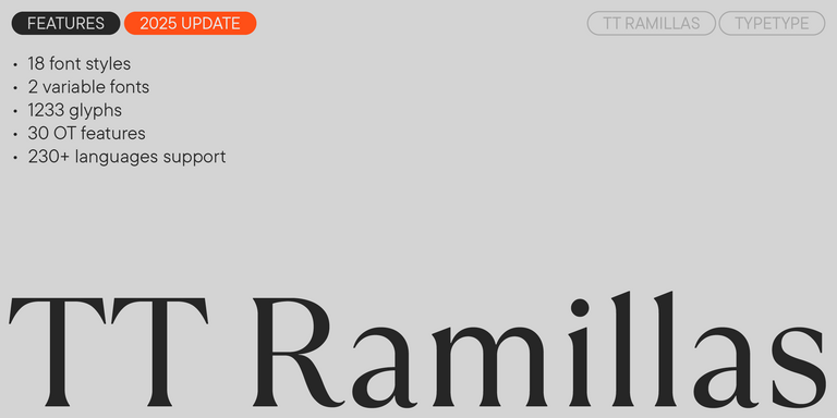
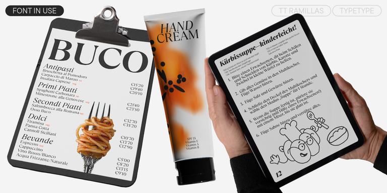
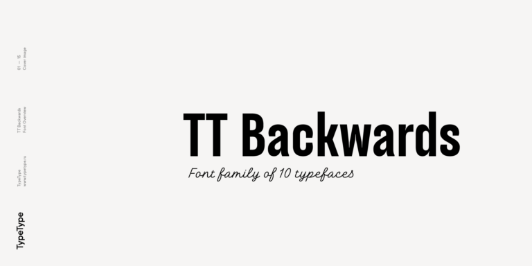
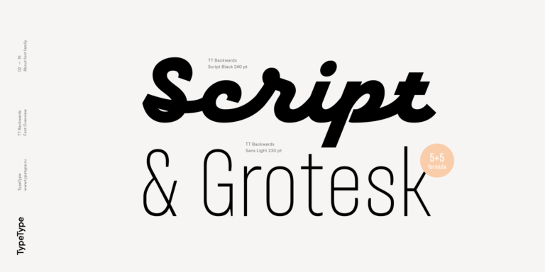
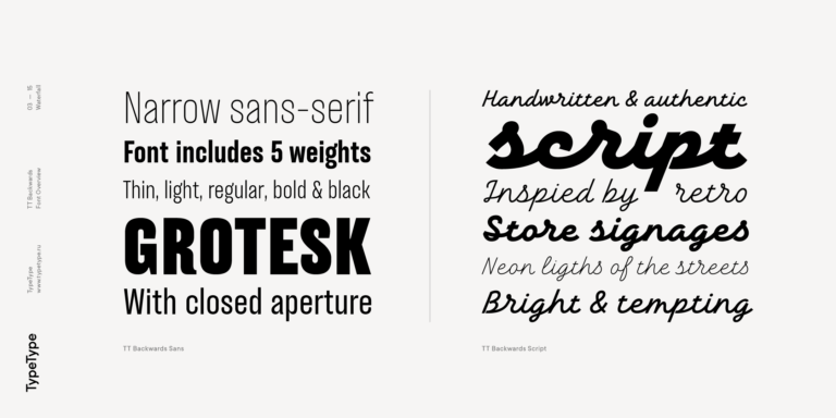
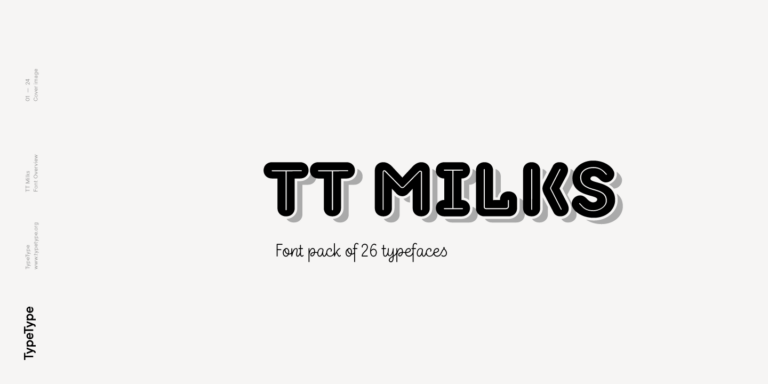
Wenn du auf der Suche nach der Ouija-Brett-Schriften bist, um dein Design zu vervollständigen, ist unser TypeType-Studio die richtige Adresse, um eine große Auswahl an Schriften für kommerzielle Zwecke zu finden. Die einzelnen Stile und die kompletten Schriftfamilien findest du auf unserer Seite online: Du kannst aus einer Vielzahl von gut gemachten und technisch geprüften Schriften wählen, sie kostenlos nutzen und eine Anfrage zum Kauf einer passenden Lizenzart hinterlassen. TypeType bietet dir die Möglichkeit, die Testversionen aller Ouija-Brett-Schriften herunterzuladen, um sie in deinen Projekten zu verwenden, und sich von den Design- oder Kundenbetreuungsteams beraten zu lassen. Du kannst uns gerne über unser Formular auf der Website kontaktieren.
- Victor jagt zwölf Boxkämpfer quer über den großen Sylter Deich.
- Fix, Schwyz!” quäkt Jürgen blöd vom Paß.
- The quick brown fox jumps over a lazy dog.
- Typographie ist zweidimensionale Architektur und bedingt extra Qualitaet in jeder vollkommenen Ausfuehrung.
- Aa Bb Cc Dd Ee Ff Gg Hh Ii Jj Kk Ll Mm Nn Oo Pp Qq Rr Ss Tt Uu Vv Ww Xx Yy Zz Ää Öö Üü ß
TT Hoves Pro is a versatile sans-serif with a recognizable geometry
We continue to expand the line of the studio's main bestseller TT Norms® Pro!
TT Livret is an elegant, modern and functional serif
TT Turns is a striking geometric sans serif with expressive elements. This versatile font works exceptionally well for running text, while at large point sizes, it takes on a distinct display character.
TT Jenevers is a modern serif with a Dutch flavor. The font family features the characteristic details peculiar to Dutch serifs—these are the asymmetrical shape of serifs and an irregular slant of ovals.
TT Regins is a Scottish modern serif. Striking contrast and sharp triangular serifs give this font a stern and commanding character, while refined forms, enlarged lowercase letters, and slightly condensed, static proportions add grace to its design.
TT Neoris is an elegant Neo-Grotesque with unlimited potential and a font that encompasses all modern requirements and user desires.
TT Fors is a modern geometric sans serif with characters and shapes contrasting in width.
TT Fellows is a humanist sans serif with a mechanical touch.
TT Interphases Pro is a neo-grotesque sans serif with equal-width proportions
TT Ramillas is a fully reconsidered high contrast transitional serif, which is perfectly adapted to modern realities and requirements.
TT Tricks is a modern text serif with a design reflecting the style of Transitional serifs. This font has a calm, elegant, and moderately stern character.
TT Espina is a display antiqua with expressive serifs
The starting point of the TT Trailers project was the idea to develop a new generation of narrow typefaces for use in movie credits and posters.
TT Autonomous is a modern techno sans serif with wide angular proportions.
TT Marxiana is a pre-revolutionary font reconstruction project. These fonts were used in the layout of the «Niva» (nee-vah, «Cultivated field») magazine published by the A. F. Marx publishing house in St. Petersburg in 1887.
TT Norms Condensed continues to develop the ideas of neutrality and versatility stemming from our bestselling TT Norms.
The TT Tsars font family is a collection of serif display fonts that are stylized to resemble the fonts of the beginning, the middle, and the end of the XVIII century.
TT Backwards Sans is a narrow grotesque, which takes us back to the book design of late 70s and early 80s with its ductile characters.
TT Milks is a Collection of typefaces for branding
TT Hazelnuts is a display sans serif font family containing a set of elegant and delicate decorative elements.
TT Bells combines the elegant softness of Antiqua with a complex and daring temper reflected in straight stroke terminals and arrowheaded serifs. The typeface is based on the broad nib, which creates these hallmark terminals and serifs.
TT Corals is a modern humanistic sans serif which has many typical traits of the beginning of the 20th century. For an increased functionality of the font family, we’ve created 6 styles of various weights.
