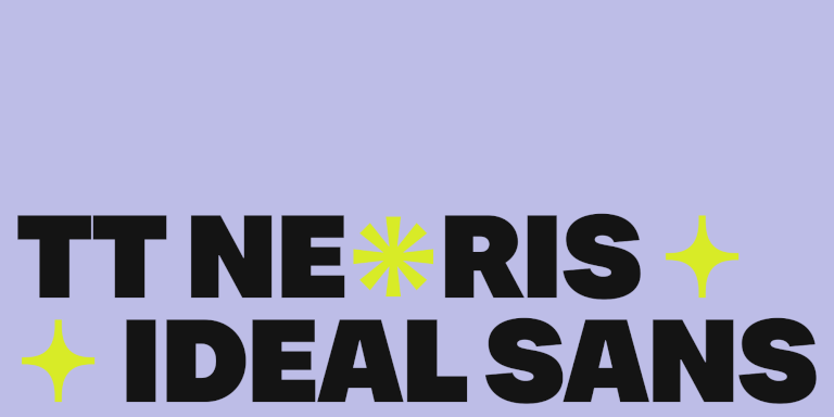
TT Neoris ist eine Schrift des TypeType-Teams aus dem Jahr 2023. Ihr Name ist von zwei Wörtern abgeleitet: „neo“, was „neu“ bedeutet, und „aufsteigen“. Wir haben zweieinhalb Jahre lang akribisch an ihr gearbeitet. Im Moment ist TT Neoris das ehrgeizigste Projekt des Studios: Unser Ziel war es, die ideale Neo-Groteske zu schaffen, die ein neues Kapitel in der Geschichte der Typografie aufschlägt und ein Bestseller wird.
Die meisten modernen Marken wählen serifenlose Schriften als ihre Hausschrift. Diese Schriften gewannen schon vor fast einem Jahrhundert an Popularität, haben aber immer noch ihren Höhepunkt erreicht. Finden wir heraus, was an diesen Schriften so attraktiv ist, und werfen wir einen Blick auf eine Auswahl der besten serifenlosen Schriften aus der TypeType-Kollektion.
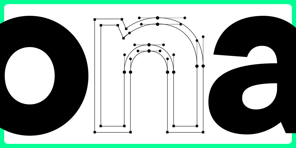
Welcome to the ninth lesson of our «UniversiTTy»! In this series, we guide you through the process of font design step by step. The font is a cohesive visual system. This can be seen on all levels: global (font type, weight, proportions, contrast, general forms) and at lower scales that encompass all graphic choices in individual characters. Let’s find out together how visual details influence the overall perception of fonts.
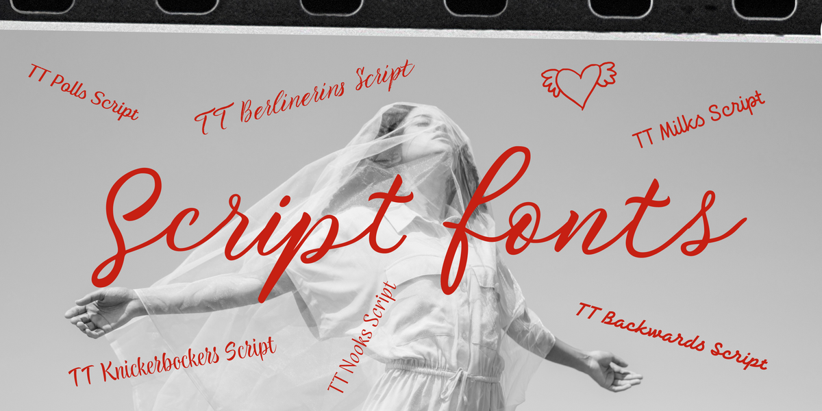
Kalligraphische Schriften sind ein mächtiges Designwerkzeug, das Ihre visuellen Projekte heben kann, wenn sie bedacht verwendet werden. Der Schlüssel liegt jedoch darin, sie effektiv und angemessen anzuwenden. In diesem umfassenden Leitfaden tauchen wir in die Welt der kalligraphischen Schriften ein.
Infografiken sind ein vielseitiges und praktisches Werkzeug, das überall Anwendung findet: im Geschäftsleben, in der Werbung, Wissenschaft, Journalismus und mehr. Dies ist eine kraftvolle Art, Informationen auf einfache, visuelle Weise zu kommunizieren.
How to install a new font on a PC? Users and designers face this question very often. Rest assured, there is nothing tricky in this process! This article provides a step-by-step guide to help you understand how to install downloaded fonts correctly on Windows and iOS-powered computers.
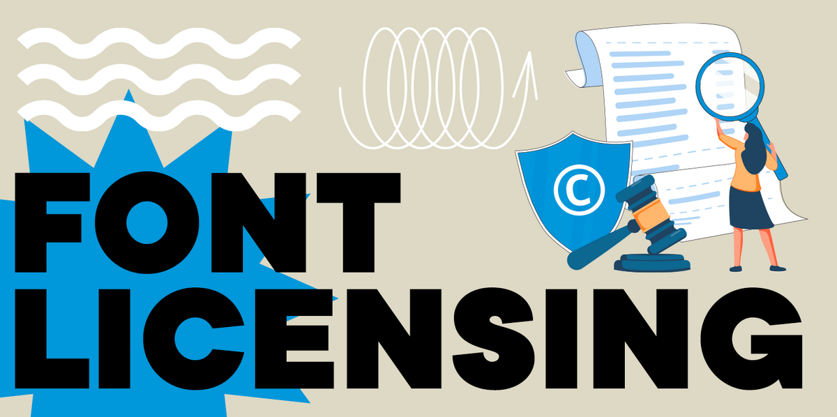
In this article, you will find out what types of font licensing exist, how to choose a suitable font license and use it, how to verify and buy a commercial font license, and how to avoid unpleasant typeface licensing issues whether you are a designer or a client.
Wide and narrow fonts are among the newest trends in typography, graphic design, and web design. At first glance, some may seem odd and awkward, but when thoughtfully applied, they can infuse a project with freshness, boldness, relevance, and strength. What are narrow and wide fonts, what variations do they come in, and where are they used? Let’s explore this together in this article.
Even seasoned designers sometimes mix up the concepts of kerning, tracking, spacing, and leading. Become a pro at distinguishing them! Learn the definitions of these concepts, explore their differences, and discover some helpful tips on how to use them while working on your fonts.
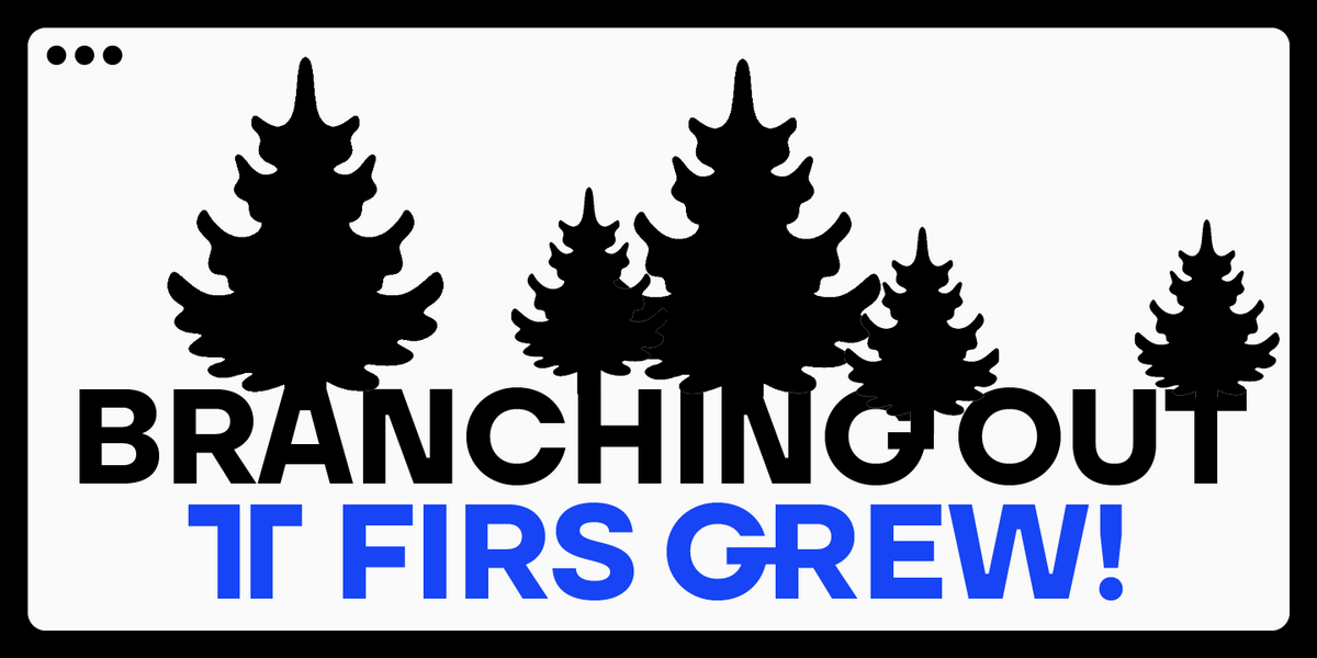
In 2023, we breathed new life into the beloved Scandinavian sans serif TT Firs Neue by dramatically refining and renewing the typeface to comply with cutting-edge standards. Soon after, we introduced the text font pair for this typeface — an elegant TT Firs Text. This article is dedicated to how it all began, why we decided to update TT Firs Neue, what we added and modified, and how TT Firs Text was born.
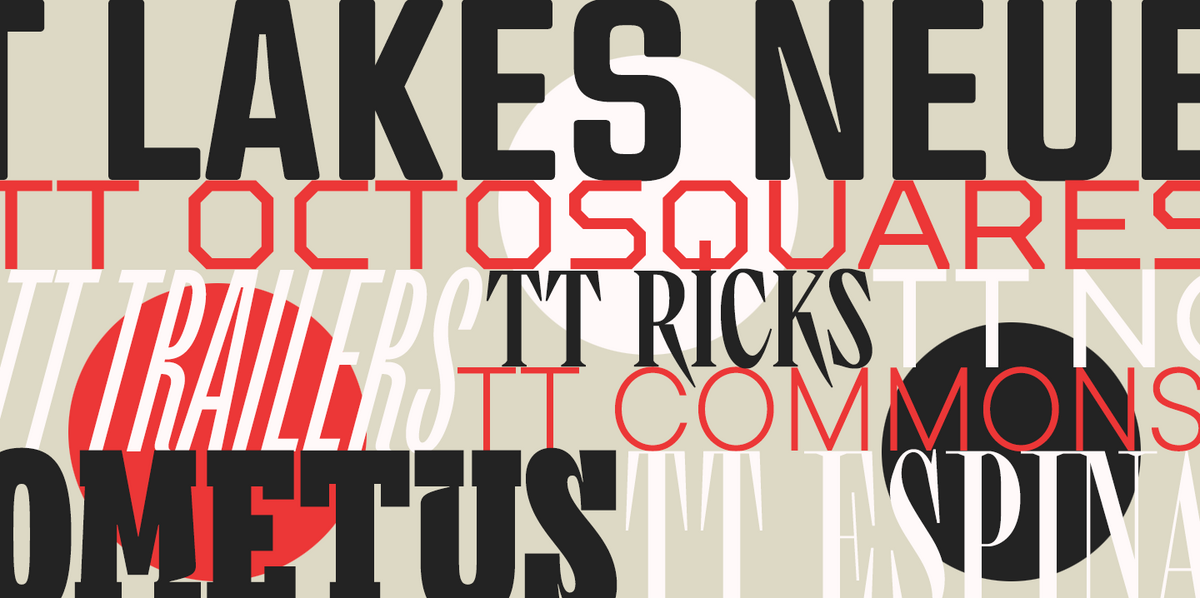
Willst du deine Typografie auf dem neuesten Stand halten und wirklich inspirierende Projekte gestalten? Die Experten und Designer des TypeType-Schriftstudios freuen sich, in diesem Artikel die wichtigsten Schrifttrends für 2024 mit dir zu teilen. Bleib im Trend!
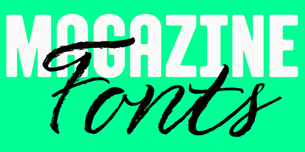
Zeitschriften sind eine perfekte Kulisse für die Typografie, um all ihre Dimensionen zum Ausdruck zu bringen. Schriftarten vermitteln in diesem Fall nicht nur Informationen, sondern beeinflussen auch direkt das Design. Sie vermitteln die Botschaft des Magazins und spiegeln seine Werte und Ideen wider. In diesem Artikel erörtern wir, wie Sie die beste Schriftart für Zeitschriften auswählen und stellen eine Liste mit 15 relevanten Optionen für redaktionelle Designs zu verschiedenen Themen zusammen.
Outline-Schriften sind ein hervorragendes Mittel, um einem Design Abwechslung zu verleihen und es attraktiv und plakativ zu gestalten. Wie sehen sie aus? Wo werden sie verwendet? Zu welchen Schriftstilen passen sie?
Wir haben all diese Fragen in diesem Artikel behandelt und eine Auswahl der besten Outline-Schriften für verschiedene Projekte getroffen.