

Wir leben in einer Zeit, in der sich Trends fast täglich ändern, und typografische Designtrends bilden da keine Ausnahme. Typografie begegnet uns allen täglich: im Internet, im Supermarkt, auf Schaufenstern und Schildern. Veraltetes Design führt zumindest zu Langeweile, im schlimmsten Fall zu Misstrauen gegenüber dem Produkt oder der Dienstleistung. Trendiges Design hingegen wirkt aufregend und attraktiv.
Wie kann man also im Jahr 2024 ein frisches, zeitgemäßes Design entwerfen? In diesem Artikel werfen wir einen Blick auf die neuesten typografischen Trends, die Ihnen bei dieser Aufgabe helfen können.
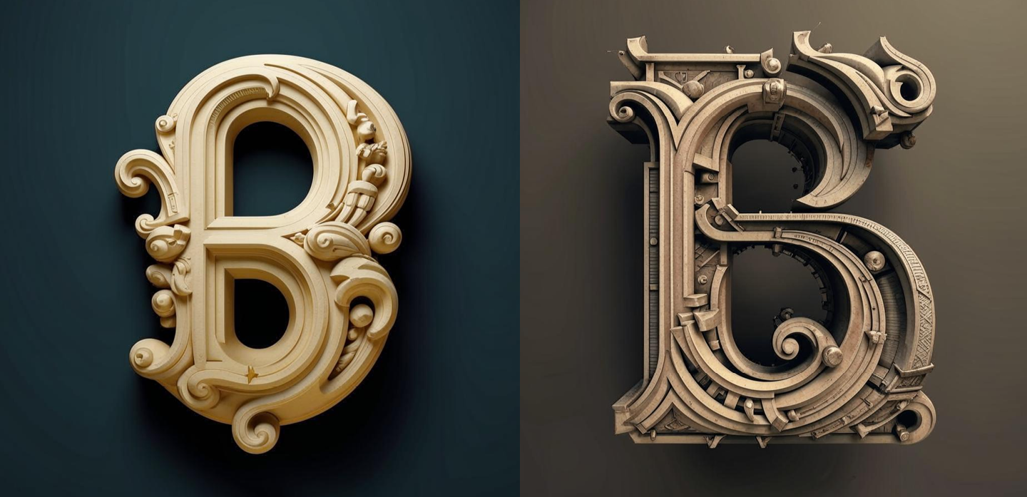
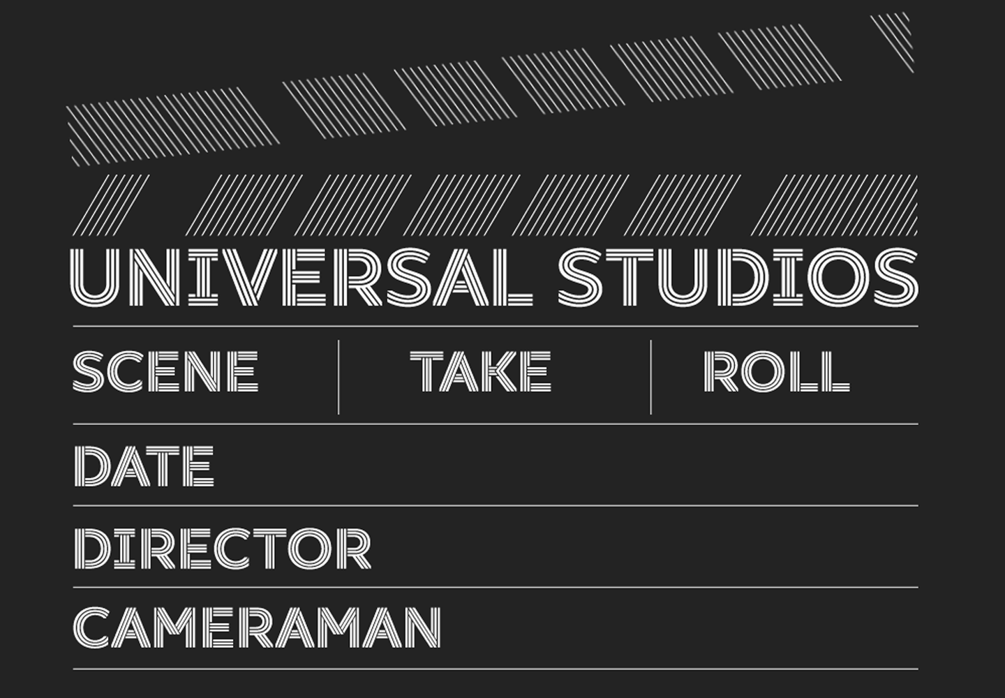
3D und interaktive Features
Es ist kein neuer Trend, aber 2024 ist er noch in der Entwicklung. Dreidimensionale oder animierte Buchstaben (oder beides gleichzeitig), die visuell über das Layout oder den Bildschirm hinauszuwachsen scheinen, wecken in uns den Wunsch, die Hand auszustrecken und sie zu berühren. Je höher die Qualität einer 3D-Schrift, desto realistischer wirkt sie. Solche Elemente verleihen der Typografie eine kühne und verspielte Persönlichkeit und machen das Design ausdrucksstark und unverwechselbar.
Wo kann man dies anwenden
Dieser Trend eignet sich überall dort, wo es darum geht, Modernität und Ungezwungenheit zu unterstreichen, Aufmerksamkeit zu erregen und sich vom Gewöhnlichen abzuheben. Zum Beispiel im Branding junger Modemarken, auf Bannern von Musikfestivals und auf den Titelseiten von Zeitschriften und Büchern über zeitgenössische Kunst.
Maßgeschneiderte Schriftarten
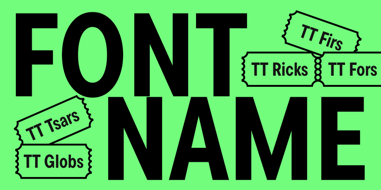
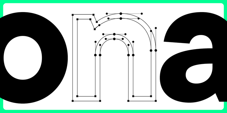
Der Trend zu Authentizität und Einzigartigkeit wird zweifellos auch im Jahr 2024 noch aktuell sein. Maßgeschneiderte Schriften geben Marken die Möglichkeit, sich selbst auszudrücken, sich von anderen abzuheben und ein wirklich einprägsames Design zu schaffen.
Im Gegensatz zur Verwendung einer vorgefertigten Schrift eröffnet die Personalisierung zahlreiche Möglichkeiten, sich auszudrücken: Auf Wunsch des Kunden können der Schrift zusätzliche Zeichen hinzugefügt werden, ein Logo kann implementiert werden, die Buchstabenformen können so verändert werden, dass sie zur visuellen Identität der Marke passen und zu einem integralen Bestandteil werden.
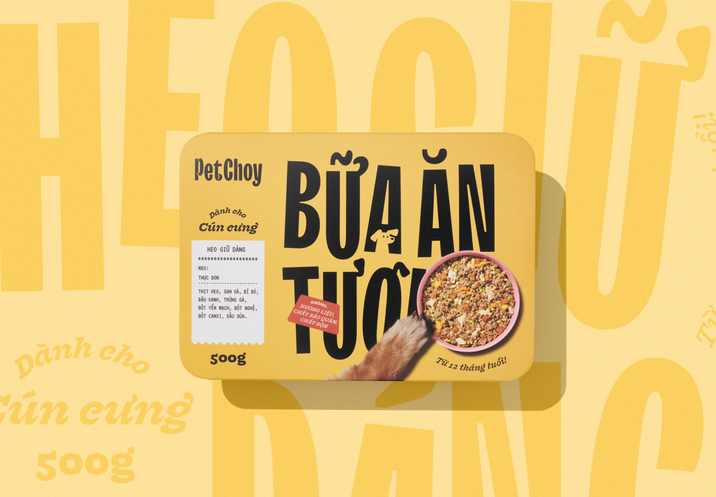
Ein hervorragendes Beispiel dafür ist die Anpassung von TT Trailers für das Rebranding des vietnamesischen Unternehmens PetChoy, das für die Herstellung von Tiernahrung bekannt ist. Wir passten die Schrift an die Bedürfnisse der Marke an und integrierten die vietnamesische Sprachunterstützung. Außerdem änderten wir das Design einiger Zeichen und fügten diakritische Zeichen in Form von Schwänzen und Ohren sowie Katzen- und Hundesilhouetten hinzu.
Anwendung
Maßgeschneiderte Fonts eignen sich für die Gestaltung einer ganzheitlichen Markenidentität und für den Einsatz auf verschiedenen Plattformen und Medien (Website, Verpackung, Werbung usw.). In unserem Artikel erfahren Sie mehr darüber, wie Sie die richtigen Optionen auswählen.
Mit KI erstellte Schriften
Der Einsatz von künstlicher Intelligenz (KI) ist ein relativ neuer Trend, der in vielen Bereichen Einzug gehalten und zahlreiche Debatten ausgelöst hat. Es gibt keinen Grund, sie zu vermeiden: KI kann den Menschen nicht ersetzen und auch kein umfassendes Schriftdesign entwickeln, zumindest noch nicht. Aber sie kann dem Schriftentwerfer helfen, sich von seinen eigenen Vorurteilen zu lösen und etwas Neues und Unerwartetes zu entwerfen.
Wo lässt sich das einsetzen?
Schriften, die mit künstlicher Intelligenz erstellt wurden, eignen sich für Projekte, die unkonventionelle Lösungen erfordern. Dieses Tool hilft Ihnen, eine neue Ebene in der Arbeit mit Schriften zu erreichen, ungewöhnliche Kombinationen und Texturen zu finden oder Schriften interaktiv zu gestalten.
Zurück zu den Serifen
Es gab eine Zeit, in der Serifenschriften an Popularität verloren, weil sie als altmodisch, steif und langweilig galten. Doch diese Zeiten sind vorbei — 2024 sind Serifen wieder im Trend. Das ist keine Überraschung, denn moderne Serifenschriften unterscheiden sich drastisch von denen, die wir aus den Druckschriften des letzten Jahrhunderts kennen. Heute sind Serifenschriften hochmoderne und ungewöhnliche Schriften mit fesselnden und bemerkenswerten Details.
Überzeugen Sie sich selbst von der Vielfalt moderner Serifenschriften. Sie können dynamisch, einzigartig und fremdartig sein wie die TT Alientz Serif oder magisch, charmant und elegant wie die TT Espina. Selbst wenn eine Schrift eher zurückhaltend ist, können Serifen eine wichtige Rolle spielen, wie bei TT Tricks und TT Norms® Pro Serif.
Einsatzgebiete
Aktive Schriften mit Serifen können sich perfekt in die visuelle Identität eines modernen Projekts einfügen, ihm die nötige Stimmung verleihen und zu einem auffälligen Akzent werden, der ideal zu Ihrer Designidee passt. Vielseitige Serifenschriften eignen sich für fast jedes Projekt und können sowohl zur Hervorhebung als auch für Fließtext verwendet werden.
Kontrastreiche Groteskschriften
Serifenlose Schriften mit hohem Kontrast sind ein Kompromiss zwischen Schriften mit und ohne Serifen. Sie haben diskrete oder fast unsichtbare Serifen und im Gegensatz zu normalen serifenlosen Schriften einen Kontrast. Diese Details ermöglichen es den Schriften, die Schlichtheit der Slab-Serifen beizubehalten und ihnen gleichzeitig Eleganz zu verleihen, indem sie Geschichte und Moderne miteinander verbinden.
Ein gutes Beispiel für eine solche Schrift ist TT Ricordi Greto. Sie zeichnet sich durch einen kaum wahrnehmbaren Hauch von Serifen aus, der den Ursprung der Schrift widerspiegelt: Sie entstand im Rahmen eines experimentellen Projekts und basiert auf dem Text einer Bodentafel aus dem Jahr 1423. Dennoch wirkt die Schrift heute sehr aktuell und stilvoll.
Einsatzgebiete
Serifenlose Schriften mit hohem Kontrast kommen am besten in großen Punktgrößen zur Geltung, wo sie ihr ganzes verborgenes Potenzial entfalten. Auf Zeitschriftenumschlägen, Verpackungen und Plakaten wirken sie spannend.
Neo-Gotik
Schriften, die von schwarzen Buchstaben inspiriert sind, Anspielungen auf Schriftzüge, Kontraste, scharfe Kanten und verschnörkelte Elemente — neugotische Schriften können ohne Weiteres als einer der eigenwilligsten globalen Schrifttrends dieses Jahres bezeichnet werden. Vertraute Methoden und Elemente dieser Schriften werden neu überdacht und harmonisch in den zeitgenössischen visuellen Code integriert.
Ein bemerkenswertes Beispiel für eine Trendschrift mit gotischen Elementen ist TT Ricks. Es handelt sich um eine kühne und wütende Antiqua mit scharfen Serifen, die von der 1892 von Gustav F. Schroeder entworfenen Schrift De Vinne inspiriert wurde. Die gotischen Züge sind vor allem in der fetten Schrift zu erkennen. Ein weiteres interessantes Beispiel ist die experimentelle Serifenlose TT Carvist. Sie ist robust und geometrisch und wirkt wie in Stein gemeißelt. Der lateinische Zeichensatz dieser Schrift hat eine gotische Anmutung, während der kyrillische Zeichensatz eher an antike Zierschriften erinnert.
Einsatzgebiete
Unabhängig von historischen Bezügen wirken moderne Schriften mit gotischen Akzenten sehr zeitgemäß. Sie verleihen Ihrem Design eine kühne, kantige und ultramoderne Ausstrahlung, die sich hervorragend für Veranstaltungsplakate, Branding sowie Buch- und Zeitschriftenumschläge eignet.
Outline-Schriften
Outline-Schriften werden im Design schon lange verwendet, aber im Jahr 2024 hat dieser Trend eine neue Stufe erreicht. Dank modernster Technologie ist es nun möglich, mit diesen Schriften ein wirklich einzigartiges Design zu kreieren, vor allem, wenn dieser Trend mit anderen kombiniert wird und 3D- und interaktive Elemente zum Mockup hinzugefügt werden.
Die besten Outline-Schriften von TypeType und anderen Schriftenstudios finden Sie in unserem Artikel.
Anwendung
Dieser Trend hilft Ihnen, Ihr Design ungewöhnlicher zu gestalten und Aufmerksamkeit zu erregen. Outline-Schriften sehen gut auf Schildern aus und kommen besonders gut zur Geltung, wenn Sie sie für Akzenttexte auf Websites, in Anwendungen und vielem mehr verwenden.
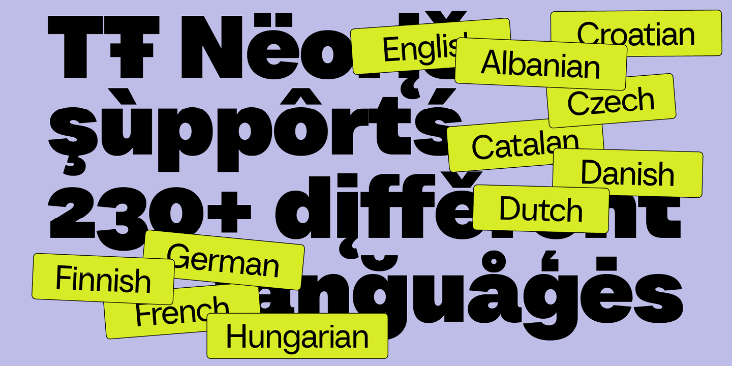
Mehrsprachige Schriften
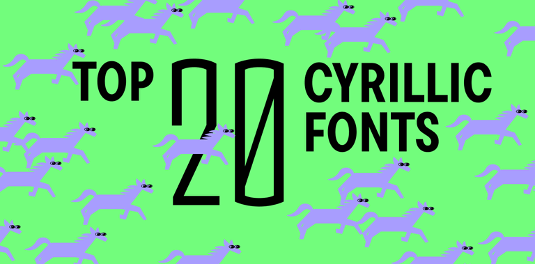
Der Trend zur Lokalisierung beeinflusst seit Jahren verschiedene Bereiche. Er hat sich auch auf das Schriftdesign ausgewirkt, wo verschiedene Studios nach und nach die Anzahl der Sprachen erhöhen, die von ihren Schriften unterstützt werden. Es gibt viele Sprachen auf der Welt, die auf einer ebenso großen Vielfalt von Schriftsystemen basieren, so dass Menschen aus verschiedenen Kulturen die Möglichkeit haben, von schönen und qualitativ hochwertigen Schriften zu profitieren.
Bei TypeType arbeiten wir seit 2022 aktiv daran, die Anzahl der auf dem kyrillischen Alphabet basierenden Sprachen in unseren Fonts zu erhöhen. TT Neoris ist ein wunderbares Beispiel für ein Projekt, bei dem wir dieses Prinzip umgesetzt haben. Die größten Schriften unserer Kollektion unterstützen mehr als 280 Sprachen, einschließlich des erweiterten kyrillischen und lateinischen Alphabets. Zu diesen Schriften gehören unsere Bestseller TT Norms® Pro und TT Commons™️ Pro.
Anwendungsbereiche
Entscheiden Sie sich für Schriften mit umfassender Sprachunterstützung, wenn Sie Ihre Website, Anwendung, Marke oder ein anderes Projekt für mehrere Länder lokalisieren möchten.
Große Schriftfamilien
Die Integration vieler verschiedener Schriftstile in einer einzigen Schrift ist zweifellos einer der wichtigsten Schrifttrends. Diese Funktion ermöglicht es Designern, visuelle Vielfalt in ein Projekt zu bringen, die am besten geeignete Schriftvariante für einen bestimmten Anlass auszuwählen, Schriftstile zu mischen und zu kombinieren und eine Schrift für mehrere Projekte zu verwenden.
Die größten Schriftfamilien in der TypeType-Kollektion sind TT Norms® Pro (104 Fonts), TT Commons™️ Pro (104 Fonts), TT Lakes Neue (91 Fonts) und TT Hoves Pro (83 Fonts).
Wo sie eingesetzt werden sollten
Es lohnt sich, große Schriftfamilien in Betracht zu ziehen, wenn Sie regelmäßig neue Schriften für verschiedene Aufgaben benötigen oder wenn Sie mehrere Schriften für ein Projekt benötigen. Für gelegentliche, einmalige Projekte empfehlen wir kleine Schriften oder einzelne Schriftschnitte.
Variable Schriften
Der letzte, aber immer noch wichtige Trend in unserer Liste sind variable Schriften. Mit diesem Werkzeug können Designer die Schrift nach ihren Bedürfnissen und ihrem Geschmack verändern und so ein originelles Design mit einzigartigen Eigenschaften schaffen.
Viele TypeType-Fonts enthalten variable Fonts. In unserem Artikel erfahren Sie mehr darüber, was sie sind und wie man sie einsetzt.

Einsatzbereiche
Variable Fonts eignen sich hervorragend für unkonventionelle Aufgaben und wenn die Schrift an ein bestimmtes Layoutformat angepasst werden muss, wie z. B. bei der Gestaltung von Websites oder Verpackungen.
Fazit
Welche Trends aus unserer Liste haben Sie am interessantesten gefunden? Speichern Sie diesen Artikel, um die Tipps in Ihren Designprojekten anzuwenden!