top_banner_basettnormspro
TT Alientz
3 الأوزان
الرئيسيةالخطوط والأنماطمتغيرةTT Alientz

TT Alientz

TT Alientz — خط متغير يمكن أن يتغير من غروتيسك فضائي موجز إلى أنتيكوا شديدة الحدة وعالية التعقيد.
نمط واحد: من $43.99
العائلة الكاملة: من $89 3 الأوزان

خيارات الشراء

اختر الخطوط والتراخيص التي تريدها ثم، اضغط على زر "إضافة إلى السلة".

هل لديك أي أسئلة حول الخط أو التراخيص؟ اكتب لنا.

اختر الخطوط التي تريدها

عرض الحزمة:
لكل نمط $29.67
من  $89
3الأوزان
من  $89
من $43.99
من $43.99
من $79
من $79
1نمط
من $79
من $79
عرض الحزمة:
لكل نمط $39.50
من  $79
2الأوزان
من  $79
من $43.99
من $43.99

هل لديك أي أسئلة حول الخط أو التراخيص؟ اكتب لنا.

اختر تراخيص الخطوط

يجب عليك تحديد حزمة الخطوط أو النمط قبل اختيار الترخيص.

اختر التراخيص التي تحتاجها.

حسب الطلب
حسب الطلب
حسب الطلب
حسب الطلب
حسب الطلب
حسب الطلب
حسب الطلب
حسب الطلب
حسب الطلب
حسب الطلب
لا عناصر محددة
الإجمالي
$0

المختبرون

TT Alientz
الحجم
Features
تشغيل الكل

A visual journey from a laconic extraterrestrial grotesque to a very prickly display serif

TT Alientz
الحجم
Features
تشغيل الكل

The TT Alientz family consists of 3 fonts: grotesque, serif and variable font. Each font contains more than 470 glyphs. In addition to broad language support (including Cyrillic), the typeface has stylish ligatures, contextual alternates, and old-style figures. Variability in the typeface affects the changes in the overall style of the font—moving the slider to adjust the variable axis, you can go from a laconic grotesque to an extreme serif.

TT Alientz في التصميم

الوصف

حول عائلة الخط TT Alientz
170+ دعم اللغات

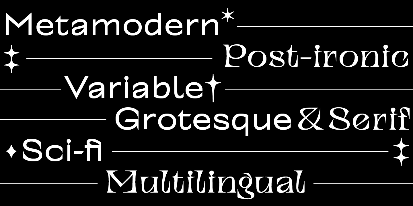
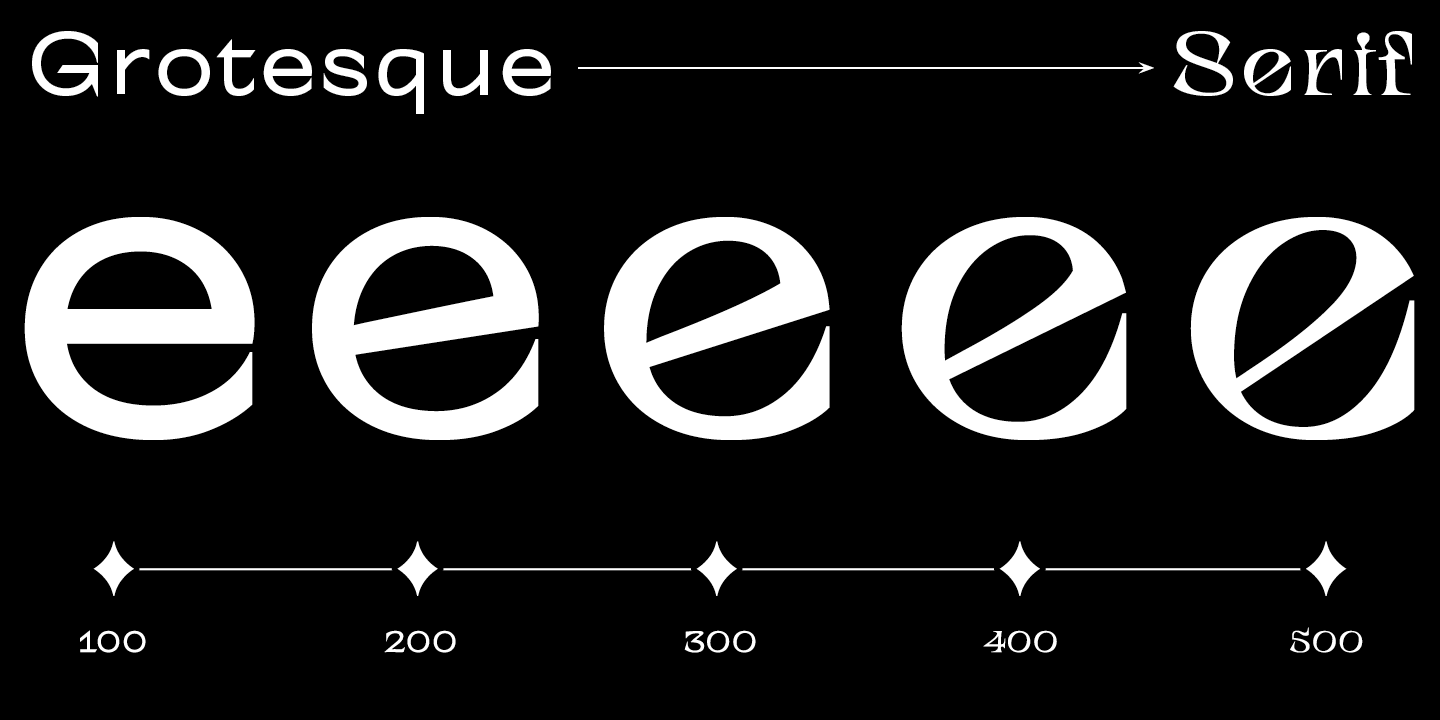
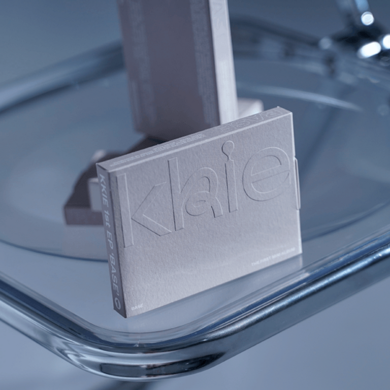
TT Alientz هو خط متغير يتيح للمستخدم خوض رحلة بصرية تبدأ من خط بلا مذنبات بسيط بتصميم “”فضائي”” إلى خط ذو المذنبات عرضي وشائك للغاية. في هذا المشروع، قررنا استكشاف تأثير مادة غريبة وكيفية تحول الأشكال الأصلية بشكل تدريجي، مما يؤدي في النهاية إلى تغييرات بصرية متطرفة.

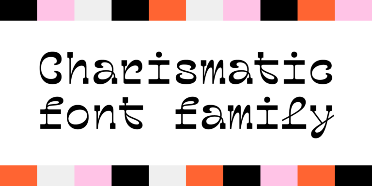
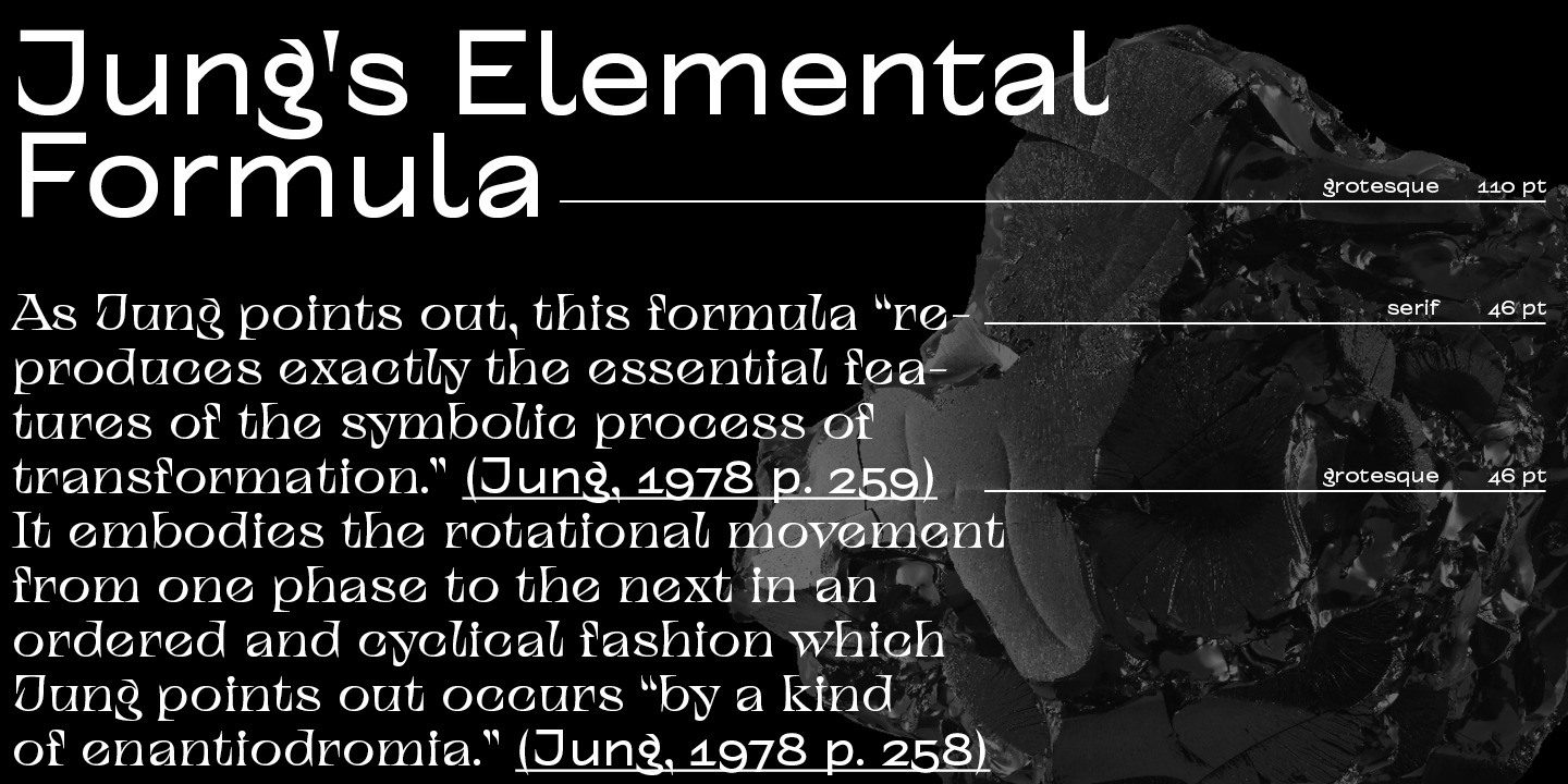
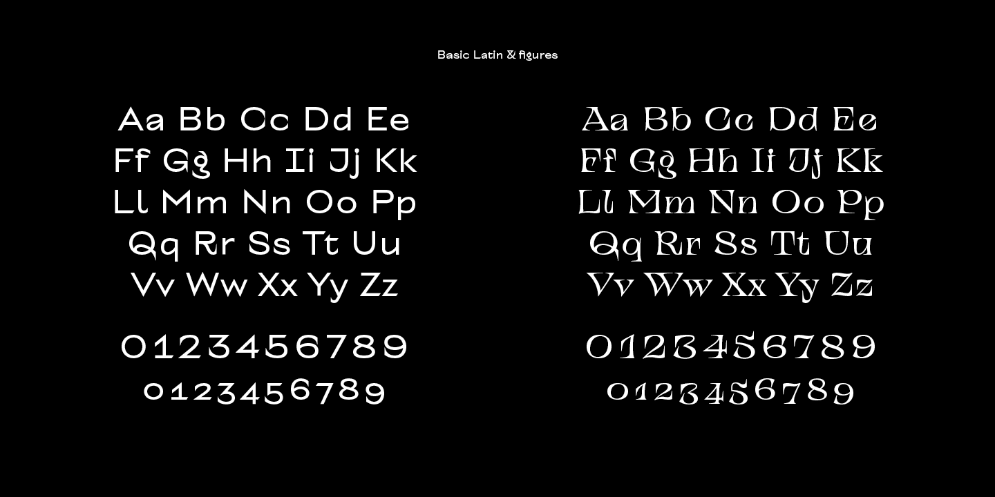
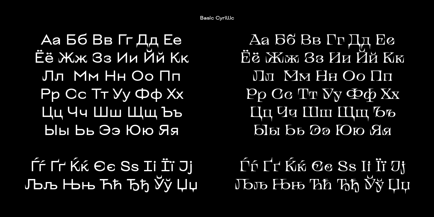
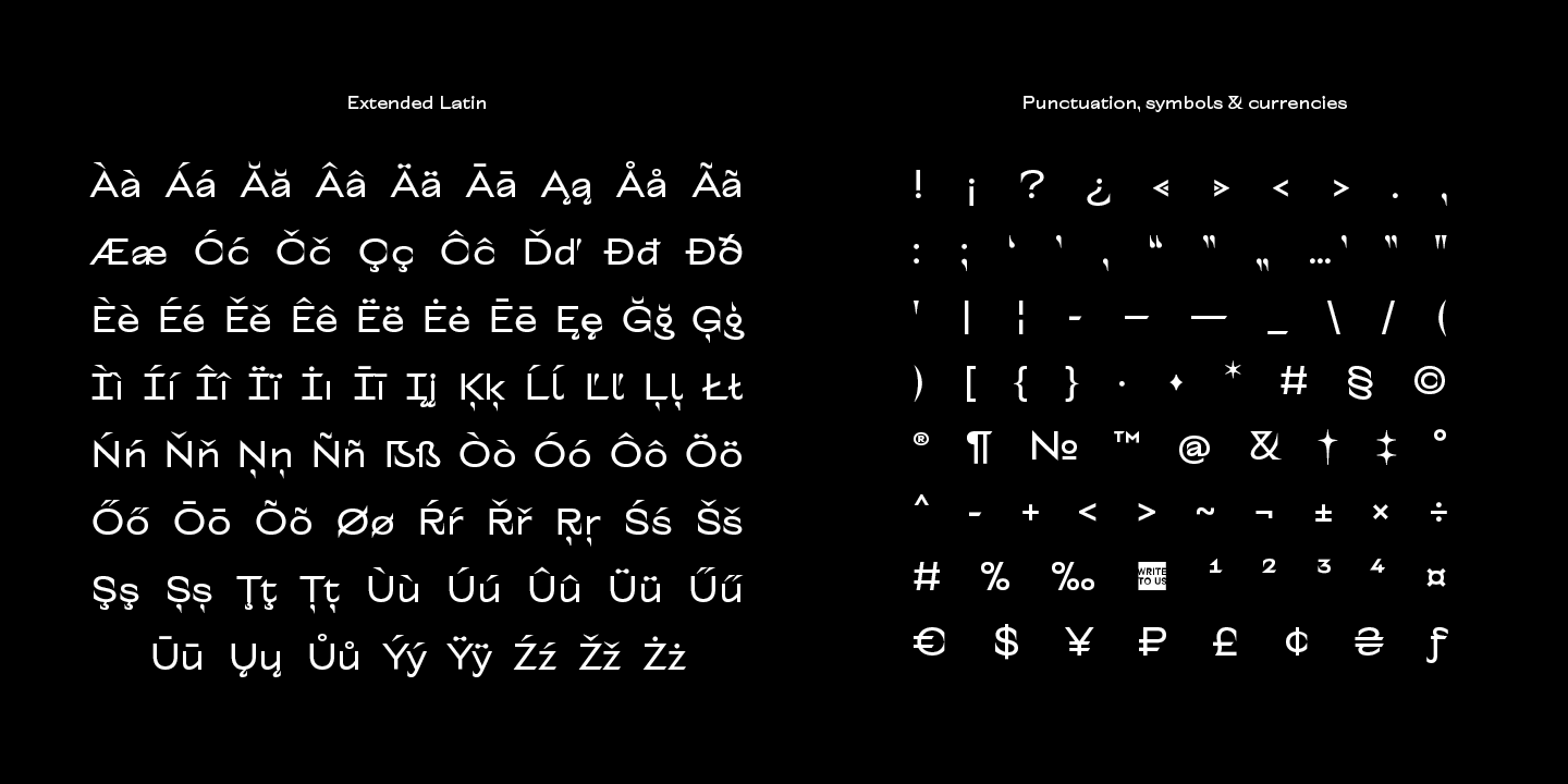
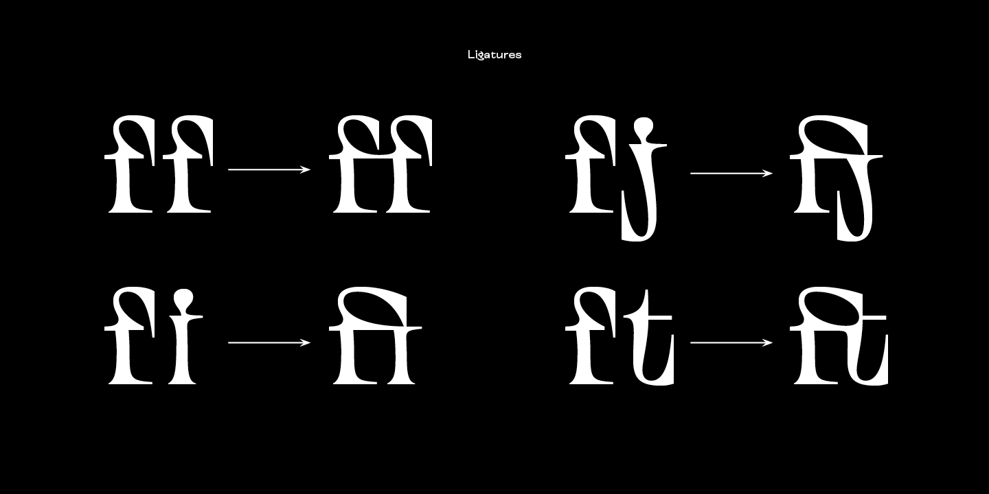
عائلة Alientz تتكون من 3 خطوط: بلا مذنبات ، خط ذو المذنبات ، وخط متغير. يحتوي كل خط على أكثر من 470 رمزًا. بالإضافة إلى الدعم اللغوي الواسع (بما في ذلك الأحرف السلافية)، يحتوي الخط على تراكيب حرفية أنيقة (ليغاتورات)، بدائل سياقية، وأرقام بالطراز القديم. يؤثر التغير في الخط المتغير على الأسلوب العام للخط — من خلال تحريك شريط ضبط المحور المتغير، يمكنك الانتقال من تصميم بسيط وبلا مذنبات إلى خط ذو مذنبات متطرف.
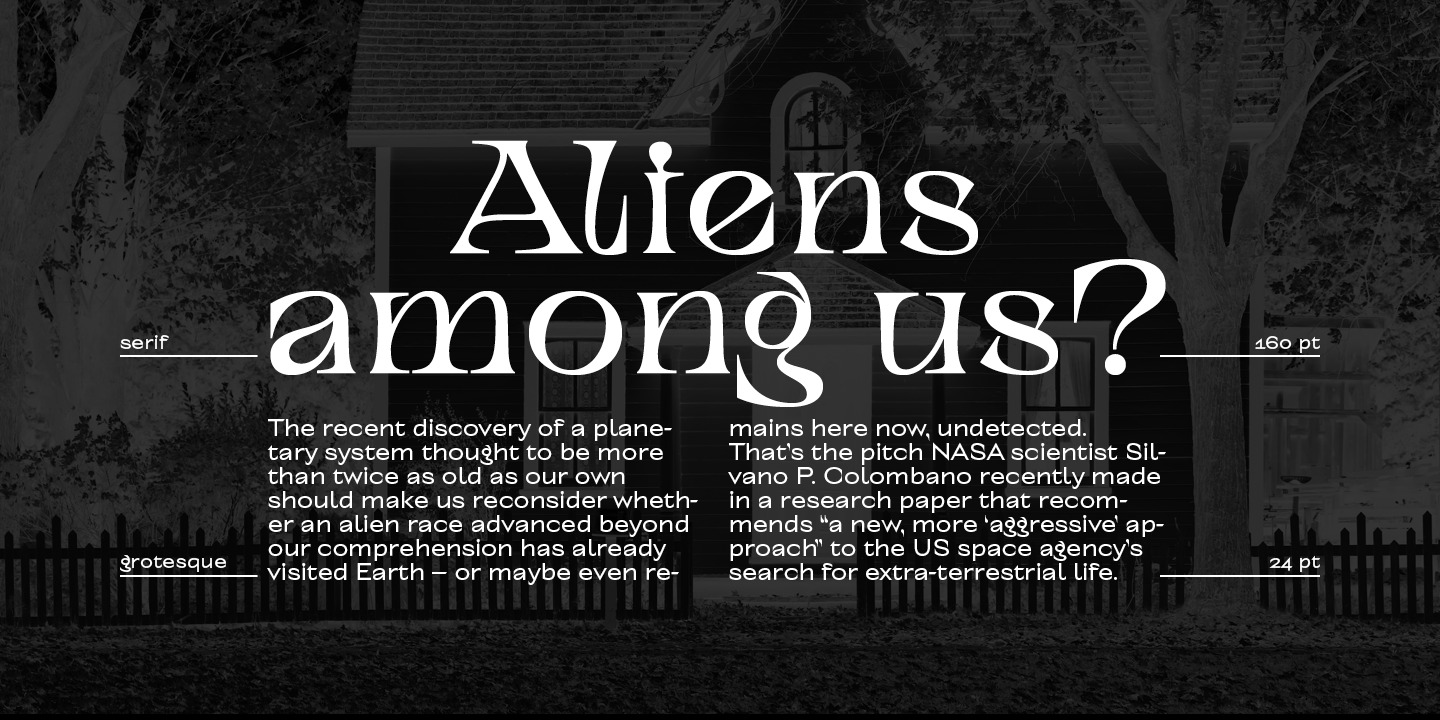
TT Alientz Grotesque هو خط بلا مذنبات عصري وأنيق، يتميز ببعض الخصائص الفريدة. في تصميم بعض حروف هذا الخط، يمكن ملاحظة عناصر حادة صغيرة تضيف تميزًا وطابعًا فريدًا له، خاصة عند استخدامه في العناوين الكبيرة والنصوص البارزة. ومع ذلك، عندما يُستخدم الخط في أحجام صغيرة وفي الكتل النصية، فإن هذه العناصر الحادة لا تؤثر بشكل كبير على قراءته. تصميم بعض حروف الخط يتسم بطابع خاص يبرز الفكرة الأصلية للتصميم، التي تضفي لمسة من الغرابة الخفيفة.

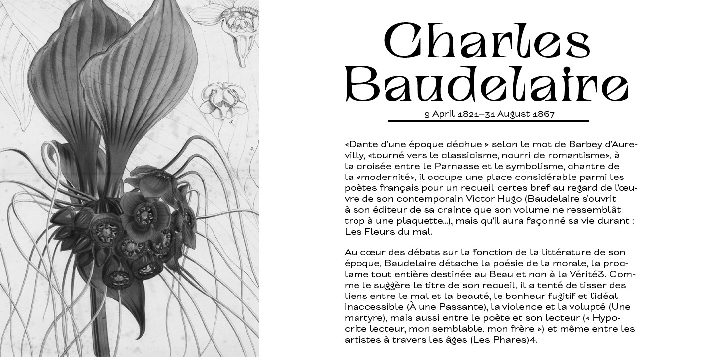
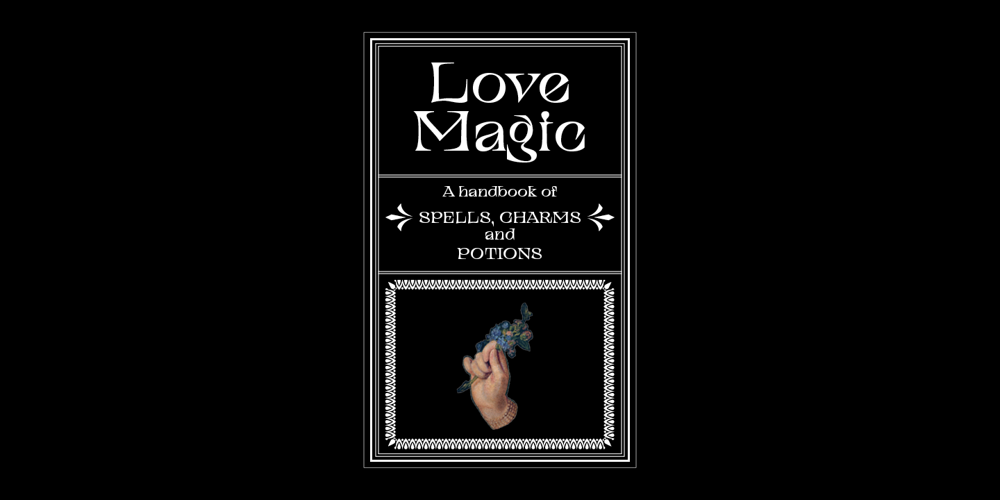
TT Alientz Serif هو تطوير معدّل من TT Alientz Grotesque، ويتميز بخصائص مختلفة. على عكس الخط بلا المذنبات، يتميز TT Alientz Serif بأنه ديناميكي، مرن، وقاسي. يحتوي الخط على العديد من الخطوط المنحنية والتباين غير التقليدي في السكتات. يمكن ملاحظة أن معظم المذنبات في الخط موجهة نحو الداخل بدلاً من الخارج. على الرغم من طابعه المتطرف، فإن الخط يبدو جيدًا في الأحجام الكبيرة والصغيرة على حد سواء.

تاريخ الإصدار

نوفمبر 6, 2019

إضافي

إصدارات مخصصة

هل تبحث عن إصدار مخصص من هذا الخط؟

نظام الكتابة المتد + عرض الكل

مجموعة الأحرف

اللاتينية الأساسية السيريلية الأساسية Extended Latin Stylistic Alternates, Standard and Discretionary Ligatures|salt,liga,dlig Lining Figures, Currencies Old-style Figures|onum Punctuation, Symbols, Mathematical Symbols, Arrows
A B C D E F G H I J K L M N O P Q R S T U V W X Y Z a b c d e f g h i j k l m n o p q r s t u v w x y z
А Б В Г Д Е Ё Ж З И Й К Л М Н О П Р С Т У Ф Х Ц Ч Ш Щ Ъ Ы Ь Э Ю Я Ѓ Ґ Ќ Є Ї Љ Њ Ћ Ђ Ў Џ а б в г д е ё ж з и й к л м н о п р с т у ф х ц ч ш щ ъ ы ь э ю я ѓ ґ ќ є ї љ њ ћ ђ ў џ
À Á Ă Â Ä Ā Ą Å Ã Æ Ć Č Ç Ĉ Ď Đ Đ È É Ě Ê Ë Ė Ē Ę Ğ Ģ Ì Í Î Ï İ Ī Į Ķ Ĺ Ľ Ļ Ł Ń Ň Ņ Ñ Ò Ó Ô Ö Ő Ō Õ Ø Œ Þ Ŕ Ř Ŗ Ś Š Ş Ș Ť Ţ Ț Ù Ú Û Ü Ű Ū Ų Ů Ý Ÿ Ź Ž Ż à á ă â ä ā ą å ã æ ć č ç ĉ ď đ ð è é ě ê ë ė ē ę ğ ì í î ï ı ī į ķ ĺ ľ ļ ł ń ň ņ ñ ß ò ó ô ö ő ō õ ø œ þ ŕ ř ŗ ś š ş ș ť ţ ț ù ú û ü ű ū ų ů ý ÿ ź ž ż
ff fi fj ft ffi ffj fft
0 1 2 3 4 5 6 7 8 9 ¤ $ ¥ £ ¢ ƒ
0 1 2 3 4 5 6 7 8 9
! ¡ ? ¿ « » . , : ; ... " ' | ¦ - _ \ / ( ) [ ] { } · * # § © ® @ & ° ^ - + < > ~ ¬ ± × ÷ % 1 2 3 4

ميزات OpenType

liga | Standard Ligatures

ff fi ffj

ff fi ffj

onum | Oldstyle Figures

1638

1638

case | Case Sensitive Forms

({[H]})

({[H]})

calt | Contextual Alternates

ft fi

ft fi

الأزواج المثالية للخطوط مع TT Alientz.

What is a font pair, and what does it serve for?

A font pair is a combination of two fonts within one text block. Most often, one of the fonts in a pair is a more expressive headline font, and the other one serves to communicate information. Such fonts complement each other and help designers solve various tasks, like highlighting key elements, adding emotional expressiveness to the project, or separating semantic blocks.

How to choose fonts for a project: Several general recommendations

To begin with, establish the project's tone. Choose the fonts that stylistically match the main idea. After that, you need to determine the functions of each font in the project and their hierarchy: which font will complement the design and which one will serve to attract attention as the main element. You need to assess the difference between the fonts and decide what kind of information each of them should convey. First, we recommend choosing the base font you will use most, and then you can find a suitable pair for it.

Core principles of font pairing and recommendations from designers

The main rule you should follow when matching two fonts is that both similarities and differences must be visible between them. You can highlight the coherence of fonts by the following characteristics: contrast, proportions, width, openness of characters, individual letter shapes, and overall tone. Feel free to experiment with different combinations. We also recommend analyzing the projects you like: this way, you can enhance your visual skills, elevate your knowledge base, and gain confidence in dealing with typography.

خطوط مشابهة

3 أنماط خط
4 أنماط خط
4 أنماط خط
شراء الخط