TT FRANTZ IS AN EXPERIMENTAL VARIABLE FONT, DISTINGUISHED BY ITS SLIMNESS AND LIGHTNESS. THE VARIATION IN THE FONT AFFECTS THE CHANGE IN THE HEIGHT OF THE MEAN LINE—BY MOVING THE AXIS ADJUSTMENT SLIDER YOU CAN EASILY RAISE OR LOWER THE MEAN LINE OF THE FONT.
مجموعة من الخطوط اللازية
- جميع الخطوط 73
- بدون الذنابات 47
- مع الذنابات 27
- سلاب 6
- العرض 41
- مكتوبة بخط اليد 10
- متغيرة 47
- بيع الخطوط 11
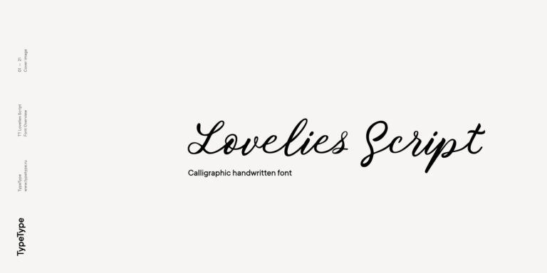
"اختر الخط المناسب مع دعم اللغة اللازية . مجموعة ضخمة من عائلات الخطوط لأي غرض أو هدف: إعداد نصوص طويلة، تصميم العناوين للمواقع الإلكترونية والمنشورات المطبوعة، الطباعة على الأقمشة والمواد الأخرى، وتصميم اللافتات والملصقات.
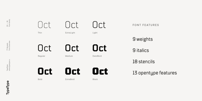
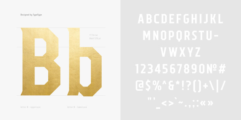
كل خط من الخطوط المقدمة يتضمن الأبجدية اللازية . مجموعة واسعة من الرموز، وعلامات العملات، وعلامات الترقيم، وأساليب الخطوط وميزات OpenType تتيح استخدام خط واحد لمشاريع متعددة. الرموز اللاتينية الموسعة التي تحتوي على علامات التشكيل توسع إمكانية استخدام الخط في دول مختلفة.
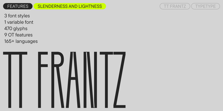
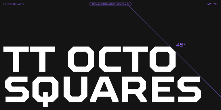
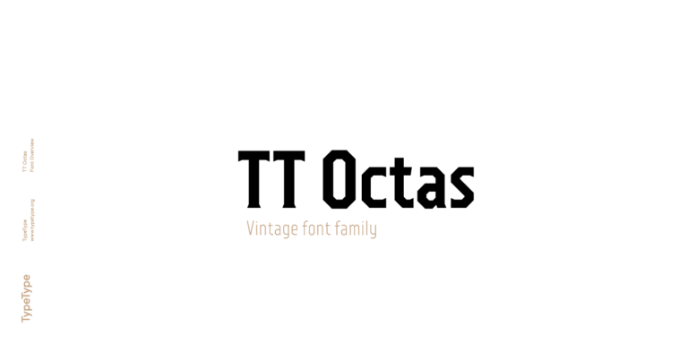
كل خط مصمم بإتقان من الناحية التقنية. العديد من الخطوط في المجموعة تحتوي على تصميمات متغيرة، مما يسمح بإنشاء تصميم فريد للمشروع.
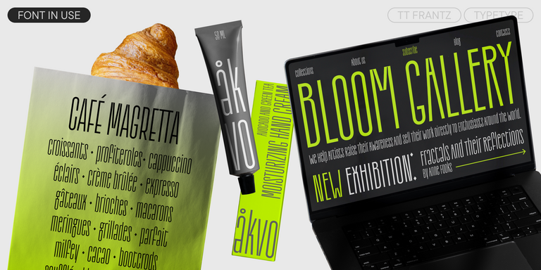
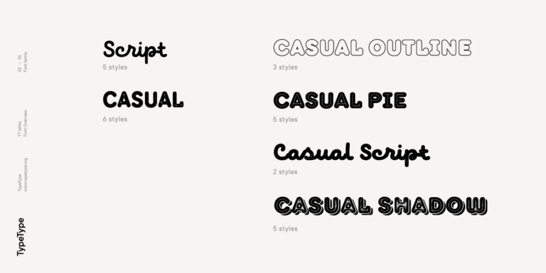
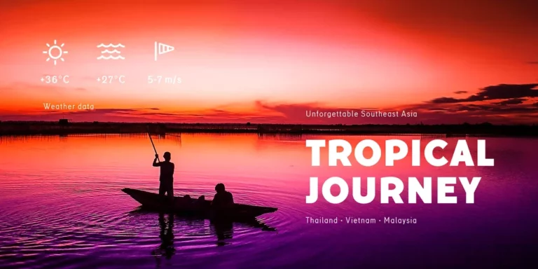
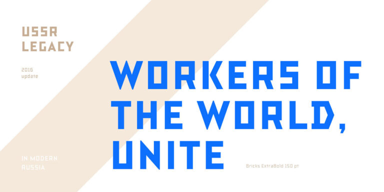
يمكنك استخدام العلامات لاختيار الخط المطلوب حسب النمط أو الطابع: هندسي أو ديناميكي، عالمي أو كلاسيكي، حيوي أو ناعم. كما يمكن البحث بسهولة حسب الهدف: خط للمجلات أو المواقع الإلكترونية، للنشرات الإخبارية أو الإعلانات.
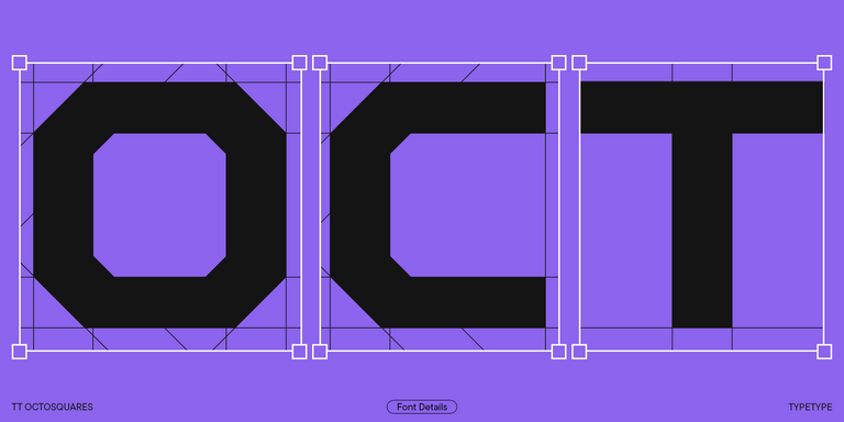
يمكن تخصيص أي خط في المجموعة من الناحية التقنية أو الجرافيكية. من خلال التخصيص، يمكن إضافة أو إزالة حرف، أو إضافة شعار الشركة، أو تقليل مجموعة الحروف لتخفيف حجم ملف الخط.
تتوفر تجربة مجانية للخطوط من الاستوديو عبر ترخيص تجريبي. للحصول على نسخة تجريبية، اختر زر ""الخط التجريبي"" واملأ نموذج الطلب. الخط التجريبي مطابق للنسخة التجارية من حيث مجموعة الحروف والمواصفات التقنية.
يمكنك أيضًا طلب تطوير خط تجاري من الصفر بناءً على خط أعجبك من المجموعة أو بناءً على متطلباتك."
- The quick brown fox jumps over a lazy dog.
- Pack my box with five dozen liquor jugs.
- Sphinx of black quartz, judge my vow
- 0123456789 !?.,:;—–()[]{}<> “quotes” ‘apostrophe’ @#%&*_+=/\| № $ € £ ₽ +−×÷=≠≤≥ … % © ® ™
- Aa Bb Cc Dd Ee Ff Gg Hh Ii Jj Kk Ll Mm Nn Oo Pp Qq Rr Ss Tt Uu Vv Ww Xx Yy Zz
TT Octosquares is a fresh, revised, expanded, and significantly improved version of our first commercial font TT Squares & its narrow version.
TT Norms Condensed continues to develop the ideas of neutrality and versatility stemming from our bestselling TT Norms.
TT Geekette is an experimental variable serif with friendly and flexible character of shapes.
TT Alientz is a variable typeface that allows the user to make a visual journey from an extraterrestrial grotesque to a very prickly display serif.
TT Commons™ Classic is a universal sans serif with a minimal contrast of strokes, a closed aperture, and geometric shapes of characters.
The TT Tsars font family is a collection of serif display fonts that are stylized to resemble the fonts of the beginning, the middle, and the end of the XVIII century.
TT Nooks is an experimental project comprised of a high-contrast egocentric serif and an upright humanist italic.
TT Backwards Sans is a narrow grotesque, which takes us back to the book design of late 70s and early 80s with its ductile characters.
When designing TT Mussels, we paid great attention to the possibility of imposing large arrays of text, and we can state that TT Mussels is a rare type of technological text fonts.
TT Knickerbockers Grotesk is a narrow contrast sans serif with characteristic elements sending us back to the 19th century in New York.
TT Polls is the modern modular slab serif family for using in sports-related design.
TT Berlinerins is a grotesque inspired by the wood-type poster types of the first third of the 20th century is responsible for the historic component of Berlin.
TT Milks is a Collection of typefaces for branding
TT Hazelnuts is a display sans serif font family containing a set of elegant and delicate decorative elements.
The quick brown fox jumps over a lazy dog.
TT Corals is a modern humanistic sans serif which has many typical traits of the beginning of the 20th century. For an increased functionality of the font family, we’ve created 6 styles of various weights.
TT Octas is a narrowly proportioned font family built upon the principle of octagonal forms: all circles in this typeface are actually octagons. Thanks to small serifs, TT Octas has a vintage character to it.
TT Bricks is the answer for lovers of Soviet culture. We’ve tried going back a hundred years and rethinking the constructivist era.
TT Slabs. Slab serif, also called «square serif». They originate shortly after the Industrial Revolution (1850), when the advertising industry began to grow.
TT Prosto Sans is a font family for any tasks. You can use this font almost everywhere.
