top_banner_basettnormspro
TT Hazelnuts
18 الأوزان
الرئيسيةالخطوط والأنماطبدون الذناباتTT Hazelnuts

TT Hazelnuts

TT Hazelnuts — خط عرضي بدون الذنابات يتميّز بعناصر زخرفية ناعمة وجميلة.
نمط واحد: من $43.99
العائلة الكاملة: من $239 18 الأوزان

خيارات الشراء

اختر الخطوط والتراخيص التي تريدها ثم، اضغط على زر "إضافة إلى السلة".

هل لديك أي أسئلة حول الخط أو التراخيص؟ اكتب لنا.

اختر الخطوط التي تريدها

عرض الحزمة:
لكل نمط $13.28
من  $239
18 الأوزان
من  $239
من $43.99
من $43.99
من $43.99
من $43.99
من $43.99
من $43.99
من $43.99
من $43.99
من $43.99
من $43.99
من $43.99
من $43.99
من $43.99
من $43.99
من $43.99
من $43.99
من $43.99
من $43.99

هل لديك أي أسئلة حول الخط أو التراخيص؟ اكتب لنا.

اختر تراخيص الخطوط

يجب عليك تحديد حزمة الخطوط أو النمط قبل اختيار الترخيص.

اختر التراخيص التي تحتاجها.

حسب الطلب
حسب الطلب
حسب الطلب
حسب الطلب
حسب الطلب
حسب الطلب
حسب الطلب
حسب الطلب
حسب الطلب
حسب الطلب
لا عناصر محددة
الإجمالي
$0

المختبرون

TT Hazelnuts
الحجم
Features
تشغيل الكل

A display sans serif fontfamily

TT Hazelnuts
الحجم
Features
تشغيل الكل

TT Hazelnuts is a display sans serif fontfamily containing a set of elegant and delicate decorative elements. Initially the family was designed for highly specialized areas, but we’ve decided to extend the number of typefaces and to make the family more universal. It will fit perfectly into layout thanks to a large variety of font weights (Thin, ExtraLight, Light, Regular, Medium, Bold, ExtraBold, Black, Heavy) and its real italics.

TT Hazelnuts
الحجم
Features
تشغيل الكل

TT Hazelnuts fontfamily is perfect for small text arrays, for instance, for fashion or advertising industries

TT Hazelnuts
الحجم
Features
تشغيل الكل

TT Hazelnuts reflects a touch of human hand

TT Hazelnuts
الحجم
Features
تشغيل الكل

3/4 cup (18 cm3)

TT Hazelnuts في التصميم

الوصف

حول عائلة الخط TT Hazelnuts
160+ دعم اللغات

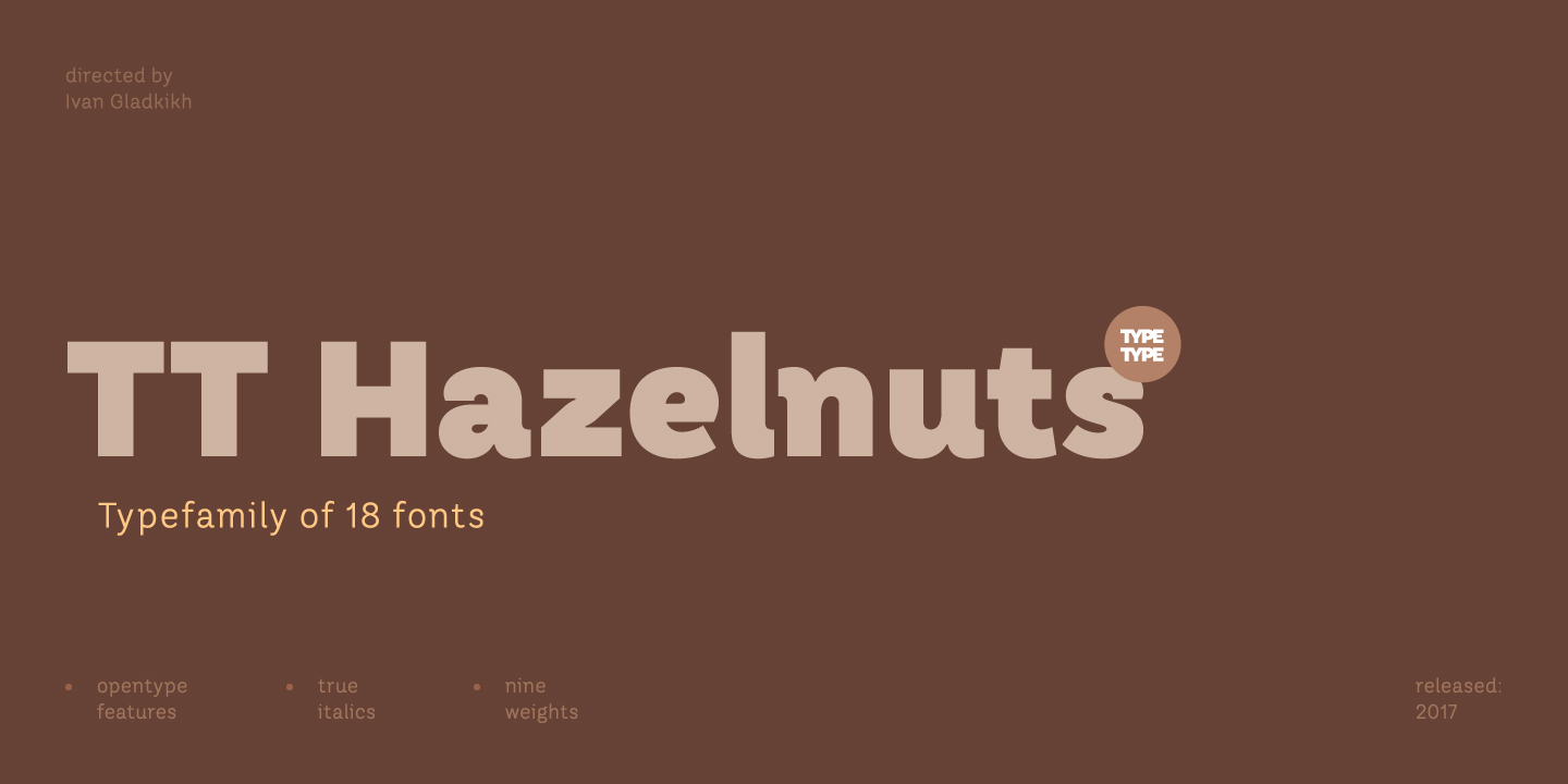
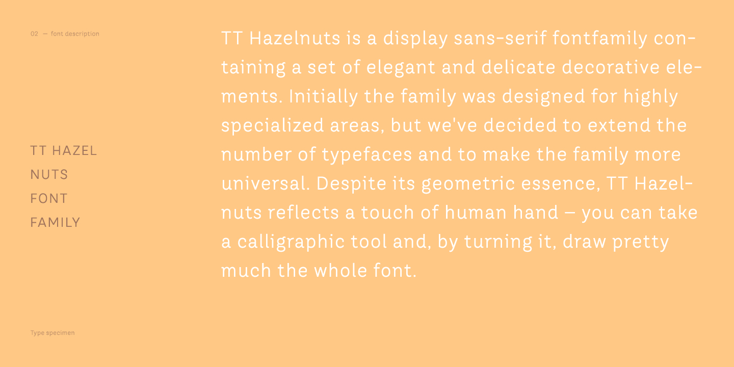
TT Hazelnuts هي مجموعة من الخطوط الزخرفية بدون مذنبات، تحتوي على مجموعة من العناصر الزخرفية الناعمة والجذابة. في البداية، كان هذا الخط مخصصًا لمجال ضيق جدًا من الاستخدام، ولكن قررنا توسيع عدد الأنماط وجعل الخط أكثر شمولية. على الرغم من طابعه الهندسي، يمكن الشعور بلمسة اليد البشرية في تصميمه؛ فبإمكانك، إذا أردت، استخدام قلم وتدويره لرسم معظم الخط تقريبًا.

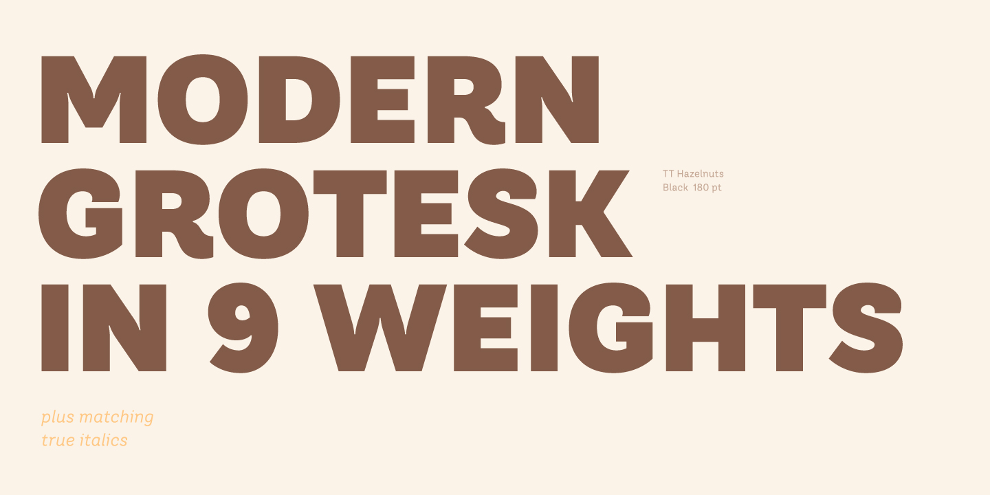
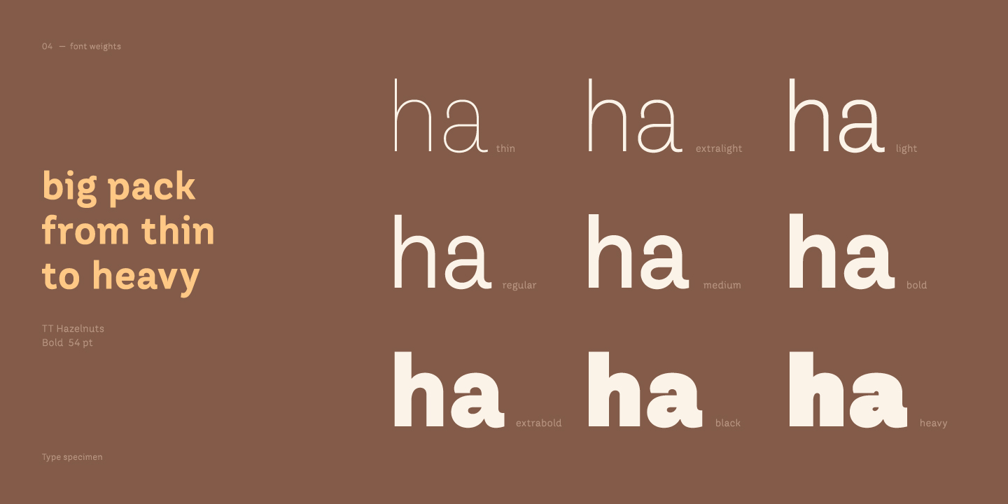
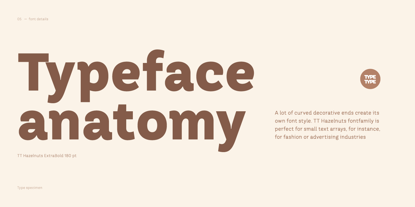
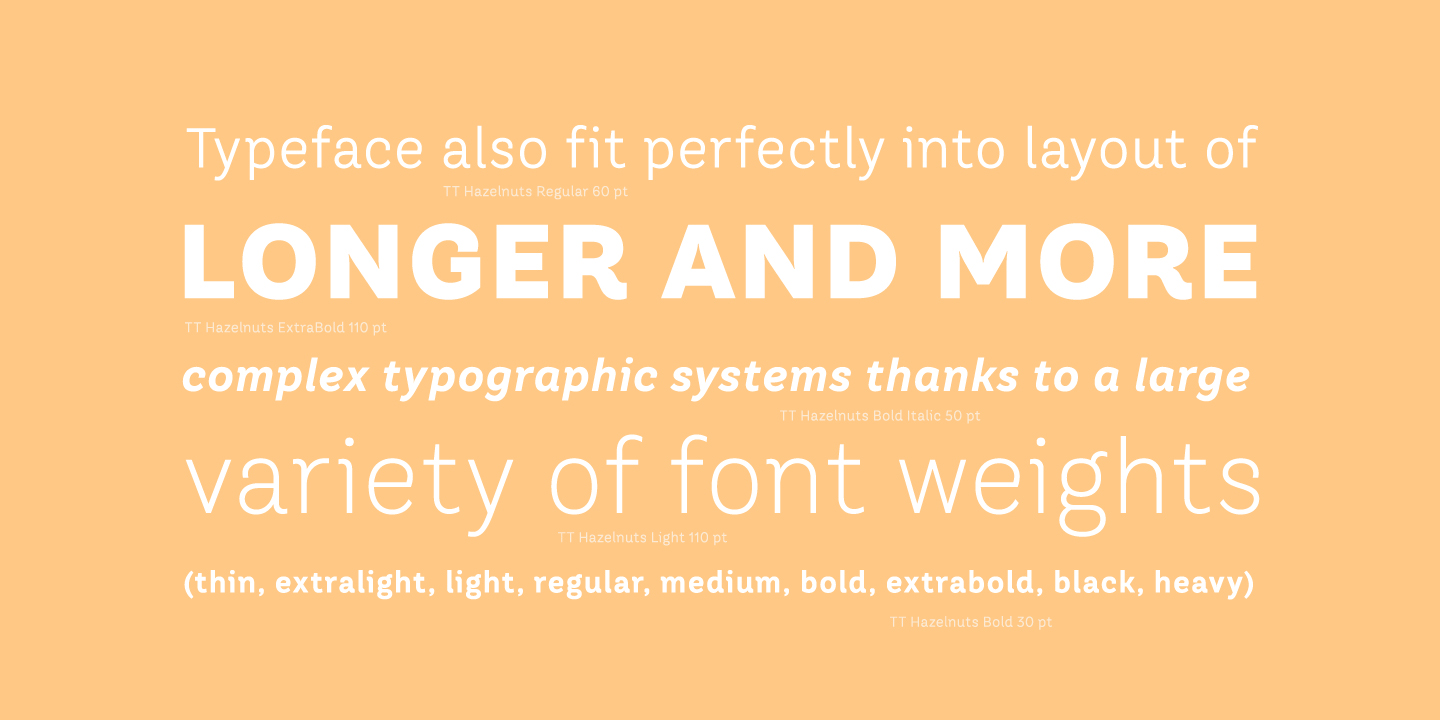
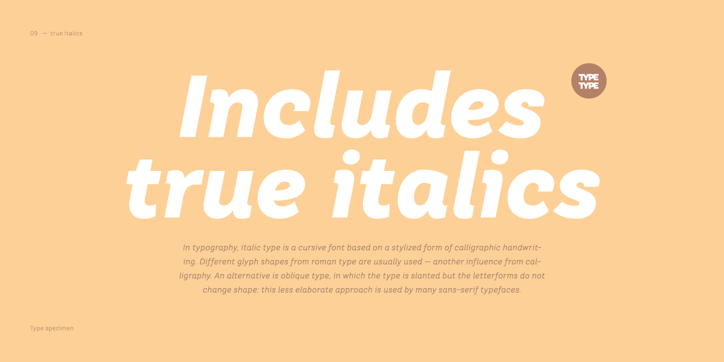
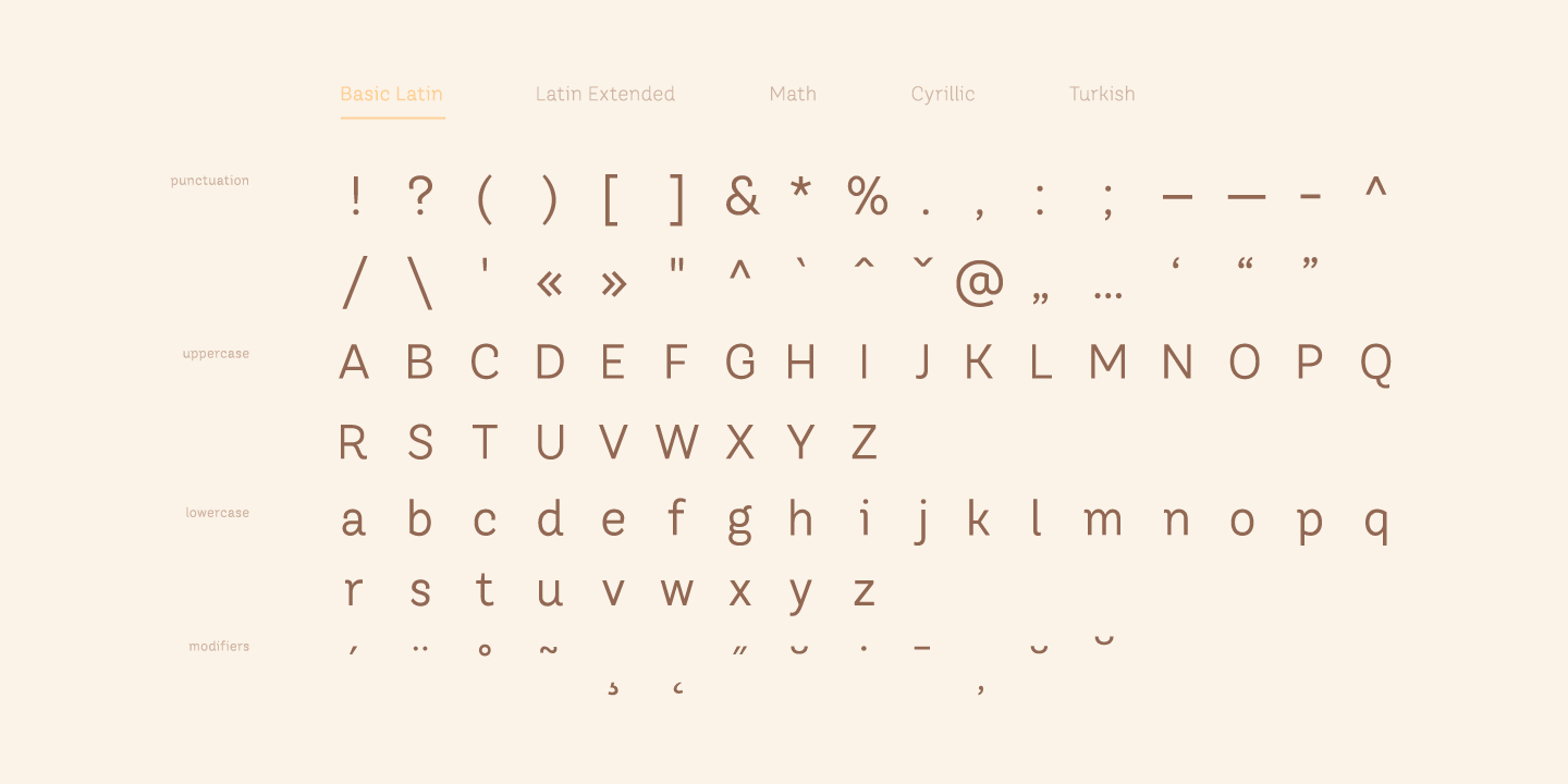
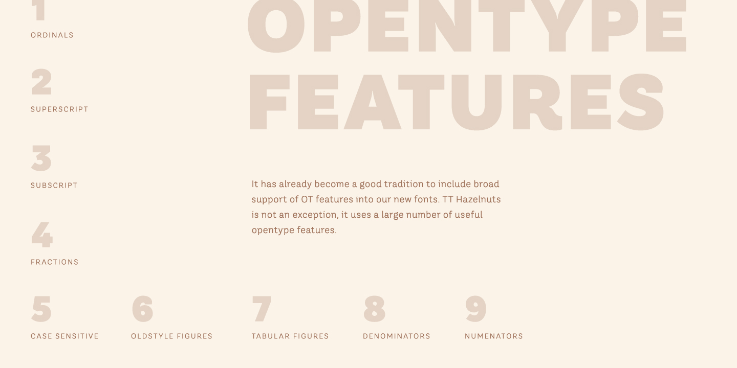
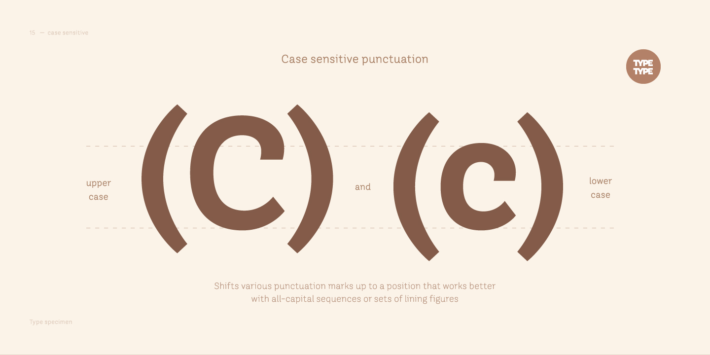
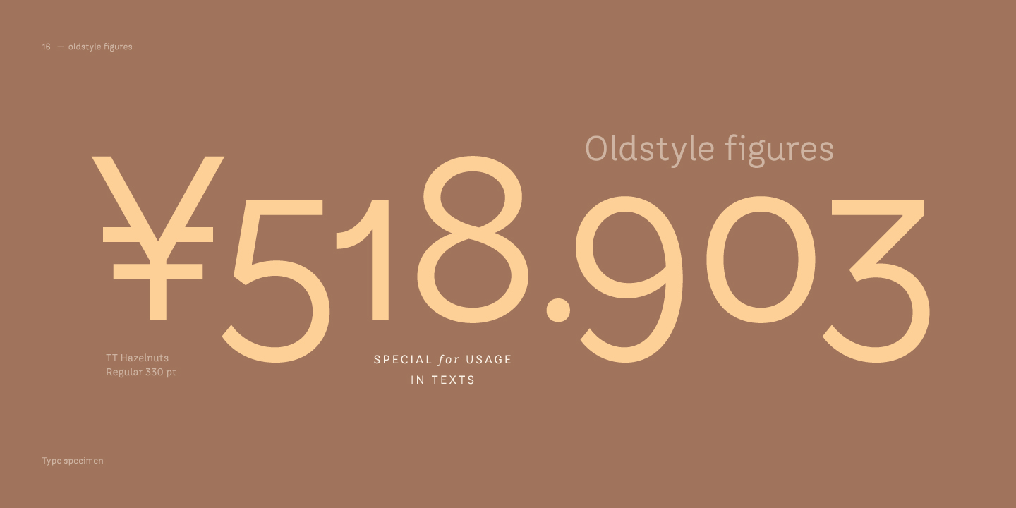
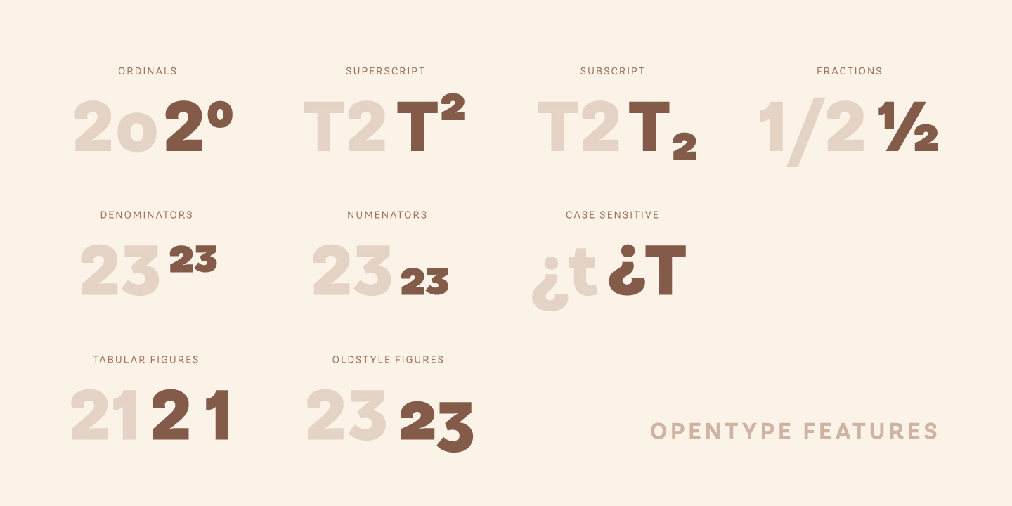
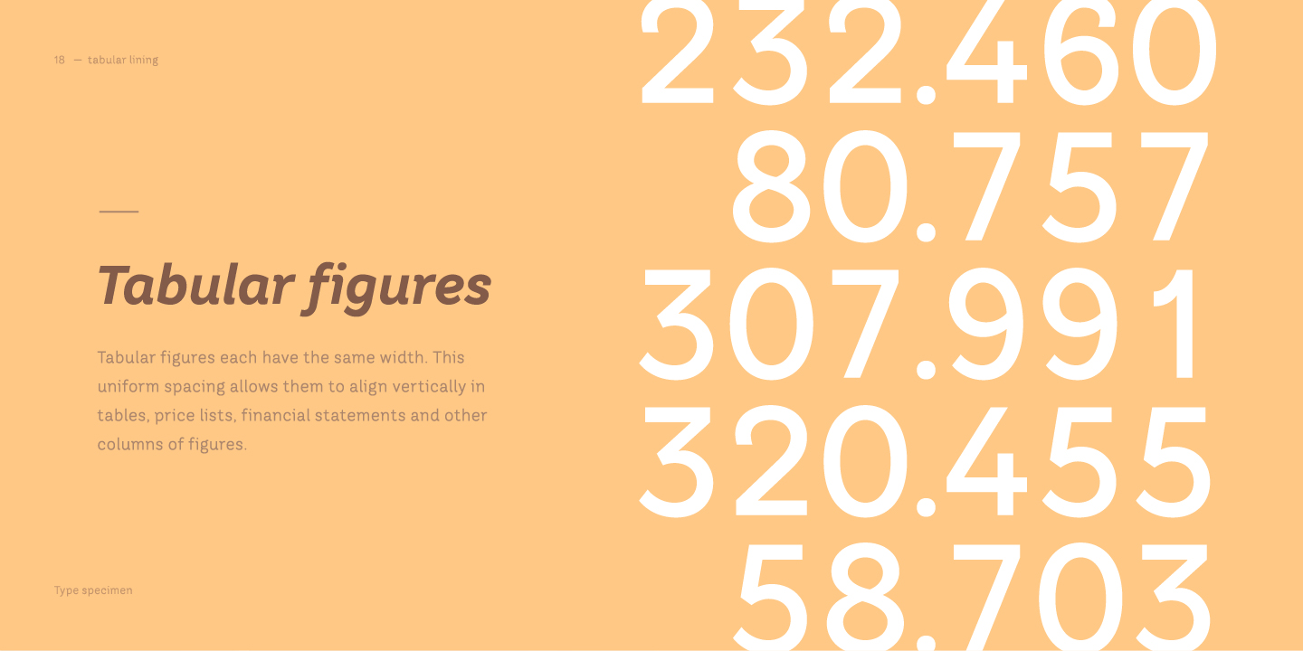
تعد مجموعة خطوط TT Hazelnuts مثالية لكتابة نصوص صغيرة الحجم، مثل تلك المستخدمة في صناعة الموضة أو الإعلانات، وتناسب أيضًا تخطيط أنظمة الطباعة الأطول والأكثر تعقيدًا، بفضل تنوع الأوزان (Thin، Extra Light، Light، Regular، Medium، Bold، Extra Bold، Black، Heavy) وتوافر إيطاليات حقيقية. وكعادة تقليدية جيدة، قمنا بتضمين دعم واسع لميزات OpenType في خطوطنا الجديدة، وTT Hazelnuts ليس استثناءً، حيث يحتوي على عدد كبير من الميزات المفيدة: ordn، sinf، sups، numr، dnom، tnum، onum، frac، case.

تاريخ الإصدار

يناير 10, 2017

إضافي

عينة

تنزيل عينة الخط (PDF)

الرسومات الإعلانية

العرض التقديمي على Behance

إصدارات مخصصة

هل تبحث عن إصدار مخصص من هذا الخط؟

نظام الكتابة المتد + عرض الكل

مجموعة الأحرف

اللاتينية الأساسية السيريلية الأساسية Extended Latin Lining Figures, Currencies Old-style Figures|onum Punctuation, Symbols, Mathematical Symbols, Arrows
A B C D E F G H I J K L M N O P Q R S T U V W X Y Z a b c d e f g h i j k l m n o p q r s t u v w x y z
А Б В Г Д Е Ё Ж З И Й К Л М Н О П Р С Т У Ф Х Ц Ч Ш Щ Ъ Ы Ь Э Ю Я Ѓ Ґ Ќ Є Ї Љ Њ Ћ Ђ Ў Џ а б в г д е ё ж з и й к л м н о п р с т у ф х ц ч ш щ ъ ы ь э ю я ѓ ґ ќ є ї љ њ ћ ђ ў џ
À Á Ă Â Ä Ā Å Ã Ą Æ Ć Č Ĉ Ç Ď Đ È É Ě Ë Ė Ê Ē Ę Ğ Ģ Ķ Ĺ Ľ Ļ Ł Ì Í Î Ï İ Ī Į Ń Ň Ņ Ñ Ò Ó Ô Ö Ő Ō Õ Œ Ø Þ Ŕ Ř Ŗ Ś Š Ș Ş Ť Ţ Ý Ÿ Ù Ú Û Ü Ū Ű Ů Ų Ź Ž Ż à á ă â ä ā å ã ą æ ć č ĉ ç ď đ è é ě ë ė ê ē ę ğ ģ ķ ĺ ľ ļ ł ì í î ï i ī į ń ň ņ ñ ò ó ô ö ő ō õ œ ø þ ŕ ř ŗ ś š ș ş ť ţ ý ÿ ù ú û ü ū ű ů ų ź ž ż
0 1 2 3 4 5 6 7 8 9 $ ¢ ¤ ¥ £ ƒ
0 1 2 3 4 5 6 7 8 9
! ¡ ? ¿ « » . , : ; ... ' " | ¦ - _ \ / ( ) [ ] { } · * # % § © ® @ & ° ^ - + < > = ~ ¬ ± × ÷

ميزات OpenType

onum | Oldstyle Figures

1638

1638

case | Case Sensitive Forms

{([H])}

{([H])}

frac | Fractions

1/2 3/4

1/2 3/4

numr | Numerators

H123

H123

الأزواج المثالية للخطوط مع TT Hazelnuts.

What is a font pair, and what does it serve for?

A font pair is a combination of two fonts within one text block. Most often, one of the fonts in a pair is a more expressive headline font, and the other one serves to communicate information. Such fonts complement each other and help designers solve various tasks, like highlighting key elements, adding emotional expressiveness to the project, or separating semantic blocks.

How to choose fonts for a project: Several general recommendations

To begin with, establish the project's tone. Choose the fonts that stylistically match the main idea. After that, you need to determine the functions of each font in the project and their hierarchy: which font will complement the design and which one will serve to attract attention as the main element. You need to assess the difference between the fonts and decide what kind of information each of them should convey. First, we recommend choosing the base font you will use most, and then you can find a suitable pair for it.

Core principles of font pairing and recommendations from designers

The main rule you should follow when matching two fonts is that both similarities and differences must be visible between them. You can highlight the coherence of fonts by the following characteristics: contrast, proportions, width, openness of characters, individual letter shapes, and overall tone. Feel free to experiment with different combinations. We also recommend analyzing the projects you like: this way, you can enhance your visual skills, elevate your knowledge base, and gain confidence in dealing with typography.

خطوط مشابهة

شراء الخط