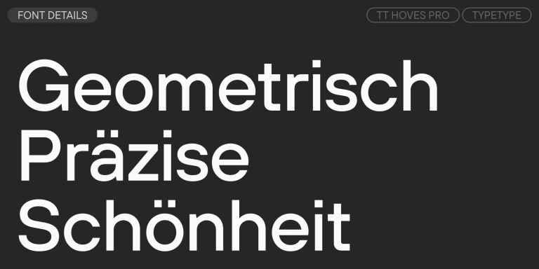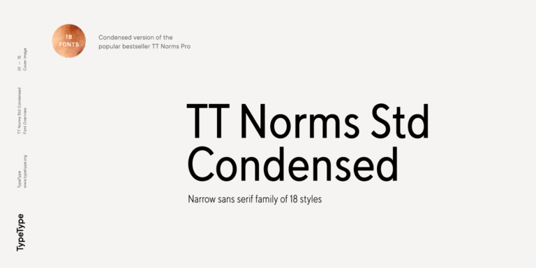
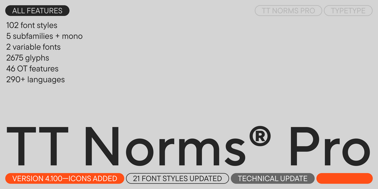
TT Norms® Pro
Regular
104 Stile

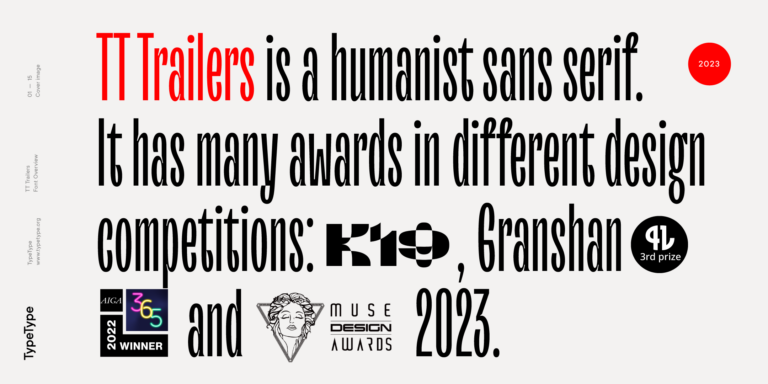
Der Bestseller TT Norms® Pro ist eine geometrische Sans Serif und ein zuverlässiger Allrounder.