
حول عائلة الخط
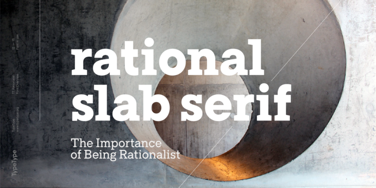
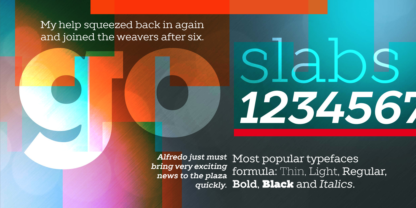
TT Slabs هو خط بسيط وجيومتري مدمج. يعتبر TT Slabs مثاليًا إذا كنت تبحث عن خط عالمي بمقاييس واسعة لمشاريعك.


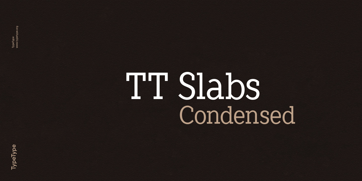
TT Slabs هو خط بسيط وجيومتري مدمج. يعتبر TT Slabs مثاليًا إذا كنت تبحث عن خط عالمي بمقاييس واسعة لمشاريعك.
إيفان غلادكيخ — مدير المشروع
أليكسا فولوشاي — مصمم خطوط
نادر رحيموف — مصمم خطوط
الإصدار: أكتوبر 21, 2014
آخر تحديث: نوفمبر 24, 2015
هل تبحث عن إصدار مخصص من هذا الخط؟
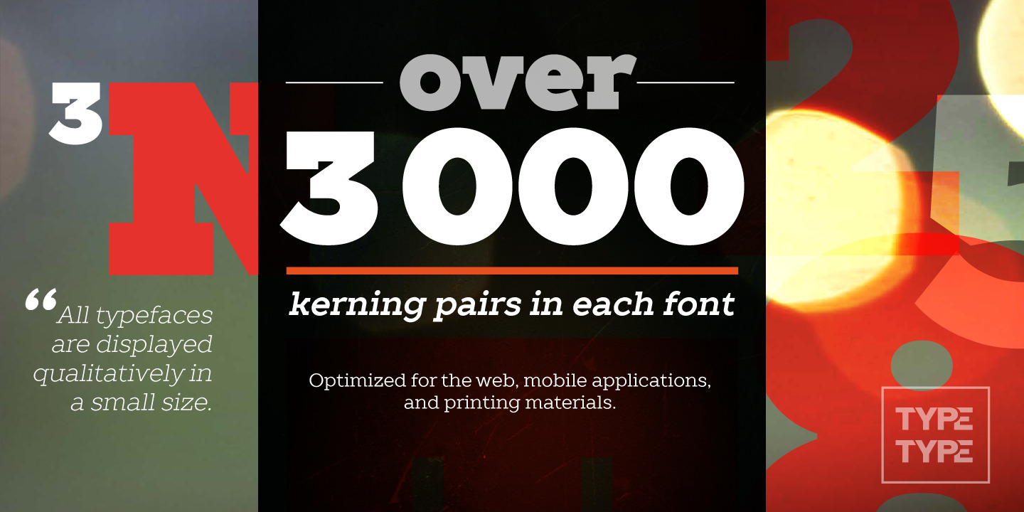
A versatile font with wide proportions
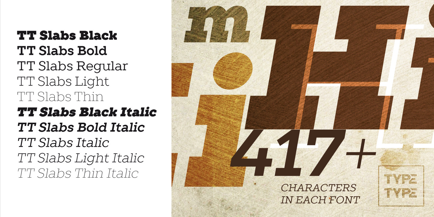
World needs a beautiful, simple and high-quality typeface. We need simple and geometric fonts. Slab is a form of serifs, which gave its name to the font family. TT Slabs includes most popular faces.
TT Slabs is very well suited for designers, who create Identity and logos
As well as for interior design and navigation
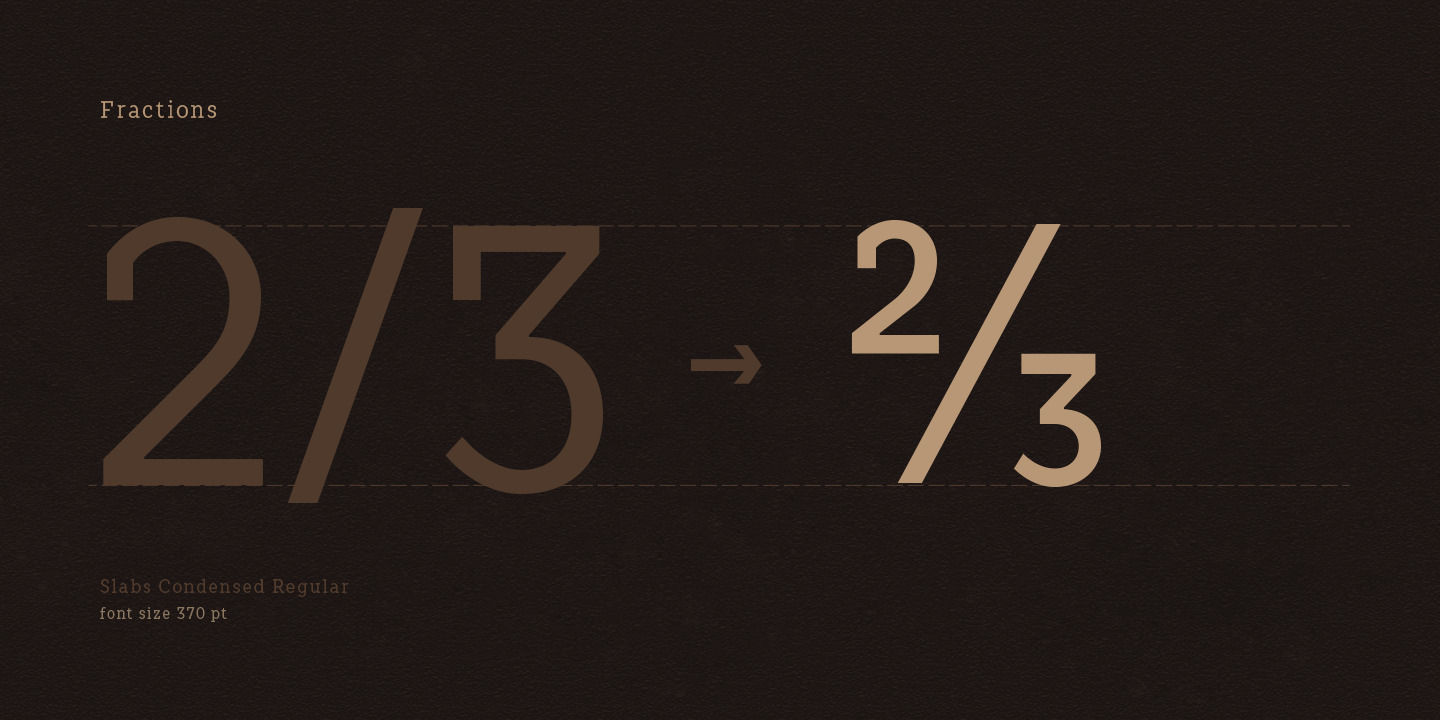
3/4 cup (18 cm3)
What is a font pair, and what does it serve for?
A font pair is a combination of two fonts within one text block. Most often, one of the fonts in a pair is a more expressive headline font, and the other one serves to communicate information. Such fonts complement each other and help designers solve various tasks, like highlighting key elements, adding emotional expressiveness to the project, or separating semantic blocks.
How to choose fonts for a project: Several general recommendations
To begin with, establish the project's tone. Choose the fonts that stylistically match the main idea. After that, you need to determine the functions of each font in the project and their hierarchy: which font will complement the design and which one will serve to attract attention as the main element. You need to assess the difference between the fonts and decide what kind of information each of them should convey. First, we recommend choosing the base font you will use most, and then you can find a suitable pair for it.
Core principles of font pairing and recommendations from designers
The main rule you should follow when matching two fonts is that both similarities and differences must be visible between them. You can highlight the coherence of fonts by the following characteristics: contrast, proportions, width, openness of characters, individual letter shapes, and overall tone. Feel free to experiment with different combinations. We also recommend analyzing the projects you like: this way, you can enhance your visual skills, elevate your knowledge base, and gain confidence in dealing with typography.