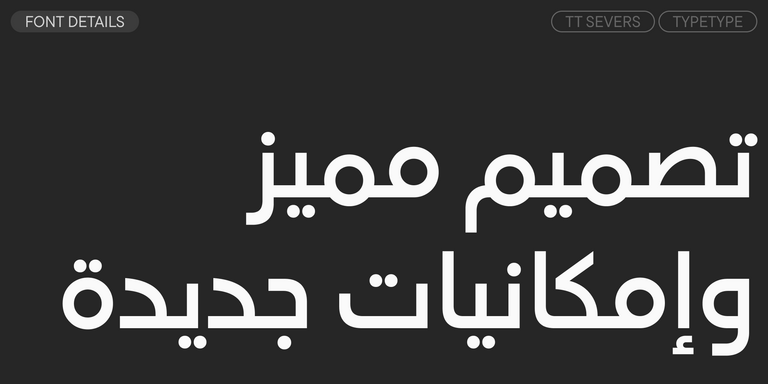
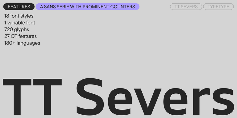
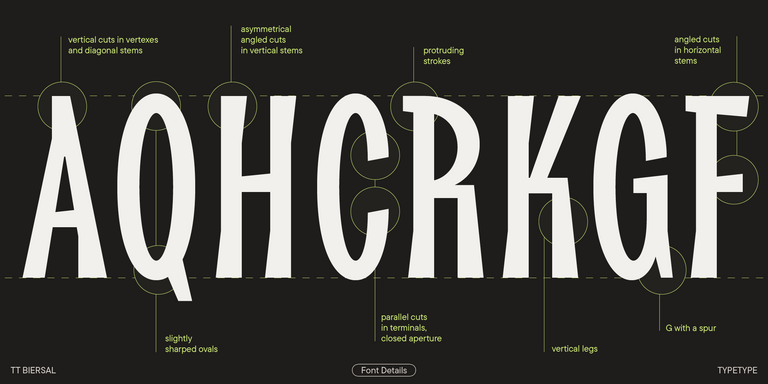
TT Severs is a geometric sans serif with emphasized elements of internal brackets. The main visual feature of TT Severs is the unusual form of internal ovals.
خطوط سلاحف النينجا
- جميع الخطوط 73
- بدون الذنابات 47
- مع الذنابات 27
- سلاب 6
- العرض 41
- مكتوبة بخط اليد 10
- متغيرة 47
- بيع الخطوط 11
إذا كنت تبحث عن خطوط سلاحف النينجا لتكمل تصميمك، فإن استوديو TypeType هو المكان المثالي الذي يوفر مجموعة واسعة من الخطوط المناسبة للأغراض التجارية. يمكنك العثور على أنماط محددة وعائلات خطوط كاملة على صفحتنا عبر الإنترنت: اختر من بين مجموعة متنوعة من الخطوط المصممة باحتراف والمُختبرة تقنيًا، استخدمها مجانًا، أو قدّم طلبًا لشراء الترخيص المناسب.
يوفر TypeType فرصة تحميل الإصدارات التجريبية لجميع خطوط سلاحف النينجا لاستخدامها في مشاريعك، بالإضافة إلى إمكانية الحصول على استشارة من فرق التصميم أو دعم العملاء. لا تتردد في الاتصال بنا عبر نموذج التواصل على موقعنا.
- The quick brown fox jumps over a lazy dog.
- Pack my box with five dozen liquor jugs.
- Sphinx of black quartz, judge my vow
- 0123456789 !?.,:;—–()[]{}<> “quotes” ‘apostrophe’ @#%&*_+=/\| № $ € £ ₽ +−×÷=≠≤≥ … % © ® ™
- Aa Bb Cc Dd Ee Ff Gg Hh Ii Jj Kk Ll Mm Nn Oo Pp Qq Rr Ss Tt Uu Vv Ww Xx Yy Zz
TT FRANTZ IS AN EXPERIMENTAL VARIABLE FONT, DISTINGUISHED BY ITS SLIMNESS AND LIGHTNESS. THE VARIATION IN THE FONT AFFECTS THE CHANGE IN THE HEIGHT OF THE MEAN LINE—BY MOVING THE AXIS ADJUSTMENT SLIDER YOU CAN EASILY RAISE OR LOWER THE MEAN LINE OF THE FONT.
TT Supermolot Neue is a redesigned, extended, and greatly enhanced reincarnation of the popular font family
TT Modernoir is a display sans serif with dynamic proportions. Fluid lines and delicate Art Nouveau forms in this typeface blend seamlessly with the rhythmic flow and improvisational freedom of jazz.
TT Ricordi Greto is an experimental project, inspired by a floor plaque dating from 1423 found in the Basilica di Santa Croce, Florence.
TT Marks delivers a script with dynamic rhythm, heartfelt character, and nostalgic appeal inspired by the classic art of American sign painting. This craft, where skilled artists hand-painted storefront signage with brushes and careful technique, is experiencing a well-deserved renaissance in today’s design world.
TT Drugs is a typeface that doesn’t feature serifs but stands out for its high contrast.
TT Biersal is a display sans serif with a free-spirited, playful, and adventurous nature. The concept of this font was sparked by a German poster from the early 1930s.
TT Cometus is an expressive typeface that captivates from the first time.
TT Travels Text is a geometric grotesque with wide proportions and specific shapes of circles and fillets, which includes two stylistic sets with completely different natures.
TT Ricks is a flamboyant elzevir-type serif, for which the words “cute” or “calm” are not a fitting definition.
A technological font family for game design
TT Bluescreens is a upgraded geometric sans serif with narrow proportions
The starting point of the TT Trailers project was the idea to develop a new generation of narrow typefaces for use in movie credits and posters.
TT Autonomous is a modern techno sans serif with wide angular proportions.
TT Berlinerins is a grotesque inspired by the wood-type poster types of the first third of the 20th century is responsible for the historic component of Berlin.
TT Hazelnuts is a display sans serif font family containing a set of elegant and delicate decorative elements.
TT Bricks is the answer for lovers of Soviet culture. We’ve tried going back a hundred years and rethinking the constructivist era.
